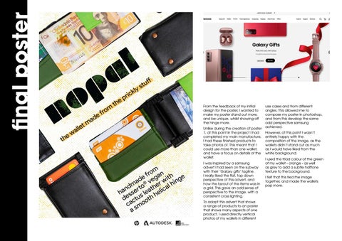
final poster
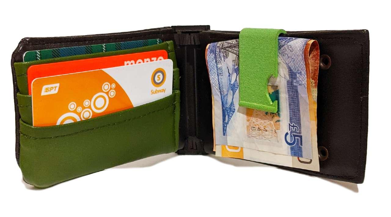
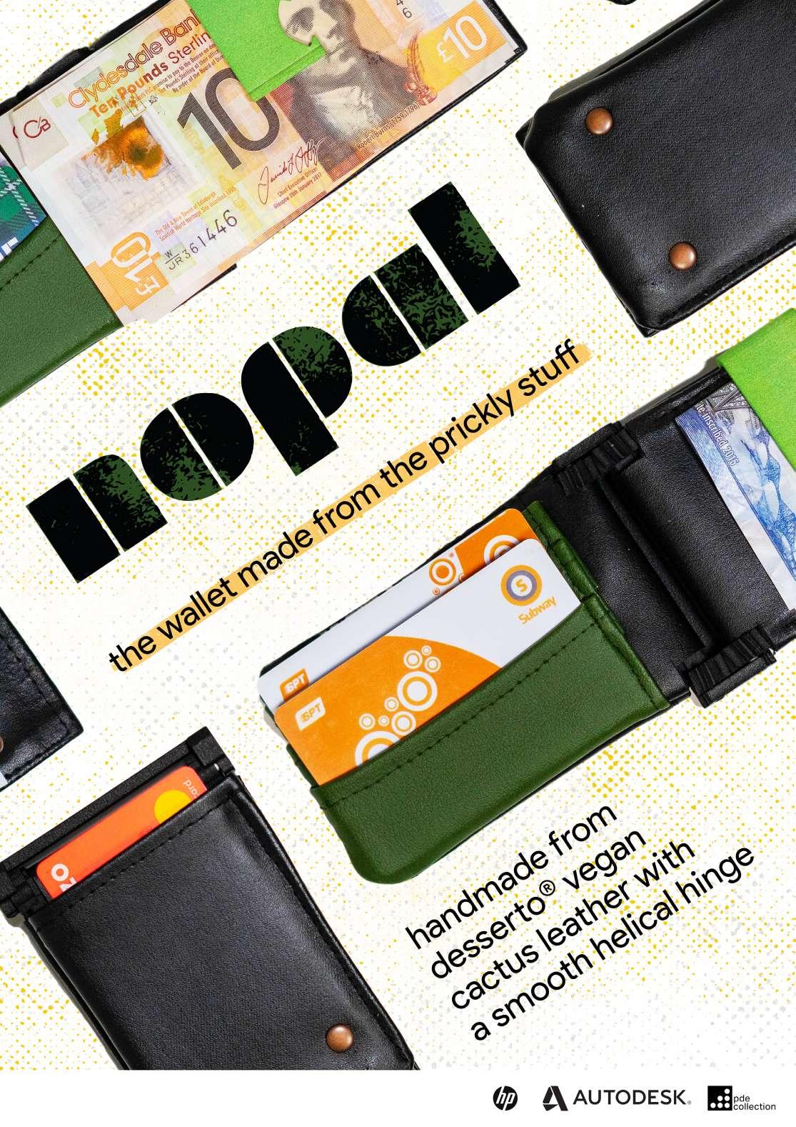
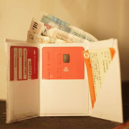
From the feedback of my initial design for the poster, I wanted to make my poster stand out more, and be unique, whilst showing off the hinge more. Unlike during the creation of poster 1, at this point in the project I had completed my main manufacture, I had these finished products to take photos of. This meant that I could use more than one wallet, and have a focus on details of the wallet. I was inspired by a samsung advert I had seen on the subway with their ‘Galaxy gifts’ tagline. I really liked the flat, top down perspective of this advert, and how the layout of the items was in a grid. This gave an odd sense of perspective to the image, with a consistent cross lighting. To adapt this advert that shows a range of products to an poster that shows many aspects of one product, I used directly vertical photos of my wallets in different
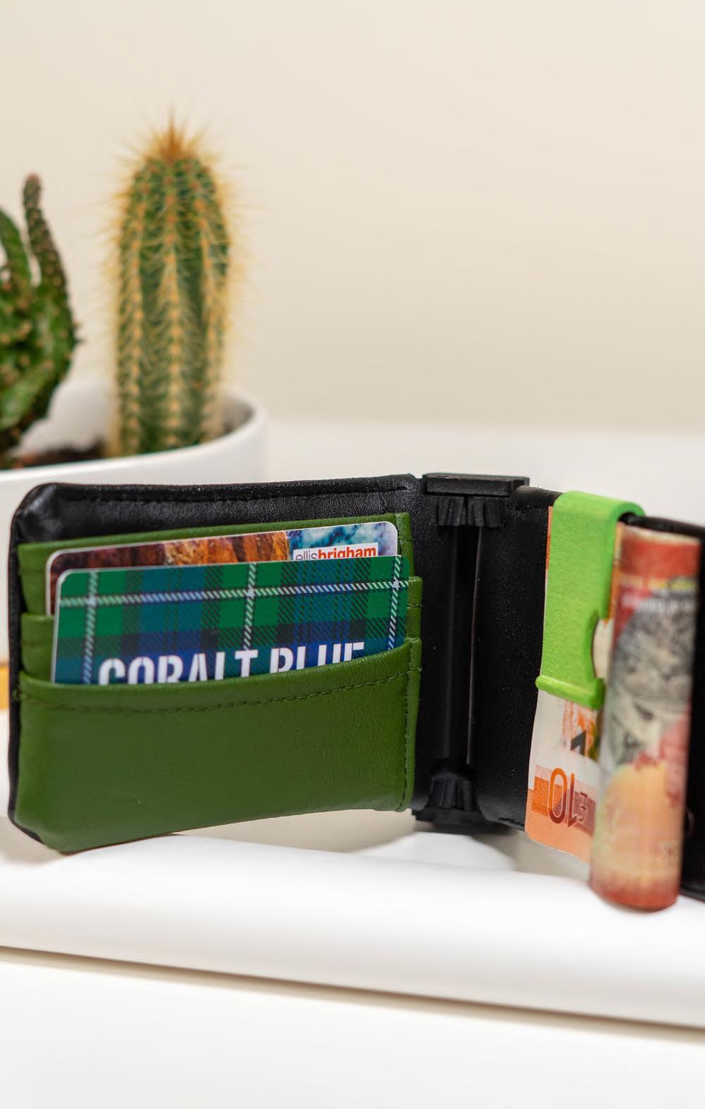
use cases and from different angles. This allowed me to compose my poster in photoshop, and from this develop the same odd perspective samsung achieved. However, at this point I wasn’t entirely happy with the composition of the image, as the wallets didn’t stand out as much as I would have liked from the white background. I used the triad colour of the green of my wallet - orange - as well as grey to add a subtle halftone texture to the background. I felt that this tied the image together, and made the wallets pop more.