2 minute read
costing
branding
wallet
Advertisement
The quick brown fox jumps over the lazy dog - Archia The quick brown fox jumps over the lazy dog - ITC Avant Garde Cond The quick brown fox jumps over the lazy dog - Lucida Sans The quick brown fox jumps over the lazy dog - Gill Sans The quick brown fox jumps over the lazy dog - Helvetica The quick brown fox jumps over the lazy dog - Product Sans The quick brown fox jumps over the lazy dog - Helvetica Neue The quick brown fox jumps over the lazy dog - PT Sans The quick brown fox jumps over the lazy dog - Futura PT Med The quick brown fox jumps over the lazy dog - ITC Avant Garde Gothic
wallet nopal nopal nopal nopal nopal nopal nopal nopal nopal nopal nopal nopal nopal cactus leather nopal nopal wallet nopal
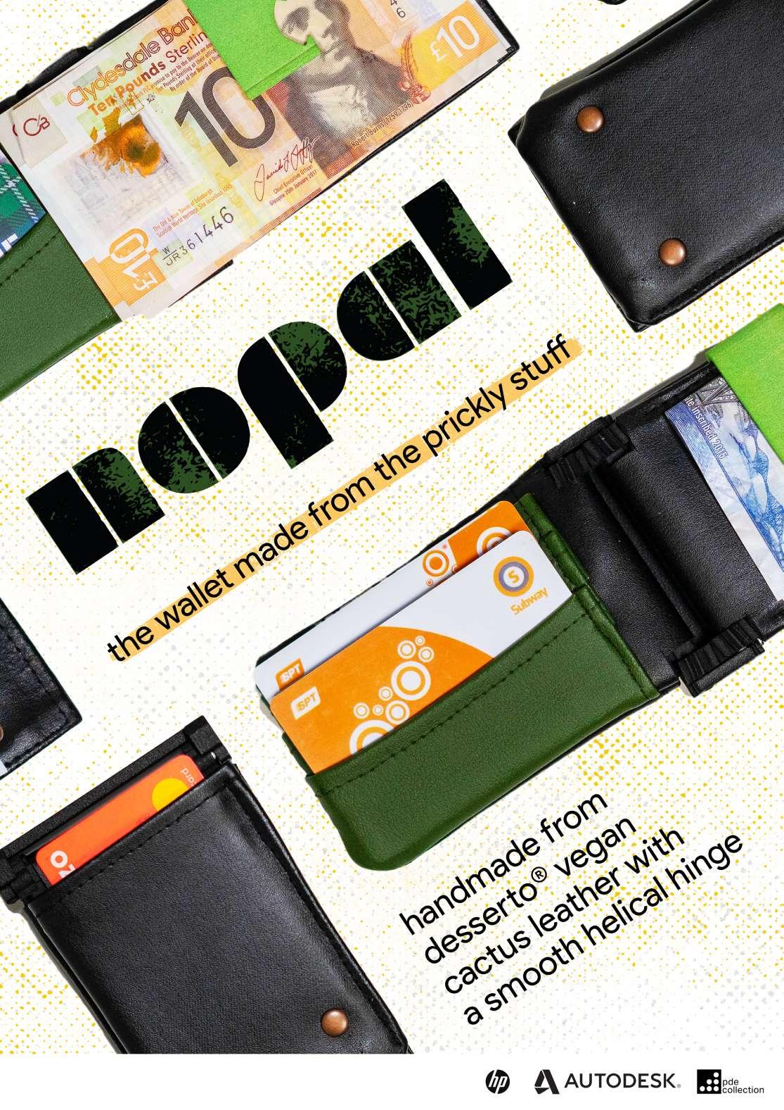
Within my logo, I wanted to capture the essence oft the cactus leather material, however didn’t want to include a cactus form or silhouette as I thought this would be tacky and misrepresent the product. I liked the idea of working with simple, geometric shapes, and using a combination of triangles, rectangles and semicircles. Using these principles I created the first logo. However, looking at this logo, I decided that the crisp, pointed edges were too far. I then went looking for typefaces that fit my geometric vision. I found Milka, a lovely typeface that consists only of wide rectangles and consistently curved edges. Bringing down the kerning allowed the logo to look more together and joined. In order to conform my logo to my product more, I tried adding different swatch textures. I really liked the effect that this created, however it could be to messy for a professional logo. I settled on using the first swatch overlay as a main logo as compared to the rest it is quite understated, however still gives a hint of the dry, arid conditions the cactus is grown in. I also decided to use the monotone one as a secondary logo/outline on items that didn’t need/couldn’t use a colour logo. To complement the Milka typeface I looked at a variety of sans serif typefaces. I settled on Product Sans, as I thought the perfect circles complemented the consistent curves seen in Milka.


