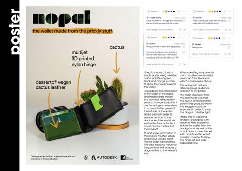
poster
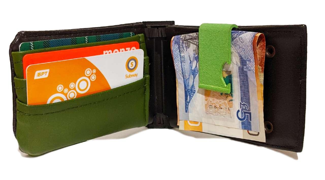
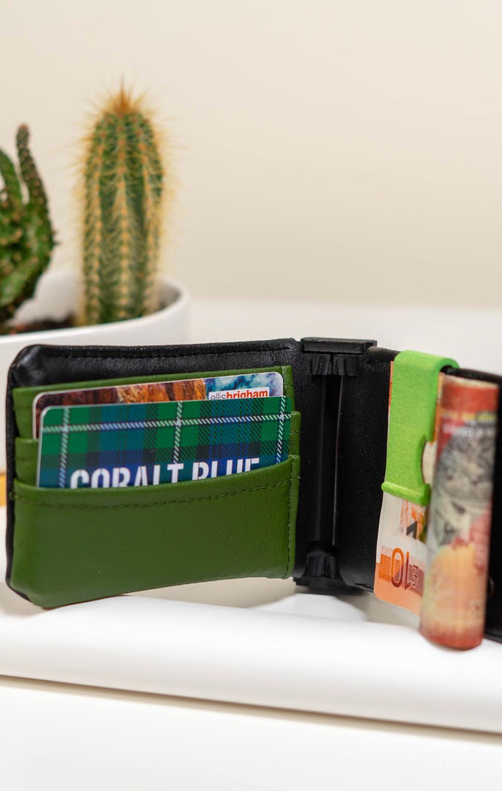
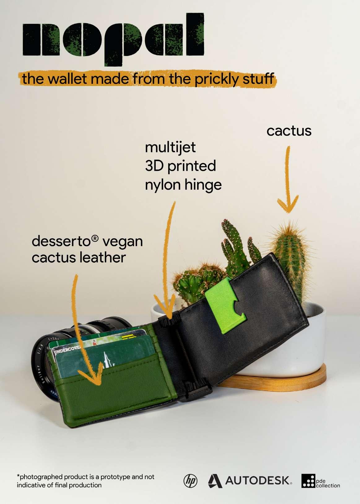
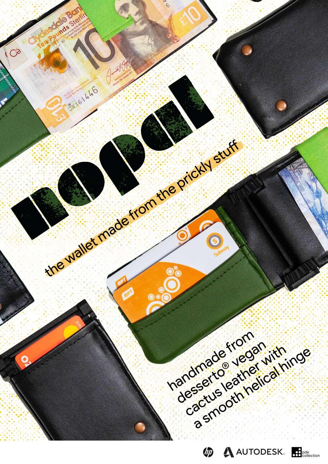
I tried to create a fun but simple poster, using a limited colour palette of green black and orange in order to draw the viewer’s eye to the wallet. I considered the placement of the wallet in the frame, and tried to dress the set in a way that reflected my product. In order to do this, I used a vintage camera lens to contrast to the green of the left side of the wallet, and a cactus in order to provide contrast to the black side of the wallet. As well as this the cactus tied nicely into the material of the product. To add some information to the poster I created labels and arrows using a paint marker brush in photoshop. This adds a playful nature to the poster as well as adds a diagonal line to the viewer’s eye.
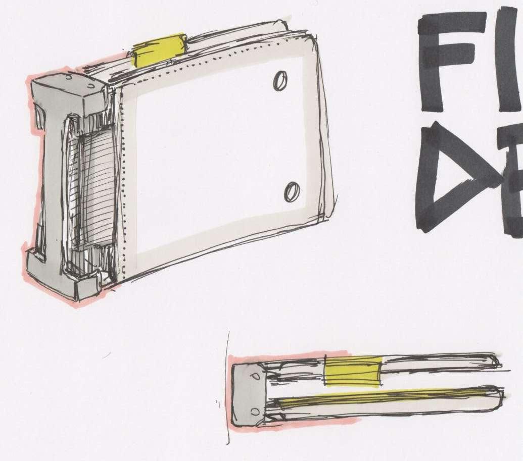
After submitting my poster to miro, I received some useful peer and tutor feedback, which can be seen above. This was great, as I was able to gauge audience reaction to my poster. The main takeaway from my comments was that the layout and idea of the poster was good, however the imagery could be improved in order to show the hinge in a better light. I think that in a second revision I could play with depth of field in order to isolate the wallet from the background. As well as this, I could look to dress the set with parts from the wallet creation, in order to show the hinge off in a sudoexploded view.