TYPE IN THE WILD
Spring 2023
GRA2208
Alia Scotka
week one week two week three week four week five week six week seven
1-2 3-4 5-6 7-8 9-10 11-12 13-14
TABLE OF CONTENTS
15-16 17-18 19-20 week
week
week
eight
nine
ten
week one good
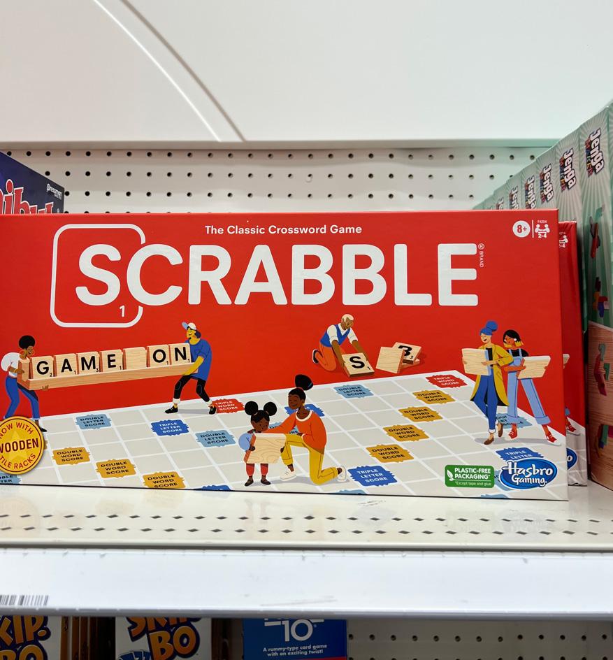
When it comes to promoting a brand, the main goal is making it look aesthetically pleasing to the point it lures consumers or viewers in. The main hooks are color and typeface which a lot of brands I saw throughout Target had. Target is a store that I would consider to be well put together compared to competitors like Walmart or Dollar General. It gained its popularity just by the products they have and the organization of the place. I noticed a lot of examples that included the spatial awareness of the text itself to the edges of the label. There are a plenty of factors that come into play when dealing with the design of a product which includes the text size, font, and type family. What immediately caught my eye was one of my favorite board games to play called Scrabble. Scrabble is a well-known board game and for the longest time used more of a serif and Roman typestyle for its design for the game. The sans serif characters in the title are presented in small caps. There is a use of the same font family throughout the design including the game letter pieces. I’ve noticed a trend in many products that have steered away from the Roman typestyle in their designs. I appreciate the weight of the title and the space in between the characters, as a viewer you can read it from a great distance without having to guess what it says. I liked the fact that this company had rebranded themselves again just by making use of sans serif. Altering minor changes in the design of a well-known product speaks volumes.

1 Type in the Wild
bad
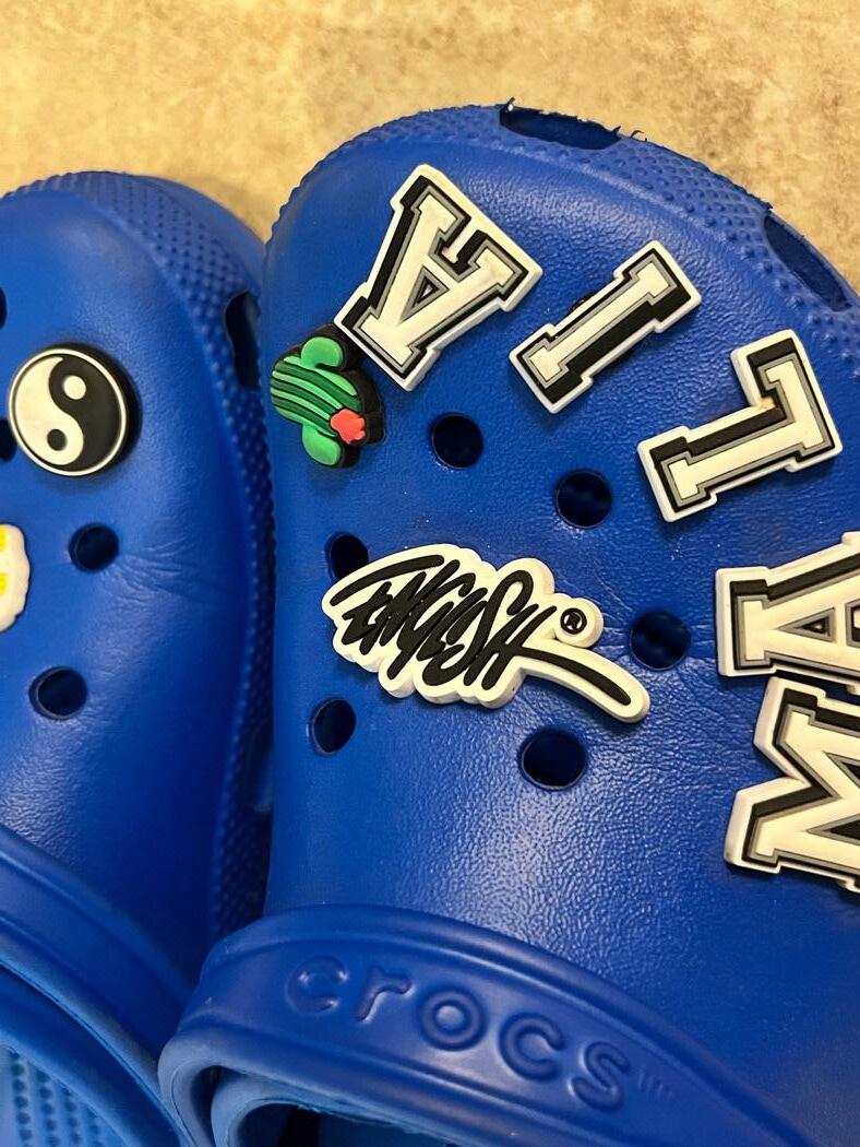
There are a lot of design mistakes made by companies when they decide to design their brand themselves without the help from an actual graphic designer. In many cases, this is a problem many businesses face because they don’t find it necessary to pay to have one or they rely heavily on the credibility of their product or company. How I found this example of bad typography was me stumbling across it on the ground. This is a Crocs shoe charm that is meant to read “English”. At first when I was picking it up off the ground, I thought it was a signature of some sort that did not have any sort of legible letters in it. It does give the sense of it being handwritten in a Condensed Italic typestyle. I am assuming this design was not meant to be scaled this far down to the size of a shoe charm, but now imagining it scaled up I still see it just as chaotic. I do see this as a fun creative design, but at first glance it was very hard for me to understand what letters were being used. What they can get away with is the placement of the characters on the baseline, there is no definite baseline. For this design to be successful, there needed to be a better choice in the spacing between the characters. The characters are too close together it almost looks like they are on top of each other. For me, the longer I look at it, all the characters blend, and it just looks like a scribble to me.
2
week two good
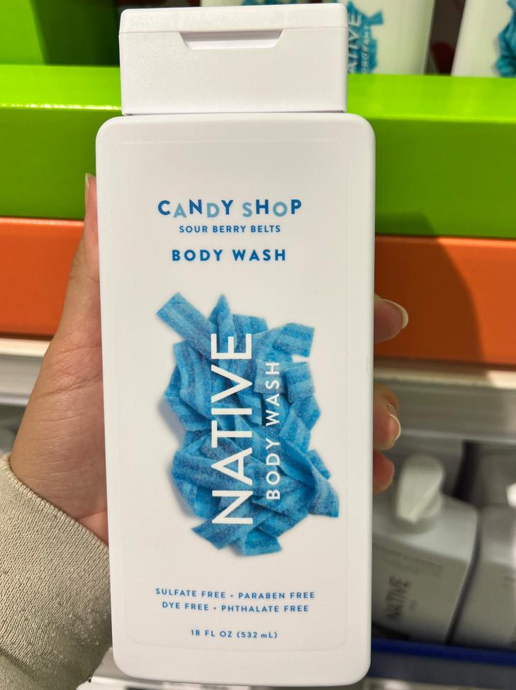
Walking through the store the other day, I came across the body wash aisle with all the popular brands that had colorful designs. Native started rising in popularity a couple years ago and they’ve been a hot commodity even with how expensive it is. I do consider this a good example of good typography because of how it checks the boxes. The letterspacing between the characters of the brand’s name suits the overall design. As you hold the bottle upright you are not able to read the name as easily as the descriptions above and below it. Naturally horizontal text is easier to read left to right than vertical text that reads bottom to top. Now as a consumer, when you are dispensing the body wash it changes the orientation of the bottle, making the center title easier to read and the center focus. The finishing strokes of the font family are sans serif presented in small caps. All the letters are uppercase, and they have the same x-height. Looking at both words: “Native” and “Body Wash”, they are different text sizes but share the same kerning measurement. At first glance, it may seem like the “Native” text is in semi bold compared to the text underneath, but since it is a larger text size it gives the impression, it might be heavier. I appreciate the use of one font-family because it is not as busy or chaotic to the viewer. It is nice that they chose text colors from the background image to compliment the design even more.
3 Type in the Wild
bad
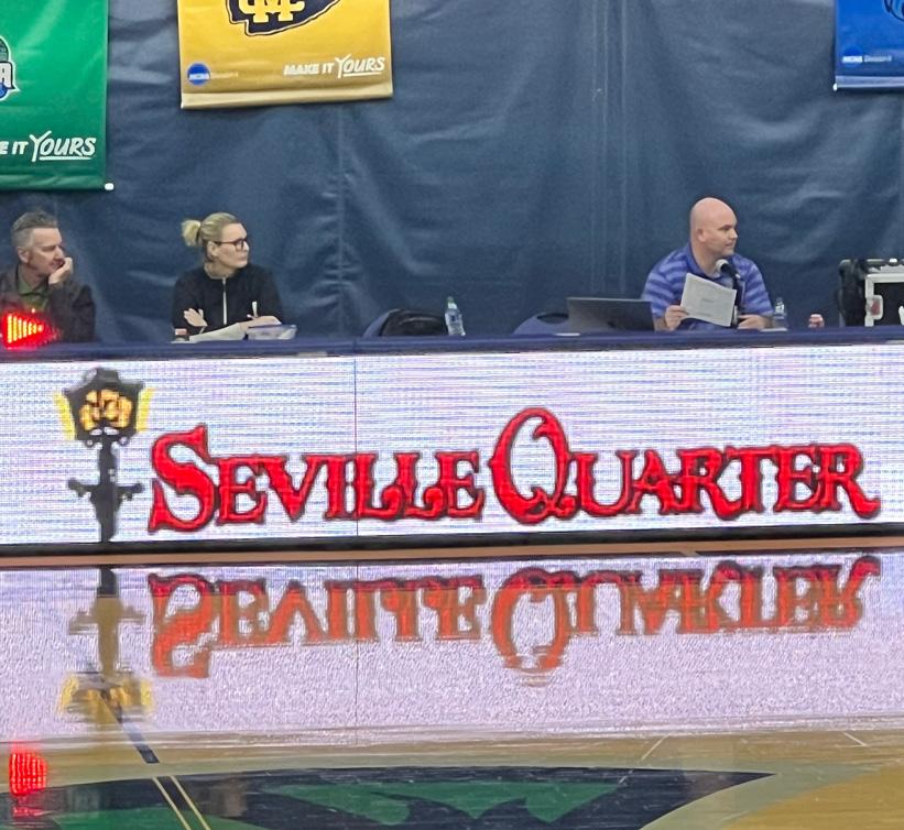
In Pensacola, there is a bar downtown called Seville Quarter. I noticed its company logo at a UWF Women’s Basketball game and thought it was an interesting choice of font. The typeface suits the theme of the bar, matching the old New-Orleans or Louisiana night club vibe. There is somewhat of a rustic feel that I really appreciate. It does look like the font was handwritten in an old feather pen. I think that for the viewer to be able to read this with ease there needs to be an increase in kerning. There seems to not be enough letterspacing between each character in each word which makes it look too crowded. The logo contains two words: “Seville” and “Quarter”, and as it is presented on the announcer’s board table it looks like one long word. An increase in word spacing and letterspacing would make it look less congested. I don’t see the need for them to be overlapping or touching each other. I think having the “S” and the “Q” in different text size/x-height from the other letters was a smart choice, but it would be executed better if there was more word spacing. The typestyle of the letterforms is Roman which presents each letter with serif finishing strokes. The weight of the letters is bolder than regular. A subtle change that I would make to the design would be to remove the outer protrusion sticking out from the middle part of each letter. I would push towards making it look more modern by removing the exaggerated finishing serif strokes.
4
week three good
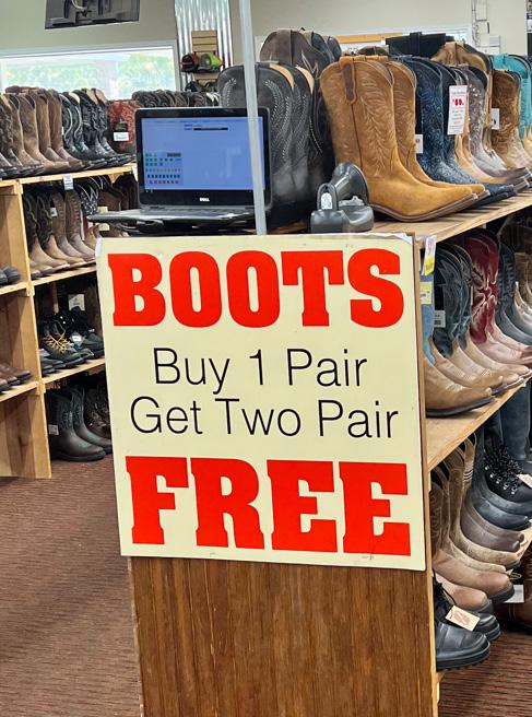
When it comes to sales, most brands try to use bold and eye-catching fonts to lure in consumers. I saw a huge billboard outside that first read “BOOTS FREE”, the bold and pronounced typeface caught my attention right away. My immediate thought was that they were giving out free pairs of boots and I needed to see what the hype was all about. The two typestyles that are being used in this advertisement are both variations of Egyptian and Helvetica. The weight of the words “BOOTS” and “FREE” are much heavier than the phrase in between them. They are presented in an extra bold variation of Century Expanded. The finishing strokes of the serif are not as protruded when it is in such a heavy typeface. Having a thick and bold font gives the impression is it physically massive. I consider this a good example because there is a correct amount of line and word spacing between both all the characters and words along with a simple color choice of red and black. The design for this advertisement is straight to the point and executes its main purpose. The “Buy 1 Pair Get Two Pair” is in black Helvetica thin which is just the right amount of weight to not stand out as much. I appreciate the use of Helvetica and thick Slab Serif because it creates two separate focuses on the text. I do wish there was more linespacing in between those two lines of text in the phrase because if you look closely at the lowercase letter “y” in “Buy”, it descends nearly touching the capital “T” in “Two”.
5 Type in the Wild
bad
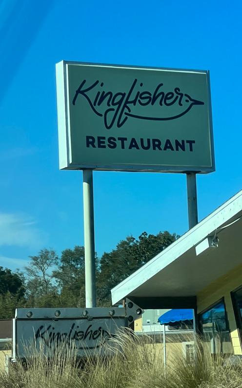
On the way to the navy base, there is a restaurant that sticks out like a sore thumb because it’s surrounded by no other buildings and holds up a minimalist sign promoting their business. I think the company who designed this spent more time trying to make the “fisher” look like a fish in the head title rather than making it legible. There are different ways of implementing a fish in the logo of this design and this choice wasn’t the best. At a quick glance, I had mistaken the “fisher” as “lisher” because they decided to combine cursive and print. I don’t think there needed to be a cursive “f” or “r” in the head title at all. Once characters do not share the same font-family, it can be difficult to make up the word. As a viewer, I paid more attention to the word “restaurant” than the actual business title itself because it was more of a bolder typeface and easier to read. It is in sans serif small caps, having all the characters within the word are sharing the same x-height. Most business signs with proper typography you read top-down and in this case, I read down-up because my eyes saw less chaos on the bottom. The head title “Kingfisher” is in a typeface that looks handwritten which gives a calligraphic impression. I don’t see using that typeface as a great choice for promoting a restaurant on the side of a busy road. If it was designed continuing the theme of a sans serif font-family, implementing variations in weight and possibly stroke would execute the restaurant promotion better.
6
week four
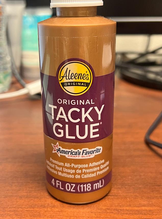
good
Arts and craft supplies can be great examples of good typography to come across. This bottle of glue was sitting on my desk that I noticed had a nice typeface to its front label. I appreciate that all three words share the same sans serif font-family that I would consider falling under Helvetica typeface. It was a smart decision by the designer to use a smaller text size for the word “Original” because it still imposes the importance of the classification without overpowering the large text underneath it. The text on the label in comparison to traditional display sizes I would say that the “Original” would be 24 points in relation to 72 points for the “Tacky Glue”. The use of the same x-height was key to making this design simplistic and clean which makes it easy to look at as a viewer. I find nothing wrong with the line spacing within the group of text, but I do see a need for some padding on the top and bottom. By doing this, it gives the impression that “Original Tacky Glue” is both vertically and horizontally centered. I want to add that I also appreciate the choice in different typefaces for the other mentions pertaining to the product. The color choice of this brand was another smart decision because it doesn’t fall under the generic white glue packaging. Using another neutral color like the bronze/brown makes the purple to white text stand out even more. I immediately thought it was a high quality brand just by the whole color scheme and typeface.

7 Type in the Wild
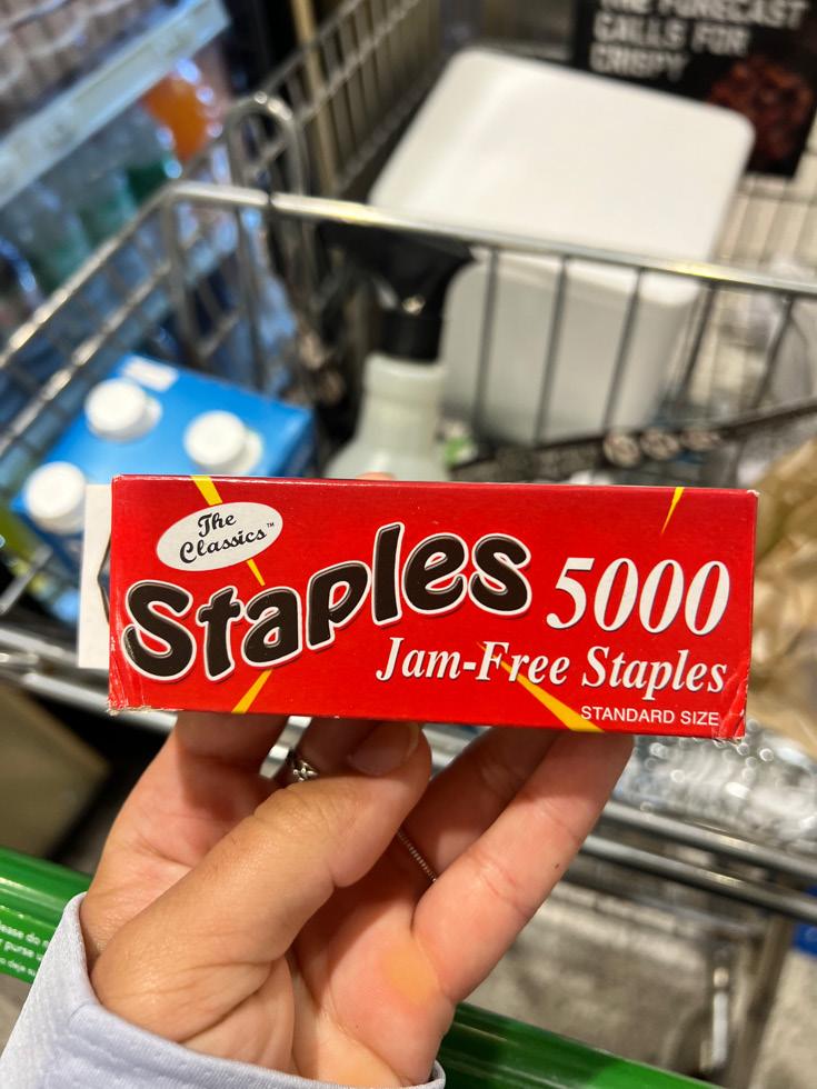
bad
This was an interesting find in Publix on a grocery run when I needed to buy more staples to refill my stapler. There’s a lot that can be changed about the whole design for this box of staples. I can start off by bringing attention to the poor choice of four different typefaces that make up the front cover of the box. Good designs usually have one to two different typefaces that vary in weight and stroke. The bubble that contains the words “The Classics” just looks like black scribbles in a white circle from a distance. I assume this was done to give it more of an old school appearance, but it was not needed. Moving onto the main focus, the word “Staples” is warped, bold, and has an outer stroke that can be uneasy to look at. Though this kind of style gives it a fun groovy feel to it, I don’t think the warped bubble feature should have been applied to the “Staples” text. If there was a clear baseline, it would be much easier to read and the only positive I would take away from it is that the bubbled word does not have serif strokes. Now the text on the right-hand side is not only in bold but also in Century Expanded or Egyptian typeface. As a whole, the “5000 Jam-Free Staples” looks fine because it gives it a sense of age to the box but does not need to add to the number of typefaces being used. I think overall the whole entire design would look better in different weights of Helvetica typeface with the correct line and word spacing. For example, in the bottom right corner with the word “Standard size” is in sans serif small caps which I think is the only display of text that fits the front cover.

8
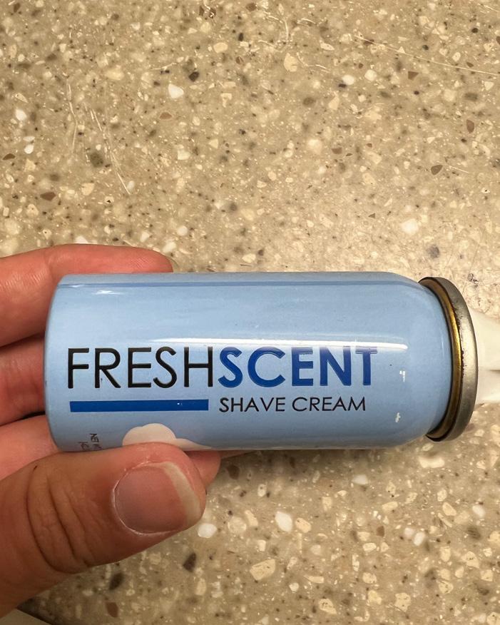
week five
good
I was going through my traveling shower bag and came across this miniature shaving cream from one of the hotels. I absolutely love the color that it is wrapped in. It was a great choice of using one typeface for both the main and subheading. Even though the two words in the main heading are different colors, there is a slight difference in thickness between the two words “Fresh” and “Scent” due to a stroke that’s applied to it. The thickness to the word “Scent” implies word spacing between itself and the word before it without having actual points of spacing. I really appreciate the consistency of continuing to use the same amount of thickness and color for the underline underneath “Fresh”. Since most people read left to right, looking at the label our eyes will follow the thick blue line towards the words “shave cream”. It may seem like “shave cream” is thinner than the word “Fresh”, but that is only because it is in a smaller text size. The use of a sans serif typeface for this was a smart choice because it gives the impression of a clean and simple look. Though if the design could also have been executed with the use of a serif typeface, it would not be displayed in small caps and there would need to be more letterspacing. The positioning and the layout of the text is complimented by the same x-height that both headings are displayed in. It was great to see the orientation of the label was vertical and read bottom to top because as a consumer you don’t want to read two words that wrap around the entire container.

9 Type in the Wild
bad
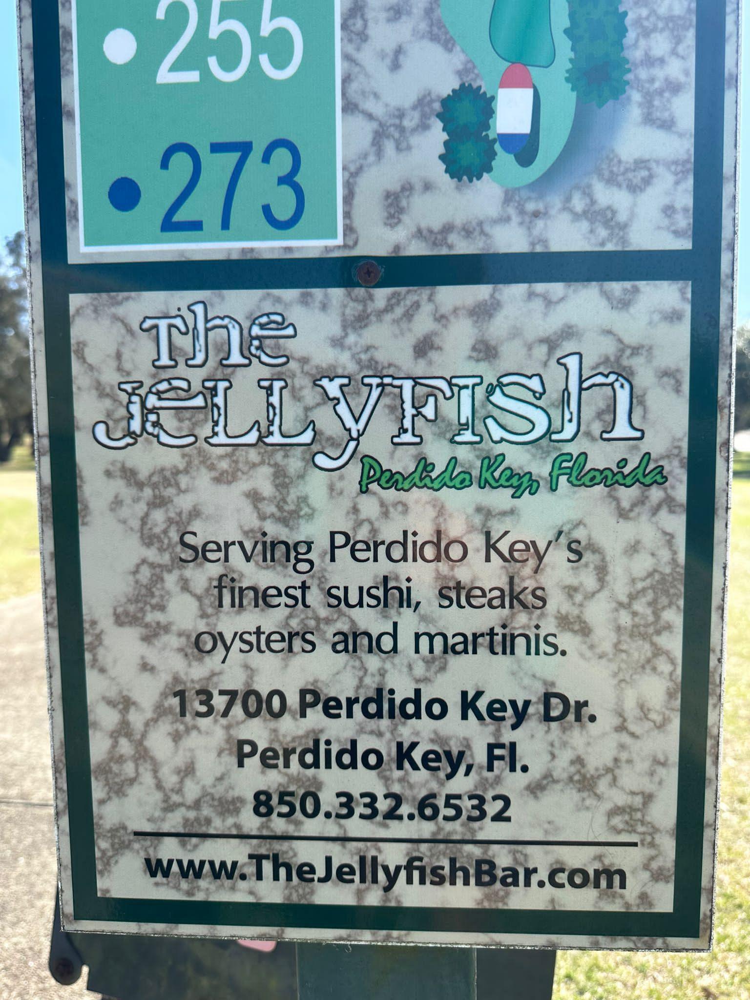
When I went out to practice at the A.C. Reade Golf Course, there was an advertisement for a restaurant on the first tee box. The background colors and the font chosen for this were two very poor choices. The texture and color of the background makes it extremely hard to read any of the text that sits on top of it. If it was a solid neutral color such as white, beige, brown, gray, or black, the background would already be stepping in the right direction. It makes zero sense to why the title of the restaurant “The Jellyfish” needed to be in a deteriorating kind of font. The chipping away pieces of the characters do not provide enough contrast between itself and the background. The company would have been more successful using a well-known typeface similar to the one they used like Modern or Caslon. It was a very creative take that does not fit overall look. Along with the location underneath, it does not need to be in a condensed handwritten font. A better alternative was to have gone with Helvetica like how the bottom half of the description is in. With how much information this advertisement is trying to give out to players that arrive to the tee box, it should not be difficult to read. A design like this should present text in bold sans serif or serif with standard amount of word and letterspacing because you want to be able to capture the message from afar.
10
week six
good
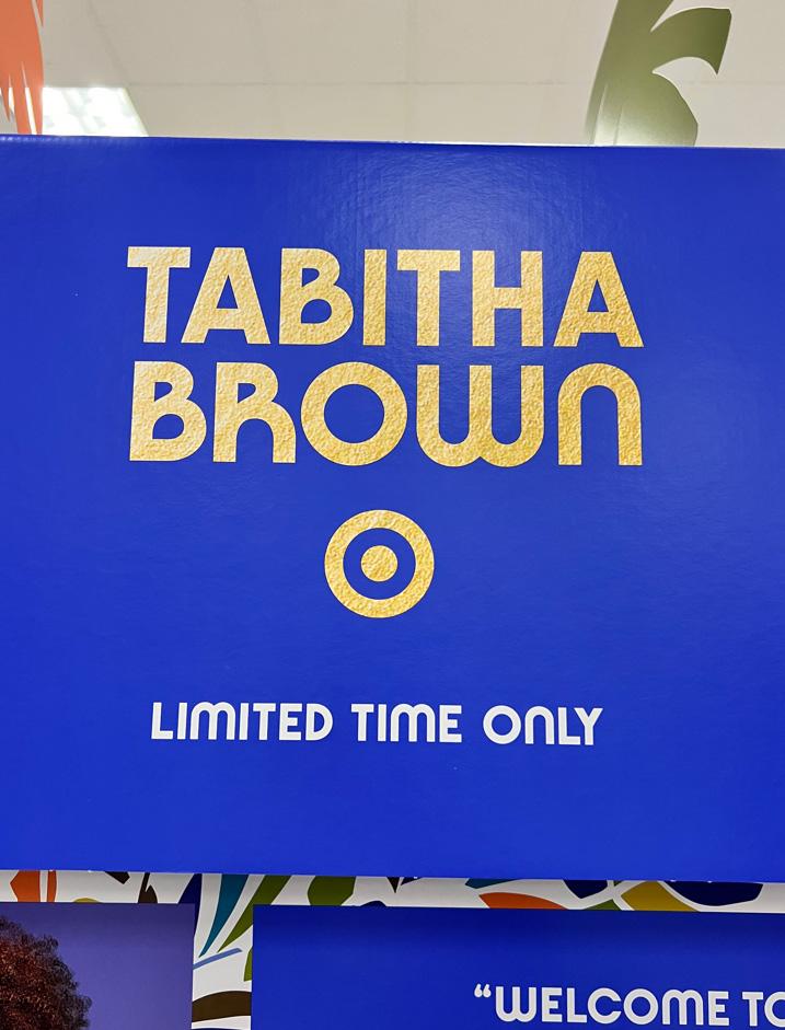
Walking through Target, this advertisement booth stood out to me because of it fun colors and patterns. I immediately zoned in on the brand name and found it very easy to read. This is a great example of using texture within the typeface. For instance, the gold shimmer is within the text “Tabitha Brown” is both subtle and noticeable which doesn’t make it harsh on the eyes. There seems to be the perfect amount of noise applied to the texture of the shimmer. It’s sans serif typeface has weight to the characters almost making it look bold. They are displayed in the same x-height as well as sharing the same baseline width making it look like it is contained in an invisible box. The “Brown” counts to five letters compared to “Tabitha” that counts seven and in order for them to match the same width the last name “Brown” has to increase in size. There really is no noticeable difference between the two which is a great feature to incorporate when trying to contain a first and last name in branding. The color choice in this example is one of the many things I appreciate because the designer decided to use a very solid indigo color as the background that had text on it which contrasted very well with the white and yellow tones. Since there was a fair amount of linespacing between the words itself, the logo, and the subheading there’s no feeling of it being too congested still executing the center focus in the middle of the billboard.
11 Type in the Wild
bad
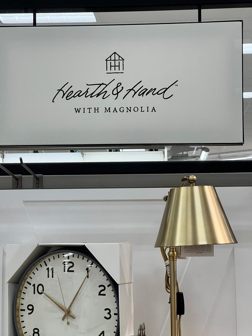
As I made my way through the aisles in Target, near the good example of the “Tabitha Brown” there was this housing décor company that I had to get really close up to so I can make up the letters in the heading. For starters, the brand name is in a handwritten font that is also italicized which made me tilt my head to read it. It was a great approach of choosing the clean simplistic route in the black and white theme because it gives a classy look. The only positive far as the typeface displayed that I took away from this was the subtext underneath the brand name was in a complimenting font. It is in small caps with the characters sharing the same x-height. The placement of the subtext gives a great base for the brand name above it. Cursive in the real world can be troublesome to read, let alone the marketing world. As a consumer, from a distance this is an extremely difficult typeface to read especially when it’s italicized too. Brands that use handwritten font in their logo want to give the impression that their product comes off personal and professional. Based off the kind of décor items and the handwritten font choice, I understood the company wanted to go for an elegant style. This can still be executed using a typeface like the “with magnolia” text but in a heavier and thicker weight. If the calligraphic or handwritten typestyle was something the company just could not go without, then they could still do it but in a more subtle and less exaggerated way.
12
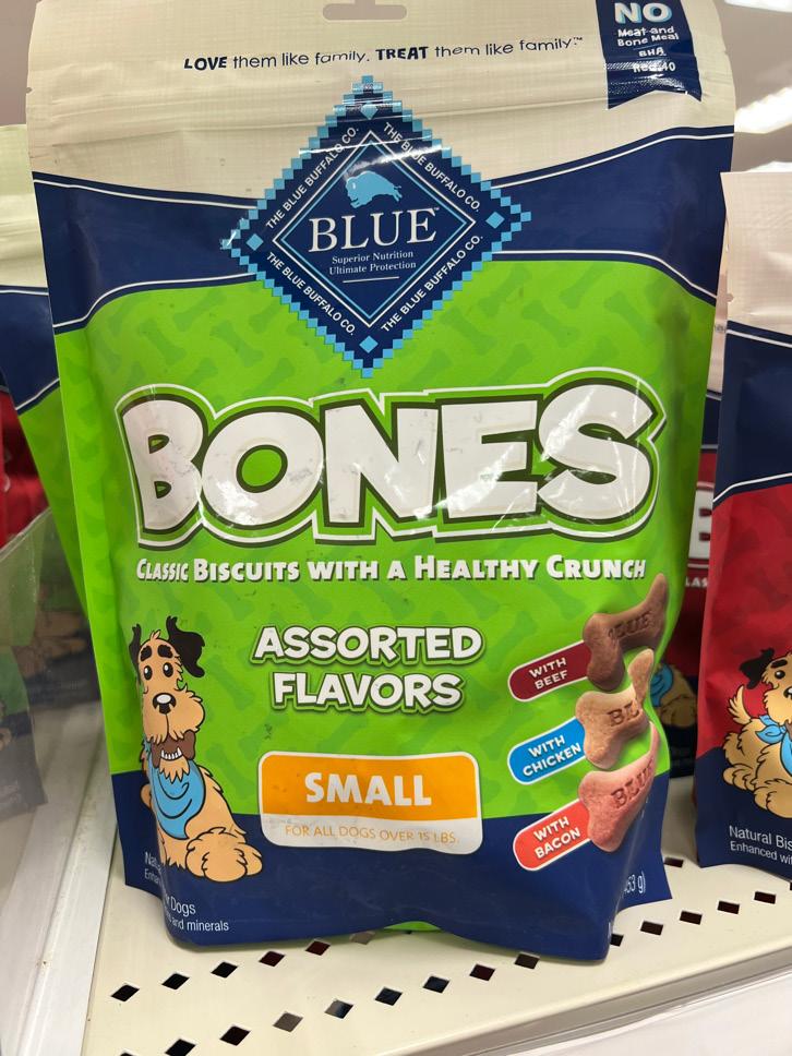
week seven
good
As I was browsing through Target, I passed a pet food aisle that had a small Blue Buffalo section with dog treats. The neon green in this packaging immediately caught my eye along with the other fun colors that complimented the entire bag of treats. The word “Bones” is centered and is predominantly bigger in text size than the rest which was supported by its weight and uppercase lettering. This is a great design tactic because it gives the consumer enough information about what kind of treat are in the bag without throwing too much at them at first sight. It helps to also create a fun look using a sans serif typestyle which is exactly what the Blue Buffalo Company did. For me, once I was engaged with the bright colors and large typeface, I was then able to digest any of the subtext underneath “Bones” and the additional information that pertained the bag of treats. I noticed that the line of subtext underneath “Bones” met the same width which was successfully accomplished by decreasing the text enough to a legible size. With both lines of text sharing the same width, this gives the impression that they are contained in a set margin area creating an imaginary box. It was a great choice to use two typefaces in the green section of the design because it provides consistency throughout the entire face of the package. I appreciate the use of a heavier typestyle because the white text color is able to stand out more on such a bright green background. Even though there is a very little amount of letterspacing within “Bones” and “Assorted Flavors” it is still successful because of the dark green stroke around each individual letter. Without stroke on the words that have minimal letterspacing would make the letters look like they were overlapping each other.

13 Type in the Wild
bad
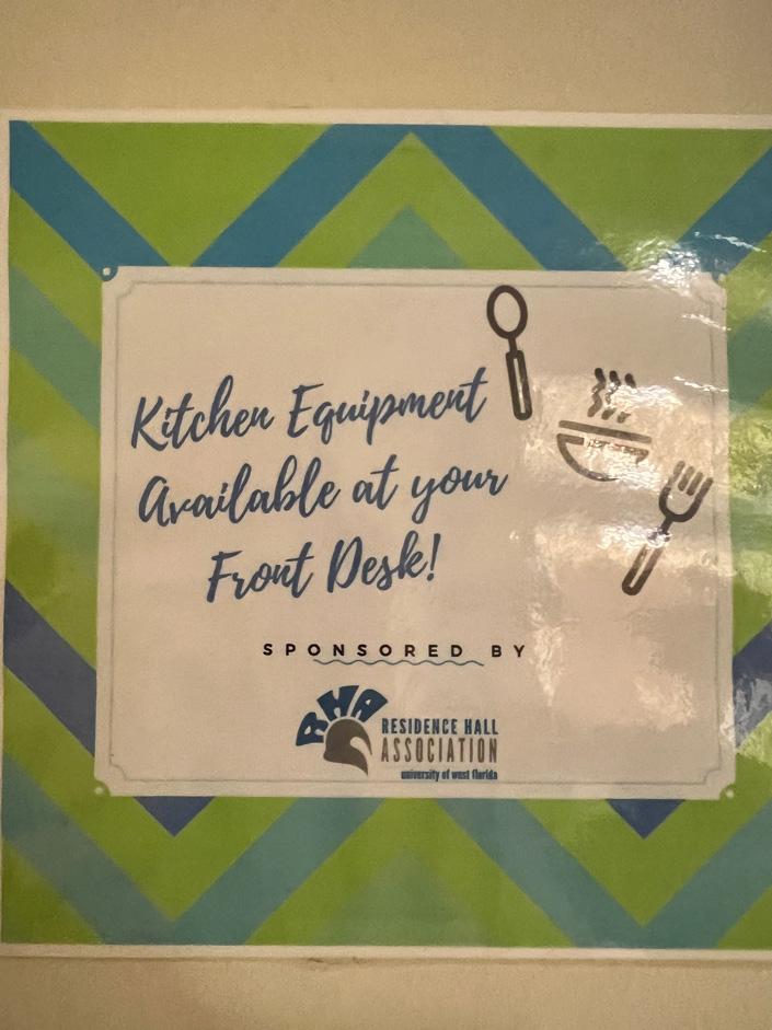
I live in the dorms on campus and in our hallway, there is a notice to residents about where to find kitchen equipment if you need to use it. Overall, it is a fairly cute design with very poor typography. The text “Kitchen Equipment Available at your Front Desk!” is displayed in a calligraphy typeface. I would have no problem with reading one to two words in a calligraphic font, but not an entire phrase. As more words are put together in a handwritten phrase it starts to look very scribbly, defeating the whole purpose of trying to catch your attention. An alternative would be to use a similar typeface to Helvetica because of how easy it would be to read while still looking professional. The words “Kitchen Equipment” could be in a heavier style to create more emphasis since it’s the main idea of the notice. A design flaw with the kitchen icons scattered to the right of the phrase. I think with the changes in typeface for the phrase along with positioning it in the top center of the white rectangular area, the kitchen icons could be scaled down and placed centered underneath the phrase it would aesthetically pleasing. A positive that I can take away from this is that I appreciated the typeface that the “Sponsored By” is in along with the spacing in between the letters. The wavy line underneath it seems completely useless to design scheme of it all, it doesn’t compliment it at all.
14
week eight
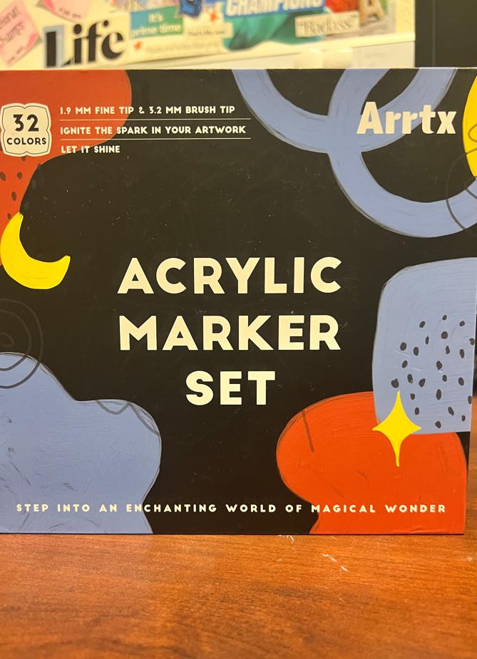
I love using my artistic skills when I’m faced with an art project. For Christmas, I was gifted this Acrylic Marker Set that had such fun colors inside of it with different brush tips. A great thing that I noticed was the white color choice of all the text on the front of the box. The color palette in general is more on the darker toned spectrum which makes it easier to read the white text because of the color contrast. There is a consistency of using the same typeface throughout the entire face of the packaging. The centered arrangement of the title “ACRYLIC MARKER SET” is displayed in small caps and is sans serif. Since the title is set at a different point size than the rest of the text it does seem to look heavier, but they all share the same weight. It is also pleasing to digest the subtle description that pertain what is in the box as they also share the same text size. The linespacing really makes the overall design more appealing and less crowded. The blue, red, and yellow design elements that surround the title gives me the imposes depth within a 2D design. For example, the type portion in the top-left and the text along the bottom seems to be on the top layer while the title seems to look further away on like a second/bottom layer. The layering creates somewhat of a foreground and background impression which makes this design successful. Overall, I really appreciate the consistency and spatial awareness that presented throughout the entire packing.

15 Type in the Wild
good
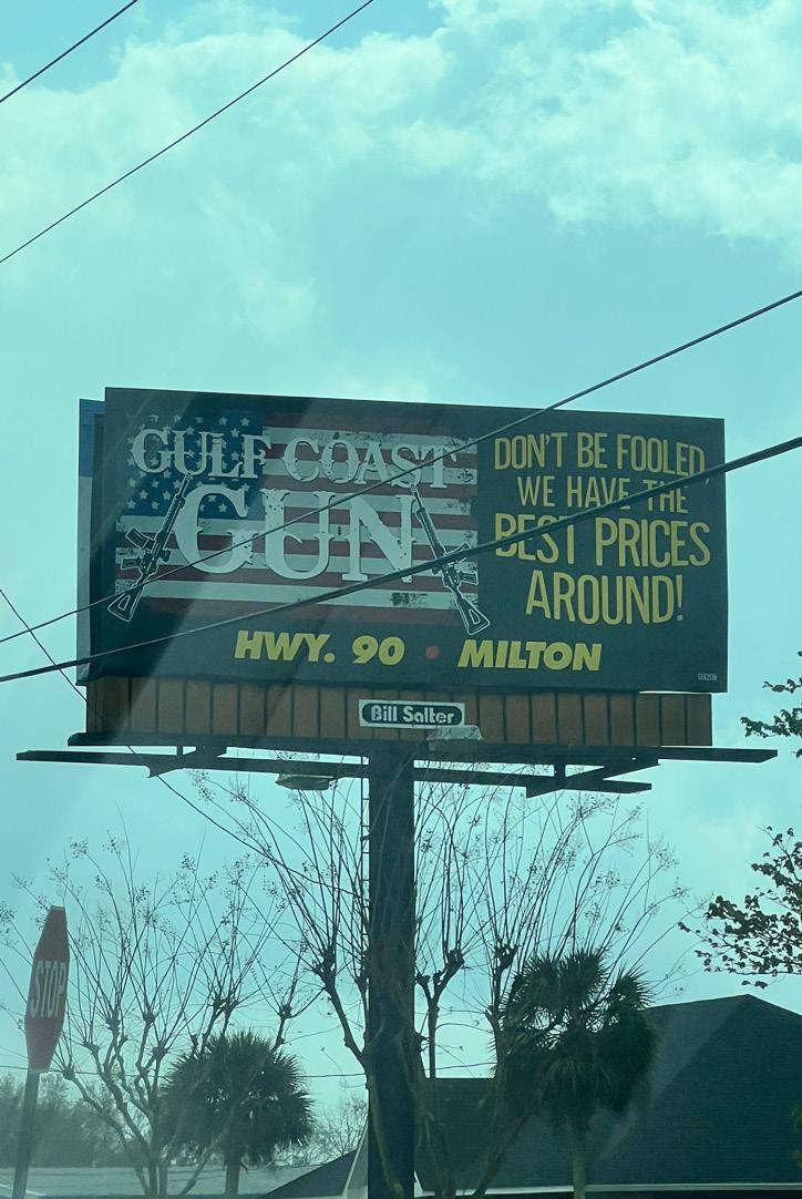
On my way back from campus, I came across this billboard promoting a gun shop near the area. One half of the sign is taken up by the brands logo and the other is taken up by a slogan. To me, I did not understand the significance of using yellow for the text color when it could have been more flattering if it was in white. There are a total of three different typefaces that make up this billboard design which is not the best design choice. For starters, the gun stores name “GULF COAST GUN” is a custom font that is displayed in all serif uppercase. Parts of the letters are textured leaving it with open areas which makes it look like the billboard itself is dirty. I understand the purpose behind wanting to include an American flag behind the title, but I would suggest lowering the opacity of the flag to create more emphasis on the white text. The lowering of opacity would also promote depth in the design making it more interesting to look at.
bad
Moving onto the slogan to the right, it seems like the baseline for the first, third, and forth line of text is warped or arched. To improve the legibility of the phrase, maintaining the original typeface would solve the stretched out look while also having no arch in the baseline. The “HWY.90 MILTON” did not need to be italicized because the boldness already provides enough emphasis on the location. On a billboard, you want to keep wording to a minimum because people have little to no time to read it. So, with that thought their slogan could have been narrowed down to “Best Prices Around!”.
16
week nine
good
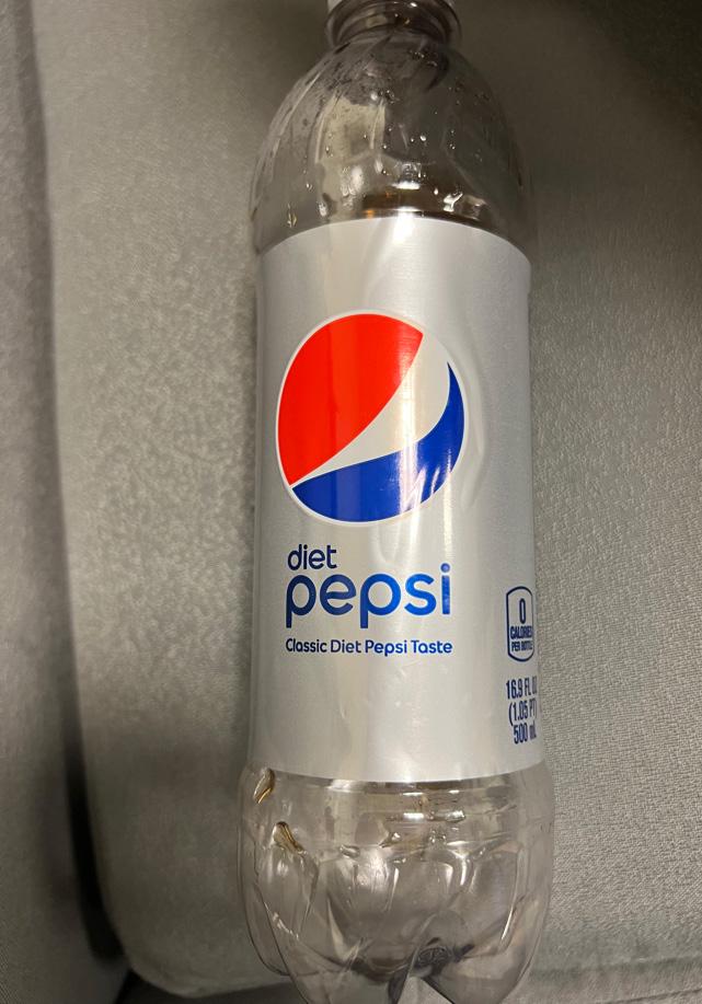
After I finished drinking my diet Pepsi, I began to appreciate the overall design of their logo and how the typeface was laid out. The approach with using lowercase as a way of presenting the drink that it is along with the brand was nice and subtle. The lowercase letters give it a smooth tone and vibe. I do not see it being successful if it was the other way around with all uppercase/smalls caps because it would come off as aggressive and insinuate some type of kick flavor with the drink itself. The font family that all the text is in compliments the logo. The logo is very round and has a fluid visual movement to it which also resonates off each individual character. There is minimal letterspacing between the characters, but it still is successful because of how the sans serif typeface is mapped out. I think three lines of text can take up quite a bit of space, which in this case I think smaller size line of text underneath the “diet Pepsi” can make do without. Since it is displayed on the label, the design of making it exceptionally different in text size from the larger text above it makes it unnoticeable to some extent. Looking more into the kind of drink it is, is all determined by the consumer themselves which displaying it in a smaller text size gives them that choice. Another great design choice was how the text was left aligned on the front part of the bottle. The logo itself is a huge focus point that the designer did not want to steer away from when aligning the text left underneath it. The word “diet” is not significant enough to be centered with “Pepsi”, that is why it is in a smaller text size.
17 Type in the Wild
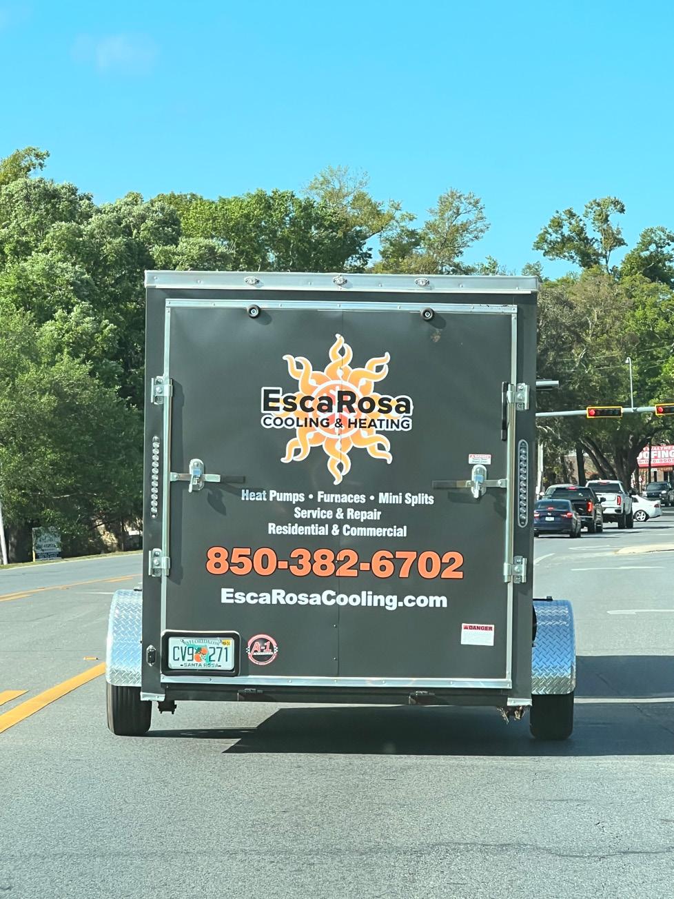
bad
As I made my way to our home golf course, I came across this small business that promoted their cooling and heating company on the wrapping of their back trailer. For starters, separating the background logo from the black text that is laying on top of it I see working on their own. I think the sans serif typeface that company title is in was not a bad choice. It was the combination of having the black text on top of a very busy graphic with not enough white space makes it difficult to reading when it is a moving advertisement. Another difficult part that tests the legibility and readability is the detail information underneath the entire company logo itself. I do not see any of that information being successful read by those driving by at all because of how condensed and small the text is. There is plenty of real estate on the back of this trailer that. I understand that the contact information specifically the phone number is important to have, but it does not need to have a black stroke applied to the orange color text when the boldness already emphasizes enough. I do not support the use of multiple typefaces in this design primarily because of how chaotic and unprofessional it makes it look. I would suggest sticking to the same typeface that the “EscaRosa” is in with differences in weight for each group of text and by doing so you create some type of consistency throughout the design.

18
week ten
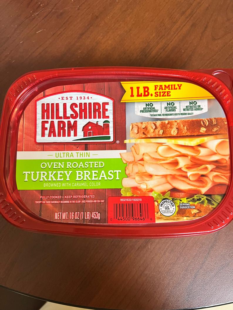
good
It has always been a must to have turkey with my cream cheese bagels in the morning and I never paid much attention to the label on the lid of the plastic container. I have always eaten this brand for years and its design is so distinctive from the rest of the others that it’s quite easy to find. I considered this to be good typography because of how the typeface blends nicely with the overall design. To me, each bit of information has it’s on composition for itself. For example, the groups of text that are on different colored backgrounds look like their own sticker giving the impression of a collage design. There are two main font families being used that are both sans serif and serif. The “HILLSHIRE FARM” seems to share the similarities to the font, “Impact” which is a condensed and has minimal letterspacing. Its text size is greater than the rest creating enough visual hierarchy. The “OVEN ROASTED TURKEY BREAST” contrasts the company’s typeface very well and with the bright green as its background color it falls just after in visual hierarchy. The sizing of the text when it comes to designing a product like this is very important to understand and is what this company did great on. The information does not look too chaotic or congested even with the minimal line spacing it seemed to have. The only suggestion that I would make pertains information that could be removed from the front and added to the back which would be the three “NO” categories. To me, its tab looks too close to the sandwich and by removing it, the “FAMILY SIZE” ribbon can be moved down more.

19 Type in the Wild
bad
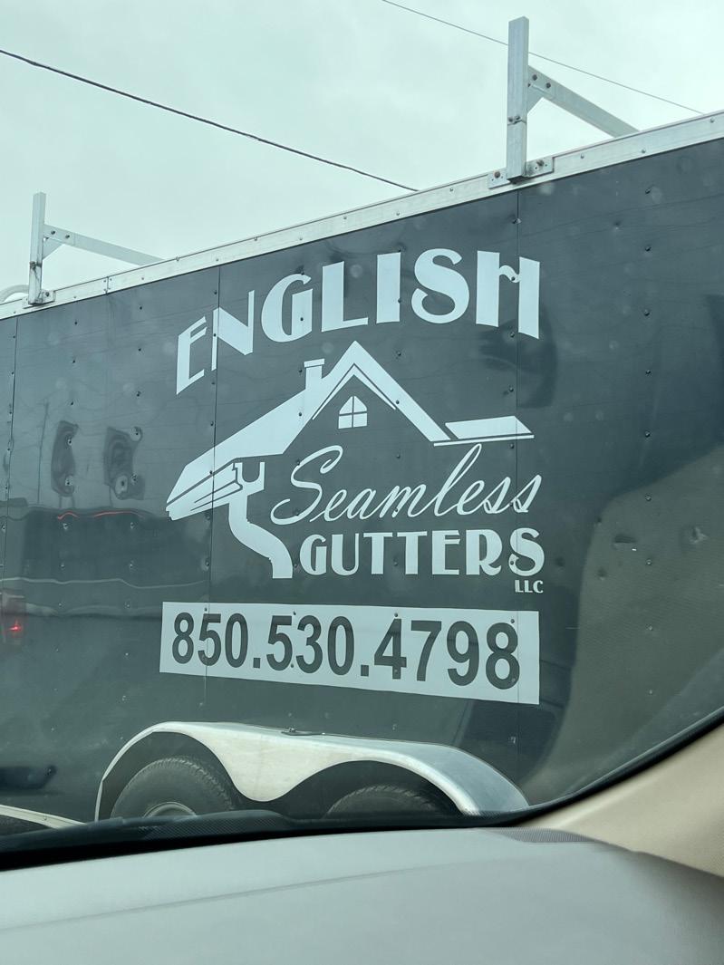
Any chance that I get to see a company’s back trailer, I make sure to snap a picture no matter if it’s good or bad. In this case, this company’s trailer falls into the bad typography category. For starters, I noticed three fonts in this design which included one similar to Broadway, version of calligraphy, and Arial. I did not see a problem with the font choice for the word “ENGLISH”, but the arched baseline made the word look warped. If space underneath the text was an issue, then the text size should have been decreased with a straight baseline. I appreciated the creative graphic of the house with the attached gutter and the successful use of only using black and white. The text within the graphic seems to too separate from the title which breaks up the flow of the company’s name “English Seamless Gutters”. The graphic could have been enlarged to provide enough space for “ENGLISH” to fit in with the rest. I am not the biggest fan when calligraphy or script is used on a moving advertisement because it displays poor legibility. The word “Seamless” comes too close to the bottom of the roof. A good design has up to two typefaces. I think the phone number and the word “Seamless” should have shared the same font to provide consistency. The phone number is in Arial typeface which is a great font choice to use when dealing with advertisements like this one, but it unfortunately sticks out from the rest.
20