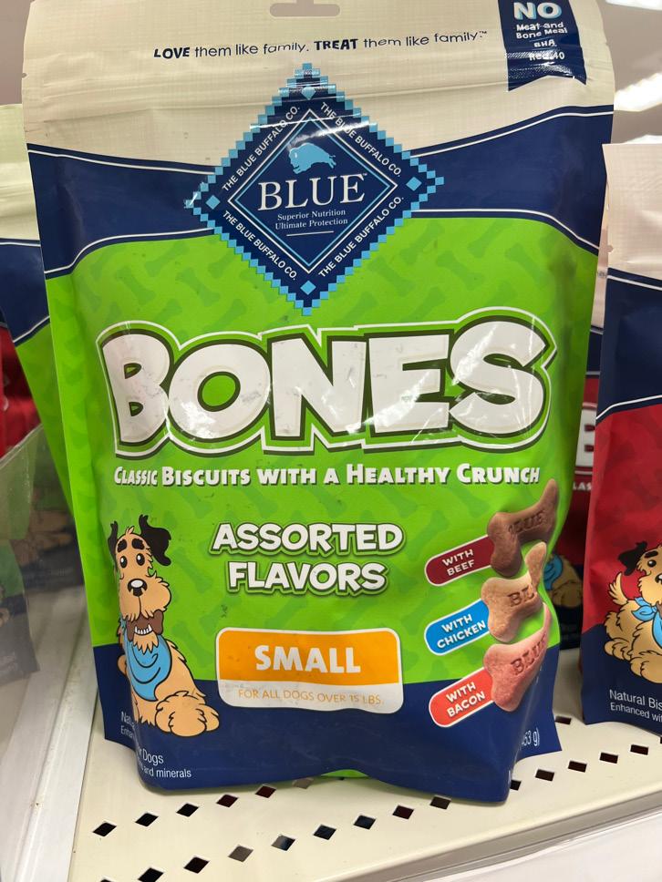
1 minute read
bad

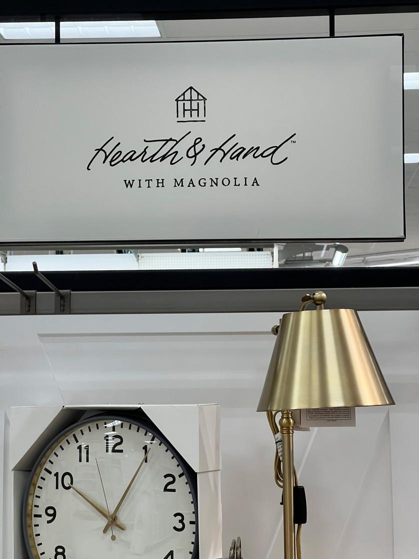
As I made my way through the aisles in Target, near the good example of the “Tabitha Brown” there was this housing décor company that I had to get really close up to so I can make up the letters in the heading. For starters, the brand name is in a handwritten font that is also italicized which made me tilt my head to read it. It was a great approach of choosing the clean simplistic route in the black and white theme because it gives a classy look. The only positive far as the typeface displayed that I took away from this was the subtext underneath the brand name was in a complimenting font. It is in small caps with the characters sharing the same x-height. The placement of the subtext gives a great base for the brand name above it. Cursive in the real world can be troublesome to read, let alone the marketing world. As a consumer, from a distance this is an extremely difficult typeface to read especially when it’s italicized too. Brands that use handwritten font in their logo want to give the impression that their product comes off personal and professional. Based off the kind of décor items and the handwritten font choice, I understood the company wanted to go for an elegant style. This can still be executed using a typeface like the “with magnolia” text but in a heavier and thicker weight. If the calligraphic or handwritten typestyle was something the company just could not go without, then they could still do it but in a more subtle and less exaggerated way.
Advertisement