1 minute read
bad

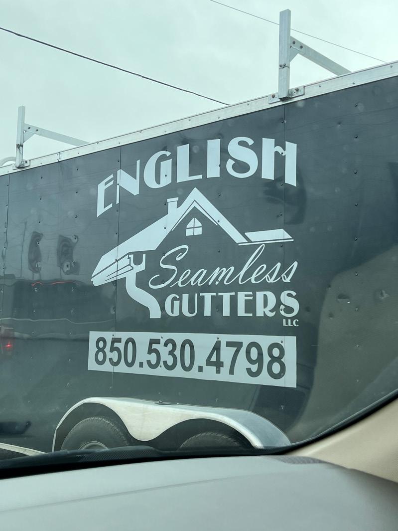
There are a lot of design mistakes made by companies when they decide to design their brand themselves without the help from an actual graphic designer. In many cases, this is a problem many businesses face because they don’t find it necessary to pay to have one or they rely heavily on the credibility of their product or company. How I found this example of bad typography was me stumbling across it on the ground. This is a Crocs shoe charm that is meant to read “English”. At first when I was picking it up off the ground, I thought it was a signature of some sort that did not have any sort of legible letters in it. It does give the sense of it being handwritten in a Condensed Italic typestyle. I am assuming this design was not meant to be scaled this far down to the size of a shoe charm, but now imagining it scaled up I still see it just as chaotic. I do see this as a fun creative design, but at first glance it was very hard for me to understand what letters were being used. What they can get away with is the placement of the characters on the baseline, there is no definite baseline. For this design to be successful, there needed to be a better choice in the spacing between the characters. The characters are too close together it almost looks like they are on top of each other. For me, the longer I look at it, all the characters blend, and it just looks like a scribble to me.
Advertisement