1 minute read
bad

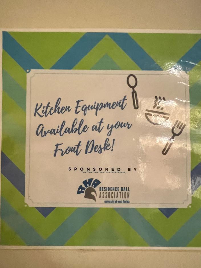
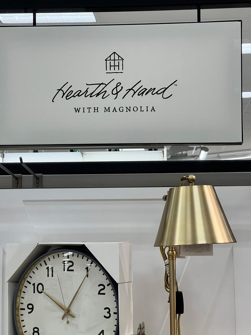
I live in the dorms on campus and in our hallway, there is a notice to residents about where to find kitchen equipment if you need to use it. Overall, it is a fairly cute design with very poor typography. The text “Kitchen Equipment Available at your Front Desk!” is displayed in a calligraphy typeface. I would have no problem with reading one to two words in a calligraphic font, but not an entire phrase. As more words are put together in a handwritten phrase it starts to look very scribbly, defeating the whole purpose of trying to catch your attention. An alternative would be to use a similar typeface to Helvetica because of how easy it would be to read while still looking professional. The words “Kitchen Equipment” could be in a heavier style to create more emphasis since it’s the main idea of the notice. A design flaw with the kitchen icons scattered to the right of the phrase. I think with the changes in typeface for the phrase along with positioning it in the top center of the white rectangular area, the kitchen icons could be scaled down and placed centered underneath the phrase it would aesthetically pleasing. A positive that I can take away from this is that I appreciated the typeface that the “Sponsored By” is in along with the spacing in between the letters. The wavy line underneath it seems completely useless to design scheme of it all, it doesn’t compliment it at all.
Advertisement