1 minute read
week nine good

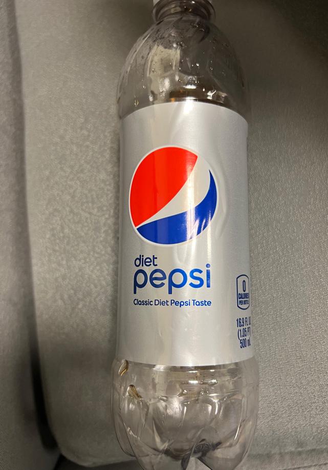
After I finished drinking my diet Pepsi, I began to appreciate the overall design of their logo and how the typeface was laid out. The approach with using lowercase as a way of presenting the drink that it is along with the brand was nice and subtle. The lowercase letters give it a smooth tone and vibe. I do not see it being successful if it was the other way around with all uppercase/smalls caps because it would come off as aggressive and insinuate some type of kick flavor with the drink itself. The font family that all the text is in compliments the logo. The logo is very round and has a fluid visual movement to it which also resonates off each individual character. There is minimal letterspacing between the characters, but it still is successful because of how the sans serif typeface is mapped out. I think three lines of text can take up quite a bit of space, which in this case I think smaller size line of text underneath the “diet Pepsi” can make do without. Since it is displayed on the label, the design of making it exceptionally different in text size from the larger text above it makes it unnoticeable to some extent. Looking more into the kind of drink it is, is all determined by the consumer themselves which displaying it in a smaller text size gives them that choice. Another great design choice was how the text was left aligned on the front part of the bottle. The logo itself is a huge focus point that the designer did not want to steer away from when aligning the text left underneath it. The word “diet” is not significant enough to be centered with “Pepsi”, that is why it is in a smaller text size.
Advertisement