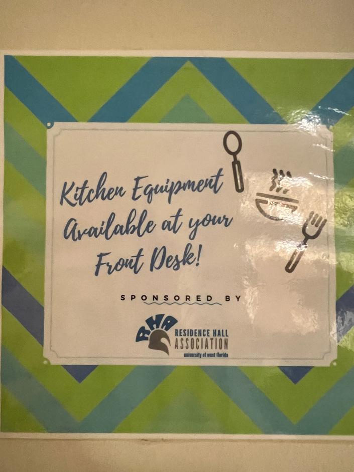
1 minute read
bad

In Pensacola, there is a bar downtown called Seville Quarter. I noticed its company logo at a UWF Women’s Basketball game and thought it was an interesting choice of font. The typeface suits the theme of the bar, matching the old New-Orleans or Louisiana night club vibe. There is somewhat of a rustic feel that I really appreciate. It does look like the font was handwritten in an old feather pen. I think that for the viewer to be able to read this with ease there needs to be an increase in kerning. There seems to not be enough letterspacing between each character in each word which makes it look too crowded. The logo contains two words: “Seville” and “Quarter”, and as it is presented on the announcer’s board table it looks like one long word. An increase in word spacing and letterspacing would make it look less congested. I don’t see the need for them to be overlapping or touching each other. I think having the “S” and the “Q” in different text size/x-height from the other letters was a smart choice, but it would be executed better if there was more word spacing. The typestyle of the letterforms is Roman which presents each letter with serif finishing strokes. The weight of the letters is bolder than regular. A subtle change that I would make to the design would be to remove the outer protrusion sticking out from the middle part of each letter. I would push towards making it look more modern by removing the exaggerated finishing serif strokes.
Advertisement