1 minute read
week four good
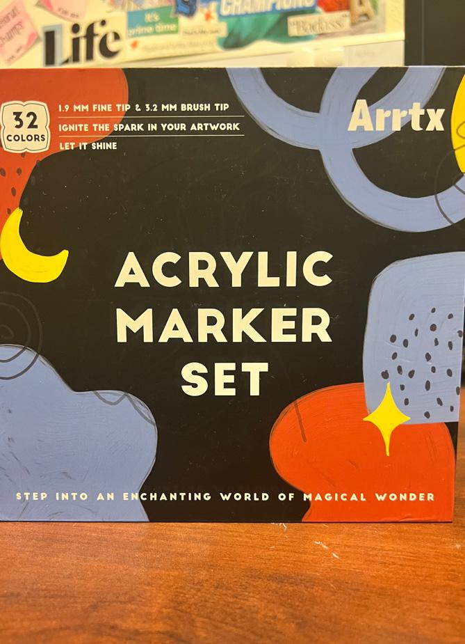
Arts and craft supplies can be great examples of good typography to come across. This bottle of glue was sitting on my desk that I noticed had a nice typeface to its front label. I appreciate that all three words share the same sans serif font-family that I would consider falling under Helvetica typeface. It was a smart decision by the designer to use a smaller text size for the word “Original” because it still imposes the importance of the classification without overpowering the large text underneath it. The text on the label in comparison to traditional display sizes I would say that the “Original” would be 24 points in relation to 72 points for the “Tacky Glue”. The use of the same x-height was key to making this design simplistic and clean which makes it easy to look at as a viewer. I find nothing wrong with the line spacing within the group of text, but I do see a need for some padding on the top and bottom. By doing this, it gives the impression that “Original Tacky Glue” is both vertically and horizontally centered. I want to add that I also appreciate the choice in different typefaces for the other mentions pertaining to the product. The color choice of this brand was another smart decision because it doesn’t fall under the generic white glue packaging. Using another neutral color like the bronze/brown makes the purple to white text stand out even more. I immediately thought it was a high quality brand just by the whole color scheme and typeface.
Advertisement

