1 minute read
week eight

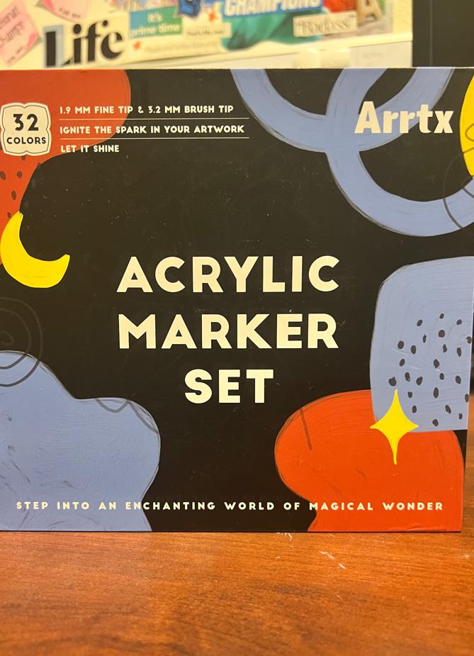
I love using my artistic skills when I’m faced with an art project. For Christmas, I was gifted this Acrylic Marker Set that had such fun colors inside of it with different brush tips. A great thing that I noticed was the white color choice of all the text on the front of the box. The color palette in general is more on the darker toned spectrum which makes it easier to read the white text because of the color contrast. There is a consistency of using the same typeface throughout the entire face of the packaging. The centered arrangement of the title “ACRYLIC MARKER SET” is displayed in small caps and is sans serif. Since the title is set at a different point size than the rest of the text it does seem to look heavier, but they all share the same weight. It is also pleasing to digest the subtle description that pertain what is in the box as they also share the same text size. The linespacing really makes the overall design more appealing and less crowded. The blue, red, and yellow design elements that surround the title gives me the imposes depth within a 2D design. For example, the type portion in the top-left and the text along the bottom seems to be on the top layer while the title seems to look further away on like a second/bottom layer. The layering creates somewhat of a foreground and background impression which makes this design successful. Overall, I really appreciate the consistency and spatial awareness that presented throughout the entire packing.
On my way back from campus, I came across this billboard promoting a gun shop near the area. One half of the sign is taken up by the brands logo and the other is taken up by a slogan. To me, I did not understand the significance of using yellow for the text color when it could have been more flattering if it was in white. There are a total of three different typefaces that make up this billboard design which is not the best design choice. For starters, the gun stores name “GULF COAST GUN” is a custom font that is displayed in all serif uppercase. Parts of the letters are textured leaving it with open areas which makes it look like the billboard itself is dirty. I understand the purpose behind wanting to include an American flag behind the title, but I would suggest lowering the opacity of the flag to create more emphasis on the white text. The lowering of opacity would also promote depth in the design making it more interesting to look at.
Advertisement