1 minute read
week ten good


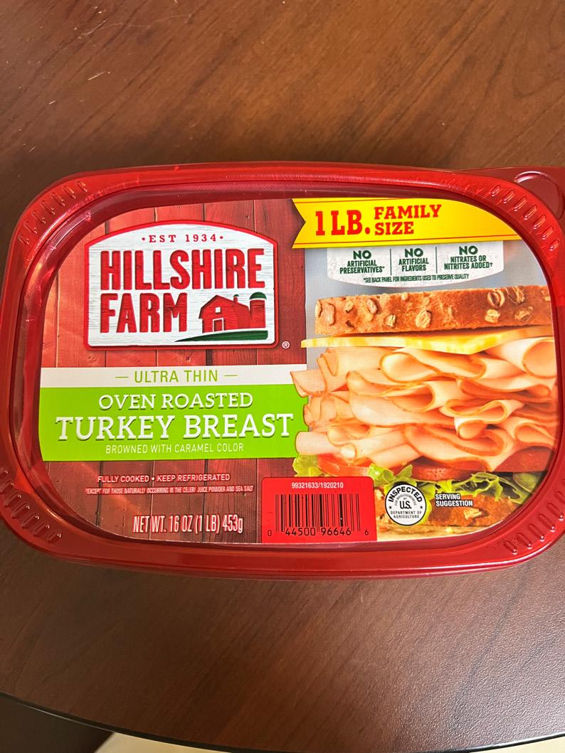
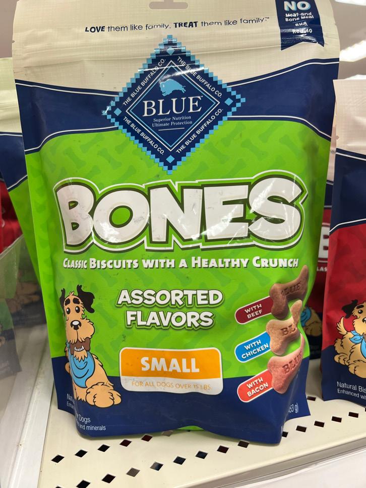
It has always been a must to have turkey with my cream cheese bagels in the morning and I never paid much attention to the label on the lid of the plastic container. I have always eaten this brand for years and its design is so distinctive from the rest of the others that it’s quite easy to find. I considered this to be good typography because of how the typeface blends nicely with the overall design. To me, each bit of information has it’s on composition for itself. For example, the groups of text that are on different colored backgrounds look like their own sticker giving the impression of a collage design. There are two main font families being used that are both sans serif and serif. The “HILLSHIRE FARM” seems to share the similarities to the font, “Impact” which is a condensed and has minimal letterspacing. Its text size is greater than the rest creating enough visual hierarchy. The “OVEN ROASTED TURKEY BREAST” contrasts the company’s typeface very well and with the bright green as its background color it falls just after in visual hierarchy. The sizing of the text when it comes to designing a product like this is very important to understand and is what this company did great on. The information does not look too chaotic or congested even with the minimal line spacing it seemed to have. The only suggestion that I would make pertains information that could be removed from the front and added to the back which would be the three “NO” categories. To me, its tab looks too close to the sandwich and by removing it, the “FAMILY SIZE” ribbon can be moved down more.
Advertisement