
Dream Collector
Design Objective:

Design a mobile app service and brand by creating a logo, a style guide, storyboards, wireframes, full-color compositions in a working prototype, mockups, and a branded booklet.
Design Brief:
Dream Collector is an app that solves the problem of losing or rebuying items people already own. Dream Collector allows users to save images and information about their collections or any other large groups of items that they collect or want to start collecting. The app helps the user keep their collections separate while giving them easy access to their items at all times. The app also allows users to buy from antique stores as well as other users on the app. The logo relates to the brand by using graphics of a button, a stamp, and a coin, all things that people commonly collect. The name Dream Collector was chosen to convey the joy users feel when they are able to save their collections on the go. The purple, yellow, and light blue used in the logo help to represent this feeling, especially when combined with the word “Dream” in the name. Dream Collector utilizes these colors to give the app a simple look that is easy to navigate. The use of blue and purple in particular throughout the app conveys a calm feeling to the user.

Scan For Dream Collector Booklet


Sew Down
Design Objective: Design a brand identity out of a commonly used household item. Produce an environmental graphic, mockups, and a GIF series that all represent the brand.
Design Brief:
Sew Down is an art therapy business that allows the local community to come in and learn different types of sewing. Sew Down’s goal is to bring people together by creating.


Sew Down uses a tomato pincushion to create a simplified logo using only two colors. The logo and the name both show people that sewing is the focus of the establishment. The primary color is green to convey a sense of calm. The logo was placed on a sign outside the business to attract potential customers. An environmental graphic was designed as well to spark creativity in the customers in the lobby where they will easily see it. A GIF set was made to promote Sew Down on social media. These GIFs consist of spools moving into the shape of a heart, and a collection of various sewn hearts switching between frames. Hearts were chosen as the main focus of the GIFs to symbolize that sewing can bring people together.


Allestin
Design Objective: Create a brand for a new weight loss drug by creating a logo, packaging, collateral, a trade show booth, and mockups.

Design Brief:
Allestin is a weight loss drug that is marketed toward obese women who want extra help losing weight. The primary brand color is pink to represent femininity, as the goal of the company is to aid females while they work out. The secondary color is green because green represents nature and the outdoors. This is also signified in the logo by having a pink background and the tittle of the “I” in Allestin being replaced with leaves. The pink background around the box was used to keep consistency with the branding but also to stand out to women. The design of the box is simplistic so that the important information is more prominent. The trade show booth was created with the Allestin logo and slogan as well as photos of women outdoors. The pictures of women at the top and bottom of the mountain with the Allestin logo in between represent how Allestin helps to bridge the gap between the beginning of the weight loss journey and the peak of it. The booth staff wear branded lanyards and give out free t-shirts to potential customers that participate in the booth exercises. These t-shirts feature the Allestin logo on the front pocket and a
graphic with the slogan on the back. These exercises are hosted by a professional fitness trainer to get people in the mindset of how much this product will help them.


The Fitting Protagonist

Design Objective:
Design a brand for a mobile retail business. This brand must include a logo, patterns, a truck design, collateral, and mockups that all represent the mobile business.

Design Brief:
The Fitting Protagonist is a mobile business that delivers cosplays of anime characters right to people’s doors. The Fitting Protagonist allows customers to rent or buy a cosplay as well as makeup and other accessories that go with the costume. The mobile business also offers trained employees to assist in getting ready and can tailor fit the outfit to the customer. The name Fitting Protagonist symbolizes the customer becoming not just a character, but the main character to their own story. In the logo, the ribbon, representing clothing, and the sword, representing anime, are in the shape of an F and a P combined to stand for Fitting Protagonist. The logo is blue, light purple, dark purple, light brown, and dark brown. The purples of the ribbon show the high quality of the products because purple symbolizes strength and royalty. The blue and browns on the sword show that the quality customers are getting is sleek and clean. The pattern on the packaging and truck uses different clothing items and accessories to show what the business offers. It also uses the brand colors
to stand out to potential customers on the road. The collateral for the business is a box that holds accessories and makeup kits, as well as a suit bag to hold cosplays. All packaging shows the brand’s logo and pattern to help customers easily identify the business.


2 Color Throwback Design
Design Objective:
Create a retro design for two-color t-shirts and a sticker series, including mockups.

Design Brief:
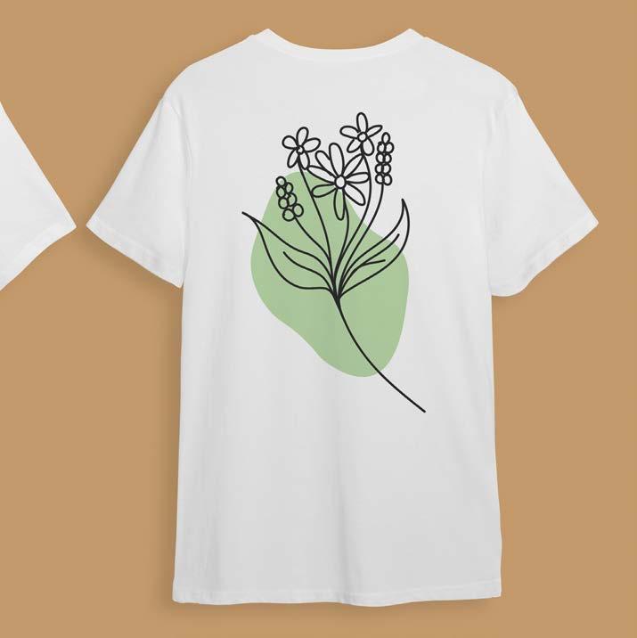
Using retro one-line designs as inspiration, 11 one-line graphics were created featuring flowers, leaves, and faces with either pink, orange, blue, or purple blobs of color in the background. These graphics are often used in retro one-line art because it invokes a free and calming feeling as well as visual appeal. Light pastel colors were placed with the design to stand out from other one-line designs that often have neutral coloring. Each graphic is paired with a single color to establish the image’s mood. The graphics were then put onto the front and back of 5 t-shirts, using thinner graphics for the front of the shirt and wider graphics for the back. Each shirt is paired with the same color on both sides to create a rainbow effect by pairing all the shirts together. Die cut stickers were also created for each image. This gives the stickers more visual movement and adds the feel of a handcrafted touch.



Sparkle Flow
Design Objective: Design a logo, a style guide, packaging mockups, postcards, a GIF, social media posts, a website prototype, and a case study for a sports drink.

Design Brief:

Sparkle Flow is a sports drink brand that focuses on fruity flavors. The logo simply features the name Sparkle Flow with a few sparkles on a blue background. The sparkles around the logo relate to the word “Sparkle” and the scripted font relates to the word “Flow” and gives the logo movement. The logo is also placed diagonally to emphasize the energy the drink will give customers. Sparkle Flow comes in four flavors: lemon, orange, watermelon, and kiwi. These were chosen to give a variety of refreshing flavors for the customers to try. Each fruit is cut in half on its respective can to make the shape of a circle below the logo. The sports drink comes in a tall can that has a simple design and color palette. The branding colors on the packaging are three different shades of blue, as well as the colors of whichever flavor a particular drink is. The background blues on the cans relate to water and flow that reflect the company name. The different color backgrounds that change for every flavor help each fruit stand out and give visual appeal to every can. All the colors help give the customer a calm and relaxed feeling
when looking at them and will motivate them to buy the product again. A social media campaign was created to promote Sparkle Flow and show off discounts that are available for students. The media campaign gives a call to action for students to take a break from studying on different holidays as well as highlighting different student accomplishments. The website was designed to show off the products and bundles that customers can buy. Customers can also sign up for an email newsletter for exclusive offers while on the website. When signing up for the newsletter, customers will receive postcards for 50% off their next purchase with a tailored thank you from the company. The website, newsletter, and postcards all feature elements with the brand colors as well as the respective colors that relate to the fruit being shown. The added fruit color helps give variety and visual appeal to help customers recognize the company.
 Scan For Sparkle Flow Case Study


Lost In Tokyo
Design Objective:


Design and create a logo, a style guide, page mockups, and an advertisement to be used in a city planning guide for Tokyo, Japan.
Design Brief:
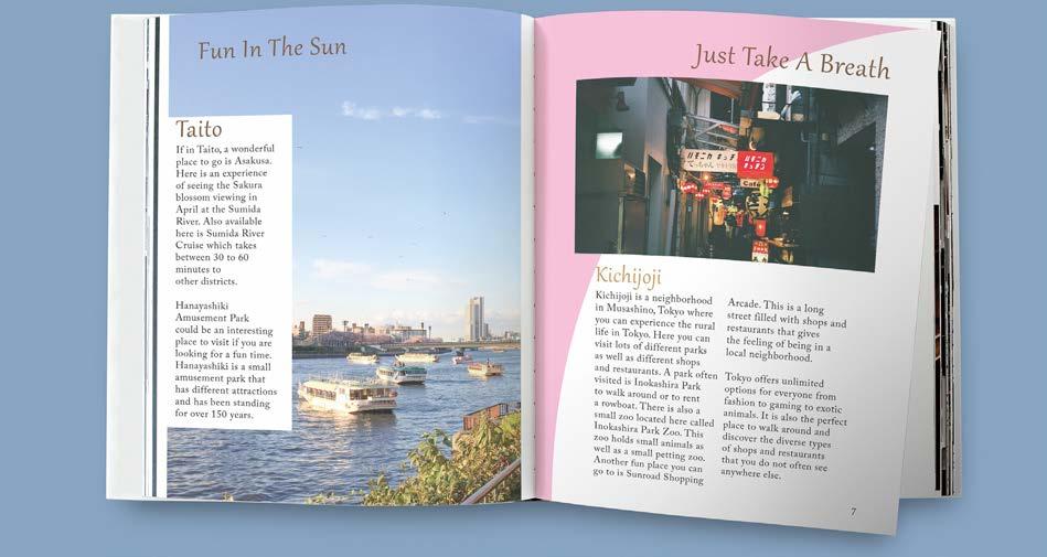
A cherry blossom stem and a traditional Japanese hand fan were chosen to make the logo, as these are a staple for Tokyo. The name Lost in Tokyo was chosen to give a sense of mystery to what the city guide is about, making the viewer more likely to engage with the book. The logo uses different shades of brown, blue, and pink to give the feeling of the Japanese culture as well as help the logo stand out against the black background. A black background was chosen to bring more attention to the logo and the subtitle of the book. When opening the book, the viewer will see bright pages that contrast with the dark cover of the guide. The pages are white with light pink and blue in different corners and edges of each page. This pink and blue reference to the logo explains the culture Japan has to offer. The bright pages also allow the reader to feel open and have fun as they read about the places in Tokyo to visit. The guide starts with a table of contents and a map of the various locations that the book discusses, as well as imagery of each location on the respective pages. The

advertisement for the city planning guide helps sell the idea of visiting Tokyo by showing the nightlife of the city from the air and from the ground. These add to the mysterious feeling when looking at the cover of the book.




Spirit Shop

Design Objective: Design wall, window, and banner environmental graphics for the Catawba Valley Community College (CVCC) Campus Store.
Design Brief:
A simple wall and window environmental graphic was designed with the CVCC branding for the campus store’s spirit shop. The color palette chosen is dark red and golden yellow, as these are the campus store’s branding colors and give the design a powerful and exciting feel. The wall graphic is of the CVCC Red Hawk mascot carrying a yellow banner with the words “Spirit Shop” in white. This simple design not only helps the customer navigate the store but also shows school spirit by having the Red Hawk fly with the banner. The waves of the banner represent the hills of Catawba Valley. The window graphic uses a simple pattern of overlapping feathers in red outlined in yellow and the words Spirit Shop between some of the feathers. The feathers relate to the Red Hawk mascot on the wall. The store banner shows a sale for 25% off using the brand colors to keep the environmental graphics consistent. The banner also uses the feathers from the window graphic and Red Hawk wings to help tie in the banner with the store’s wall and window.


Vision Students Art Show
Design Objective:

Create a composite, a banner, a postcard, and a yard sign for the Catawba Valley Community College Vision Art Show.
Design Brief:
The composite consists of a photo of an open door at the end of a hallway, an alleyway surrounded by apartment buildings, a silhouette of a man covered in flowers, a snail, a cat with a butterfly on its nose, and jellyfish swimming over a starry night sky. The main color palette consists of pink, blue, purple, and black to convey an unnatural, dream-like feeling. The composite relates to the theme of creativity by having the viewer step into a magical world filled with giant animals and a vibrantly colored nightlife that defy logic from our world. The silhouette covered in flowers represents the viewer, full of creativity and life, looking at the cat that resembles the grace and independence of the world. The cat is also looking at the butterfly which reflects transformation, hope, and faith. The snail represents life’s progress and the sacred space of the home that reflects the dream-like feeling of the world. The banner, postcard, and yard sign all include information about the art show along with the Vision logo in the pink and blue colors from the composite image. All of these elements help motivate the viewers

to come to the art show that is promoted by the information in the text. The text is white to make it stand out against the dark background and grab the viewer’s attention after noticing the enchanting scene of images.


Power Crown
Design Objective:


Design a major league team proposal for a city and create a logo, a style guide, wayfinding, an environmental graphic, a brand proposal, and product mockups for the city and major league sport.
Design Brief:
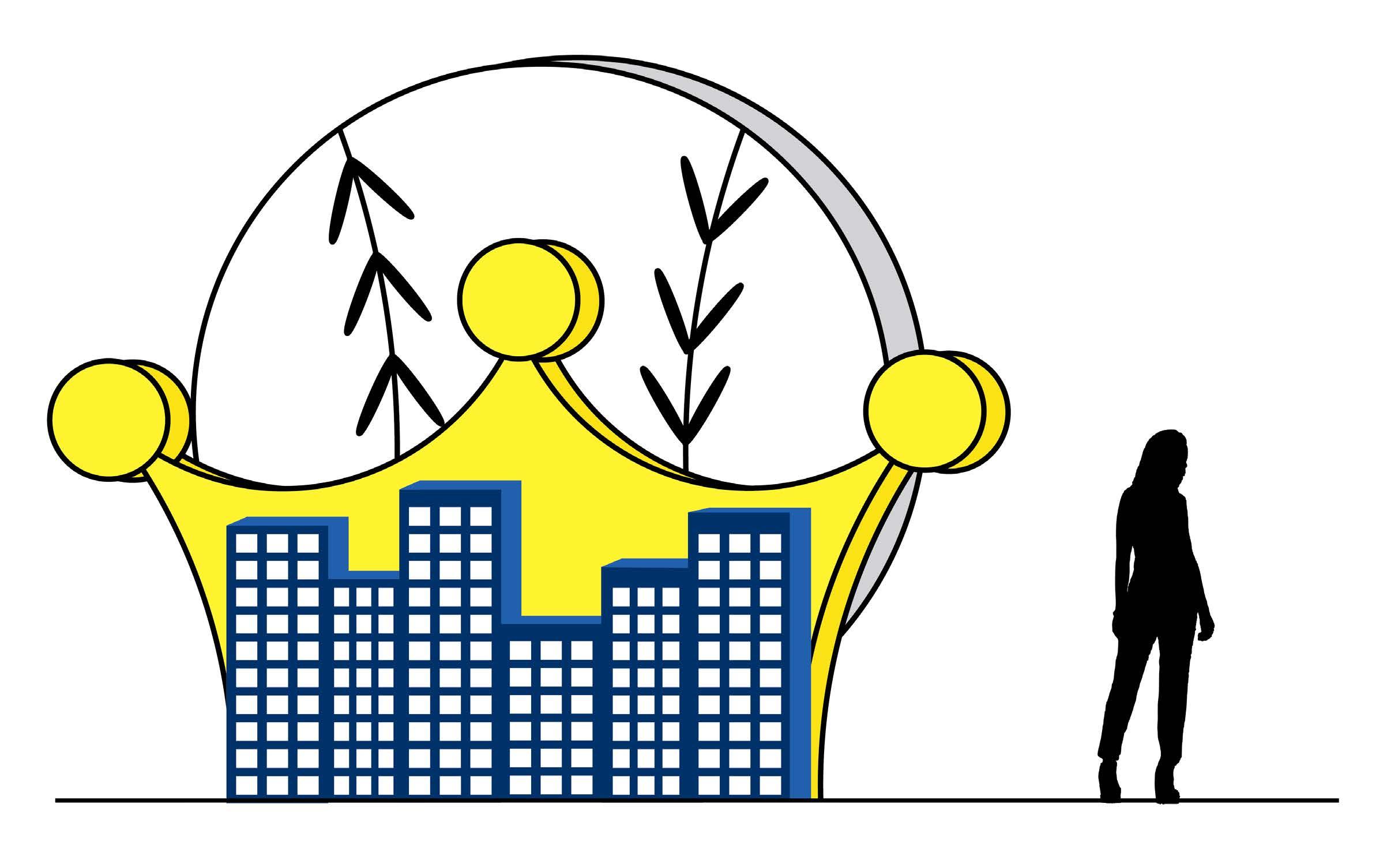
Power Crowns is a Major League Baseball team for Charlotte, North Carolina. Due to Charlotte being known as the “Queen City”, the main part of the logo is a crown. The baseball sitting on the crown helps viewers associate the team with baseball. The sharp eyes added to the crown give the team recognition of Charlotte’s history and power. This personification of the crown gives the feeling that the Power Crowns team is a powerful and elite team that will be hard to beat. The color palette is yellow, dark blue, and black. The yellow brings out the crown while the dark blue emboldens the eyes and the team’s name, and the black outline the logo graphic, giving the logo more depth. The secondary logo is the logo graphic separated from the team’s name, and the third logo is the separated logo graphic of the crown baseball in front of two crossed baseball bats. All the logos also are made for a dark purple background with the logo being outlined by a white line. Wayfinding and environmental graphics take the logo crown and use them as signs
and patterns, as well as using the logo eyes and baseball. Signs locate seating numbers, seating levels, floor levels, and parking sections. The environmental graphic incorporates the logo crown and baseball with a cityscape at the bottom. The windows of the city that represent Charlotte and the crown both light up in the dark making for an eye-catching sight for stadium guests. The logo can also be used on different products the team can sell such as baseball caps, baseballs, and baseball bats.




Mystery Puzzle Set
Design Objective:

Design a set of puzzles and packaging for a mystery puzzle box set.


Design Brief:
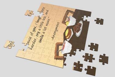
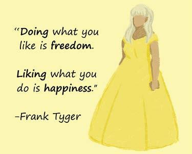
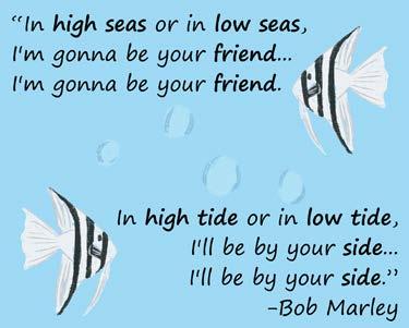
The mystery puzzle set comes with 12 different puzzles with different quotes and illustrations. Inspiration for marking a puzzle set best friends edition is the feeling of meeting an old best friend after years of being apart. The quotes that were picked relate to motivation, happiness, freedom, and friendship, with specific words bolded in each to help emphasize the meaning and purpose of the quote. Each illustration represents the quote paired with it and is made in a simple and sketchy art style. This gives the puzzle a hand-drawn feel while also adding texture against the solid color backgrounds. The illustrations and backgrounds are in rainbow order to make each puzzle stand out from the others while still giving an overall open and playful feeling. The puzzle box uses some of the illustrations from the puzzles all around the box with the bottom having more information about the puzzle set. The information also appears on the back of a small card that is included with every box. These are challenge cards the user can do while making the puzzle with the incentive to give it to someone else when completed to provide word-of-mouth marketing for the puzzle set.


