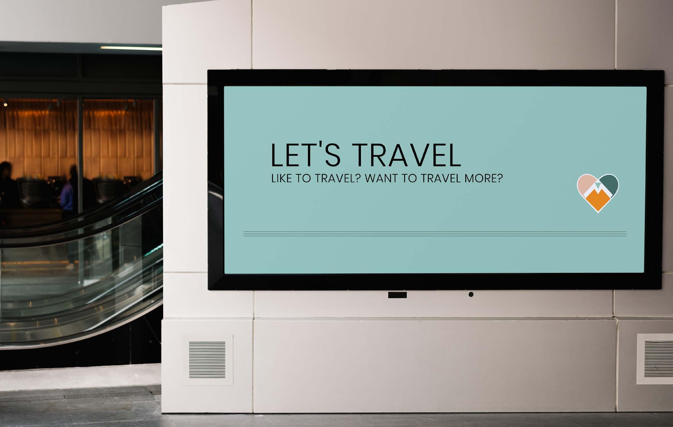
DreamScribe App Design
Design Objective:
The design objective for the App Design was to create a user-friendly application interface that then seamlessly integrates with the user’s journey in recording and exploring dreams. This involved crafting a cohesive brand identity including the creation of a distinctive logo, icons, and patterns that resonate with the app’s purpose and target audience.
Design Brief:
The design process for DreamScribe involved conceptualizing a logo and icon set that resonated with the app’s core functionality and the ability to analyze dreams. Utilizing Adobe Illustrator, I crafted a logo featuring a stylized dreamlike state symbolizing the capturing and exploration of dreams. The icon set incorporates dreamlike elements such as clouds, stars, and hearts, enhancing the app’s aesthetic. The brand’s palette of purples, greys, and light pinks evokes a dreamlike ambiance, to have users in the experience of documenting their dream narratives. The design iterations ensured the alignment with the app’s AI-driven dream analysis capabilities, resulting in a visually cohesive brand identity. Using Adobe XD, I designed and refined the UI elements ensuring brand consistency.W

DeamScribe
stars dreamlike
moonlight
utopia
clouds
Signature DreamScribe DreamScribe Courier New
Branding Yustine


Prototype
Booklet
App
App


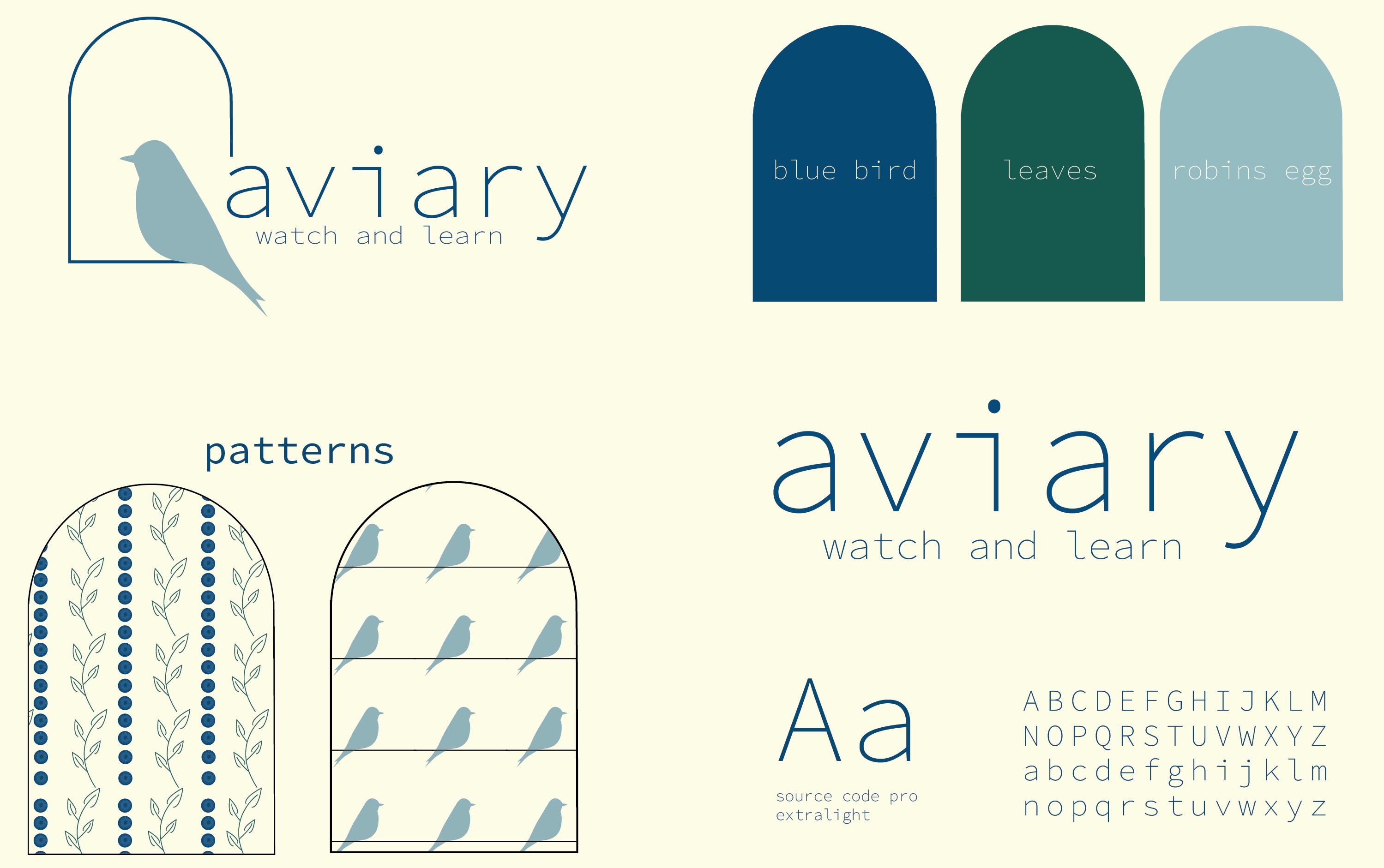
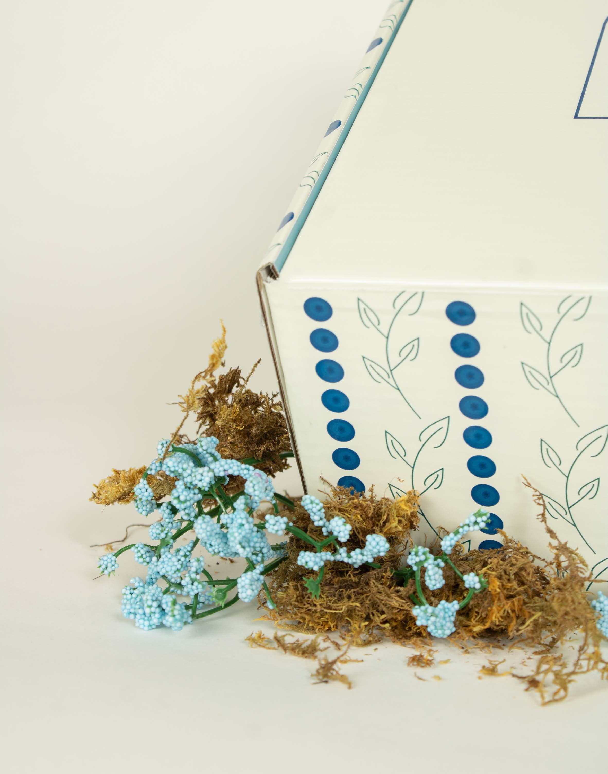
Aviary Subscription Box
Design Objective:
To create a cohesive and visually compelling brand identity for a Subscription Box. Additionally, to ensure a transition from digital to physical realms by translating the brand’s visual language into the products, meticulously capturing their essence through photography and lifelike mockups, enhancing the overall brand experience.
Design Brief:
The design process for the Aviary project commenced with research into birdwatching culture and market trends. Using Adobe software, I then began by creating the brand’s visual identity and meticulously to craft a distinctive logo that embodies the essence of avian wonder. Drawing inspiration from nature I developed branded patterns that evoke a sense of harmony and grace. Through iterative refinement I ensured the logo and patterns seamlessly integrated across all brand touchpoints including the microsite and subscription box design. The result is a unique and captivating brand that resonates with birdwatching enthusiasts, inviting them into a world of discovery and appreciation for avian life.


Digital Marketing Case Study
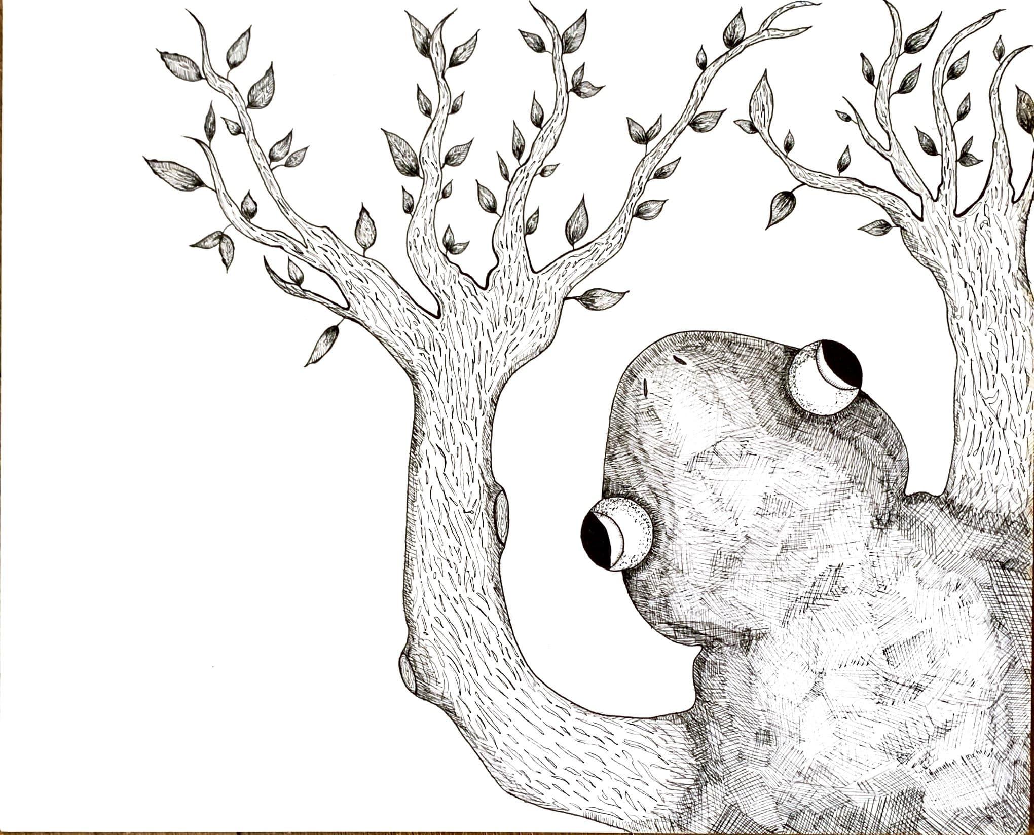
Technical Drawing
Design Objective:
The design objective for this technical drawing project was to merge seperate elements—a chosen animal with an unrelated object or animal into a cohesive and compelling composition. Through meticulous attention to detail and precision in technical drawing, the aim was to create an imaginative depiction that would captures the essence of both components.
Design Brief:
The design process for the Tree Frog technical drawing involved merging a frog with tree branches for limbs, creating a whimsical yet cohesive composition. Beginning with pen and ink sketches, I outlined the initial concept before transitioning to then using Adobe Illustrator for digital refinement. The resulting illustration formed the foundation for a children’s book with added collateral, a pack of stickers to enhance the storytelling experience. Through meticulous attention to detail and creative ingenuity, the goal was to inspire imaginative exploration and engagement among young readers.


Mystic Tea Co.
Design Objective:
To develop a cohesive and compelling brand identity for packaging, that will resonate with the target market, while also effectively being able to communicate the brand’s values and enhancing product recognition and desirability across various touchpoints.
Design Brief:
Mystic Tea Co. a visionary tea company, seeks to transcend packaging norms and capture the essence of tranquility through its brand identity. The logo, adorned with a lotus symbolizing serenity, serves as the center, embodying the brand’s commitment to holistic wellness and sustainable practices. Through three teas, Mystic Tea Co. aims to revolutionize the tea experience, offering a blend of innovation and tradition. The design incorporates trending elements, and promises to be visually striking. With a keen focus on being sustainabile, Through thoughtful imagery and strategic branding, Mystic Tea Co. aspires to become the epitome of harmonious living in the modern tea landscape.


mystic tea co.
Aaabcdefghijklm
nopqrstuvwxyz


mystic tea co. chai spice warm • spiced • complex NET WT. 11.8 oz mystic tea co.
aromatic • floral • balanced NET WT. 11.8 oz mystic tea co. matcha tea smooth • earthy • vibrant NET WT. 11.8 oz
blooming tea
Animated Gif QR

Mosaic Airline
Design Objective:
To establish a unique and compelling brand identity for the new airline, reflecting its core values, target audience, and service offerings. This was accomplished by through the creation of a distinctive logo design, with comprehensive media assets, and captivating mockups. The design objective is to create a cohesive and compelling brand identity that sets the airline apart in a competitive market.
Design Brief:
The Mosaic Air logo features a heart-shaped motif comprised of arranged tiles in various vibrant colors. Drawing inspiration from the ancient art form of mosaic, the logo embodies the concept of unity in diversity, with each tile representing a unique individual or community together to form a cohesive whole. The heart shape symbolizes love, compassion, and shared humanity, while the mosaic reinforces commitment to inclusivity and collaboration. Majority of the work was accomplished through using Adobe Illustrator.


Burlington Batz
Design Objective:
To create a cohesive and compelling brand identity for a new baseball team that resonates with the target audience, reflects the team’s values, and fosters a sense of community pride and enthusiasm. This includes the development of a distinct logo, comprehensive media assets, and engaging environmental graphics to establish a memorable and enduring brand presence in the sports industry.
Design Brief:
The primary logo for The Burlington Batz features a baseball with bat-like ears and claws gripping a baseball bat with the team name inscribed. This design symbolizes intimidation and agility. The secondary logo integrates the word “bat” into stylized typography, with bat wings emerging from the letters to evoke athleticism. The tertiary logo highlights Burlington’s location in Vermont, featuring the state outline with Burlington pinpointed and green coloring to reflect the “Green Mountain State” nickname. Environmental graphics such as signage and banners will extend the brand identity, incorporating elements of Burlington’s landscape and culture to engage fans and establish a presence in baseball.


 Burlington Batz


to View Proposal
Scan
Booklet
Beard Bud Vending
Design Objective:
To create a unique vending machine specializing in beard care products that embodies masculinity, sophistication, and convenience to establish a memorable brand identity. The project aims to develop design package including the logo, packaging, branding elements, pattern design and vending machine graphics.
Design Brief:
The silhouette logo of a bearded man instantly communicates the brand’s purpose and target audience. The simplicity and boldness make it easily recognizable and memorable, exuding masculinity, and sophistication. The color palette, featuring shades of greens and tan, conveys naturalness and authenticity while maintaining a modern aesthetic. These colors evoke the freshness of nature and the warmth of traditional barber shop settings, resonating with the brands overall target audience. The packaging design reflects the brand’s commitment to quality and innovation, utilizing sleek materials that communicate reliability and premium craftsmanship. The branded pattern has classic barber shop imagery, creating a visually captivating design that is able to reinforce the brand’s connection to grooming while adding some nostalgia.
 Scan for Vending Machine Prototype


Salvation Poster Series
Design Objective:
Create a visually captivating poster series comprised of three distinct pieces, each conveying a compelling message or theme cohesively while allowing for individuality and uniqueness.
Design Brief:
The poster series on salvation aims to evoke a sense of spiritual journey, transcendence through carefully composed visual elements. Through meticulous compositing and blending techniques in Photoshop, we seamlessly integrate elements of nature and spirituality, that creates a visual narrative that speaks to the desire to have redemption. Overall, the poster series on salvation leverages the power of visual storytelling and design principles to evoke contemplation and emotional resonance, inviting viewers on a journey of spiritual introspection and renewal.


Infographic Poster
Design Objective:
The design objective for this project was to create an engaging and visually appealing infographic poster centered around the theme of indie music.
Design Brief:
The design process for The Essence of Indie poster involved research into indie music culture followed by concept development and sketching.
Using Adobe Illustrator, I crafted custom icon set of instruments and songs from indie subgenres. To enhance the user experience, I turned these icons into stickers by utilizing vector graphics for scalability and printability. The design and feedback refined the final, ensuring visual harmony and effective communication of indie music.


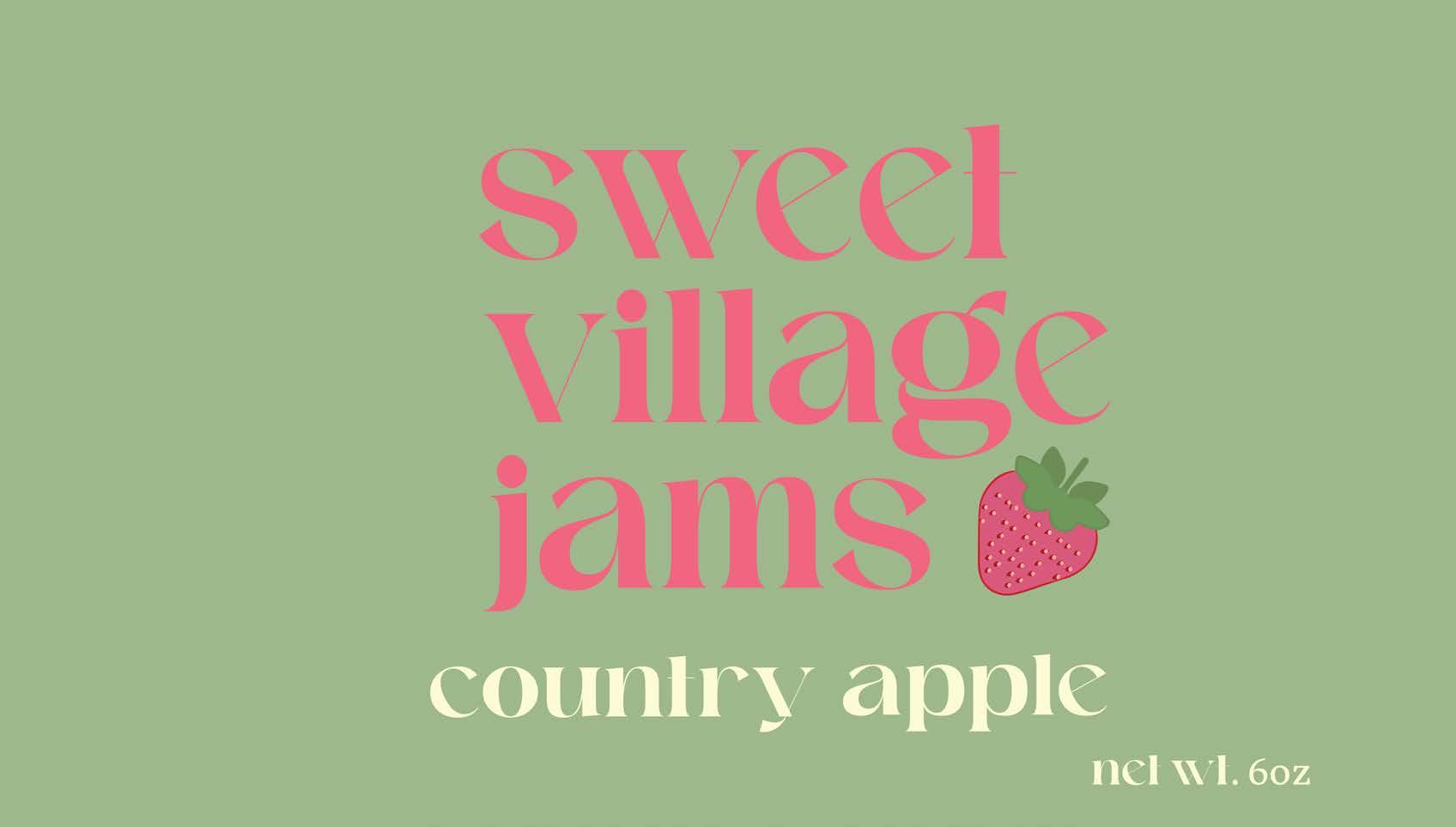
Sweet Village Jams
Design Objective:
The design objective for this packaging project is to develop a cohesive and compelling brand identity that resonates with our target market while effectively communicating the essence and values of the brand.
Design Brief:
Sweet Village Jams shows the development of a vibrant brand identity and packaging design for a local jam business while resonating with contemporary trends. The logo, characterized by its playful typography and whimsical imagery, serves as the cornerstone of the brand, evoking a sense of nostalgia with a modern twist. Through the utilization of simple colors and charming patterns. The design process involved meticulous exploration of graphic elements to ensure a cohesive visual language that exudes warmth and authenticity, reflecting the handcrafted nature of Sweet Village Jams.