Raleigh Rogues
NBA Team
Design Objective:
Create a logo, style guide, ideation, wayfinding, environmental graphics, proposal booklet, jersey mockup, and court mockup for a made up NBA team.
Design Brief:
The Raleigh Rogues are a fictional basketball team from Raleigh, NC. The logo is a Racoon that looks mischievous and aggressive. The sharp angles and multiple borders display more angry design details that are normal in sports branding. The colors are bright but nostalgic, giving the team a vintage feel that is popular right now. The wayfinding and environmental graphics are meant to display how the stadium and how the branding may translate to other parts of the team. The jersey and court mockups are the most eye-catching and arguably the most important for the team’s image. Everything that was made for this project has a cohesive design language that seamlessly translates from one project to the next.

PROPOSAL BOOKLET


Tranquil Magazine
Design
Design Objective:
Create a cover, spread, mockups, and an interactive publication for an original magazine spread.
Design Brief:
The magazine is a strict display of Adobe Photoshop and Illustrator skills. The idea of this project was to create a piece that is meant to highlight my originality as well as showcase my organizational skills when it comes to the use of Adobe Indesign. The front cover is an altered photo of a person that I then added original illustrations to. The inner spreads maintain the same look from the cover in their own way and display content in a cohesive and attractive way through use of balance and hierarchy. The color scheme features muted colors that are consistent in the photography, type, and graphics.


MAGAZINE SPREAD
Concrete
Cafe Packaging Series
Design Objective:
Create a logo, animated GIF, and a packaging series for three different flavors of coffee while maintaining a consistent design throughout each differing label.
Design Brief:
Concrete Cafe is a canned cold brew company that sells coffee in gas stations, convenience stores, and grocery stores in the United States. The logo is rustic and organic feeling giving the branding a modernized look. The different flavors come with different labels and colors to make it easy to distinguish between flavors and also attract attention to different elements of the design itself. The animated GIF is a promotional piece used for social media to create interest. This is a digital animation on top of a video that helps add to the vibe of the company as a whole.


ANIMATED GIF
Music Crafter App
Concept
Design Objective:
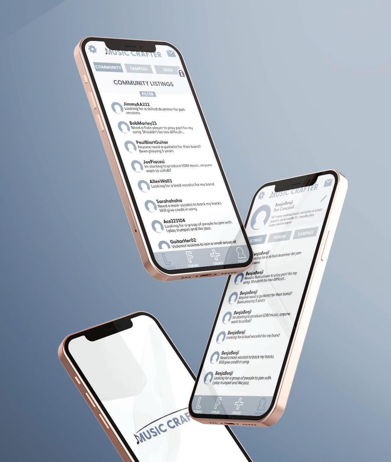
Create a logo, styleguide, personas, wireframes, screen flows, collateral mockups, and QR codes to a working, original app.
Design Brief:
Music Crafter is an app that is designed to help musicians reach out to other musicians for any needs they may have including: meetups, collaborations, repairs, lessons, and more. The app itself is designed from the ground up without the use of any outside resources. The app is meant to be simple and in line with the overall branding of the company. The logo depicts a music note that replaces the first stem of the letter “M”. The line that spans from one send of the logo to the other is called a “tie” a musical notation and it connects two notes to be played as one. Like the logo, this app aims to connect people to make collaborative projects.


Bravura Airlines
Airline Branding
Design Objective:
Create branding and mockups for a business class airline that caters to the experience of a specific audience.

Design Brief:
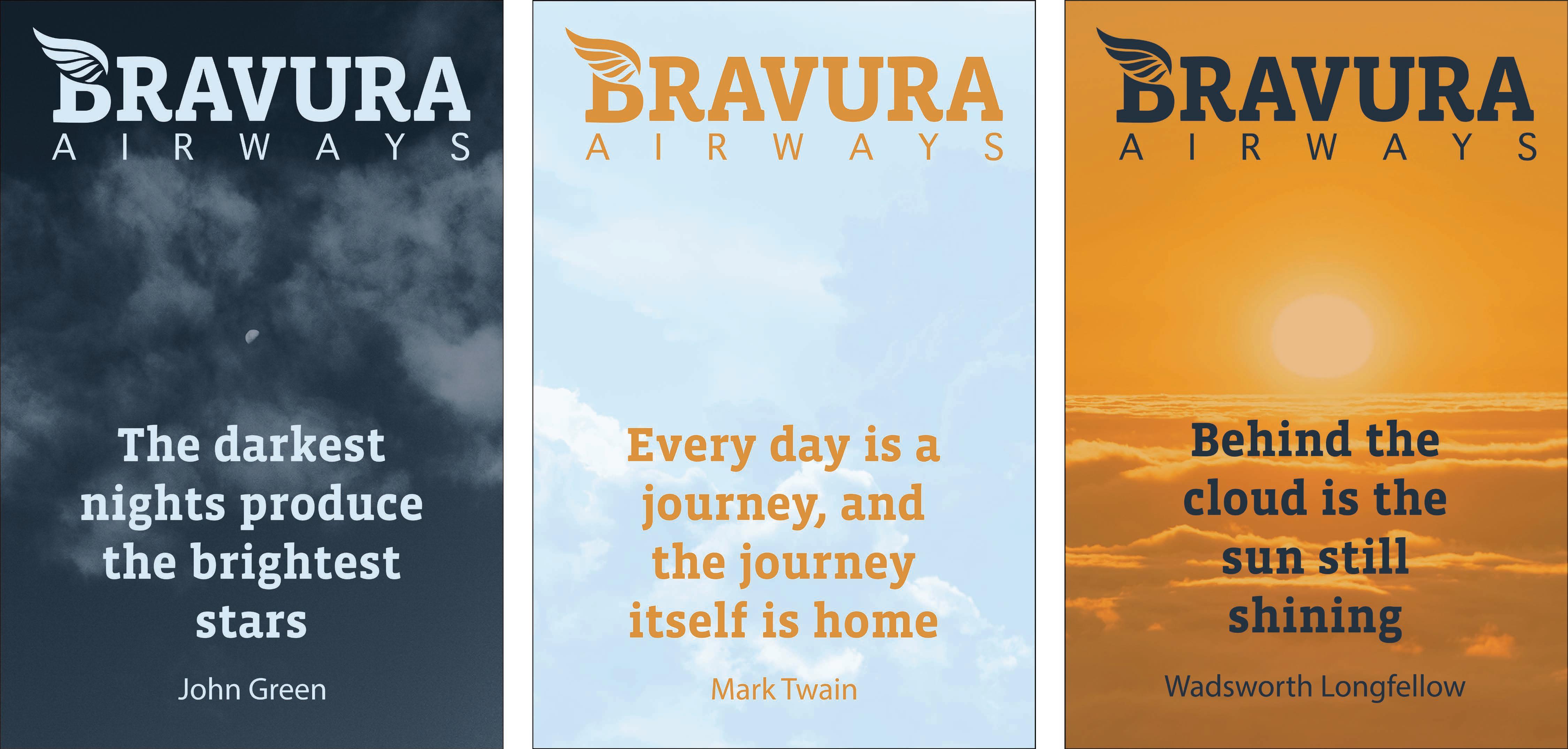
Bravura Airlines is a professional business class airline that is marketed towards individuals that travel for work and want a more streamlined flying experience. Bravura itself means “a display of great skill and experience” which is what this airline plans to prove to its customers. The logo depicts the goddess Athena, who is known to represent strategy and leadership. The wings of the helmet are also used to create the hair, creating a balance throughout the logo. The colors are meant to create a professional look that gives off a feeling of trust and uniformity. This design as well as the secondary logo are used on the plane mockups. The poster series is present to create uniformity and confidence within the airport terminal. Each poster makes the people who choose our airline feel as if they made the smart choice.


V6 Flicks
Drive-In Movie Theater
Design Objective:
Create branding, an event poster, mockups, and promo video for a drive-in movie theater.
Design Brief:
V6 Flicks is a drive-in movie theater located in Charlotte, NC. The logo’s colors are complementary blue and red colors and are bordered with black and white strokes. The underline of the word “Flicks” is stylized to look like it was flicked across the logo. The V6 also has line work that is in the same style. The branding is centered around cars and car culture. This makes sense for a drive in since people watch the movie in their car. The event poster is made in a futuristic style that is common in many sci fi movies. The colors have changed to make it more dystopian looking and the neon accents help with hierarchy. The promo video is used to promote the brand on social media.


PROMOTIONAL VIDEO
Wallace’s Scoops
Vending Machine
Design Objective:
Create a logo, style guide, ideation, and mockups for a vending machine that sells ice cream and other sweet snacks.
Design Brief:
Wallace’s Scoops is a fun, brightly colored branding campaign for a vending machine that serves all types of ice cream and sweets. The main logo is the company’s name in bold, rounded type and sitting on top of it is Wallace the Walrus. Wallace is made of spilled ice cream and has an ice cream cone hat and tusks. His body shape is meant to resemble both a melting ice cream and a walrus. The vending machine design is meant to attract attention from any angle. The side displays Wallace and the pattern along with the type on top. The main screen displays the same things and lets customers know that Wallace ice cream is organic. The branding across the machine and packaging mockups are consistent and iconic.


NC Nascar T-Shirt
SkillsUSA Shirt Design
Design Objective:
To create a T-shirt design for SkillsUSA that represents North Carolina and is uniquely designed to showcase design knowledge and technical skill.
Design Brief:
This design for SkillsUSA was inspired by vintage Nascar shirts that are popular right now. The car was modeled after an old car that was raced by Richard Petty who was born and raised in North Carolina. The car is number “65” which represents when SkillsUSA was founded. The stickers next to the number represent the SkillsUSA framework. I added the racing flags because they are iconic and make for good leading lines to and from the type and car. The type on top is simple and displayed on a ribbon. The colors I chose are meant to evoke a grunge feeling that reminds people of Nascar. The distressing was done in Photoshop to make it seem more vintage.


Raleigh Rogues
NBA Team
Design Objective:
Create a logo, style guide, ideation, wayfinding, environmental graphics, proposal booklet, jersey mockup, and court mockup for a made up NBA team.
Design Brief:

The Raleigh Rogues are a fictional basketball team from Raleigh, NC. The logo is a Racoon that looks mischievous and aggressive. The sharp angles and multiple borders display more angry design details that are normal in sports branding. The colors are bright but nostalgic, giving the team a vintage feel that is popular right now. The wayfinding and environmental graphics are meant to display how the stadium and how the branding may translate to other parts of the team. The jersey and court mockups are the most eye-catching and arguably the most important for the team’s image. Everything that was made for this project has a cohesive design anguage that seamlessly translates from one project to the next.

CMYK 17:98:93:7 PANTONE 7620C 193, 39, 44 RGB 205, 204, 203 RGB 19:15:16:0 CMYK Cool Gray 2c PANTONE 78, 77, 77 RGB 65:58:57:37 CMYK 7540C PANTONE 0, 0, 0 RGB 75:68:67:90 CMYK Black 6c PANTONE
Personified Art Supplies Subscription Box
Design Objective:
Create a logo, style guide, packaging mockups, digital marketing case study, email mockups, and a web prototype for the brand.

Design Brief:
Personified Art Supplies is a subscription box that provides high quality art supplies and tutorials for artists or future artists. The idea is to get people inspired to make new and creative art by showcasing local artists in different communities and get a look inside their creative process. The branding is fun and light with the mascot being an artistic pigeon. The art box creates attention by its use of the cute patterns and colors. The design is modern with subtle nods at street art and NYC culture.


WEB PROTOTYPE
PROPOSAL BOOKLET


Let’s Grow!
Game Menu
Design Objective:
Create branding, icons, screen flow, and a prototype for a video game main menu screen.
Design Brief:
Let’s Grow! is a moody and uniquely stylized game concept that utilizes a monochromatic color scheme and paper textures to create a somber atmosphere. This project is to highlight skills relating to the gaming industry and how the skills shown in my previous projects can relate to gaming and UX in general. The game menu graphics, UI, music, and sound effects are all original and make for a very unique end product that catches the eye and ear. The purpose of the project was to display my ability to do everything that an employer may want whether it be design work, animation, music, or coding.


Create a logo, style guide, ideation, wayfinding, environmental ay how the stadium
team. The jersey and court mockups are the most eye-catching ates from one project to

PROTOTYPE


