SKYY STUDIO Leyton
Starlinker App Design
Design Objective:
Develop a distinctive mobile application using Adobe XD. The application should feature a custom logo, cohesive iconography, and incorporate an in-app purchase functionality. The prototype should be fully functional, ready to be showcased to potential investors.
Creative Brief:
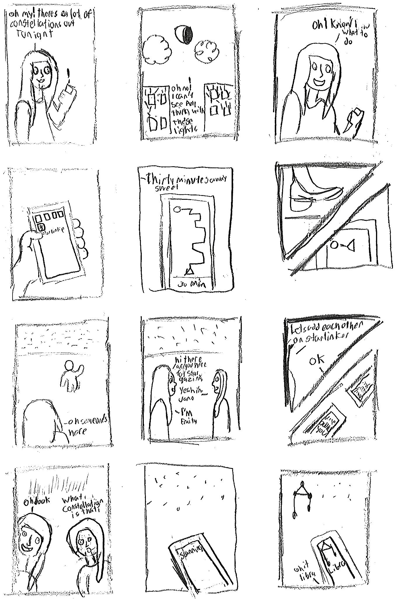
The app, StarLinker, was created with the purpose of aiding users in locating stars and identifying specific constellations and other celestial objects. Additionally, it assists in enhancing visibility of stars. The app’s logo features a constellation depicting two individuals holding hands. Its icons encompass fundamental app functions such as settings, messaging, profiles, star scanning, navigation, blocking, and flagging. A notable in-app purchase is the social feature, facilitating users to connect and converse with others interested in stargazing and learning. Leveraging camera and navigation functionalities, the app is designed to assist users in locating visible stars. The color scheme predominantly consists of a soft lavender hue complemented by starry yellow accents.

Alisha
AaBbCcDdEeFfGgHhIiJjKk LlMmNnOoPpQqRrSsTtUu VvWwXxYyZz
StarLinker
Calibri
AaBbCcDdEeFfGgHhIiJjKkLl
MmNnOoPpQqRrSsTtUuVv WwXxYyZz
Raleway
AaBbCcDdEeFfGgHhIiJjKkLl MmNnOoPpQqRrSsTtUuVv WwXxYyZz

Alex, 35
Alex is an enthusiastic stargazer and amateur astrophotographer who often finds it challenging to locate the perfect spots for stargazing due to light pollution in urban areas. They are passionate about identifying stars, planets, and constellations, but the complexity of the night sky can be overwhelming. Additionally, they have a strong desire to connect with fellow stargazing enthusiasts in their area and learn from experienced sky observers. Alex is in search of an app that can help them discover optimal stargazing locations, offer real-time assistance in identifying celestial objects, and provide a platform for building connections within the stargazing community.

Emily, 28
Emily is captivated by the beauty of the night sky and is an active science communicator. She frequently finds herself searching for optimal locations to observe celestial phenomena while struggling with identifying specific stars and constellations. Additionally, she’s keen on fostering a sense of community among fellow astronomy enthusiasts. Emily desires an app that can help her discover the best stargazing spots away from urban light pollution, provide accurate real-time information about stars and constellations, and facilitate connections with other individuals who share her passion for stargazing.

Samir, 42
Samir is an avid stargazer and science enthusiast who loves spending his evenings under the open sky, observing the stars and constellations. However, he often faces challenges when trying to identify specific stars and constellations, and he’s also interested in meeting like-minded individuals to share his passion for stargazing. He’s in search of an app that can not only help him find optimal stargazing locations away from light pollution but also provide real-time guidance on identifying stars and constellations. Additionally, he wishes to connect with fellow stargazers in his local area, allowing him to exchange tips, stories, and maybe even organize stargazing events together.


SKYY STUDIO Leyton
Mysterioso Subscription Box
Design Objective:
Create an exclusive subscription box featuring a custom logo and mockups, complete with a physical box filled with products. Additionally, craft a comprehensive digital marketing strategy for the subscription box, outlining planned social media posts, email campaigns, and website content compositions.
Creative Brief:
The Mysterioso Subscription Box offers a thrilling surprise with three carefully curated items. Each box includes a game, a movie, and a book for the user’s enjoyment. The logo depicts a chessboard showcasing these three types of items with the Mysterioso name elegantly incorporated on the sides of the chess board. Both the mockup and actual boxes are sleek black, accentuated by the logo on the lid. Inside, a captivating pattern of question marks and exclamation points adds to the mystery. In the digital marketing study, this enigmatic motif extends to email designs, while the website reflects the logo’s striking red, yellow, and gray hues.

A box of mysterious fun
Bebas Neue
A box of mysterious fun
Aa Bb Cc Dd Ee Ff Gg Hh Ii Jj Kk Ll Mm
Nn Oo Pp Qq Rr Ss Tt Uu Vv Ww Xx Yy


 Digital Marketing Case Study!
SKYY STUDIO Leyton
GD USA Magazine
Design Objective:
Design a five page magazine spread for GD USA Magazine using Adobe InDesign. The theme of the magazine prompt centers around technology, requiring comprehensive research to inform the spread’s content. Incorporate photo manipulation techniques and interactive elements to enhance the engagement of the magazine spread.
Creative Brief:
The magazine spread is centered around the concept of the Uncanny Valley. The cover features a photo-manipulated image incorporating the GD USA logo, as requested by the company. The design of the spread employs two columns to efficiently utilize space while maintaining readability. Paragraphs are strategically arranged around images showcasing humanoid robots with human-like features, creating a sense of eeriness in line with the theme. Additionally, an interactive element is included in the form of a hyperlink within the magazine, providing readers with further insight into the Uncanny Valley phenomenon.


 View Digital Article
SKYY STUDIO Leyton
Heart & Mind Packaging
Design Objective:
Design three packaging labels for a brand either featuring similar packaging with different flavors, the same flavor in different packaging, or three distinct packaging designs for the same brand. Utilize Adobe Dimensions to create 3D models and apply the labels to produce mockups showcasing the complete packaging.
Creative Brief:
The label design focuses on promoting healthy cleansing juices. The logo is intentionally kept simple to ensure that the main design elements of the label stand out effectively. Three juice labels were created, each based on the three most popular flavor profiles: Kale, Citrus, and Root. The first design features the Kale Green drink, highlighting the presence of kale and listing other ingredients within the juice. The second design, Deep Root, showcases a beverage derived from root vegetables, prominently featuring beet as the primary ingredient. Lastly, the Citrus Tango design emphasizes oranges as its main ingredient. The background colors of the labels correspond to the predominant ingredient in each juice, with enhances visual appeal. Additionally, each label includes accurate nutrition facts researched and integrated into the design, reflecting the contents of the respective drinks.


Dreamboat
AaBbCcDdEeFfGgHh IiJjKkLlMmNnOoPp
QqRrSsTtUuVv WwXxYyZz
AaBbCcDdEeFfGgHhIiJjKkLl MmNnOoPpQqRrSsTtUuVv WwXxYyZz


SKYY STUDIO Leyton
Eclipse Airline
Design Objective:
Design an airline logo and utilize Photoshop to create a mockup of the logo on an airplane. Additionally, develop two collateral items to complement the airline.
Creative Brief:
The Eclipse logo features a plane trail forming a crescent moon shape, with the moonyellow design composing the “C” in Eclipse, clipping into the “L” and “I” as well. The remaining portion of the logo is in a light blue hue. The plane showcases this logo on its side, with the plane’s line wrapping around the entire aircraft. For collateral, the chosen items are an airline pillow and a luggage tag.

Primary Logo

Minion Variable Concept
AaBbCcDdEeFfGgHhIiJjKkLl
MmNnOoPpQqRrSsTtUuVv
WwXxYyZz
Secondary Logo


SKYY STUDIO Leyton
Anchorage Caribous Branding and Wayfinding
Design Objective:
Create a sports team inspired by one of the major leagues in a metropolitan area currently lacking representation in the sports scene. Develop five wayfinding elements and one environmental graphic for your team, complete with detailed blueprints.
Creative Brief:
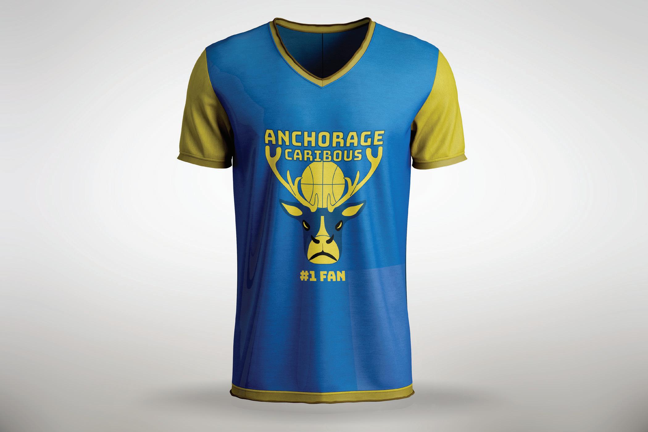
The Anchorage Caribous, a basketball team hailing from Anchorage, Alaska, sport a logo featuring a caribou with a basketball nestled within its antlers. The primary colors of the logo are deep navy and strong yellow. Wayfinding elements and the environmental graphic echo these colors, incorporating the caribou’s antlers into each design. The wayfinding items include seat plates, signage direct visitors to the gift shop, designated parking sectors, seating area indicators, and entrance signs. As for the environmental graphic, it showcases a mural of the team logo accompanied by the rallying cry “Take Charge.”

Primary Logo
ANCHORAGE CARIBOUS ANCHORAGE CARIBOUS
Secondary Logo Wordmark
ANCHORAGE CARIBOUS ANCHORAGE CARIBOUS
Tertiary Logo


 Branding Booklet
SKYY STUDIO Leyton
Bella Vita Bites Vending Machine
Design Objective:
Create a vending machine concept and select products for the vending based on a given prompt. Develop a logo for the vending machine and design packaging for the products. Utilize Adobe Dimensions to generate 3D mockups of the packaged products. Subsequently, employ Photoshop to insert the vending machine design into a mockup vending machine for presentation
Creative Brief:
The project was inspired by quick service healthy Italian food. The project is named “Bella Vita Bites,” with “Bella Vita” translating to “Beautiful Life” in Italian. The main logo features an Italian chef’s hat adorned with the colors of the Italian flag. For the packaging of the products in the vending machine, a healthy penne dish was chosen and designed to be conveniently microwavable. The packaging includes instructions and a nutrition facts label. The vending machine itself is colored in a vibrant red sauce hue with images of various pasta types adorning the sides to showcase the range of available items. The design incorporates a glass window to display the products inside the vending machine along with a microwave attachment to emphasize the convenience of heating up the food before consumption.


AaBbCcDdEeFfGgHhIi
JjKkLlMmNnOoPpQq
RrSsTtUuVvWwXxYyZz
 Pacifico Regular
SKYY STUDIO Leyton
Dawn’s Drive-in Theatre
Design Objective:
Create branding for a drive-in theater and develop poster where typography takes center stage, prioritizing the text over elaborate visuals.
Creative Brief:
The Dawn’s Drive-In Theatre poster features a scenic beach backdrop with the sun setting on the horizon and waves gently lapping at the shore with a beach ball. Typography plays a central role with the header in Marvin Round font highlighted in sunset orange and sun yellow strokes, while the body text is in Bree font. The Dawn’s logo, crafted from Kewl Script, has been customized in sunset orange with black text accents.


Kewl Script
AaBbCcDdEeFfGgHhIiJj
KkLlMmNnOoPpQqRrSs
TtUuVvWwXxYyZz
Bree
AaBbCcDdEeFfGgHhIiJj
KkLlMmNnOoPpQqRrSs
TtUuVvWwXxYyZz

 View Promo Video
SKYY STUDIO Leyton
Icons and Infographic
Design Objective:
Utilize Adobe Illustrator to craft icons and an infographic centered around a single prompt sentence. Develop five primary icons and five secondary icons, supported by thorough research on the topic. Subsequently, design a poster incorporating the icons and research findings.
Creative Brief:
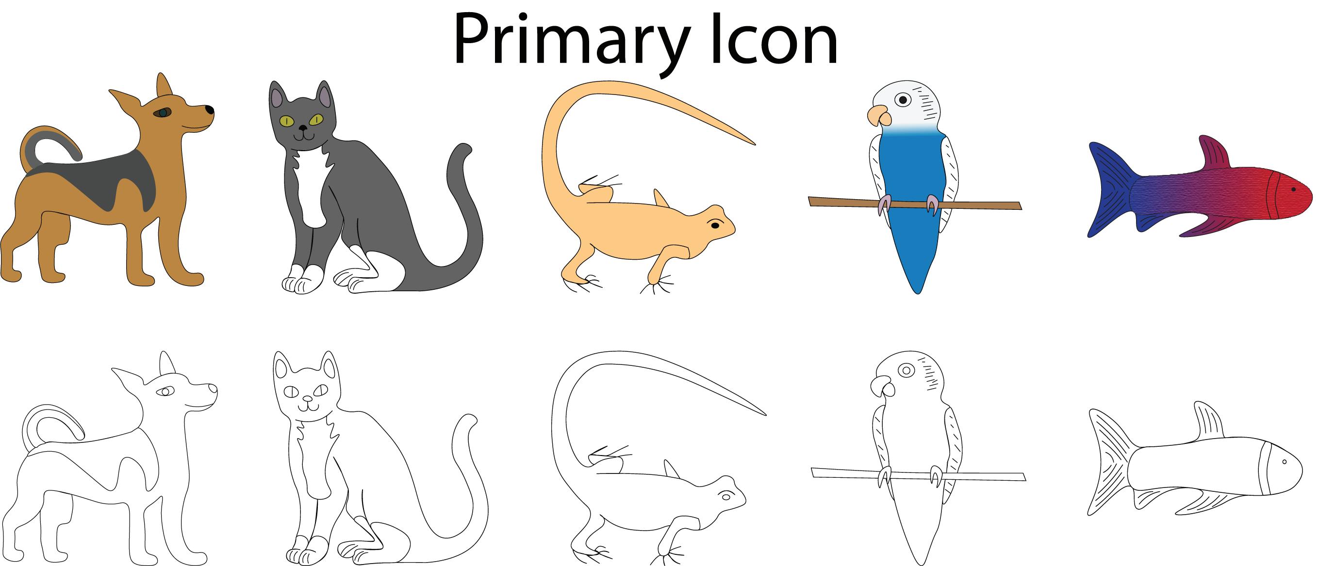
The selected prompt revolves around the theme “Pets are our special friends.” Five primary icons were crafted for the infographics, representing the five most common house pets. The icons for dogs and cats were inspired by personal pets, while the remaining primary icons depict popular pets such as lizards, parrots, and beta fish. Secondary icons were created to represent common items associated with each pet including a ball, a bone, fish food, a heat lamp, and a toy mouse. The poster design aims to resemble the interior of a house, featuring a shelf to showcase each of the icons individually.


SKYY STUDIO Leyton
Character Development and T-shirt Design
Design Objective:
Develop a dual-colored design intended for a t-shirt series. Furthermore, generate two additional designs complete with full mockups to complement the initial concept. Conclude by documenting the production process, highlighting the colors featured in the original design.
Creative Brief:
Each t-shirt design is inspired by personally developed characters. Each design features a unique color scheme tailored to the character yet maintains a consistent format: a simplified depiction of the character in a two-color design. The initial design, central to both the production process and featuring a character named King, was my starting point. Opting for a light blue as the primary color, I supplemented it with black as a supporting shade, a choice maintained across all designs to ensure cohesion. The subsequent two characters were characterized by their predominant colors: gold and green, respectively.


