1 minute read
Lost In Tokyo


Design Objective:
Design and create a logo, a style guide, page mockups, and an advertisement to be used in a city planning guide for Tokyo, Japan.
Advertisement
Design Brief:
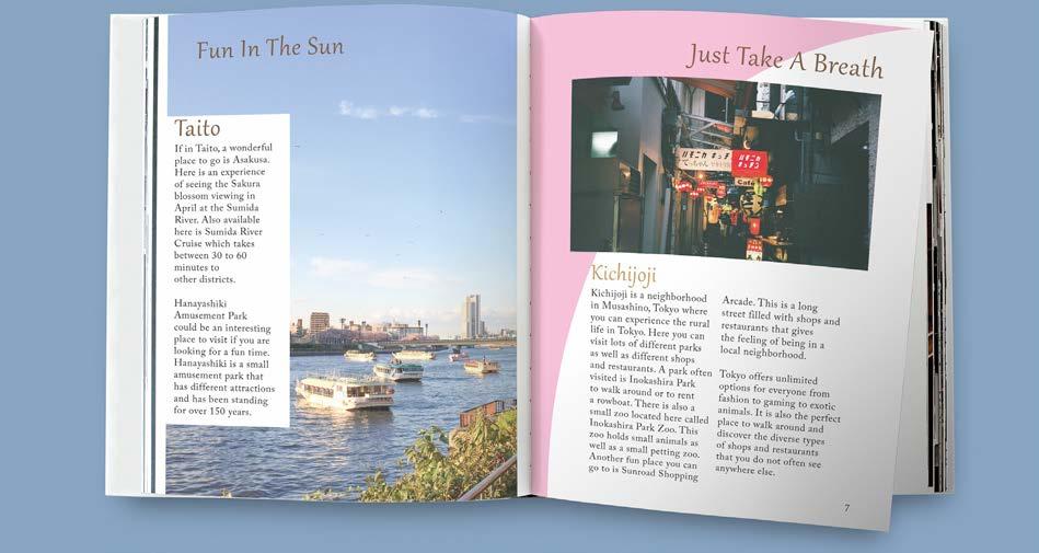
A cherry blossom stem and a traditional Japanese hand fan were chosen to make the logo, as these are a staple for Tokyo. The name Lost in Tokyo was chosen to give a sense of mystery to what the city guide is about, making the viewer more likely to engage with the book. The logo uses different shades of brown, blue, and pink to give the feeling of the Japanese culture as well as help the logo stand out against the black background. A black background was chosen to bring more attention to the logo and the subtitle of the book. When opening the book, the viewer will see bright pages that contrast with the dark cover of the guide. The pages are white with light pink and blue in different corners and edges of each page. This pink and blue reference to the logo explains the culture Japan has to offer. The bright pages also allow the reader to feel open and have fun as they read about the places in Tokyo to visit. The guide starts with a table of contents and a map of the various locations that the book discusses, as well as imagery of each location on the respective pages. The advertisement for the city planning guide helps sell the idea of visiting Tokyo by showing the nightlife of the city from the air and from the ground. These add to the mysterious feeling when looking at the cover of the book.