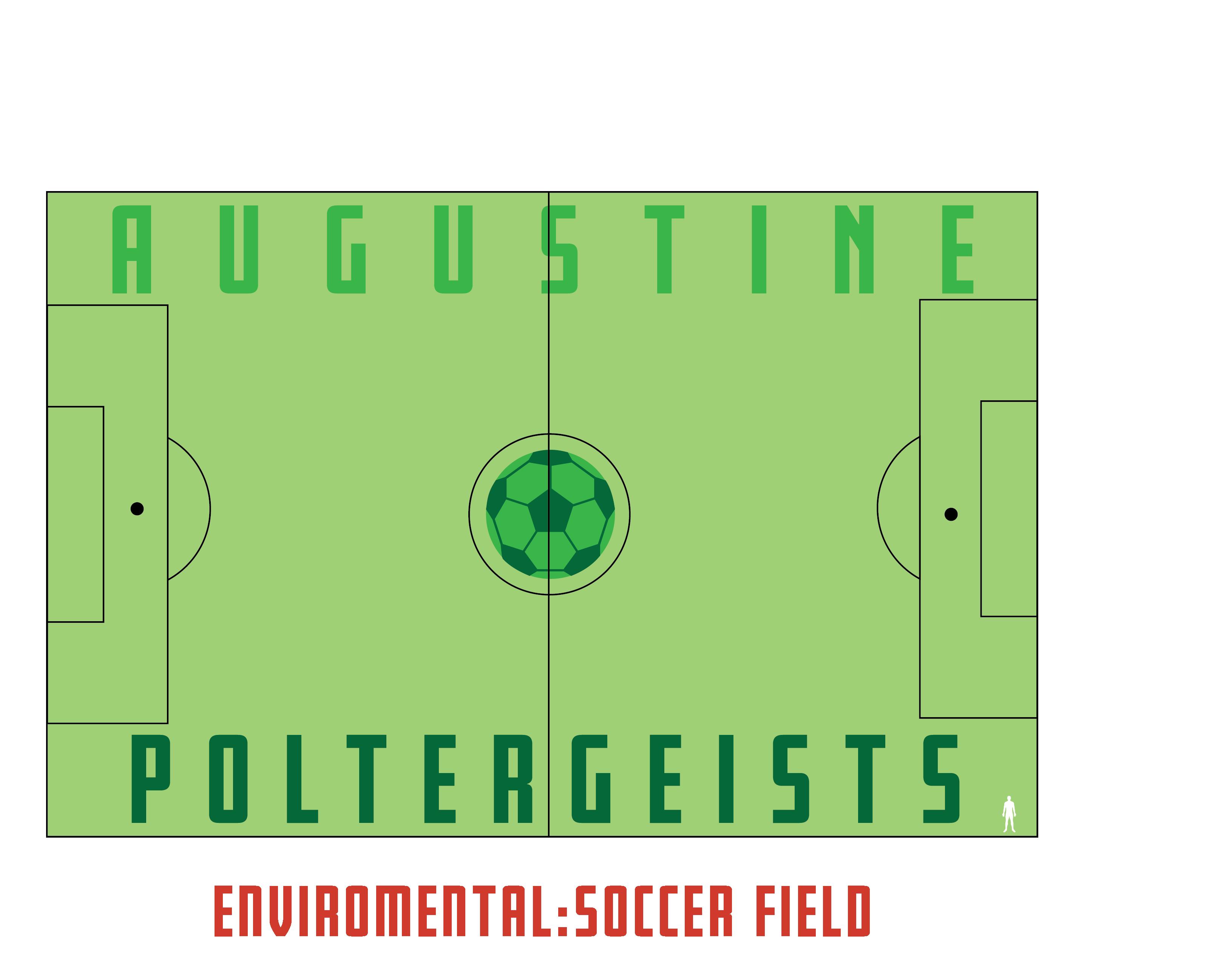
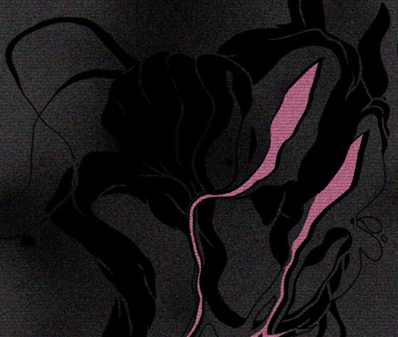
AUSGUSTINE POLTERGEISTS |
SPORTS TEAM BRANDING
DESIGN OBJECTIVE
Finding a void in a major city’s major league sports teams and designing a team’s identity to fill that void.
DESIGN BRIEF
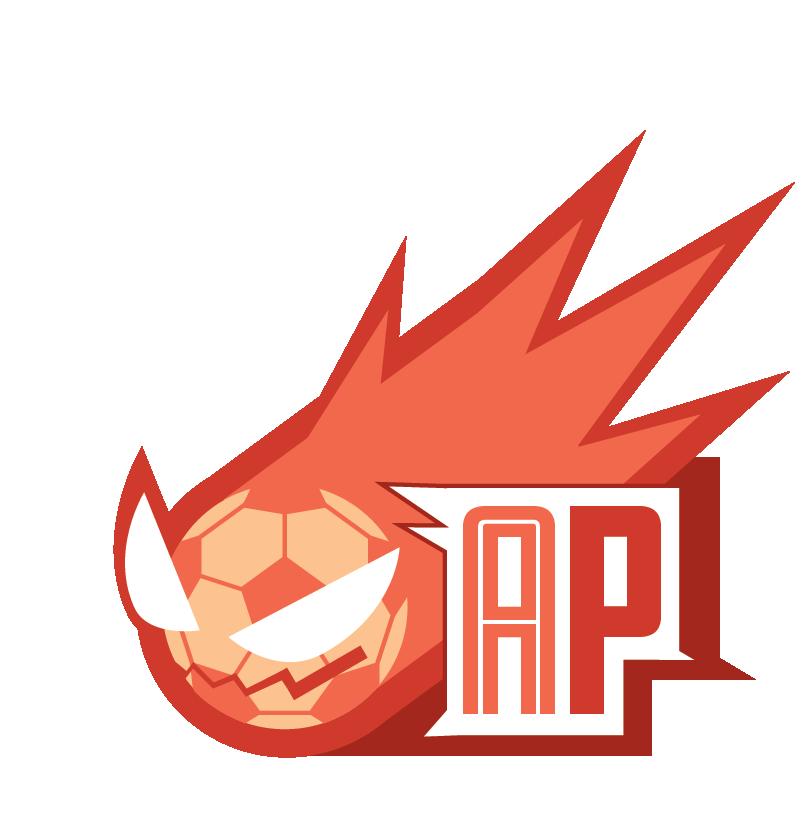
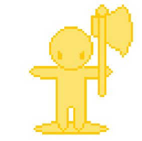
The Augustine Poltergeist emerges as a dynamic force in the realm of soccer, filling the void in Florida’s soccer landscape with a team that mirrors the rich history and vibrant spirit of St. Augustine. Nestled in a city steeped in both history and tourism, the Augustine Poltergeist stands as a testament to the prowess and potential of this flourishing region. As the city’s premier soccer team, the Augustine Poltergeist draws inspiration from the supernatural ambiance that St. Augustine is renowned for. The team’s mascot, a spirited poltergeist, encapsulates the mystique of the city’s paranormal occurrences, symbolizing the team’s tenacity, unpredictability, and ability to haunt the competition on the field.
The Augustine Poltergeist’s branding is a bold visual statement, employing bright reds and oranges that not only reflect the vibrant energy of the team, but also serve as a warning sign to opponents. This color palette acts as a beacon, signaling that the team is prepared to play with intensity, passion, and an unyielding determination to emerge victorious. The Augustine Poltergeist isn’t just a sports team; it’s a representation of St. Augustine’s spirit, poised to leave an indelible mark on the soccer scene and establish itself as a powerhouse in the Florida sports.
AUSGUSTINE POLTERGEISTS | SPORTS TEAM BRANDING
IDEATION
AUSGUSTINE POLTERGEISTS | SPORTS TEAM BRANDING
LOGOS TYPOGRAPHY
AUSGUSTINE POLTERGEISTS | SPORTS TEAM BRANDING
FRESNO BLACK
A B C D E F G H I J K L M N
O P Q R S T U V W X Y Z
FRESNO INLINE
A B C D E F G H I J K L M N
O P Q R S T U V W X Y Z
COLOR PALETTE UNIFORM
AUSGUSTINE POLTERGEISTS | SPORTS TEAM BRANDING
C: 0 M: 27 Y: 46 K: 0 C: 0 M: 74 Y: 73 K: 0 C: 17 M: 94 Y: 100 K: 25 C: 0 M: 88 Y: 86 K: 15
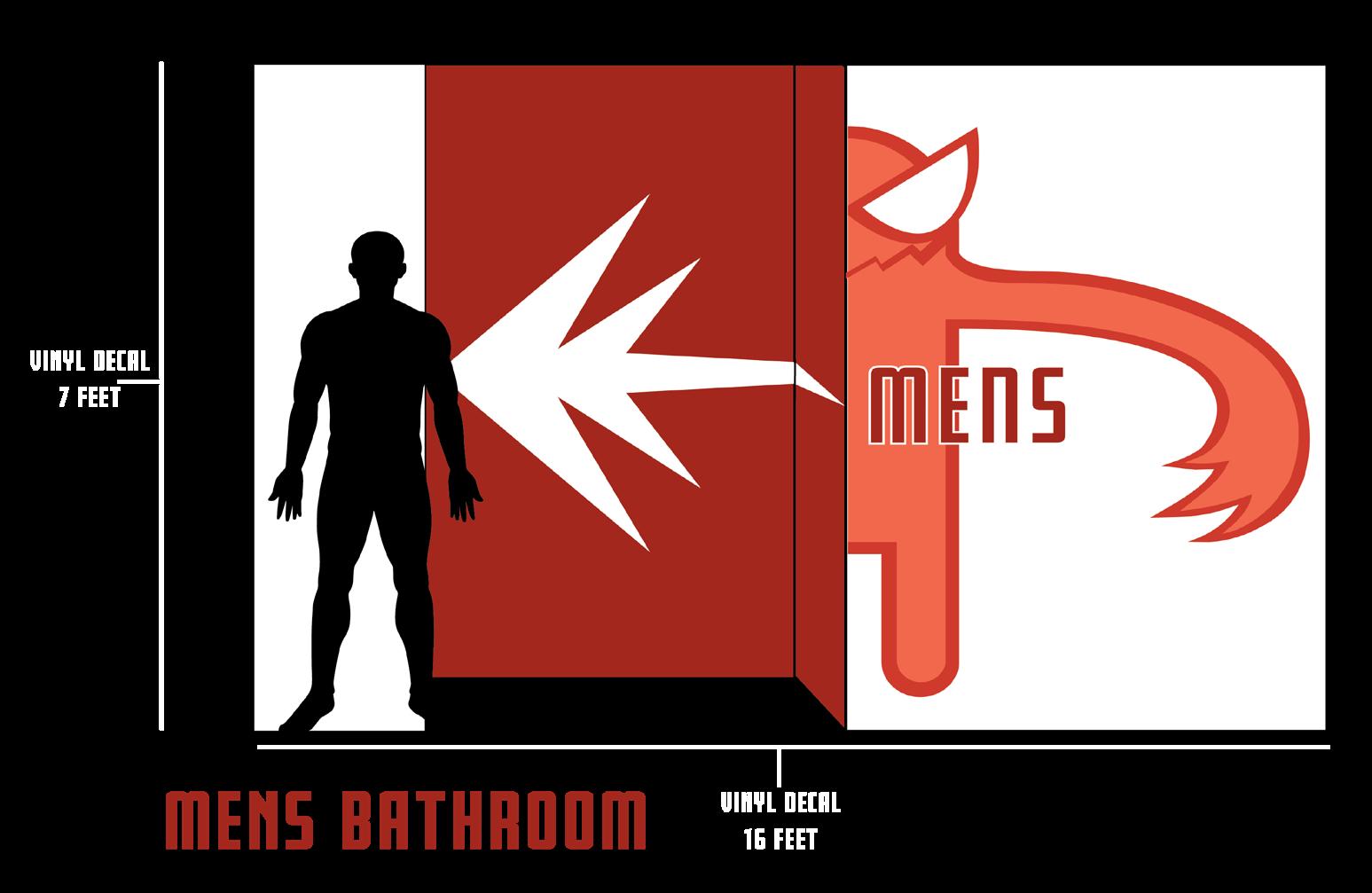
WAYFINDING | BATHROOMS STADIUM
SIGN
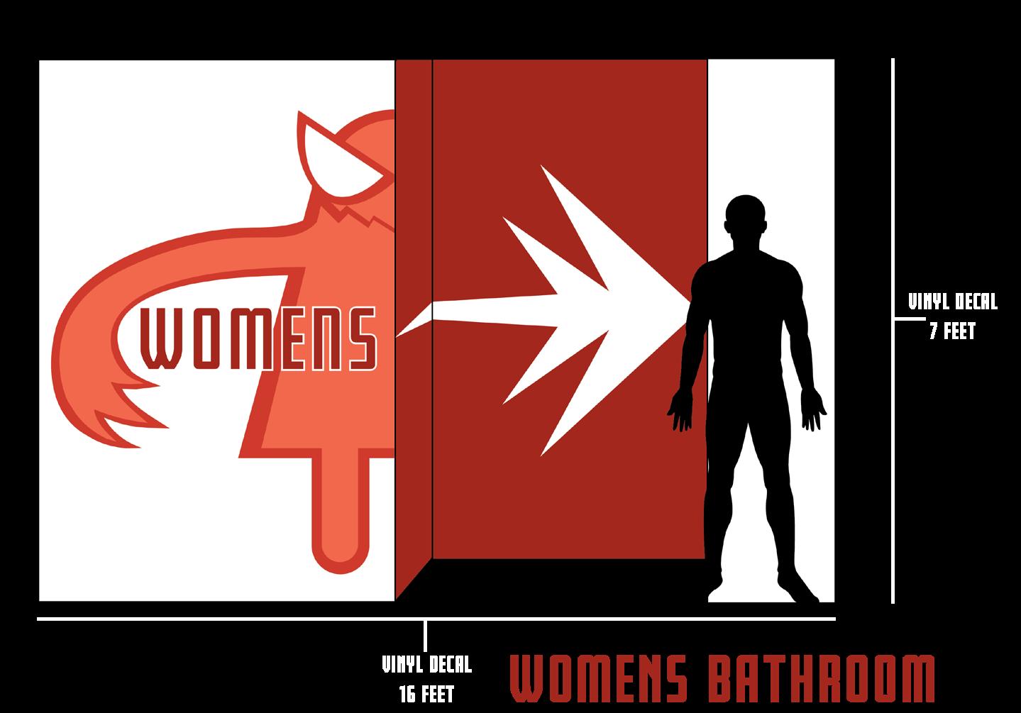
AUSGUSTINE POLTERGEISTS | SPORTS TEAM BRANDING
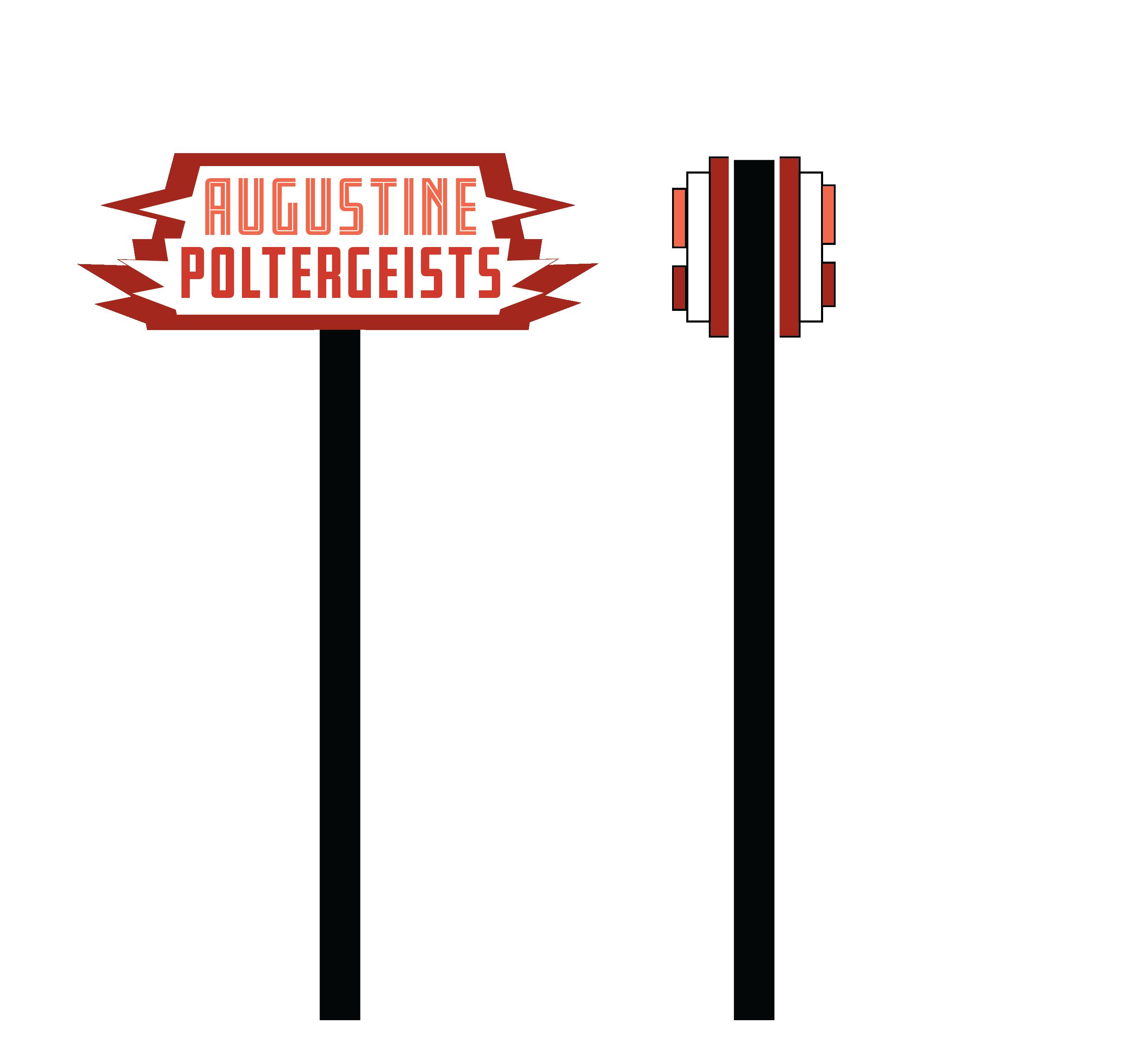
ENVIROMENTAL GRAPHIC ELEVATOR
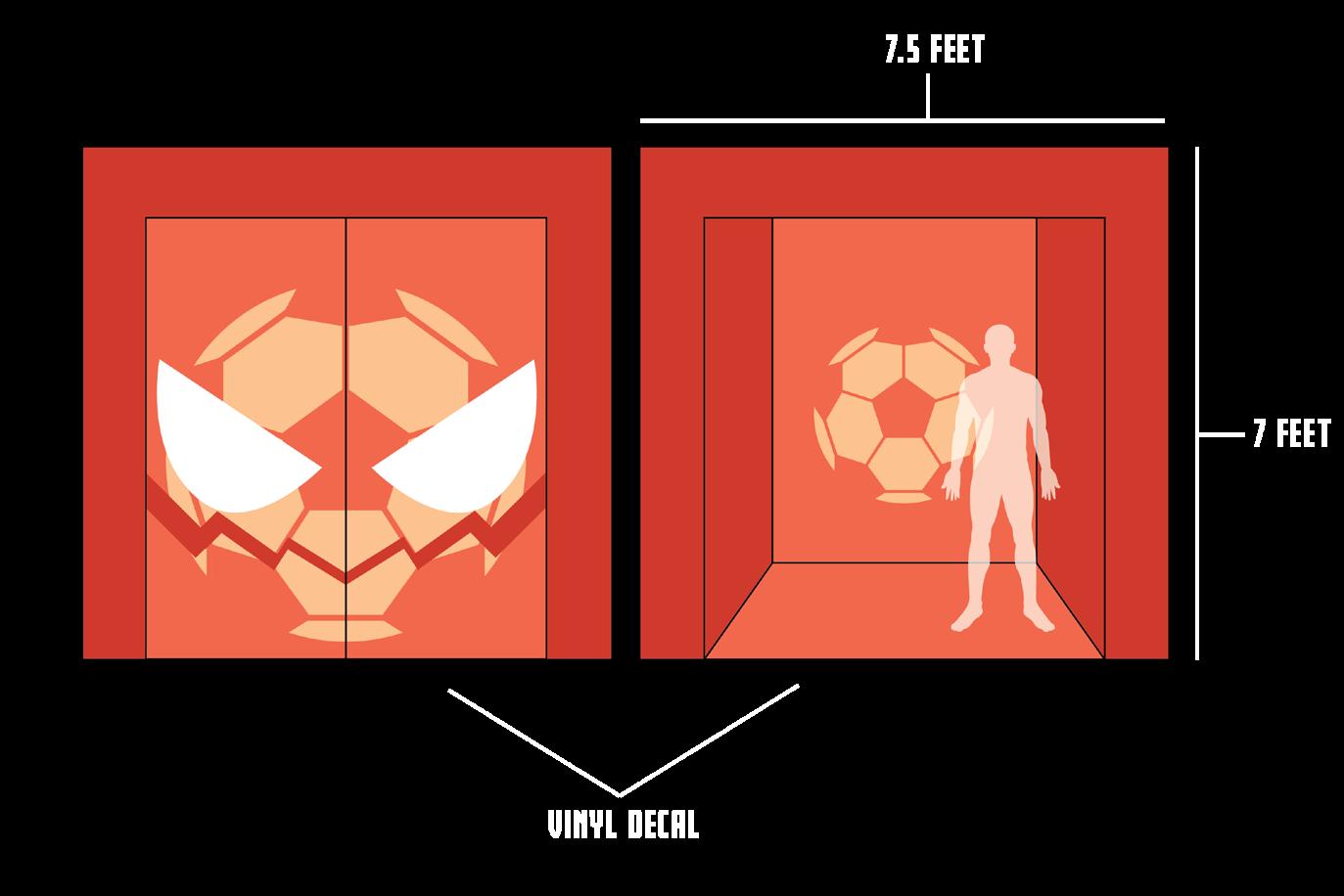
SEAT NAVIGATION
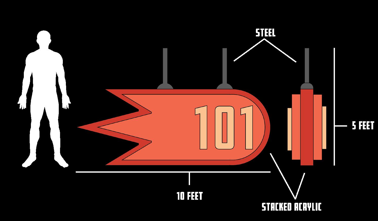
| SPORTS TEAM BRANDING
AUSGUSTINE POLTERGEISTS
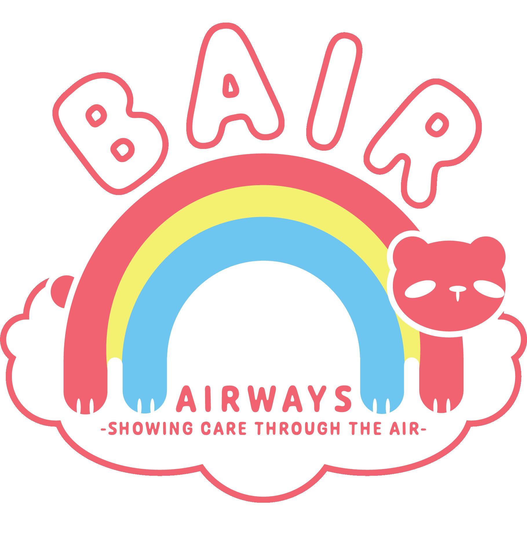
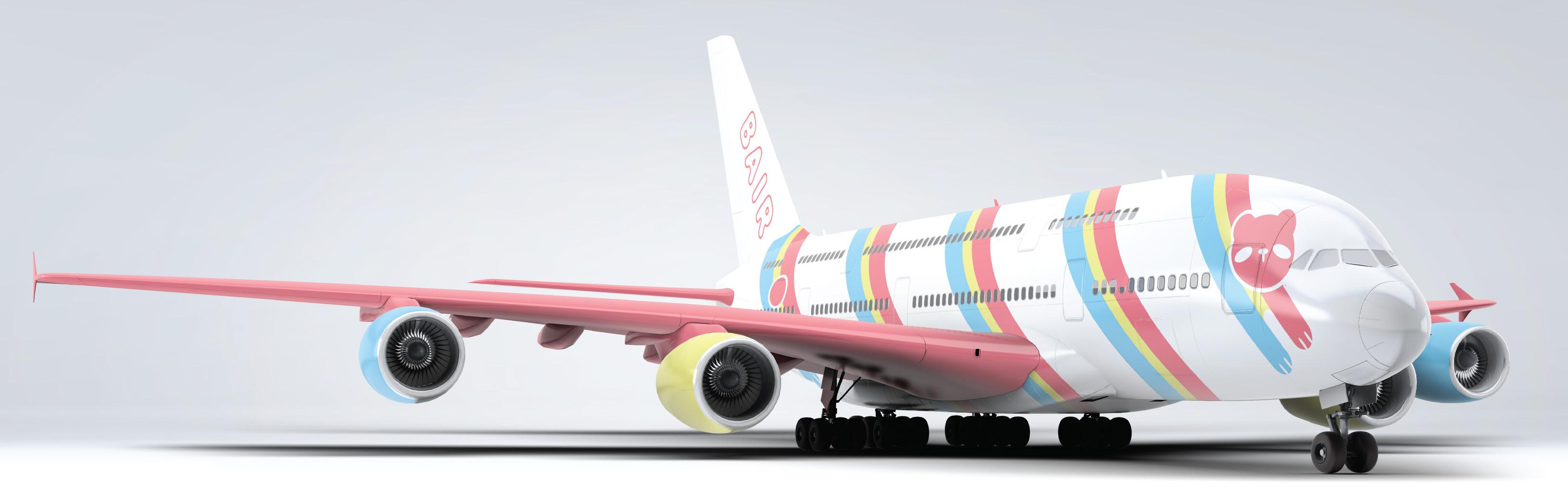
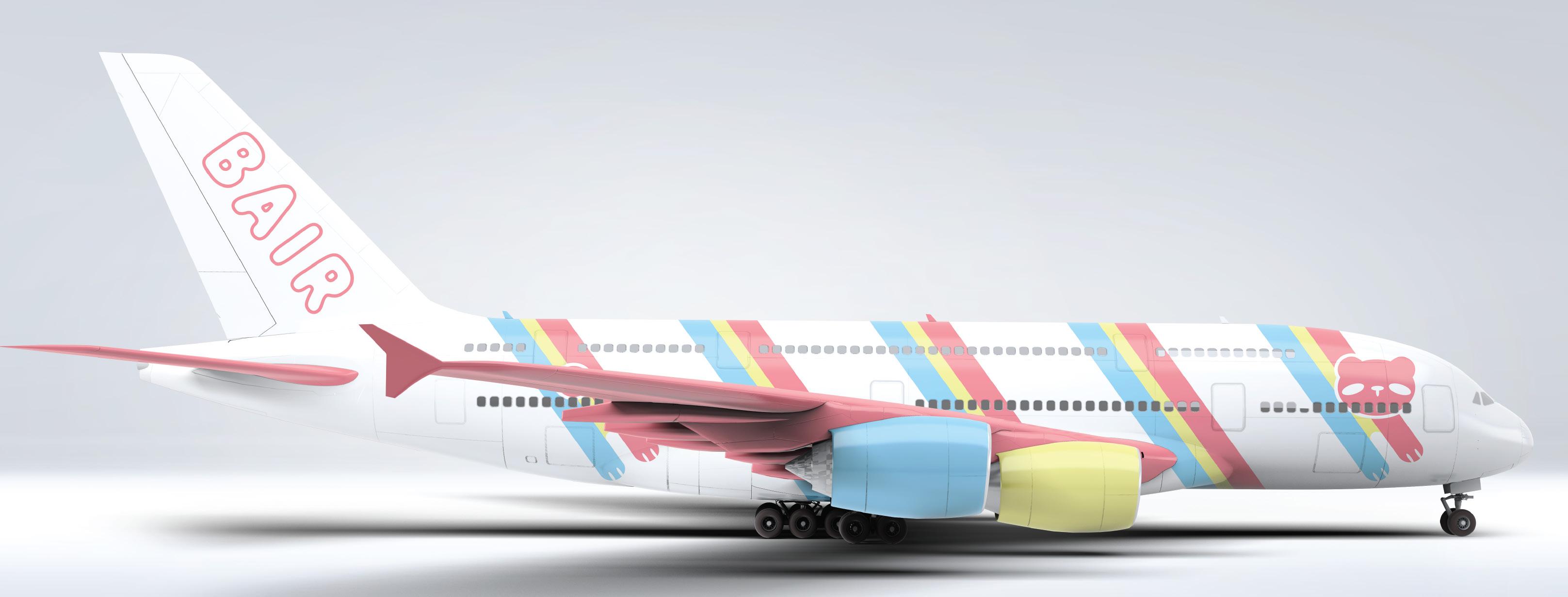
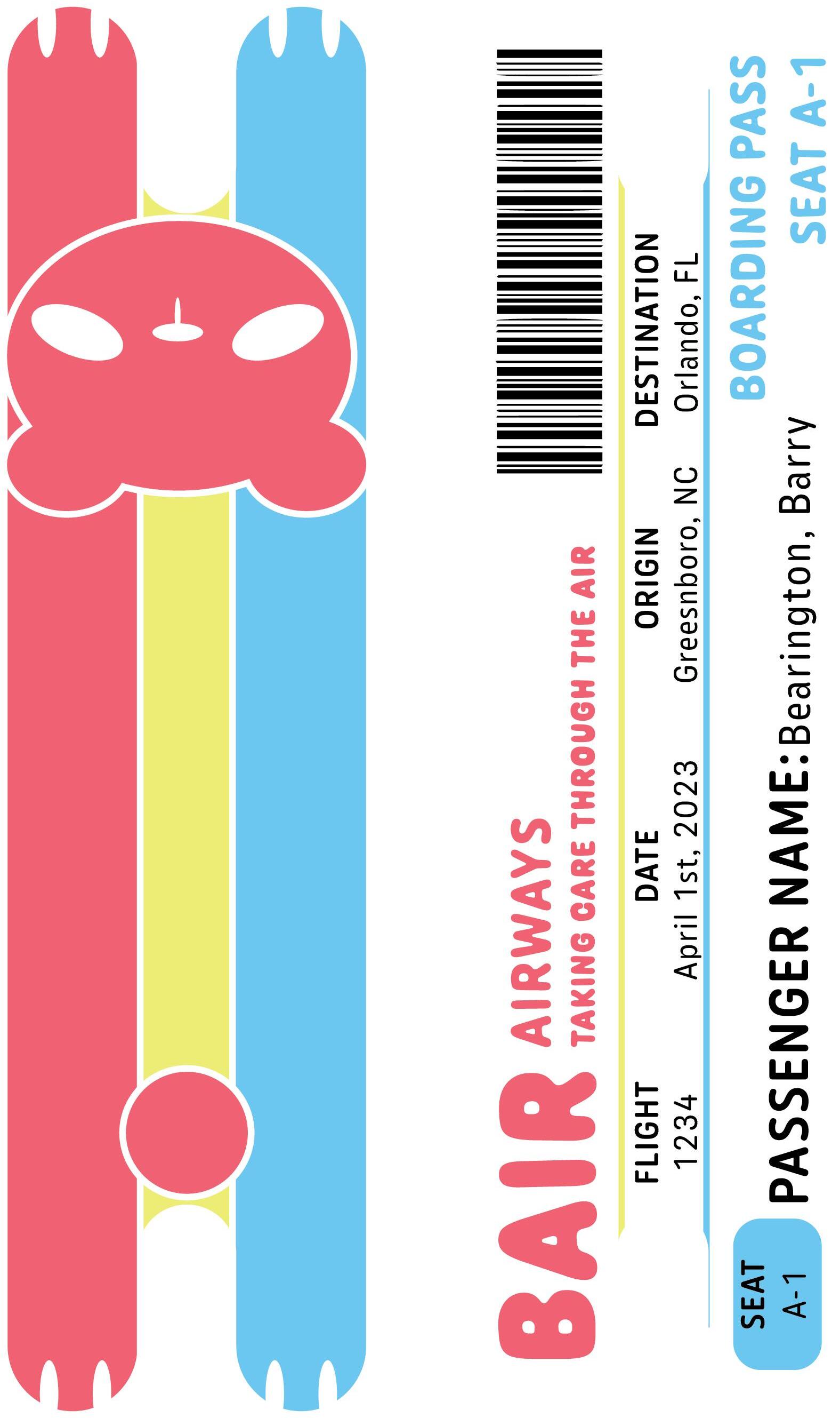
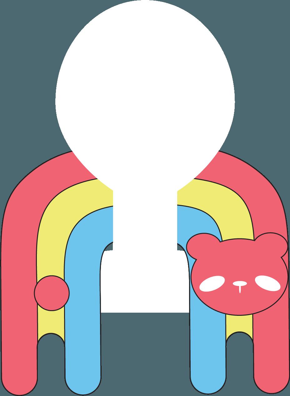
BAIR AIRLINES | AIRLINE BRANDING
DESIGN OBJECTIVE
Constructing the branding and collateral for an airline based on a choosen theme based around the airline’s audience and the network it travels in.
DESIGN BRIEF
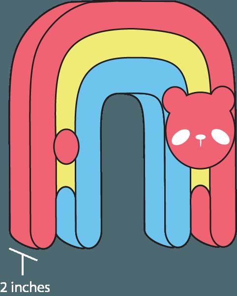
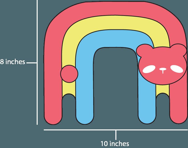
Bair takes flight with a mission to transform the flying experience centered around families and children, making every journey a delightful adventure. Geared towards creating an environment that transcends the mundane, Bair is designed to be more than just a mode of transportation; it’s a whimsical escape for young travelers and their families. The airline is characterized by its commitment to infusing joy into air travel, ensuring that every aspect of the journey, regardless of its duration, is a memorable and enjoyable experience.
At the heart of Bair’s charm is its lovable mascot, Bow – a rainbow-shaped bear bursting with color and cheer. Bow encapsulates Bair’s dedication to creating a welcoming and entertaining atmosphere on board. As the embodiment of fun and comfort, Bow is not merely a symbol but a friendly companion on the journey, alleviating travel anxieties and turning flights into cherished memories. Bair Airlines strives to be more than a carrier; it aspires to be a magical conduit for families to embark on exciting adventures together, with Bow leading the way to a sky full of smiles and laughter.
BAIR AIRLINES | AIRLINE BRANDING
PERSONAS
AGE: 73
PROFESSION: Business Owner
INCOME: High
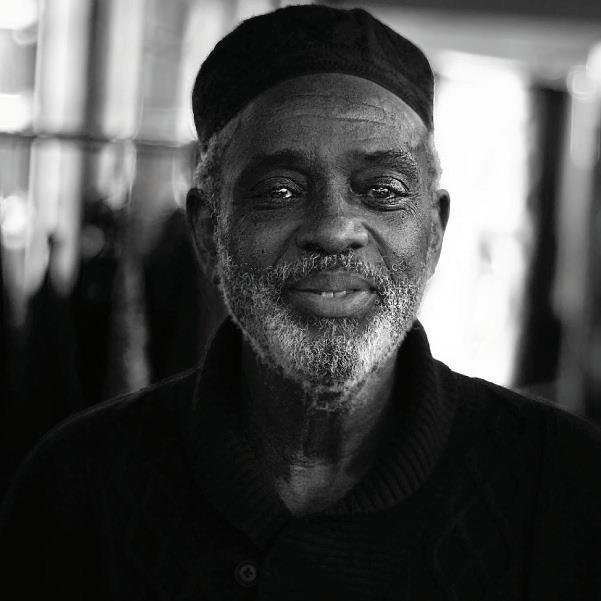
Gearing up for a much-needed vacation, Albert and his three favorite grandsons love flying to every theme park imaginable. He has always been more of a homebody, often choosing to stay in his hometown working on a chain of restaurants he manages. Albert wants nothing more than to spend his vacations focusing his time on creating an unforgettable vacation for the people he loves. Two of the main struggles he faces on every trip is joint pain when sitting too long and trying not get overly stressed when crowds at the airport get too loud. Albert also struggles working with newer technology, but has found ways to work around it like talking to airline workers to help him book his tickets properly.

AGE: 25
PROFESSION: Flight Attendant
INCOME: Middle
Fueled by her love of travel, Kendal chose to become a flight attendant. One of Kendal’s other motivations for being a flight attendant is being able to socialize with customers and their children. She has always loved being part of a child’s first flight and loves to make sure it is always a comfortable trip for them. The only time she has ever been frustrated as a flight attendant is when having to deal with rude passengers or families. Even with this issue, Kendal still comes to her job each day with a positive attitude and combats difficult customers with a smile on her face. She has vast experience with technology from her training as a flight attendant and the computer science electives she took in college.
AGE: 7
PROFESSION: Student
INCOME: Low
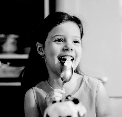
Overwhelmed with many emotions, little Jamie gets prepared the first plane flight she has ever had. Her single mother worked hard saving up for a trip to see a Broadway play for Jamie’s eighth birthday. Her worries for the flight are sitting still for too long, getting hungry, and any turbulence the plane may face. Jamie can easily quell these nervous feelings by doodling in her sketchbook, eating a sweet snack, or huddling close to her mother. She is not the greatest with technology, but loved every moment sitting beside her mother to plan their trip together. She wants nothing more than a smooth and fun first flight with her closest family member.
BAIR AIRLINES | AIRLINE BRANDING
PLANE MOCKUPS COLLATERAL | TICKET
BAIR AIRLINES | AIRLINE BRANDING
COLLATERAL | NECK PILLOW
BAIR AIRLINES | AIRLINE BRANDING
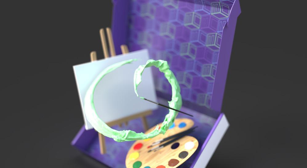
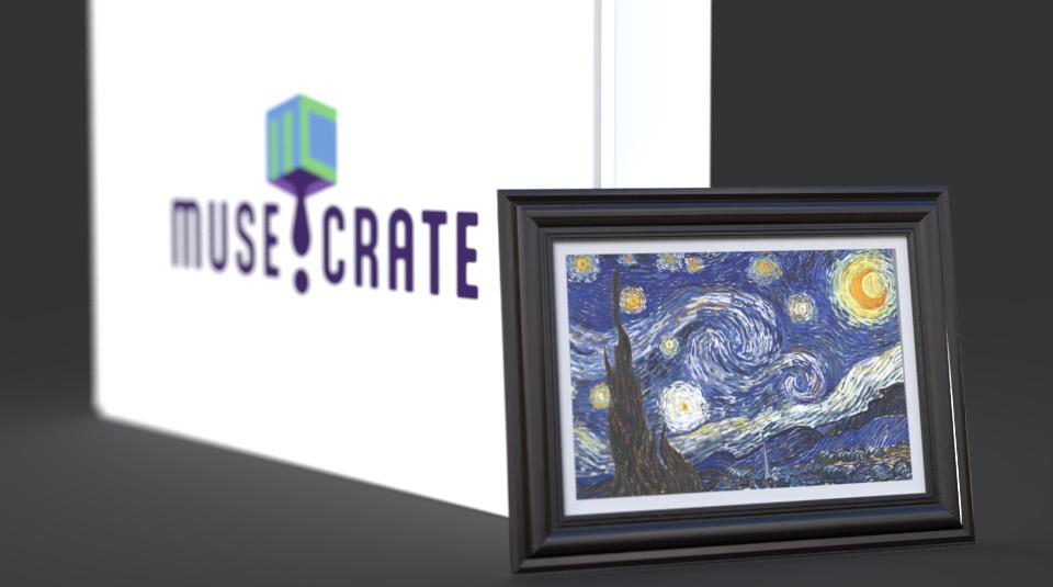
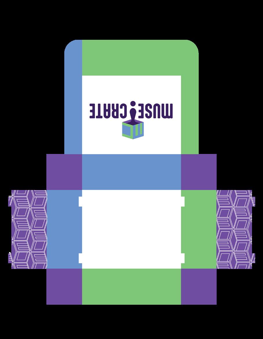
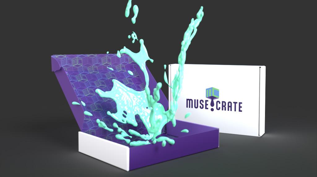
MUSE-CRATE | SUBSCRIPTION BOX
DESIGN OBJECTIVE
Choosing a theme and creating branding, packaging, and marketing for a subscription box from the ground up.
DESIGN BRIEF
Muse-Crate is a revolutionary subscription box designed to inspire and cultivate the artist within, blending the joy of creation with the wisdom of artistic masters across various mediums. Each month, Muse-Crate unveils a curated box centered around a specific art medium, equipping subscribers with all the essential tools needed to embark on their artistic journey. From painting to sculpture, every box is a hands-on exploration of diverse artistic expressions. What sets Muse-Crate apart is its commitment to education and admiration. In addition to the art supplies, subscribers receive a mini recreation of a masterpiece crafted by a professional artist specializing in the monthly theme. Accompanying this treasure is a comprehensive guide outlining the techniques employed by the featured artist, offering valuable insights and encouraging both novice and experienced artists to expand their horizons.
Muse-Crate’s mission is to demystify the creative process, making art accessible to individuals of all skill levels. By spotlighting the work and techniques of professional artists, the subscription box aims to foster a deeper appreciation for various artistic mediums while providing a practical avenue for personal expression. Muse-Crate isn’t just a subscription box; it’s an immersive artistic experience that empowers subscribers to unleash their creativity and explore the rich tapestry of the art world.
MUSE-CRATE | SUBSCRIPTION BOX
LOGOS TYPOGRAPHY
Aptly Light
A B C D E F G H I J K L M N O P Q
R S T U V W X Y Z
a b c d e f g h i j k l m n o p q r s t u v w x y z
Aptly Bold
A B C D E F G H I J K L M N O P Q
R S T U V W X Y Z
a b c d e f g h i j k l m n o p q r s t u v w x y z
MUSE-CRATE | SUBSCRIPTION BOX
MUSE CRATE
COLOR PALETTE PATTERNS
MUSE-CRATE | SUBSCRIPTION BOX

C: 52 M: 0 Y: 71 K: 0 C: 60 M: 35 Y: 0 K: 0 C: 66 M: 82 Y: 0 K: 0 C: 89 M: 100 Y: 22 K: 27

MUSE-CRATE | SUBSCRIPTION BOX BOX MOCKUPS
SOCIAL MEDIA | INSTAGRAM
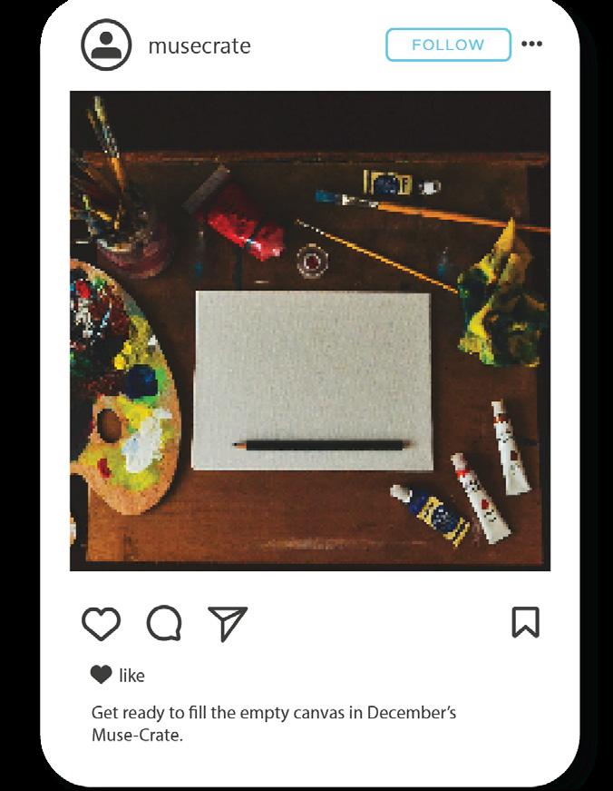
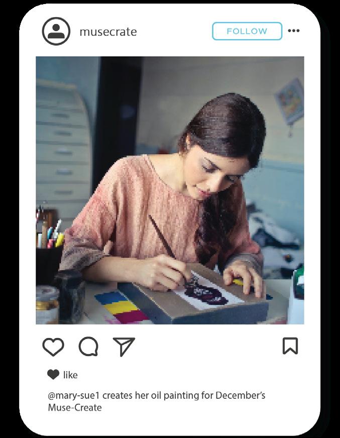
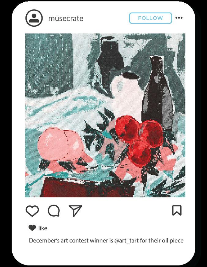
TIKTOK
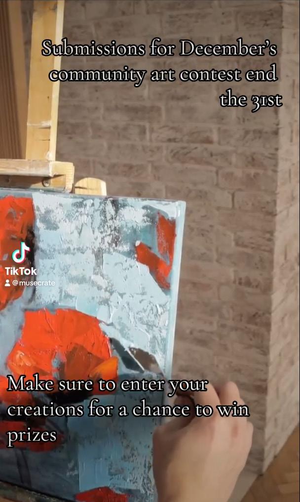
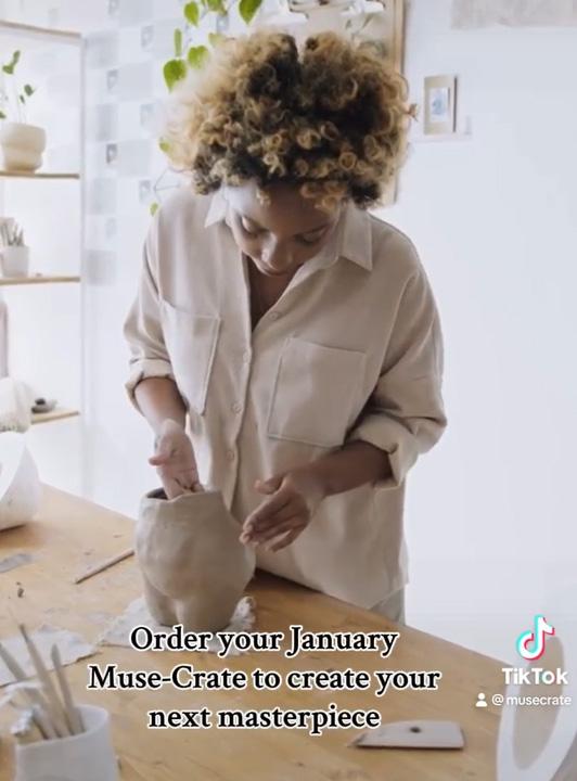
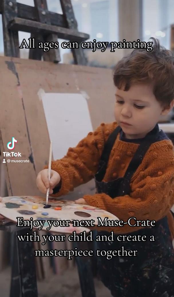
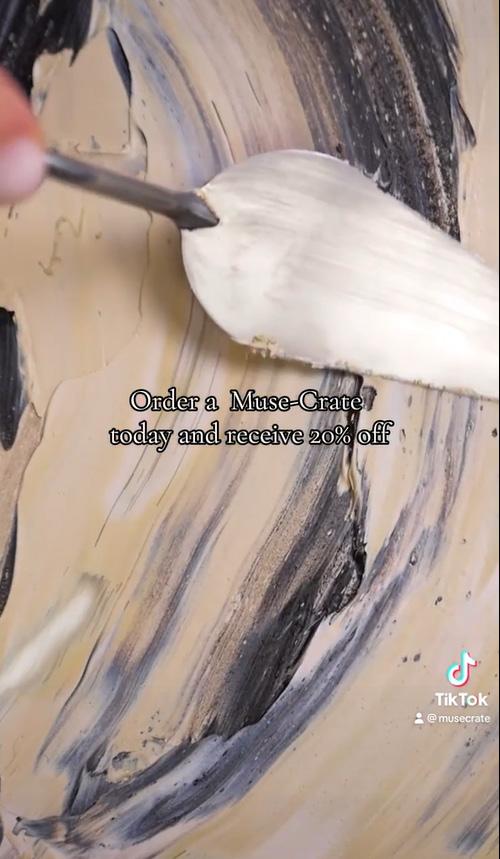
MUSE-CRATE | SUBSCRIPTION BOX
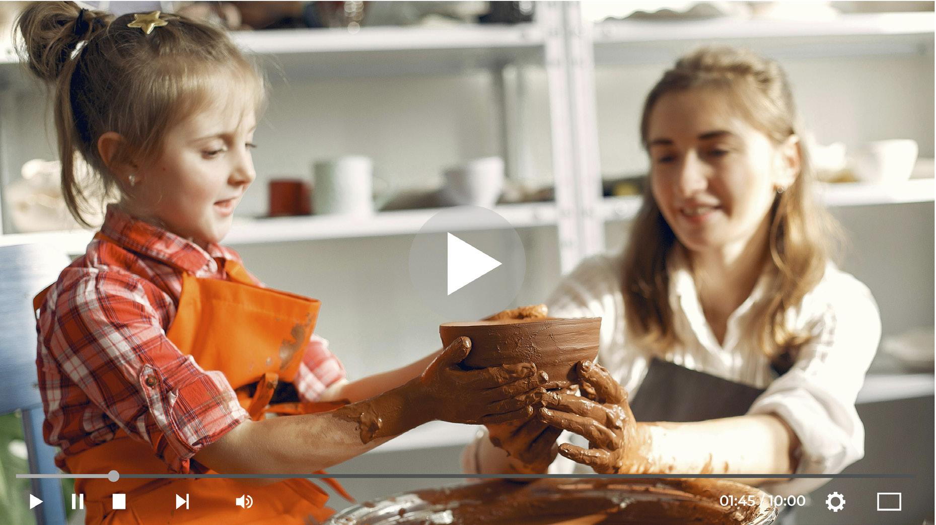
YOUTUBE

MUSE-CRATE | SUBSCRIPTION BOX SCAN ME CASE STUDY QR SCAN ME PROTOTYPE QR
WEBPROTOTYPE | MOCKUP
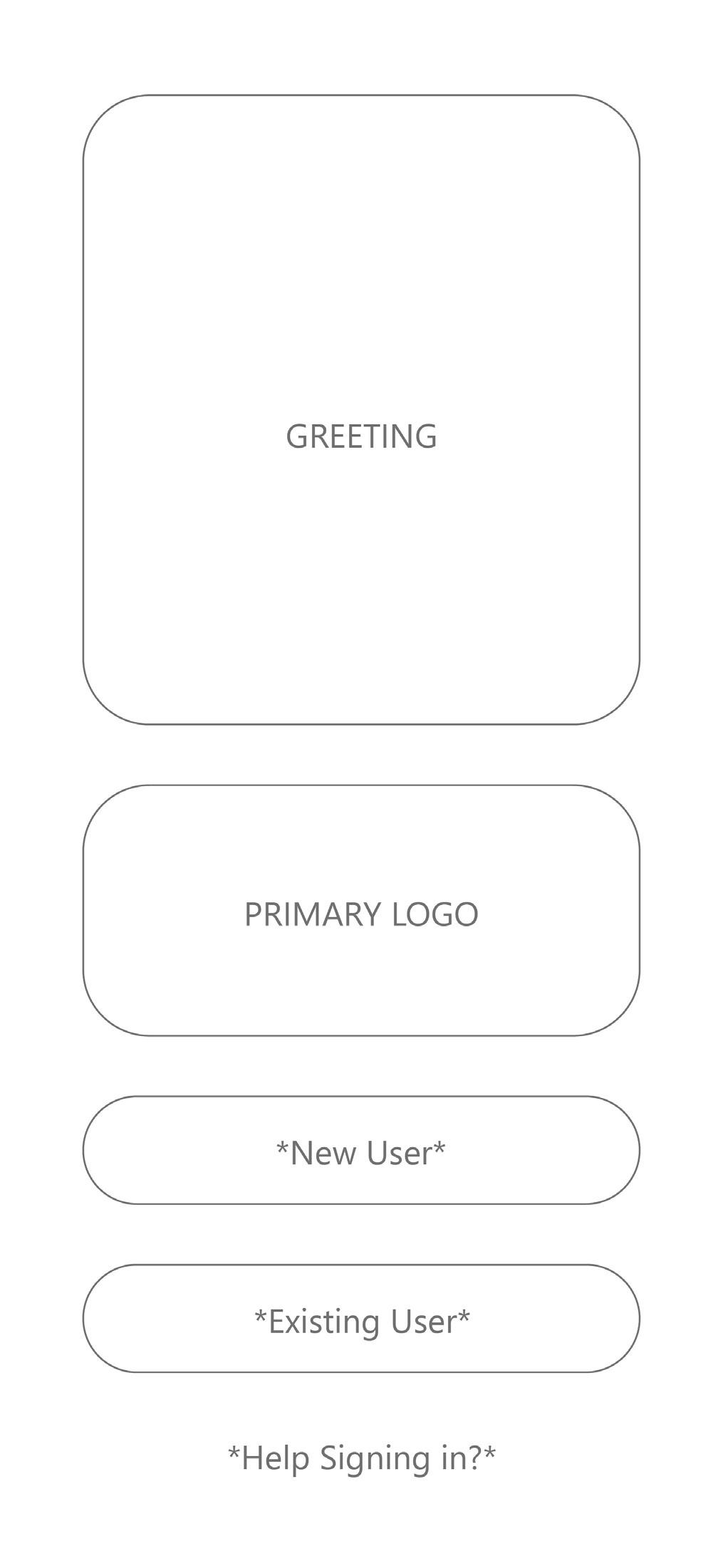
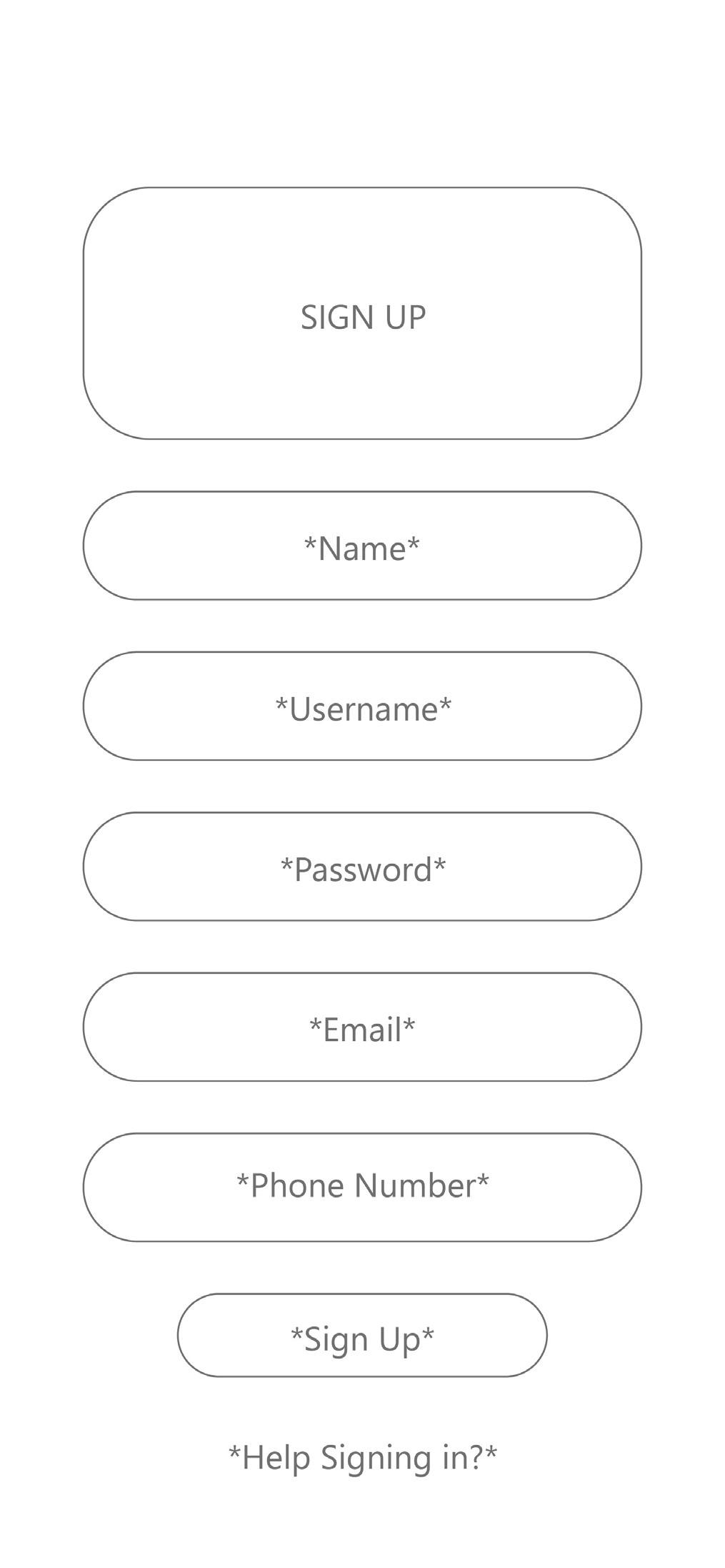
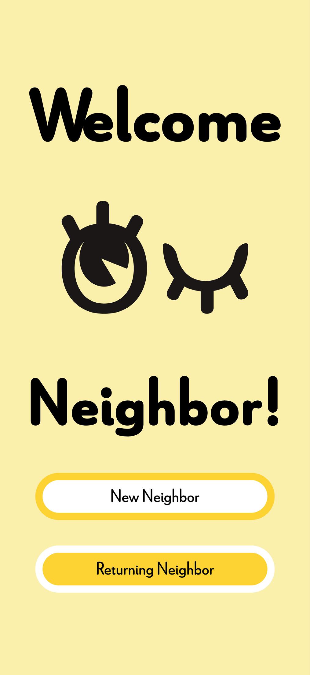
NEIGHBORHOOD NOOK | APP
DESIGN
DESIGN OBJECTIVE
Conceptualizing the purpose, brand identity, and a prototype for an app that that does not currently exist on the appstore.
DESIGN BRIEF
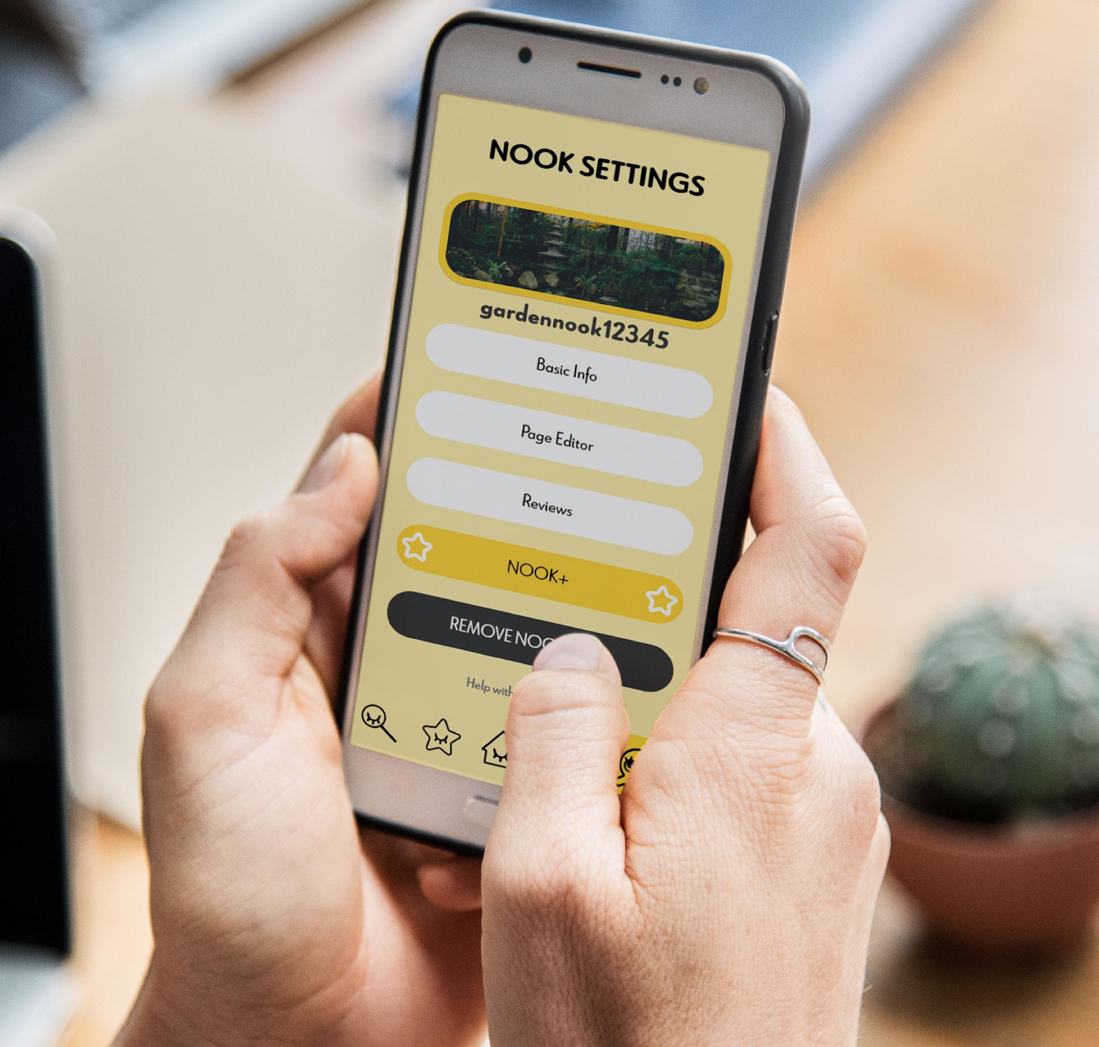
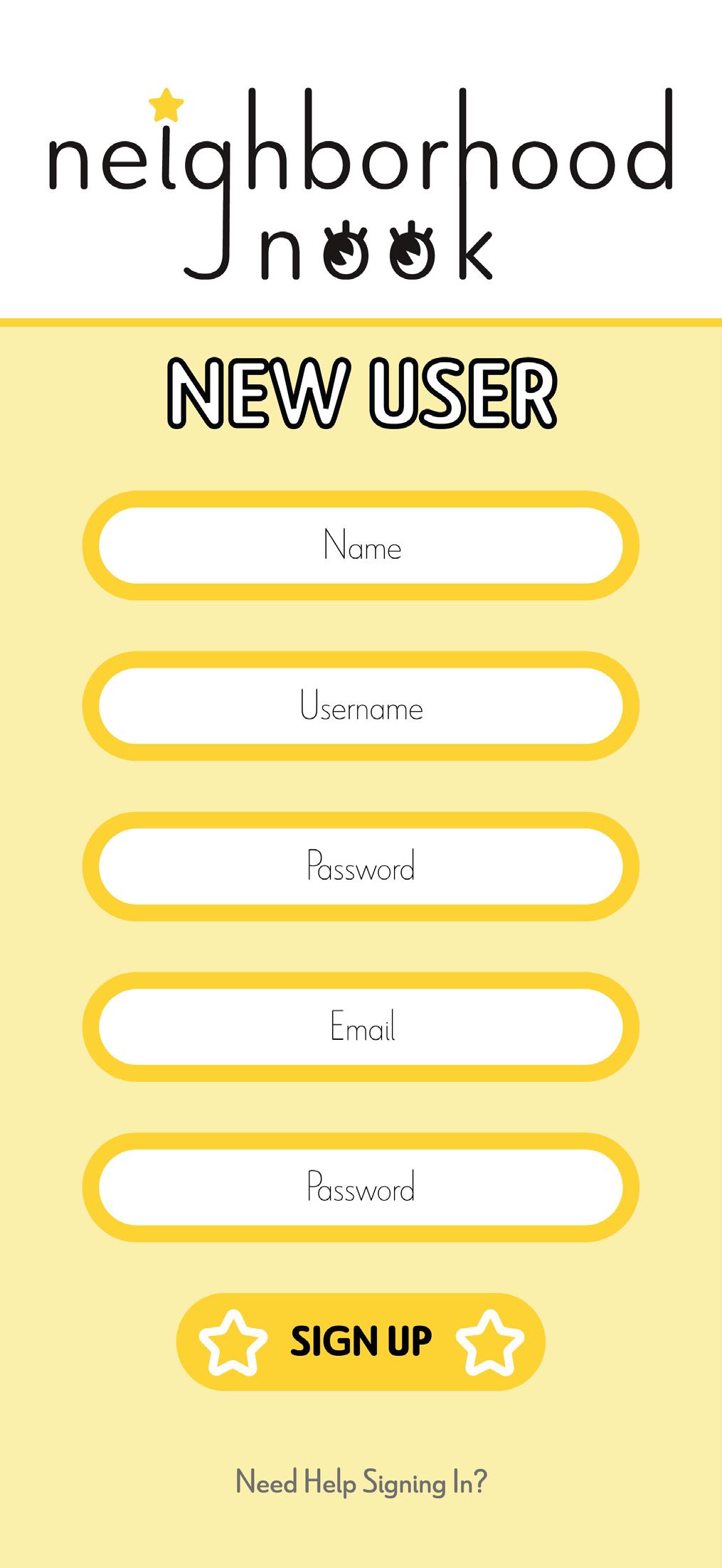
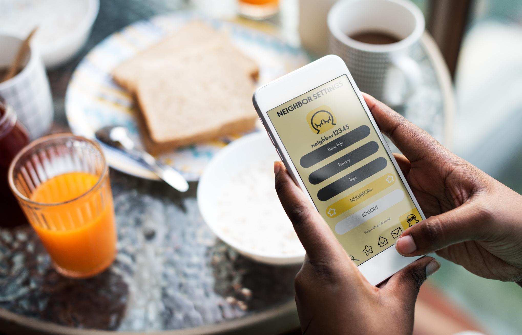
Neighborhood Nook is a charming mobile application designed to bridge the gap between consumers and small local businesses, particularly those offering handmade goods and services. The app’s inviting aesthetic and cozy interface create a welcoming space for users to discover and support their nearby local gems. With a dual functionality, the app is divided into two halves, each serving a distinct purpose. The first half caters to users eager to explore their local community, providing an intuitive map interface and specialized filters to uncover unique local offerings. The second half is dedicated to empowering small businesses, offering them a platform to showcase their craft, engage with customers, and cultivate a stronger connection with their community.
The visual identity of Neighborhood Nook is carefully crafted to evoke warmth and community spirit. A palette of black, white, and warm yellows, complemented by hand-rendered icons that represent each section of the app. The overall design reflects simplicity and friendliness, ensuring that users and businesses alike feel a sense of belonging in this digital space dedicated to celebrating the artistry and uniqueness of local businesses.
NEIGHBORHOOD NOOK | APP DESIGN
LOGOS TYPOGRAPHY
Le Havre Rounded | Regular
A B C D E F G H I J K L M N O P
Q R S T U V W X Y Z
a b c d e f g h i j k l m n o p q r s t u v w x y z
Le Havre Rounded | Black
A B C D E F G H I J K L M N O P
Q R S T U V W X Y Z
a b c d e f g h i j k l m n o p q r s t u v w x y z
NOOK | APP DESIGN
NEIGHBORHOOD
COLOR PALETTE ICONS
NEIGHBORHOOD NOOK | APP DESIGN
C:
M: 0 Y: 0 K: 0 C: 1 M: 3 Y: 34 K: 0 C: 2 M: 10 Y: 82 K: 0 C: 69 M: 63 Y: 62 K: 57
0
PERSONAS

AGE: 42
PROFESSION: Florist
INCOME: Middle
Isabella is an up and coming florist in her local area hoping to make a splash in the career she loves. She has two teenage children that often help with her business, such as showing her how to use newer technology. An app to show off Isabella’s business could help her local business gain more traction.

AGE: 68
PROFESSION: Retired
INCOME: High
Joel was born and raised in Salt Lake City, Utah. He has a love for his grandaughter and his hometown. Even though his grandaughter love to travel, Joel always tries to show them the wonders local to their hometown. Joel would love an app that can show his grandaughter local business to visit together.
AGE: 25
PROFESSION: Nursing
INCOME: Middle
Jenna is a nurse that travels constantly to care for many different patients. She loves seeing each new city and the sights they have to offer. One of Jenna’s favorite activties is trying popular family owned resturants. An app that can show her local businesses in the area could help make her search easier.
NEIGHBORHOOD NOOK | APP DESIGN
WIREFRAMES DIGITAL COMPS
NOOK | APP DESIGN
NEIGHBORHOOD
SCAN
SCAN ME
NEIGHBORHOOD NOOK | APP DESIGN
ME BOOKLET QR
PROTOTYPE QR
APP MOCKUP
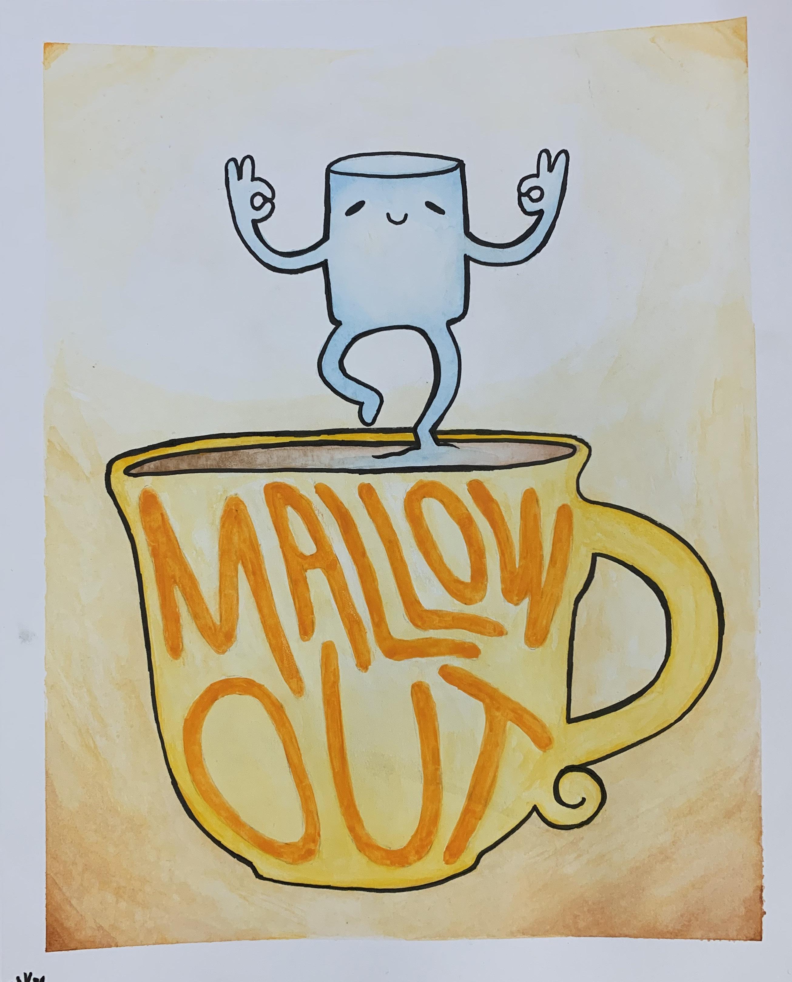
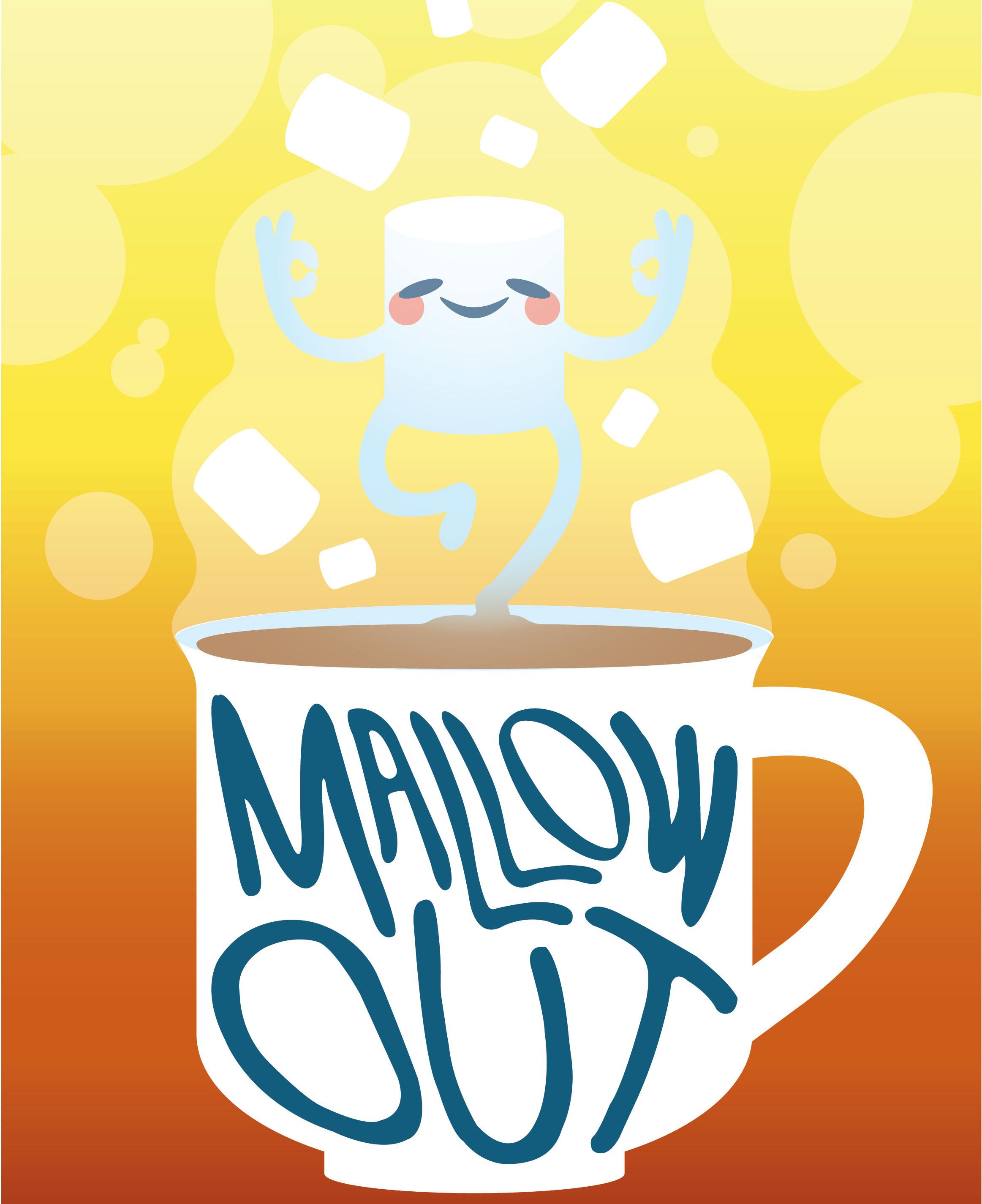
MALLOW OUT |
DESIGN OBJECTIVE
Create a design that is based around a pun and rendered using watercolor paints.
DESIGN BRIEF
Mallow Out poster combines the tranquility of watercolor art with a clever pun to deliver a message of relaxation and calmness. Originally crafted with watercolor paints, this poster captures the essence of serenity through its warm color palette of yellows, oranges, and browns, evoking feelings of comfort and coziness. The addition of a vibrant blue accent color adds a touch of freshness and balance to the composition. Inspired by motivational wall posters, Mallow Out encourages viewers to take a moment to unwind, breathe, and embrace a more relaxed state of mind amidst the hustle and bustle of daily life.
This digital rendition of the watercolor masterpiece ensures that the intricate details and soothing textures of the original artwork are preserved, allowing the poster to serve as a visual oasis in any space. Whether hung in a bedroom, office, or relaxation area, Mallow Out serves as a gentle reminder to pause, destress, and find peace in the present moment, making it a perfect addition to any environment seeking a touch of tranquility and positivity.
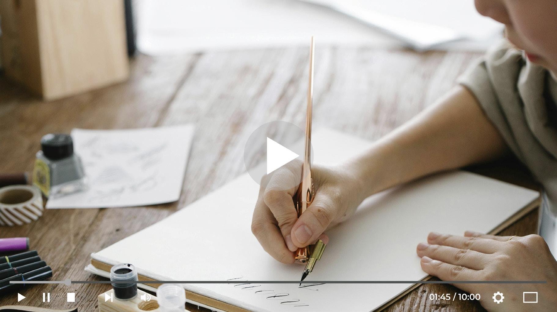
WATERCOLOR PUN POSTER MALLOW OUT | WATERCOLOR PUN POSTER
DIGITAL MOCKUP
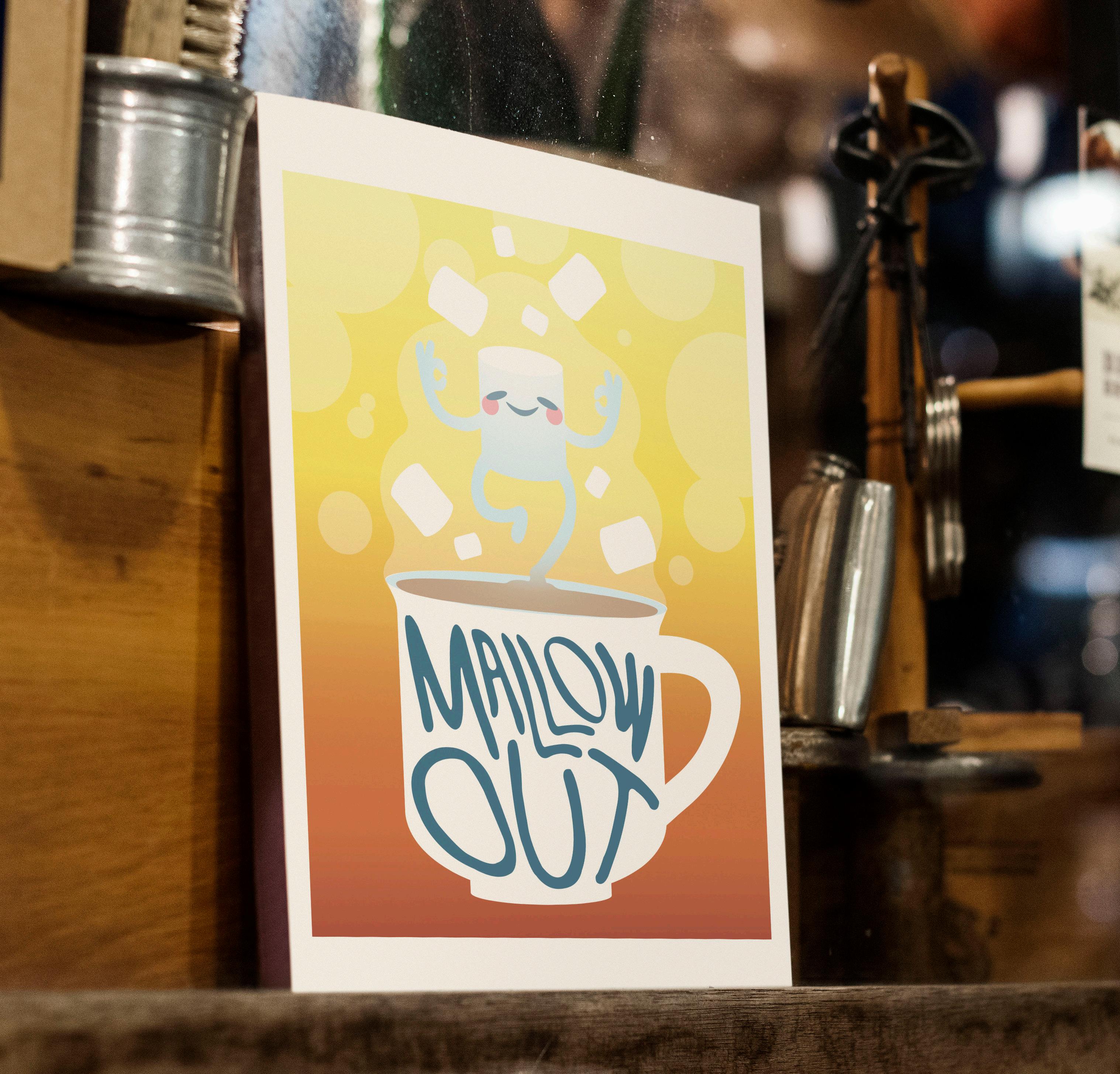
MALLOW OUT | WATERCOLOR PUN POSTER
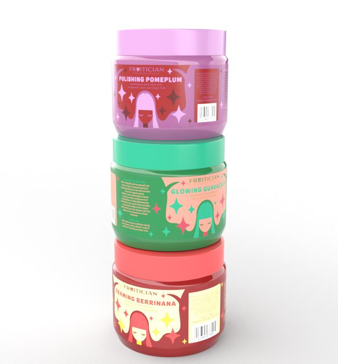
FRUITICIAN | PACKAGING DESIGN
DESIGN OBJECTIVE
Design the branding, packaging, and mockups for a hair product line.
DESIGN BRIEF
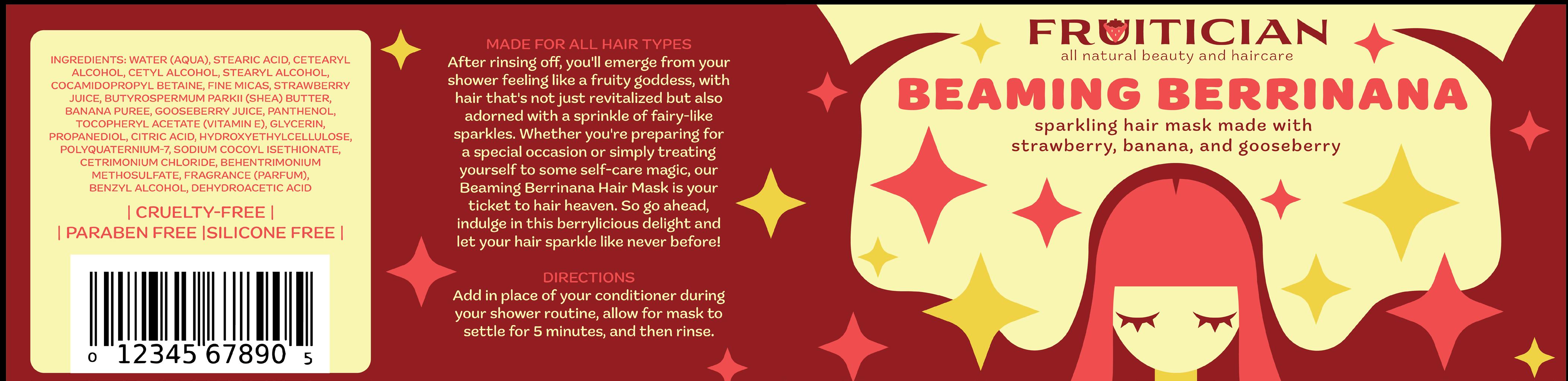
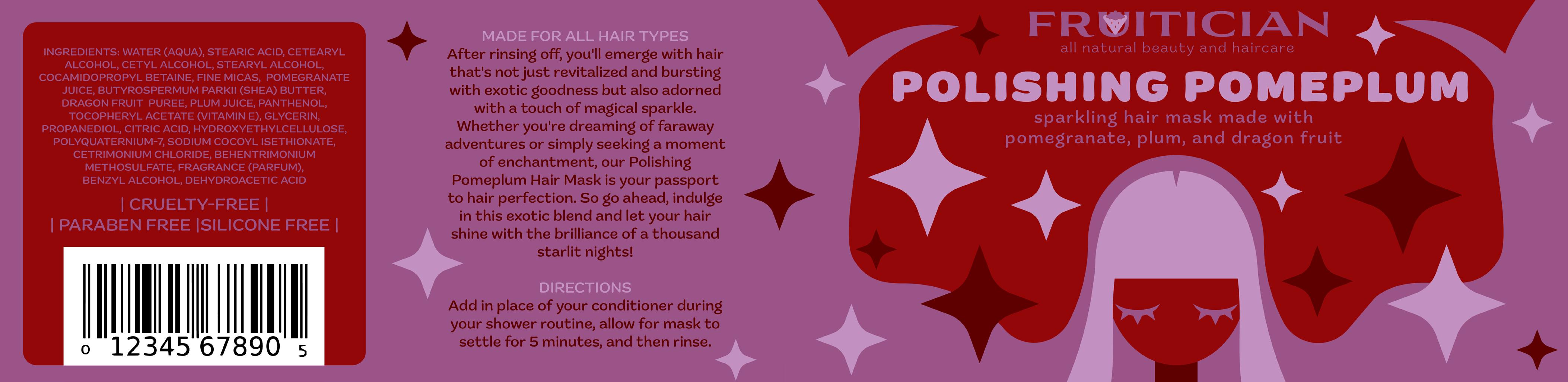
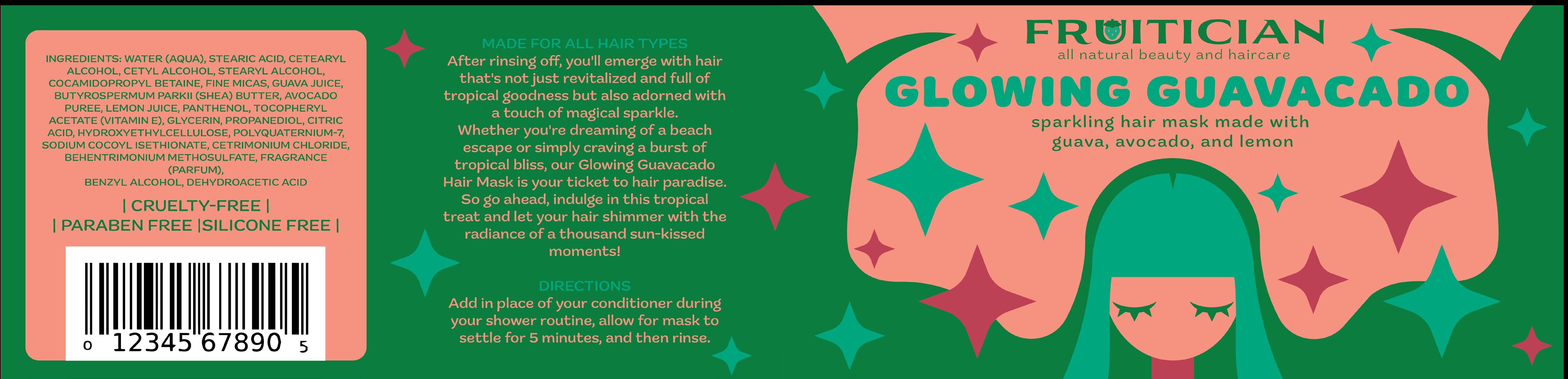
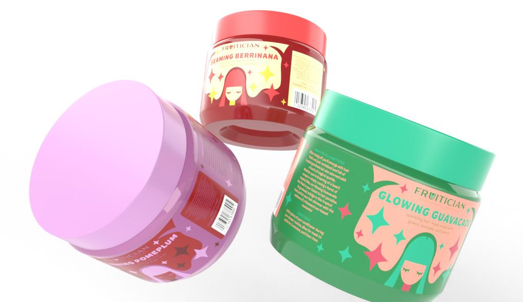
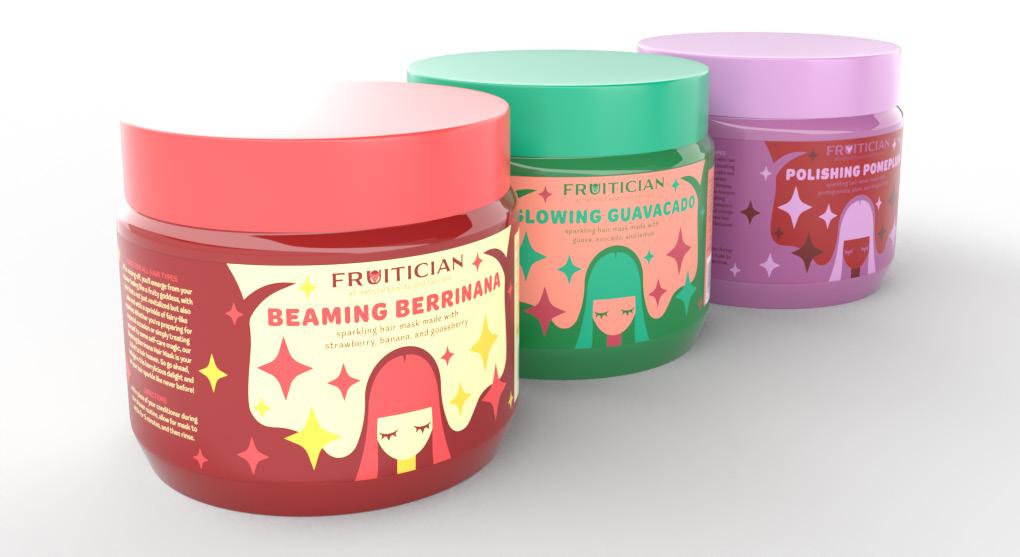
Fruitician’s hair mask packaging is a harmonious blend of efficacy and allure, embodying the brand’s commitment to healthy, dazzling hair. The packaging design is a visual celebration of nature’s bounty, with each variant Beaming Berrinana, Glowing Guavacado, and Polishing Pomeplum represented by vibrant colors that mirror the fruits infused in the masks. The labels feature captivating illustrations of women with long, flowing hair surrounded by delicate sparkles, evoking the transformative and luminous qualities of the product. This imagery not only enhances the visual appeal but also conveys the promise of healthy, radiant hair that Fruitician’s masks deliver.
The packaging’s thoughtful design extends to the user experience, with clear labeling and product information ensuring customers can easily identify and select their preferred scent. The incorporation of tiny sparkles on the labels further enhances the product’s allure, hinting at the subtle shimmer the hair masks impart to the user’s hair. Fruitician’s hair mask packaging not only entices customers with its eye-catching aesthetics but also conveys a sense of luxury and efficacy, making it a standout choice for those seeking a hair care experience that combines nourishment, glamour, and natural goodness.
FRUITICIAN | PACKAGING DESIGN
LOGOS
PACKAGING LABELS
 FRUITICIAN | PACKAGING DESIGN
PACKAGING LABELS
FRUITICIAN | PACKAGING DESIGN
MOCKUPS PACKAGING ANIMATION

SCAN ME TO VIEW FRUITICIAN ANIMATION
FRUITICIAN | PACKAGING DESIGN
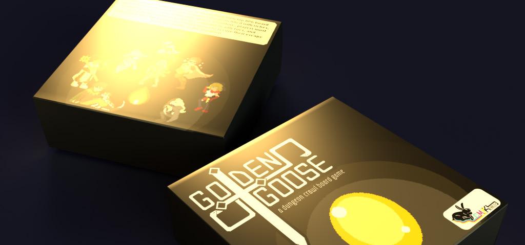
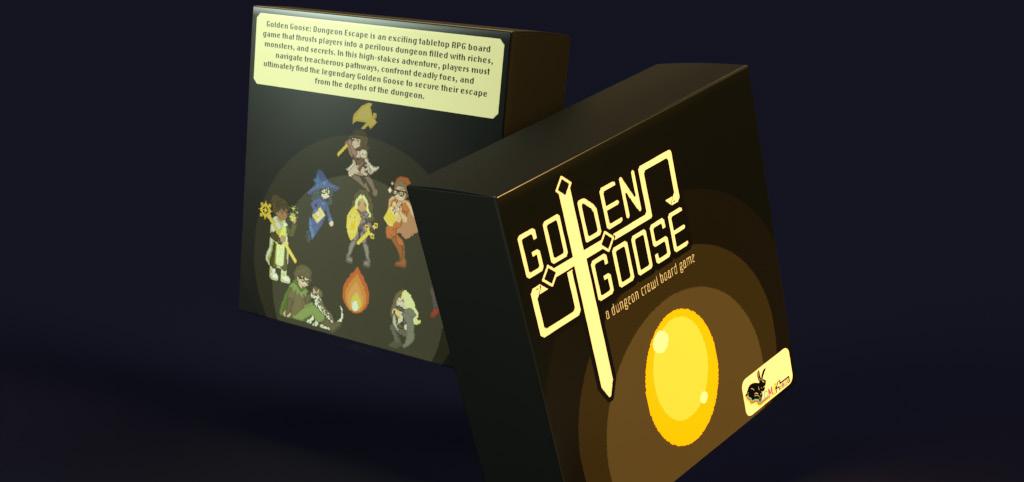
GOLDEN GOOSE | BOARD GAME DESIGN
DESIGN OBJECTIVE
Develop a project that fills a gap in the portfolio by creating a design that is unique to all other projects in the portfolio.
DESIGN BRIEF
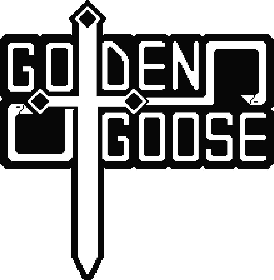
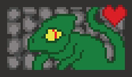
Golden Goose takes the tabletop gaming experience to new heights, blending the excitement of dungeon crawling with the simplicity that both newcomers and seasoned fantasy enthusiasts can appreciate. As a role-playing board game, Golden Goose immerses players in a captivating world filled with monsters, treasures, and the ultimate quest for the prized Golden Goose. The game strategically combines elements of monster fighting and treasure hunting, creating an engaging narrative where players navigate through various dungeon rooms, facing challenges and making critical decisions to amass wealth. The primary objective is clear - collect as much treasure as possible while avoiding the perils of the dungeon’s inhabitants.
As the most treasured artifact in the game, capturing the Golden Goose and successfully escaping the dungeon is the key to an overwhelming victory. This unique twist adds an extra layer of excitement and strategy to the gameplay, making every move and decision crucial. The pixel art style of Golden Goose lends a nostalgic touch, reminiscent of retro adventure video games with a top-down perspective. This aesthetic not only enhances the game’s visual appeal, but also invites players to embark on a nostalgic journey while creating their own stories within the fantastical realm of Golden Goose.
GOLDEN GOOSE | BOARD GAME DESIGN
LOGOS TYPOGRAPHY


ADSO | Ultra Light
A B C D E F G H I J K L M N O P Q R S
T U V W X Y Z
a b c d e f g h i j k l m n o p q r s t u v w x y z
ADSO | Regular
A B C D E F G H I J K L M N O P Q R S
T U V W X Y Z
a b c d e f g h i j k l m n o p q r s t u v w x y z
GOLDEN GOOSE | BOARD GAME DESIGN
COLOR PALETTE MOCKUPS
C: 0 M: 0 Y: 0
0
2
7
68
0
0
20 Y: 99
0
100
100
100
100
GOLDEN
GOOSE | BOARD GAME DESIGN
C:
M:
Y:
K:
K:
M:
Y:
K:
K:
C:
M:
C:
MONSTER CARDS PLAYER PIECES
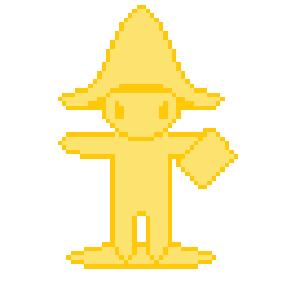
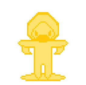
Gold
Grubber
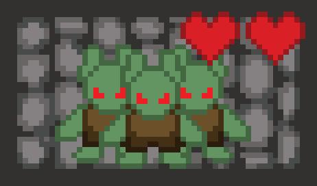
Goblin Gang
Skele-King
GOLDEN GOOSE | BOARD GAME DESIGN
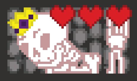
BODY ART BEAUTIES | ICON POSTER
DESIGN OBJECTIVE
Create an informational poster based on the broad topic of tattoos that includes an icon set.
DESIGN BRIEF
The Body Art Beauties icon poster is a visual celebration of female tattoo artists, capturing the essence of their talent and creativity. The poster features two distinct icon sets: one showcasing the diverse faces of tattoo artists, highlighting their unique styles and personalities, and the other depicting the tools used in the art of tattooing. The color palette of dark blues evokes the richness of diluted ink, adding depth and sophistication to the design. Complementing this palette are ink splotches scattered throughout the background, creating an immersive and authentic tattoo studio ambiance.
Central to the poster’s design is a wire element that serves as both a visual motif and a functional element, guiding the viewer’s gaze across the composition. This wire symbolically connects the tattoo machine and foot pedal, representing the artist’s skillful control and precision in their craft. The Body Art Beauties poster not only pays homage to female tattoo artists but also invites viewers to appreciate the artistry and dedication involved in the world of body art. Through its thoughtful iconography, color scheme, and composition, the poster serves as a captivating tribute to the beauty and creativity found in the realm of tattooing.
BODY ART BEAUTIES | ICON POSTER
ICONS BODY ART BEAUTIES | ICON POSTER
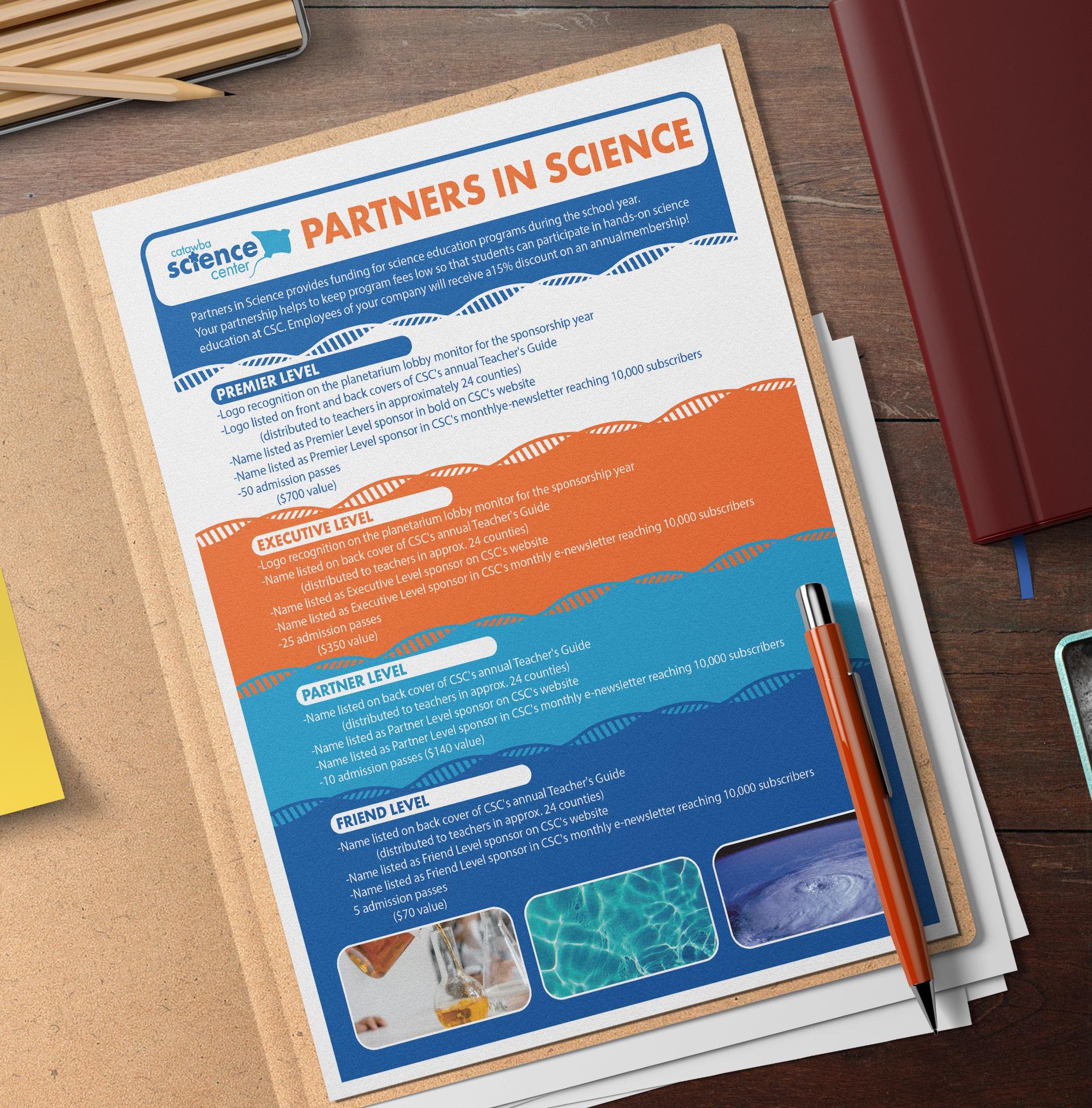
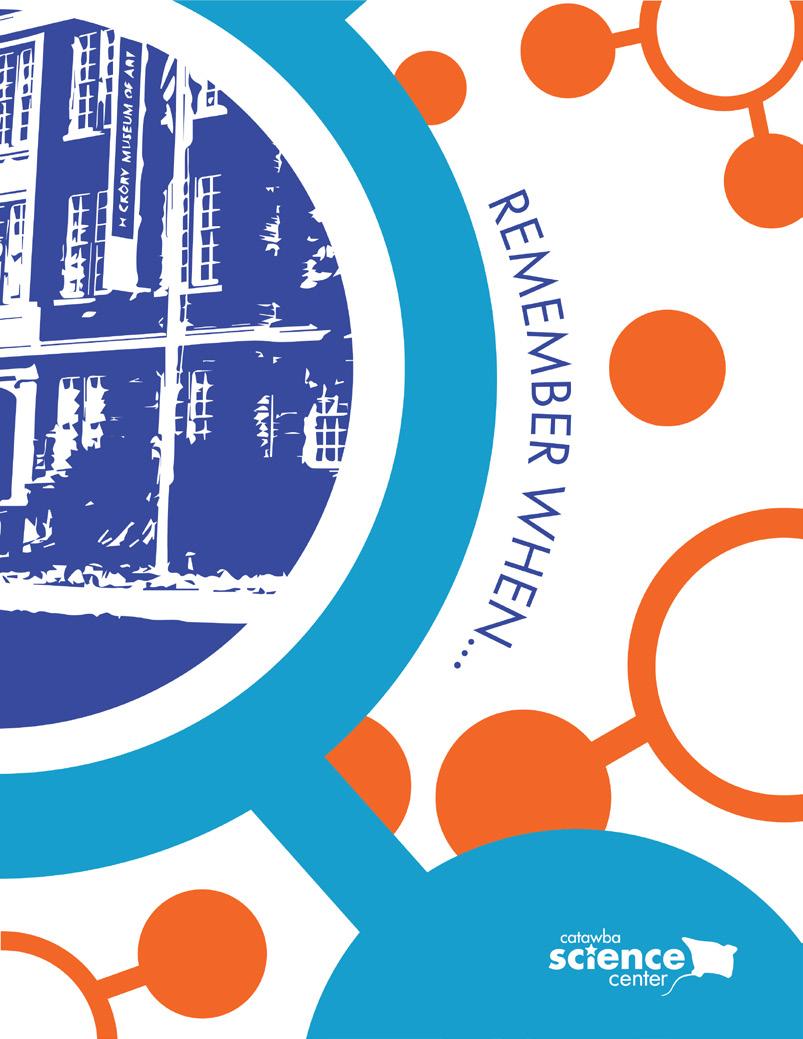
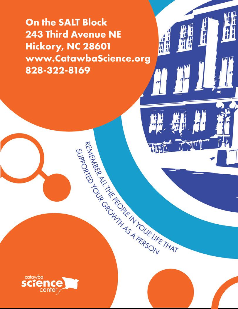
CATAWBA SCIENCE CENTER | AGENCY
DESIGN OBJECTIVE
Redesign the Catawba Valley Science Center booklet, sponsor sheets, and the admission card in collaboration with the Elemental Creative agency.
DESIGN BRIEF
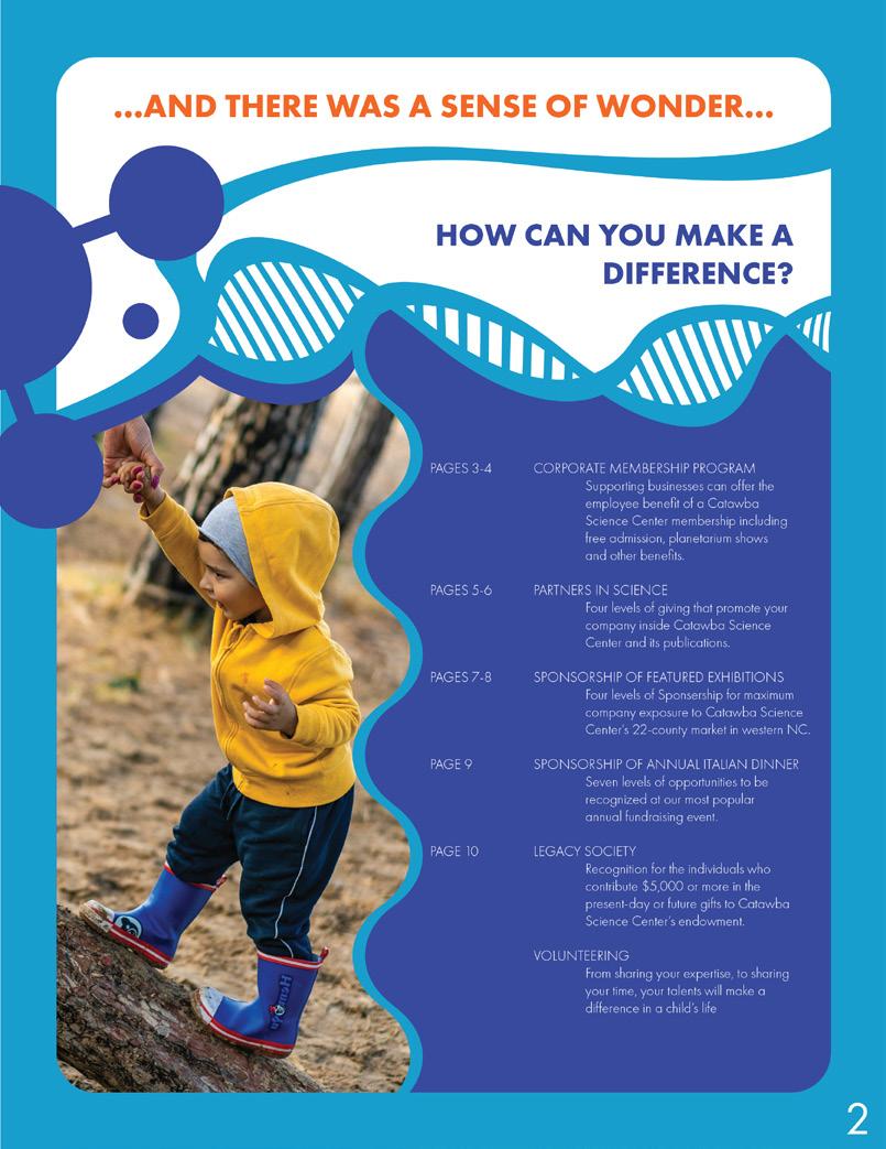
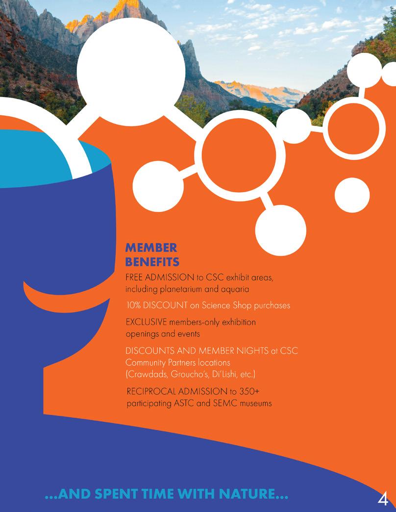
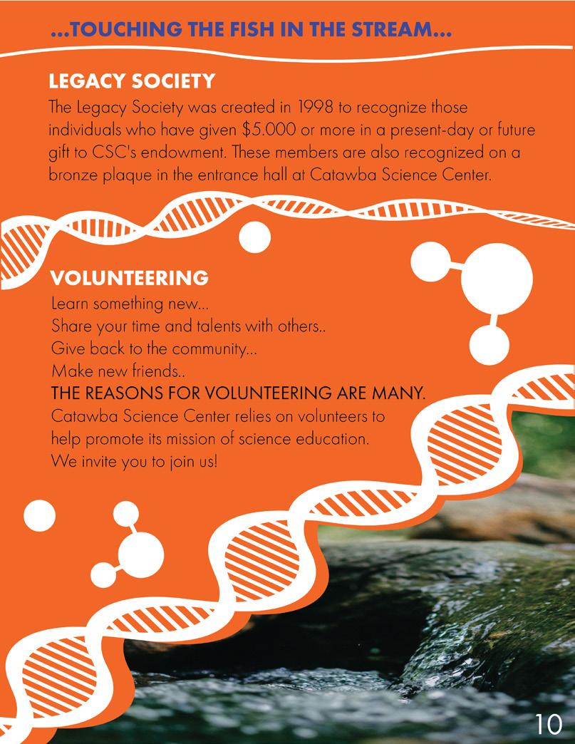
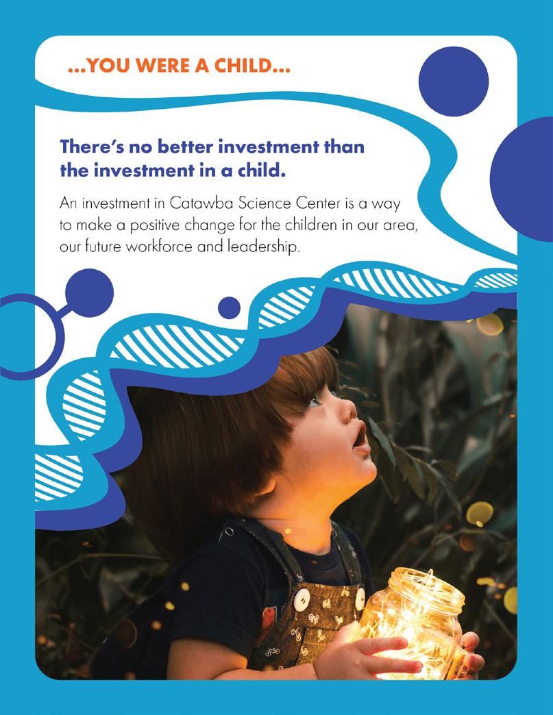
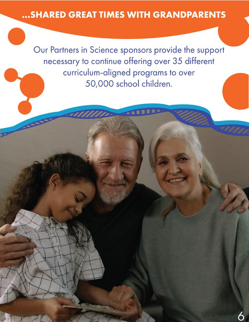
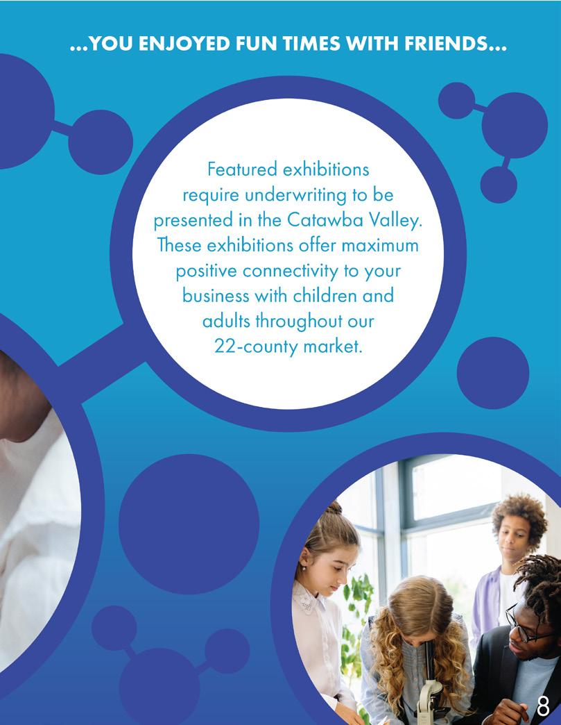
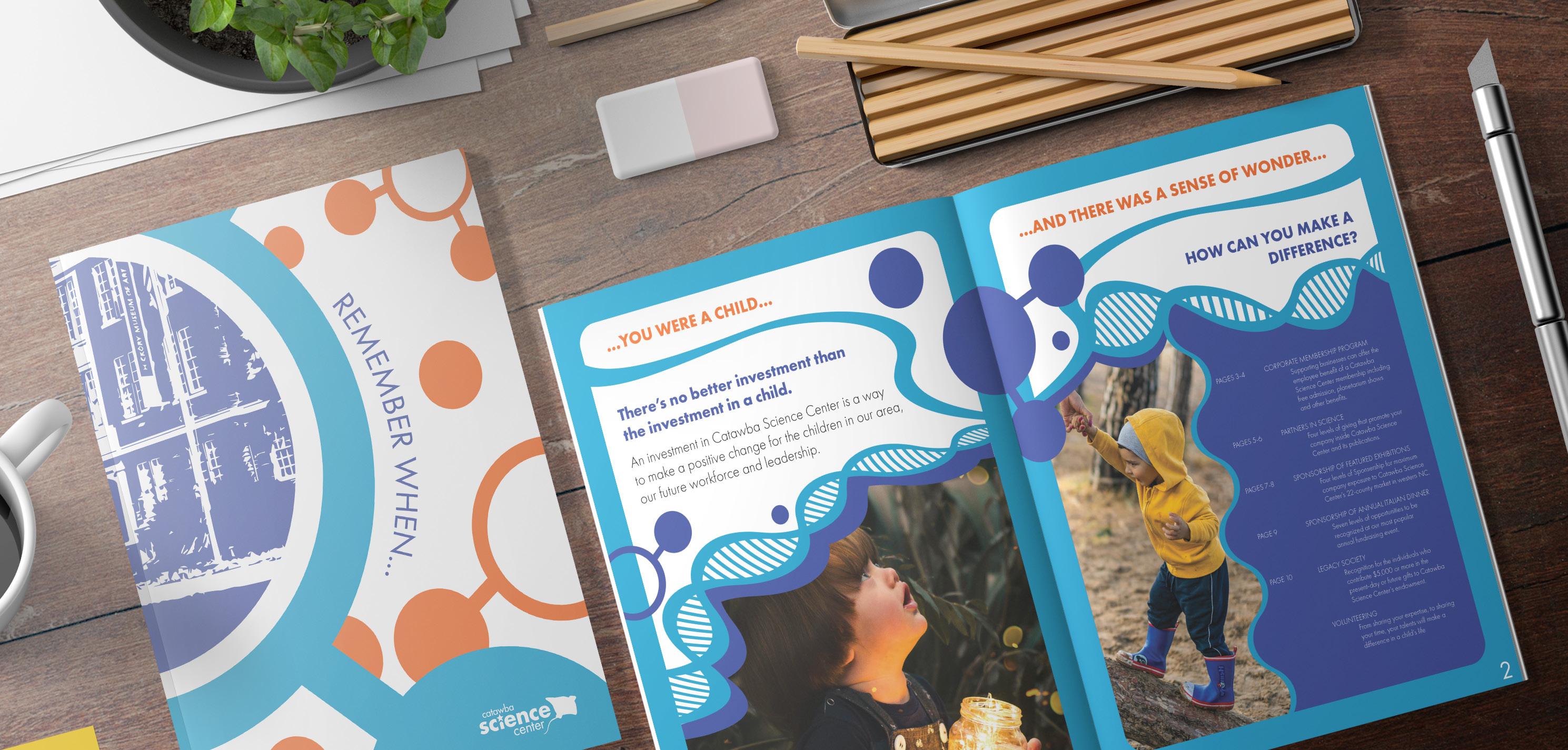
The redesign for Catawba Valley Science Center’s booklet, sponsor sheets, and admission card aims to capture the essence of the center’s vibrant and engaging atmosphere. With a focus on fostering children’s curiosity and love for science, the new designs infuse a playful and exciting feel using the center’s signature colors of bright orange, light blue, and dark blue. These colors not only create a cohesive visual identity across all materials, but also evoke a sense of energy and enthusiasm, perfectly aligning with the Science Center’s mission. The main icons featured in the redesigns, including a DNA strand and a water molecule, serve as visual representations of scientific exploration and discovery, further reinforcing the center’s educational objectives.
The redesigned booklet, sponsor sheets, and admission card for Catawba Valley Science Center are designed to be visually captivating and engaging, enticing visitors to delve into the world of science with curiosity and excitement. The use of dynamic layouts, playful typography, and bold graphics brings the center’s educational offerings to life, making learning a fun and immersive experience for both children and adults alike. This redesign not only reflects the Science Center’s commitment to inspiring young minds but also creates a cohesive and visually appealing brand presence that resonates with visitors seeking a memorable and enriching scientific journey.
CATAWBA SCIENCE CENTER | AGENCY
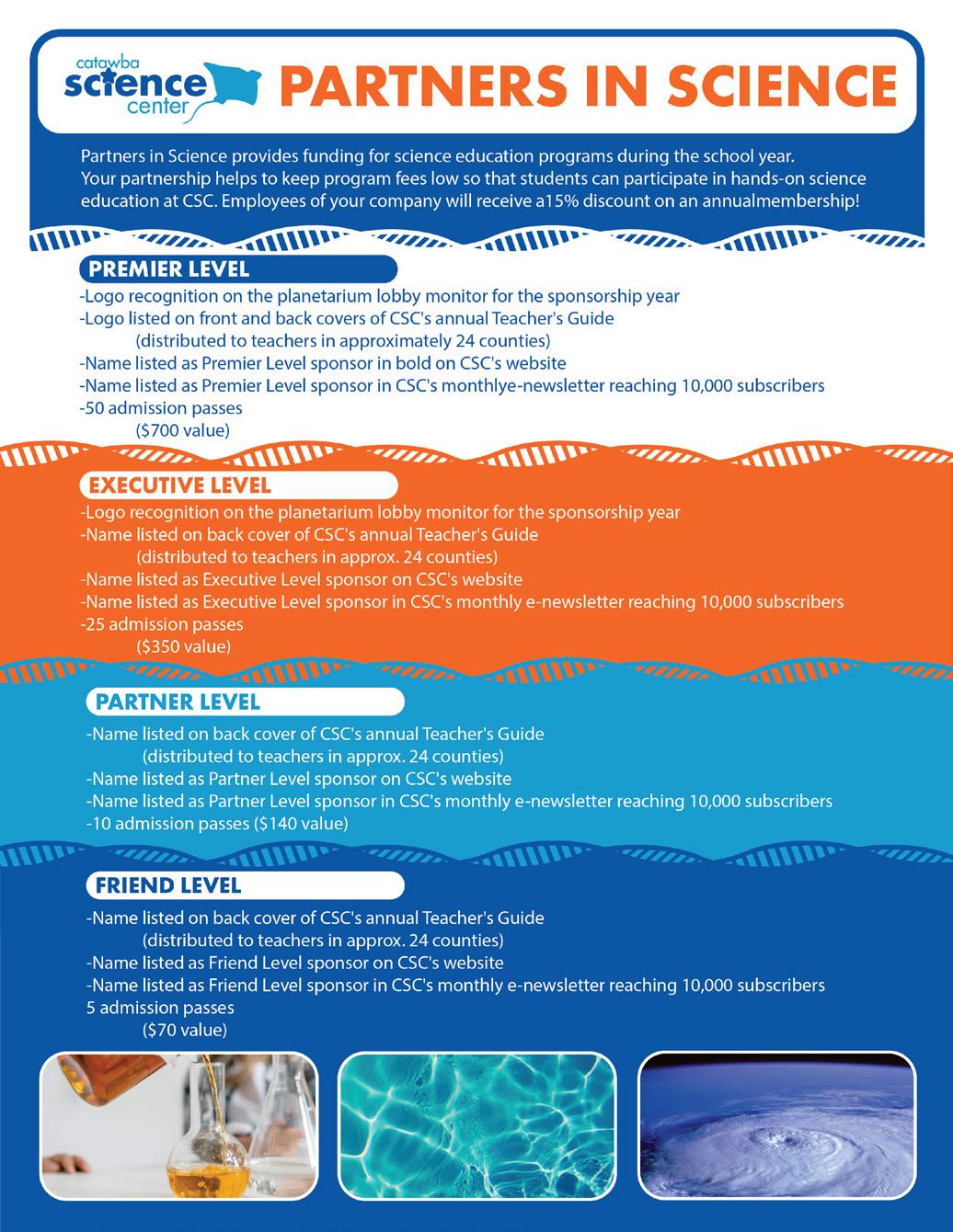
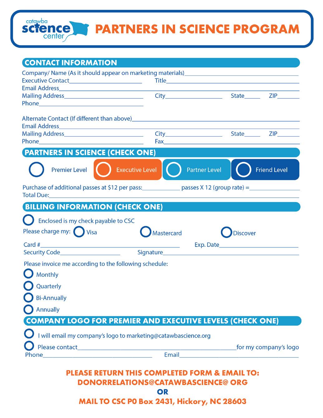
SPONSER PAPERWORK
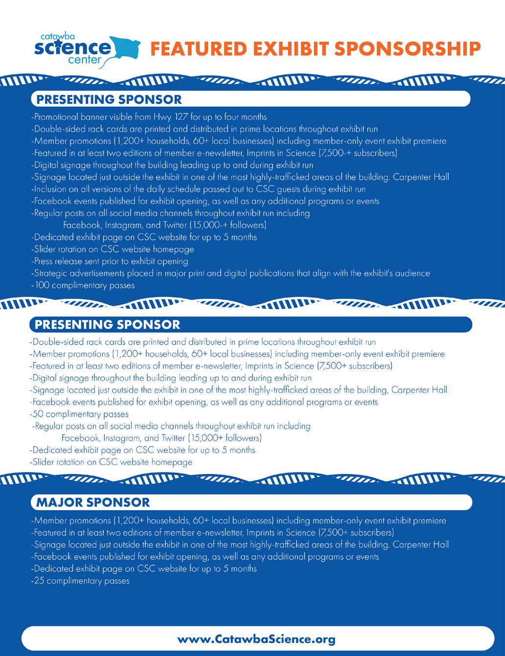
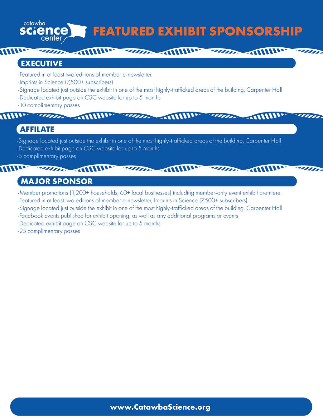
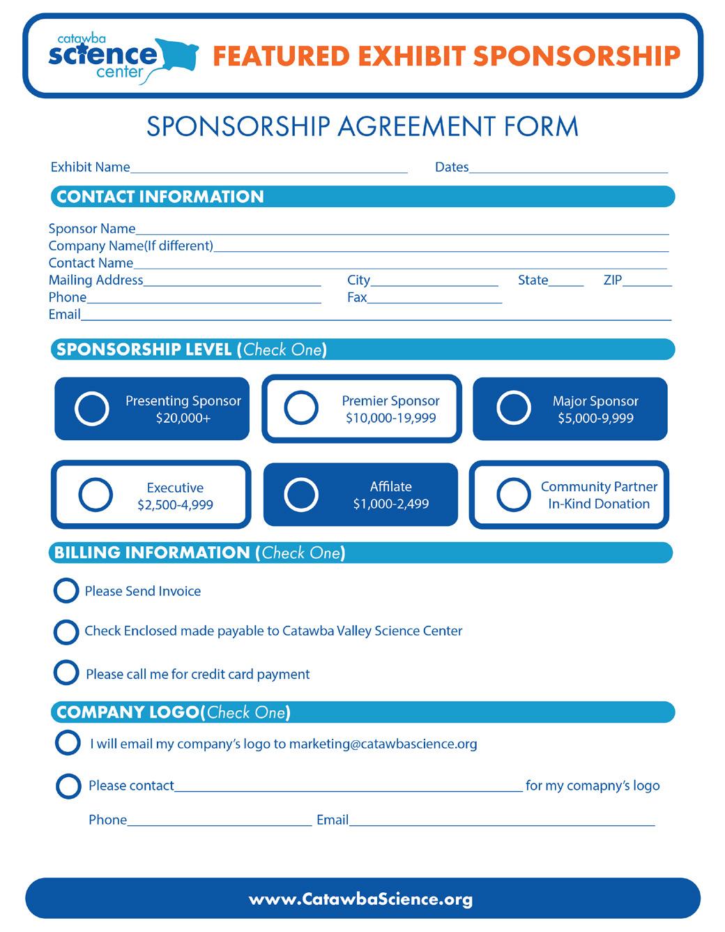
CATAWBA SCIENCE CENTER | AGENCY
BOOKLET REDESIGN
CATAWBA SCIENCE CENTER | AGENCY
ADMISSION
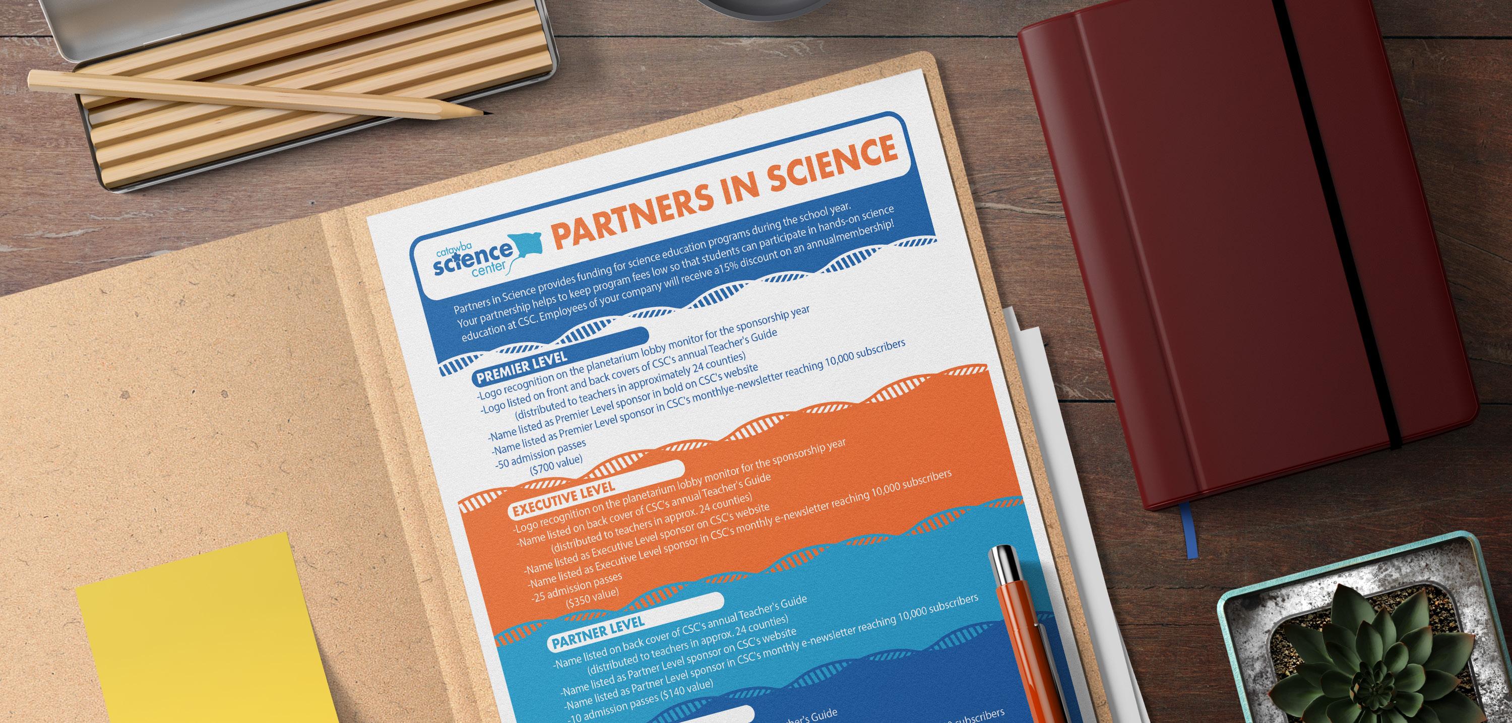
PARTNERS IN SCIENCE
One FREE General Admission
Youth or Adult May Not Be Used in Group Admission
Expires:
SCAN ME TO SEE BOOKLET AND SPONSER SHEETS
CATAWBA SCIENCE CENTER | AGENCY
ON
CARD BASED
REDESIGNS BY BENJAMIN CAMPBELL
MOCKUPS
GIZMO’S| T-SHIRT DESIGN
DESIGN OBJECTIVE
Create a two color t-shirt design based on a choosen theme or style.
DESIGN BRIEF
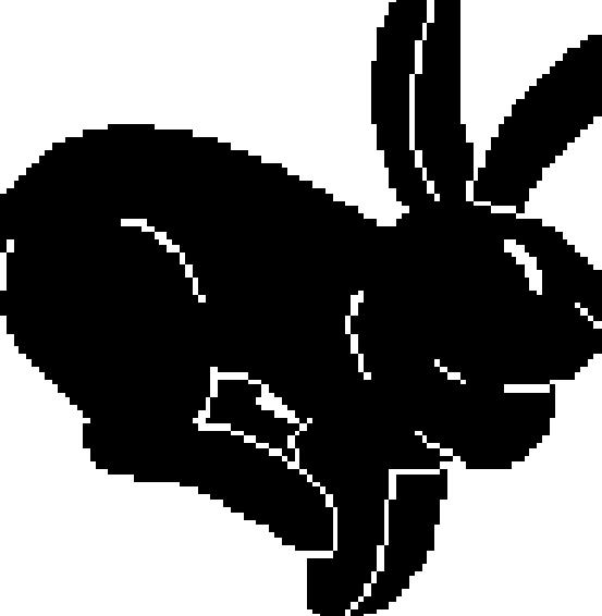
The Gizmo’s Gardening and Lawn Care t-shirt design delves into the realms of analog horror and mascot horror, creating a uniquely unsettling and captivating visual experience. The front of the shirt features the friendly and inviting rabbit mascot of Gizmo’s Gardening, embodying the charm and innocence of traditional mascot designs. In stark contrast, the back of the shirt unveils a terrifying version of the rabbit mascot, infused with elements of horror that evoke a sense of unease and intrigue.
The use of a limited color palette, consisting of white and magenta for the printed design on a black shirt, enhances the contrast and intensifies the eerie ambiance, drawing viewers into the unsettling world of mascot horror.
The juxtaposition of the friendly mascot and its sinister counterpart on the t-shirt encapsulates the essence of analog horror, where familiar and comforting elements are twisted into something unsettling and unnerving. The incorporation of the Gizmo’s Gardening branding on the sleeve adds a touch of authenticity and cohesion to the design, grounding it within the context of the fictional company. Overall, the Gizmo’s Gardening and Lawn Care t-shirt design aims to intrigue and captivate viewers with its blend of innocence and horror, creating a wearable piece of art that embodies the unsettling nature of mascot horror in an analog horror inspired aesthetic.
GIZMO’S | T-SHIRT DESIGN
PRINTING PROCESS
ANIMATION
SCAN ME TO SEE ANIMATION

GIZMO’S | T-SHIRT DESIGN