Bramblefield Designs
Iconographic Poster
Design Objectives
My iconographic poster aims to evoke a sense of mystery, enchantment, and intrigue. The imagery should be imbued with an otherworldly quality, featuring elements such as ritual items, flickering candlelight, and crystals carved with delicate hands. The color palette will be rich and atmospheric, with deep hues of midnight blue, velvety purples, and smoky grays, accented by flashes of ethereal green. The typography will be bold yet elegant, reminiscent of ancient scripts and esoteric manuscripts, adding to the sense of mystique and allure.
Design Brief
For the first step, I researched images and symbols that were reminiscent of the aesthetic I wanted to go for with the poster. After finding a good collection of inspiration images, I came up with a simple color paletTE to use with both the icons and background of the poster. Then I began sketching out the base sketches for the icons. After the sketches were complete, I took a good quality image of the sketches and opened it in illustrator. Building on top of the sketch, I went through and completely digitized the icons, beginning first with the line art. With the line art complete, I began adding the flat colors, then moving onto shading. When the icons were complete, I then went about placing them in their positions on the poster. With the icons in their proper places, I went about adding in the colored background of the poster. The final touches were the typography and added color effects to enhance the colors and contrast of the poster.

Primary and Secondary Icons
strangemagic
Oh , what a
Vending Machine
Design Objectives
The design objectives for our adorable themed candy vending machine, inspired by pink clouds and soft ribbons, prioritize creating a whimsical and enchanting experience for users of all ages. Firstly, the vending machine should exude a sense of charm and playfulness through its design elements, with a predominant color scheme of pastel pinks and whites reminiscent of fluffy clouds and delicate skies. the design aims to evoke feelings of joy and nostalgia while offering a unique candy-dispensing experience that leaves a lasting impression on users.
Design Brief
I started designing the vending machine wrap and brand design by researching vending machines with similar purposes. After gathering a list of similar machines, I then began looking up brands with a similar aesthetic to my brand’s desired aesthetic. With both reference materials in mind, I began sketching the brand’s logo. When the brands logo sketch was signed off, I then moved on to digitizing the logo, starting with the linework, then the flat colors, and then finally the shading. I then added typography to the logo. After the logo was complete, I then moved onto sketching concepts of the machines wrap. With the wrap concept approved, I then went on to creating each face of the machine in illustrator.


SugarSilk SugarSilk SugarSilk
A B C D E F G H
I J K L M N O P Q
R S T U V W X Y Z
SugarSilk SugarSilk
LadyApple
Gum
Drops Fleur
Subscription Box
Design Objectives
Preserved aims to deliver a captivating and educational experience to our subscribers while ensuring the preservation and presentation of insect specimens at the highest standards. the packaging should be durable yet eco-friendly, reflecting our commitment to sustainability. We prioritize the safety and preservation of the specimens, so the design should include secure compartments and materials that maintain optimal conditions for the insects. Additionally, we aim to provide informative materials such as pamphlets or cards detailing each insect’s species, habitat, and ecological significance, enhancing the educational value of the box. Ultimately, our design endeavors to spark curiosity, appreciation, and a deeper understanding of the insect world among our subscribers.
Design Brief
For the logo of Preserved, I drew inspiration from stained glass windows and wrought iron filigrees. The colors for the logos were chosen to help better reflect the stained-glass theme. The butterfly motif is composed of multiple translucent segments, mimicking the appearance of real stained glass. The gold accents and lines incorporate subtle yet striking details into the design to enhance its luxurious and premium feel, as well as adding depth and elegance to the overall composition. The box of the subscription box is a solid lacquer wood box to further add to the lux aesthetic of the brand.

PreserveD
Entomology and Other Curiosities

Alegreya Sans SC Thin Italic
A B C D E F G H I J
K L M N O P Q R
S TU V W X Y Z
Drive-In Theater Poster
Design Objectives
The drive-in movie theater poster for the Blood Moon horror event aims to evoke an atmosphere of eerie enchantment while enticing audiences to experience a night of cinematic delight. Firstly, the poster should capture the essence of gothic aesthetics. The color palette should evoke a sense of darkness and suspense.Also, the poster should include relevant event details such as date, time, movie title, and venue information. Ultimately, the design should captivate the audience’s imagination, enticing them to embark on a thrilling cinematic journey into the heart of gothic storytelling under the stars.
Design Brief
For the Blood Moon poster design, I drew inspiration from classic horror movie hand-illustrated posters. I researched the details and themes used in these posters and assembled a reference board of some of my personal favorites of these. My posters composition, font, and colors were inspired by these classical posters. Once I had my inspiration images compiled, I began sketching out thumbnails for the poster. With the thumbnail approved, I went on to properly illustrating the poster digitally using the program ClipStudioPaint. With the illustration portion of the poster complete, I exported the illustration and placed it within an appropriately sized InDesign document. From this point I went about adding the typography of the poster, arranging it and sizing it as needed . For the logo, I was inspired by 50’s and 60’s neon signs, and wanted to create a logo that was reminiscent of these signs, as well as had a unique magical look that was all its own.

Moon Rock
Moon Rock Blood Moon
Crimson Peak
Horror Night
A B C D E F G H I J
K L M N O P Q R S T U
V W X Y Z
666Edithville Lane Denver, NC 28037
Interview wth the Vampire Sleepy Hollow 3pm-3am
Great Vibes
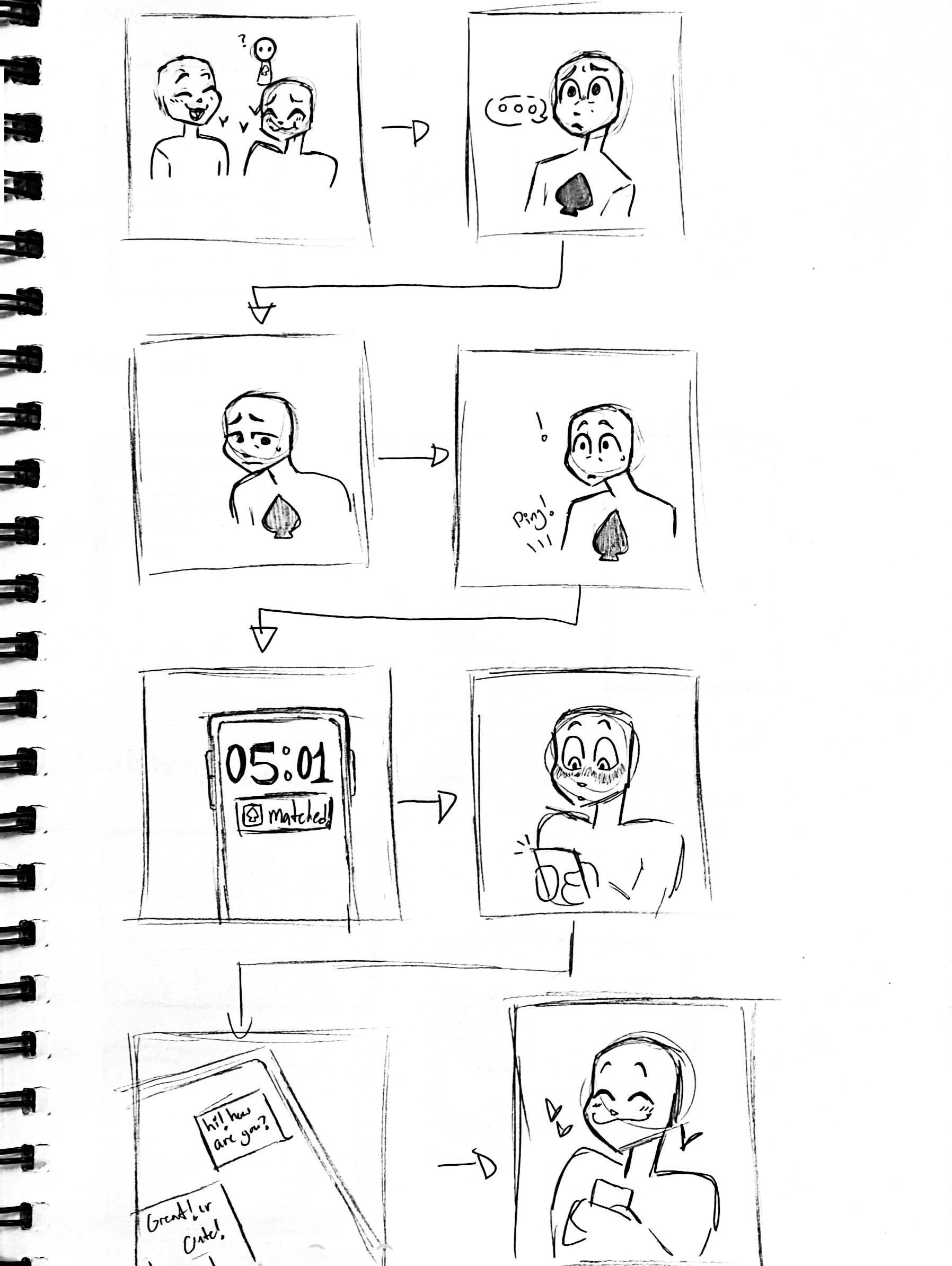
App Design
App Design Objectives
Incorporating the colors of the asexual flag—black, gray, white, and purple—as primary hues throughout the app’s design will serve to visually represent and honor the diverse experiences within the asexual community. The logo design should embody the app’s mission of fostering meaningful connections and inclusivity, utilizing simple yet impactful imagery or typography that resonates with asexual individuals. The logo should be versatile and scalable, easily recognizable across various digital platforms and promotional materials.
App Design Brief
For designing the app, I started by looking into the branding and logo designs of similar apps and websites. Using this information, I moved onto designing several different logo concepts for approval and critique. After two of the designs were approved, I moved on to recreating the logos digitally. With the logos complete with both colors and typography, I then began conceptualizing the app’s general layout and needed icons. A rough wireframe was built in Adobe XD with the required screens and options, and the final product was built on top of this wireframe.


Spades Social Spades Social Sirenia Regular
Aa Bb Cc Dd Ee Ff Gg Hh Ii Jj Kk Ll Mm Nn Oo Pp Qq Rr Ss Tt Uu Vv Ww Xx Yy Zz

Looking for someone who is understanding of her needs, who listens and wants to experience new things with her. She has been in the closet for several years, but has recently decided to be public and proud with herself and her sexuality.

Looking for someone who likes piña coladas and getting caught in the rain. Isnt very partial to caves. Very recently discovered his sexuality, and is curious to meet others of the same identity.

Hoping to find someone who loves art, cooking, and compueter design. Very open and proud about their sexuality, but is unsure of where to look for companionship that fits his needs.
Casandra Cole Sher/Her
Lewis Trader He/Him
Tera Doe He/Him/They/Them


App Booklet Spade Social App
Sports Icon Design
Design Objectives
For the Hermes icon, I want to have it be clean and simple, with a limited color palette of just black and white. I want the line work to be where most of the details in the piece are, and I want the laurel in the background to be a good source of continuation for the piece.
Design Brief
I started by drawing several planned thumbnails for the icon. Once my icon was approved I went on to sketching and inking the final concept. With the paper concept done, I moved on to drawing over the paper sketch in illustrator.


P22 Aragon
Aa Bb Cc Dd Ee Ff Gg Hh Ii Jj
Kk Ll Mm Nn Oo Pp Qq Rr Ss
Tt Uu Vv Ww Xx Yy Zz
Sports Branding
Sports Branding Design Objectives
I want my sports team’s logo to embody the mysterious and spooky vibes of Louisiana, and I want the color palette to carry this theme as well. I want the font used with the logo to match the vibe and aesthetics of the brand, and I want the colors used to have at least some historical connections to the state.
Sports Branding Design Brief
I began the project by coming up with a list of names for a potential baseball team from Baton Rouge, Louisiana. I researched the city, and came up with a list often names. When the name “Baton Rouge BloodBats” was chosen as the final name, I went on to sketching several different logo thumbnails. The bat theme was the ultimate final choice, and with approval I went on to illustrating the logo in Adobe Illustrator. With the line art done, I went and found a color palette that matched the theme and vibe I was trying to go for. After applying the color palette, I found the two fonts I was going to use and applied them to the logo.

BlOoD SuCkErS
Rouge Baton Rouge BlOoD SuCkErS

Mr Darcy Bold
A B C D E F G H I J K L M N O P Q R S T U V W X Y Z


P Q r S T u V W X Y Z
 Baton
Baton
True Gore A
E F G H I J
L
O
B C D
K
M N
Album Illustration
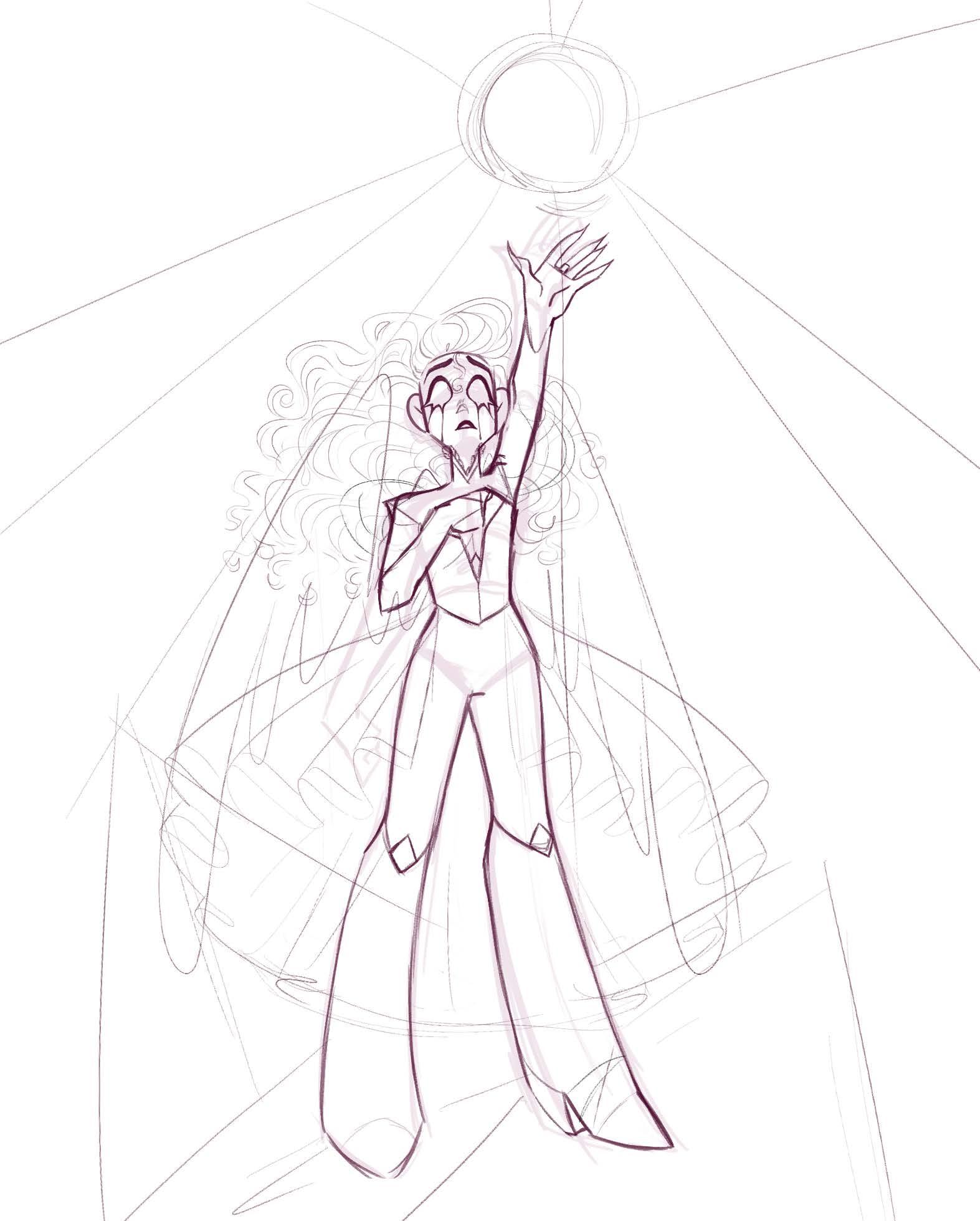
Album Illustration Design Objectives
For the Venus album cover, I want the album cover to have a gentle watercolor look to it, while the illustration itself has visible brushstrokes and fine details. I want the illustration to have ahigh fantasy aesthetic, and to utilize soft colors as apposed to harsher colors. I want the line art to be clean and I want the typography to be clean and well put together as well.
Album Illustration Design Brief
I began the album cover by making a mood board of images to draw inspiration from. With the mood board complete, I drew a base sketch with a rough concept for how I wanted the figures pose to look. With the base sketch done, I then moved onto creating a cleaner, more detailed sketch which added clothing and hair details. With both sketches completed, I then moved onto line art, and then flat colors. After the flat colors, I began rendering each of the details of the illustration, from the sky to her hair. After applying some minor color details and adding a soft golden color to the line art, I exported the illustration as a high quality .jpg and opened it in Adobe In design to place the typography.


Airline
Airline Design Objectives
I want my airline to reflect a high class, luxurious air with regal details and lovely colors. I want the logo to look professional and high quality, with a color palette to mach. The design of the plane should reflect this as well, along with the product packaging.
Airline Design Brief
To begin my airline design, I researched several different high-class airlines, including their branding and airplane designs. With my compiled list of inspiration images, I began sketching the logomark of the brand. With the logomark approved, I then moved onto looking into font and sketching out the font next to the deiceded upon logomark. With both the logomark thumbnail and typography approved, I then began to digitize the logo in Adobe Illustrator. I colored the logo with a limited but refined color palette, and designed the wrap of the plane and the packaging to match.


A rgent
 Enola Briara 45 Actress
She is cold, curated, and well put together. She is motivated by power and beauty. Good for her. She hates kitten heel pumps and sticky seats. She prefers to travel in luxury with as much free space and leg room as possible. She is well known for often throwing a fit on airlines when her needs are not met as quickly as she would prefer them to be. She once asked an air host to fire themselves when she noticed that the milk tea she ordered had milk in it.
Gordon Ellis 25 Investor
He is the son of an Apple investor and a Microsoft investor. He travels the United States looking for new startups for his parents to invest in. Works as a scout for his philanthropist parents. His goals are to bring in as much business as he can for his parents and to make a good impression on each person he meets. He wants to be a good representation of his family and parents, and he goes to great lengths to make sure that appearance and personality is a good reflection of his family.
P22 Aragon
Aa Bb Cc Dd Ee Ff Gg Hh Ii Jj
Kk Ll Mm Nn Oo Pp Qq Rr Ss
Tt Uu Vv Ww Xx Yy Zz Barteldes Small
Aa Bb Cc Dd Ee Ff Gg Hh Ii Jj
Kk Ll Mm Nn Oo Pp Qq Rr Ss
Tt Uu Vv Ww Xx Yy Zz
 Gabriel Ghest 27 Ambassador
He travels frequently for his work and prefers to travel via airline for convenience. He enjoys the luxuries that come with high class travel and appreciates the amenities provided by airlines. He buys from luxury brands and is usually seen wearing designer clothing. He does his best to be as polite with hair hosts as he can be, and usually leaves a good impression on the people he travels with. He used to have a fear of air travel, bit after years and years of having to do so for work, he no longer really cares about that fear anymore.

Packaging Series: Aura Drops Perfume
Design Objectives
For my perfume packaging, I want the packaging to look real andreminiscent of high-quality designer perfume bottles and designs. I want the colors of each bottle to corelate well together, and I want each bottle to convincingly look as if they were part of a matched set. I want the logo to look casual, but also high quality.
Design Brief
I researched inspirational perfume brands and their bottle designs, as well as their various different advertisements. With a lengthy list of inspirational brands and bottles, I went about searching for the perfect mock up bottle design to work as base for the bottles. With the bottle mockup in mind, I sketch and digitizing the perfume brands logo and typography. With the logo in mind, I opened the bottle models in Adobe Dimension and laid them out in the order I wanted. I added a different colored glass texture to each bottle, took a high quality screen shot, and opened three images in illustrator. Within illustrator, In began adding additional details to the bottles, such as the gold filigree, the gem-top details, shading, and lighting effects.

Alegreya Sans SC Regular
A B C D E F G H I J K L M N
O P Q R S T U V W X Y Z


