

CURRICULUM VITAE
DUSICA MITROVIC
Interior Architect
SKILLS
Rendering with Copic Markers
Microso Programmes
Adobe Photoshop
Adobe Indesign
REVIT
AutoCAD

3DsMax
VRay
EDUCATION
High School- The English Academy, Kuwait
Grade 7-11
Exchange Year- Archer High School, America
Grade 12
CONTACT
Dusica Mitrovic

Marbella- Spain
dusicamitrovic2003@gmail.com
Instagram: dm.interiorss
HOBBIES
A er living and visi ng many countries I truly see myself as a young woman who is open to change and new ideas. have always loved the more crea ve side in life and the pursuit of happiness therefore I saw myself in interior architecture in hopes of crea ng that spark in people when they enter. I hope to be able to incorporate my musical passion as well.
SOFT SKILLS
Good me management
Very organised
Highly mo vated
Quickly adap ve Op mis c

LANGUAGES
Opera Singing- ABRSM
Piano- ABRSM diploma
Volleyball
Travelling
WORK EXPERIENCE
SAYAGO Arquitectos- 3 months 2022
Serbian English
Arabic
Spanish
1 35 7 R E T A I L A R T C E N T E R T I N Y H O U S E B I O M I M I C R Y
2 4 6 8 T H E P E N D U L U M C O W O R K I N G A P A R T M E N T V I L L A
RETAIL STORE


 Stella McCartney
Date: July 2021
Loca on: London
Our task for this module was to design a extravagant virtual retail space for a luxurious brand of our choice by researching the business’s message, style and history. Through establishing and implemen ng a conceptual stance This store should create a centre stage for our brand’s products and we are expected to carefully set inten ons for our design and represent the brand well. By taking the clients needs in mind, a design that shows the store’s values must be cra ed in order to a ract the target audience. We had to choose a loca on for our store which should be in a pres gous area or street to implement a conceptual stance and respect the tradi on of the chosen site.
01
CONCEPT DEVELOPMENT
For my interior, I wanted to have 1 and a half floors due to the very high ceiling. However, I s ll want to conserve part of the 6 meter ceiling by crea ng a top floor that overlooks half of the bo om floor.


Stella McCartney always guides her clients throughout her store. She does this using a linear concept in which the customers follow a linear path. Within her stores it varies between a linear path with straight lines and with curves. Linear does not mean it has to be a straight line but it means it organises the walking path in a coherent and calculated direc on. By working on my floor plan it was evident that the curves, which all center around the same axis, are what lead the customers to view all of the products on both of the floors.

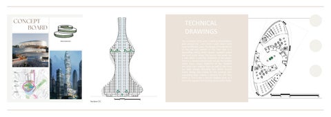
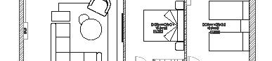
TECHNICAL DRAWINGS

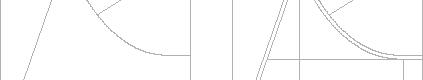
The interiors of the brand’s stores o en have a cavity in the entrance where the most shopped items are displayed and then it splits into seperate rooms with seperate displays. Stella is known for having seperate displays for each of her items. A couple of her stores include stairs if the structure allows it.

The staircase of the store is the main guiding point for the users and all of the curved elements in the floor plan go around the same circle center. The curved walls give an elegant touch yet s ll allow space for storage behind them.


N N 3 3
AA AA BB BB Sec on AA Sec on BB
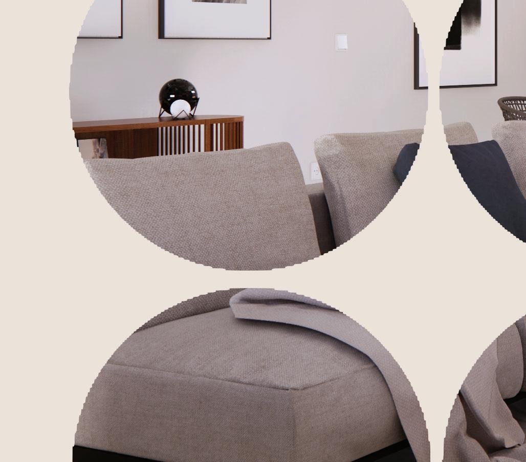
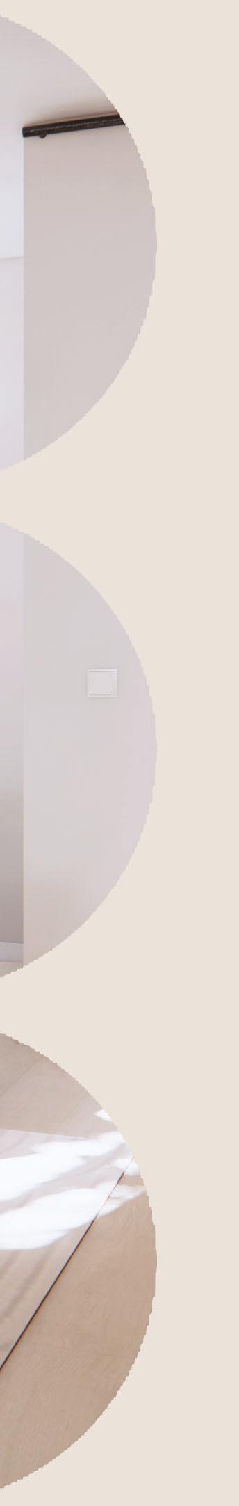
RENDERS
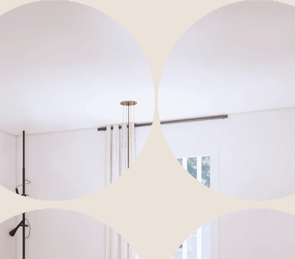
Through my analysis of Stella McCartney’s stores, I gathered materials that would be most true to the brand and also coherent within the same space. I resulted in the warm greys with a nude grey terazzo floor le and touches of some peach pink velvet textures. The velvet texture will go on all of the sea ng areas whereas the marble will go on the bases of the displays in front of them. The reflec on of the light against the warm grey walls will open up the spaces and give it the most elegant touch. The darker warm grey looks distrac ng with the wall panels however the light gives a beau ful light waterfall illusion against it.


ART CENTER
Date: June 2022
Loca on: Marbella
For the final project of second year, the task was to create an exposi on for an art and culture center in the Palacio de Congresos in Marbella.
To create this task we were asked to analyze the region of Andalusia and to develop a flexible interior architecture that focuses on the region’s music, art and cinema. We have to transform the given space and create something innova ve and inspiring for the guests and tourists in the city. This could help boost the tourism in Marbella.
02
CONCEPT DEVELOPMENT
I wanted to have three primary spaces which will take up the vast majority of the space and will be distributed in a ra o to make a radial spa al organiza on. I showed my final process in nine steps on AutoCad where I started off with a circle that I divided into 24 segments and separated into three overall structures with one piece between them and an equal difference in size. I then added some space in the middle where I want to place the cafe and created three circles using the division lines as tangents. I slowly used the line tool to create a structure that intertwines and folds into three separate spaces that flow into one another. Overall it gives an organic floor plan which will have different heights showing in the sec ons and eleva ons.


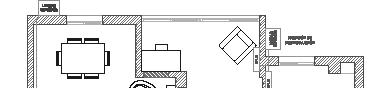
TECHNICAL DRAWINGS


The circula on in my plan is very simple and shows that each space can be accessed from mul ple points. As soon as you enter you can choose which of the three dominant spaces a racts you the most and go there first rather than to be constricted to going to each space in a sequence. There is a chill bar area with res ng seats to relax, take a break, discuss the art and read some Spanish magazines. There is a whole area with workshops and an open concept library with portrait drawing masterclasses and ac vi es in the middle. The flow of the space is seamless and goes around the three main circumferences of the main spaces.

 Section AA
Section BB
Section AA
Section BB
AA CC BB
Section CC
RENDERS


A main spa al organisa on that saw was radial, based around a circle and the axis of the circle. Using this radial composi on the flow in the space is much more interes ng and guides the visitors in a be er way. There were usually three primary spaces inside the centers which were used for different ac vi es. These three spaces would be linked to each other in a way that they are spaces within a space and they guide users from one primary space to another. Around the primary spaces would usually be open areas for visitors to sit, relax, observe and to learn.

THE PENDULUM VERTICAL CITY

Date: May 2023
Loca on: Marbella
For the final project of third year, we were given the brief to design a space for the future which will help relief a problem which could be a threat to the human race in the future. A er extensive research I came to the conclusion that overpopula on will be a big threat to how we live in the future and will cause many problems, including poverty, inequality and lack of resources. Therefore my solu on is to create a ver cal city which will house a large community and allow for them to have all the services and neccessi es needed in one infrastructure.

03
CONCEPT DEVELOPMENT


When was exploring concepts for my ver cal city I came across the concept of flux which means constantly changing. This fit with my project because the future is constantly changing and there are so many factors in the future that are unkown. The shape that I used was an oval which was created by drawing a double pendulum. This double pendulum shows flux and how factors affect the results of the shape. I used the pendulum to divide the space and dis nguish between public and semipublic spaces.


I created a 50 floor building which is mostly divided into residen al floors and commercial floors. The central area will have a large green area which goes all the way up and serves for ven la on. The ceiling has lights which show the pendulum design and separates the public and semipublic spaces.


CONCEPT
TECHNICAL DRAWINGS

The circula on of my plan is radial as the pendulum goes around the users have a path which leads them to different areas. The design of the pendulum on the top and bo om of the floor plan is a descending ceiling which visually separates public and semi public areas. The area in the center has a tube which is used for ven la on of the spaces. There is a nanostructured path around the building which scans unique footprints of the residents and scans their medical data. As well as this there are black energy absorbing les which convert kine c energy into energy for the building. Each preceeding floor creates a balcony for the floor below it. This is also a passive shading tac c as it thermally regulates the building and provides shade.

1 10 20 100
BOARD Section CC
RENDERS


A main spa al organisa on that saw was radial, based around a circle and the axis of the circle. Using this radial composi on the flow in the space is much more interes ng and guides the visitors in a be er way. The main spaces in the renders are the exterior, commercial flloor central areas and the apartment modules. The bedroom to the le shows a bedroom which doesn’t have the large windows and therefore uses VR screens to allow the users to change the views in their bedrooms. On the le the ceiling design is more visible represen ng the pendulum.

COWORKING SPACE

Date: November 2021

Loca on: Unkown

The Brief for this project is to create an innova ve and flexible coworking space in which people can work, host mee ngs, talk to other people and relax in the me between. The design had to have parametric design as it is the future of flexible design. The building given to us had to be transformed into a public space for everyone to be able to go into and work. This means that it had to be acessible and easily navigated. To succesfully compelete this project we have to comprehend the way a design can be flexible and to implement it in our work for a futuris c and mo va ng space a er the pandemic.


04
CONCEPT DEVELOPMENT


My concept for this project was to revive working and living normally. To revive means to give back strength and this is a process that happens very o en. A er the pandemic everyone wants to get out of the house and off of zoom and go back to normal. Although that unfortunately isn’t possible at the moment our goal was to make it a more interes ng place for people to come to and work safely at. For me revive is assocaited with greenery and trees and decided that I would want the spa al organisa on to be centralised like a tree with its trunk and branches branching out. The branches are also a good comparison to the parametric design.
The circula on of the building will be centralized and will revolve around a central point. The paths as well as the rooms and the stairs all consist of a circular path from the midpoint of the building


For the parametric por on of the project I will create parametric sea ng at the recep on, some parametric desks for the private work suites and a parametric ceiling going along the rooms.

TECHNICAL DRAWINGS


For these technical drawings we had made for our coworking space it shows the parametric slats and sea ng around the coworking offices and recep on. This included ligh ng, plumbing, electrical systems and more. This also included in making a report in which we showed es mated costs and quota ons. The centralized floor plan shows good circula on and guides the users towards the offices as well as towards the relaxing area on the bo om floor. Everything on the floor plan follows the same center of the circle but with varying diameters.


conference room bar lounge reception private office printing room storage room w/c w/c conference room private office private office kitchen open concept office w/c w/c
AA AA BB BB
Section AA
Section BB
RENDERS

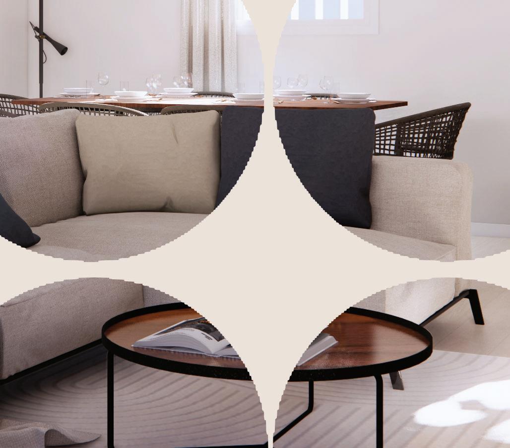
Since green is a mo va ng colour I focused in using green in my materials as well. It compliments the plywood really well and makes the white stand out. There is a lot of glass in the structure such as the railing in the entrance and the glass sliding doors of the private suites and conference rooms. Wood is a sturdy material and is very good for the structures that are huge such as the bar and the tables.
For this project I used warm light to give a more cozy feeling inside the building. I wanted to have fake ceilings on both floors with wood panels and LED lights in between.


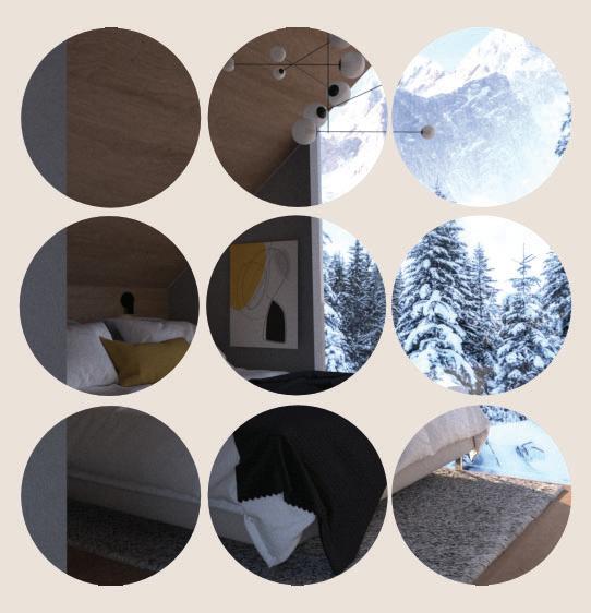
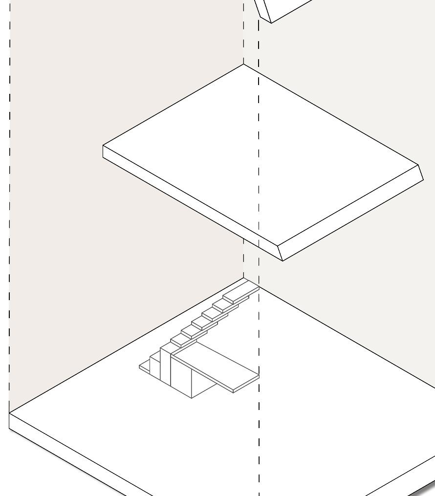
TINY HOUSE
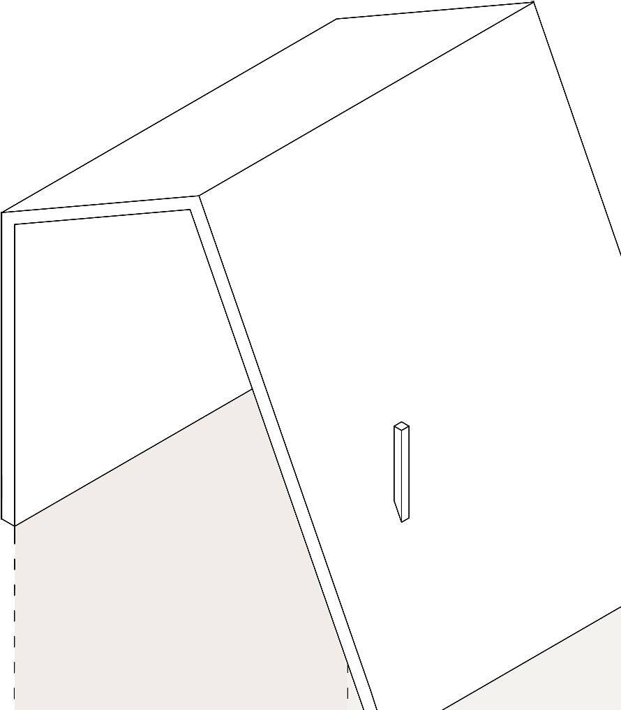
Date: January 2022

Loca on: Triglav, Slovenia
This project required us to create a ny house for two people in any loca on we wanted. The maximum size of the ny house was 23 square meters. The house had to have a dining, sleeping, working and recrea onal area as well as a bathroom. The area had to be innova ve, sustainable and very high on storage. Mobility was an important func on because a lot of people get ny houses to save money to travel and change their surroundings.
05
CONCEPT DEVELOPMENT
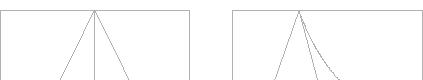


A frame houses are a big part of the community as almost all of the residents live in some sort of A frame house. These frames allow for rain and snow to glide down and not deposit on the roof for long periods of me. I also chose an A frame to immitate the nature and the surroundings in which my ny house is placed.
The main theme of the structure of this house is triangles and hiding as much as possible to avoid clu er as well as make the space flexible and allow for change. chose three triangles because the name Triglav means three points in Slovenian. This inspired me to use the name as the concept as well as to immitate the nature of the parks most famous top.


TECHNICAL DRAWINGS

A frame houses are a big part of the community as almost all of the residents live in some sort of A frame house. These frames allow for rain and snow to glide down and not deposit on the roof for long periods of me. I also chose an A frame to immitate the nature and the surroundings in which my ny house is placed.
The main theme of the structure of this house is triangles and hiding as much as possible to avoid clu er as well as make the space flexible and allow for change. I chose three triangles because the name Triglav means three points in Slovenian. This inspired me to use the name as the concept as well as to immitate the nature of the parks most famous top.
012
012
0
0
BB BB AA AA
012
0
BB
Section AA Section
RENDERS


I wanted to use a consistent wood texture throughout the house so I chose a texture that wasn’t too light but wasn’t too dark either to let the space feel bigger. Grey is seen on the sofa and on the carpet to compliment the mustard yellow details. The bathroom has grey les and a wooden parametric panel behind the toilet seat. The exterior structure has mostly black steel to let the rain slope down into the water tank. The rooms get natural light because they are lined with glass windows.

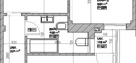
FERTILITY CLINIC
Fer lity Clinic

Date: December 2022
Loca on: Marbella
The aim for this project is to explore the principles of renova on and rehabilita on and ways that you can improve an exis ng building using inser on, installa on or interven on. This project allows us to explore different techniques and create spaces that reform the architecture. My proposal is to create a fer lity center with facili es for healing, relaxing, medical analysis and comfortable temporary housing. This space would allow for the clients coming in to feel comfortable and have their privacy respected. I plan to make this space feel warm, refreshing and healing.
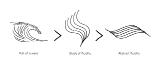
Through using the biomimicry of the female body I want to create a space with warm colors and curves that remind women how strong and beau ful they are. The space will be hygienic, thermally regulated and well illuminated to ensure the medical procedures are not jeopardized and the center to s ll emit a luxurious feeling.
246810
246810 06
CONCEPT DEVELOPMENT
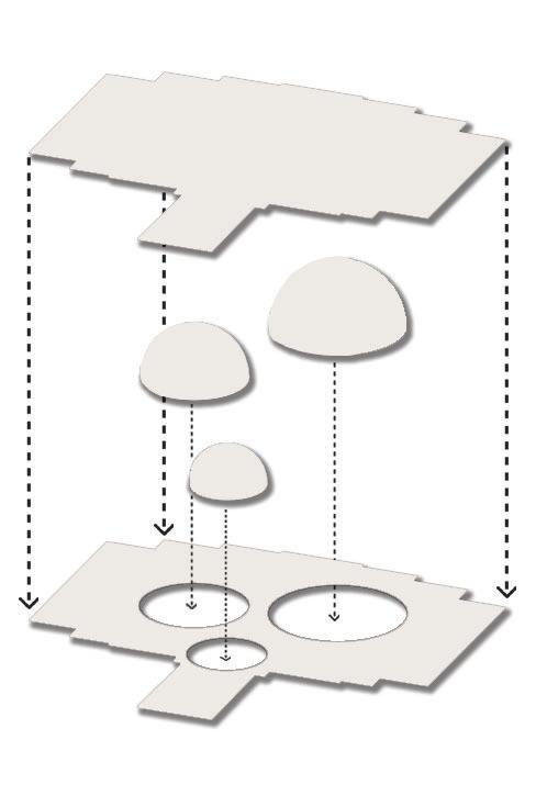
My proposal is to create a fer lity center with facili es for healing, relaxing, medical analysis and comfortable temporary housing. This space would allow for the clients coming in to feel comfortable and have their privacy respected. plan to make this space feel warm, refreshing and healing. Through using the biomimicry of the female body and non Euclidean geometries I want to create a space with warm colors and curves that remind women how strong and beau ful they are. The space will be hygienic, thermally regulated and well illuminated to ensure the medical procedures are not jeopardized. I wanted to have three primary spaces which will take up the vast majority of the space and will be distributed in a ra o to make a radial spa al organiza on.
I showed my final process in nine steps on AutoCad where I started off with a circle that I divided into 24 segments and separated into three overall structures with one piece between them and an equal difference in size. I then added some space in the middle where I want to place the cafe and created three circles using the division lines as tangents. I slowly used the line tool to create a structure that intertwines and folds into three separate spaces that flow into one another. Overall it gives an organic floor plan which will have different heights showing in the sec ons and eleva ons.

TECHNICAL DRAWINGS


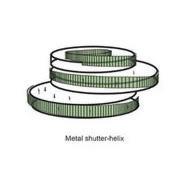
While looking at references in nature I no ced how many things are curved and wondered if there was a concept for division using curved lines. The reasoning behind this is because of the process happening inside the clinic which is the division of the egg cells and the mitosis. This lead me to discovering non euclidean geometries. These geometries are defined by curved lines and straight lines which create hyperbolic spaces. This works for my project because I can create so curved walls in the exis ng straight wall structure. The concept that I wanted to use was the birds feathers. The way that it has mul ple layers and is so so is what inspired me to place it into my space. I wanted to also use the structure of the feather for the facade as it is a strong geometry and can help with thermal regula on and light regula on.
02 6810 6810
BB BB AA AA 6810 6810
AA
BB
CC 6810
Section
Section
Section
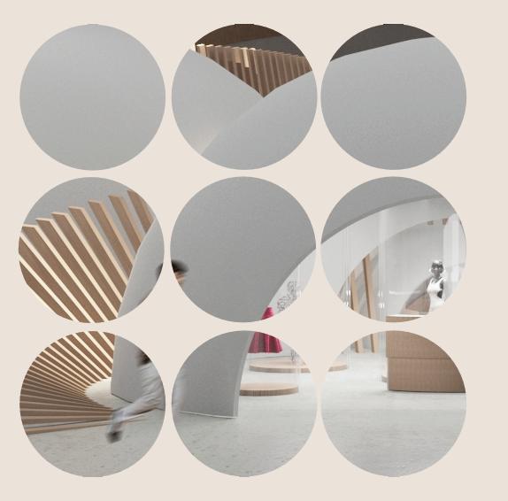
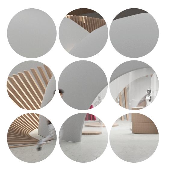
RENDERS


Since green is a mo va ng colour I focused in using green in my materials as well. It compliments the plywood really well and makes the white stand out. There is a lot of glass in the structure such as the railing in the entrance and the glass sliding doors of the private suites and conference rooms. Wood is a sturdy material and is very good for the structures that are huge such as the bar and the tables.
For this project I used warm light to give a more cozy feeling inside the building. I wanted to have fake ceilings on both floors with wood panels and LED lights in between.
APARTMENT RENOVATION
Internship Project Date: October 2022
Loca on: Malaga
The first project that I worked on during my internship was this reforma on and renova on of a family apartment in Malaga, Spain. The layout of the apartment before the renova on was not func onable and was not allowing for the family to live in harmony. For this project I was required to help with the exis ng technical drawings on AUTOCAD, however my main role was to accurately 3D model the apartment from the beginning and to design the interior of each space in the apartment.
07
TECHNICAL DRAWINGS
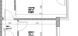
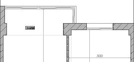
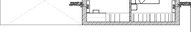
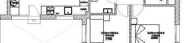
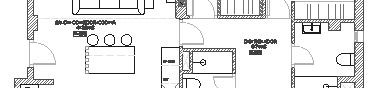
The concept was mostly developed by our boss and the clients however as an intern who was developing the 3D renders I was informed by the wishes of the clients about the desired style. The furniture in the renders would just allow for the clients to be able to visualise the space and to show a more cohesive style that they could then further choose to use. The layout of the apartment a er we demolished some walls was much be er and created a more open living room. suggested using glass windows with black metal panelling for a more modern style, if within the budget of the clients.

RENDERS


The renders show a minimalis c apartment design with beige colours and some orange and wood tones. The kitchen has a bit of separa on with the wooden planks and elegant hanging lights above the kitchen island. The space is clean and has a lot of natural light from the balcony and garden. The house has warm tones and modern furniture such as the modern hanging lights and ma e aluminium kitchen appliances.


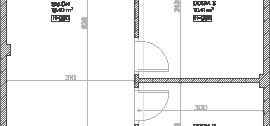
VILLA RENOVATION
Internship Project
Date: November 2022
Loca on: Torremolinos
The brief that we recieved for this project from the clients was to transform the 3 floor villa into a beau ful cohesive WabiSabi style. The villa contained mul purposed rooms, such as a cinema room, gym, leisure area, mul ple kitchens and bedrooms and a stunning outdoors area. My job during the projects that I worked on was to help with the technical AUTOCAD drawings and to model and design the 3D aspects on Sketchup. This was one of the bigger projects that I have done throughout my studies and it was definitely a challenge.

08
TECHNICAL DRAWINGS
The concept was mostly developed by our boss and the clients however as an intern who was developing the 3D renders I was informed that I had to design in a wabisabi style and ensure that the space was not too clustered and used a cohesive tone of wood and neutral colours. The shared spaces in the villa included chunky furniture and stramlined light fixtures. The spaces had a lot of empty space and encapsulated a lot of light from the large floor to ceiling windows.

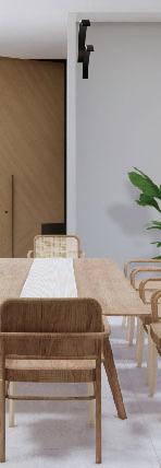
RENDERS

The renders of the villa show a dominant wabi sabi style which uses a lot of bamboo furniture and warm tones. The lowered furniture is a dis nct part of the style and is mostly monotoned and simple with clean straight lines. The villa has 2 floors and a basement which houses many ac vi es and rooms. The top floor has its own living room and kitchen with a large swinging door. There is an infinity pool and a large garage and it is located close to the beach.