SHOPPING MALL WAYFINDING SYSTEM
FESTIVAL THEME
DESIGN MANUAL
Shopping Mall Wayfinding System: Festival Theme 1/48
FOREWARD & INTRODUCTION
FESTIVAL-THEMED
This manual presents a festival-themed wayfinding system for a shopping mall. The system is designed to help visitors navigate the mall during the festival period and locate festival-related areas, stores, and events easily. The aim is to provide clear and concise guidance to ensure visitors can fully enjoy the festival without worrying about getting lost or missing out on anything. The system caters for visitors of all levels of familiarity with the mall and aims to make the festival experience as seamless and enjoyable as possible.
CONTENTS 1. ABOUT THIS MANUAL 3 2. THE PRINCIPLES OF DESIGN 7 3. GRAPHIC STANDARDS 19 4. MAP DESIGN OVERVIEW 37 5. SIGNAGE PROTOTYPE 43
TABLE OF
ABOUT THIS MANUAL
This manual cover note provides an overview of the wayfinding strategy for a festivalthemed event, to ensure a successful application for all users.
The Wayfinding Strategy
What Is Wayfinding Festival-Themed Concept
Purpose Of Guideline
01
THE WAYFINDING STRATEGY
This strategy focuses on the implementation of a new suite of signs with the existing wayfinding system to inform the customers about the festival programs.
The issue with the majority of wayfinding systems in shopping malls is their confusing and inconsistent nature, leading to frustration among visitors. A festival-themed wayfinding system can significantly improve the visitor experience during the festival period by using clear and concise directions, festival-themed colors, imagery, and language, ultimately enhancing customer satisfaction. This document outlines how and where these signs should be used, and how they should ne designed and built in order to effectively implement the wayfinding strategy.
About This Manual 4/48
FESTIVAL-THEMED CONCEPT
Creating a festival-themed shopping mall wayfinding concept is essential in Hong Kong due to the city’s strong tradition of celebrating festivals. Festival-themed wayfinding can help shoppers easily find festival-related areas, events, and stores within the mall during festive periods, enhancing their overall shopping experience.
To achieve this, a printed map that is consistent with the general wayfinding icons can be used as a guidance tool. Shoppers are accustomed to using printed maps as a wayfinding aid, making it a useful tool to ensure that shoppers can navigate the mall efficiently.
Moreover, the printed map can be designed to incorporate the festival theme, with festival-related icons and colors, creating a cohesive and immersive experience for shoppers. The general wayfinding system and festival-themed wayfinding system can be combined naturally by using similar design elements, such as color and font, and by placing the festival-themed signage in areas that are consistent with the general wayfinding system. By doing so, shoppers can easily navigate the mall using both systems, ensuring a seamless shopping experience during the festival period.
About This Manual 5/48
PURPOSE OF GUILDELINE
The purpose of this document is to: Provide a resource that will assist with the development of a consistent approach to wayfinding for all shopping mall.
Give specific information about the development of wayfinding principles for visual grammar and applications.
Identify ‘general journeys’ and the ‘festival journeys’ needed to provide good wayfinding theory.
About This Manual 6/48
THE PRINCIPLES OF DESIGN
This design principles outlines the key principles of design, to create effective and visually appealing solutions.
Shopping Mall Environment
Sight Lines and Legibility
Color Principles
Material Principles
02
SHOPPING MALL ENVIRONMENT
(DE) CLUTTERING – SIGNAGE
CONSISTENT AND PREDICTABLE PLACEMENT
Consideration given to the consistency of signage placement and mounting heights can significantly improve the predictability of information for travellers.
CLEAR SIGHT LINES FOR SIGNS
Signs should be placed perpendicular to the main flow of passenger movement to allow the passenger to find the relevant wayfinding information intuitively.
APPROPRIATE SPACING BETWEEN SIGNS
Signage should stand out from its environment to enable clear visibility. A predictable signage rhythm should be established to set expectations for the traveller. Signage squeezed together without consistent layout is more difficult to follow.
CLEAN LAYOUT
Information designed according to a set of definitive standards – for layouts, letter heights, line spacing, colour palette – should read as a system and give the passenger confidence in the accuracy of the information.
The Principles of Design 8/48
The Principles of Design
SHOPPING MALL ENVIRONMENT
(DE) CLUTTERING – PRINTED MAP
CONSISTENT AND PREDICTABLE PLACEMENT
The placement of key elements on the map, such as the legend, scale, and directional indicators, should be consistent and predictable to improve the user’s ability to locate and understand the information. For example, the legend should always be located at the same place on the map, and the scale should be clearly marked and consistently placed in relation to the map.
APPROPRIATE SPACING BETWEEN SIGNS
The spacing between elements on the map should be balanced and consistent to ensure easy reading and understanding. Information should be grouped together logically, with clear boundaries and spacing between different areas of the map, such as different levels or zones of the mall.
9/48
SHOPPING MALL ENVIRONMENT
(DE) CLUTTERING – PRINTED MAP
CLEAR SIGHT LINES FOR SIGNS
The map should be designed to provide clear sight lines for key information, to ensure that users can find the relevant information quickly and intuitively. Directional indicators should be clearly placed to indicate the most direct routes to key destinations.
EMPHASIZE KEY INFORMATION
To reduce clutter on a printed map, it’s important to emphasize key information most relevant to the user. This can be achieved by using larger fonts, bolding or highlighting important labels, and limiting detail in less important areas of the mall.
CLEAN LAYOUT
Simple and clean layout with consistent fonts, colours, and icons makes the map easy to read and understand. The information should be organized in a logical and intuitive manner, with clear headings and labels to guide the user. In order to reinforce the sense of familiarity and location, the design should match the mall’s branding and guidelines.
SIMPLIFY ICONOGRAPHY
To reduce clutter and improve readability, it’s important to simplify the map iconography. Use a limited set of icons, each with a clear and distinct meaning, and avoid unnecessary detail. The use of a single icon can be used to represent all stores, with additional labeling to indicate specific categories.
The Principles of Design 10/48
The Principles of Design
WAYFINDING ZONE
• Ensure the location of information is expected and predictable
• Create clear lines of sight on the main path and wayfinding elements
SIGHT LINES AND LEGIBILITY SIGNAGE
WALL-MOUNTING & HANGING HEIGHTS
These and other principles of good sign design can be found in the reference documents provided below.
11/48
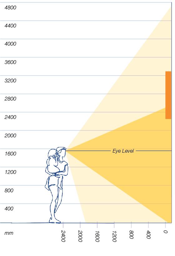
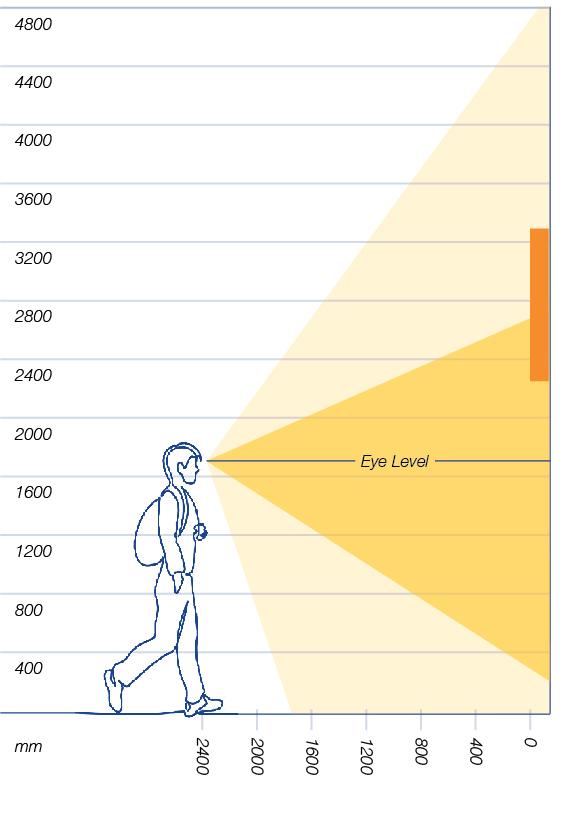
SIGHT LINES AND LEGIBILITY
SIGNAGE
SIZING TO DISTANCE
• Ensure that the signage can be easily read and understood by viewers from a distance
• Minimum Cap-Height (CH) for Shopping Mall
Signage
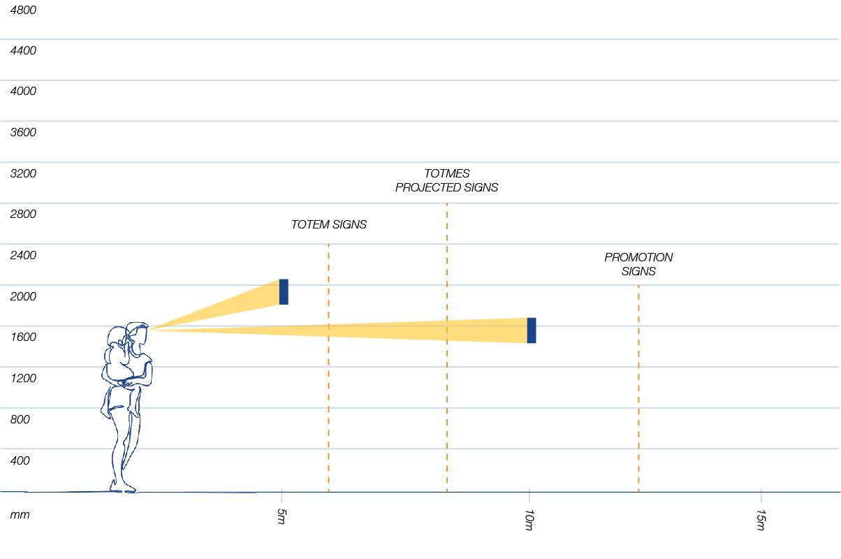
The Principles of Design 12/48
The Principles of Design
COLOR PRINCIPLES
COLOR PALETTE
For the festival-themed wayfinding system, a bright and playful color palette would be appropriate to capture the festive spirit. The color palette should feature bold, eyecatching colors that are easily distinguishable from one another. Colors can be used in combination to create a colorful and joyful atmosphere. This color palette will be used in conjunction with the festival’s color palette. Die cut vinyl application on inkjet printing are not acceptable on permanent signs. CMYK and RGB approximate matches are provided as a reference for printed (CMYK) map and digital (RGB) temporary signs only. Overall, the color palette should be fun, festive, and easy to recognize.
13/48
The Principles of Design
COLOR PRINCIPLES
APPLICATION ON FESTIVAL PRINTED MAP
14/48
PANTONE PANTONE PANTONE PANTONE CMYK CMYK CMYK CMYK RGB RGB RGB RGB HEX HEX HEX HEX 7687C 715C 123C 656C 100/86/15/3 0/54/94/0 0/23/91/0 12/7/3/0 26/266/138 248/141/43 255/198/41 220/227/235 1A428A F88D2B FFC629 DCE3EB
15/48 APPLICATION ON SIGNAGE
RAL RAL PMS PMS CMYK CMYK RGB RGB
The Principles of Design
COLOR PRINCIPLES
1.
2. 9016 9005 Bright White Process Black 0/0/0/0 0/0/0/100 255/255/255 0/0/0
Background Color Arrows, pictograms and text plaed on a reverse color background
APPLICATION
MATERIAL PRINCIPLES
MATERIAL SELECTION
Signage should incorporate metal trim or frames in silver or gold to add elegance and sophistication. The metal trim or frame should be refined and closely matched to mall design styles. In addition, accent lighting can be incorporated into the sign to draw attention and highlight key information. By carefully selecting materials that complement the festivalthemed temporary wayfinding system, the signage will be functional but also visually appealing and memorable for festival goers. Festival-themed printed maps should be durable enough for visitors to keep as souvenirs.
The
of Design 16/48
Principles
The Principles of Design
17/48
MATERIAL PRINCIPLES
APPLICATION
Glossy Paper


1. Printed Map
Sticker Paper
1. Interaction Elements
APPLICATION ON FESTIVAL PRINTED MAP
TYPE TYPE WEIGHT WEIGHT COLOR COLOR SIZE SIZE Glossy Paper Sticker Paper 150gsm 150gsm White White A3 A4
MATERIAL PRINCIPLES
APPLICATION ON SIGNAGE
APPLICATION
Aluminium


1. General information
Signage
Stainless Steel
1. Festival or Event
Related Information
Signage
LED Light Strip

1. Signage or Totem Sign
Highlight
2. Text Effect on Dark Background
MATERIAL
Principles of Design 18/48
The
MATERIAL MATERIAL COLOR COLOR COLOR TEXTURE TEXTURE TEXTURE MAX SIZE MAX SIZE MAX SIZE
Stainless Steel LED Light Strip White Dark Grey 6000K Matt Brushed Frosted Acrylic 1200 x 2400mm 1200 x 2400mm 10 x 5000mm
Aluminium
GRAPHIC STANDARDS
This graphic standards outlines the key elements of the brand’s visual identity, to ensure a consistent and cohesive brand image across all marketing materials.
Typography & Text Hierarchy
Visual Vocabulary
Visual Grammar
03
TYPOGRAPHY & TEXT HIERARCHY
SIGNAGE TYPOGRAPHY
TEXT HEIGHT
Minimum width 70% of the pictogram inside and outside the box.
Font Size: 105pt, Initial words used in the icons.
Minimum 15% of the hanging signs.
Font Size: 165pt, Words used in the hanging signs.
Franklin
Minimum 15% of the hanging signs.
Font Size: 165pt, Numbers used in the hanging signs.
Graphic Standards 20/48
Franklin Gothic Heavy Franklin Gothic Demi
Aa Bb Cc Dd Ee Ff Gg Hh Ii Jj Kk Ll Mm Nn Oo Pp Qq Rr Ss Tt Uu Vv Ww Xx Yy Zz Aa Bb Cc Dd Ee Ff Gg Hh Ii Jj Kk Ll Mm Nn Oo Pp Qq Rr Ss Tt Uu Vv Ww Xx Yy Zz 0 1 2 3 4 5 6 7 8 9
Gothic Demi
Graphic Standards
21/48
TYPOGRAPHY & TEXT HIERARCHY
TEXT HEIGHT
PRINTED MAP TYPOGRAPHY
30pt (Floor Level)
16pt (Titles)
11pt (Contact Titles)
8pt (Detail Information)
Franklin Gothic Demi
Font Size: 30 / 16 / 11 / 8pt, Short sentance or Single Words
9pt (Detail Description)
Franklin Gothic Book
Font Size: 165pt, Numbers used in the hanging signs.
Aa Bb Cc Dd Ee Ff Gg Hh Ii Jj Kk Ll Mm Nn Oo Pp Qq Rr Ss Tt Uu Vv Ww Xx Yy Zz Aa Bb Cc Dd Ee Ff Gg Hh Ii Jj Kk Ll Mm Nn Oo Pp Qq Rr Ss Tt Uu Vv Ww Xx Yy Zz
Graphic Standards 22/48
VISUAL VOCABULARY
ARROWS
Arrow Variations – for Pathways Orientation
ONWARD JOURNEY INFORMATION
Journey Inside Shopping Mall
Up Down Left Right Up Left Up Right Down Left Down Right Smoking Area No Smoking Elevator Exit Entrance Escalator Up Escalator Down Stairs
Graphic Standards
23/48
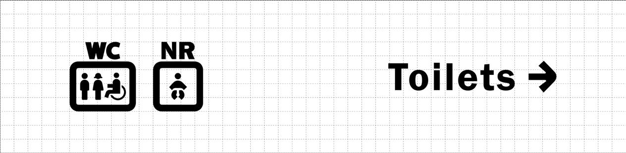
VISUAL VOCABULARY
USAGE ON SIGNAGE
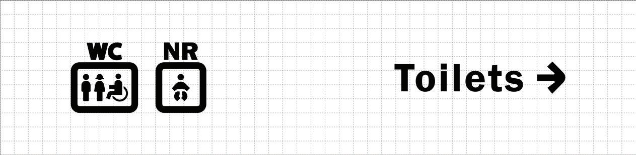
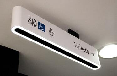
AMENITIES & FACILITIES
Superimposition
Toilet Facilities, Main Shopping Mall Facilities and other Amenities
Baby + Nursery Room
Male + Female + Disable + Restroom
-
Nursery Room Intagram
mable
Restroom Male Female Disable Child / Baby Information Center Parking WI-FI Garden Bench
VISUAL VOCABULARY
COMMERCIAL ESTABLISHMENTS
Shops (Categorize different types of retail shops)
Others (Common establisments included in shopping mall)
Movie Restaurant Market Pop-up Store
Standards 24/48
Graphic
Grocery
Toys Home Decor
Jewellery Clothing Cosmetics Footwear Bookstore
Graphic Standards
25/48
VISUAL VOCABULARY
ICON FORMULAR
FESTIVAL
RELATED
Superimposition
Christmas
Market + Related Festive Elements
(Elements related to Chistmas could be replaced for specific use) Chirstmas
Informational Icon + Related Festive Elements
Chinese New Year
(Elements related to Chinese New Year could be replaced for specific use)
Christmas Tree Gift Christmas Market Christmas Decor New Year Decor
Gift Chinese New Year New Year Market
VISUAL VOCABULARY
FESTIVAL RELATED
Festival or Promotion Information
(Provide an informational signs for high demanded needs during festival season)
Gift Wrapping Gift Card Sale Celebration Cake
Printed Map Interaction Icons
(Icons for shoppers to record or plan their trip)
Graphic Standards 26/48
Bookmark Wish List Favourite
Graphic Standards
27/48
VISUAL GRAMMAR – TOTEM SIGN
Use a bright and festive color palette to create a fun and exciting atmosphere for temporary totem signs, while also ensuring that the colors are legible and easy to read from a distance.
 COLOR CHRISTMAS COLOR PALETTE EXAMPLE
PANTONE PANTONE PANTONE PANTONE CMYK CMYK CMYK CMYK RGB RGB RGB RGB HEX HEX HEX HEX 7687C 1807C 3435C 7752C 100/86/15/3 24/91/78/16 87/45/78/49 21/27/100/0 26/266/138 167/52/57 18/71/52 208/175/33 1A428A A73439 124734 D0AF21
VISUAL GRAMMAR – TOTEM SIGN
COLOR
Color palette for specific festivals can be combined with map color principles to create a wide range of design style.
CHINESE
YEAR
EXAMPLE Graphic Standards 28/48
NEW
COLOR PALETTE
PANTONE PANTONE PANTONE PANTONE CMYK CMYK CMYK CMYK RGB RGB RGB RGB HEX HEX HEX HEX 715C Warm Grey 1C 1955C Black 2C 0/54/94/0 15/14/17/0 29/100/70/27 62/60/76/66 248/141/43 214/209/202 142/21/55 51/46/32 F88D2B D6D1CA 8E1537 332E20
Graphic Standards

29/48

VISUAL GRAMMAR – HANGING SIGN
CONTRAST
Use high contrast between text, background and environment to make the information stand out and be easily readable.
Black Powder Coated Pattern
White Aluminium
Black Powder Coated Pattern
GENERAL NOTES:
1. Double-faced, handing sign with LED accent light underneath.
2. White hanging sign to be fabricated aluminium with powder coated pattern.
3. Black hanging sign with replaceable stainless steel and die cut pattern and front lit LED light.
Die Cut Pattern
w/ Front Lit
LED Light
Dark Grey
Brushed
Stainless Steel
Die Cut Pattern
w/ Front Lit
LED Light
VISUAL GRAMMAR – HANGING SIGN
Graphic Standards
RECOMMENDED SIZING
The hierarchy of sizes account for the distance from which that type will be viewed, as well as the relative importance of that category of signage. Standardising type sizes by using such sizing catergories, maintains typographic consisteny.

GENERAL NOTES:
The height and width of the icons is most often 2.5 times the Cap-Height of the typography.
30/48
BOTTEM VIEW 100mm 30mm 30mm 35mm FRONT VIEW 900mm 900mm 20mm 20mm 220mm
READABILITY
To ensure pictograms are proportioned appropriately, they will live within a rounded square, where the pictogram extends to fill 70% of the square, maximizing in ethier height or width of pictograms. The rounded corner will be a fillet of spproximately 17.5% the overall width of the square.
VISUAL GRAMMAR – PRINTED MAP
DIMENSIONAL CONTROL
Graphic Standards 31/48
Designed for Printed Map
Zone for Pictogram
Xmm 0.7(X)mm 0.175(X) Rounded Edge 0.7(X)mm Xmm
Graphic Standards 32/48
VISUAL GRAMMAR – PRINTED MAP
HIERARCHY
Use clear visual hierarchy, solid shape and contrasting outline to ensure that the pictograms stands out and is easily identifiable.
CHRISTMAS PRINTED MAP EXAMPLE
Amenities and Facilities (Black) (Blue)
(Green)
(Orange)
Commercial Establishments (Others)
Festival Related
Graphic Standards
33/48
VISUAL GRAMMAR – PRINTED MAP
Use a bright and festive color palette for the printed maps to create a fun and exciting atmosphere, while also ensuring that the colors are legible and easy to read.
PANTONE PANTONE PANTONE PANTONE PANTONE PANTONE CMYK CMYK CMYK CMYK CMYK CMYK RGB RGB RGB RGB RGB RGB HEX HEX HEX HEX HEX HEX 7687C 197C 1908C 3425C Cool Grey 2C 7689C 100/86/15/3 4/91/91/0 0/50/4/0 97/35/85/30 18/14/15/0 79/33/7/0 26/266/138 228/61/48 248/154/186 0/98/65 208/207/205 35/141/193 1A428A E43D30 F89ABA 006241 D0CFCD 238DC1
COLOR CHRISTMAS COLOR PALETTE
Graphic Standards
34/48
VISUAL GRAMMAR – PRINTED MAP
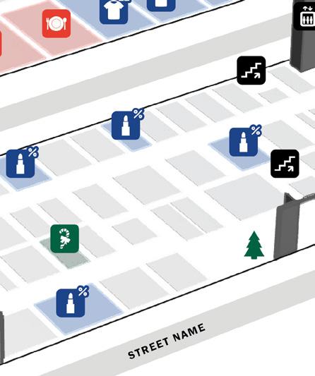
DECISION POINT
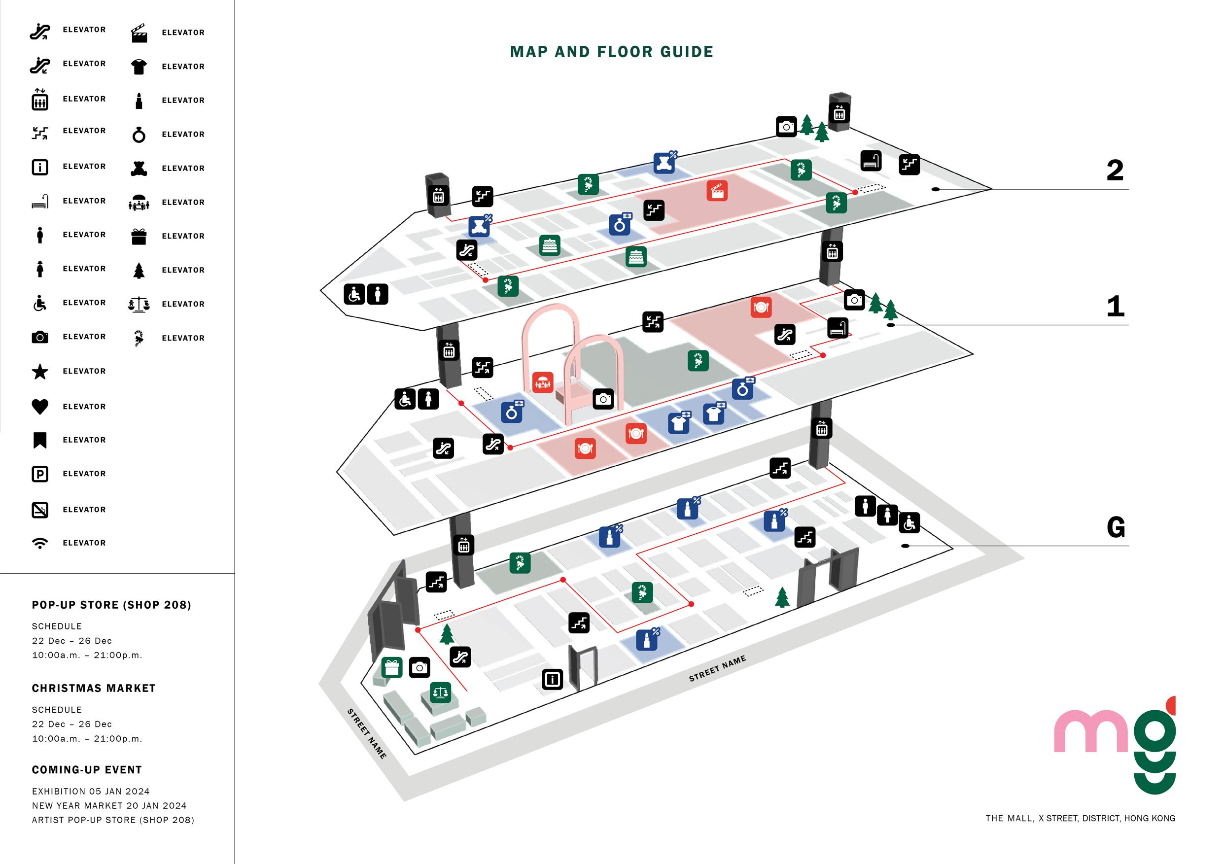
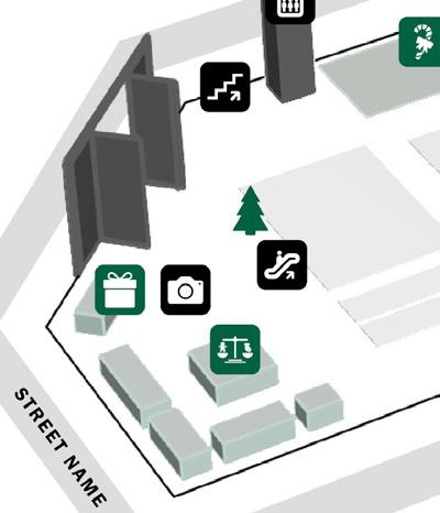
Indicate where the directory line and signage are located at decision points, such as adjacent to the elevator, escalator, and entrance.
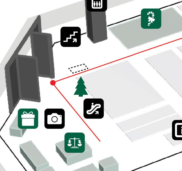
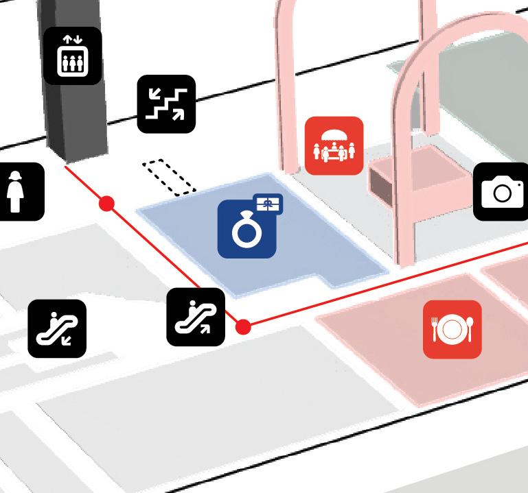
SCHEMATIC DIAGRAM
Decision Points
Visitor Routes
Information Screen

MAP DESIGN OVERVIEW
This printed map design overview provides an overview of the content and design patterns used to create an effective and visually appealing printed map.
Design Pattern
04
Printed Map Pattern Diagram
PRINTED MAP PATTERN DIAGRAM
Related Parent & Child
Develope
Map Design Overview 38/48
EXAMPLE
DESIGN PATTERN
To represent the specific sale shop, include the sale icon in the commercial pictogram.
INFORMATION HUB
The solution is particularly useful during holidays or festivals when there may be an increased number of shoppers in the mall.
CONTEXT
The Information Hub solution is designed for use in shopping malls or retail environments, where shoppers may be looking for information on mall amenities or promotions.
FORCES
1. Increase Foot Traffic
2. Complex Layout
3. User Experience
PROBLEM
Limited information available and difficulty in finding it.
SOLUTION
Include relevant information such as promotions and amenities on printed maps throughout the mall during holiday or festival.
CONSEQUENCE
1. Improved Information Management
2. Incresed Efficiency
3. Better Decision-making
RELATED PATTERN
Interactive Map
Design Overview 39/48
Map
DESIGN PATTERN
INTERACTIVE MAP
The Interactive Map can be a powerful tool for mall management to enhance customer satisfaction by providing a clear and easy-to-use map.
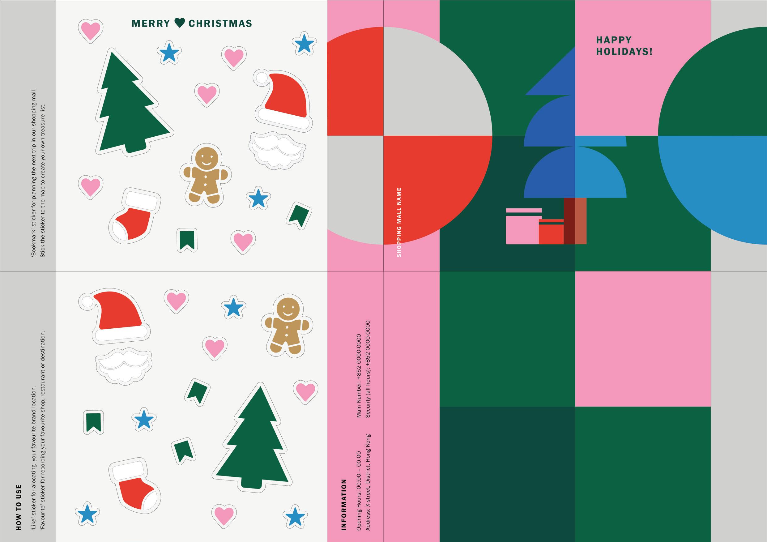
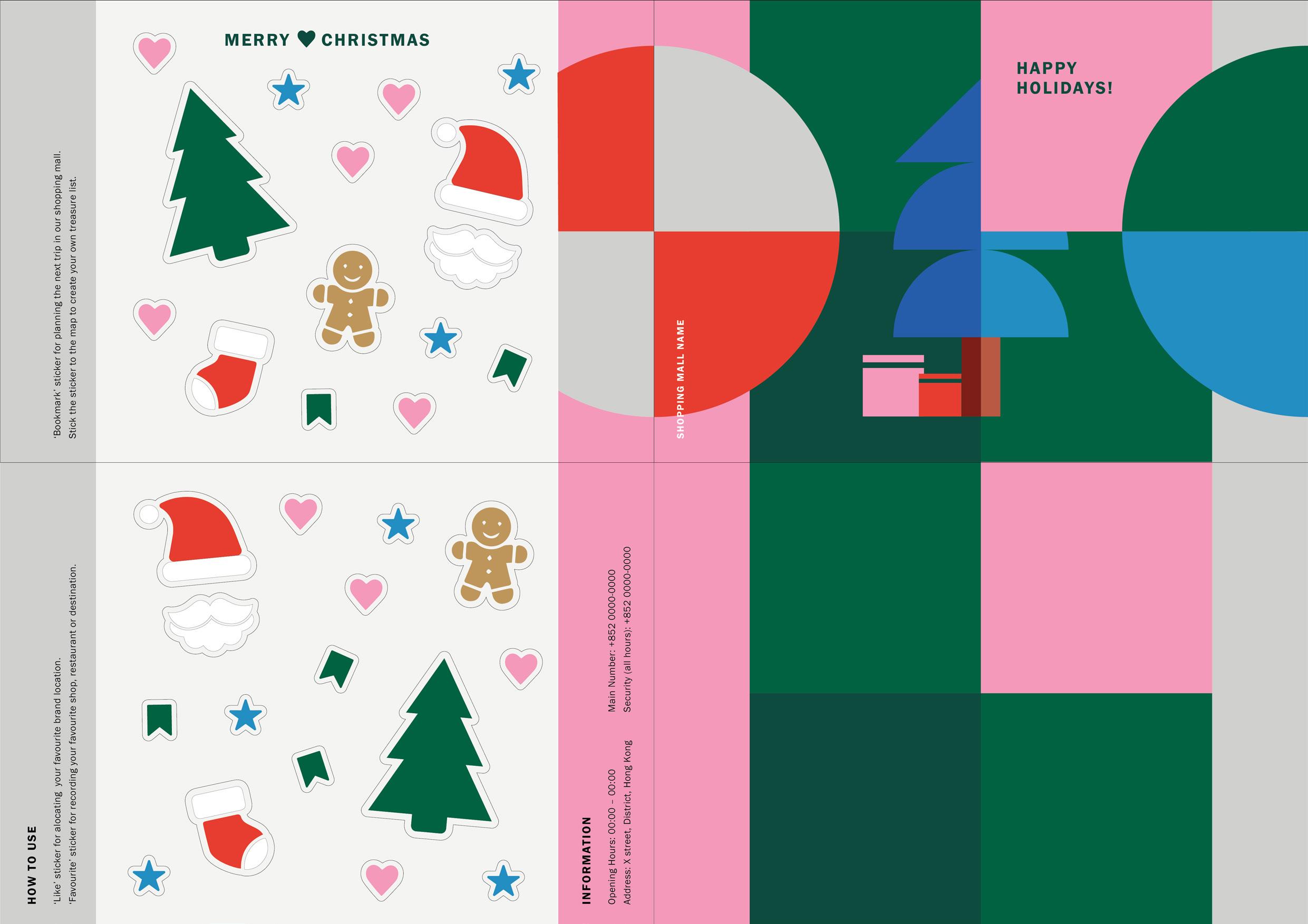
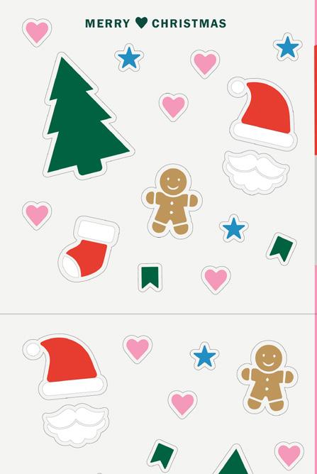
Interact feature sticker for recording and planning visitors trip. Festive related sticker for souvenir purpose.
The Interactive Map solution is designed for use in shopping malls where shoppers may become disoriented or lost while trying to find a specific store or location.
FORCES
1. Complexity of Shopping Malls
2. User Experience
Difficulty in finding particular stores and locations during festival seasons.
Provide visitors with an interactive printed map that allows them to mark their current location and plan a route to their desired destination.
CONSEQUENCE
1. Improved User Experience
2. Increase Engagement
RELATED PATTERN
Information Hub
Map Design Overview 40/48
CONTEXT PROBLEM SOLUTION
EXAMPLE
Map
Design Overview
EXAMPLE
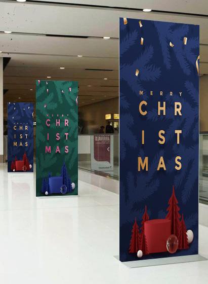
FESTIVE DECOR
The Festive Decor solution is designed for use in every detail during holidays or festivals when shoppers want a festive atmosphere.
PROBLEM
SOLUTION CONTEXT
The Festive Decor solution is designed for use in shopping malls during holidays or festivals when shoppers are looking for a festive atmosphere.
Difficulty to create festive atmosphere. Use festival-themed icons and symbols in wayfinding signage and printed maps to create a festive atmosphere.

1. Festive Atmosphere
2. User Experience
1. Increase Atmosphere
2. Improve Aesthetics
3. Increase Social Sharing
4. Improved User Experience
Promotion Signage
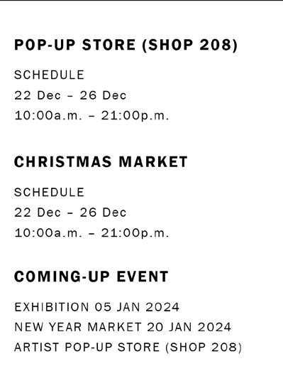
Information of pop-up store and market location and opening hours, up-coming events schedule for notice. 41/48
DESIGN PATTERN
FORCES
RELATED PATTERN CONSEQUENCE
DESIGN PATTERN
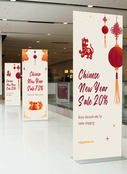
INTERACTIVE ACTIVITIES
The Interactive Activities solution is designed for use in shopping malls during festivals or special events when shoppers are looking for a variety of activities and events.
Information of pop-up store and market location and opening hours, up-coming events schedule for notice.
CONTEXT PROBLEM SOLUTION
The Interactive Activities solution is designed for use in shopping malls during festivals or special events when shoppers are looking for a variety of activities and events.
Unclear schedules and event locations. Provide a calendar of events and activities on the festival-themed map with clear indications of event locations.
FORCES RELATED PATTERN CONSEQUENCE
1. Festival Atmosphere
2. User Experience
3. Communication
1. Enhanced User Satisfaction
2. Improved Brand Perception
Point of Interest
Map Design Overview 42/48
EXAMPLE
SIGNAGE OVERVIEW
This signage prototype provides an overview of the design and content of the signage, as well as the design patterns used to create an effective and engaging user experience.
Signage Pattern Diagram
Design Pattern
05
SIGNAGE PATTERN DIAGRAM
Related Parent & Child
Develope
Signage Overview 44/48
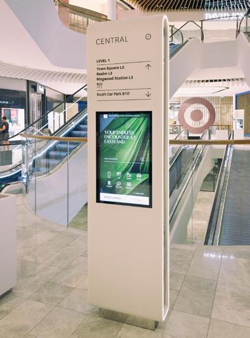
Arrows are placed in a sequential order that corresponds to the direction people should move in.
DESIGN PATTERN
ARROW ORDER
Arrow order is a design pattern that is to guide people in the right direction. This pattern involves placing arrows in a specific order to help people navigate through a space more easily.
Arrow order is particularly useful in environments where people are unfamiliar with the layout or where there are multiple paths that can be taken to reach a destination.

FORCES
1. Need for clear and concise direction.
2. Need to convey information quickly and efficiently.
Difficult for people to navigate to their intended destination.
By placing arrows in a specific order, and provide a definition of each arrow sign.
RELATED PATTERN CONSEQUENCE
1. Improved Usability
2. Reduced Errors
3. Increased Efficieny
4. Improved Visual Design
Signage Placement
Signage Overview 45/48
EXAMPLE
PROBLEM SOLUTION CONTEXT
DESIGN PATTERN
SIGNAGE PLACEMENT
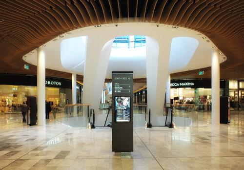
Signage placement is a design pattern that involves the strategic placement of signs in a space to maximize their visibility and effectiveness.
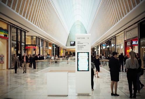
Place the totem sign in a relatively spacious area to stand out from the crowd, enable detail reading and avoid walkway blockages.

CONTEXT PROBLEM SOLUTION
Signage placement is important in any environment where people need to receive information quickly and efficiently.
Poor placement, inadequate lighting, or cluttered surroundings.
By strategically placing signs in a location that is easily visible and accessible.
FORCES RELATED PATTERN CONSEQUENCE
1. Consider sightlines and viewing angles.
2. Avoid obstructing views of other important items or areas.
1. Improved Wayfinding
2. Enhanced Accessibility
3. Improved Asethetics
Arrow Order
EXAMPLE Signage Overview 46/48
Divide the floor level information and shopping all facilities sign into two seperate presentation.
DESIGN PATTERN
POINT OF INTEREST
A design pattern that involves identifying and highlighting specific locations or features within a space that are of particular interest or importance. Dividing the signs into two category by presenting in different format.
CONTEXT
Point of interest is commonly used in environments where there are commonly useful features that users nagivate alot.
FORCES
1. Limited Space
2. Clear Classification
PROBLEM
It is easy to mess up variety signage throughout the mall.
SOLUTION
By using visual cues and additional signage, users can be guided to points of interest and provided with additional information and guidance.
RELATED PATTERN CONSEQUENCE
1. Enhanced Navigation
2. Improved User Experience
Interactive Activities
Signage Overview 47/48
EXAMPLE
DESIGN PATTERN
PROMOTION SIGNAGE
Promotional signage is a design pattern that involves the pairing use of temporary signs and printed maps to promote holidays and festive seasons.
Shoppers can find the destination by comparing the pictograms on the hanging sign with the map.
Promotional signage is commonly used in retail environments, but can also be used in public spaces and transportation hubs to promote events or special promotions.
Traditional signage may not be effective in capturing people’s attention or generating excitement for special events.
Temporary signage with festive pictograms can draw people’s attention, aligned with the printed map, creating excitement.
FORCES RELATED PATTERN CONSEQUENCE
1. Effective promotion of special events
2. Capture people’s attention and generate excitement
1. Increase Sales
2. Increased Foot Traffic
Festive Decor
EXAMPLE Signage Overview 48/48
CONTEXT PROBLEM SOLUTION
SHOPPING MALL WAYFINDING SYSTEM
FESTIVAL THEME
DESIGN MANUAL
ASSIGNMENT 3
Design Manual for Information Graphics
INFO
Prepared by SHDS3230 Information Graphic (Group 201)
Designed by Chan Yuen Si Jesie
Student No. 20037150S