1 minute read
The Principles of Design

from Design Manual
by C Chan

Color Principles
Color Palette
Advertisement
For the festival-themed wayfinding system, a bright and playful color palette would be appropriate to capture the festive spirit. The color palette should feature bold, eyecatching colors that are easily distinguishable from one another. Colors can be used in combination to create a colorful and joyful atmosphere. This color palette will be used in conjunction with the festival’s color palette. Die cut vinyl application on inkjet printing are not acceptable on permanent signs. CMYK and RGB approximate matches are provided as a reference for printed (CMYK) map and digital (RGB) temporary signs only. Overall, the color palette should be fun, festive, and easy to recognize.
The Principles of Design
Color Principles
Application On Festival Printed Map
Material Principles
Material Selection
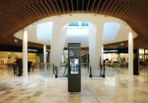
Signage should incorporate metal trim or frames in silver or gold to add elegance and sophistication. The metal trim or frame should be refined and closely matched to mall design styles. In addition, accent lighting can be incorporated into the sign to draw attention and highlight key information. By carefully selecting materials that complement the festivalthemed temporary wayfinding system, the signage will be functional but also visually appealing and memorable for festival goers. Festival-themed printed maps should be durable enough for visitors to keep as souvenirs.
The Principles of Design
17/48
Material Principles
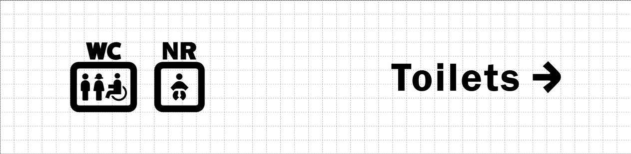
APPLICATION
Glossy Paper


1. Printed Map
Sticker Paper
1. Interaction Elements
APPLICATION ON FESTIVAL PRINTED MAP
Material Principles
APPLICATION ON SIGNAGE
APPLICATION
Aluminium


1. General information
Signage
Stainless Steel
1. Festival or Event
Related Information
Signage
LED Light Strip
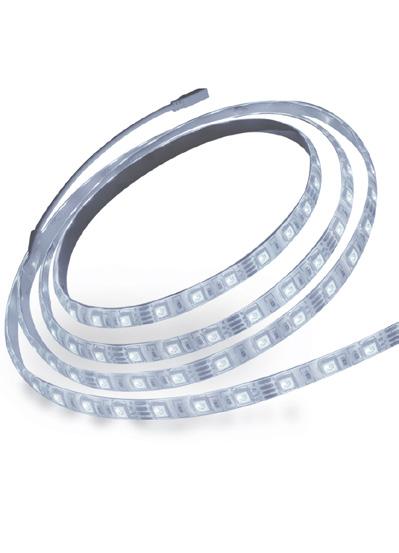
1. Signage or Totem Sign
Highlight
2. Text Effect on Dark Background
MATERIAL