1 minute read
VISUAL GRAMMAR – HANGING SIGN

from Design Manual
by C Chan

Recommended Sizing
The hierarchy of sizes account for the distance from which that type will be viewed, as well as the relative importance of that category of signage. Standardising type sizes by using such sizing catergories, maintains typographic consisteny.
Advertisement
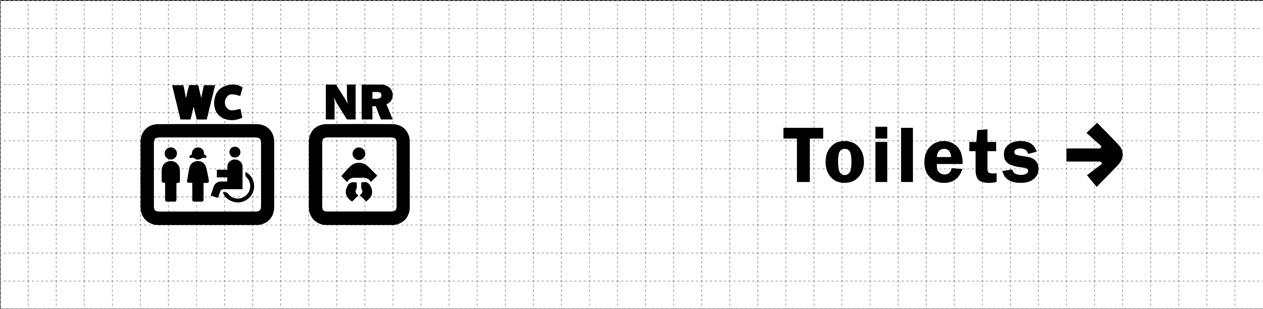
GENERAL NOTES:
The height and width of the icons is most often 2.5 times the Cap-Height of the typography.
Graphic Standards
33/50
VISUAL GRAMMAR – PRINTED MAP
Use a bright and festive color palette for the printed maps to create a fun and exciting atmosphere, while also ensuring that the colors are legible and easy to read.
Graphic Standards 34/50