1 minute read
VISUAL GRAMMAR – HANGING SIGN

from Design Manual
by C Chan

Recommended Sizing
The hierarchy of sizes account for the distance from which that type will be viewed, as well as the relative importance of that category of signage. Standardising type sizes by using such sizing catergories, maintains typographic consisteny.
Advertisement
GENERAL NOTES:
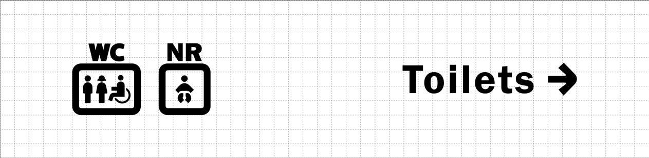
The height and width of the icons is most often 2.5 times the Cap-Height of the typography.
Graphic Standards 33/50
VISUAL GRAMMAR – PRINTED MAP
Readability
To ensure pictograms are proportioned appropriately, they will live within a rounded square, where the pictogram extends to fill 70% of the square, maximizing in ethier height or width of pictograms. The rounded corner will be a fillet of spproximately 17.5% the overall width of the square.
Dimensional Control
Graphic Standards 34/50
VISUAL GRAMMAR – PRINTED MAP
Hierarchy
Use clear visual hierarchy, solid shape and contrasting outline to ensure that the pictograms stands out and is easily identifiable.
Graphic Standards
35/50