1 minute read
SHOPPING MALL ENVIRONMENT

from Design Manual
by C Chan

(DE) CLUTTERING – PRINTED MAP
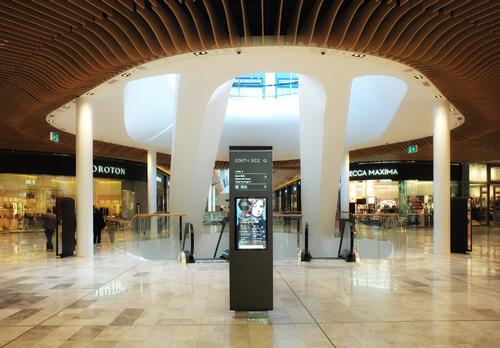
Clear Sight Lines For Signs
Advertisement
The map should be designed to provide clear sight lines for key information, to ensure that users can find the relevant information quickly and intuitively. Directional indicators should be clearly placed to indicate the most direct routes to key destinations.
Emphasize Key Information
To reduce clutter on a printed map, it’s important to emphasize key information most relevant to the user. This can be achieved by using larger fonts, bolding or highlighting important labels, and limiting detail in less important areas of the mall.
Clean Layout
Simple and clean layout with consistent fonts, colours, and icons makes the map easy to read and understand. The information should be organized in a logical and intuitive manner, with clear headings and labels to guide the user. In order to reinforce the sense of familiarity and location, the design should match the mall’s branding and guidelines.
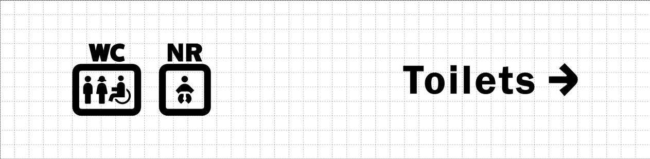
Simplify Iconography
To reduce clutter and improve readability, it’s important to simplify the map iconography. Use a limited set of icons, each with a clear and distinct meaning, and avoid unnecessary detail. The use of a single icon can be used to represent all stores, with additional labeling to indicate specific categories.