schultzcreative.studio tyler@schultzcreative.studio
Design Portfolio


about

Hi, my name is Tyler Schultz. I am a photographer, designer, writer and artist. I am both highly adaptable and firmly grounded, finding creativity in the world around me. Fueled by curiosity, I'm constantly looking to understand the people and places I encounter, learning of new ways to express things creatively. I want to bring my creative experience and unique perspective to an editorial team that uplifts and empowers communities and creativity.

Brand Identity
Cross-Platform, Brand Identity, Long-format
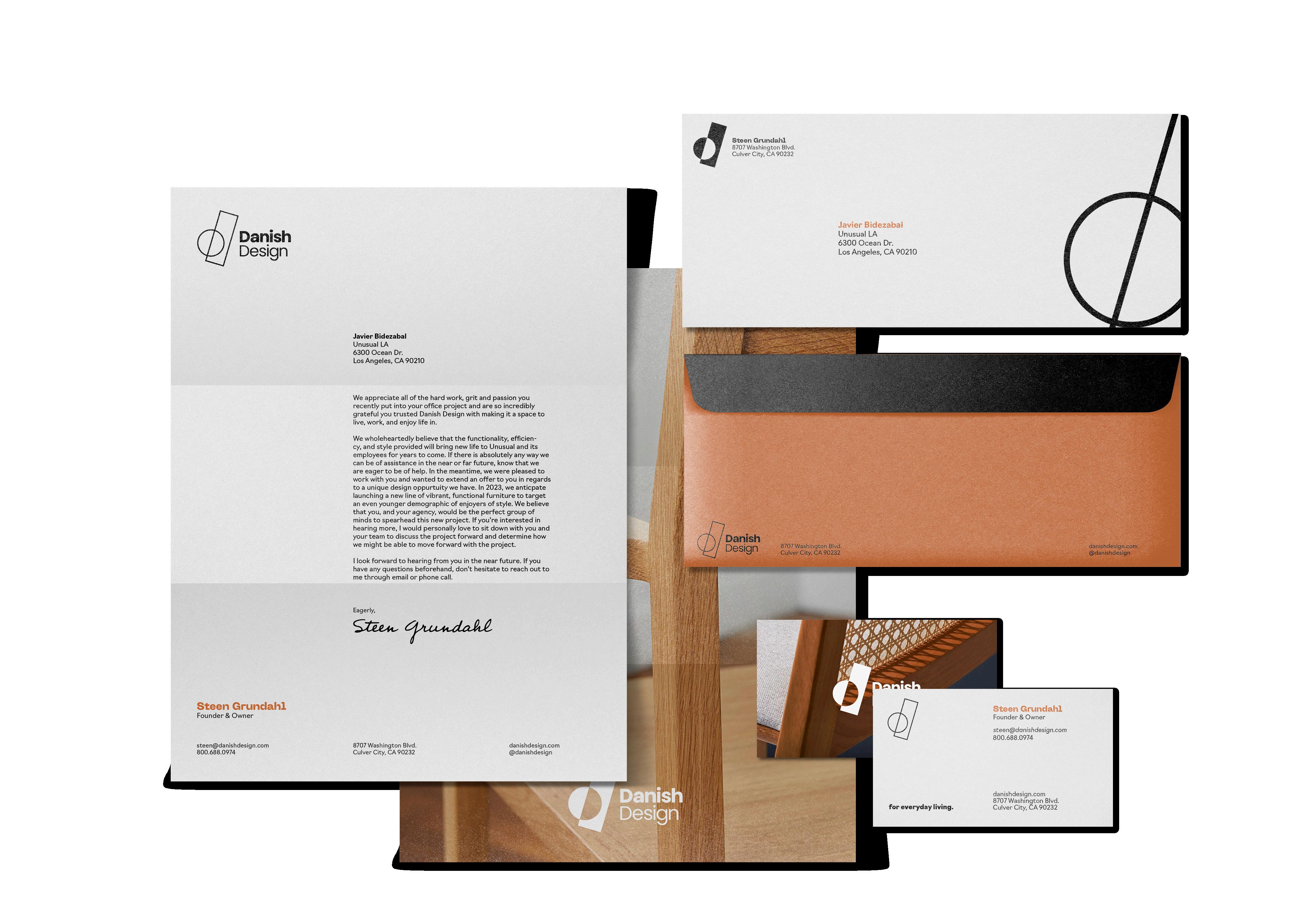
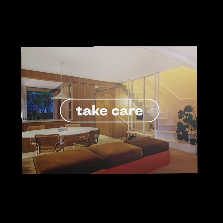
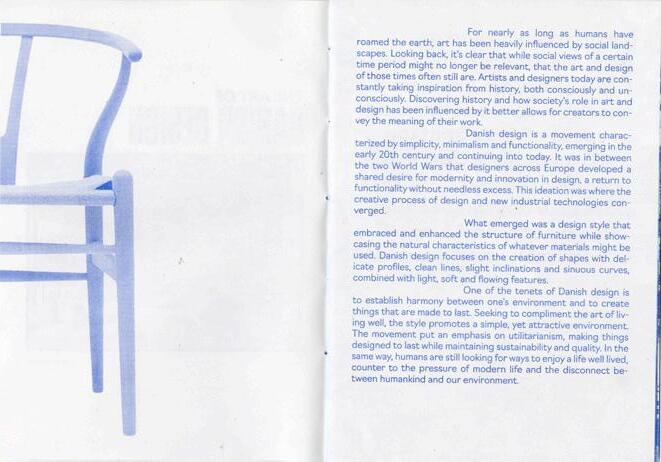
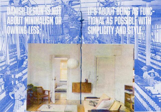
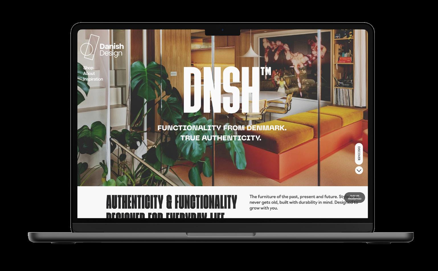
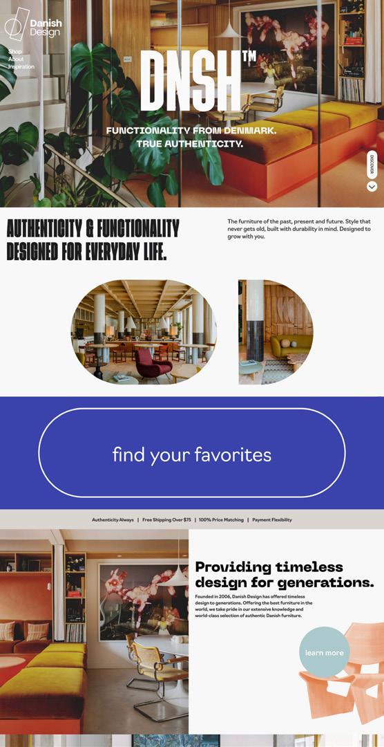
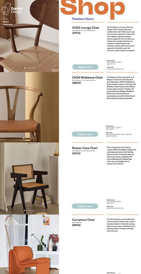
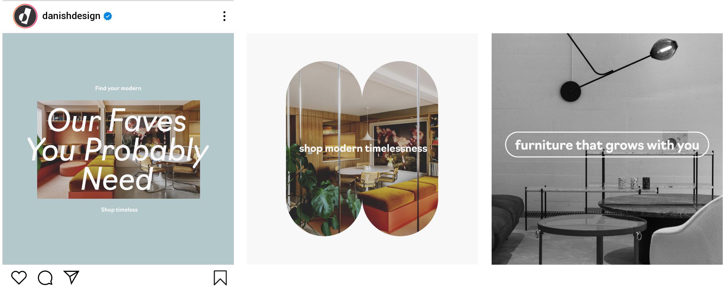
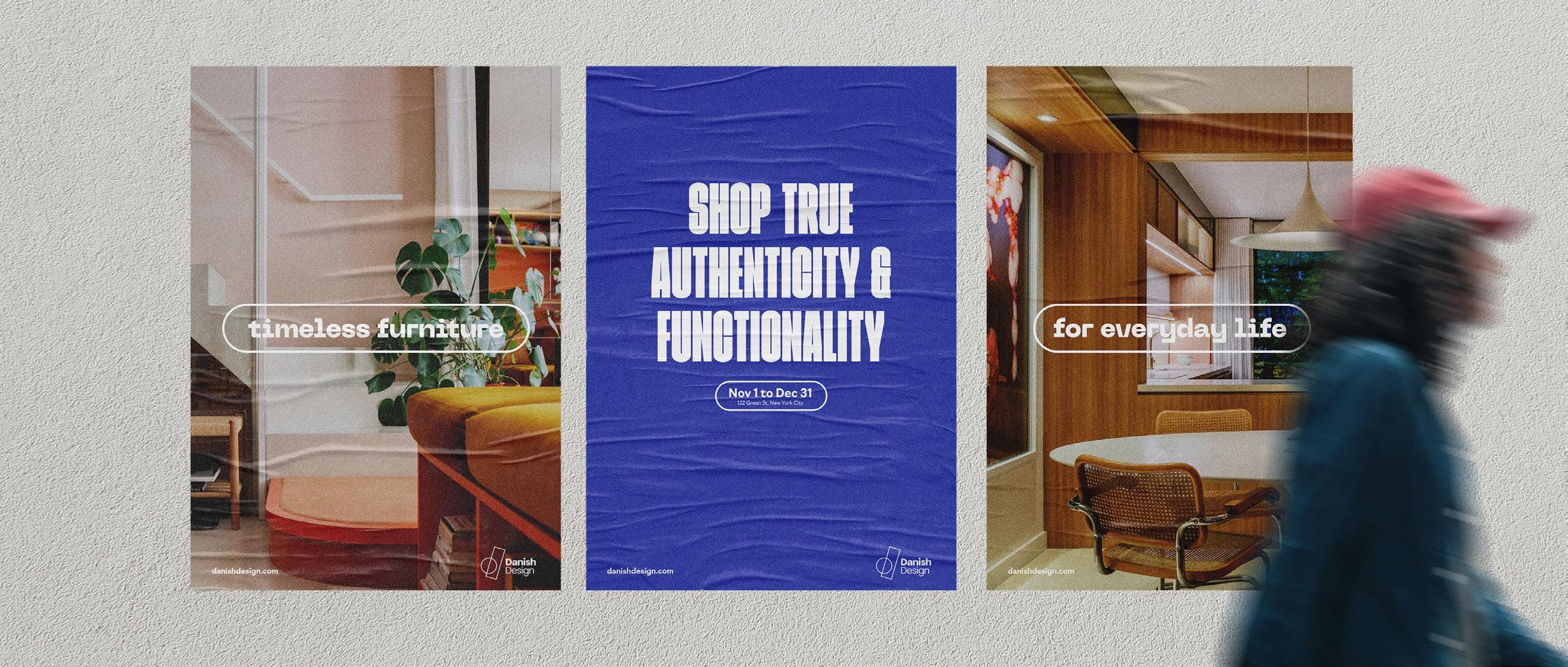
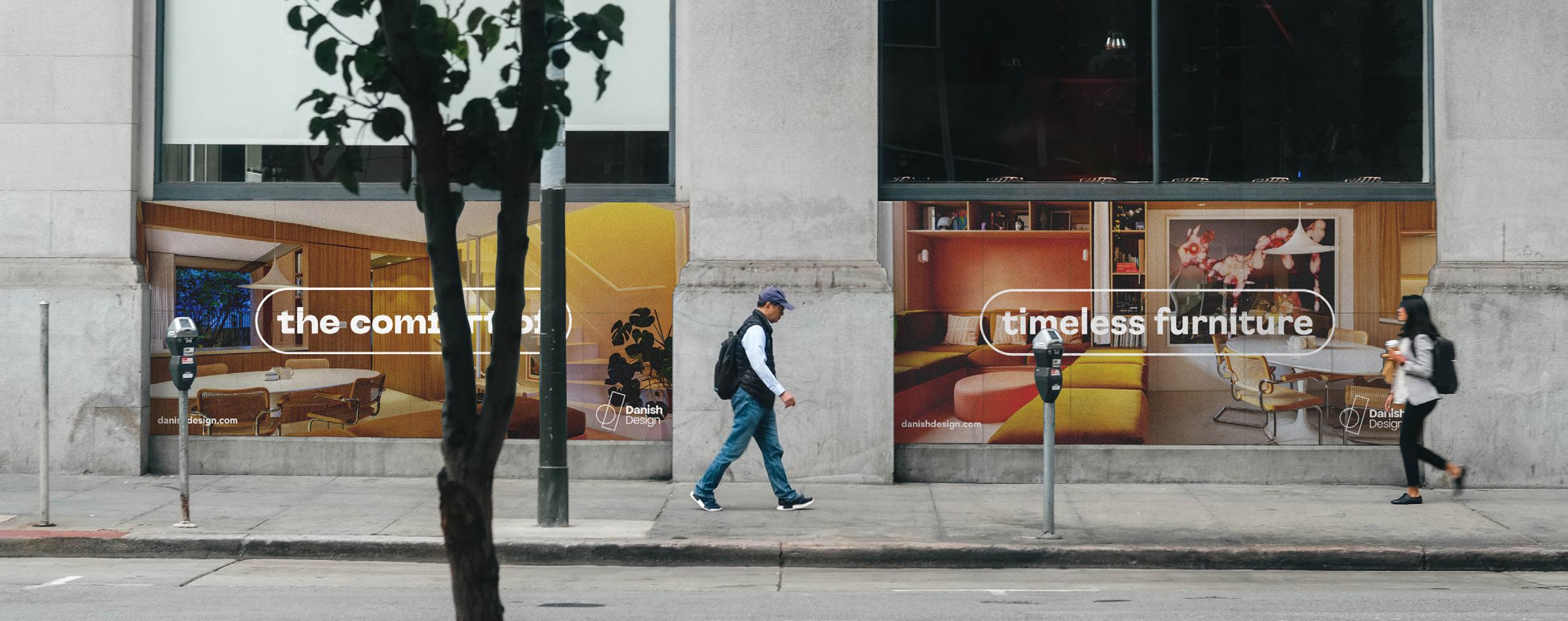
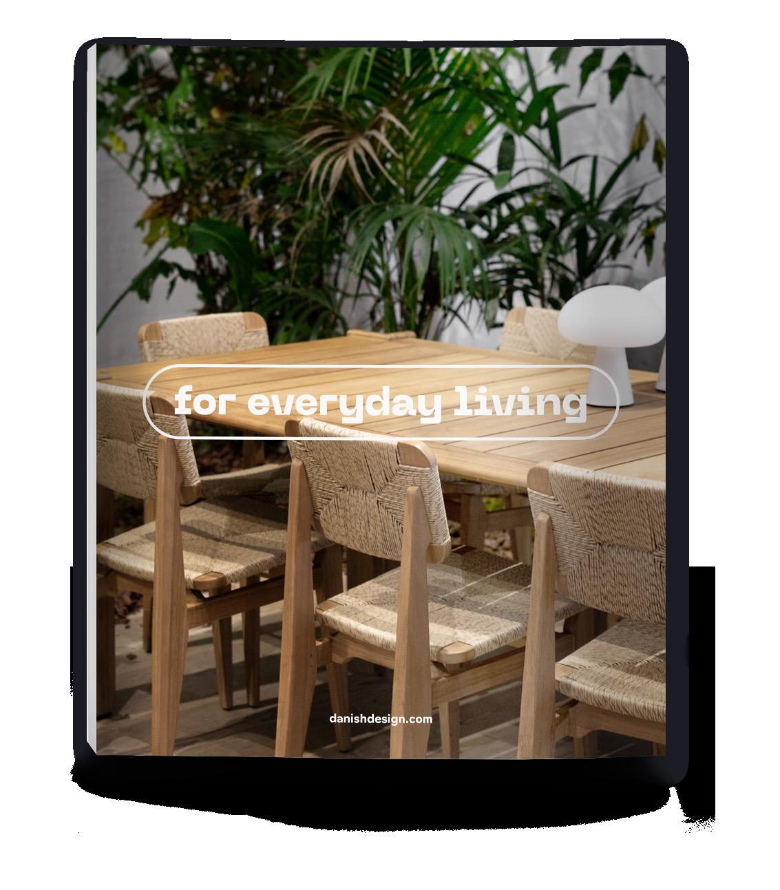
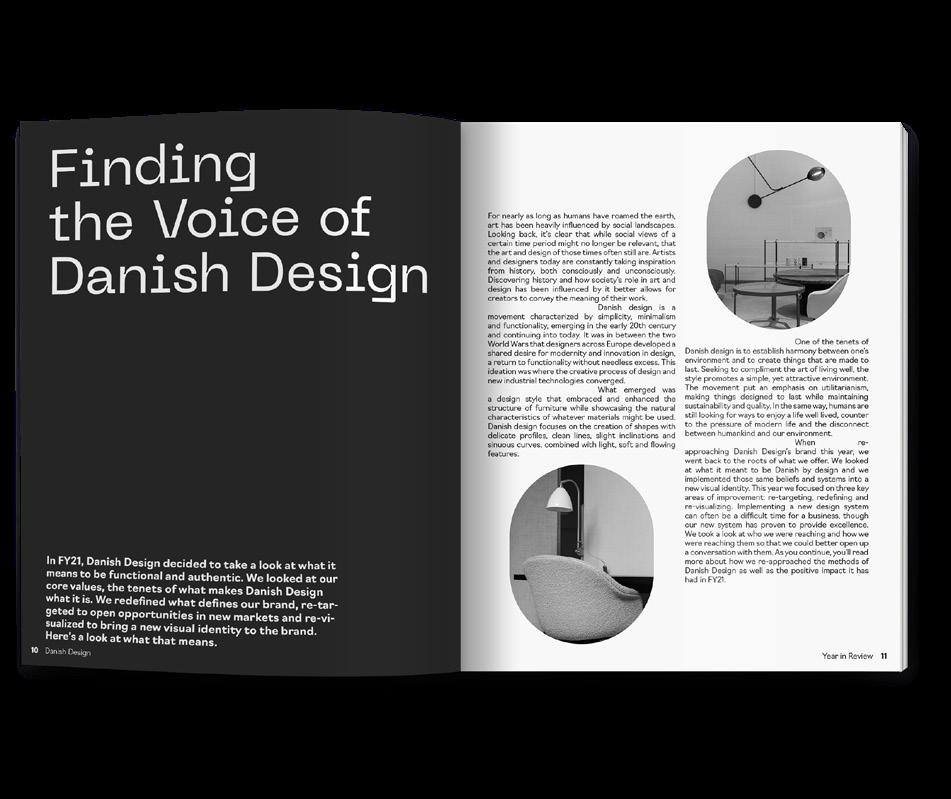
Danish Design Store is a furniture store focusing on providing authentic, functional Scandinavian design to the United States. This rebrand aims to bring a new energy to the brand’s outdated brand identity. This rebrand resolves the disconnect between Danish Design Store’s current identity and the tenets of Danish design - functionality, style, and simplicity. The rebrand offers a modern identity for customers to identify and connect with while improving their digital presence, a key pain point for the solely online retailer.


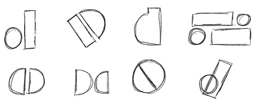
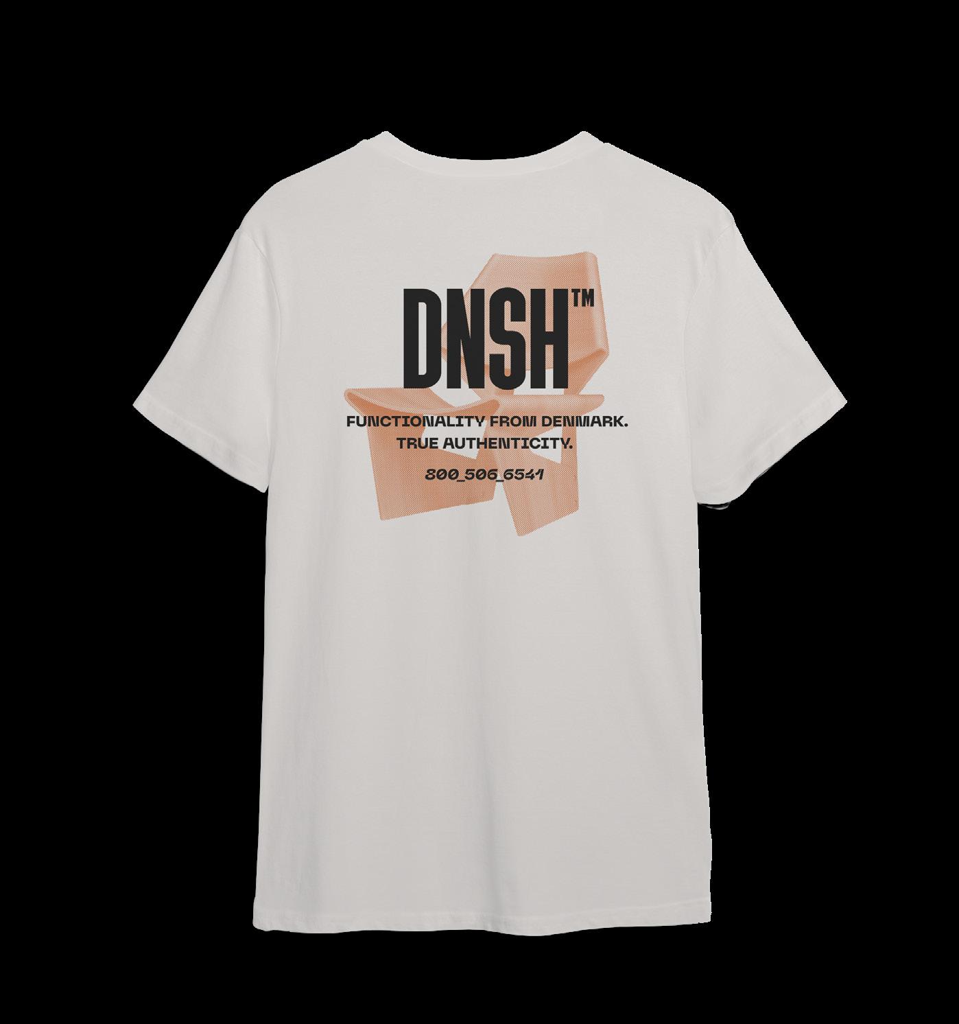
When brainstorming for the logo, I knew that I wanted it to reflect simplicity and functionality. In initial sketches, I aimed to break apart the letter 'd' into its most basic structures. It became clear through logo experimentation that the rectangle and circle, two fundamental shapes, were prevalent. I further explored the relationship between the two until I eventually reached the rough idea for the final logo execution. The linear style of the primary logo forms the letter 'd' from the simplistic, fundamental shapes of a rectangle and a circle.
Timeless sans-serif typography combined with experimental, new-wave sans type to exemplify how Danish design fits into the new era. A clear and concise use of typographic hierarchy to emphasize the most important information.
The primary palette consists of neutral tones that reflect the nature of Danish design and the colors found throughout the home along with a vibrant blue that represents imagination and the personal influence on design. The color palette combines the idea that functionality can be individualized, accenting the home with personal flare.
Initial logo sketches
Finalized logo & inverse logo
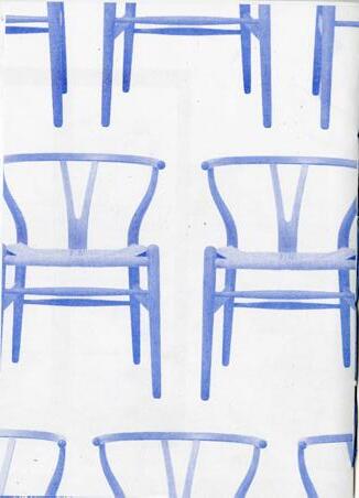
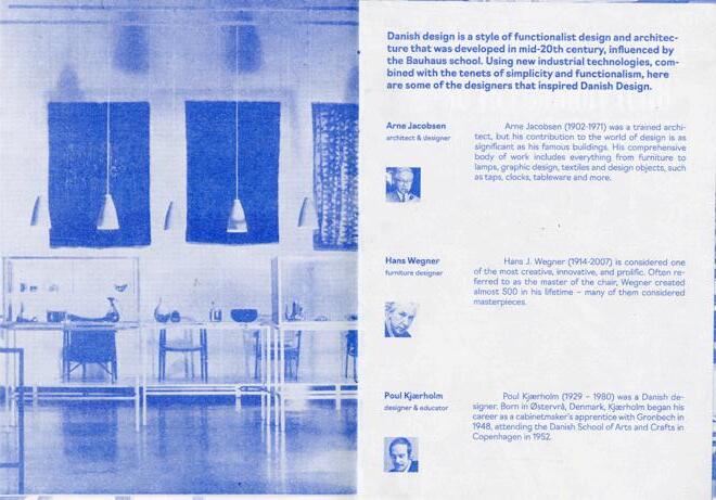
Designed by the greatest minds of Danish design's past and present, our furniture is made to last
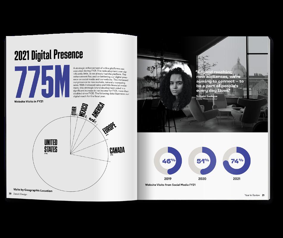
As an online furniture retailer, it's vital to understand the digital space and market accordingly. Danish Design Store's market focus is on young adults aged 25-35 who are early in their professional career. Located around the world in large metropolitan areas like CMDX, Berlin, NYC & Toronto. The market is interested in style and function, is tired of the corporate design trends of the twenty-first century. Willing to spend a bit more to ensure that they get the highest quality in a product, but doesn't enjoy the overly intricate or elaborate style. Strategically targeting this market is of key importance as they begin to search for "real" furniture that will last a lifetime.
The rebrand targeted the core of Danish Design Store's current identity, better connecting the identity to the design style's tenets of functionality and simplistic style. The decision to condense the brand name to Danish Design was influenced by the retailer's reliance on the digital marketplace without any physical store locations. The rebrand also improved the brand's digital presence through an increased focus on digital marketing and the improvement of the website's user interface and experience. Influenced by research, re-targeting allowed for the careful consideration of type, color, image, and tone to establish a better connection to the brand's audience while establishing Danish Design as a trusted online furniture retailer.

Online
40%
are below 40 years old
75%
base credibility on the visual identity
20%
are aged 25 to 34, making up the largest segment
48%
head directly to larger, more recognized brands
 Existing Danish Design Store Branding
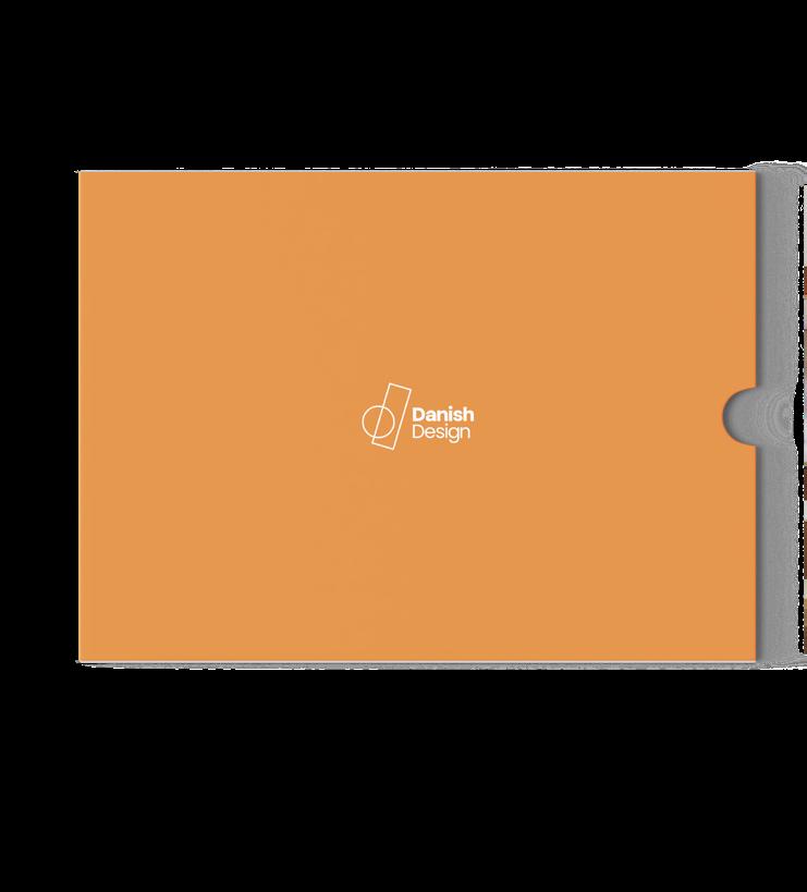
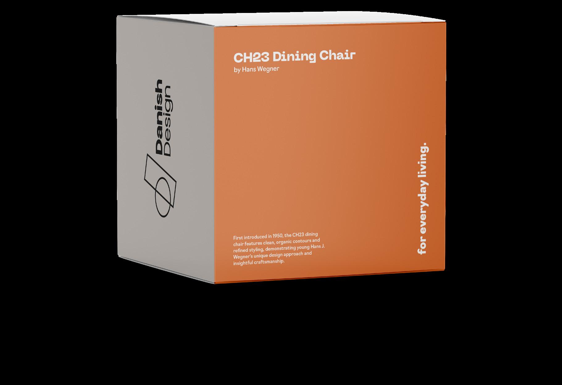
Furniture Packaging

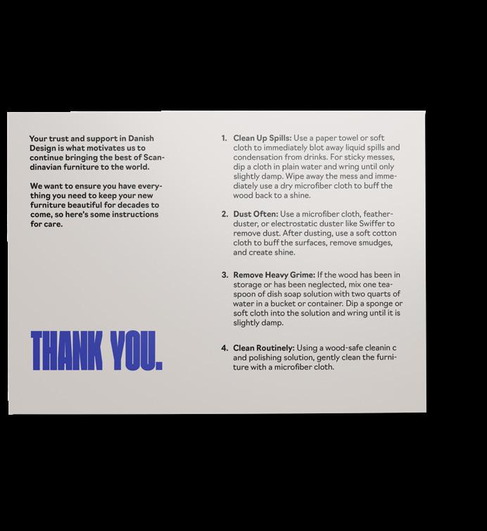
Furniture Care Instruction Card
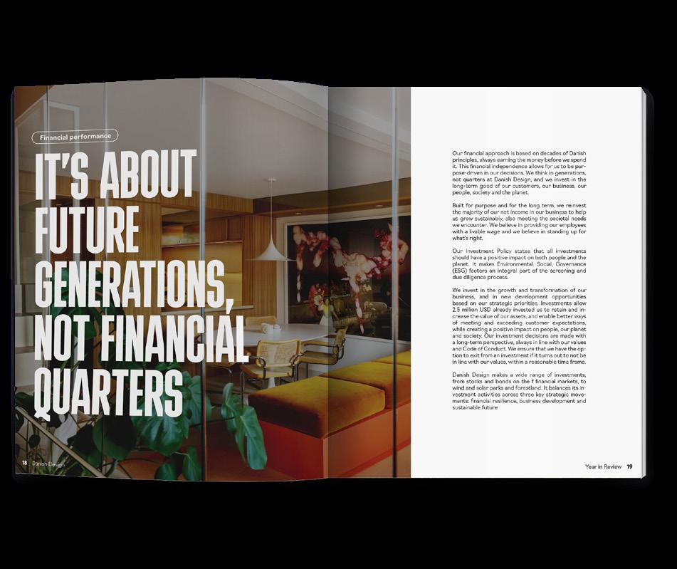
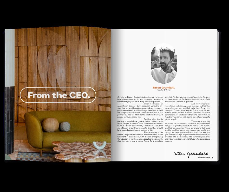
Annual Report Front Interior Spreads
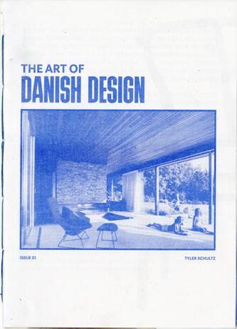
40 Page Magazine
Long-format
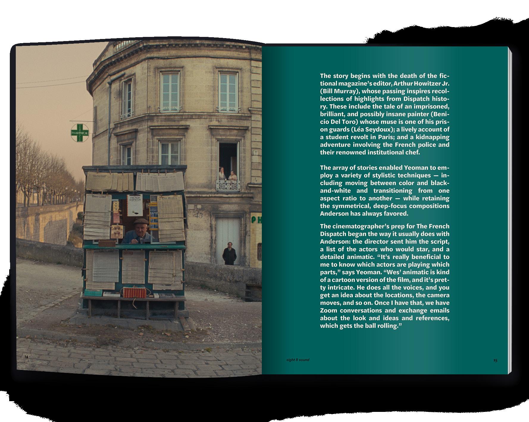
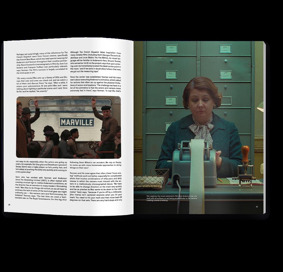
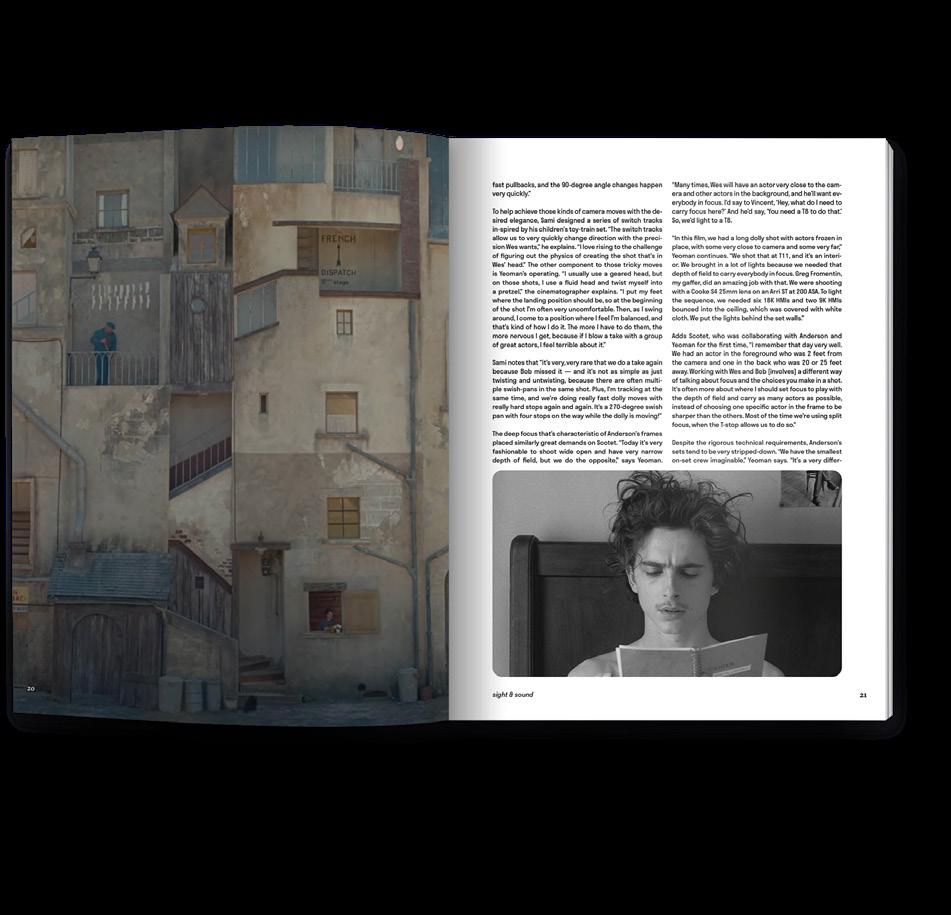
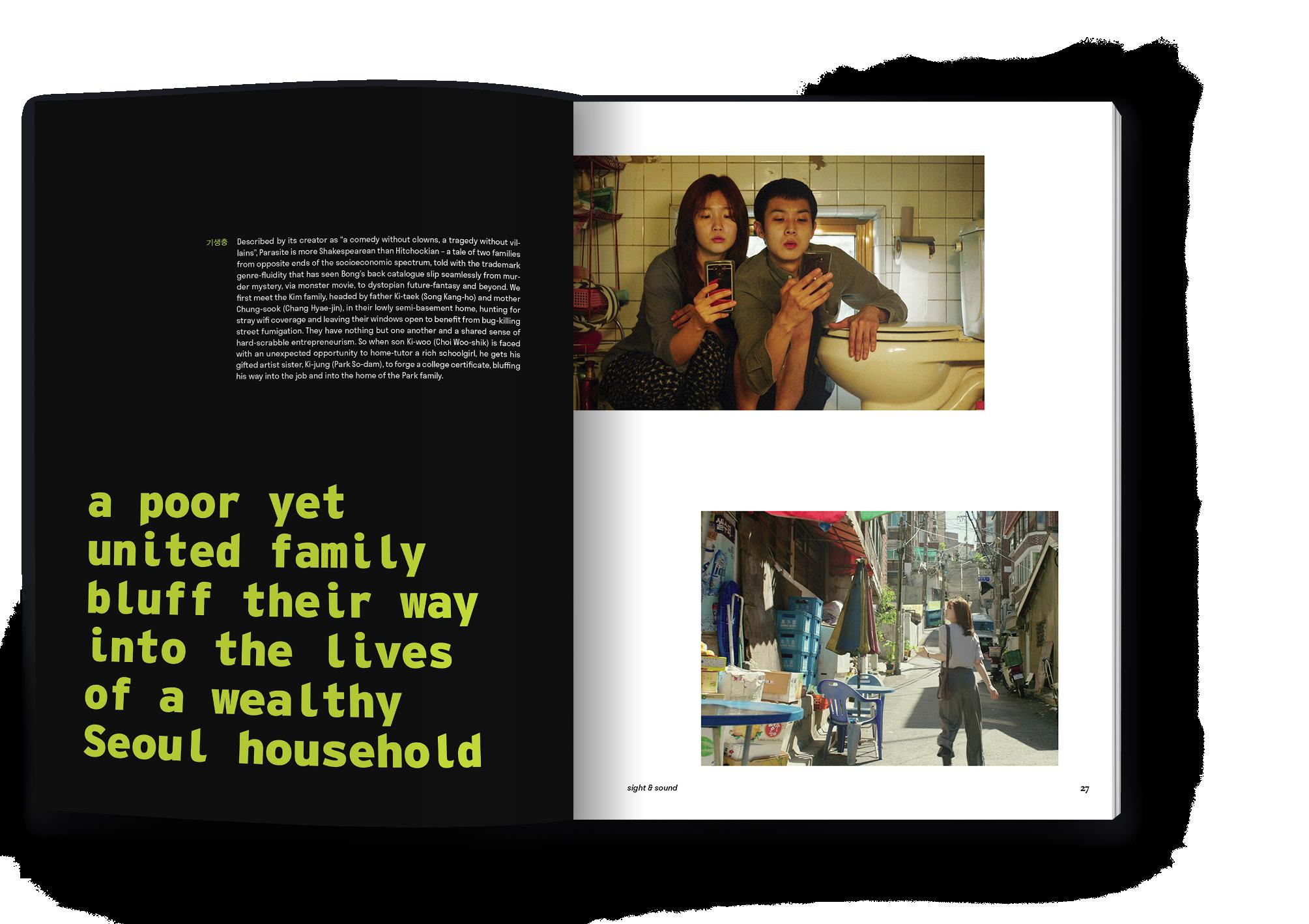
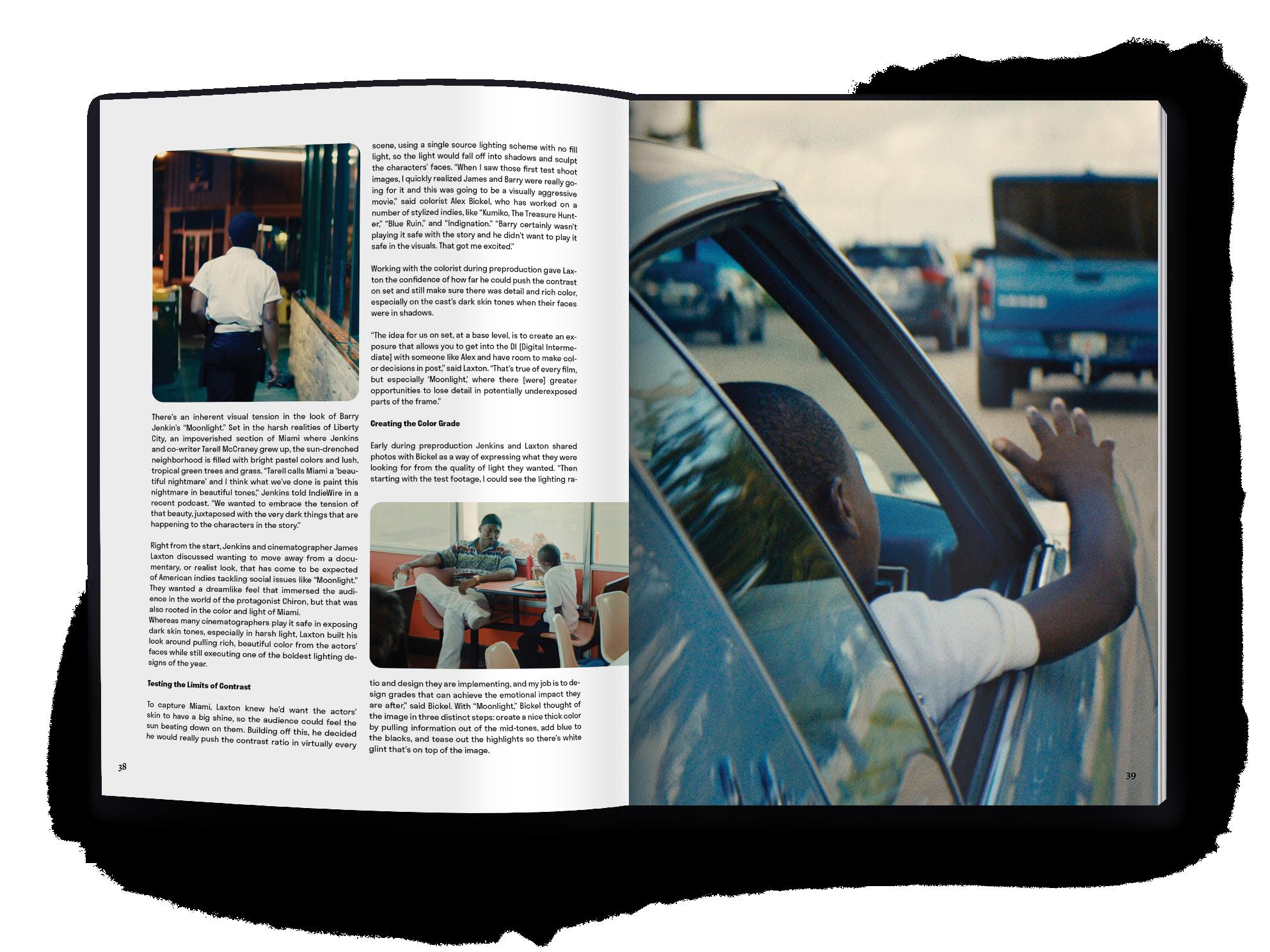
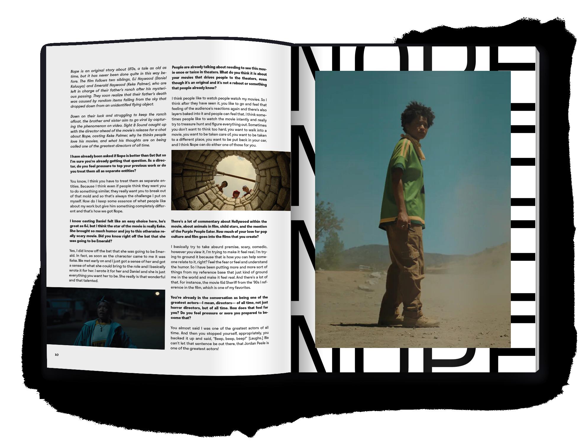
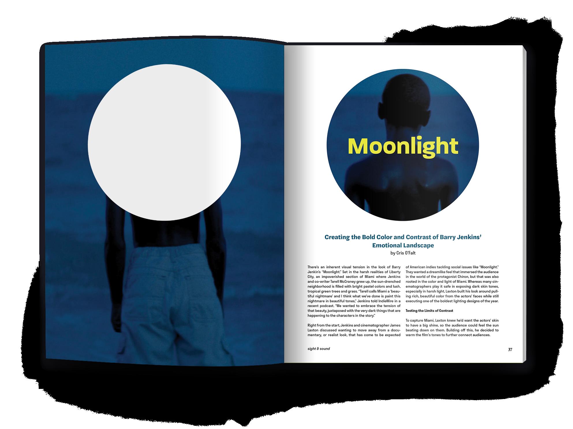
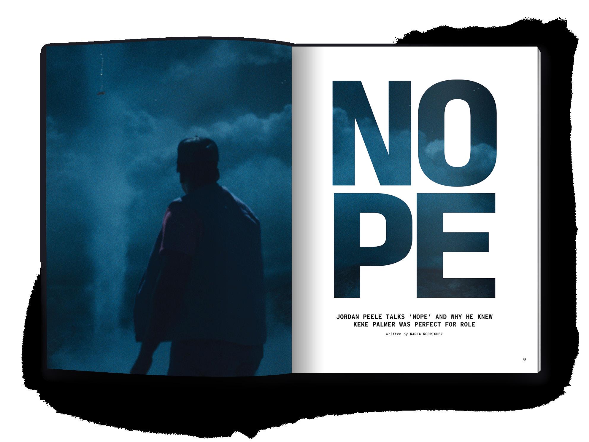
Sight & Sound is a fictional film magazine that aims to highlight the visual design and creation of films. Unlike other film publications, Sight & Sound focuses solely on the visual and sound design and their role in the art of storytelling.
The publication itself utilizes experimental and modern design styles in combination with vibrant film stills, approachable copywriting, and sophisticated topics to maintain an approachable, yet informed perspective. Designed, visually and verbally, to draw anyone who finds interest in visuals, the publication breaks through the jargon offered by others.
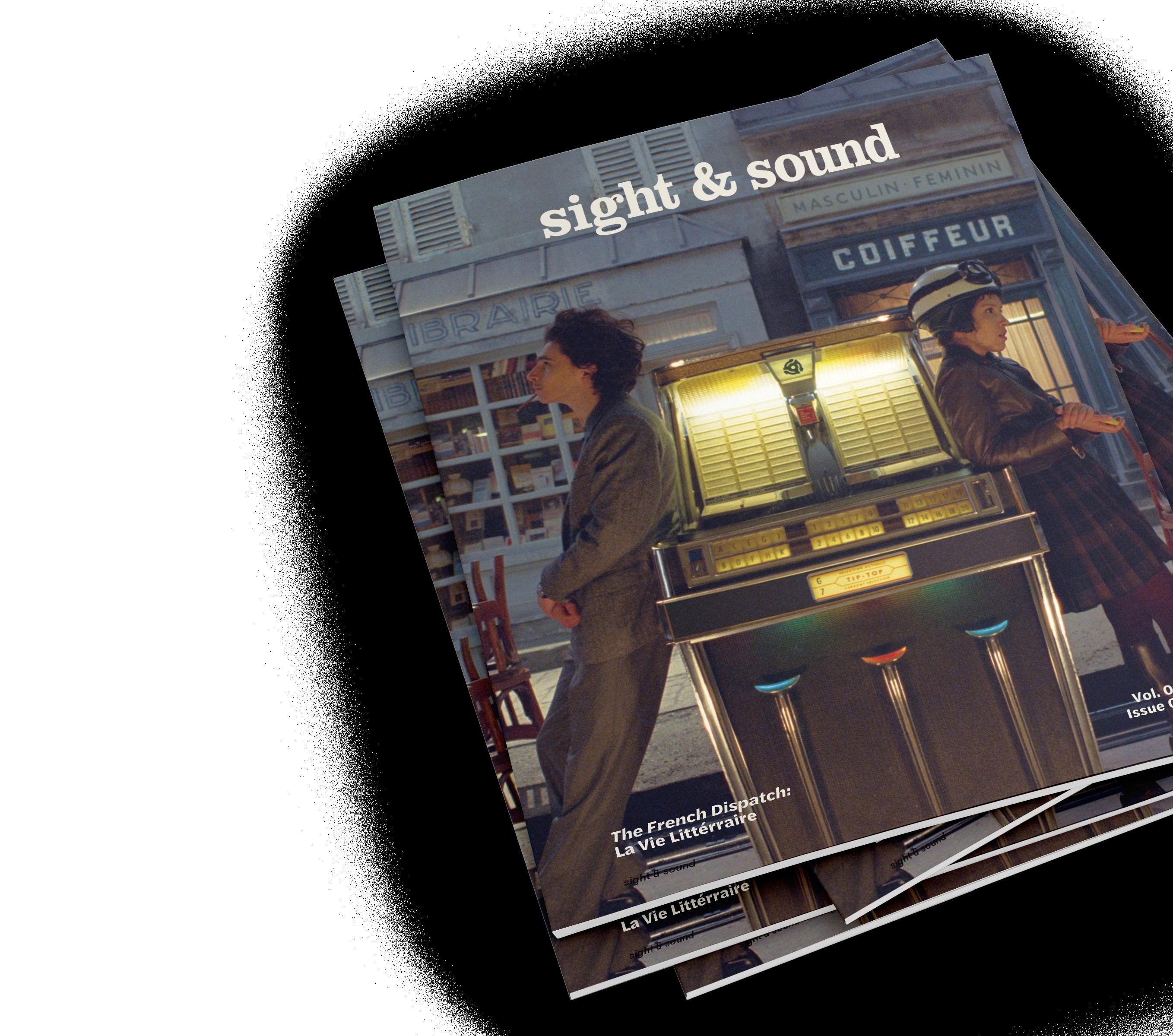
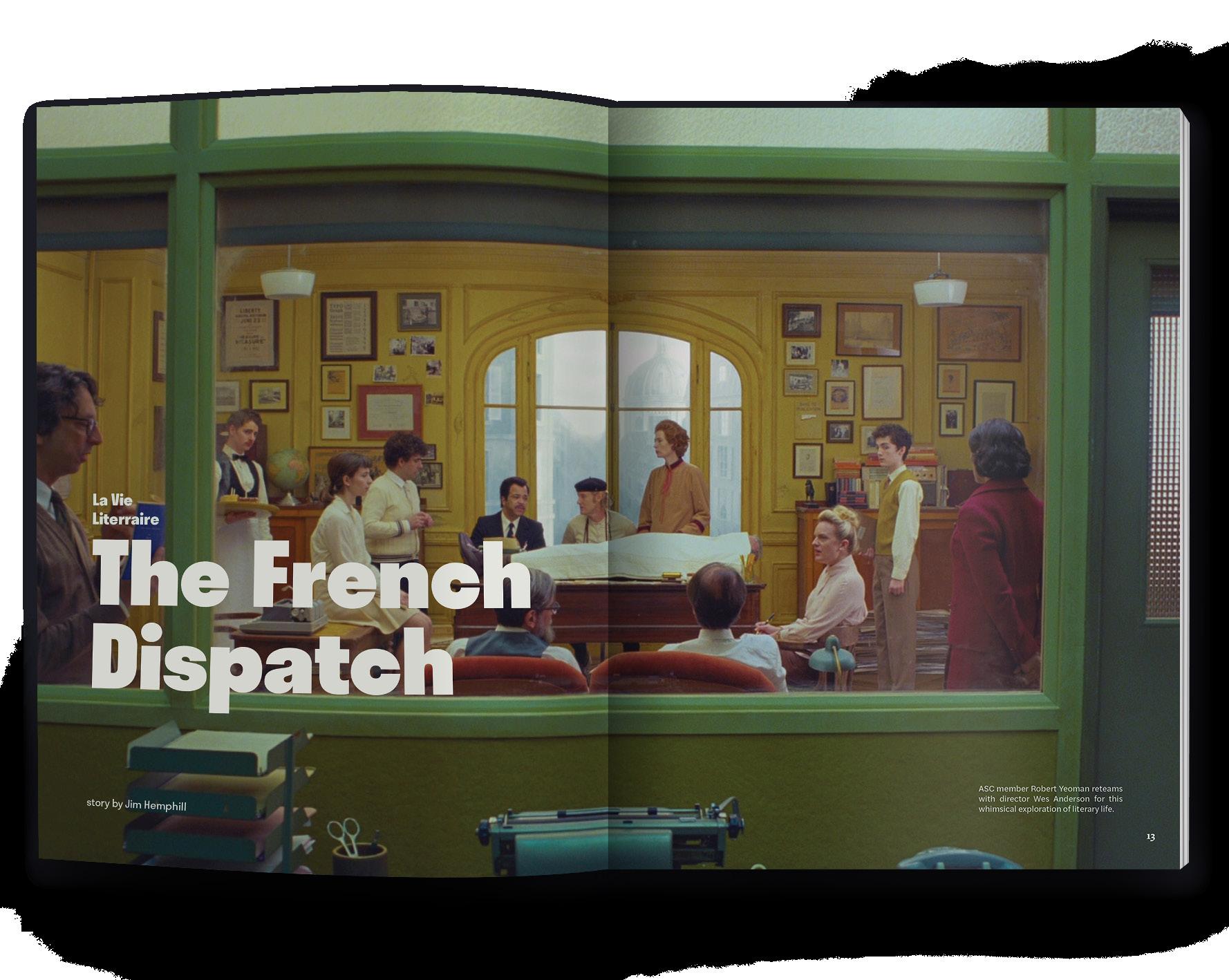
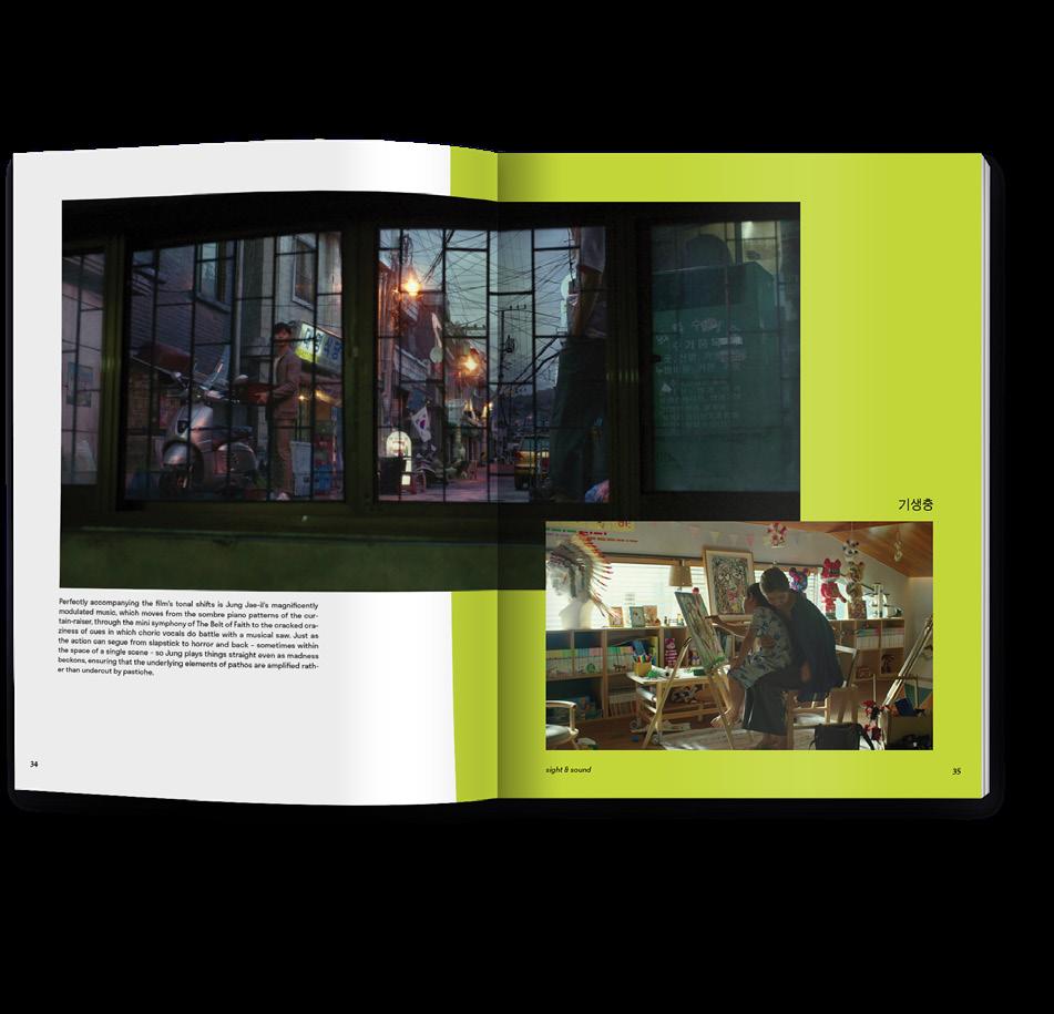
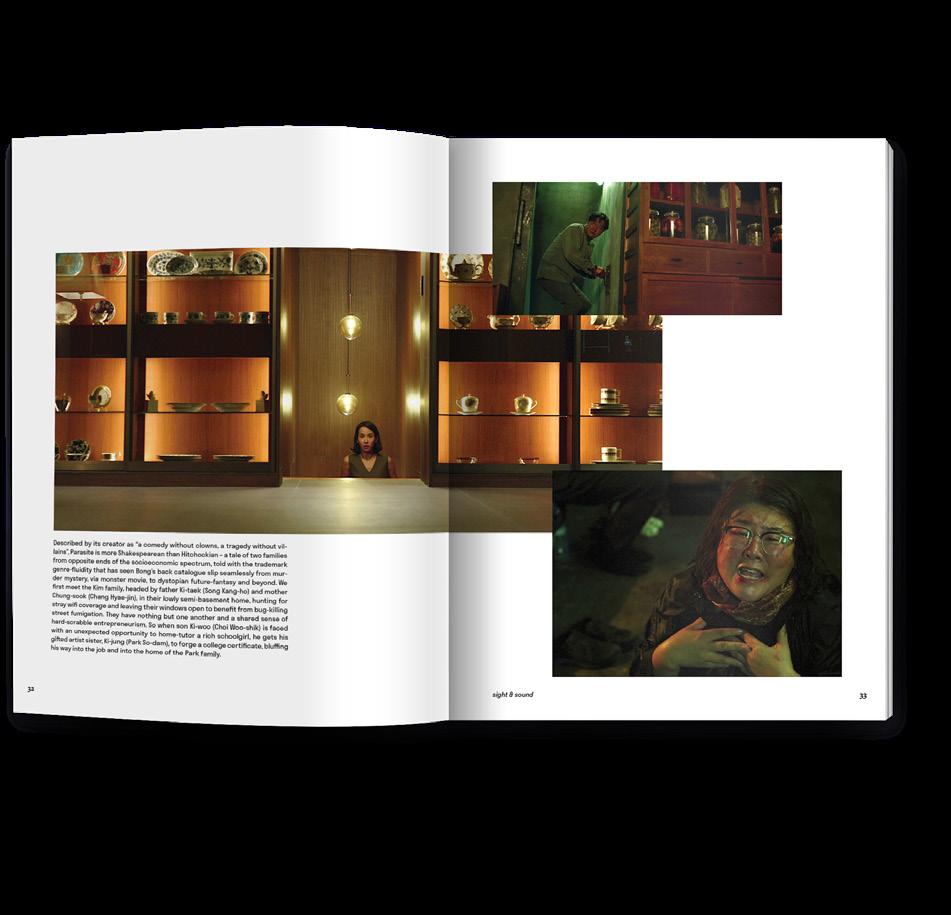
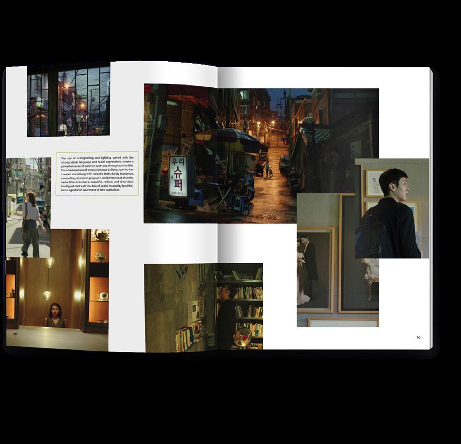
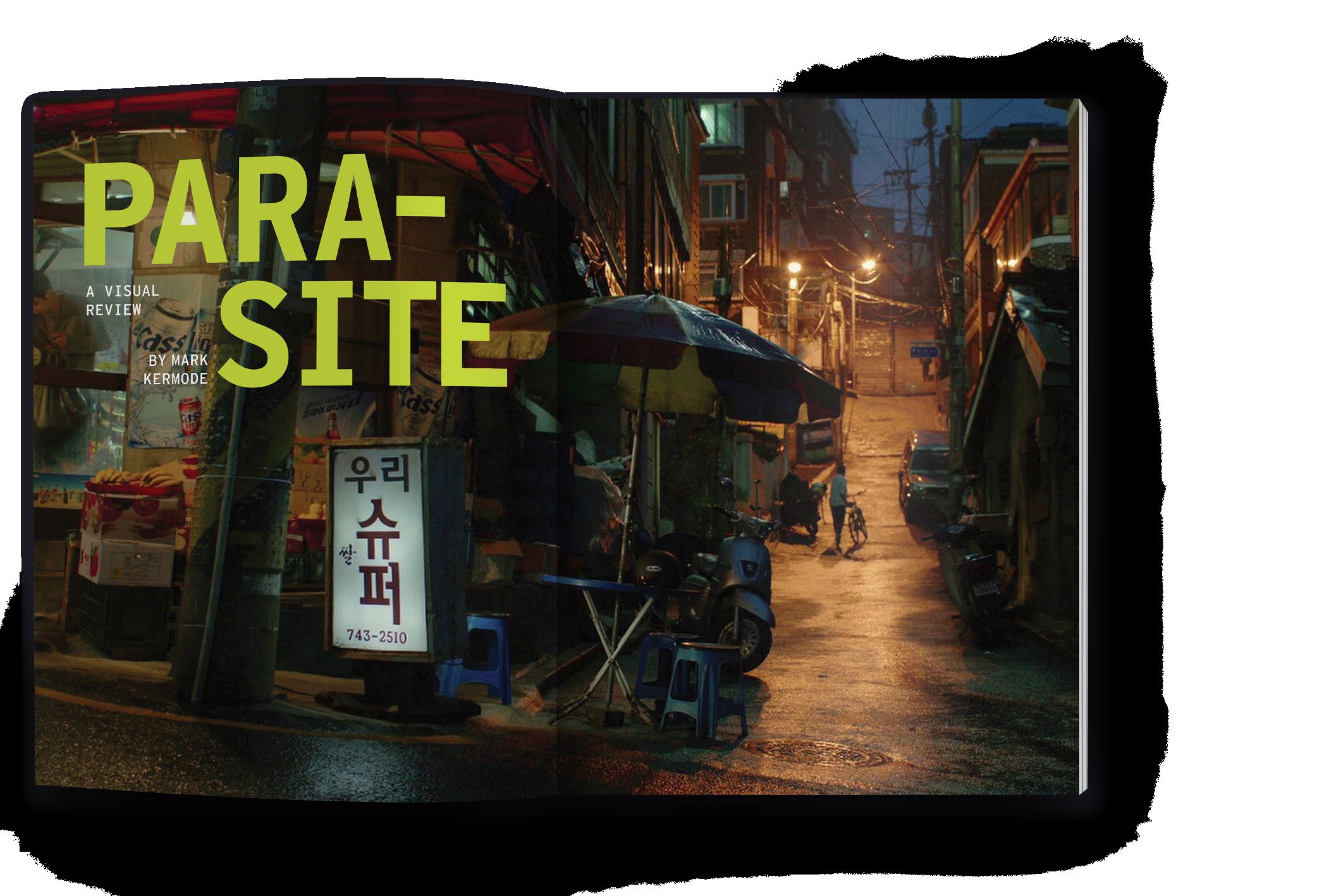
Parasite Visual Feature Story
16 Page Catalog
Long-format
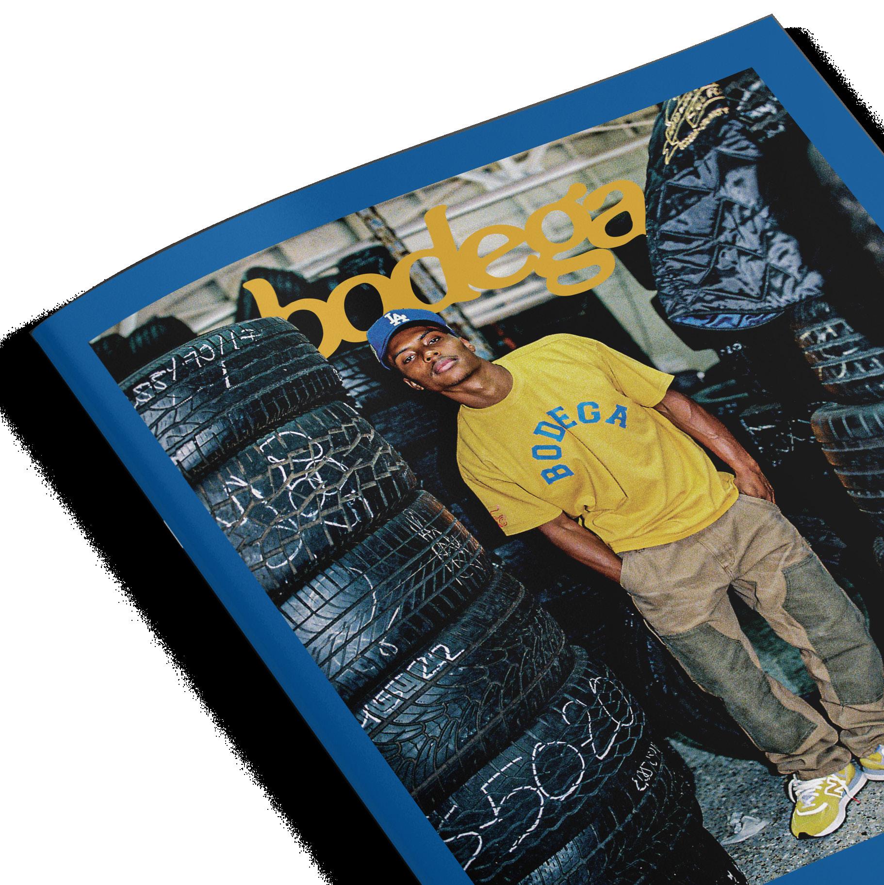
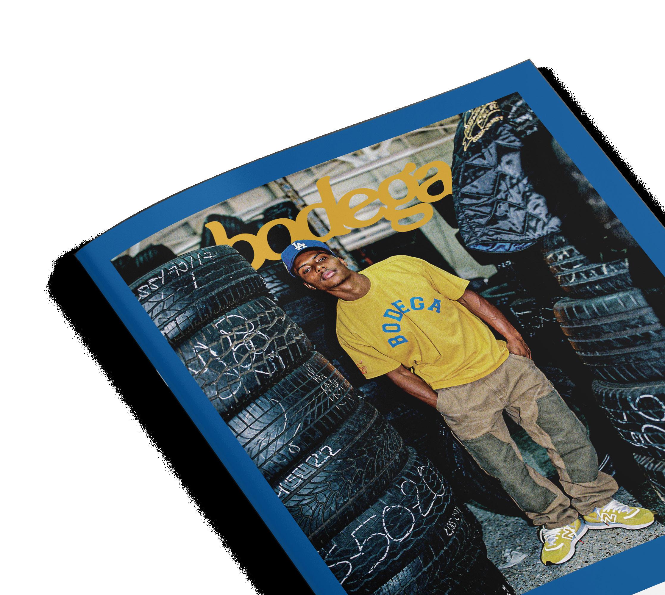
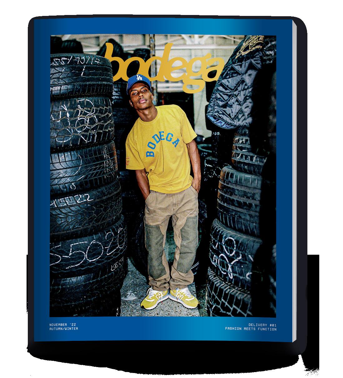
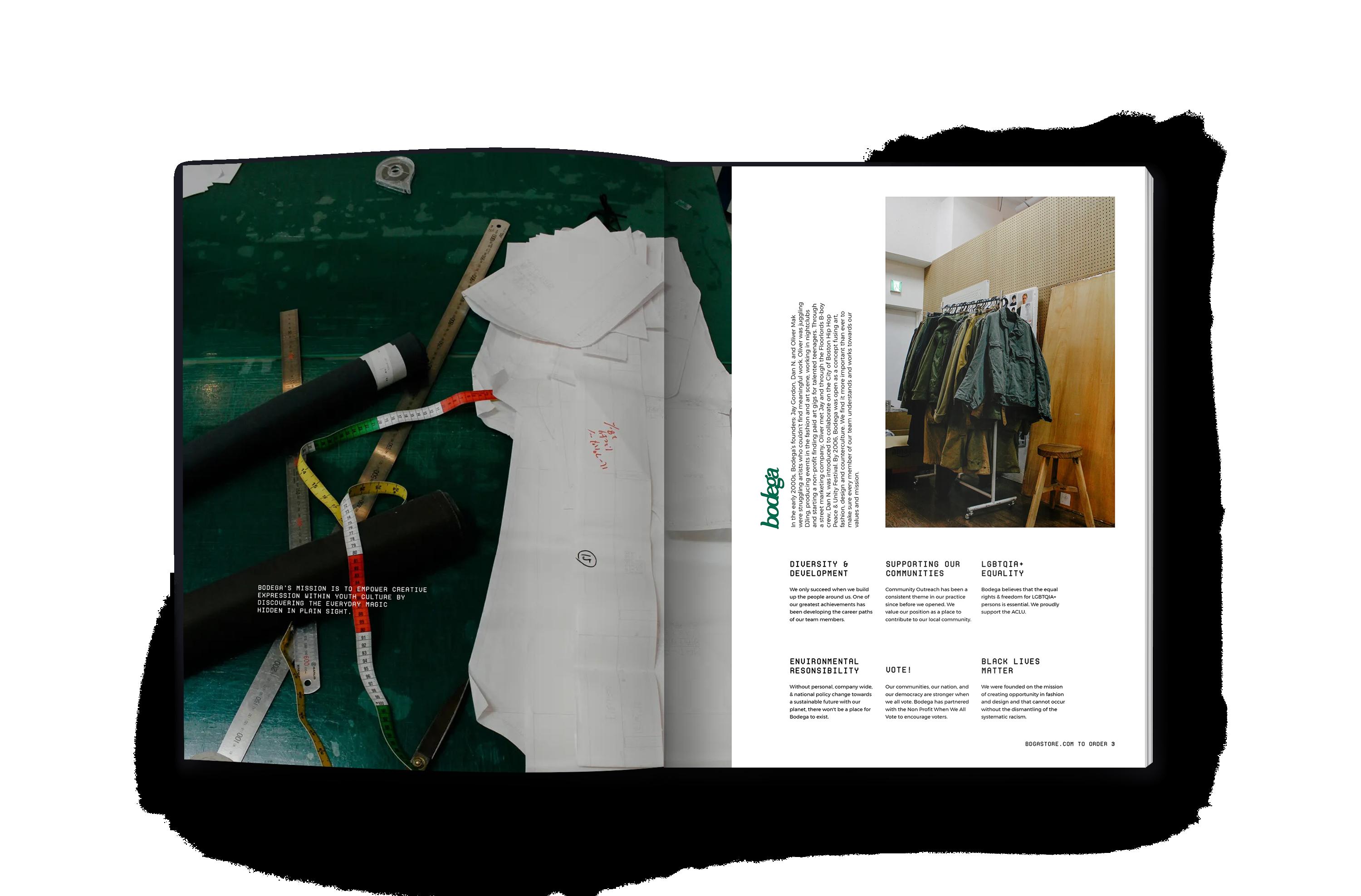
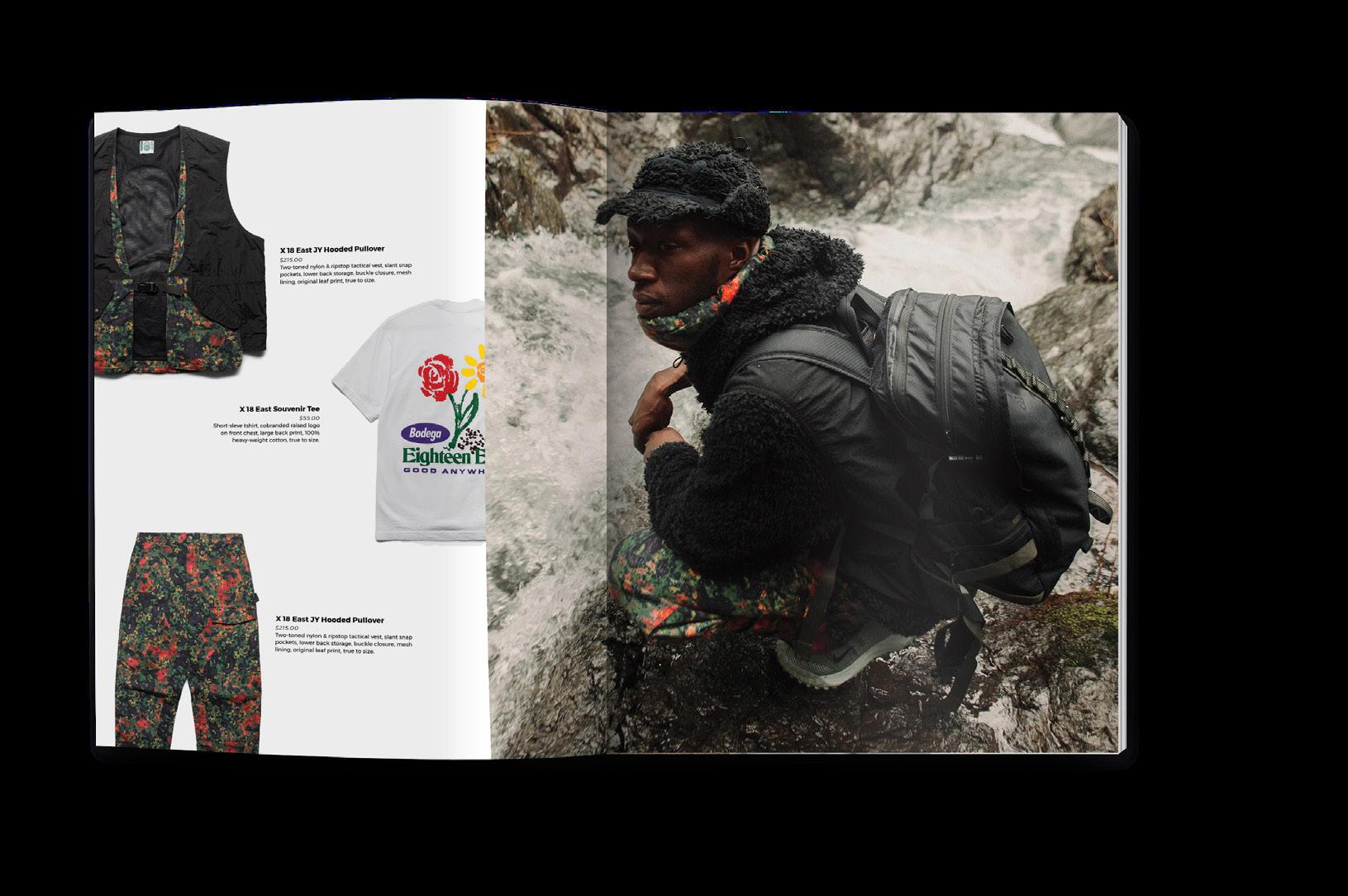
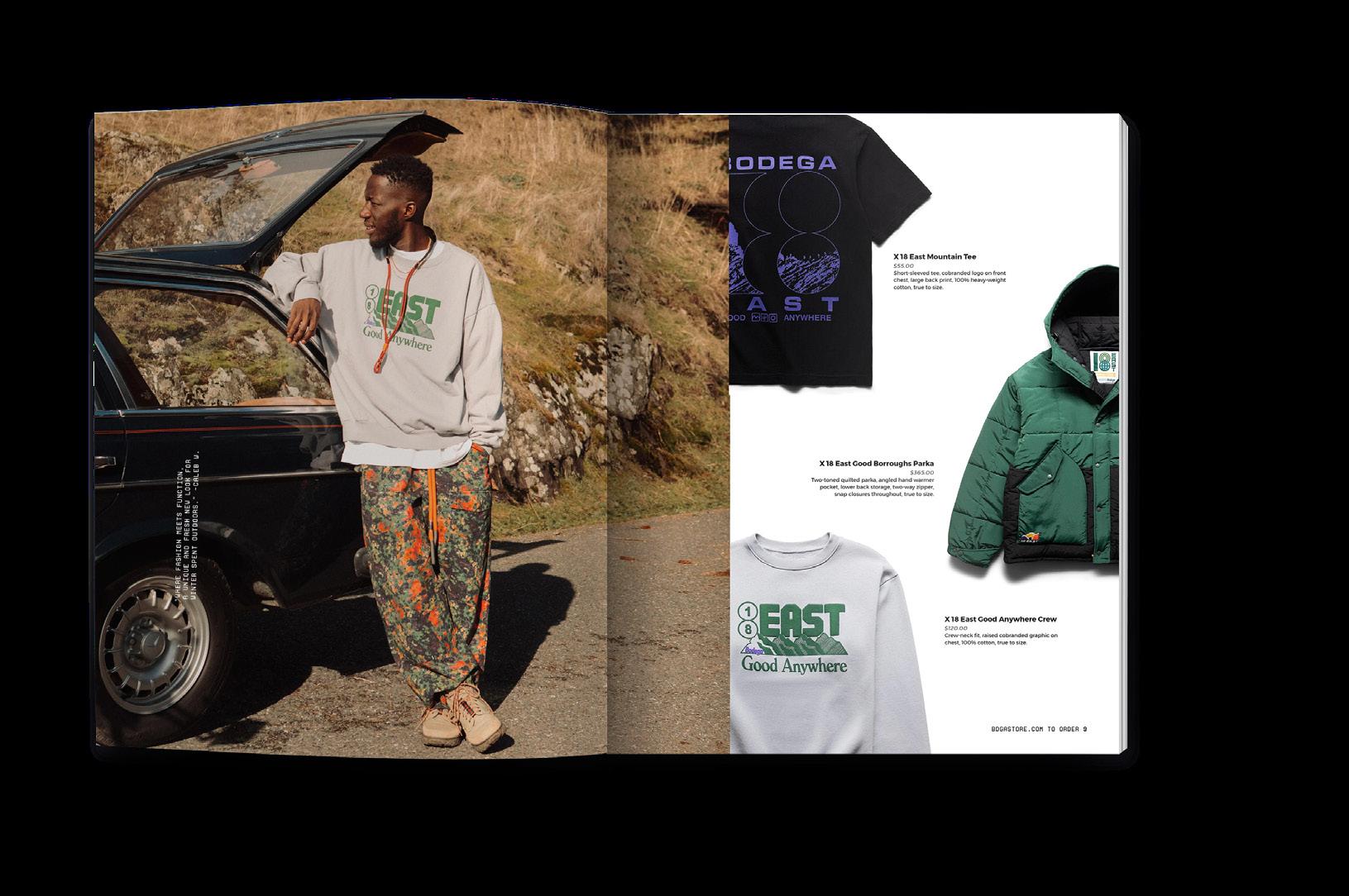
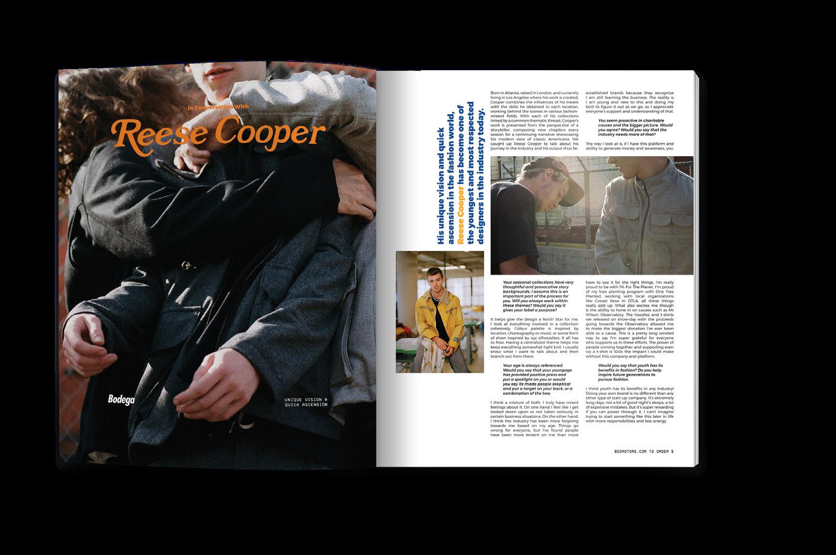
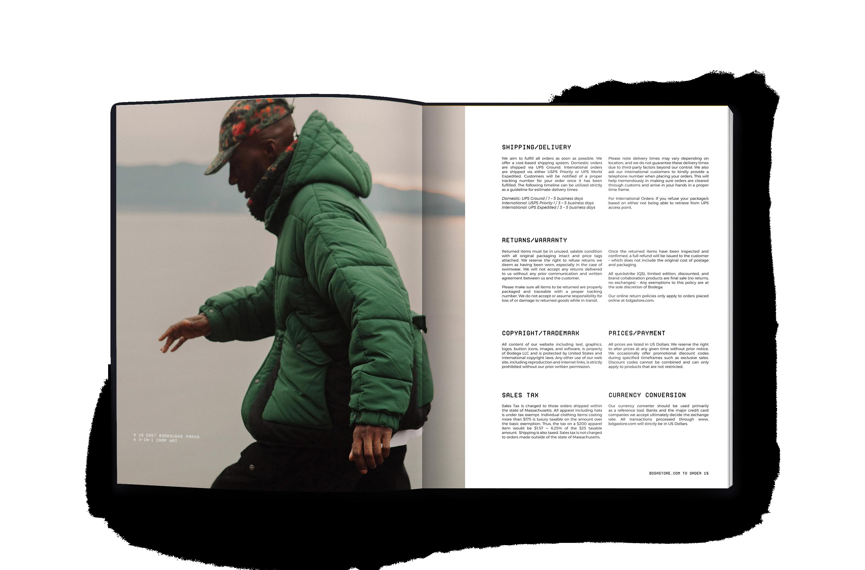
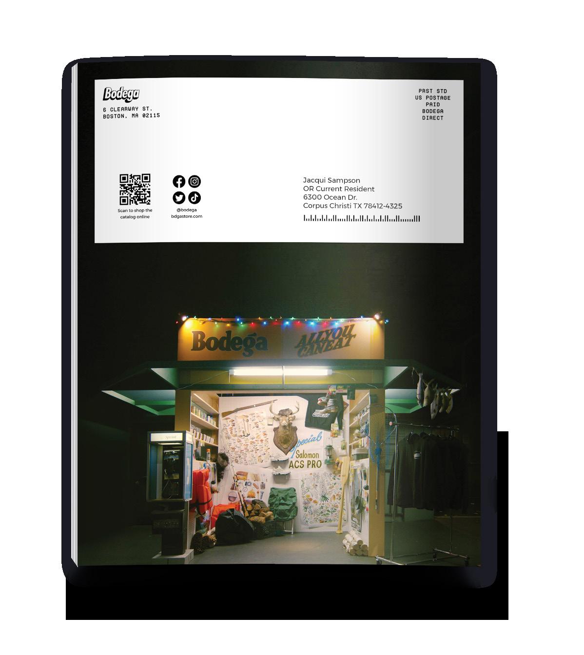
Bodega is an independently owned street-wear and urban fashion retailer who's mission is to empower creative expression within the street-wear scene. Bodega was created as a tool to expose the world to the unexpected and out of the ordinary visions that come from the scene. The retailer aims to unite through a love of fashion, art, counterculture, and design, offering a uniquely diverse community brought together through street fashion and culture. Beyond selling street fashions, Bodega strives to uplift visionaries, offering their brand as a platform for creative minds to share their styles with the world. Bodega tells the stories associated with their pieces, which is where I drew inspiration for this theoretical catalog. The 16-page catalog offers a look into the mind of one of the designers in their Autumn/Winter 22 lines along with lifestyle spreads to support the versatility and function of the line.
Interior Spreads
Terms of Service & Back Cover
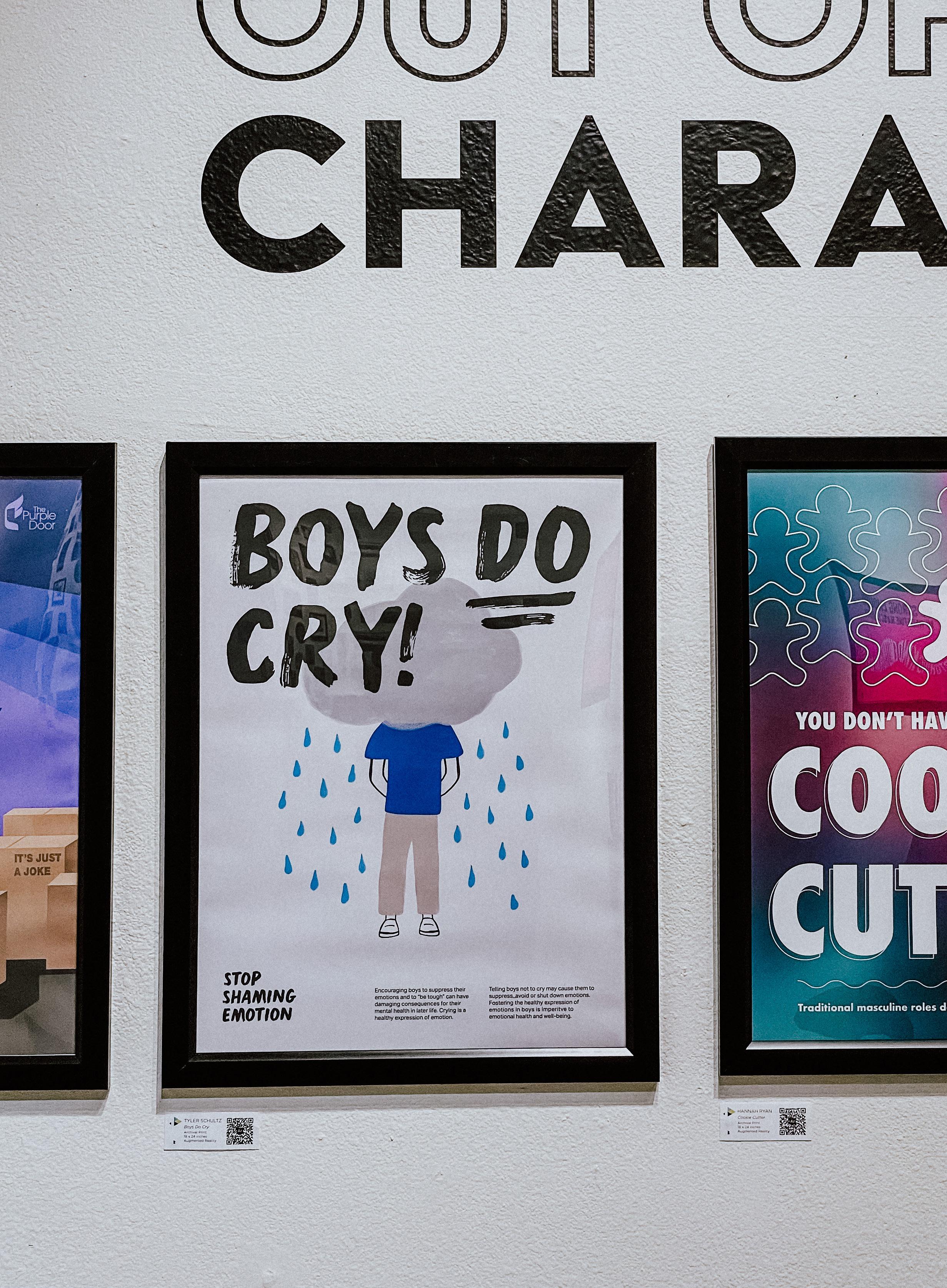
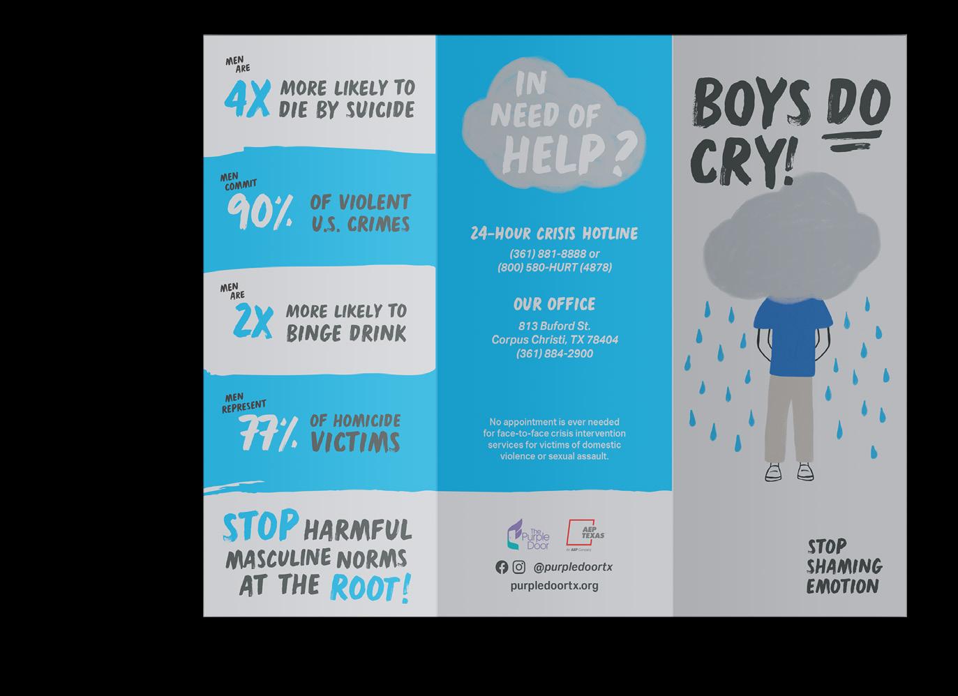
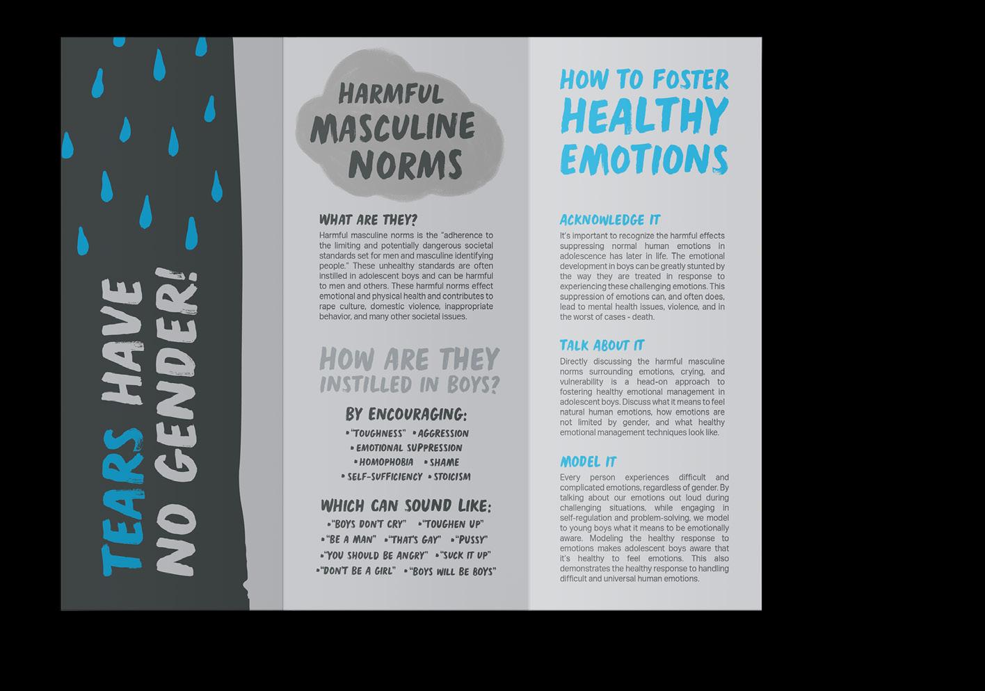
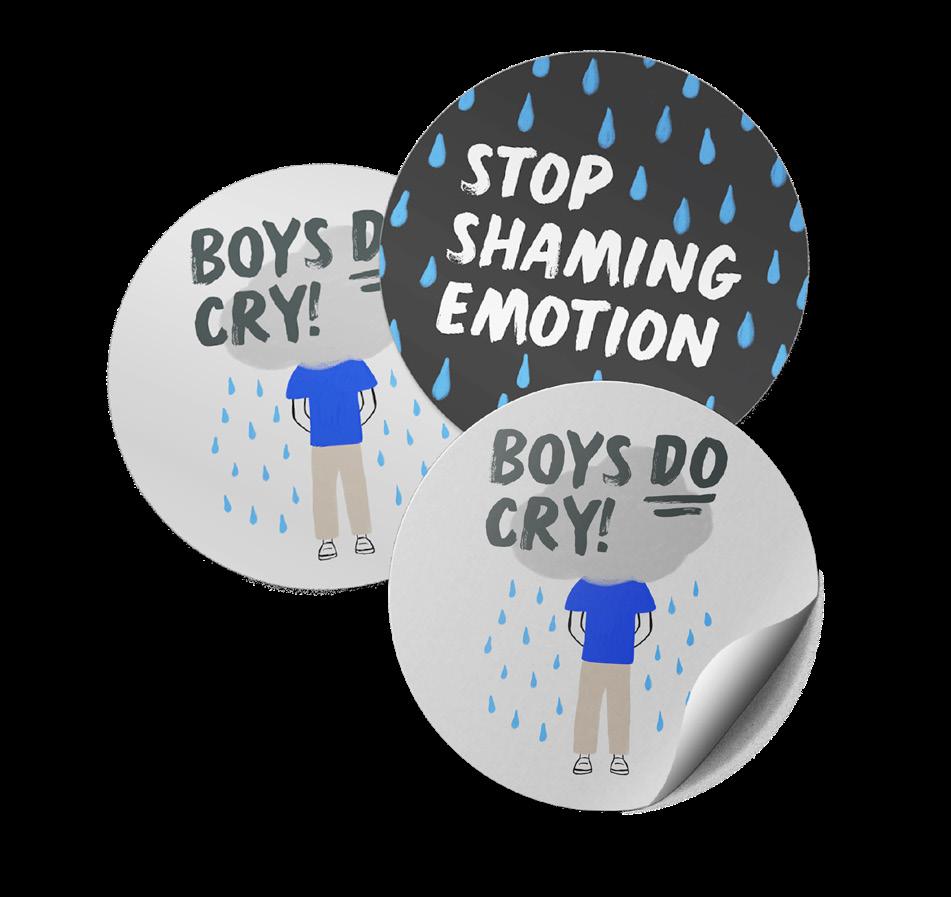
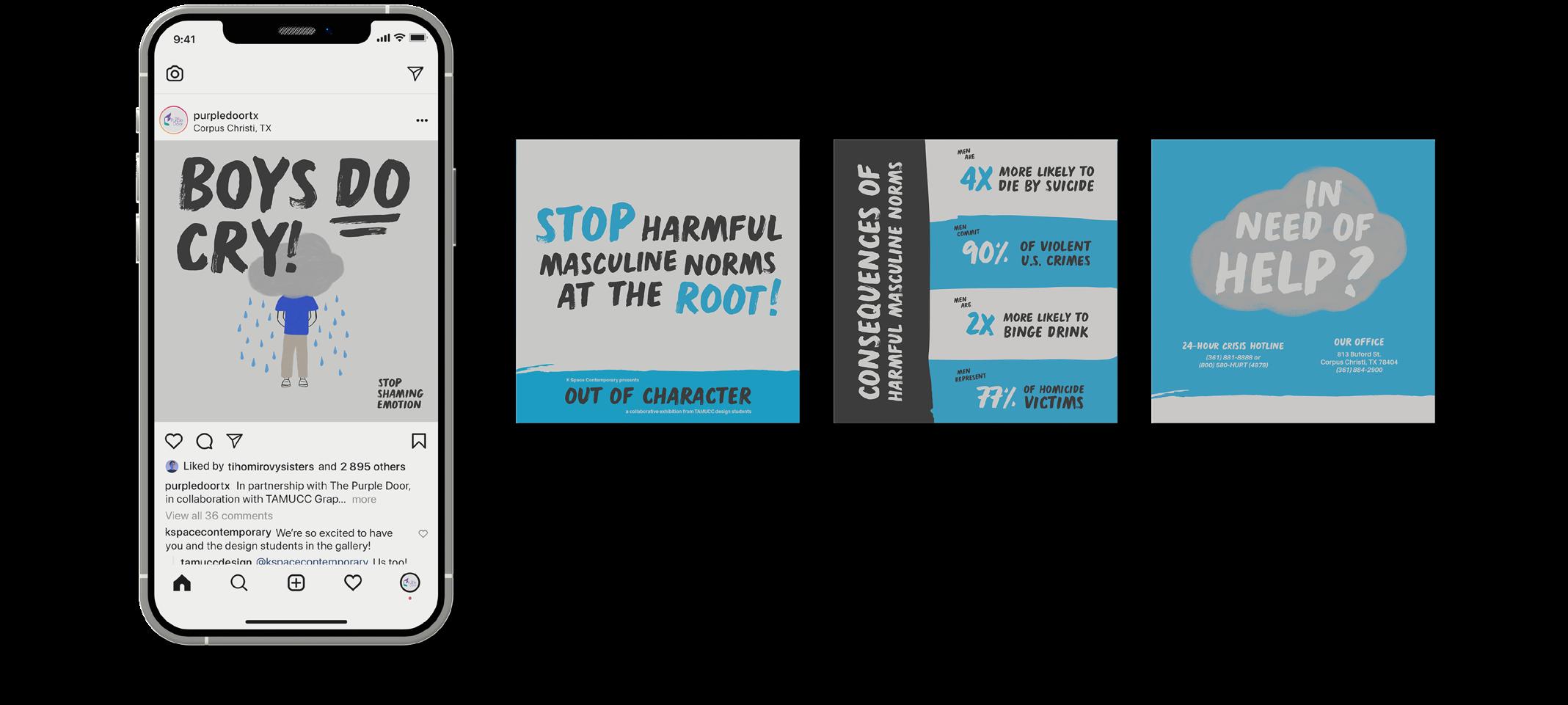
In partnership with The Purple Door, the goal of Boys Do Cry was to educate the public on the harmful effects of harmful societal masculine norms through creative representation. Acting as an open conversation with the community, the campaign informed viewers on these norms, how they affect society, and what we can do to change them.
After research, it was clear that much of the perpetuation of these harmful societal masculine norms occurs during adolescence when learning to cope with emotions. Focusing on this, the visual approach both educates and represents the emotions and the response they evoke. Using a simplistic illustrative approach combined with handdrawn typography, the campaign informed the reader of the normalcy of human emotion while offering helpful techniques for fostering healthy emotional management in adolescent boys.
UI/UX,
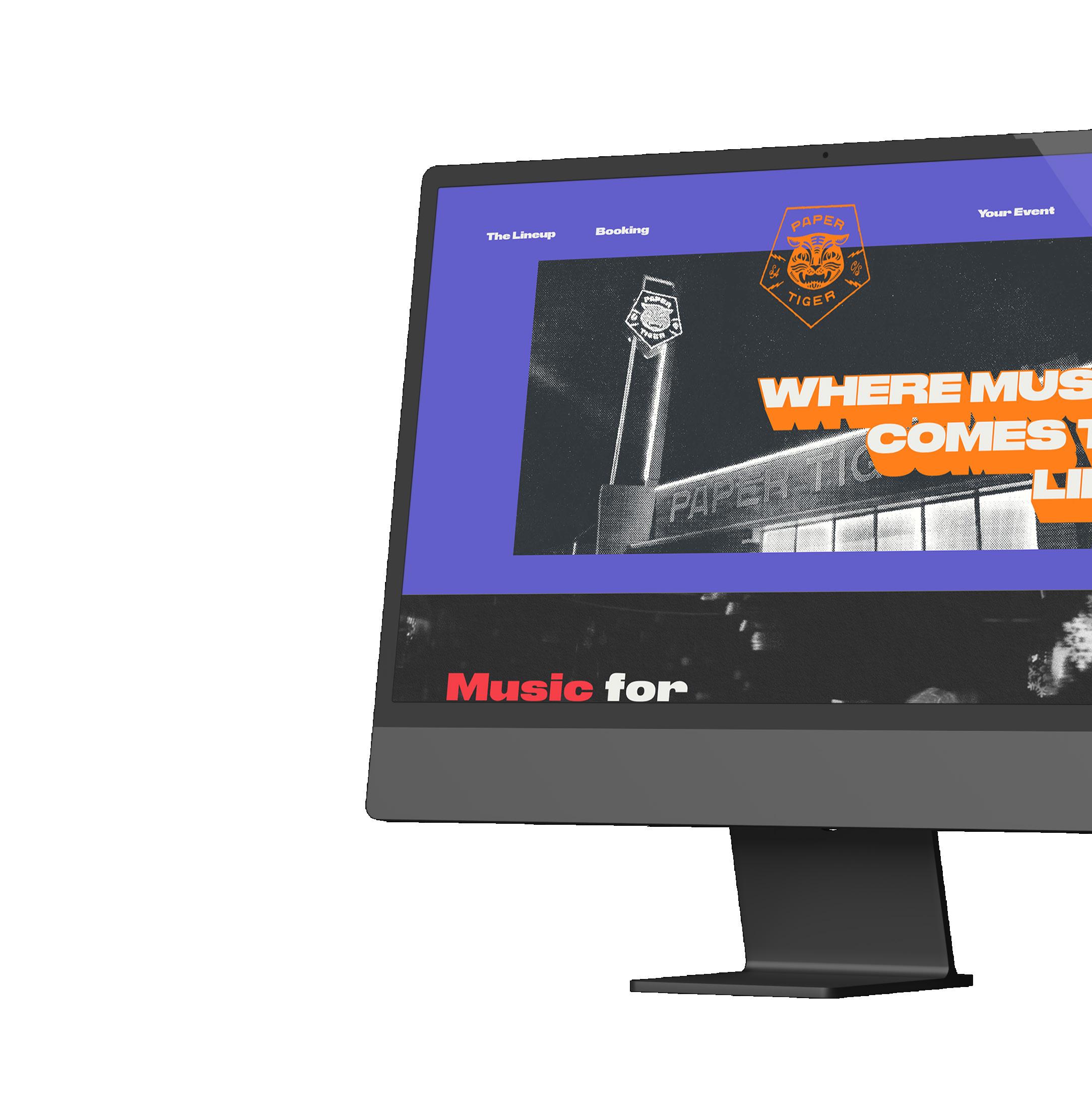
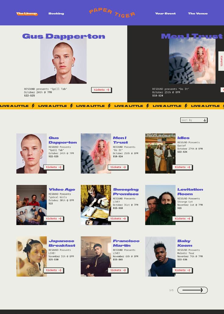
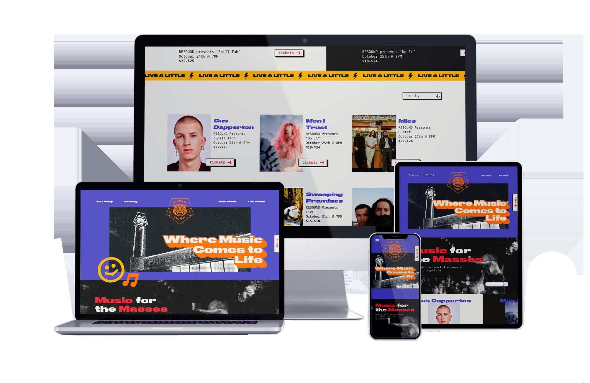
Paper Tiger is a live music venue based out of San Antonio, TX that caters to independent artists of all genres. As one of the most lively and vibrant venues in the city, this fictional website redesign aimed to bring a unique voice to the brand while also improving the user interface and experience. To improve the venue’s site, the use of bold messaging, loud typography, and vibrant colors, Paper Tiger’s new website showcases the personality behind the brand, matching the target audience of the brand
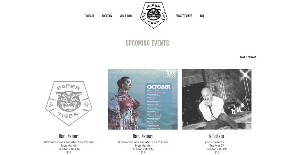
Existing Website

The fire was so zealous it caused the group to evacuate the friends
The fire was so zealous it caused the group to evacuate the friends
Paper Tiger Cobalt Marlboro Shamrock Tiger Paper Taxi CabMobile App
UI/UX, Branding
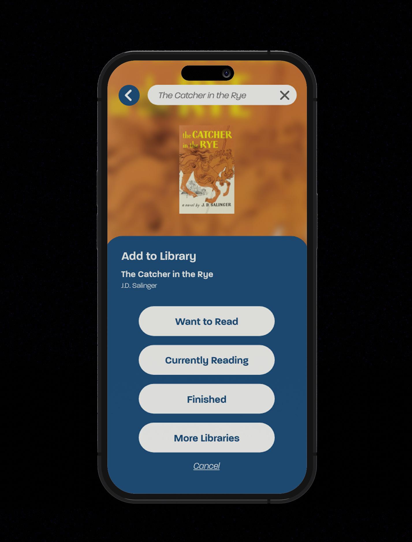
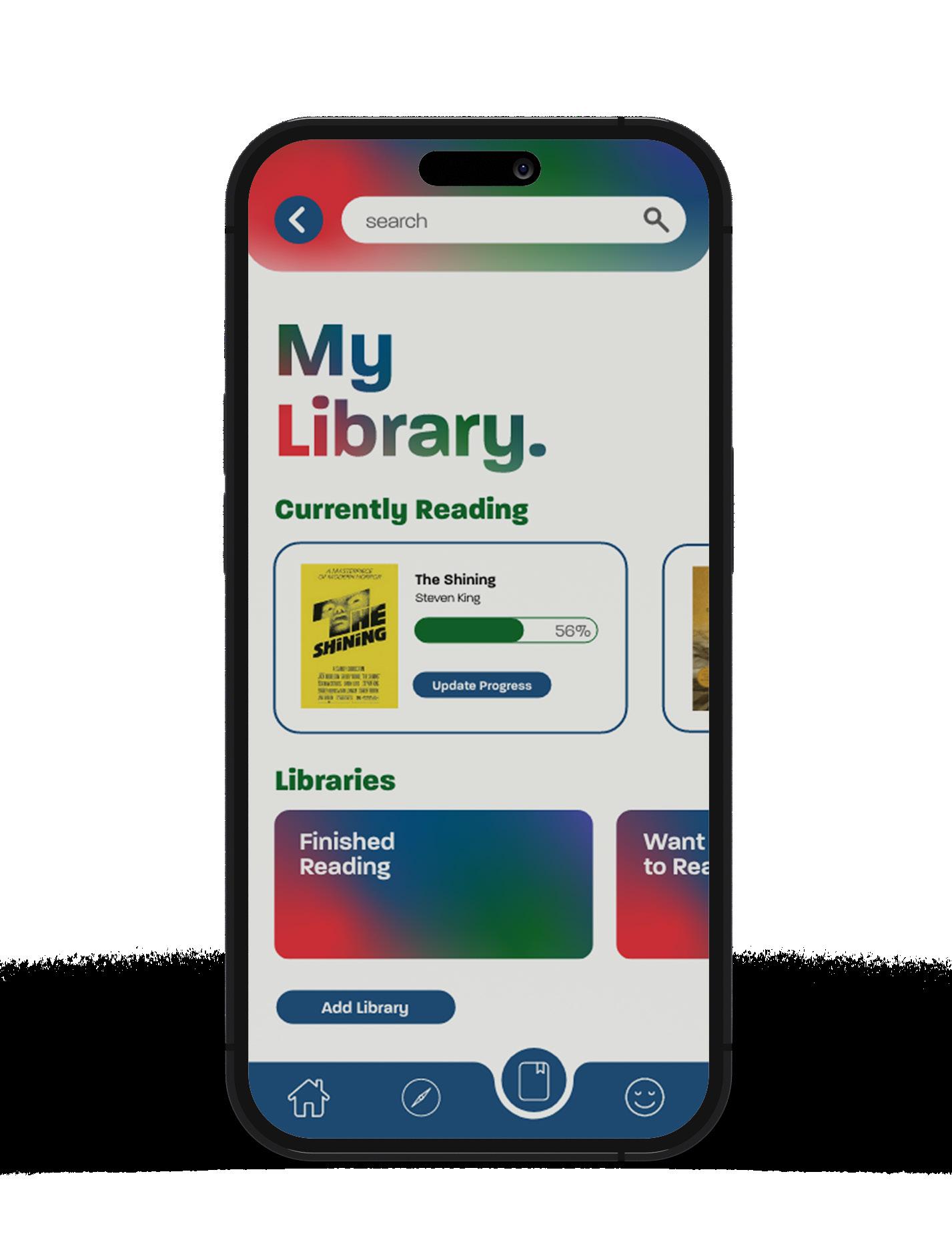
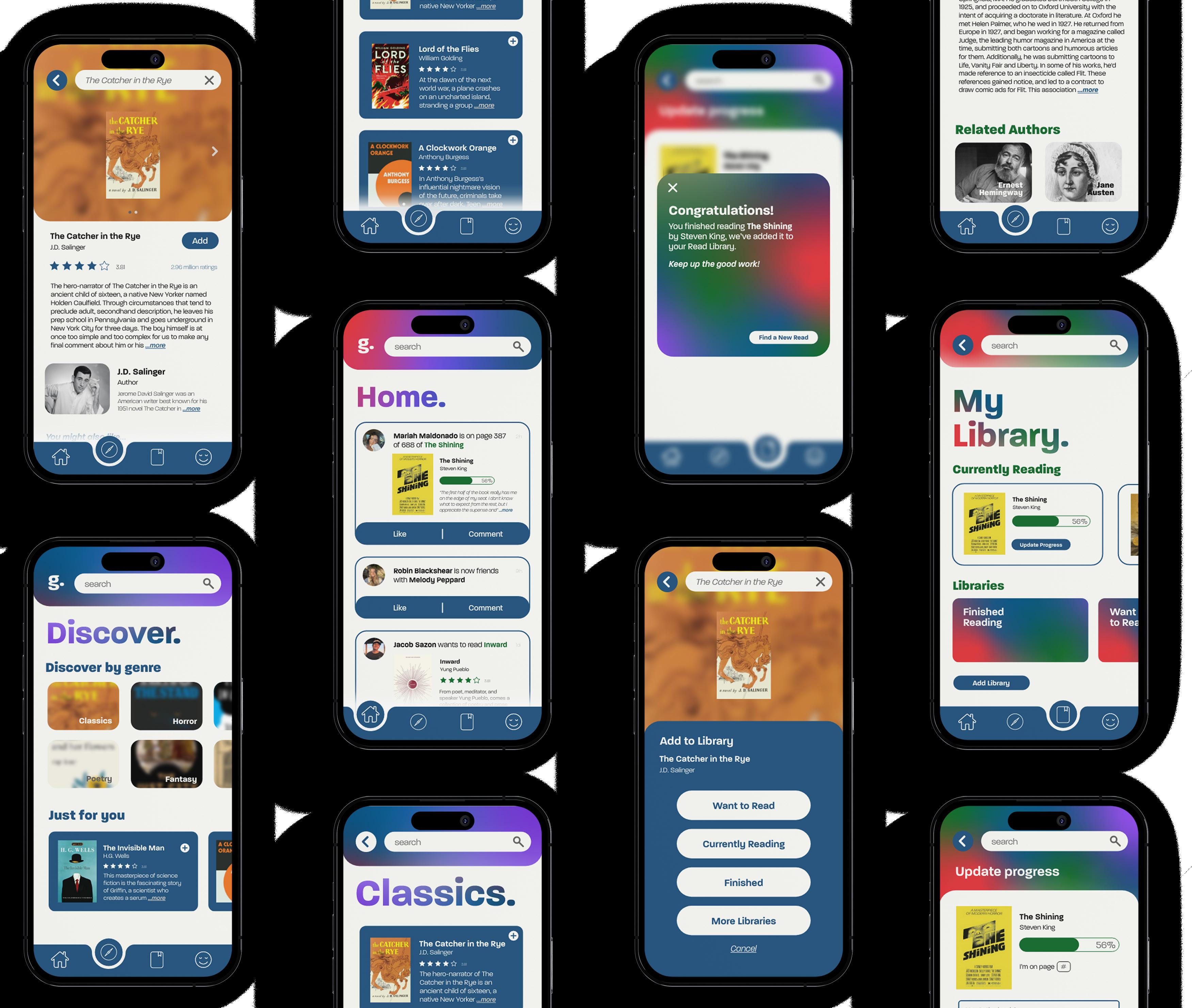
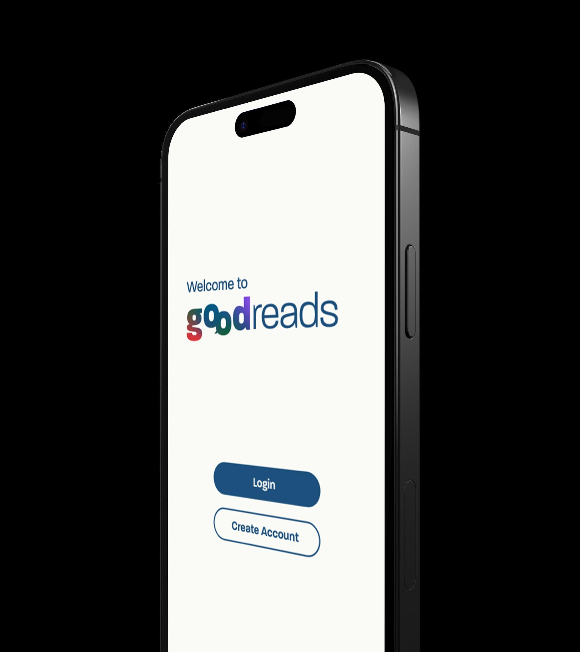
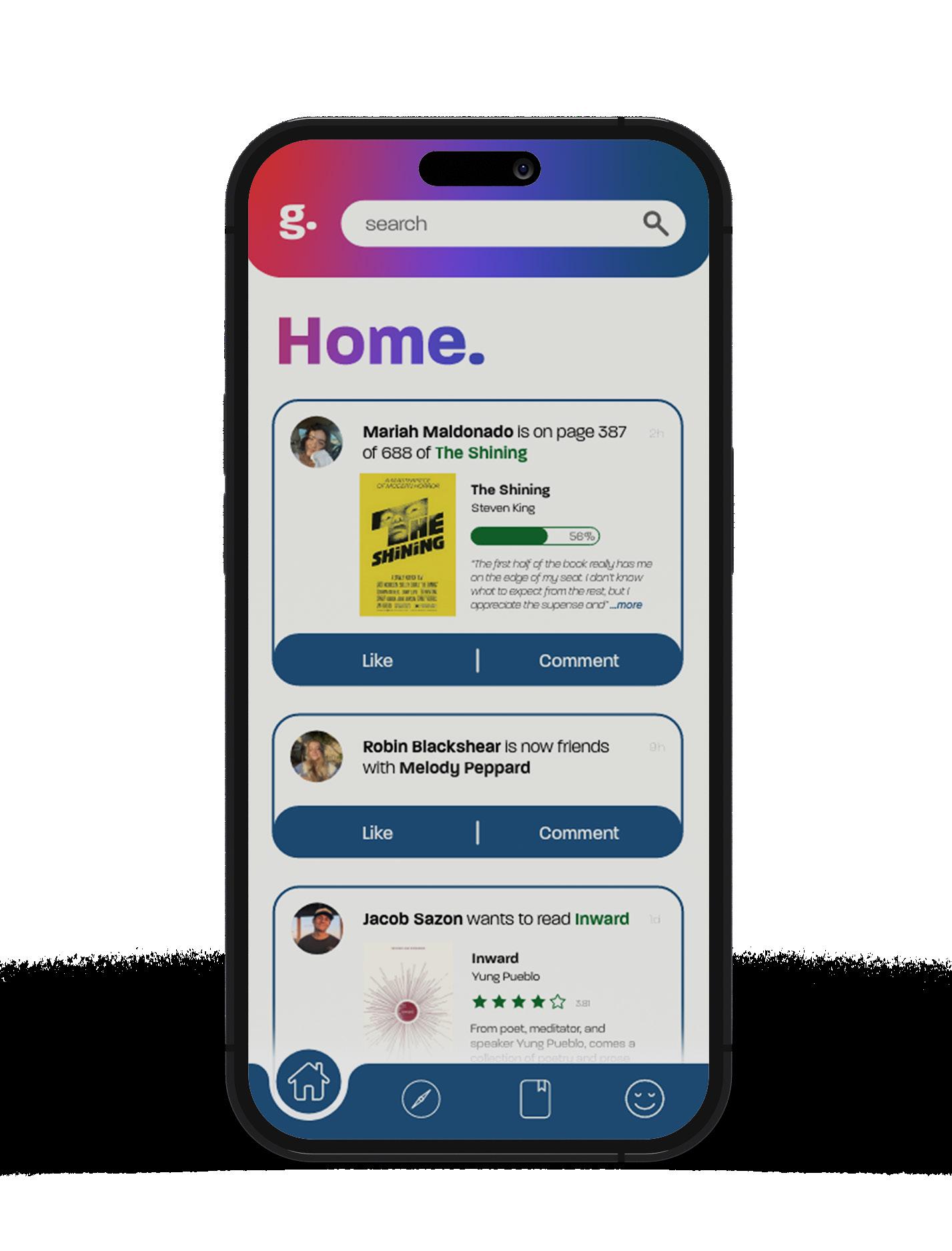
The fictional mobile app redesign aimed to take the existing Goodreads app and redesign it to improve the user interface and experience. As an avid reader and user of Goodreads, I knew it had opportunity for improvement in both areas. The mobile app allows users to track and share their reading progress with friends, along with other features that allow you to discover new books, read reviews, and more. The redesign improved the user experience by streamlining the user flow, making it more user friendly and intuitive to use. This was achieved consolidating features as well as making certain interactive features more apparent. The user interface was improved by the introduction of a more modern and sophisticated brand identity, replacing the app's current outdated visual style.
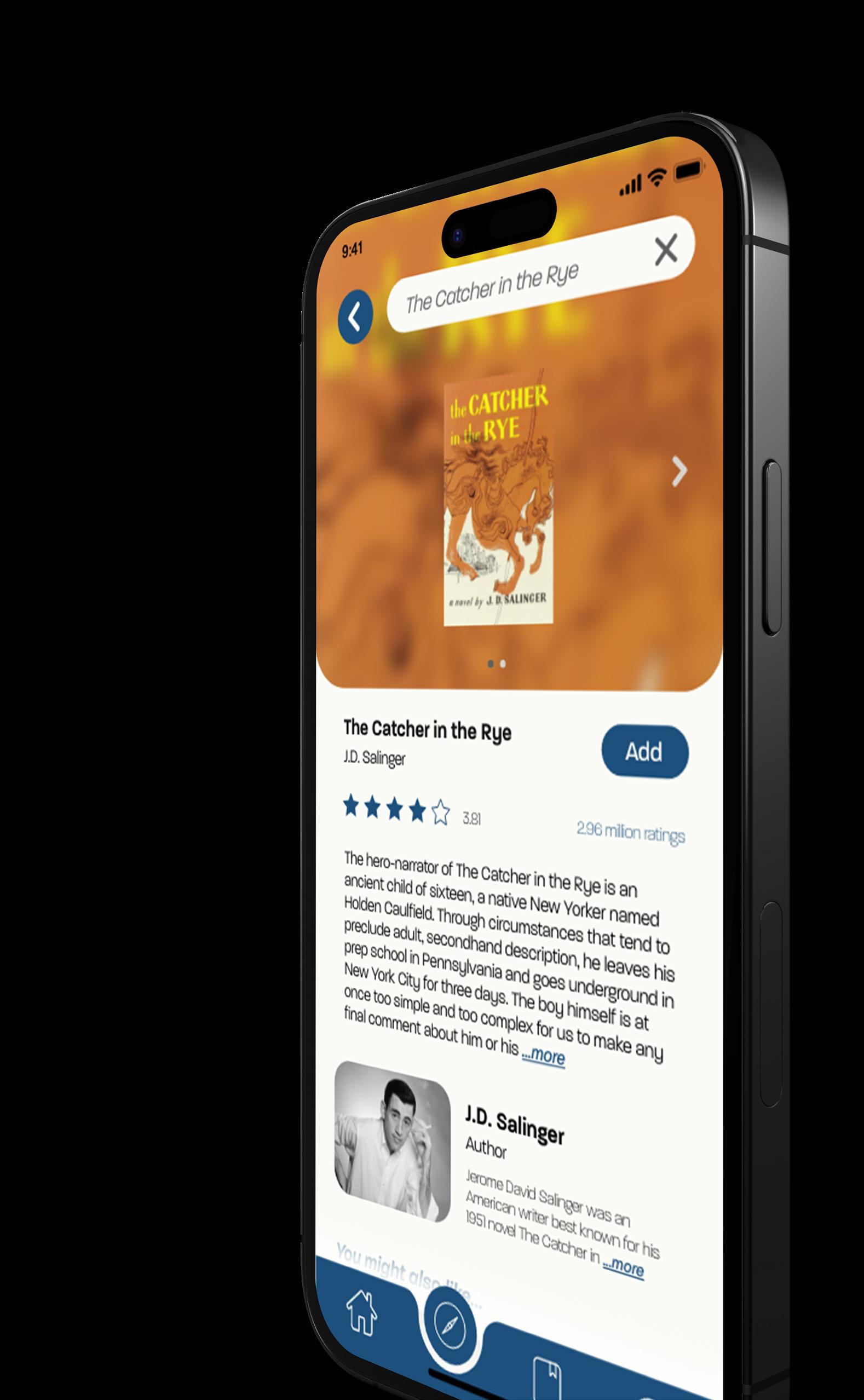
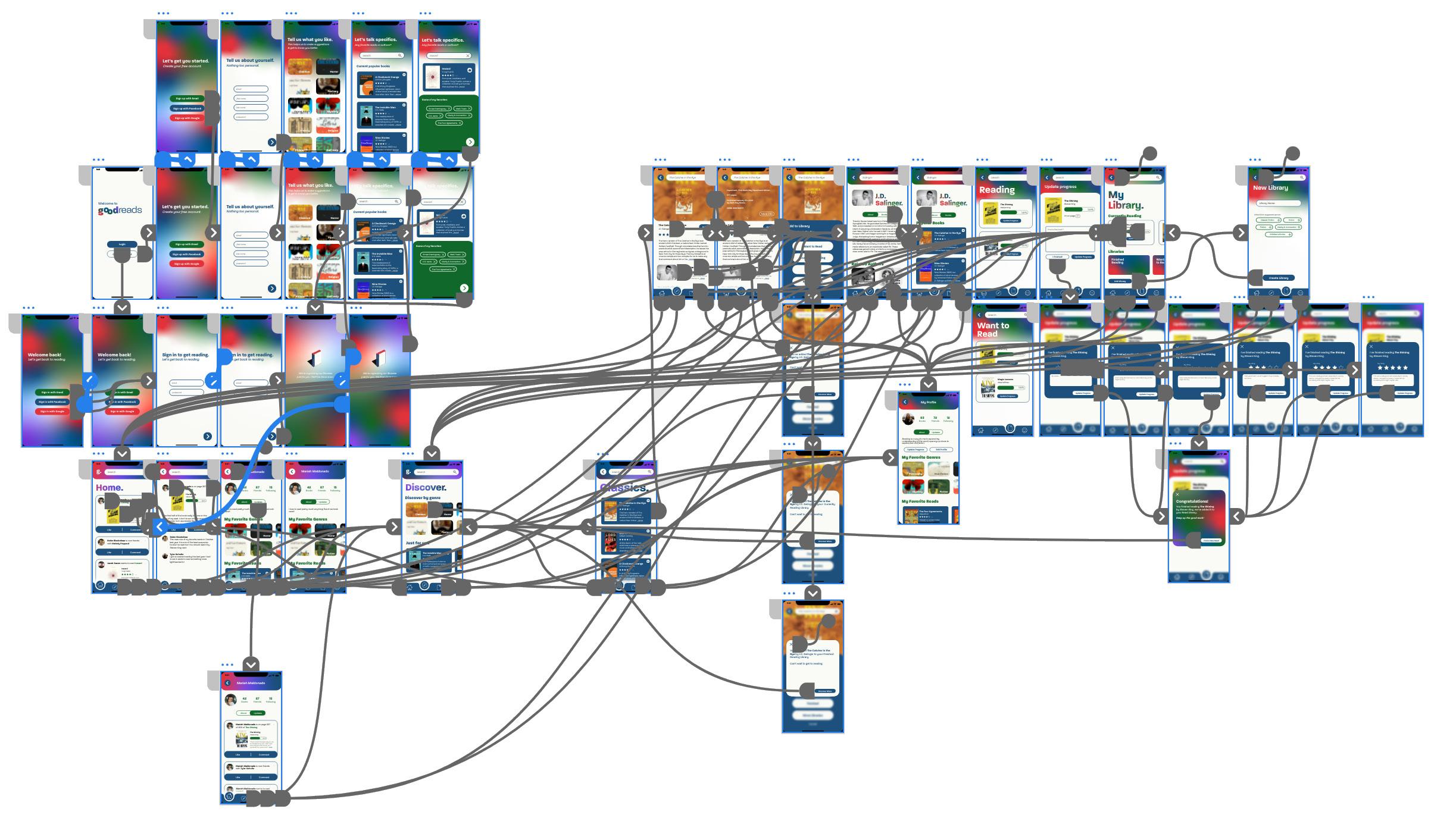
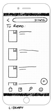
Through research of the app, it became clear that Goodreads' visual identity was outdated. The app's dull color palette, cumbersome design style, and cluttered layout provide little visual interest or clarity. One review on the Apple App Store states, "This app has really sparked my interest in reading again, and for that it deserves 5 star. However, the more I use it, the more I see its shortcomings. Why is it not simpler to add multiple books, find recommendations, update progress, or write notes?" Making the app easier to use while also improving the design is essential to continue attracting readers.
Goodreads
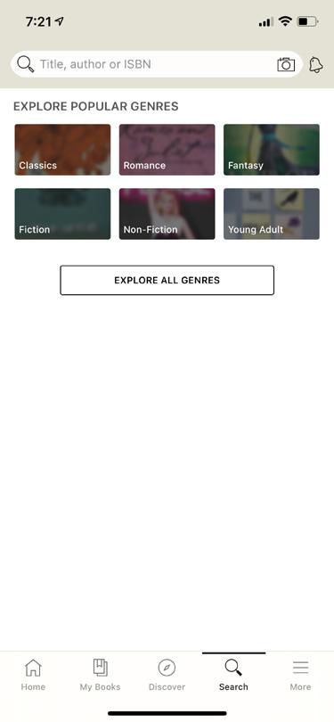
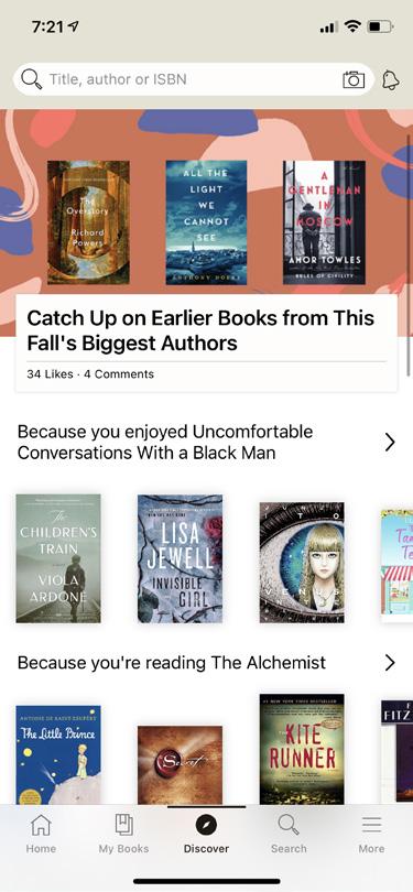
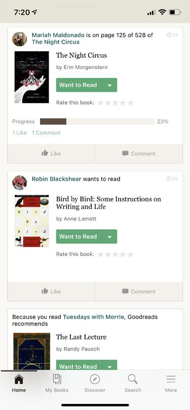
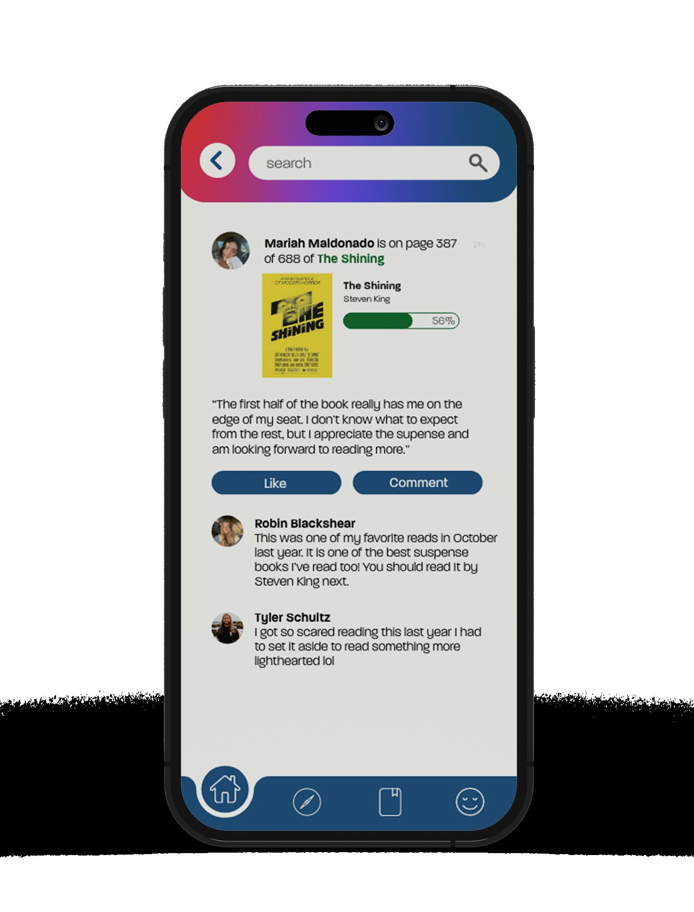
Seeing what your friends are up to is one of the key selling points on joining the app, though the app's current home screen is clouded with recommendations, popular reads, and trending authors. By removing these from the home feed, finding friend's most recent progress and engaging is now easier.
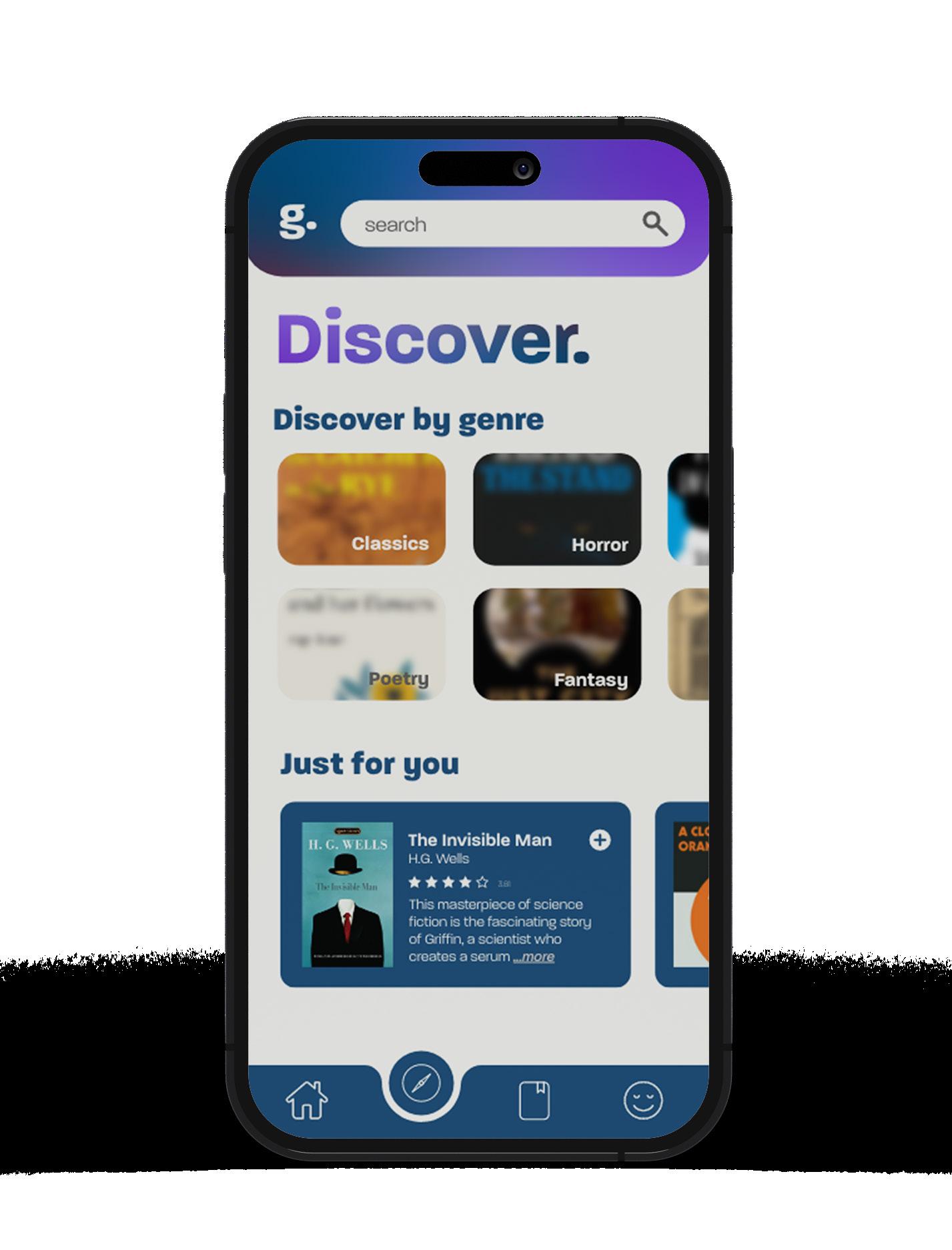
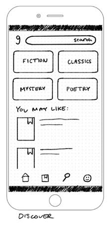
Discovering new books on Goodreads was made simple by combining the existing app's discover and search pages into one screen. The current app has these features separated, making the user experience confusing. Combining search, discover by genre, personalized recommendations, popular books, and more into the simple Discover screen allows for a seamless and easy to navigate experience.
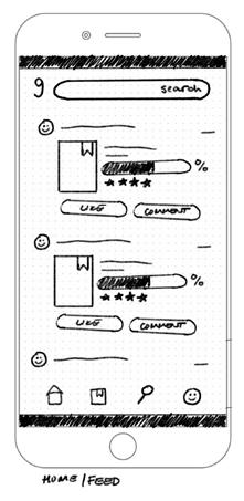
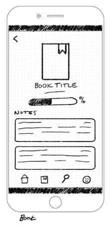
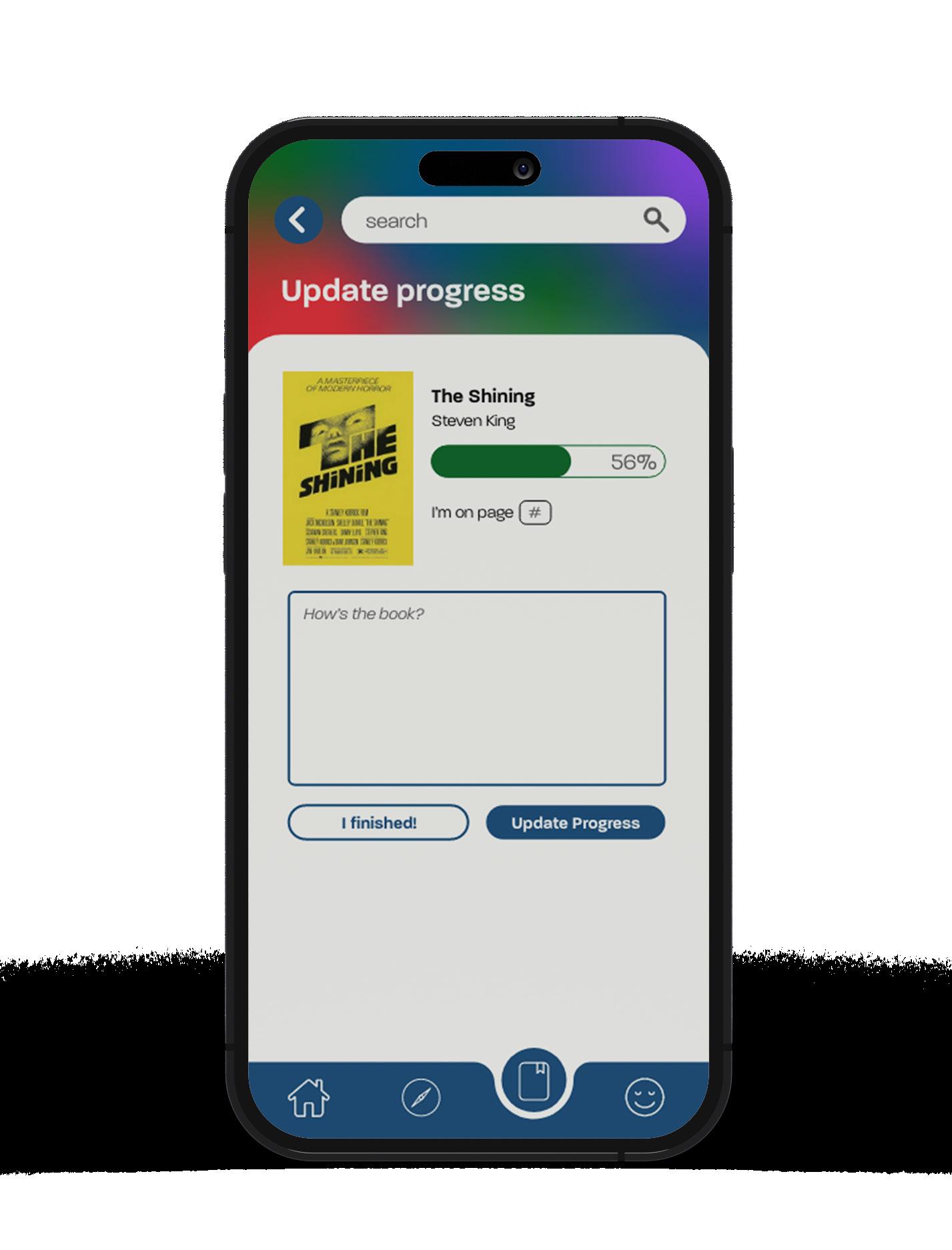
Keeping track of progress, books you're wanting to read, and any other libraries created is now easier to follow. By having a clear differentiation between currently in progress reads and other libraries, updating your page number and writing your thoughts to share with friends is more easily accessible.