GRAPHIC DESIGN PORTFOLIO mandyespericueta.com | mandyespericueta@gmail.com | 361.343.1466
TABLE OF CONTENTS
Mood (Case Study)
Mobile App | UI/UX Design
Senor Muerte
Package Design | Brand Identity
Cafe Bustelo (Case Study)

Package Design | Brand Identity | Brand Redesign
Growspace
Magazine Design | Editorial
BookBuddy
Mobile App | UI/UX Design | Brand Identity
ABOUT ME
Hi, I'm Mandy, a graphic designer who thrives on creating designs that leave a lasting impact. With a Bachelor's Degree in Graphic Design from Texas A&M University - Corpus Christi, I'm passionate about crafting designs that resonate with viewers and communicate a deeper message.
For me, design is not just about aesthetics, it's about connecting with people on an emotional level. That's why I believe in taking a research-driven approach to design, understanding the target audience, and tailoring designs to meet their needs. I enjoy working with clients to bring their design vision to life and delivering designs that exceed expectations.
I view design as a language of its own, one that can be used to create a sense of unity and bring people together. Whether it’s brand development, advertising, packaging, or more, I'm committed to delivering designs that inspire others and make an impact.
Every brand has a unique story to tell, and my goal is to bring that story to life through professional, detailed, and engaging designs.
Mandy Espericueta Graphic Designer

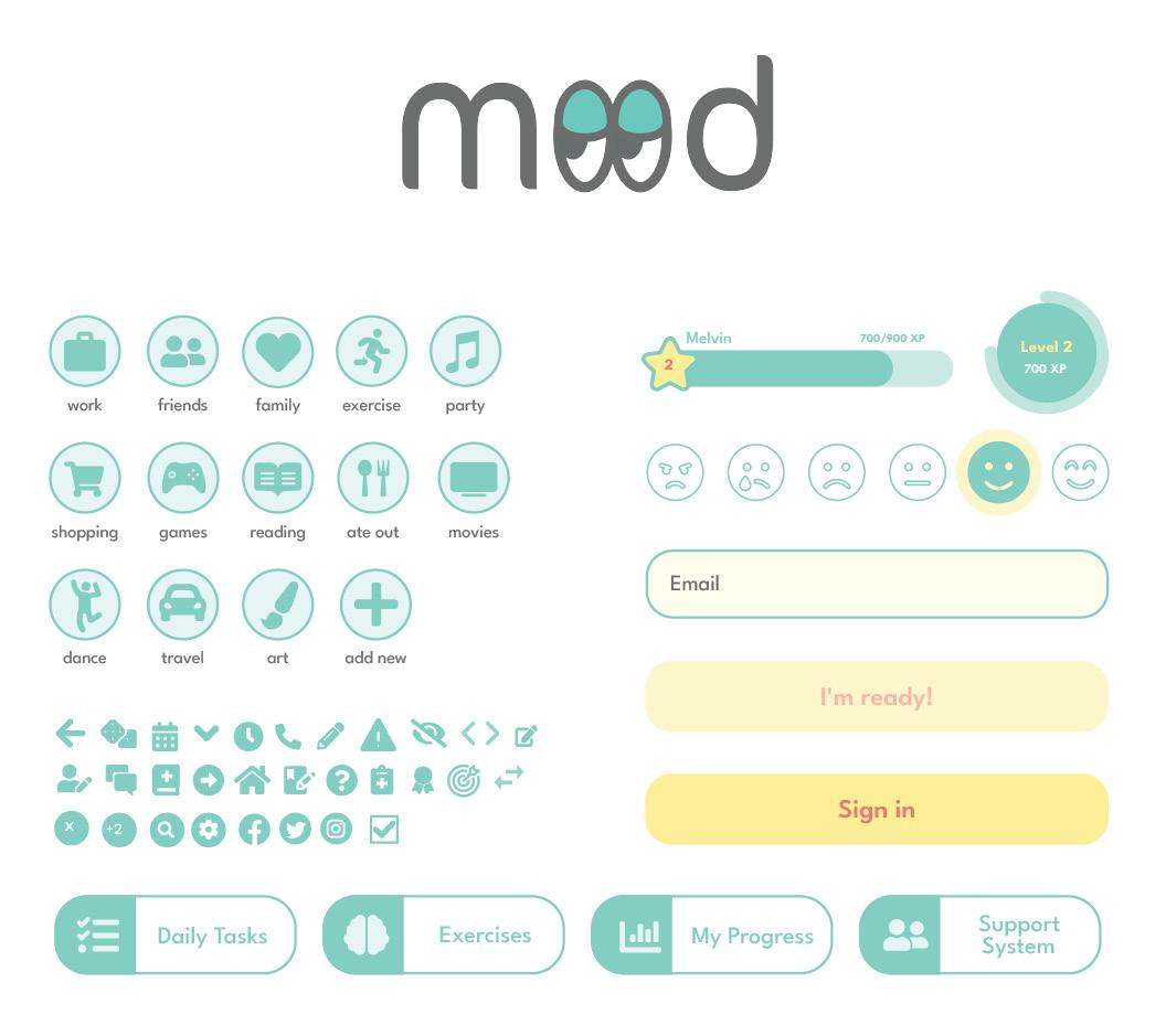
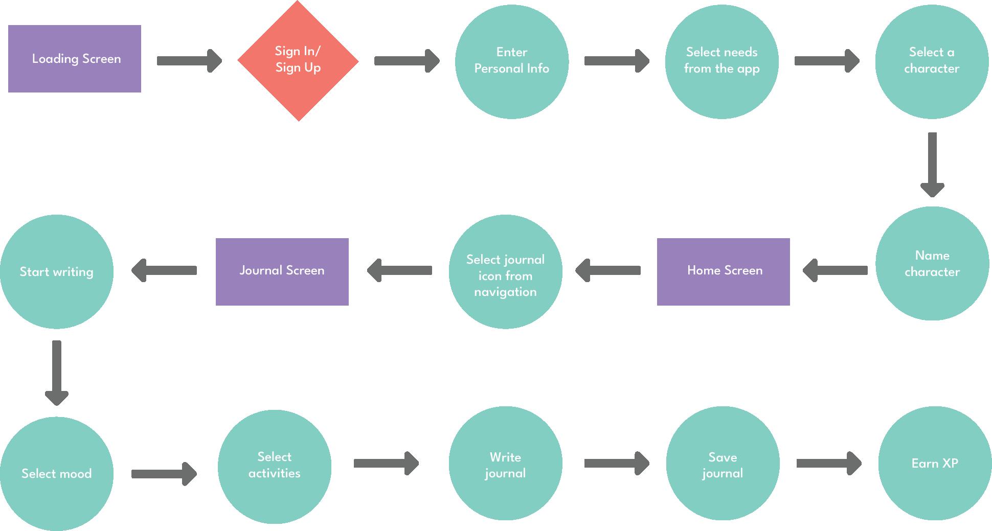
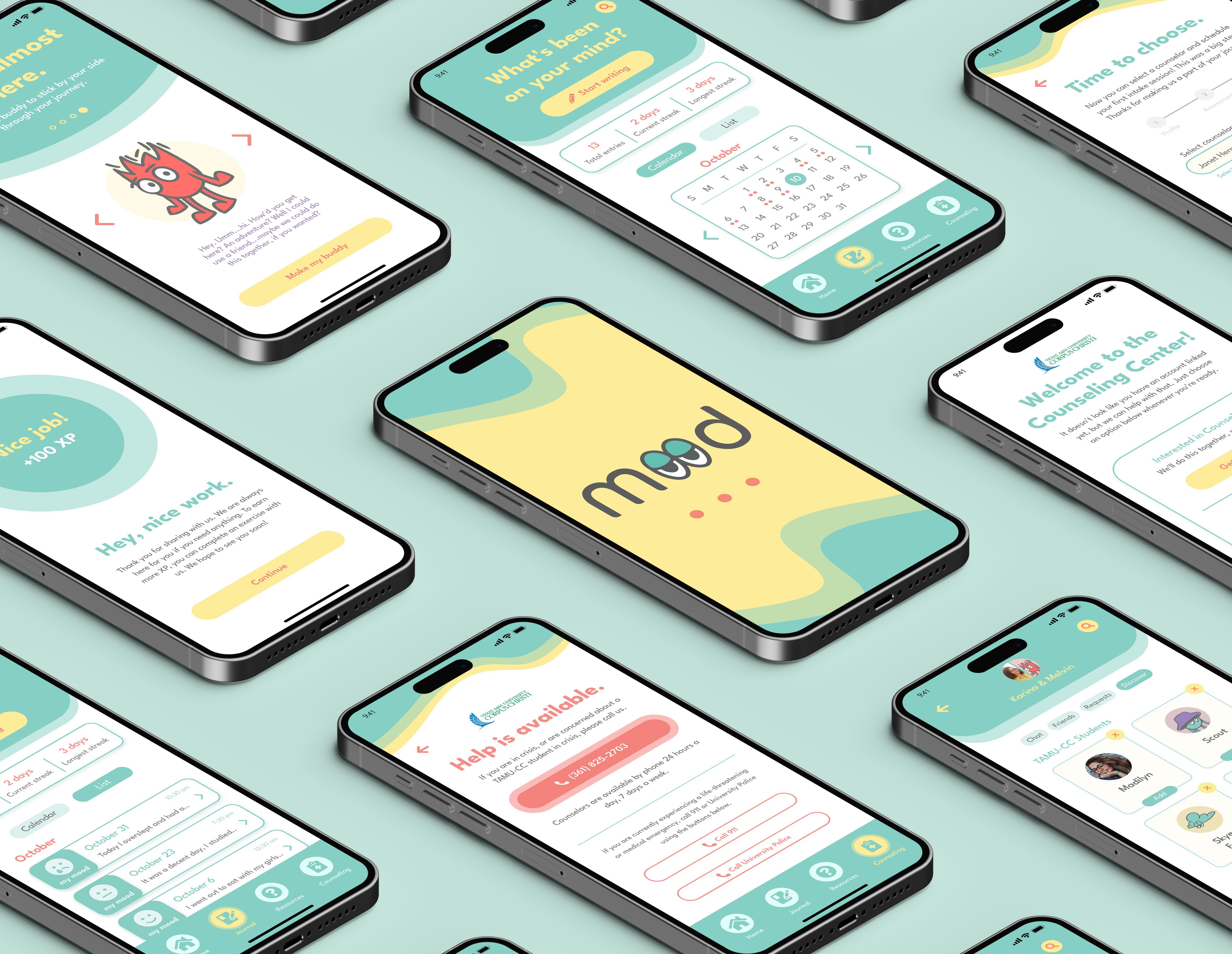
MOOD (CASE STUDY)
Mobile App Design
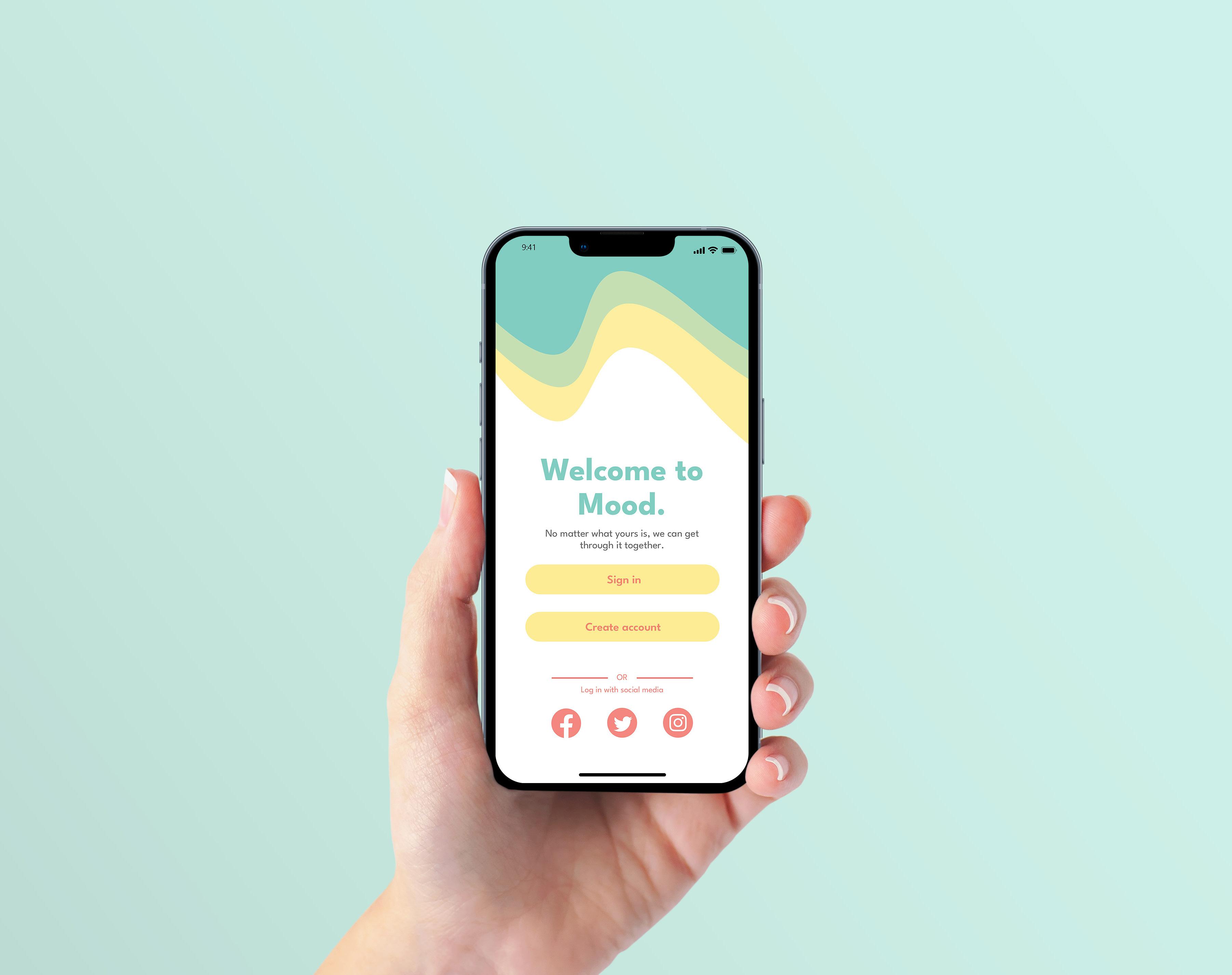
UI/UX DESIGN
BRAND IDENTITY
2023
SIGN-IN/SIGN-UP SCREEN
Mandy Espericueta
Overview
Mood is a mobile app for college students who struggle with mental health and want to focus on self-care. Mood uses uplifting colors, relatable characters, and supportive messaging to guide and encourage users on their self-care journey. When signing up for an account the user will indicate the college or university they are attending. Mood uses this information to offer the student a more personalized self-care experience, providing them easy access to university resources, connecting them with other users, and even allowing them to link their app with their University Counseling Center.
Problem Solved?
The Mood mobile app was designed with the intention to reduce the stigma of seeking help for mental health and promote a more open campus environment for all students.
Design Considerations
• Create easy functions to track user emotions and actions.
• Guide users on their self-care journey.
• Create a fun and interactive experience that will prompt users to return.
• Integrate app compatibility with on-campus counseling services.
• Customization options within the app and personal connection with characters.
Mood Case Study | App Design
Character Creation
Five characters were created for users to choose from during the sign-up process. Each character features a differing style and voice, making in-app interactions unique depending on which character the user has chosen.
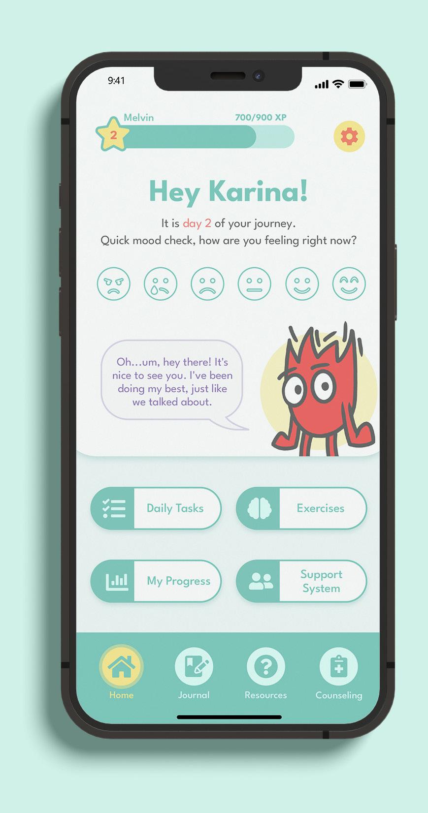
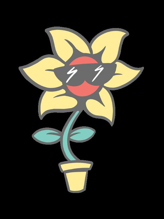

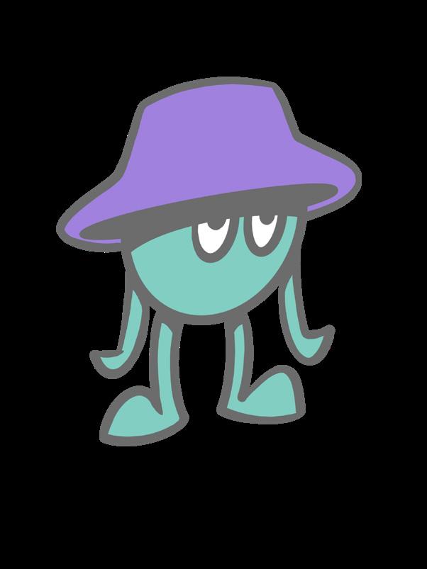

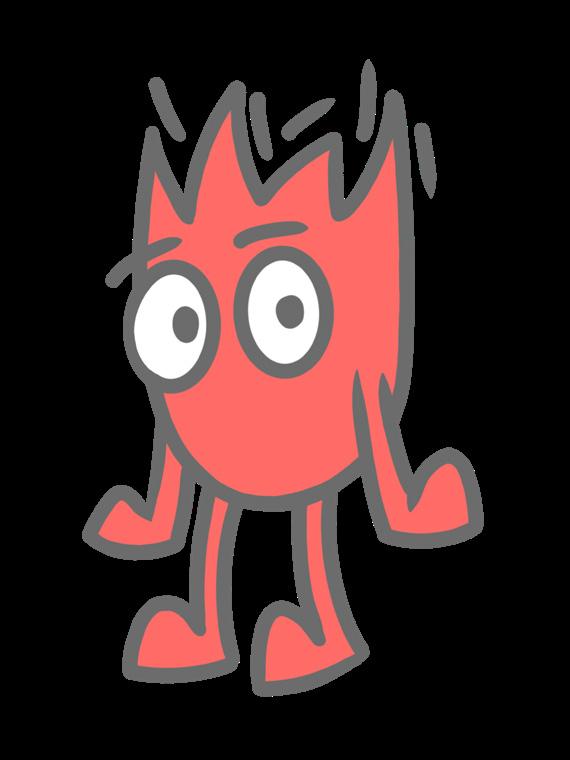 CHARACTER DESIGN AND ILLUSTRATION BY ERIC DAVILA
Mandy Espericueta
CHARACTER DESIGN AND ILLUSTRATION BY ERIC DAVILA
Mandy Espericueta
SE Ñ OR MUERTE
Packaging Series 2020
Mandy Espericueta
PACKAGE DESIGN BRAND IDENTITY FULL BRAND SHOT
Overview
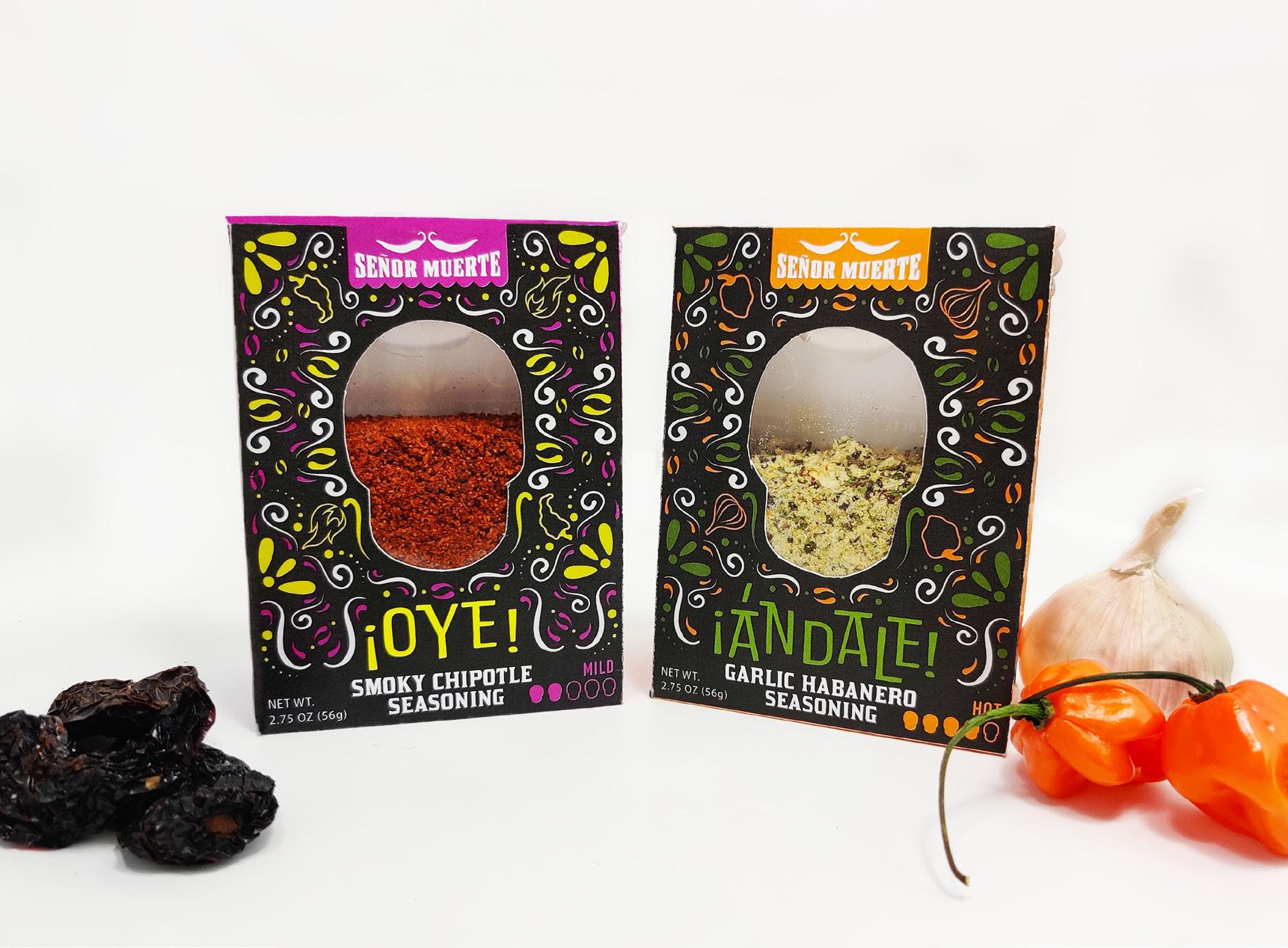
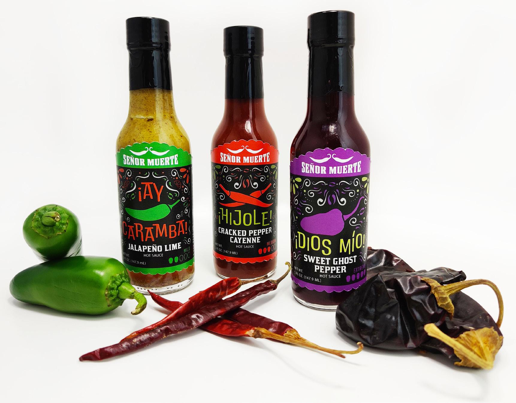
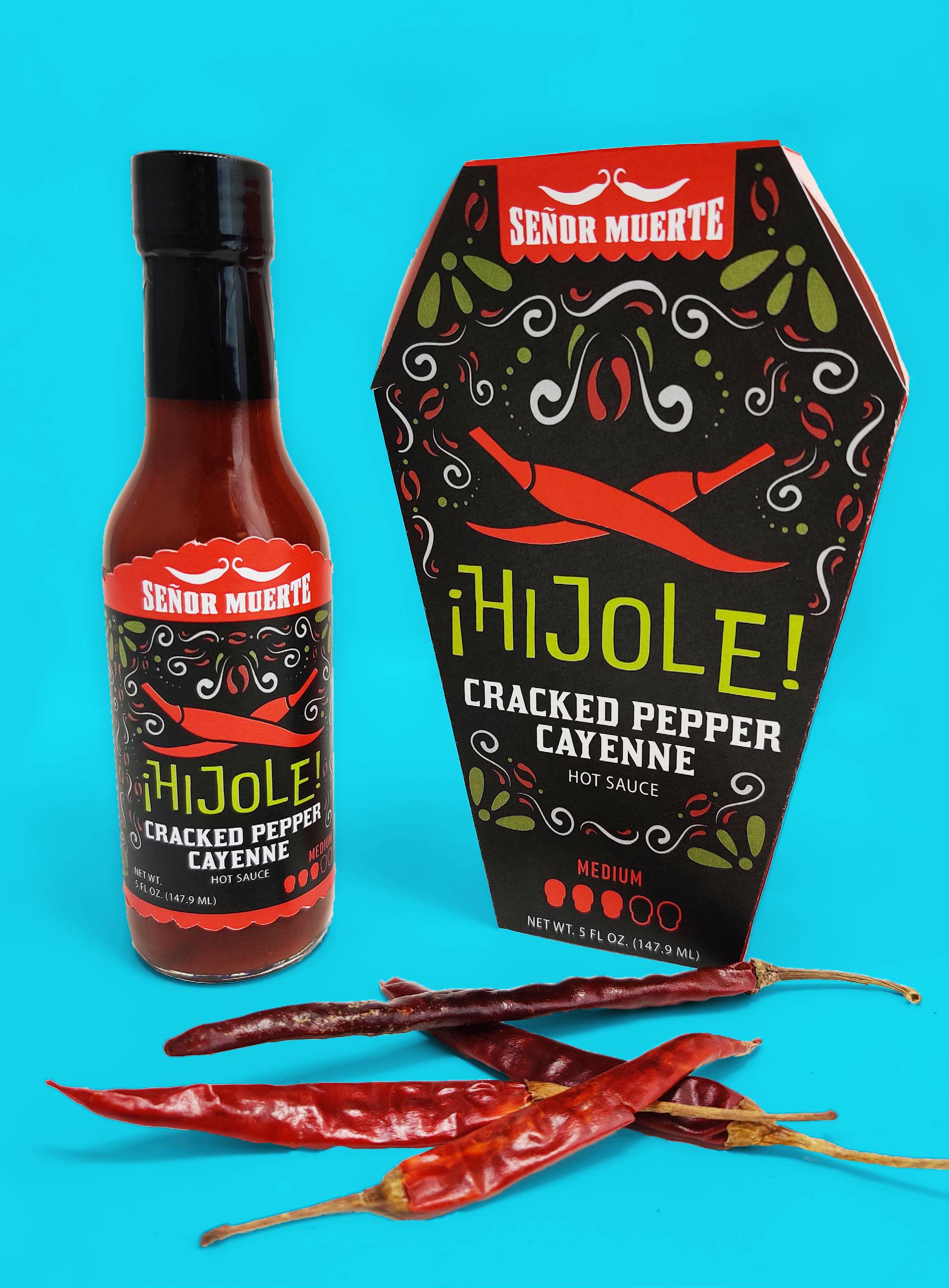
Hola Amigos! Señor Muerte is a fictional brand of hot sauces and hot seasonings that are sure to bring the spice. The designs are heavily inspired by traditional Día de los Muertos design, with a broad color palette, skull imagery, decorative elements, and cultural verbiage. The brand consists of three hot sauces, available in a variety of spice levels, and two hot seasoning packets. In addition to the products themselves, a containing box for the hot sauce and a trifold recipe guide were also created.
Brand Identity
The full color logo depicts Senor Muerte’s chili pepper mustache sitting on top of the brand name as a way to reinforce the personification of Senor Muerte as a character. The color palette is an array of strong, bold colors that are representative of traditional Dia de los Muertos design. In order to not overwhelm the designs, the colors were carefully selected in pairs that would pop against one another. Each sauce and seasoning flavor was assigned a different color pairing so that the products were visually distinct from one another and individually recognizable even when merchandised together on a display.
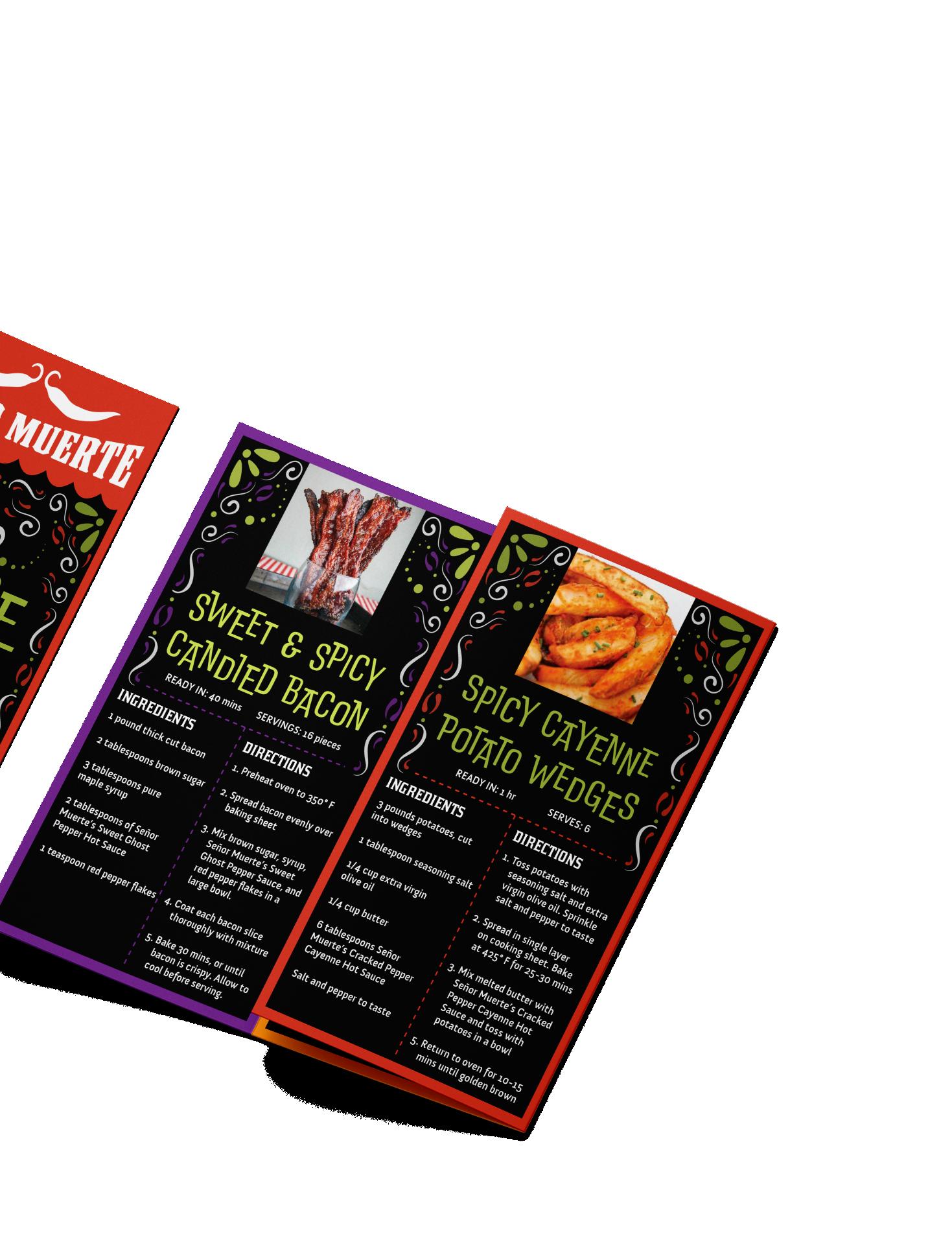
¡ HIJOLE! CRACKED PEPPER CAYENNE HOT SAUCE ¡ DIOS MIO! SWEET GHOST PEPPER HOT SAUCE ¡ OYE! SMOKY CHIPOTLE HOT SEASONING ¡ ANDALE! GARLIC HABANERO HOT SEASONING ¡ AY CARAMBA! JALAPENO LIME HOT SAUCE ONE-COLOR LOGO FULL-COLOR LOGO Señor Muerte | Packaging Series
HOT SEASONING PACKETS
Design Considerations
• Voice and design are unique enough to stand out from competitors on a store shelf.
• Dia de los Muertos theme has longevity and does not feel like a limited edition brand.
• Bold, relatable brand voice sparks emotional connection with consumer
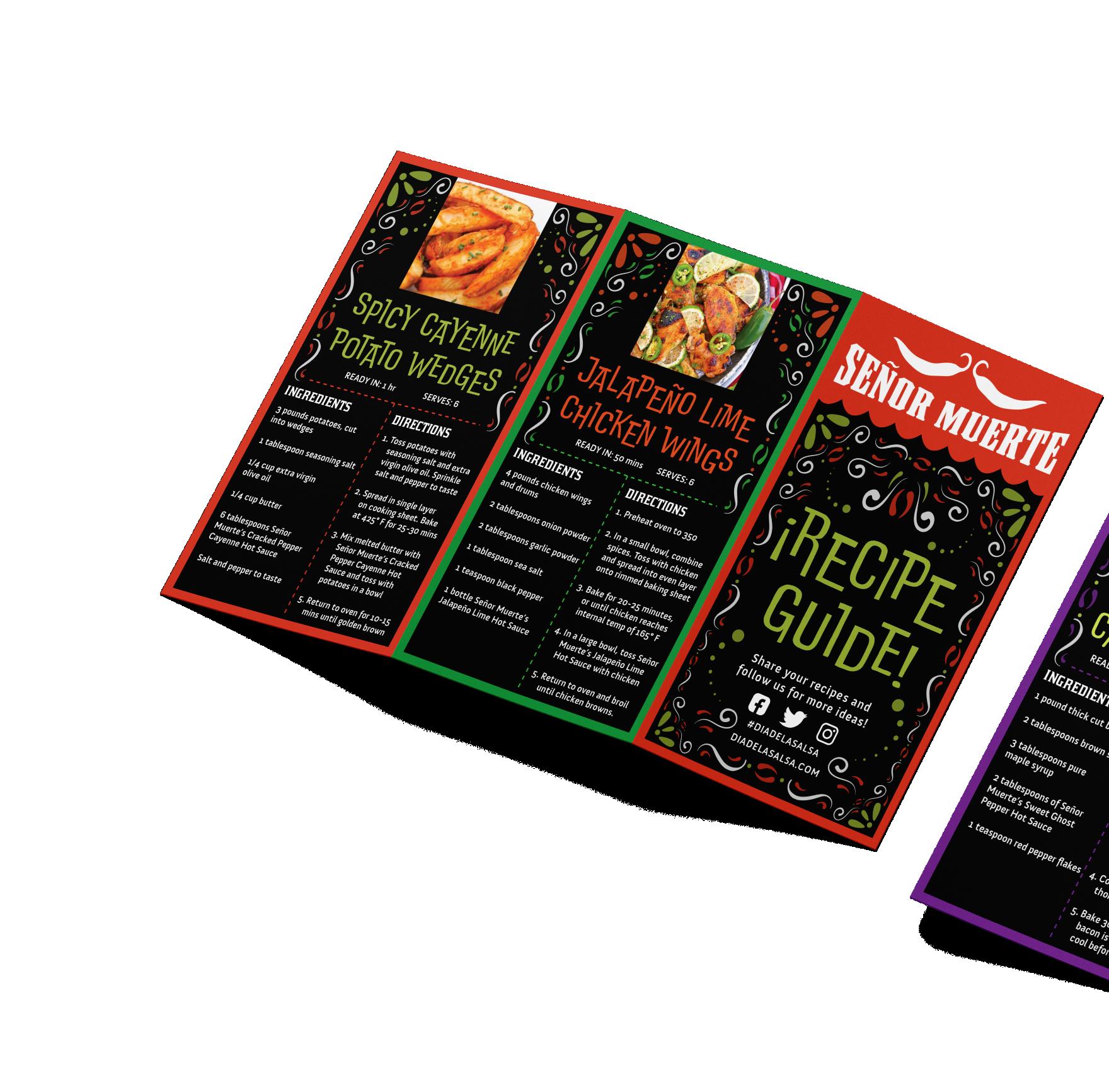
HOT SAUCE BOTTLES TRI-FOLD RECIPE GUIDE
Brand Voice
"¡Hola Amigos! We at Señor Muerte believe that the spice of life is, well, spice! But that doesn’t mean that you must throw away the flavor in order to get the heat. We would rather our food be transformed into something spicy and delicious, which is why we are introducing our Día de la Salsa line of hot sauce and hot seasoning. Our salsas are made from fresh peppers and blended with an array of spices that are sure to have your taste buds on edge while adding additional flavor to your foods. The Día de la Salsa series offers a range of heat levels to satisfy any spice lover without sacrificing tastiness. Señor Muerte knows that not every tongue can take the heat, which is why we are also introducing our ¡Oye! and ¡Andale! hot pepper seasonings. For a kick of flavor that you can control, add as much or as little of the seasoning as you want to all of your favorite sauces, such as: mayo, mustard, ketchup, barbecue, ranch, or anything else you can think of. Make any sauce a hot sauce! Life is all about taking risks, so take a walk on the wild side of salsa and say ¡Adios! to bland food."
 Señor Muerte | Packaging Series
CAF É BUSTELO CASE STUDY
Rebranding Campaign
PACKAGE DESIGN
BRAND IDENTITY
COFFEE GROUNDS CANISTER
Mandy Espericueta
Overview
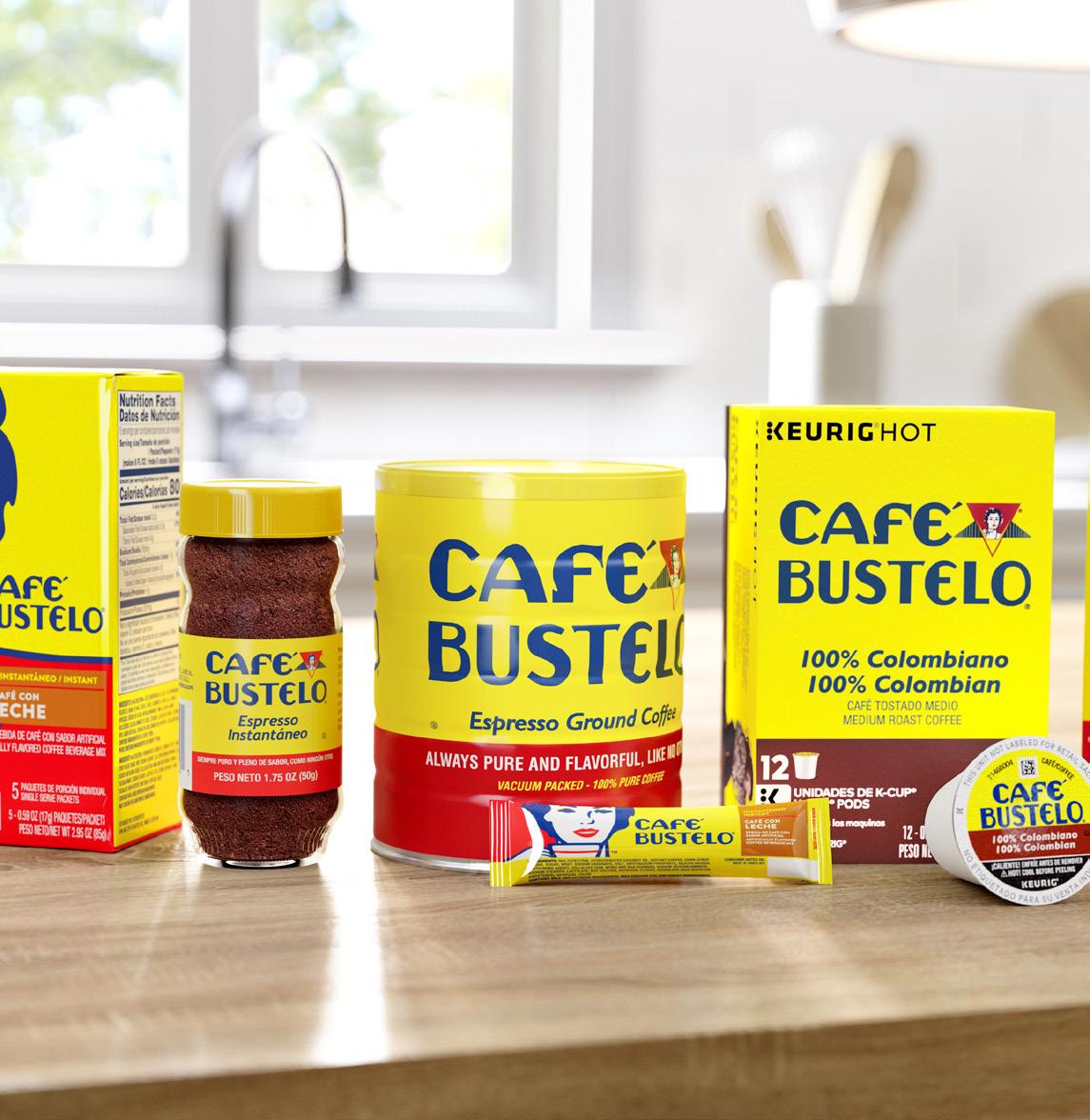
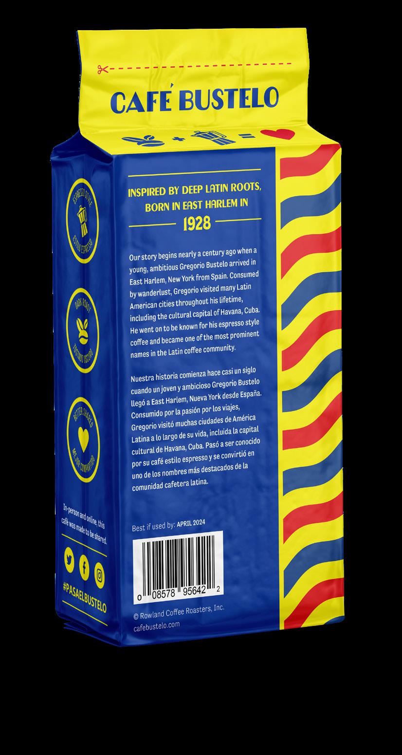
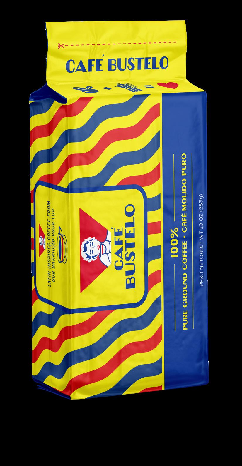
Cafe Bustelo is a beloved coffee company that prides itself in its unique flavor and Latin American roots. They were founded nearly a century ago and have made a name for themselves due to their Cuban inspired, espresso-style coffee which is both high quality and reasonably priced in stores.
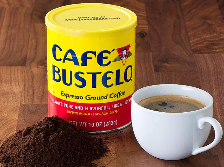
Though they maintain a relatively loyal consumer base, Café Bustelo is currently perceived as more traditional, budget-friendly, and enjoyed primarily by older generations. Whilst they do have an appealing color palette, the design of their product packaging is a bit bland and lacks any connection to their brand history, culture, or unique flavor. Café Bustelo does not have a strong marketing message or call to action that entices new and younger consumers to take a chance on them over other store-bought competitors.
Design Considerations
• Retain currrent color palette
• Emphasize connection to Latin American culture
• Strong copywriting with a central theme
• Bold type, simple illustrations, and color blocking
CURRENT PRODUCT LINEUP Cafe Bustelo Case Study | Rebrand Campaign
CURRENT BRAND PHOTO
Target Audience
The current consumer base is Latin Americans who are middle aged or above and feel a nostalgic connection to the culture or history of the brand. One of Café Bustelo’s main goals is to appeal to younger adults, aged 25-35, who identify with Latin American culture and/or have family who are Latino. Café Bustelo aims to engage with this new target audience in a way that appeals to traditional Latino values, such as family, sharing, and cultural pride. In order to better understand the intended target audience, a target persona was created that embodies the type of consumer the Café Bustelo brand appeals to.
Conceptualization
While Café Bustelo would like to remain true to their cultural roots and maintain their strong following in the Latin community, research has shown that tradition does not always translate to continued sales in the current market. To combat this, the brand will focus on appealing to a younger audience and forging a personal connection with consumers. This goal will be accomplished with the creation of a new logo, complete packaging redesign, updated brand voice, and implementation of a marketing campaign.
Rebranding Goals
• Emphasize culture, quality, and brand message
• Dispel "budget brand" perception
• Spark emotional connection to brand
• Prompt consumers to share with friends/family
• Stand out from the competition
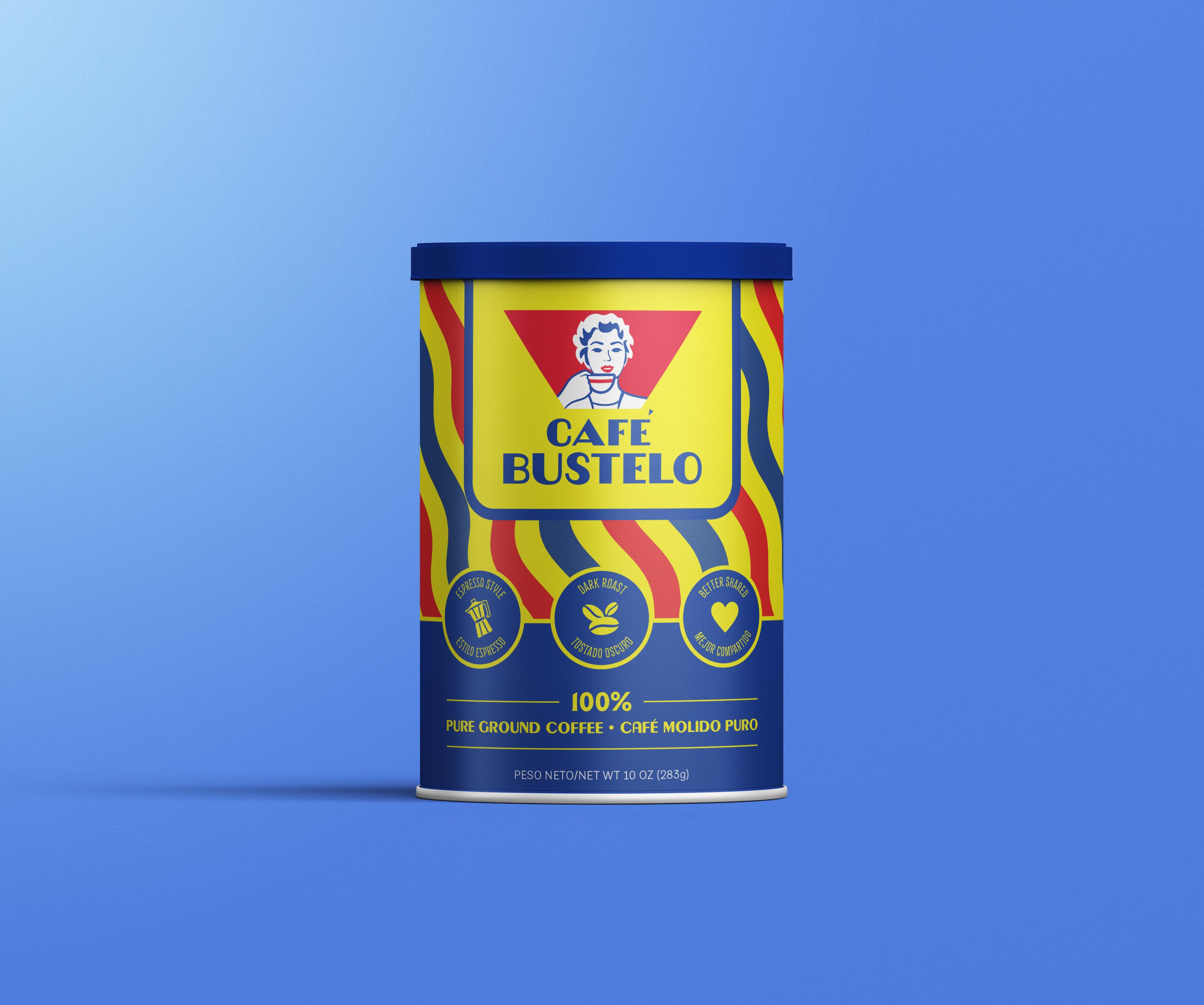
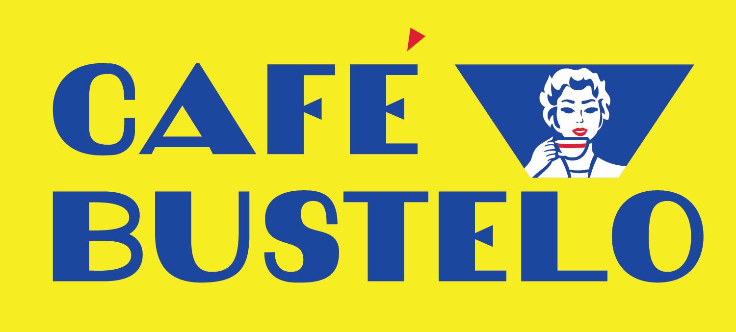
LOGO REDESIGN FIRST DRAFT
Mandy Espericueta
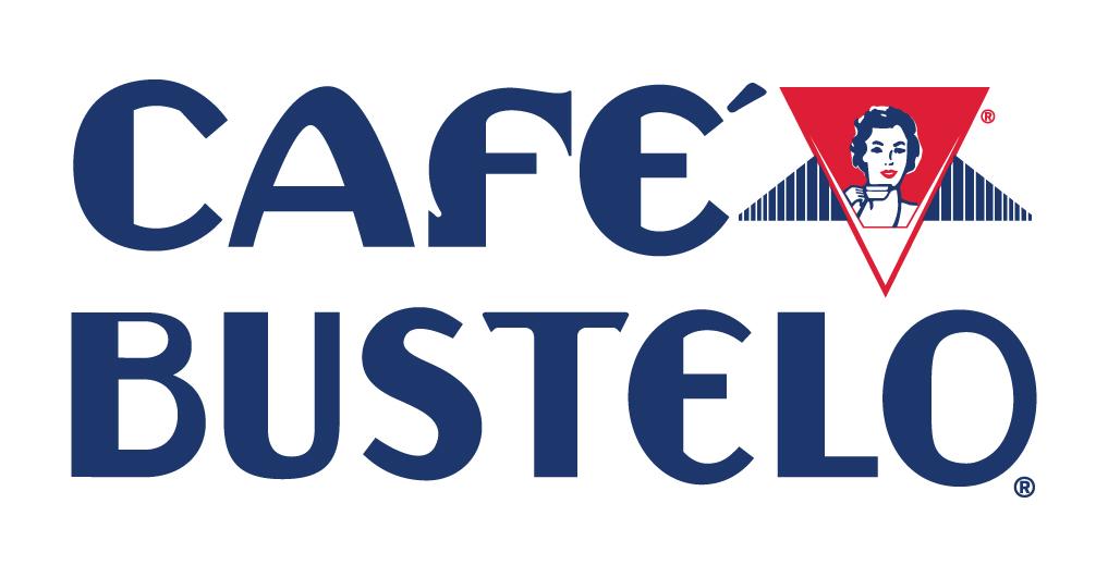
CURRENT BRAND LOGO
REDESIGNED LOGO
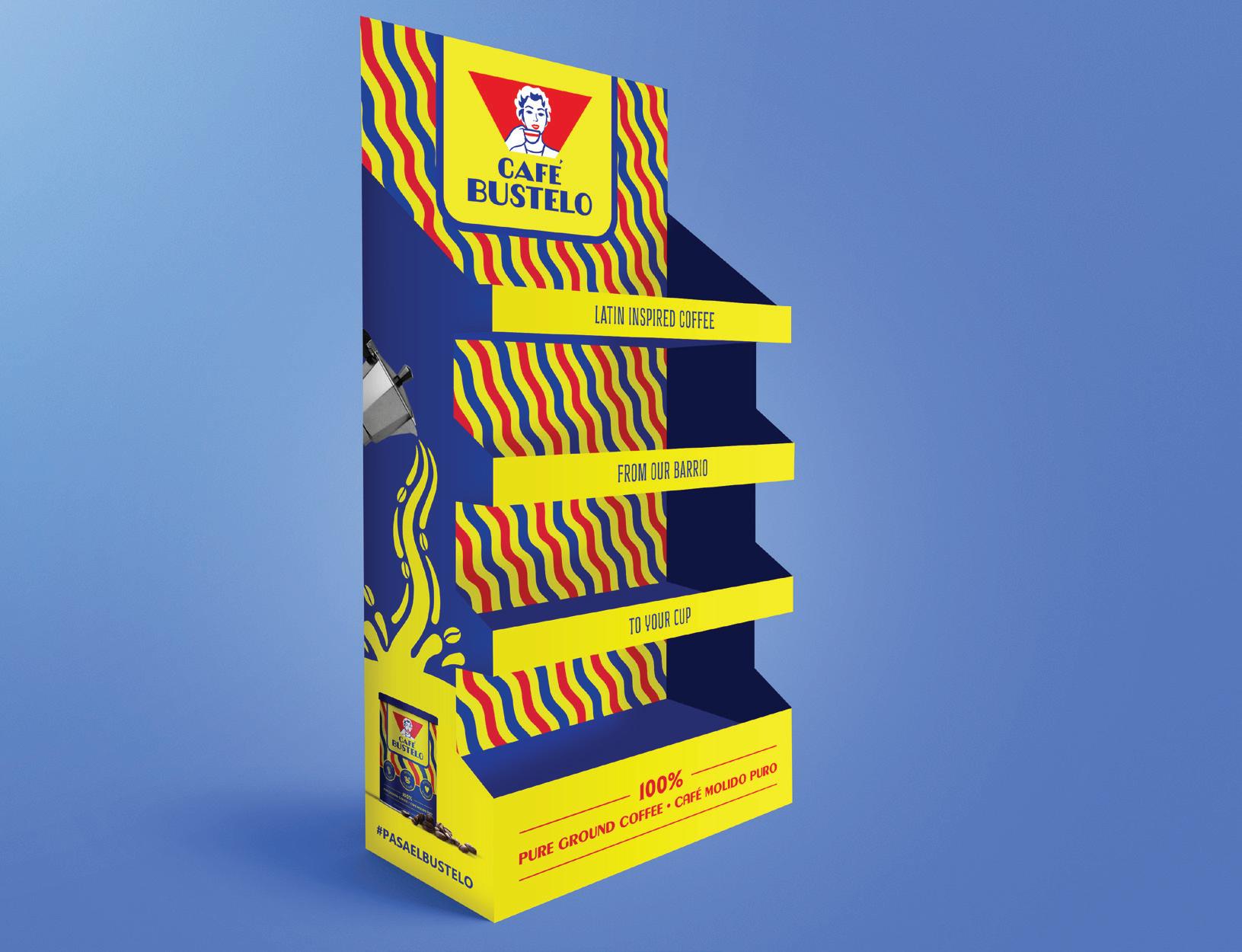
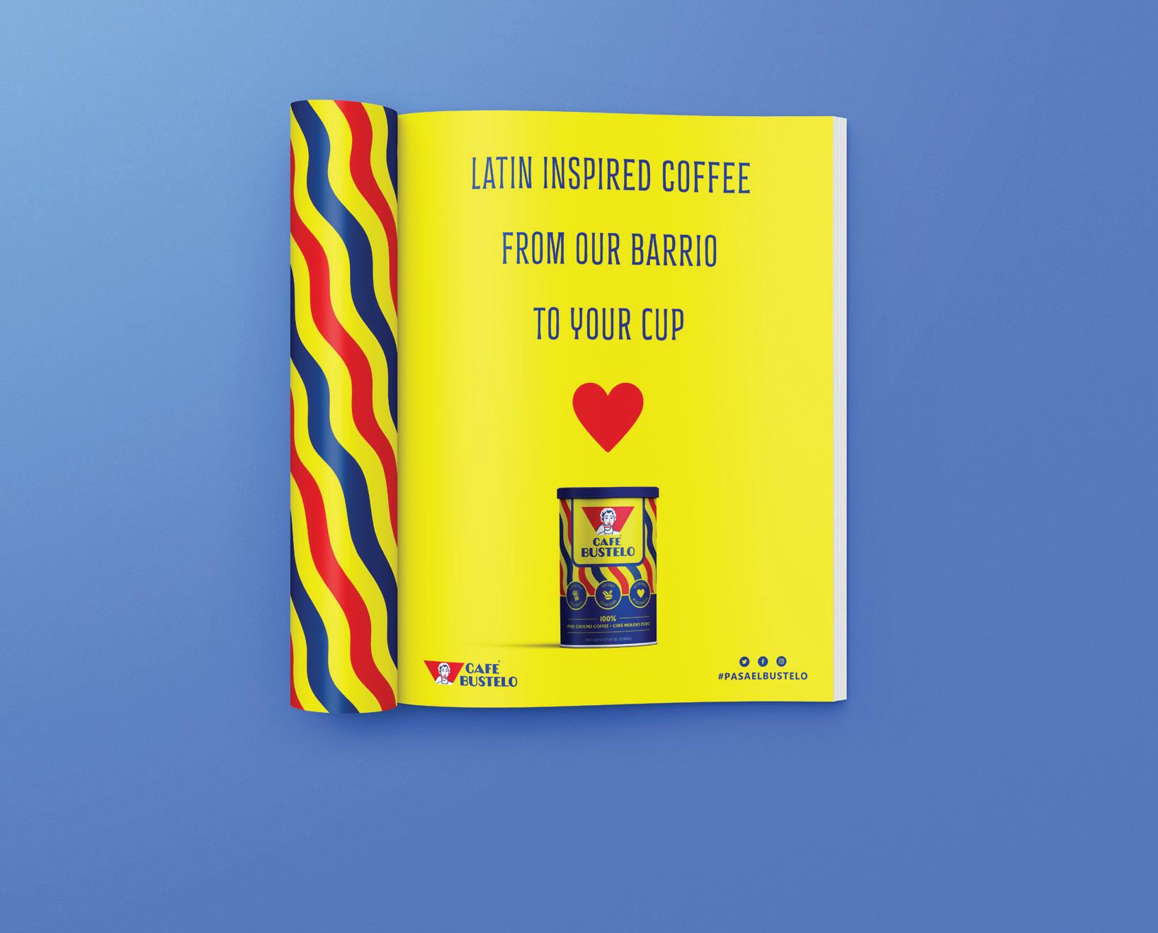
DISPLAY MAGAZINE AD
CORRUGATED
COFFEE BRICK PACKAGING
Cafe Bustelo Case Study | Rebrand Campaign
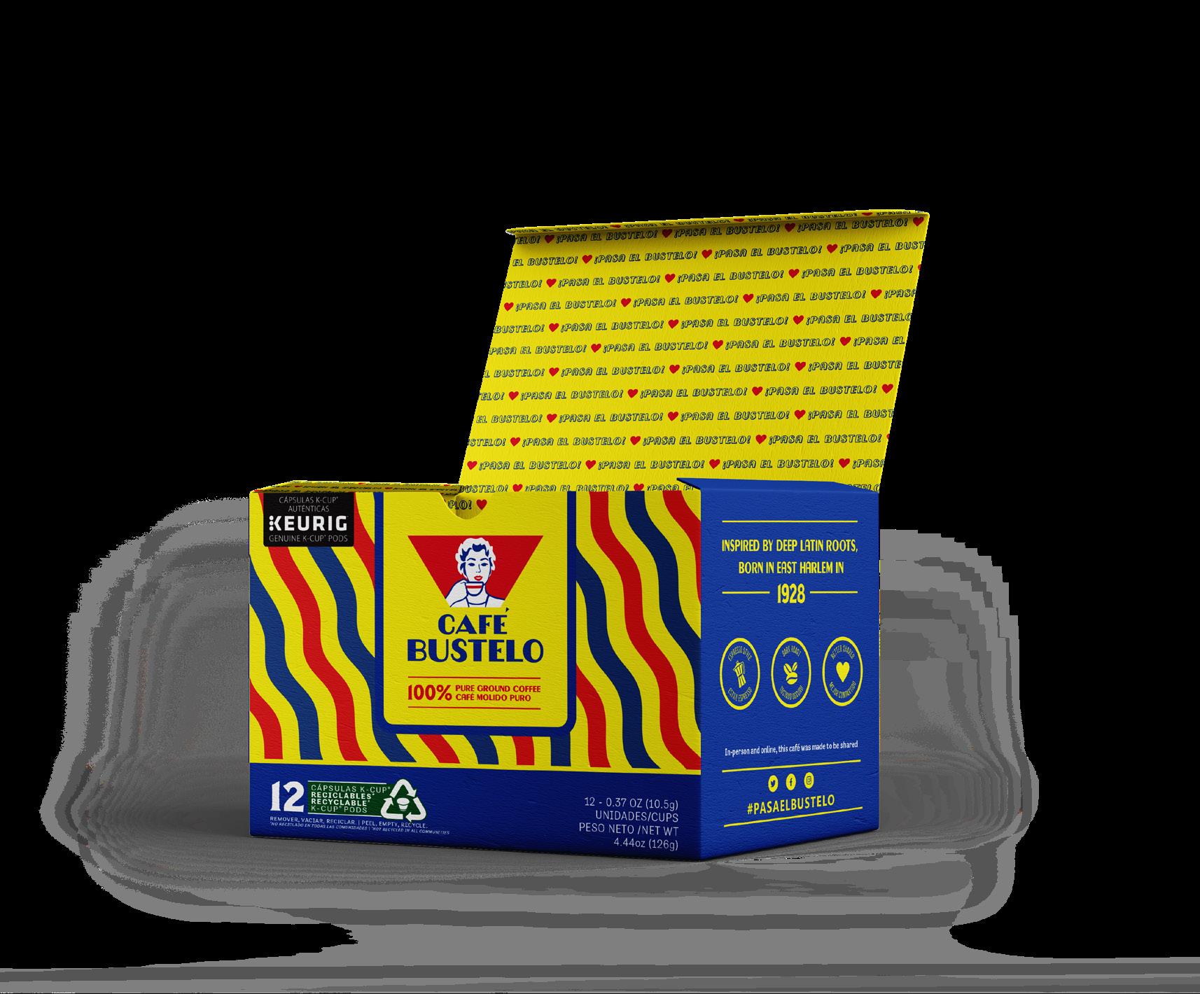
K-CUP
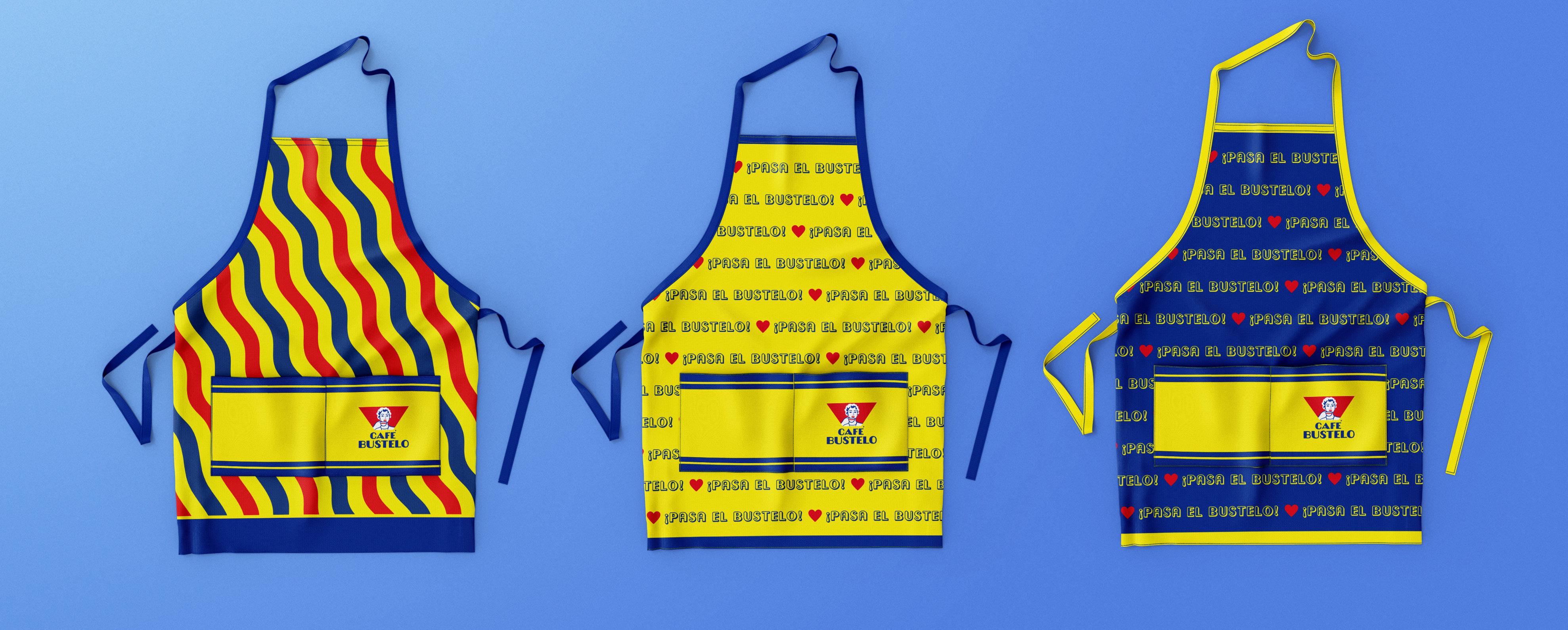
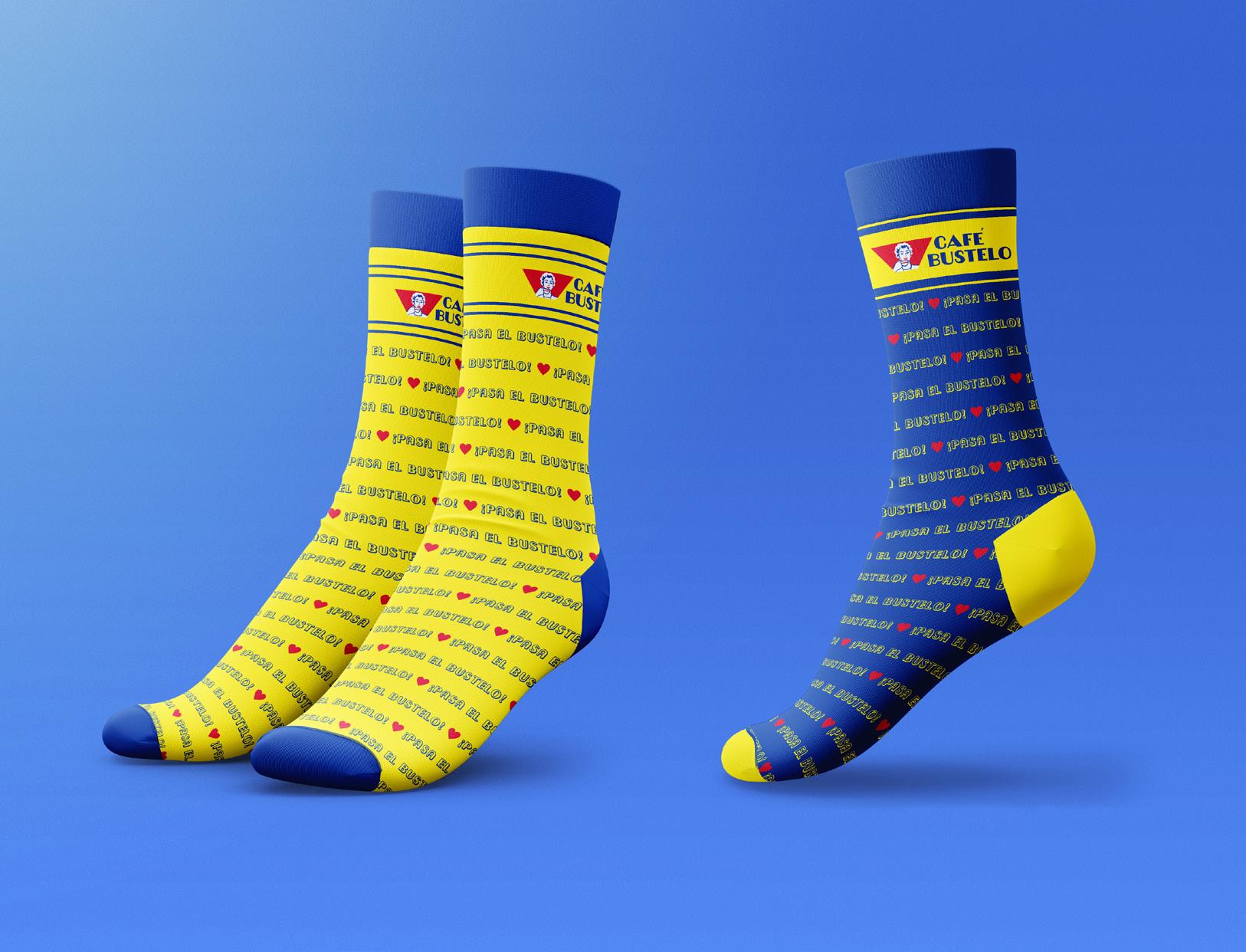
SOCK DESIGNS
APRON DESIGNS
PACKAGING
PUBLICATION GROWSPACE
Magazine Design
Overview
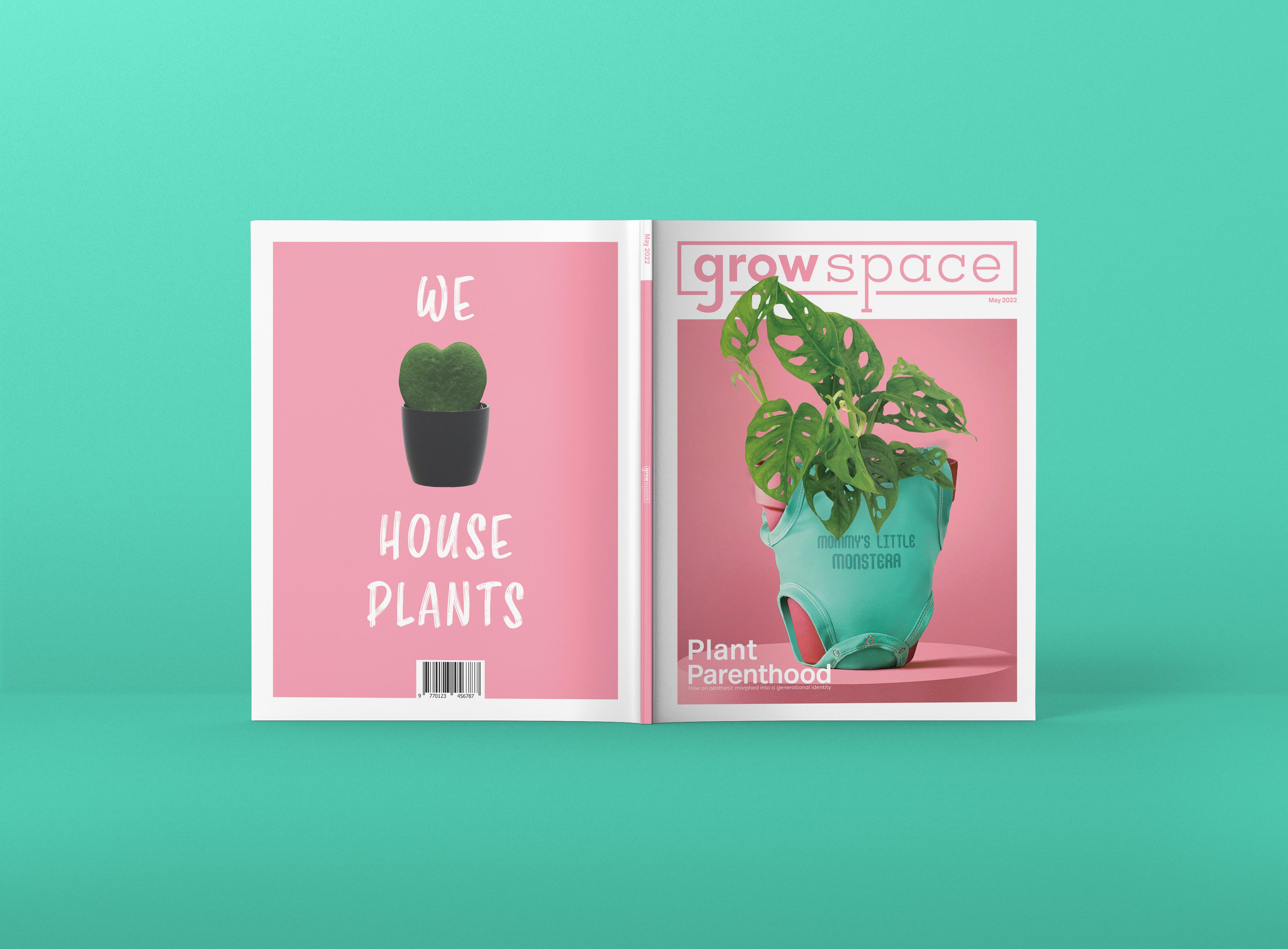
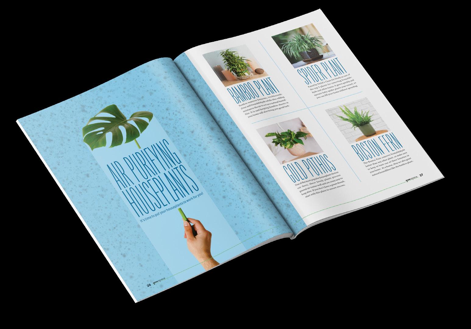
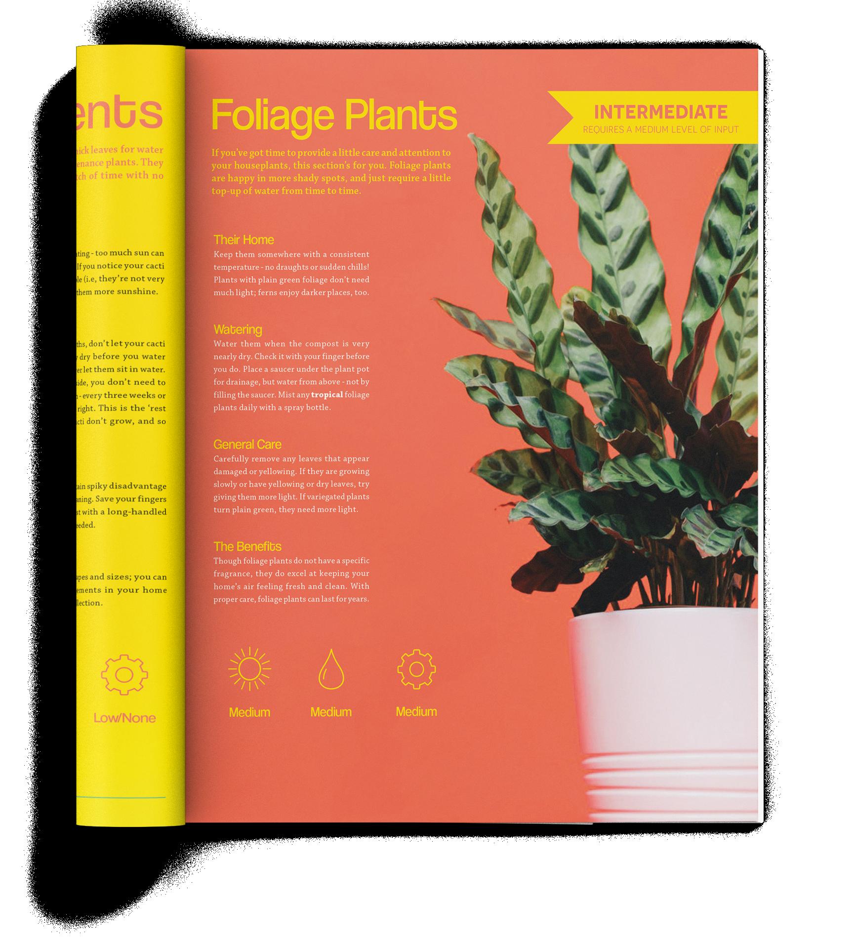
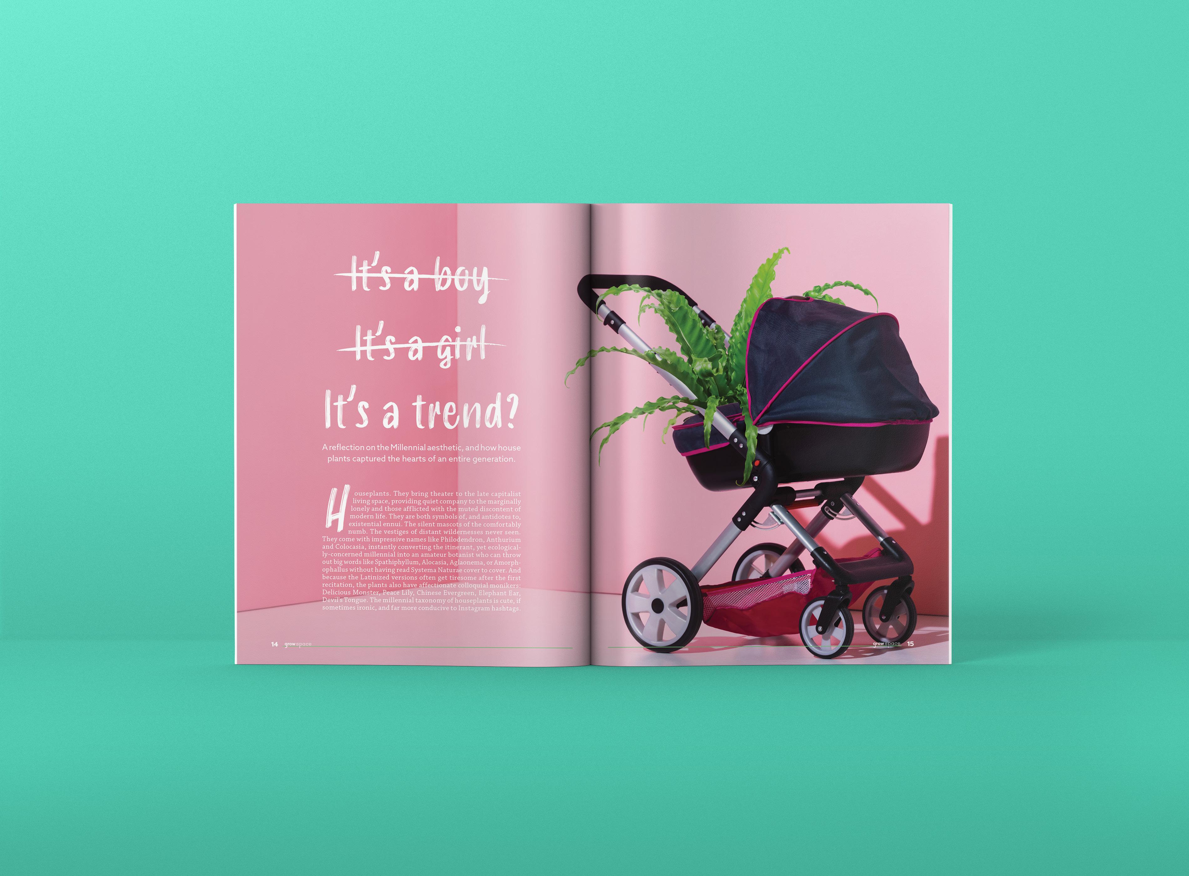
GrowSpace is a unique magazine that focuses primarily on houseplants and indoor gardening. In our increasingly urban world, younger generations often do not have access to vast amounts of nature, which has slowly led to an increased desire and appreciation for keeping nature inside your own home, no matter how small the space. House plants and the general topic of indoor gardening has taken younger generations by storm, both in real life and on social media. This magazine aims to capture some of that wonder and love for our small, indoor plant friends, by inspiring curious readers through photography, interesting and articles/listicles, and indoor growing guides for every skill level.
Logo design
Preliminary sketches explored the idea of juxtaposing the word "grow" with the word "space" in order to emphasize the meaning of planting in small spaces. Initially, the idea of having a small sprouting plant appear in the logo itself was explored, but was not brought into the final design. The concept of having a bounding box around the logo type adds to the idea of small spaces.
Target audience
In order to reach the target audience (Primarily Millennials and younger generations) the magazine was designed with a casual, clean, and modern style. There is an abundance of white space throughout the spreads, vibrant colors, large headlines, and a multitude of beautiful photos of house plants to really inspire the reader. The magazine's main feature draws attention to the social media phenomenon of "Plant Parenthood", while the rest of the magazine feeds into the idea of being surrounded on all sides by plants.
ARTICLESPREAD
SPREAD
FEATURE
BOOKBUDDY
Mobile App Redesign
UI/UX DESIGN
BRAND IDENTITY
APP SCREENS
Overview
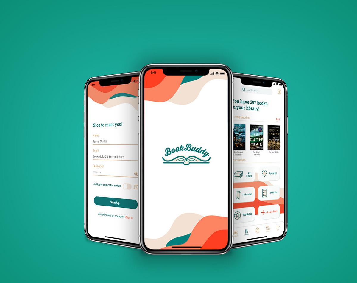
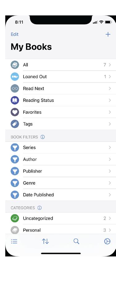
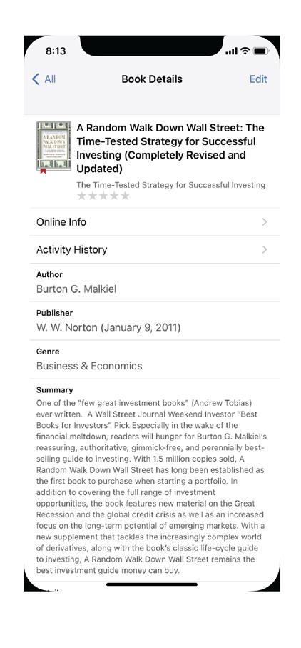
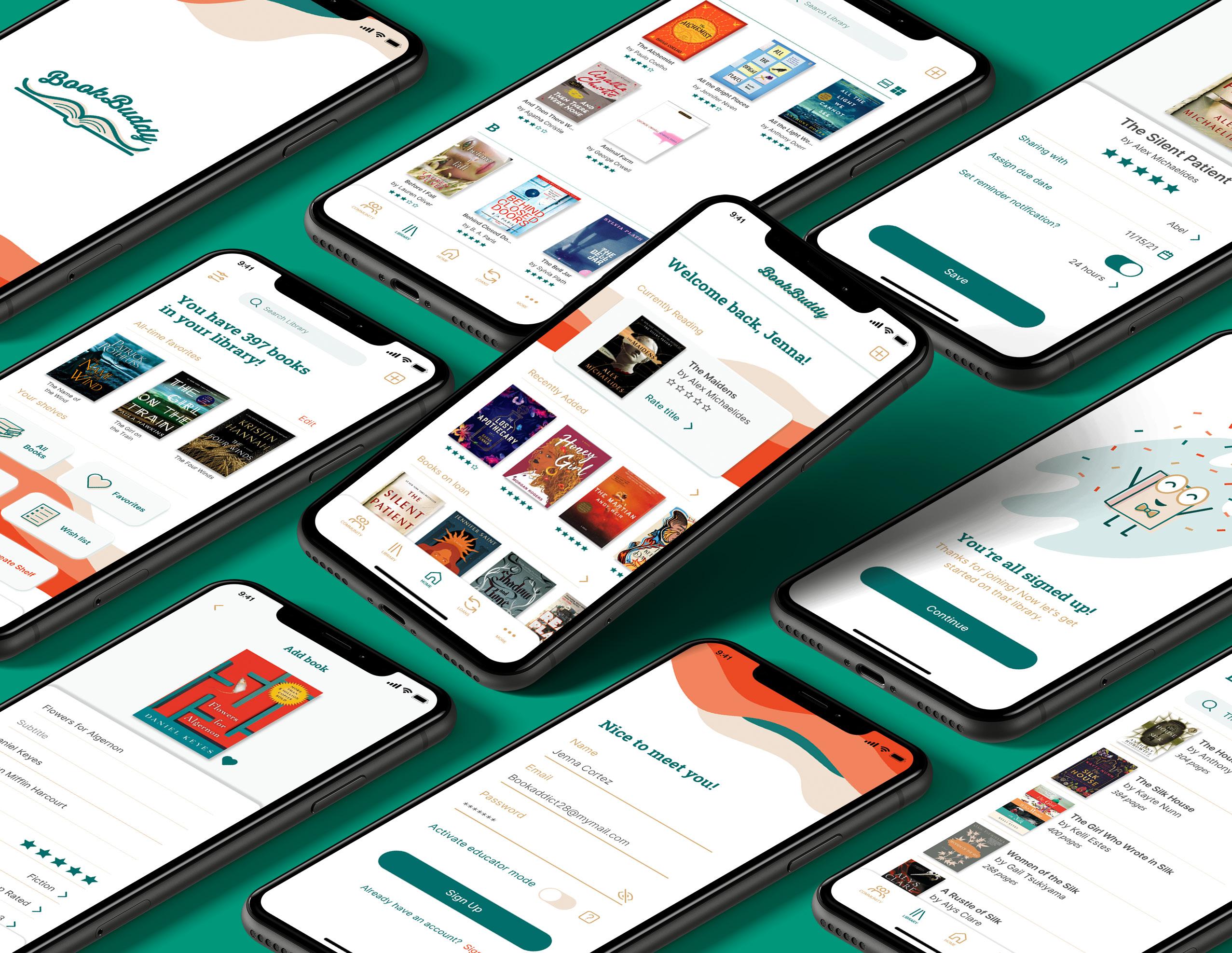
BookBuddy is a library tracking app that allows users to store information about their physical libraries in a digital format. With BookBuddy, you can organize your library, create custom shelves, mark your favorites, and rate your books. You can also keep track of books you have borrowed and loaned to friends, as well as browse the libraries of friends and other BookBuddy users.
Design Rationale
While BookBuddy is a powerful app with many capabilities, the current app was designed to be functional rather than aesthetic. With my rebrand and redesign I aim to establish a strong brand identity by incorporating a color palette, memorable logo, clean typefaces, and interesting visual elements. The result is an app that is both intuitive and visually pleasing to users.
Target Audience
BookBuddy is perfect for adults who are extreme book lovers. These users love the feeling of a physical book, or at least love being in a coffee shop enjoying a digital book. They dedicate time, money and energy into purchasing books and keeping their personal libraries organized. They love being able to discuss books with fellow book lovers in person or online and are always keen to document their honest reviews for the books they have read.
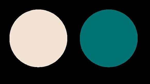
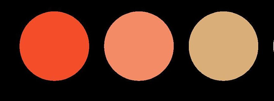
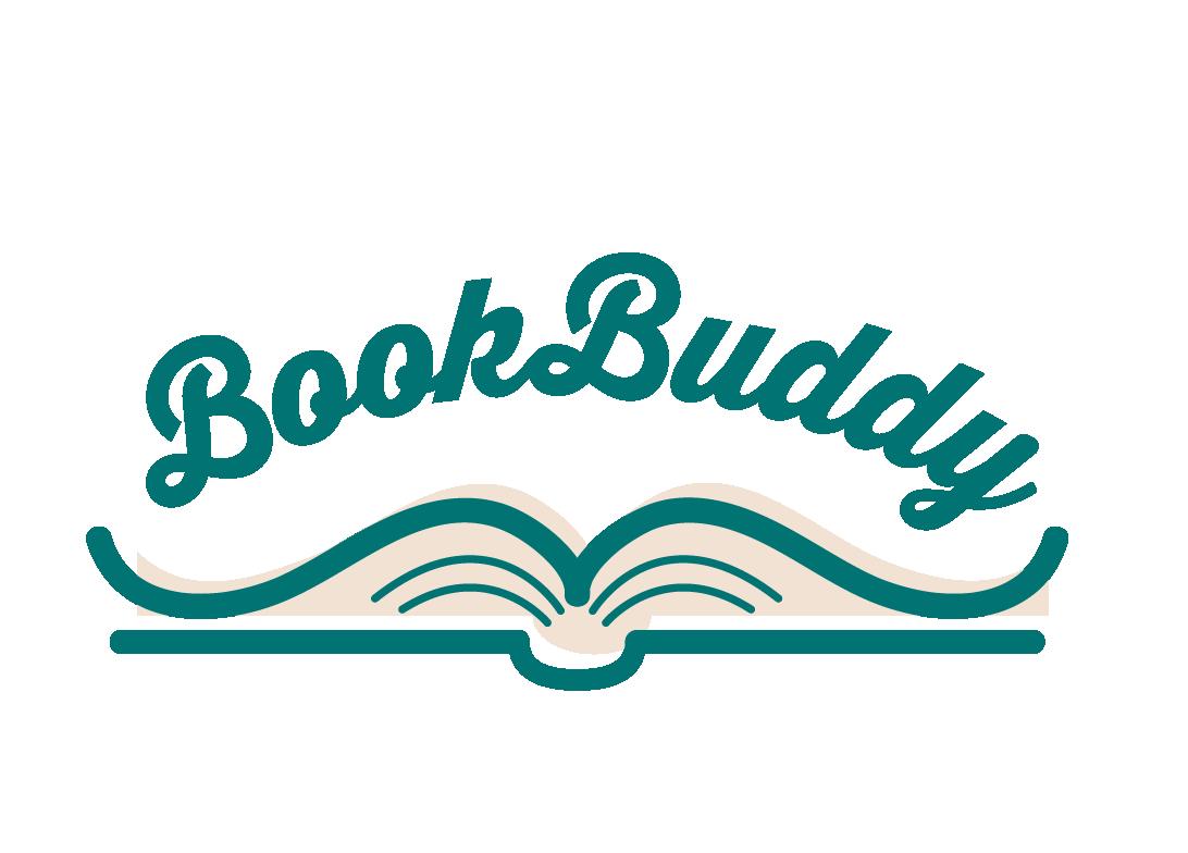
APP ICON PRIMARY LOGO BRAND COLOR PALETTE BookBuddy | App Redesign
Goals For Redesign
• Elevate current app UI
• Establish color palette and brand standards
• Incorporate community features to connect users
• Develop more customization options for personal libraries

• Organize features for more intuitive navigation
EXISTING APP DESIGN
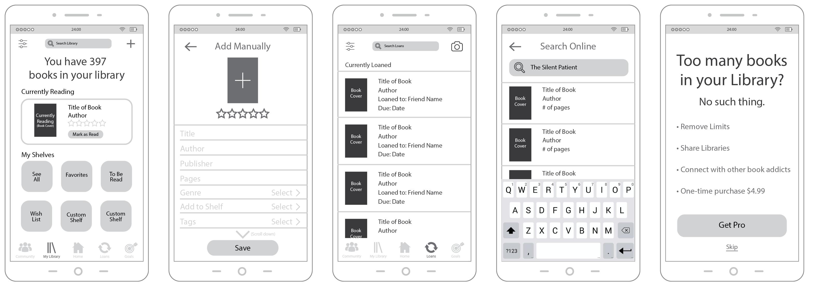
WIREFRAME PLANNING
Mandy Espericueta
Loan System
The “loans” tab allows you to channel your inner librarian with the ability to check books in and out from your personal library. See which friends are currently borrowing from your library, view your most loaned titles, and set due date reminders so that you never have a favorite read go missing again!
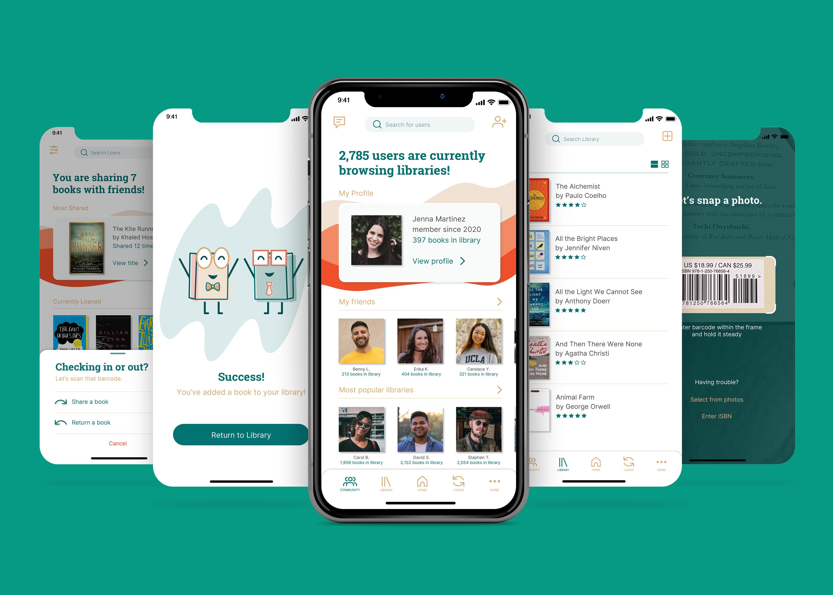
Community Tab
With the “community” tab, you can explore the digital libraries from other BookBuddy users just like you! Browse the most popular user libraries, find great recommendations, and interact with your fellow book lovers by adding users to your friends list.
Personal Library
Easily manage and customize every aspect of your digital library. Create custom shelves to organize your books, rate and review books you have read, and mark your favorites . Quickly add books to your library with the search function, scan your book’s barcode to automatically populate the info, or enter the information yourself!
BookBuddy | App Redesign
Mascot Creation
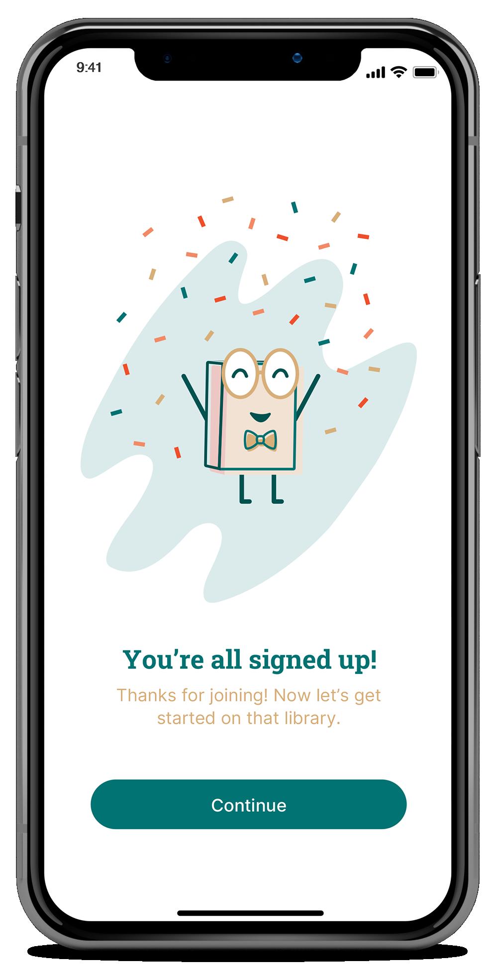
A mascot was created as part of the redesign process to enhance user experience and give the app a sense of personality. This adorable hardcover character is also named BookBuddy, making it easy for users to remember and identify him. BookBuddy helps users learn how to navigate in-app features by walking them through the onboarding process after signing up for an account. He will also pop back up to celebrate with you each time you add a new book to your library, reach a success screen, or share a book with a friend.


 BOOKBUDDY MASCOT DESIGNS SPLASH ANIMATION
Mandy Espericueta
 Mandy Espericueta
