AZALIAVALADEZ1999@GMAIL.COM @AZALIAV_GRAPHICS AZALIAV.COM AZALIA
ABOUT ME

ABOUT ME
INFINITE REQUIEM - PACKAGING
STORM BOWLING SERIES - ADVERTISING
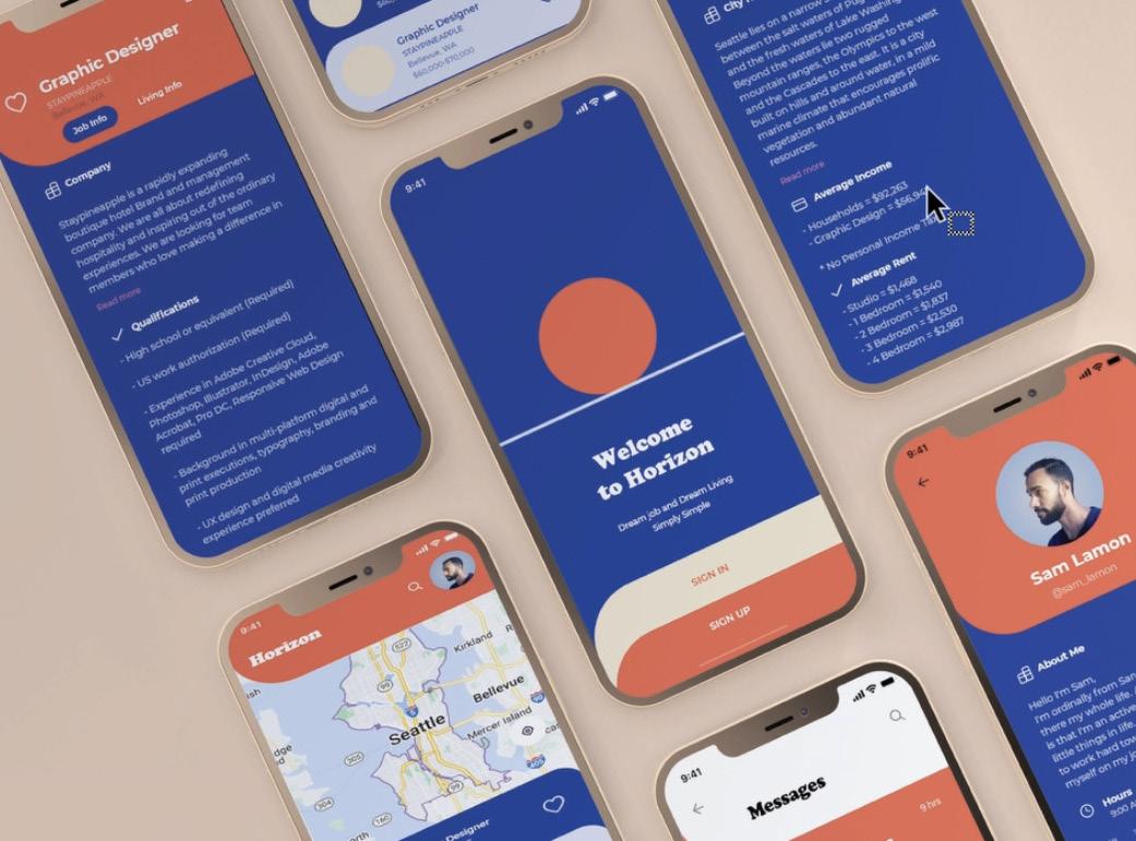
HORIZON - APP
TYPE MENU BOOKLET - TYPOGRAPHY
NIGHT WALKER - ZINE
ALAMO ARCHITECTS - WEBSITE
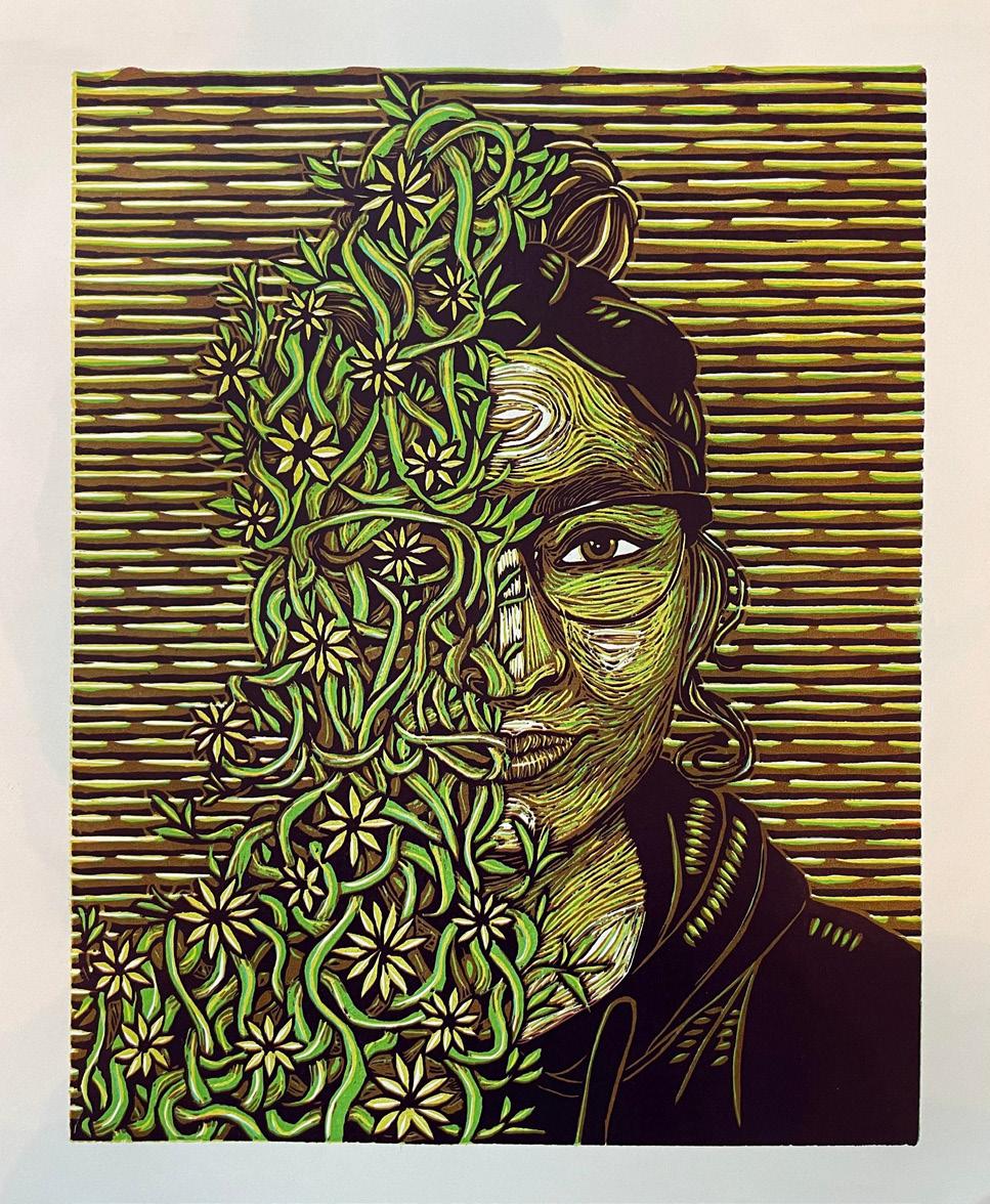
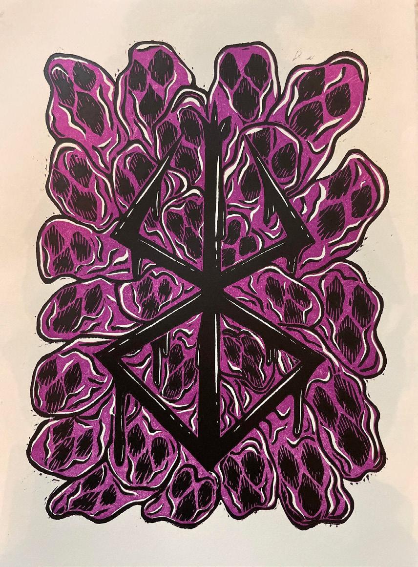
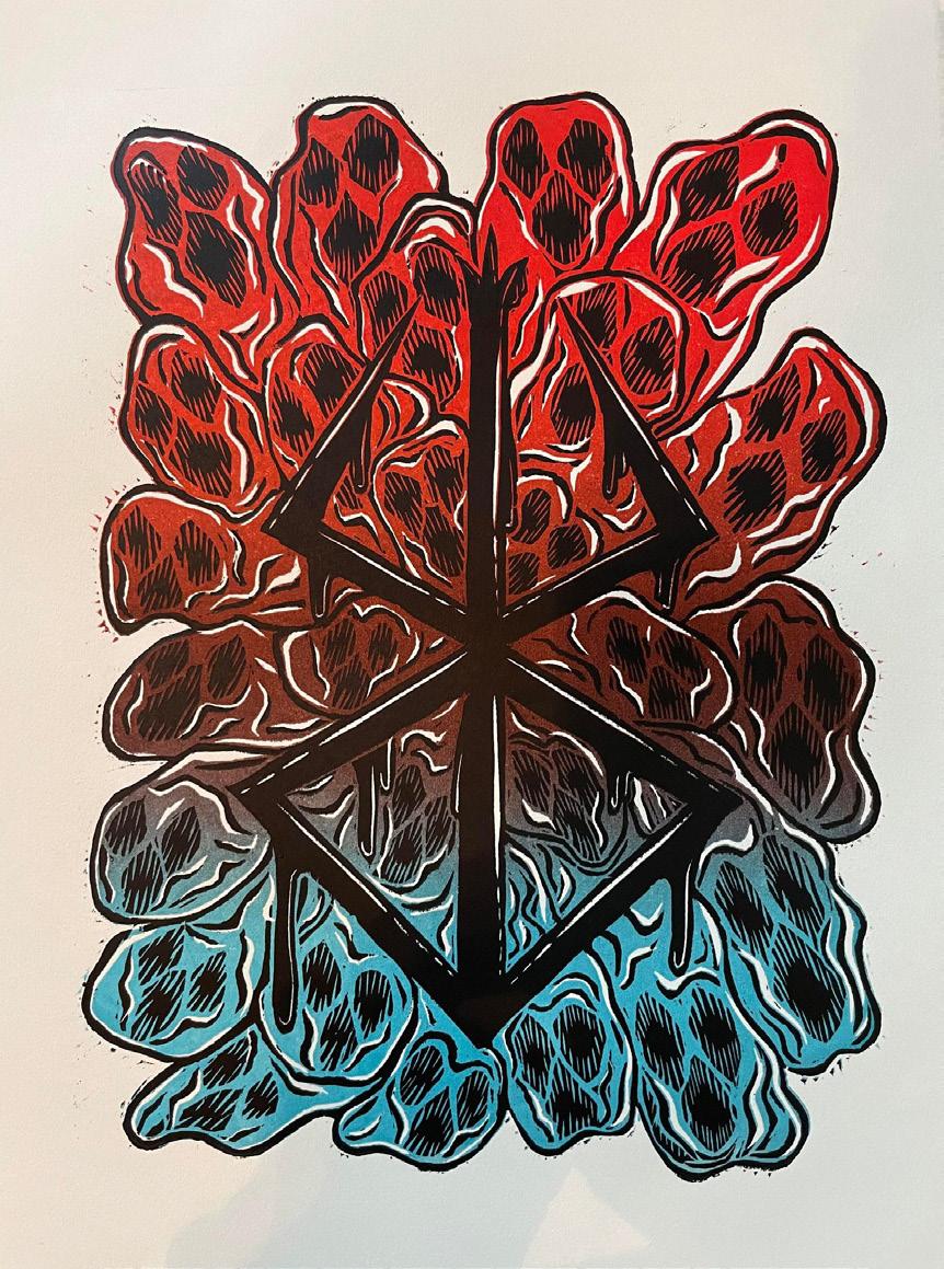
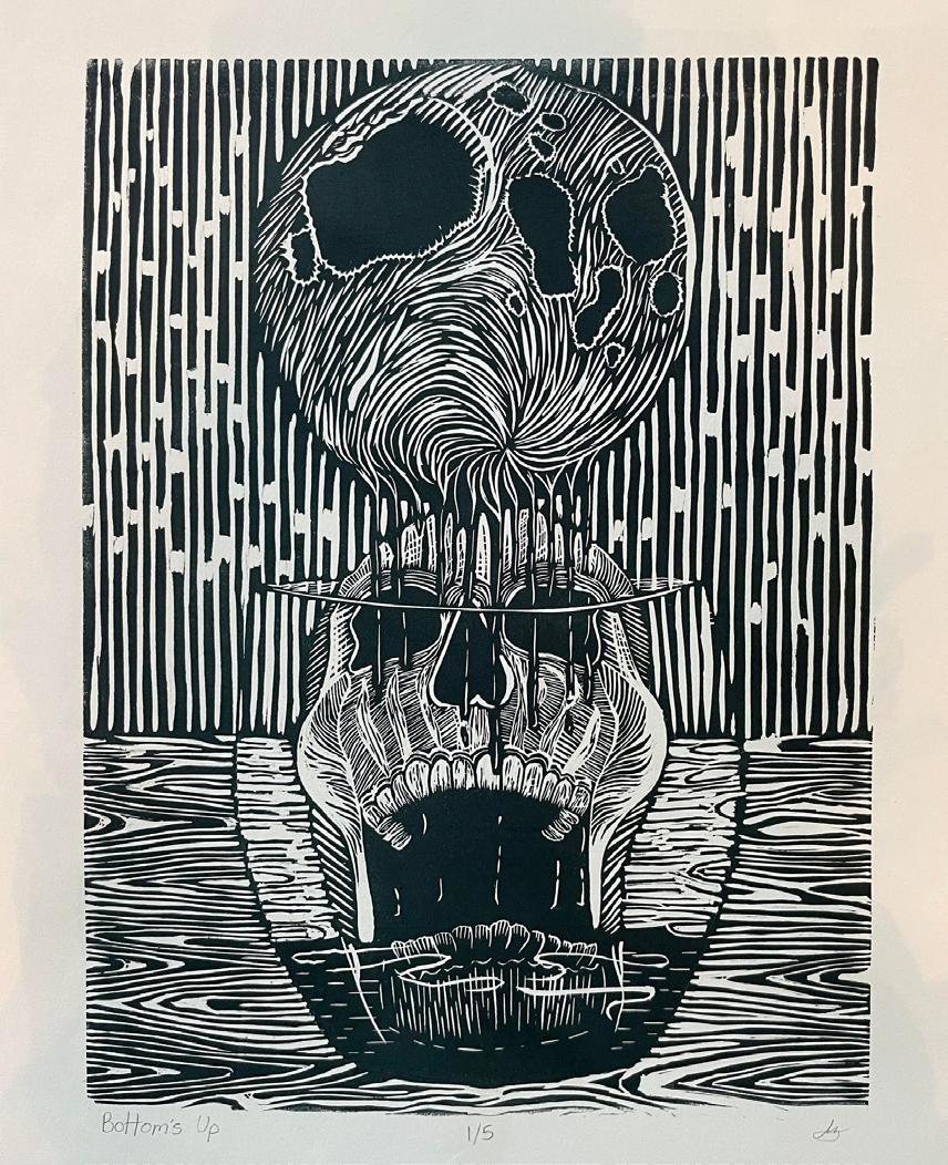
PRINTMAKING POSTERS
My name is Azalia Valadez.
I am a illustrator, designer, marketer and artist. Somethings that bring me joy consists of print media graphics, creating illustrations, and packaging. During my time as a student I have found a new passion for marketing, specifically for consumer behavior. I tend to see a lot of parallels within the design world and the ability to not only communicate but persuade viewers.
PROJECT TYPE


Packaging | Branding | Case Study
DELIVERABLES
Main box | Belly Band | Controller Box
Game CD Holder | Instruction booklet
LOGO VARIATIONS

DESIGN ELEMENT EVOLUTION
Infinite Requiem is a uniquely created new gaming console meant to highlight indie creators. We are giving them a primary platform for these games to shine alongside some of the traditional large games currently on the market. This case study shows our ability to demonstrate problem-solving skills and create branding from the ground up.
BRAND ATTRIBUTES
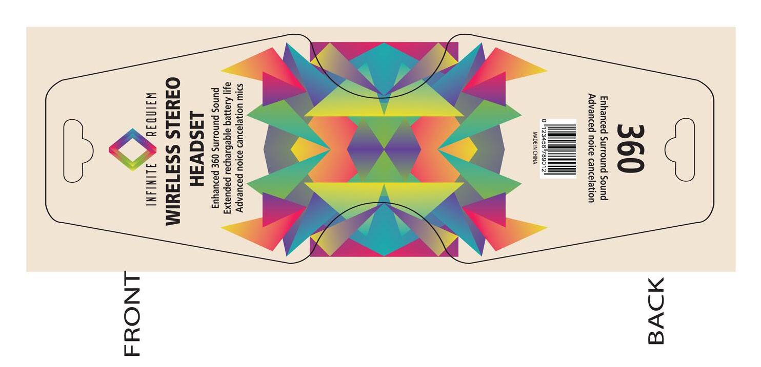
Infinite Requiem Packaging
It consists of teens starting age 14 and up, bringing them into a unique gaming world. They tend to spend time with family and create a community presence through online gaming with new and old friends. They’re in high school, involved on campus, and after a long day, they enjoy wrapping it up by hopping online to unwind with some video games. Current generations are tapping into nostalgic entertainment and styles, taking it a step into a more straightforward and fun time through the media of retro gaming or their parents. Our product could give an essence of the past in a modern way.
Based in Dallas, TX, since 2020, it is the only gaming console spotlights indie developers for anyone in the modern day and age who wants to pick up a controller during this cultural renaissance of technology and gaming. Our slogan is Nostalgia for the Present.

The controller box design and wireless headset belly band, implementing key patterns throughout. While making the controller box, it was constructed to hold the controller in place, have a view window for the product, and break down diagrams of the controller features. The belly band, a simple and intuitive design to be straightforward with the product’s characteristics.

The central console box consists of 2 unique indie games specific to this type of console, wire hookups, a breakdown preview of each game, and the new console’s features. This box is sized to current console boxes, fully functioning fold, and opens to show the inner brand patterns and video game (Phantom Tactics) designed by my collaborator Noah Melendez.
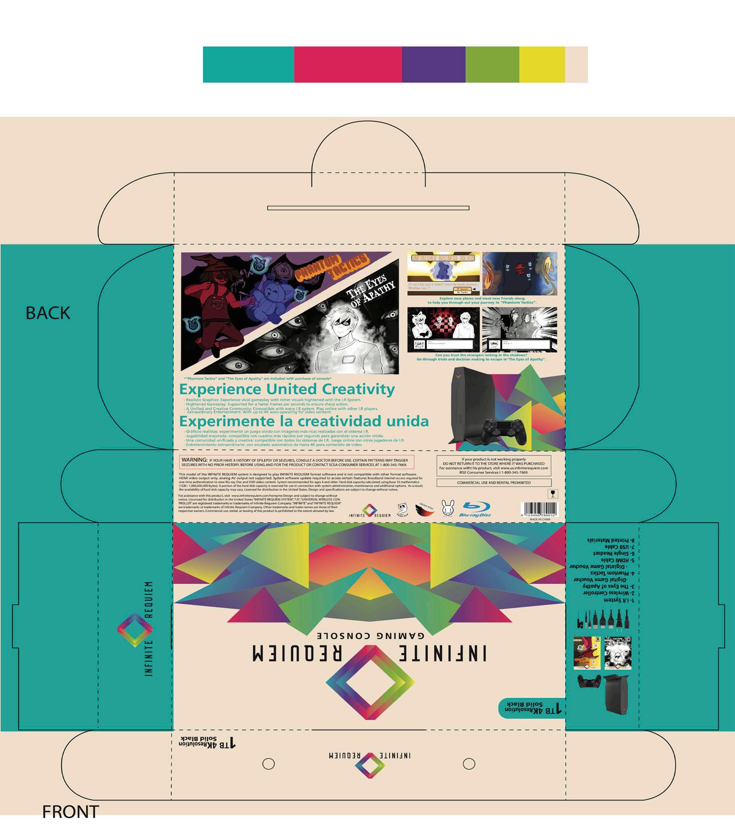

Some accessories with your new deluxe bundle of Infinite Requiem include a headset and two exclusive games. Modeled after modern video game packaging with two complete games, it highlights indie developers and elevates them to new heights.


We are wrapping it up with our premium controller, a performance that will not be outclassed by any other on the market. These products can is found when purchasing our deluxe Infinite Requiem bundle. This packaging series is modernizing vintage aesthetics and bringing a new appreciation for indie developers.


When it came to creating Infinite Requiem, I saw a gap in the market regarding the recognition that indie games and developers needed within the gaming industry compared to larger name-brand games and companies. I also took into consideration the target market being the younger generation. How many are starting to go back to nostalgic materials and types of entertainment, so by creating this new console, we are marrying the past and present to allow everyone a brand new and unique experience within the gaming community.


PROJECT TYPE

Advertising | Digital Promo
3 Print Ads | Social Media
DELIVERABLES LOGO

Storm Bowling is a brand that wants to empower bowlers and the sport into the limelight, providing peak performance to bowl like a pro or get started on their way to being one. They have a significant impact and presence within the bowling community. To showcase that, I wanted to bring the new line of bowling balls into the modern age and allow a unique sport to reach and entice new and old bowlers with a vintage/ modern aesthetic.


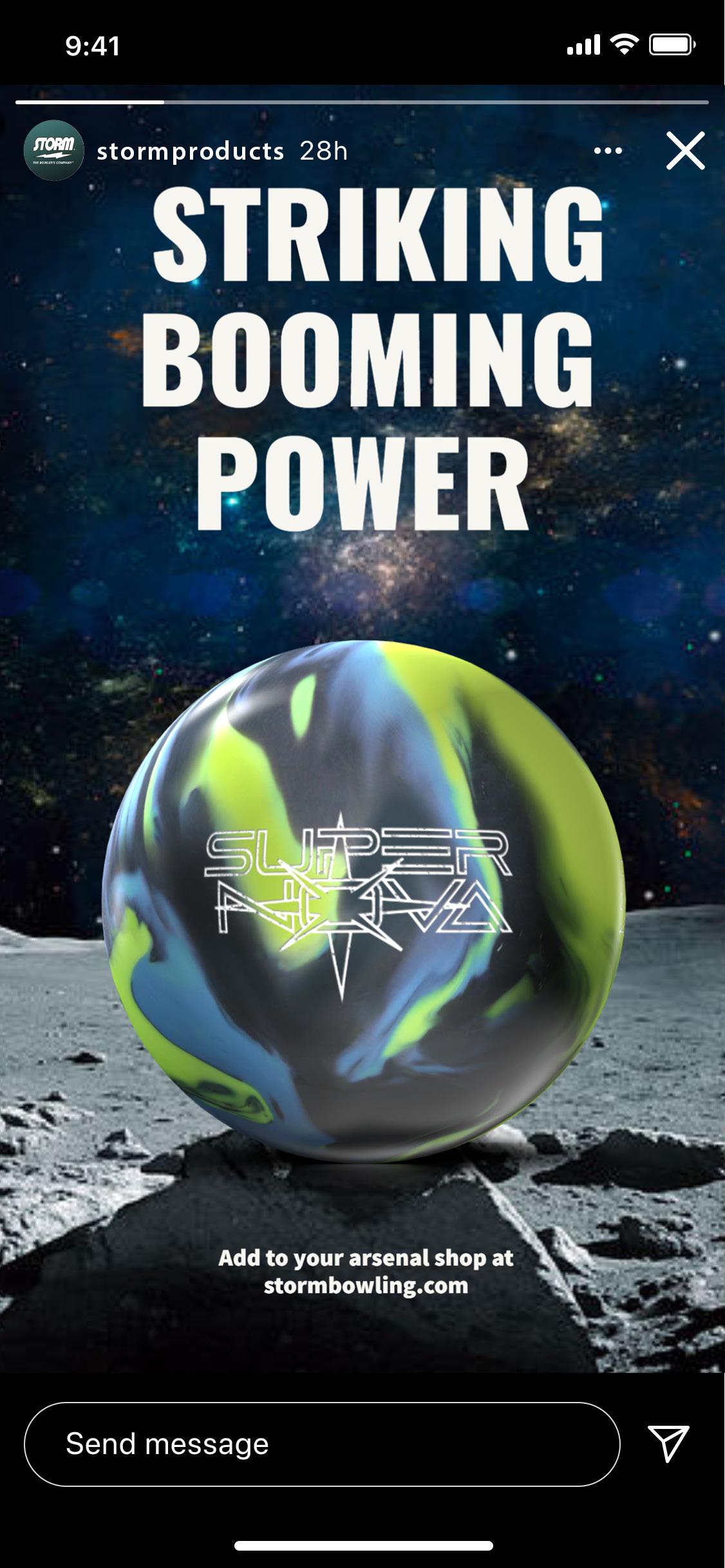
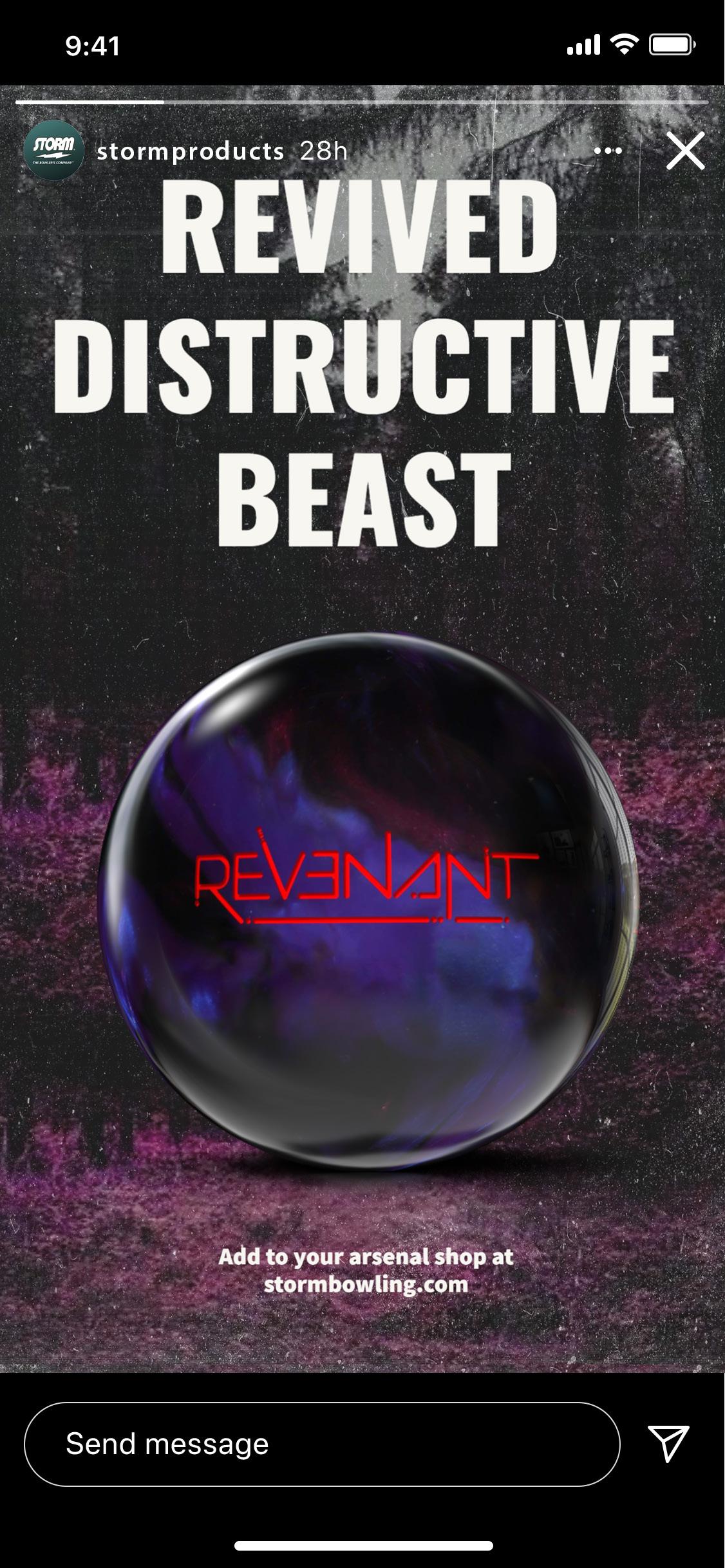


I created an ad campaign highlighting these bowling balls and their cores and utilizing each ball’s unique features in the print ads. Through photography and textured overlays, I could give each ball its setting and copywriting within the campaign to accentuate the visual attitude of each bowling ball. Additionally, the social media ads push toward a younger demographic, highlighting our unique cores that create a personal bowling experience for every bowler—across Print ads and social media, broadening our outreach to all bowlers.

UI/UX | Branding | App
DELIVERABLES
Brand Standards | Wire-frames | App | Research Survey


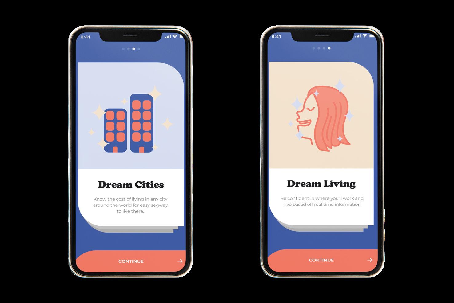
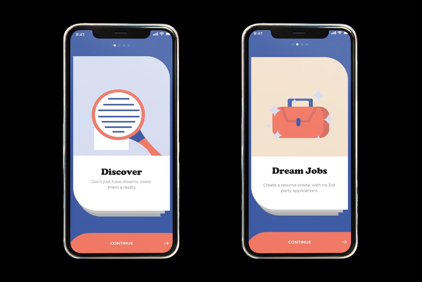
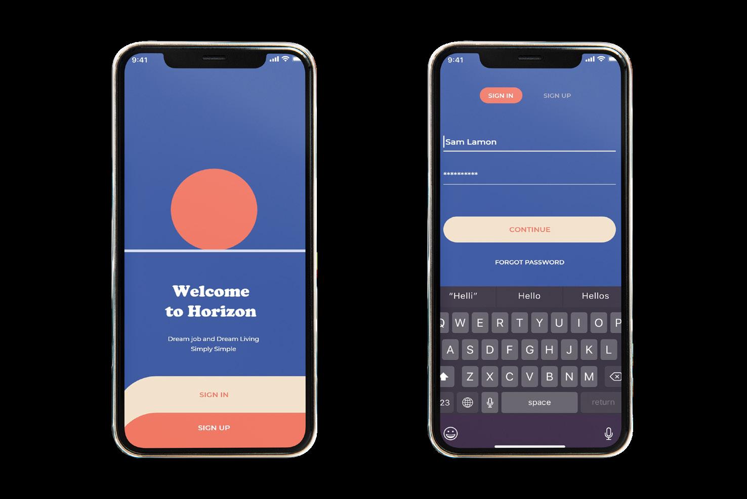
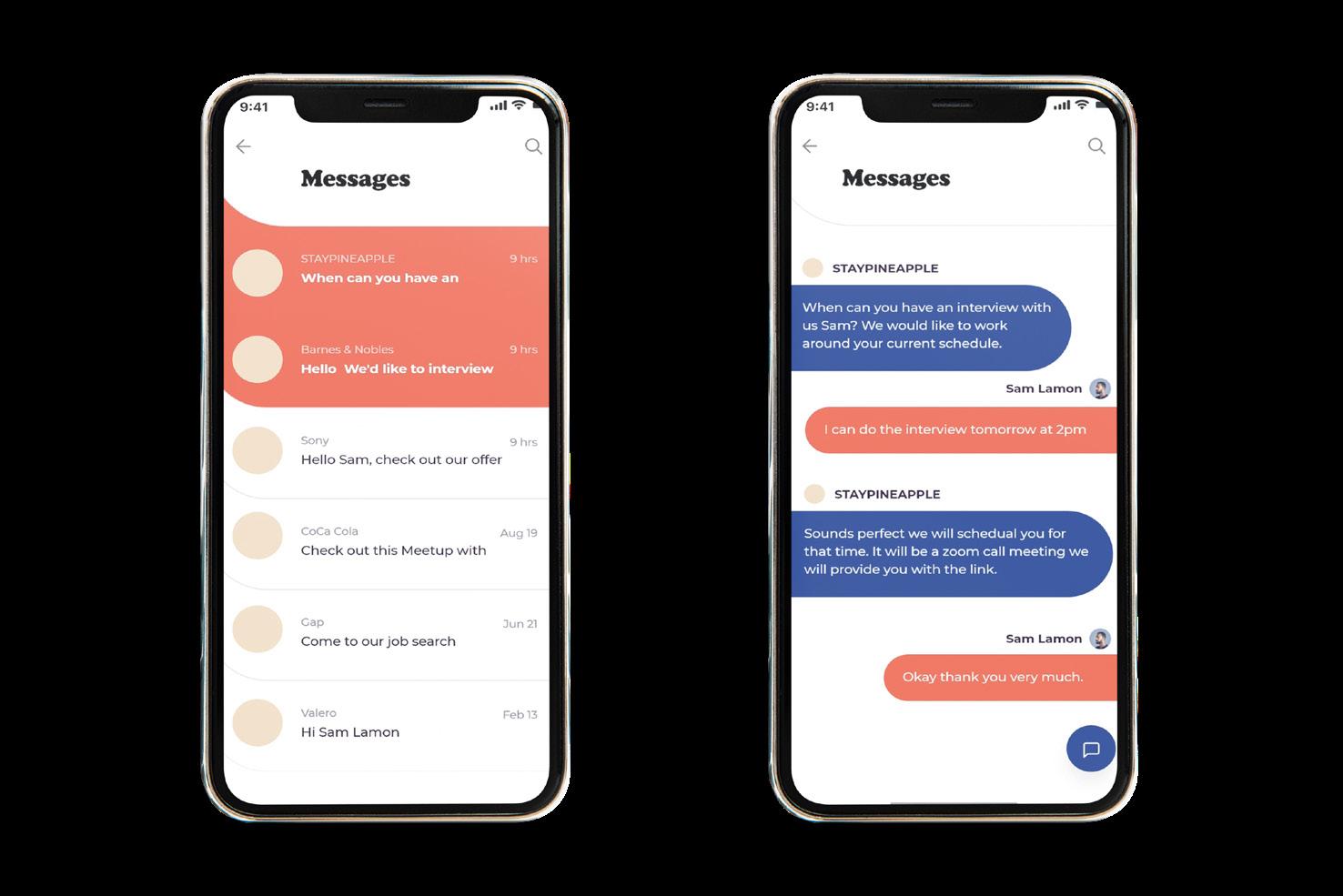
Tasked to create an app based on researching our peers’ needs and bringing them a solution. This brings us to Horizon, where we strive to present our user’s real-time information, not just on the current job market when searching for a job. But an opportunity for them to have a side-by-side comparison of the current cost of living in that area of said job. for that piece of mind when it comes to moving to a new city out of your comfort zone and into your potential new adventure just over the Horizon.
FIRST IDEATION:
FINAL SOLUTION:
The leading group consists of college students ranging between 18 and up. Some prime examples are Mayan, Sam, and Erica, student workers. Studying for their undergraduate degree, some of their personality traits consist of being studious, funny, and calm. Their main goal after graduation is to get a job that will pay well and be a fun place to live. Some of their concerns would be being afraid to move away from their family’s support or the University’s safety due to finances after graduation and looking for a job.
Some side notes about the brand are that it has originated in San Antonio, Texas, since 2022. This app is the only job searching up the cost of living side by side, making it easier for fresh out of-college students to find what they’re looking for. Making our slogan, dream job, dream city, dream living. Why settle for less when you have everything within one app.


Regarding the research, I sent out a survey to 25 of my peers To gauge their current standing in school, their plans, and problems that may stand in the way of those plans. For example, I noticed there were issues with the cost of moving to their dream city, being afraid of leaving the comfort of security from having family nearby. In addition, many have yet to use an app or even thought of using one that could help guide them aside from the general job search.

Throughout the wireframes, I planned out the different pages and buttons that would be interactive and help the user flow through the app and fulfill the goal of being user-friendly, getting into the nitty-gritty of the many possibilities that a user could end up interacting with, along with providing information and a digestible way, by not causing more of a problem but making it easier to solve.


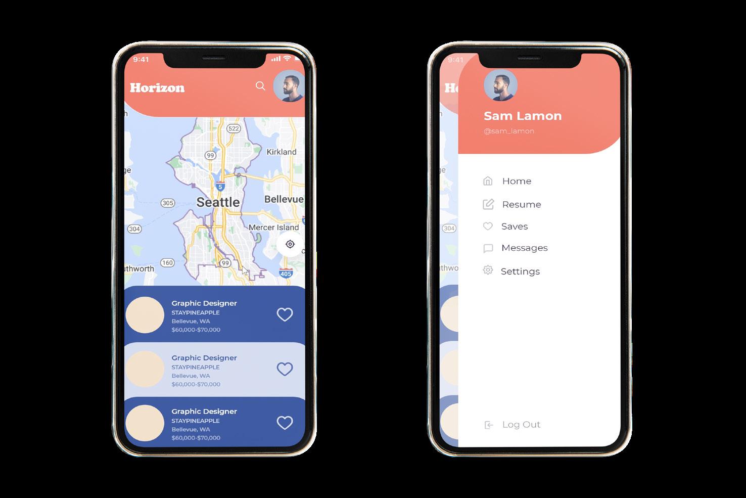
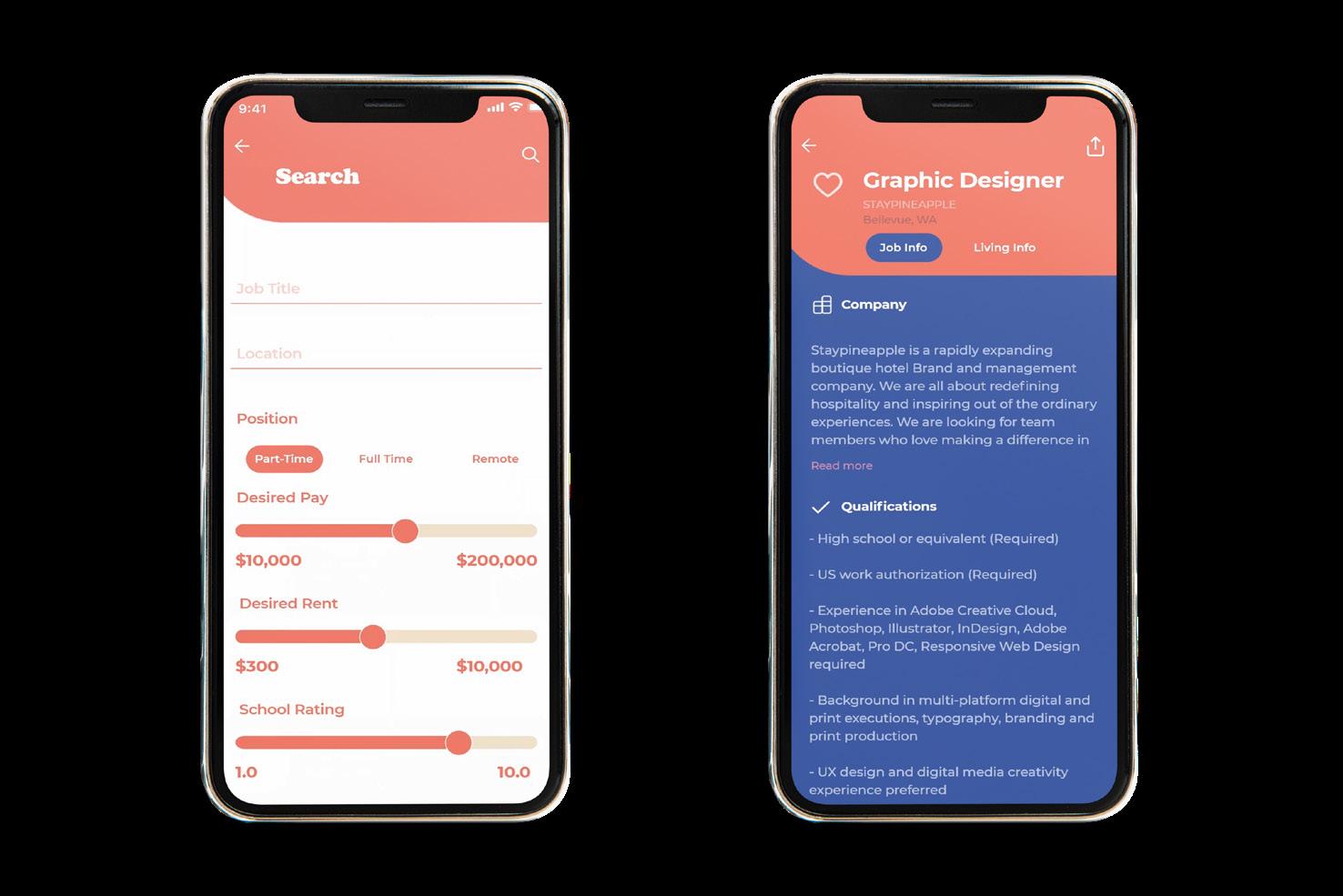
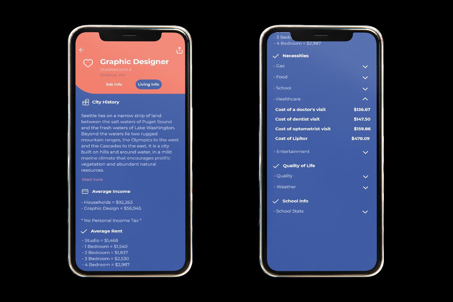
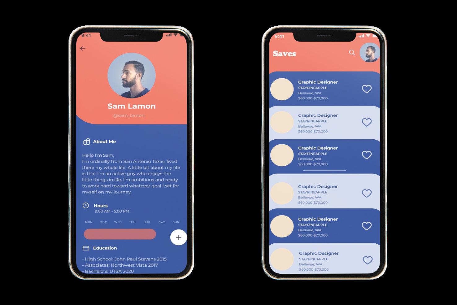
Overall I saw an issue Among my peers and decided to look into it by providing information that may have yet to be considered or known about. Giving a side-by-side comparison with finding their dream job and place to live all in one easily digestible app is a chance to broaden their Horizons. Put to rest some of their fears of moving away from family and the comfort of their familiar hometown and help them experience the world with a solid plan thanks to my app’s info.
PROJECT TYPE
Packaging | Typography | Branding
DELIVERABLES
Three Custom Typefaces | Life Style Type Usage | Type Booklet
TYPE SKETCHES


We created multiple different typefaces that all tied back to a common theme. Getting into the technicality of kerning and letter forms, my theme was desserts that all start with “M.” I considered the different textures, patterns, and shapes of said desserts when designing the typeface for each one. At the end of our project, we then selected one typeface to develop into a complete alphabet. We also had to use our typefaces within a lifestyle setting, so I did the packaging for each one.

Type Menu Booklet


When designing my final type booklet, I decided to continue on my theme of desserts and create a menu that you can order from and get these desserts packaged and ready to go for pickup or delivery. Listing each type as if they have ingredients and the different flavors that I would come in, playing along with the food theme and the potential of different flavors involved with the packaging, providing breakdown information for each type and the process that went into them from sketching to finished product to lifestyle usage.


Creating a Zine is all about sending out informative information quickly and in a fun and straightforward digestible way that can reach all types of people in public. Along with a surprise 11x17 poster inside to correlate with the theme, you will be learning something new and have a keepsake to hang up in your room. I decided to go into the stats and statistics of the societal stigmas of women walking at night and the male privilege at an early age.


In Night Walker, we go over what is currently said to women and what should be said to them instead to hone in that we may be saying these things that have negative connotations. Next, we get into percentages of women and their fear of being out at night and what they currently do to stay safe, along with two real-life examples that happened to women and how the public behaved toward these problematic situations. Finally, we are wrapping it up with the fact that it takes all of us because together, the night can be bright.


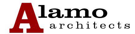

UI/UX | ReBranding | Website
Brand Standards | Website

ORIGINAL LOGO
REBRAND LOGO
When working on this redesign, I wanted to highlight the main focus. Beautiful images showcase many memorable architectural pieces they’ve done that have shaped the community. They also handle many different events and programs they are associated with, along with much info that I wanted to break down and hit the key points visually to allow users to avoid being bombarded by too much information and allow a calm and sophisticated journey throughout the site.
For Alamo architecture, I wanted to continue the type of professionalism and simplicity that I saw within their company and core values. A key factor was that they were within San Antonio, the Alamo City, so I wanted to hone in on that when it came to the logo. Within the logo, not only do you see windows, but it also represents two A’s tying back to the company name. Going even further, it even spells Alamo within it, describing the Alamo arches. They are about building the community, being very localized, so I wanted to ensure we stay true to our roots.

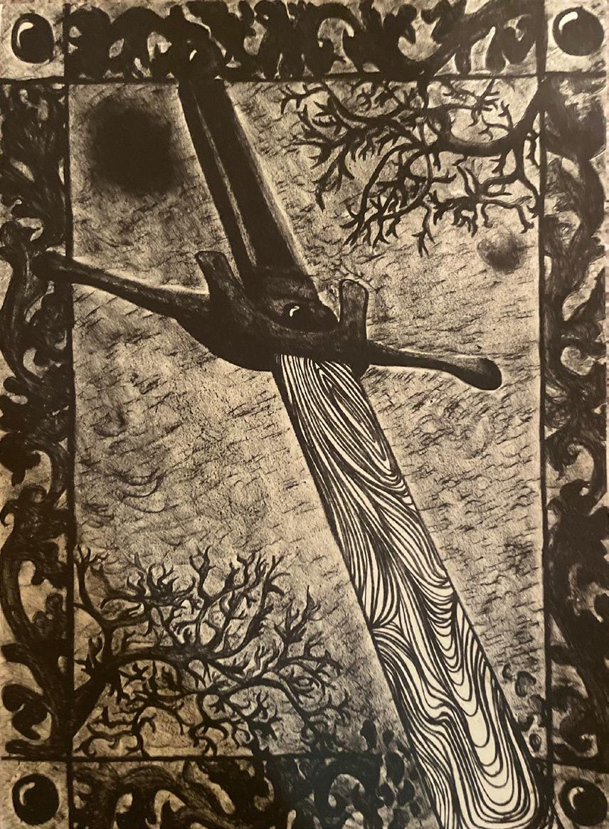
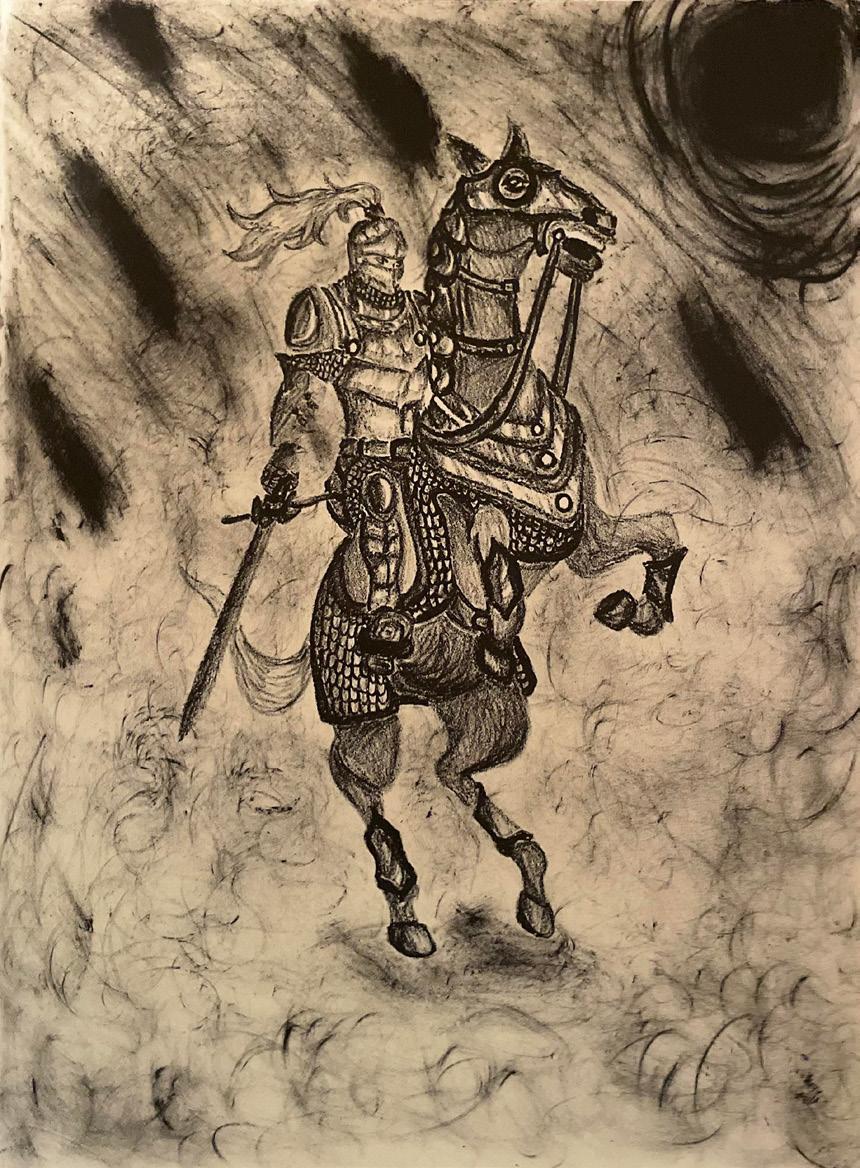
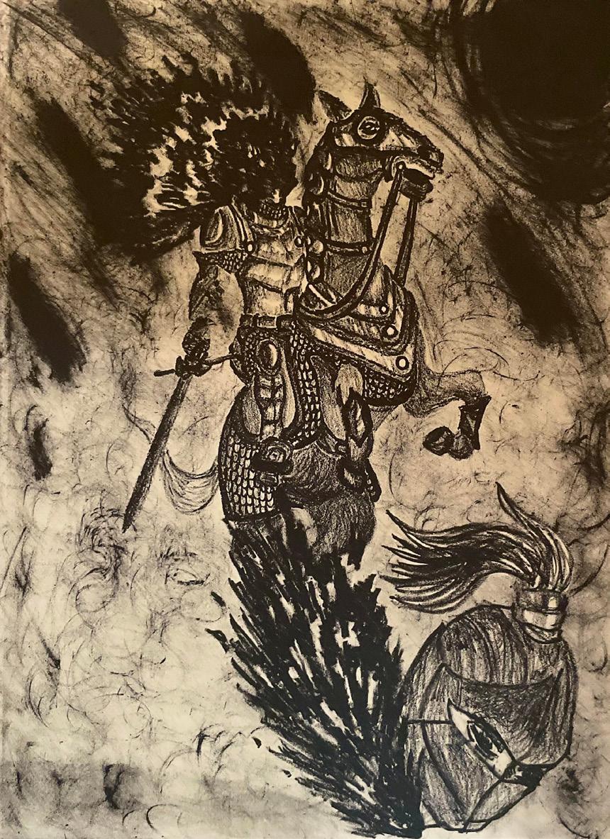
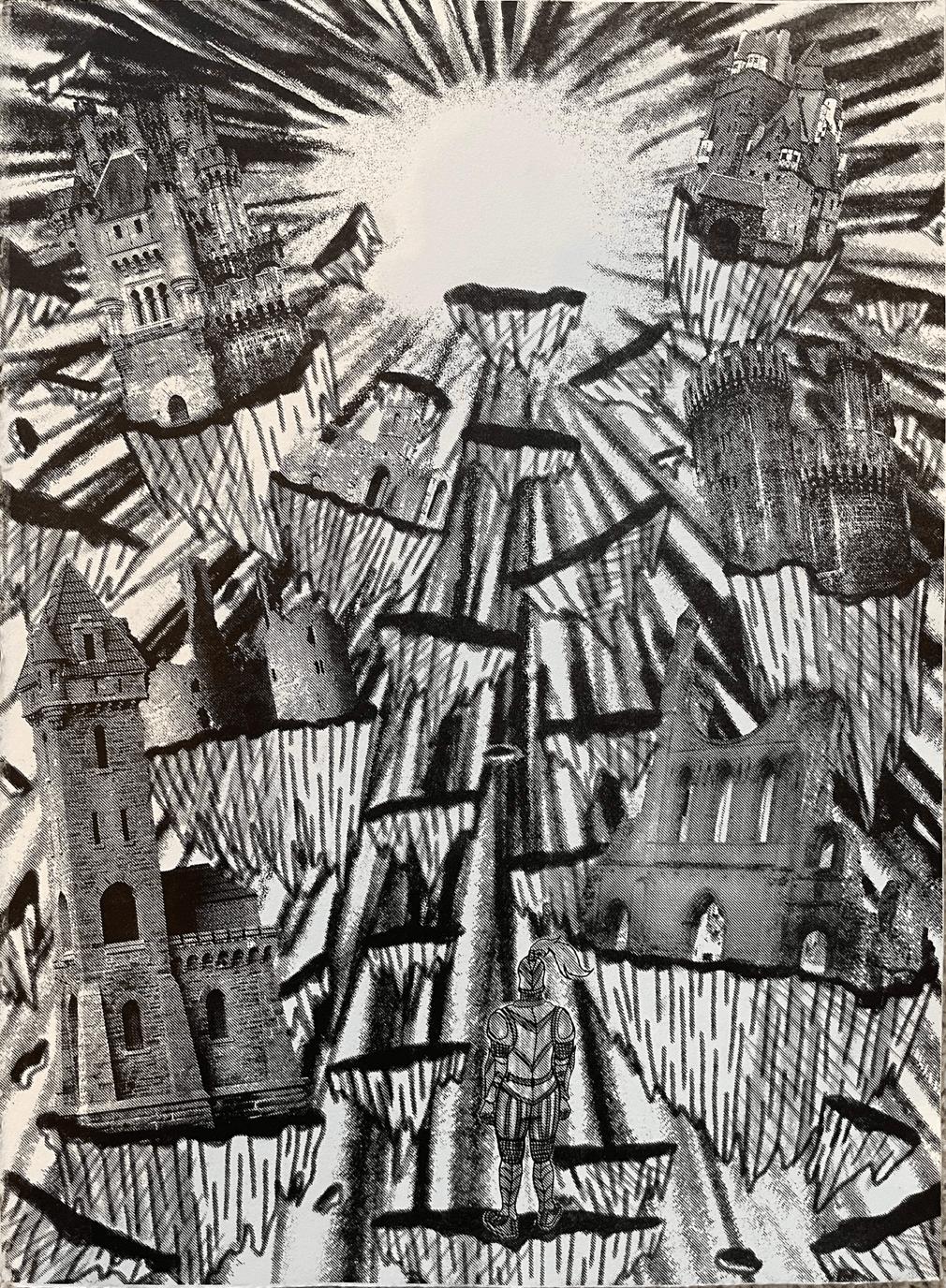
PROJECT TYPE
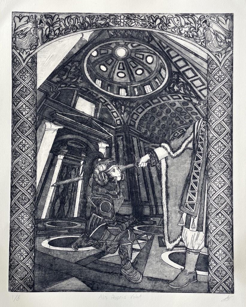
Reduction Cuts | Intaglio | Lithography
DELIVERABLES
Posters
A collection of printmaking work I’ve created, from reductive processes to lithography and intaglio, I explore a variety of styles and the use of color. I enjoy depicting scenes in great detail, always crossing my “I’s” and dotting my “T’s.” I also enjoy using imagery representing the medieval period and utilizing processes like intaglio and lithography that lends themselves very well to the imagery I create.