shayleedesign@outlook.com www.shayleedesign.com @shaylee.design
Shaylee PattersonPortfolio
Graphic Design

shayleedesign@outlook.com www.shayleedesign.com @shaylee.design
Shaylee PattersonHello there! I’m Shaylee Patterson, a graphic designer based in Corpus Christi, Texas who enjoys incorporating bold and ambitious elements into my designs. I’m a problem-solver by nature and am always eager to explore ways to push the boundaries and take projects to the next level. As a versatile designer, I possess a wide range of skills, including design, UI/UX, illustration, communication, and teamwork, among others.
My goal is to create designs that leave a lasting impression and make users feel like they’re part of something special. I’m truly passionate about my work, and I always strive to exceed my own expectations and deliver results that surpass what I initially imagined. I take pride in my ability to elevate projects and bring out the best in every design I create.

Joyryde
Mobile App
Branding, Case Study, UI/UX
RoundTrip Magazine
Publication
Branding, Illustration, Print
Lolly’s Learn & Grow Center
Website Redesign
Branding, UI/UX
Jelly Belly Candy Company
Company Rebrand
Branding, Packaging, Print
Lego Catalog
Publication Print Bella Cora Bakery
Website Redesign
Branding, UI/UX
Joyryde is the perfect app for casual bikers looking to explore their city or discover new routes through nature’s scenic wonders. Unlike many fitness-focused biking apps on the market, Joyryde offers a more relaxed and user-friendly approach to biking. Our goal was to create an app that would make biking more accessible to everyone, regardless of their level of experience. With Joyryde, riders can enjoy route suggestions, turn-by-turn navigation, and a community feed to share their biking experiences with others. Come on and take a ryde, with Joyryde!

With this project I set out to fill a gap in the current market for biking apps. I approached the project with a younger, nonfitness-focused audience in mind. The colors and visuals throughout the app are comforting, friendly, and engaging. The brand voice throughout the app is encouraging and positive, no matter what kind of rider the user may be.


 Bronze Award BEST IN GRAPHIC DESIGN: INTERACTIVE/VIDEO/MOTION


To start this project, I began researching the existing apps in the market to identify their limitations and determine how to overcome them. This involved analyzing the needs of both users and clients, primary and secondary audiences, necessary user flows, and other relevant factors. By conducting this thorough research, I gained valuable insights into what I wanted the app to offer and started drafting a site map to guide the creation of corresponding screens.
Having a solid foundation from the start saved me significant time and effort. I could easily refer to my planning document to ensure that my designs stayed within the intended parameters and aligned with my research. Ultimately, this approach allowed me to create an app that met the needs of users and clients alike while delivering a smooth and intuitive experience for everyone who uses it.


Because this app utilizes unconventional UI elements that go beyond standard design practices, I felt it was essential to introduce these features to users through a tutorial. I wanted to make sure that users were excited and engaged right from the start, so I incorporated playful colors and friendly illustrations in the initial screen. This approach ensures that users can get up to speed with the app’s unique features without any frustration or confusion.
When you open the app, the home screen welcomes you with personalized messages that change throughout the day, adding a friendly and comforting touch to your experience. Additionally, this screen features several predefined routes, each with a title and brief description to give users an idea of what to expect on each route. The app automatically categorizes routes based on various tracking scenarios, making it easy for users to start a Joyryde.
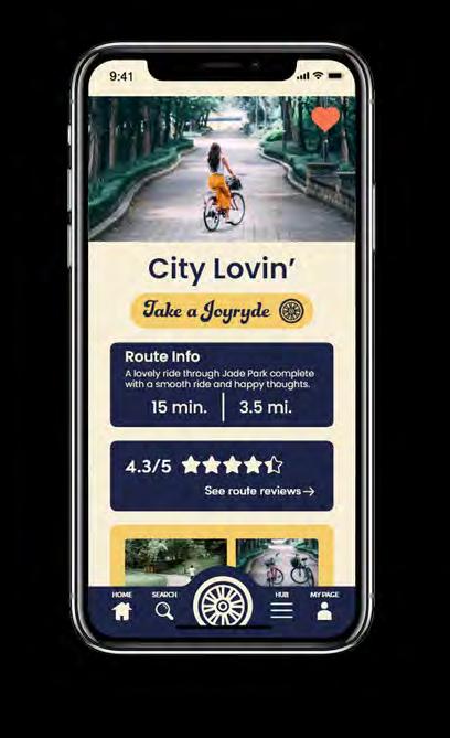


This screen provides users with all the details they need to plan their biking adventure. This includes essential information such as route distance, estimated completion time, user ratings, and photos of the route. When you’re ready to start your ride, simply click the “Take a Joyryde” button, and the app will take you to the active map screen. With all the information you need at your fingertips, the route screen makes planning your next biking adventure a breeze.

The navigation section is the core feature of the Joyryde app, providing users with navigation technology specifically tailored for biking. The screen displays important information about your route, including time of arrival, minutes to your destination, and distance to your destination. You’ll also have access to a range of pit stop options, for various trip needs. With all these features at your fingertips, you can confidently enjoy your ride!


Designing the screens was just the beginning of this mobile project. After researching the market and user needs, I realized that existing apps were either too complex or unengaging. To ensure the Joyryde app was both easy to navigate and enjoyable to use, I created a working prototype and conducted user testing. The process involved numerous connections and considerations, which are illustrated in the image below. This iterative approach helped me refine the app’s functionality and user experience, ensuring it meets the needs of its intended audience.

Round Trip Magazine is a monthly magazine focusing on art, travel, and community. We hope to provide an approachable publication that feels like a safe-space for all of our readers. Combining aspects of our favorite things about life provided a solid road for our readers to follow and explore.

In an attempt to get away from the more intense side of travel magazines, I have created the brand with approachability in mind. The magazine features lots of bright, fun colors and a playful voice in order to allow the reader to feel included and cozy when experiencing the magazine. The magazine features interesting, but soft illustrations, communityfocused articles, and important info that our readers may benefit from.


Lolly’s Learn & Grow Center is a loved Corpus Christi daycare with a passion for teaching your kiddos as much as possible. They strive to emphasize how important creating a safe learning environment is to help your children learn and grow! With their ever-growing business, Lolly’s was in need of a branding and website redesign.
In this redesign, my goal was to create a website that reassures both existing and potential families with informative content and engaging visuals. To achieve this, I used a soft and playful color scheme, and incorporated plenty of photos featuring the children and teachers. The site’s gentle and lively design encourages parents to explore and learn more about Lolly’s Learn & Grow Center, with the aim of instilling a sense of comfort and trust.


Lolly’s Learn and Grow Center’s current branding and marketing materials already convey a sense of fun and trust to the average consumer. However, during my research, I identified a gap in the company’s branding and website that lacked a professional appearance. Therefore, my redesign efforts were centered around addressing this issue while maintaining the playful and trustworthy personality of the brand.


Scan to See the Website in Action


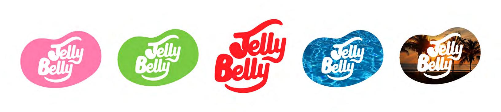
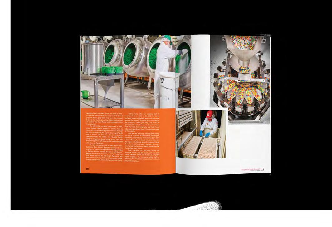
Jelly Belly Candy Company is a beloved brand that evokes nostalgia and happy memories. The company started as a small candy shop in Belleville, Illinois, and over time, it grew and evolved through a commitment to quality ingredients and a passion for candy-making. In 1976, the company was officially renamed the Jelly Belly Candy Company, and it quickly became a household name. Today, the company creates a wide variety of candies and confections that are enjoyed by people all over the world.
Jelly Belly Candy Company needs to update its approach to technology and social media to appeal to a younger and more current target audience. This involves exploring the mindset of the 16-25 age group and simplifying the brand attributes to better align with their interests. Additionally, it’s crucial to understand how this new target audience interacts with products. While doing so, it’s essential to maintain the friendly and traditional tone that Jelly Belly has already established.

Jelly bean
Rounded corners and edges
Because Jelly Belly Candy Company is such a beloved staple in American culture, I knew I had to modernize the brand in a way that did not disrupt the existing brand equity that Jelly Belly has built with consumers through the years. Looking at the existing logo, I considered what was working and what was not.

Bubbly Type
Flowing Script
Jelly Belly Red
Iconic Jelly Bean Shape
Sharp Corners
Intense Yellow Drop Shadow Included Tagline
Extended ascender and descender mimics jelly bean shape.
The iconic jelly bean shape is instantly recognizable. With this new, modernized logo, I wanted to pull a bit of life into the brand where I could. I realized just how perfectly other colors, patterns, and photos could clip into this bean shape of the revised logo to fit the theme of whatever project it is attached to.
shaped flairTo showcase the versatility of the new dynamic logo, I incorporated it into the brand’s Identity Suite, starting with the business cards. To make a lasting impression, the semitransparent Jelly Belly logo is featured on the card, with the words “Endless Possibilities” anchored to the curve.

I also incorporated a range of colors into the branding suite to reflect the various colors of jelly beans. Each department can customize their materials with different brand colors such as blue, orange, yellow, and more.

Since part of my mission was to reignite this brand with a more modern audience, I knew that I needed merchandise that would catch the eye of a younger demographic. I used color in bold ways so that it was easy for consumers to pick their favorite. I carefully considered what products would make the most sense with the Jelly Belly logo.


while the bubbly script brings in a bubbly, friendly feel.


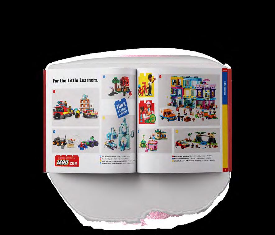
Designing a 20-page catalog for LEGO, a beloved brand among kids, teens, and adults, was a challenging task, given the company’s dynamic personality, broad audience, and established consumer trust. To ensure a successful outcome, I had to carefully consider these factors and plan my approach accordingly.


In my catalog, I wanted to showcase that the brand is not just for children. To achieve this, I featured a variety of LEGO products suitable for different age groups. Additionally, I aimed to evoke a sense of nostalgia throughout the publication by including images of people of all ages enjoying LEGO blocks. I hoped that this approach would help consumers remember fond memories from their childhood while also demonstrating that LEGO can be enjoyed at any age.

My vision for the catalog cover required more than just a flat image. I wanted to convey a sense of excitement and fun that would capture the attention of consumers. To achieve this, I combined the creative power of Illustrator to construct a dynamic LEGO background and used Photoshop to blend the images together into an engaging scene. Through this approach, I was able to bring the world of LEGO to life and inspire people to explore it further.


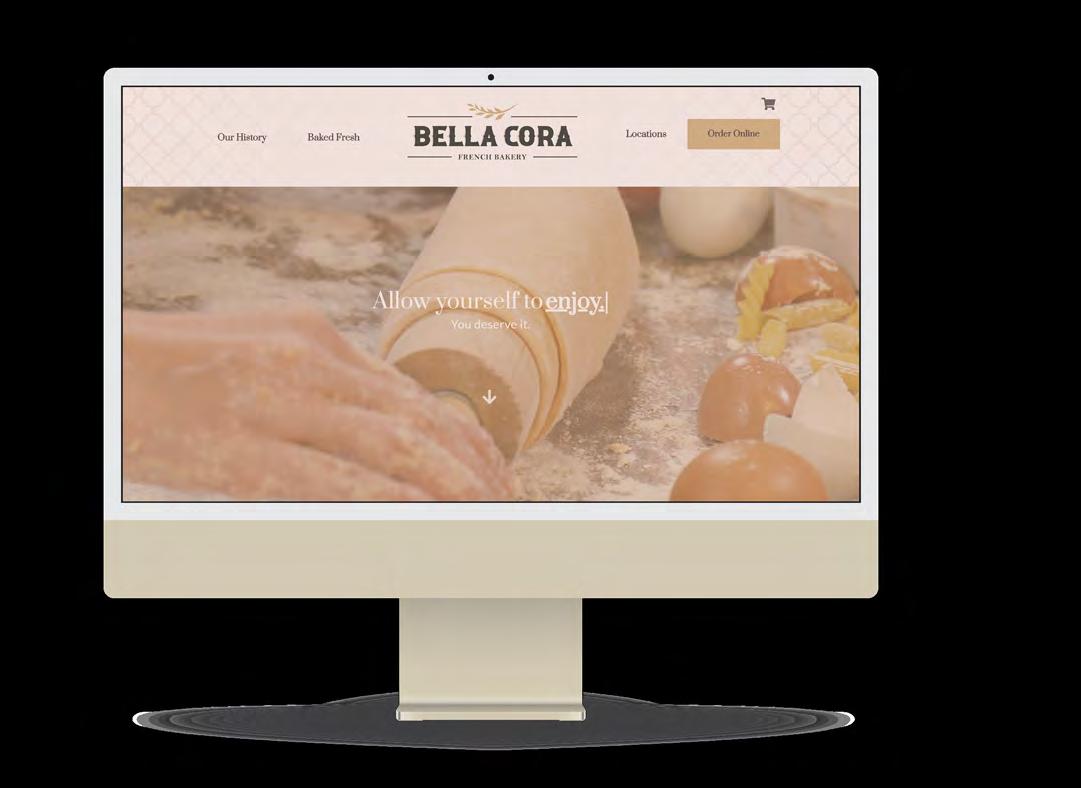
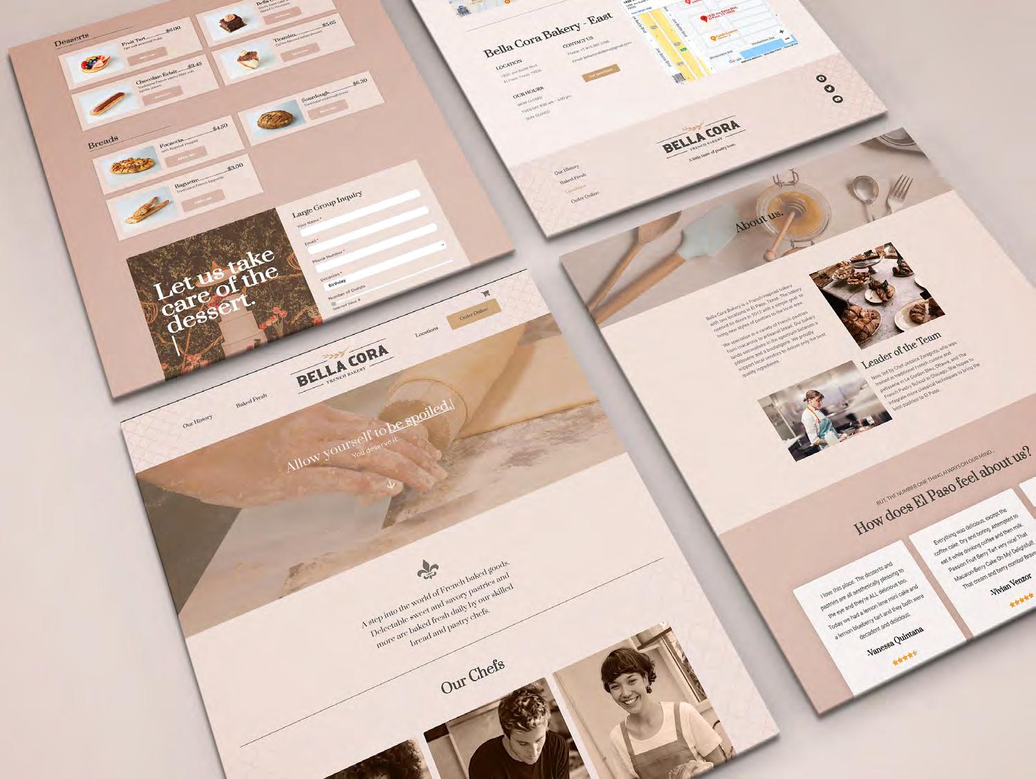
Bella Cora Bakery is an award-winning bakery located in El Paso, Texas. The bakery prides itself on having an amazing baked goods and sweets lineup. The bakery is Frenchinspired and has opened another location in El Paso since its initial opening in 2012. Their business aims to provide a selection of excellent quality and delicious pastries.

For this UI/UX website rebrand, I went with the awardwinning Bella Cora bakery that had an amazing story, but their website lacked the polished UI/UX it deserved. My objective was to infuse some personality and meaning into the website to create a warm, inviting online presence that would attract customers from far and wide. I started by revamping the logo and refreshing the color palette with bakery-approved hues. Using Wordpress and Elementor website builder, I created a new website design to reflect the bakery’s commitment to homeliness and quality.