marchit e l l Kylie Marchitello MARCHITELLO.CO @MARCHITELLO.SIMPLYBOLD 210.606.7723 KYLIEMARCHITELLO@GMAIL.COM
HELLO THERE,
I am a Graphic Designer currently based out of Texas. I love to mix photography with bold colours. The main motifs you’ll see throughout my works are mountains and circles. I am drawn to these and love incorporating them into my designs.
My brand is committed to finding a unique solution to the client’s design needs and one that supports the brand’s story and message. ‘Simply Bold’ was derived from my unique design style, and it combines the two sides of myself that like to showcase eye-catching and different solutions but in a refined and polished way.

“Creating for all those who are simply Spirited , Refined , Daring and Bold. ”
An entirely imagined brand and tea packaging series. The project focuses heavily around creating brand identity and utilizing those elements to create a product that is both eye-catching and unique to its category.
An imagined catalogue for a Miu Miu for Summer 2022 campaign. This catalog utilizes existing imagery of products from the brand and creates a new and imaginative take for the theme “Cloud Nine.” An expression for the dreamers.
An advertising campaign for both print and social, this series utilizes existing brand equity from Seedible, and utilizes it in new ways to help advertise the company’s product line of sesame seed-based butters.
A much-needed refresh to the existing brand, Blackrock Coffee based in Portland, Oregon. This rebrand features a new mobile app design that focuses on new visuals and functionality, giving the brand more legitimacy.
A new take on the exsiting figure skate brand Jackson Ultima, this rebrand focuses on creating visuals for a new demographic. This cross platform campaign breathes new life into the figure skating company.
ETERNITEA SERIES ETERNITEA SERIES Packaging MIU MIU CATALOGUE Publications SEEDIBLE AD
Print & Social BLACKROCK COFFEE UIUX ULTIMA REBRAND Cross Platform
SERIES
ETERNITEA
Packaging Design
PACKAGING BRAND IDENTITY
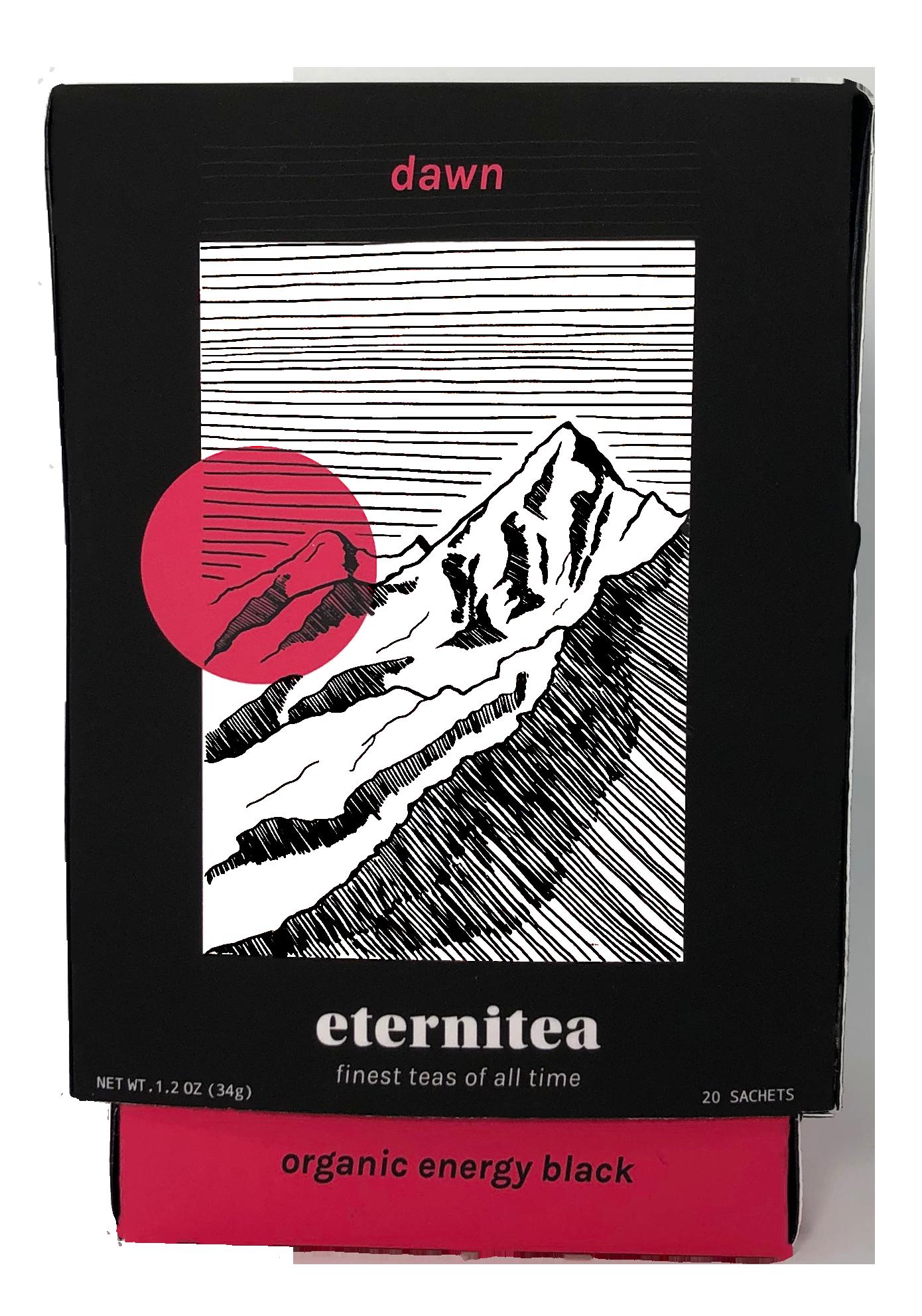
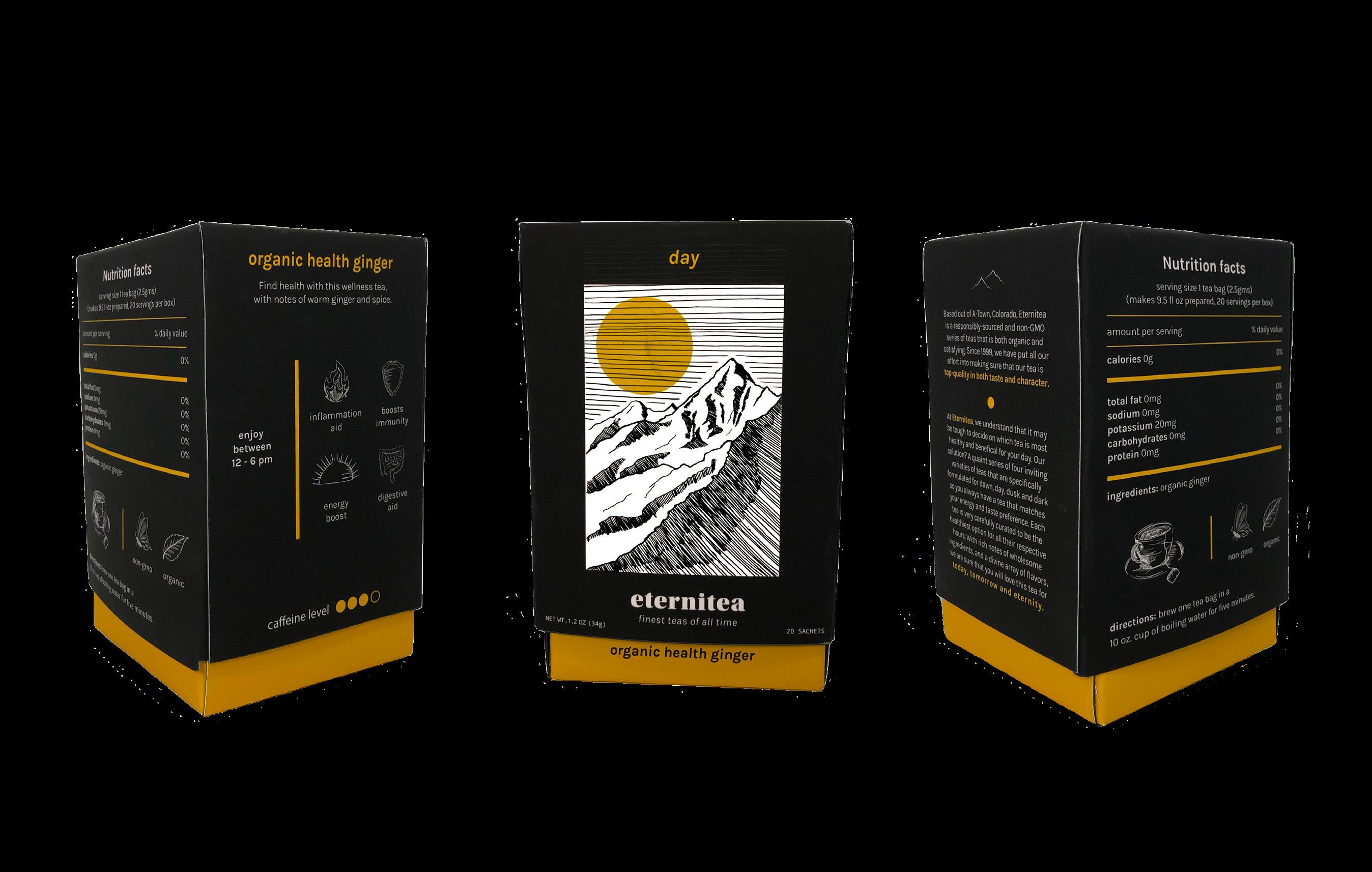
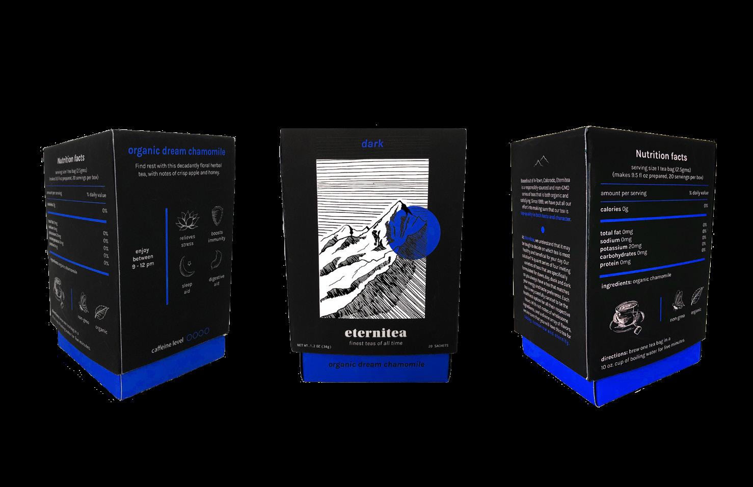
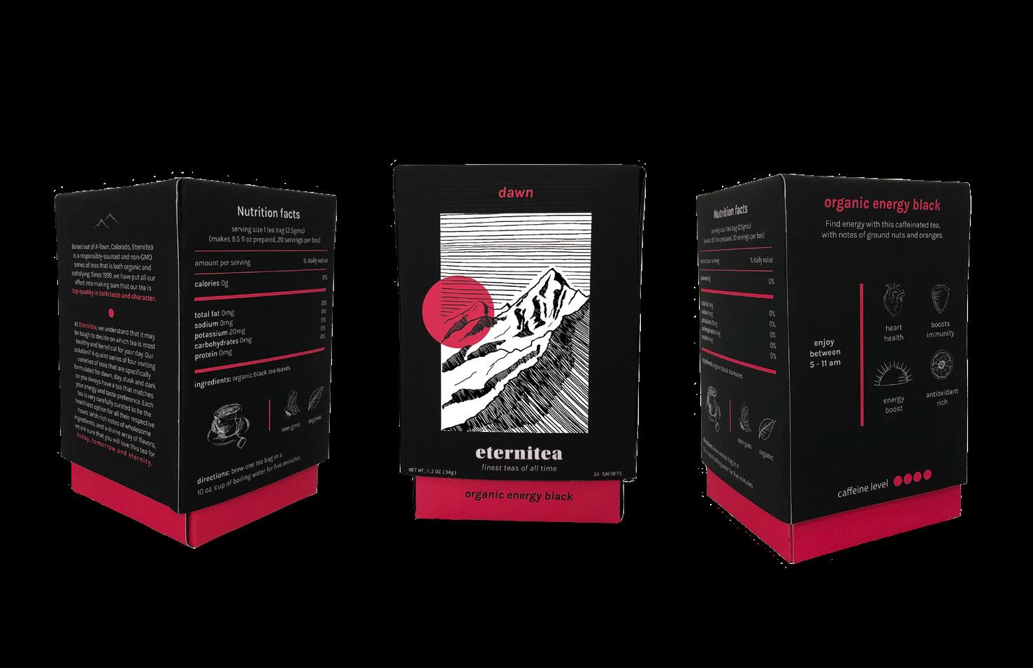
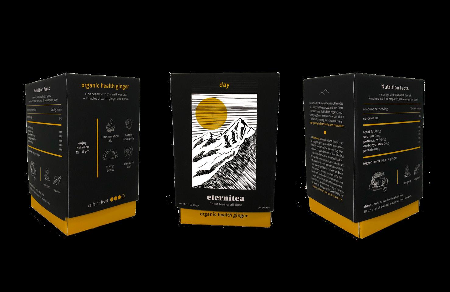
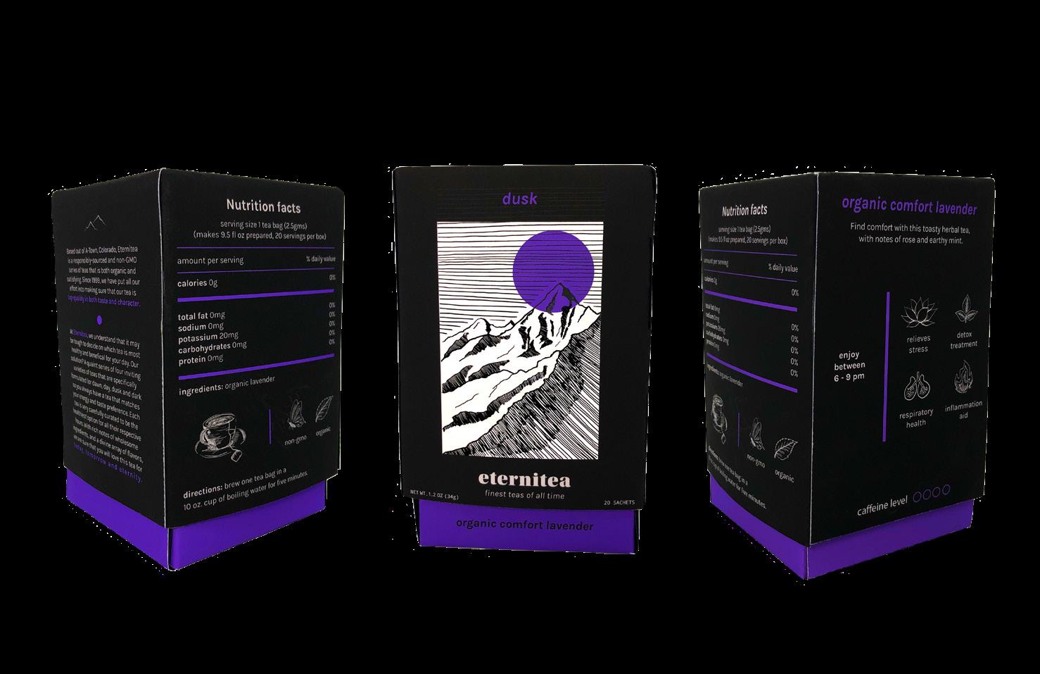
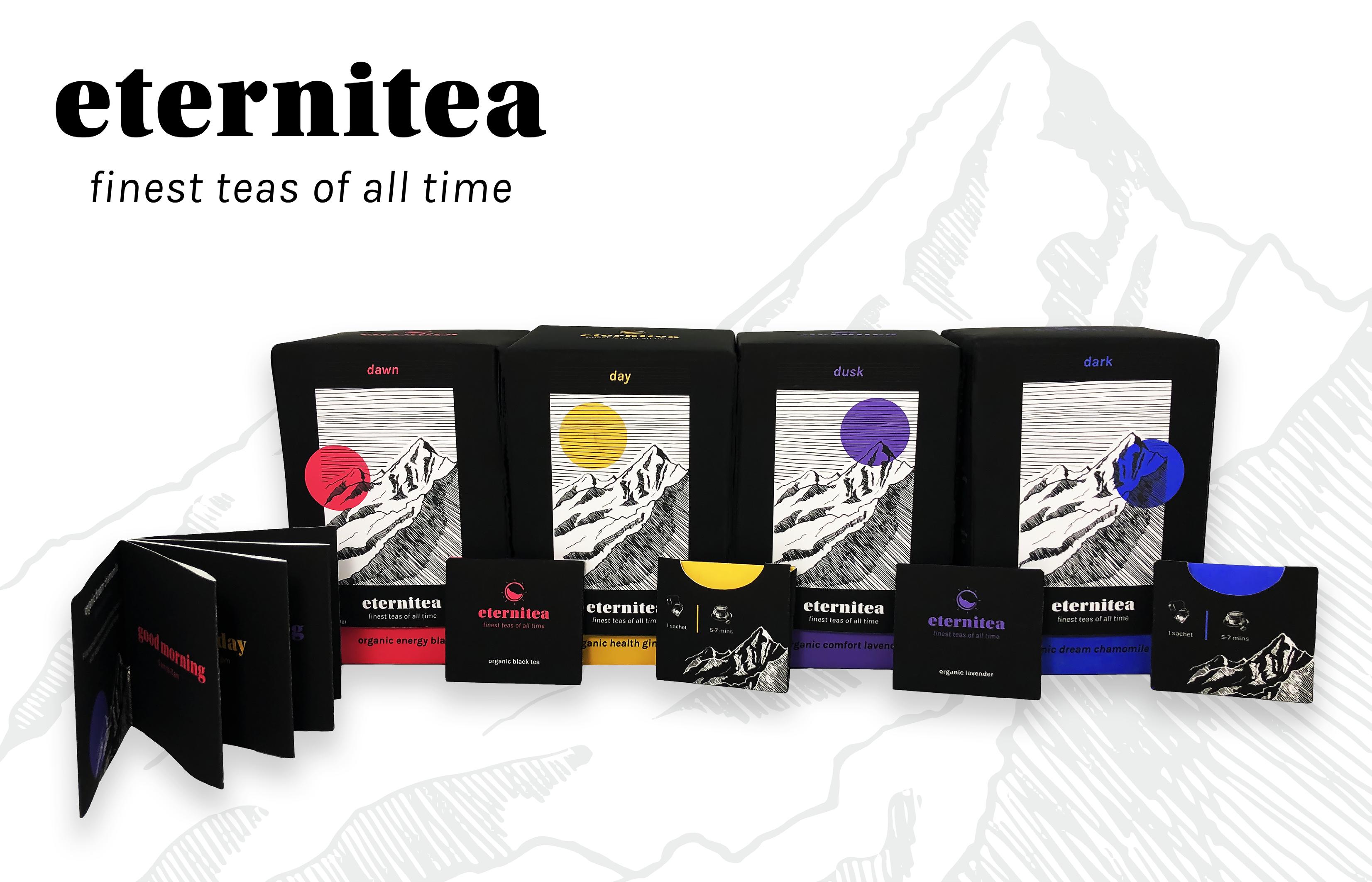
Eternitea is a hypothetical brand offering responsibly responsibly sourced and NON-GMO series of teas that is both organic and satisfying. The product offers a quaint series of four inviting varieties of teas that are specifically formulated for dawn, day, dusk, and dark so the customer always has a tea that matches their energy and taste preference. It was important to stay relevant in a competitive market, so the use of bold colours and imagery gave the label a modern edge that matched the brand story perfectly.
The tea market is highly competitive. If you can think of it, it probably exists. My goal was to create a brand that could stand against competitors and reclaim its spot on the shelves. With the new modern age, and tea drinkers’ demographics changing to a younger crowd, it was equally important to create something that resonated with its customer base and felt like something that hadn’t been done before. With this, I was able to create a unique brand identity that utilized bold colours and illustrative elements in its packaging. The brand story was simple, yet effective: A tea series based on the times of day rather than flavor.
STRATEGY: Brand Guidelines & Research

IDENTITY: Logo Design & Visual Design
This packaging series was made for a project and illustration photos used in the mood boards and illustration style sections belong to their rightful owners. I have only created the illustrations, designs and logos used in the actual packaging itself, as well as the designs of the brand standards.
ETERNITEA SERIES
second day minute hour sequence clock duration
period moment quantify chronological timeless counting eternal


schedule span infinity watch elapse cycle entropy


twentyfour decade meridian sundial space continuance eternity

ETERNITEA SERIES
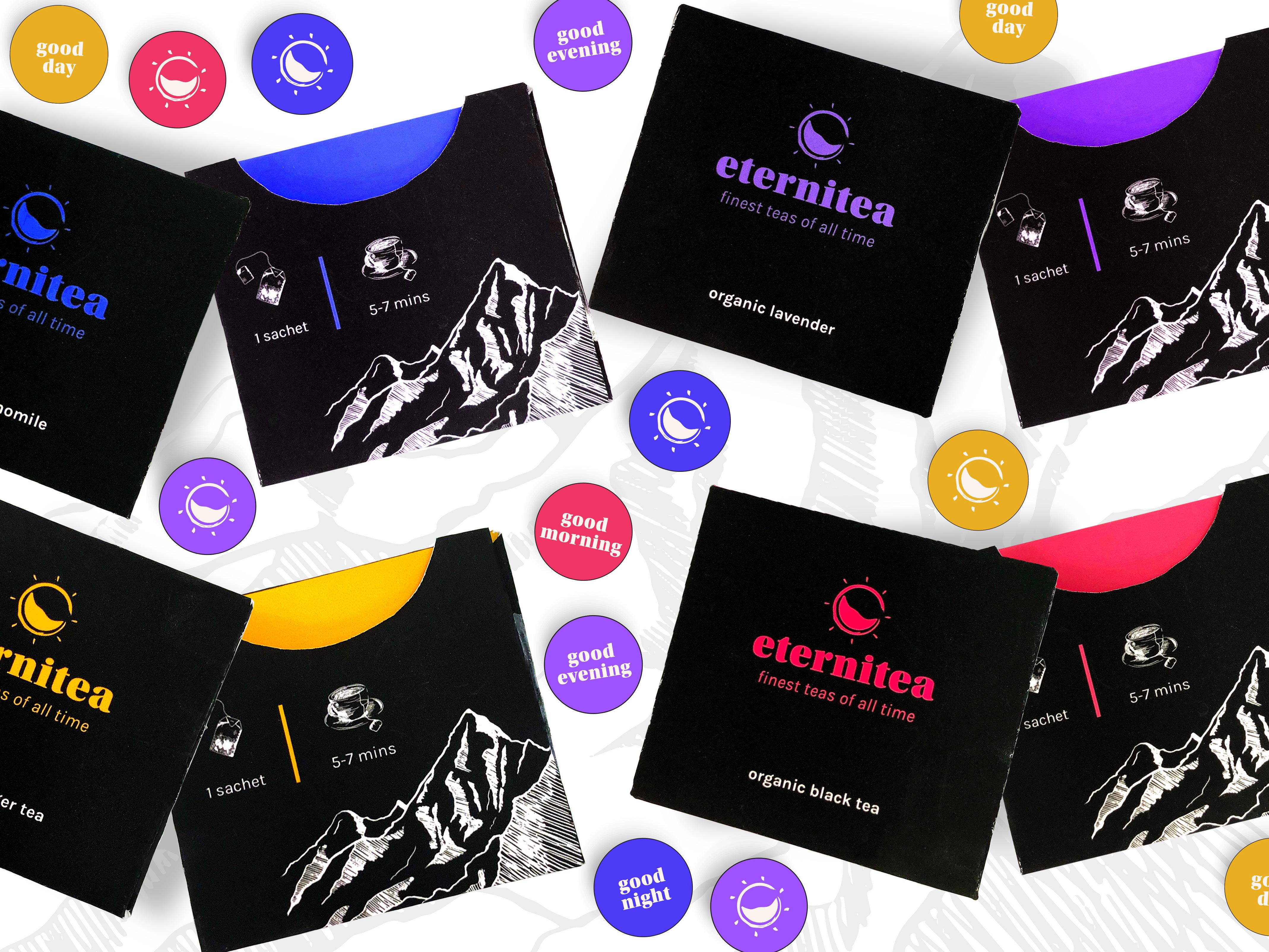
DAWN ACCENT 00/93/44/00 253/45/99 DAY ACCENT 09/33/100/00 233/173/02 OOLONG TEA 01/04/12/00 253/242/222 DUSK ACCENT 58/72/00/00 157/83/255 DARK ACCENT 78/75/00/00 76/58/245 dark dawn day dusk eternitea finest teas of all time eterni tea finest teas of all time eternitea finest teas of all time eternitea finest teas of all time eternitea finest teas of all time eterni tea finest teas of all time eternitea finest teas of all time eternitea finest teas of all time eterni tea finest teas of all time Aa Bb Cc Dd Ee Ff Gg Hh Ii Jj Kk Ll Mm Nn Oo Pp Qq Rr Ss Tt Uu Vv Ww Xx Yy Zz 1 2 3 4 5 6 7 8 9 0 HEADLINE | KARLA BOLD Aa Bb Cc Dd Ee Ff Gg Hh Ii Jj Kk Ll Mm Nn Oo Pp Qq Rr Ss Tt Uu Vv Ww Xx Yy Zz 1 2 3 4 5 6 7 8 9 0 BODY COPY | KARLA REGULAR Aa Bb Cc Dd Ee Ff Gg Hh Ii Jj Kk Ll Mm Nn Oo Pp Qq Rr Ss Tt Uu Vv Ww Xx Yy Zz 1 2 3 4 5 6 7 8 9 0 NUTRITION INFORMATION | DROID SANS MONO REGULAR ILLUSTRATION STYLE WORD LISTING MOODBOARD LOGO SKETCHES TYPOGRAPHY
BOX LAYOUT
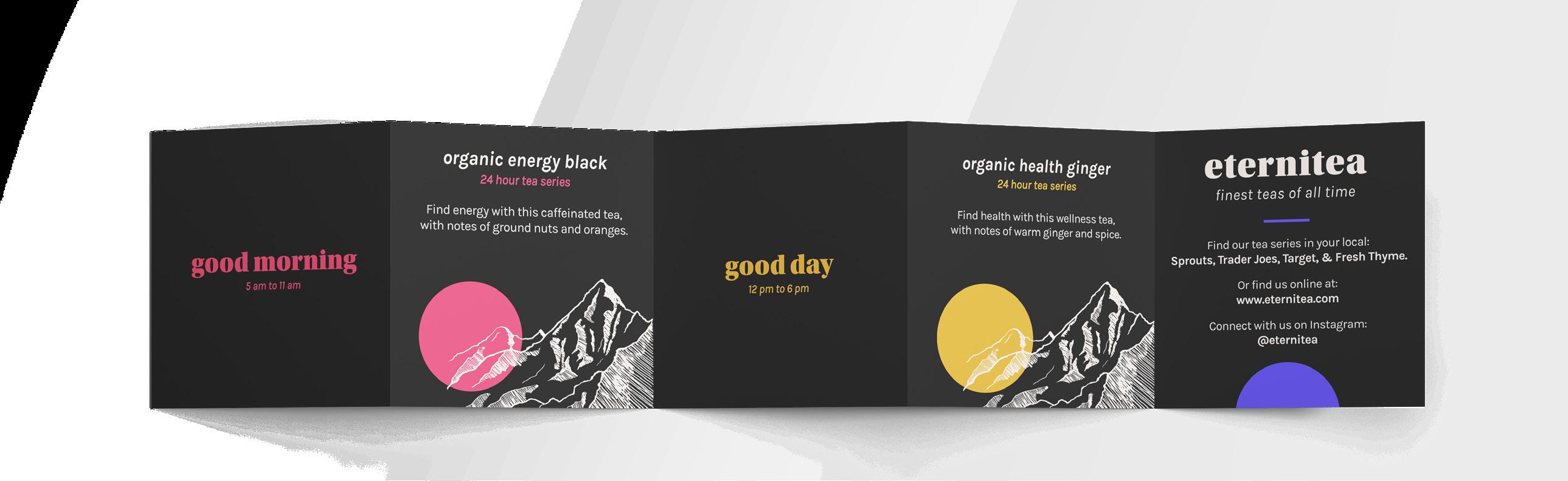
The Elements in Action
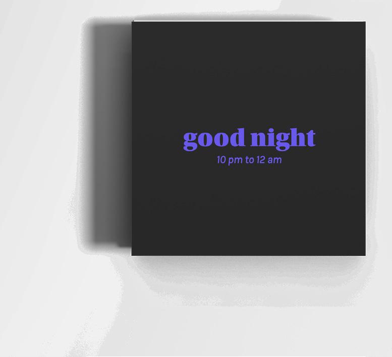
For my visual ideation with these boxes, I wanted to ensure they felt cohesive but really had a unique benefit to each of them that would make someone want to purchase it specifically.I opted to utilize the benefits of the tea on the side of each box to help amplify this. In addition, I noted the caffeine level in each tea, and specified what time you should enjoy your beverage.
enjoy between 12-6 pm
finest teas of all time

ETERNITEA SERIES
e ternite
a
ETERNITEA SERIES
BOX SERIES
PAMPHLET INSERT
e ternite a
finest teas of all time
CONSTRUCTED SERIES
MIU MIU CATALOGUE

Publication Design
PUBLICATION CATALOGUE
MiuMiu is a well-known and respected clothing brand, in which I have created a fictional catalogue that could be used for a summer collection. Usually, summer collections focus heavily on the sun and warm tones, but I wanted to create a twist on this stance and focus on cool tones with a theme of “Cloud 9.” MiuMiu’s client base is both whimsical and inspired. Cloud 9 is an expression for dreamers and an ideal aesthetic.
For this project, I utilized a lot of stacking and overlapping elements to simulate a somewhat “transparency” to the items. In addition to this, I opted to stack the clothing items in a series of grids or rows instead of the typical rows. I felt this was the best way to mirror the photos’ creative direction and structured format.
STRATEGY: Research & Concept Development
IDENTITY: Visual Design
DELIVERABLES: Printed Catalogue
This Catalogue was created for a class project, with no affiliation to MiuMiu. MiuMiu does not sponsor or endorse any of the work shown. I declare no affiliation, sponsorship, nor any partnerships with any copyright or trademark holders. All photography used courtesy of MiuMiu and brand photographers.
MIU MIU CATALOGUE


MIU MIU CATALOGUE

SEEDIBLE AD SERIES
Print & Social Advertisements
ADVERTISING SOCIAL AND PRINT
Seedible is a sesame-based butter rather than competing brands’ peanut or almond-based products making it both healthy and allergy-friendly. In addition to this, the brand values using natural and sustainably-sourced ingredients so consumers know they are buying ethical and sustainable products from the company. As an added bonus, the brand has trendy aesthetics to its packaging utilizing a colourful and earthy palette which makes it extremely eye-catching on the shelf.
For this project, I utilized and reimagined the brand elements in order to create eye-catching advertisements that speak to the consumer demographic. In addition, I wanted to highlight that this line of butter is nut-free, as this is a significant selling point for the company. Finally, I wanted to continue the brands’ voice within the copy of the advertisements and use puns and witty humor to entice consumers to buy into the brand itself.
STRATEGY: Research & Concept Development
IDENTITY: Visual Design
DELIVERABLES: Instagram Posts & Printed Advertisements
This advertisement series was created for a class project, with no affiliation to Seedible. Seedible does not sponsor or endorse any of the work shown. I declare no affiliation, sponsorship, nor any partnerships with any copyright or trademark holders. All royalty-free photography sourced from Unsplash and Envato Elements.

SEEDIBLE AD SERIES


BLACKROCK COFFEE
App Redesign
UI/UX
BRAND IDENTITY
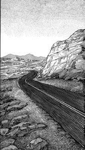
Blackrock Coffee Bar is an existing brand originating in Portland, Oregon. They serve a variety of drinks from coffee to tea and are in a market competing with top brands such as Starbucks and Dunkin’. I decided to redesign their app and rebrand their story because I thought they needed a refresh for the ever-changing younger demographic. My objectives for this project were to make the app more functional, easier to navigate, more consistent, and overall, more exciting.
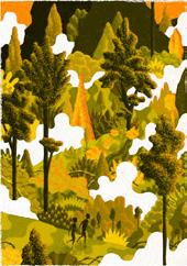
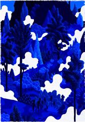
For this project, I made several design choices to elevate the existing brand standards. I rebranded the colour story from red to blue to cater to a relaxed audience and used black and white imagery to hone into consistency. I wanted to focus on mountains for imagery and in their logo because I thought they needed something to tie them back to their roots. Additionally, I’ve added illustrative elements to give the app more of an modern and decorative edge.
STRATEGY: Brand Guidelines & Research
IDENTITY: Logo Design & Visual Design
DELIVERABLES: Mobile Coffee Ordering App

For the visuals of this app, I opted for a minimalistic approach with refined illustrative details. This modern take caters towards the younger demographic while also giving the app a much-needed face lift.

BLACKROCK COFFEE
OLD DESIGN


no affiliation, sponsorship, nor any partnerships with any copyright or trademark holders. All royalty-free photography sourced from Freepic and Unsplash.


BLACKROCK COFFEE


ULTIMA REBRAND
Cross Platform Campaign
BRAND IDENTITY CROSS PLATFORM
Jackson Ultima is a long-standing figure skating brand under Tournament Sports. However, their current branding feels dated and understated as they cater to an athletic and powerful demographic. I wanted to highlight this while keeping some brand equity with the colour blue and retaining the triangle motif from their logo.


The rebrand represents individuals who are fearless and dauntless and crave to be apart of a community of like-minded individuals. This brand is to compete on the same levels as the top dogs in the sports industry and serves to inspire people to get out there and compete.
STRATEGY: Research, Branding & Visual Design
IDENTITY: Logo, Identity System, Branding & Visual Design
DELIVERABLES: Cross Platform
This redesign was created for a class project, with no affiliation to Jackson Ultima. Jackson Ultima does not sponsor or endorse any of the work shown. I declare no affiliation, sponsorship, nor any partnerships with any copyright or trademark holders. All royalty-free Photos sourced from Freepic and Envato Elements.
ULTIMA REBRAND
OLD LOGO REVISED LOGO
MOODBOARDING
BRUNCHES BOLD
67 pt.
200 tracking
All Caps
BRUNCHES REGULAR
15 pt.
200 tracking
All Caps
NOIRDEN BOLD
9.5 pt.
50 tracking Sentence Case

ULTIMA

PERFECTION. BALANCE. POWER
ABCDEFGHIJKLMN
OPQRSTUVWXYZ
The Figure Skating Company
Aa Bb Cc Dd Ee Ff Gg Hh Ii Jj Kk Ll Mm Nn
Oo Pp Qq Rr Ss Tt Uu Vv Ww Xx Yy ZZ
NOIRDEN LIGHT
8.5 pt.
70 tracking
11 leading Sentence Case
At Jackson Ultima, we build equipment for the leading skaters in the sport, incorporating that experience in our mid-range products. Jackson Ultima is the only manufacturer in the industry that can provide you your first skate all the way to your last.
Aa Bb Cc Dd Ee Ff Gg Hh Ii Jj Kk Ll Mm Nn
Oo Pp Qq Rr Ss Tt Uu Vv Ww Xx Yy Zz
TYPOGRAPHY


PROCESS
Visual Ideation & Brand Standards

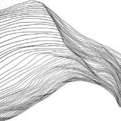
For my visual ideation, I first started with some basic word listing to get a good sense of the visual direction I wanted to pursue. From this, I learned that I wanted to emphasize a sense of motion within the branding. I knew that figure skaters typically create choreography plans that show visual motion through lines. To replicate this, I opted to use text along a path of motion instead to create something less expected. After this, I paired simple typography to emphasize a sense of balance. Finally, I chose to keep the signature Jackson Ultima blue for the color palette to retain brand equity and included a pink to add a refined touch.
 FIGURE SKATING PATTERNS
WORD LISTING
LOGO SKETCHING

LOGO SKETCHING


ULTIMA REBRAND


ULTIMA REBRAND


