W: www.stubbs.studio
@: stubbsstudio
E: stubbsstudio@gmail.com
Stubbs Studio
Contents
HALF PRICE BOOKS
Rebrand
HOT TOPIC X ATTACK ON TITAN
Catalogue

CANNASEUR
Magazine
MUSICIAN’S ACADEMY
Website Redesign
THE CREME SHOP X HELLO KITTY
Social Media Campaign
My work is not affiliated, associated, authorized, maintained, sponsored, endorsed by, or in any way officially connected with the copyright or trademark holders of any of the brands mentioned in this portfolio.
COPYRIGHT STATEMENT hey!
Long Format Copywriting Packaging Print Advertising UI/UX Branding Original Concept skills
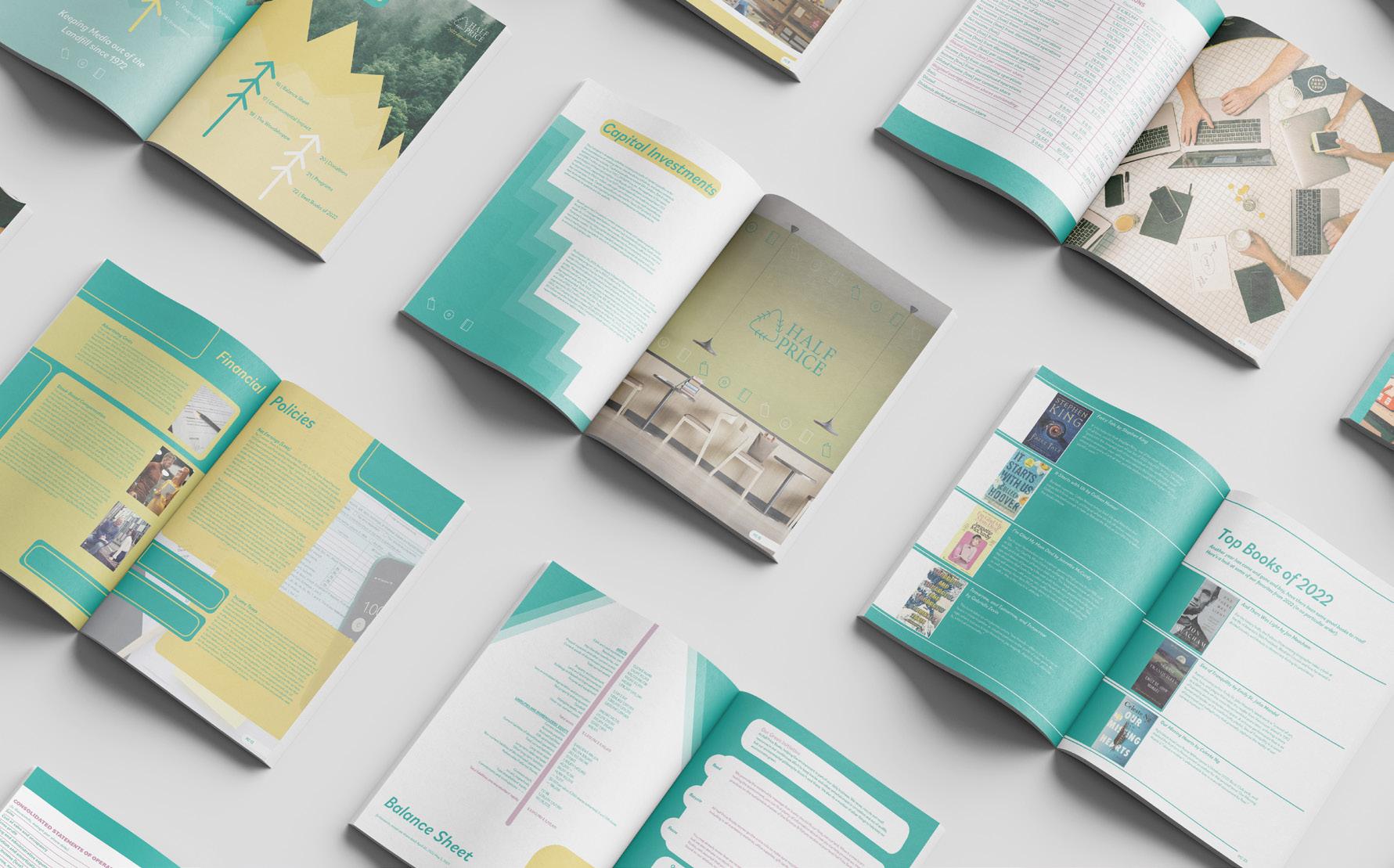
Half Price Books
The main purpose of this rebrand was to reinstate the fact that Half Price is a company that cares about the environment and was started to keep media out of the landfill. The secondary purpose was to show off the other types of media (besides books) that they sell hence the name change to “Half Price.”
Print Copywriting Annual Report Overview Skills Utilized Complete Rebrand Branding Long Format
Packaging Advertising Wall Mural
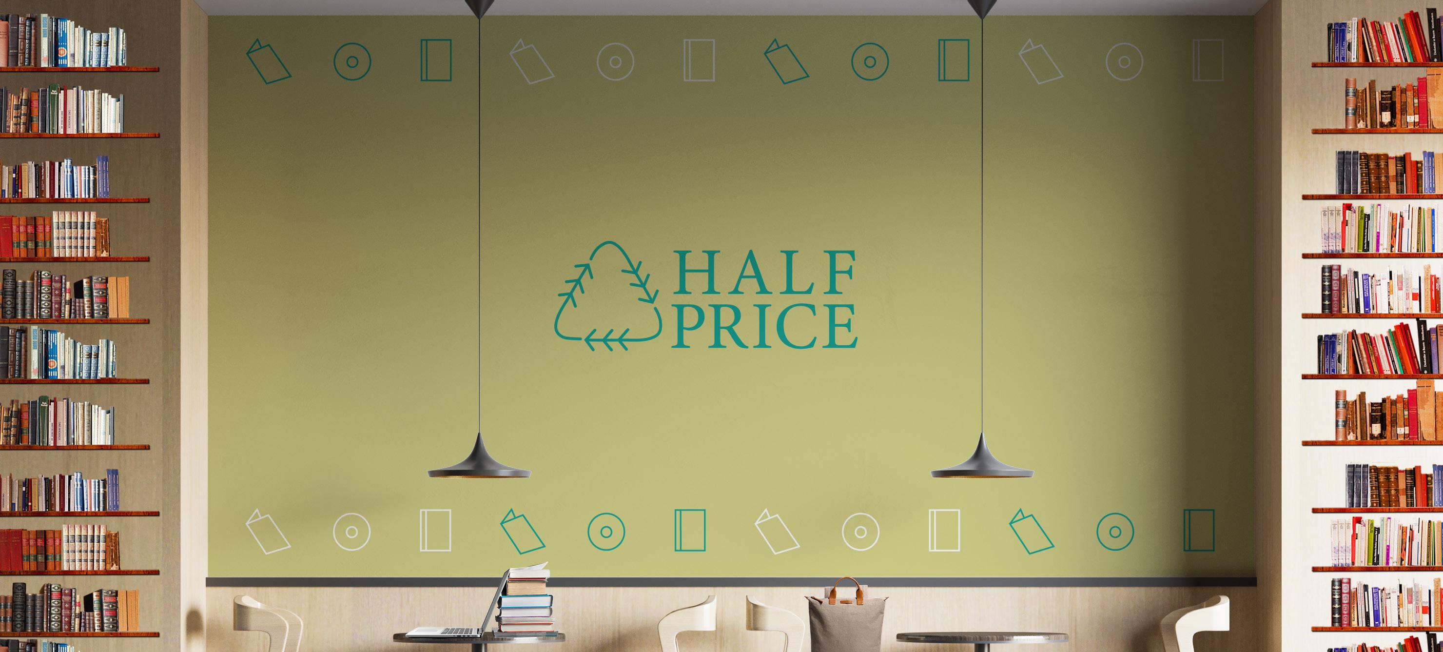
Existing Logo

Logo Redesign
The name “Half Price Books” denounced the plethera of inventory that half price resells and provides to its customers. In an effort to promote the fact that they resell all types of media to keep it out of the landfills hence the mark that I created incorporates trees and the recycling symbol.
Logo Redesign
Business Collateral
This 3 piece business collateral set is made for the people at the office of Half Price that handle HR or billing. This set was create with the more natural colors of hte palette to represent the respect the brand has for nature.
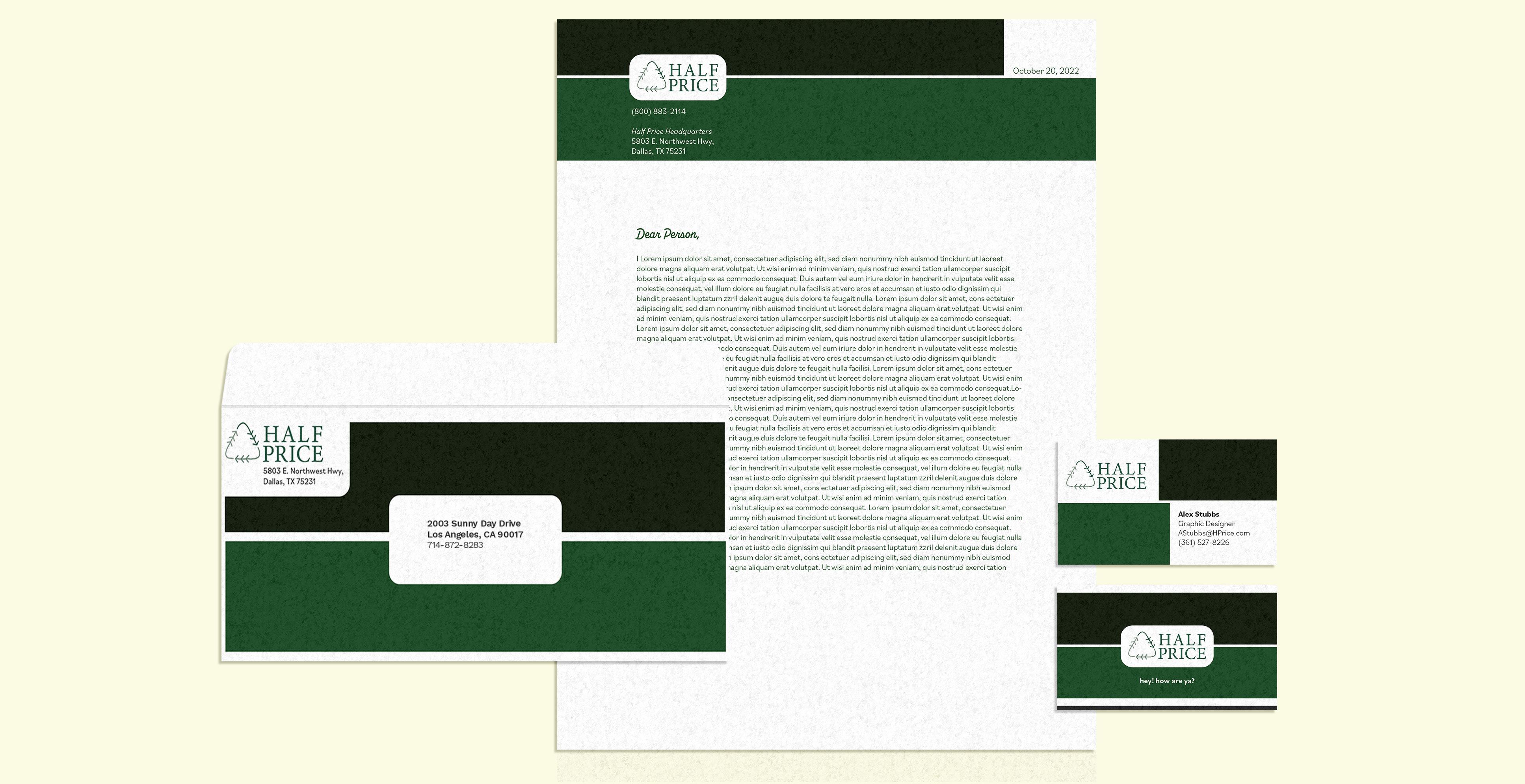
Stubbs Studio | Half Price BooksRebrand
Business Collateral
Tote Bags
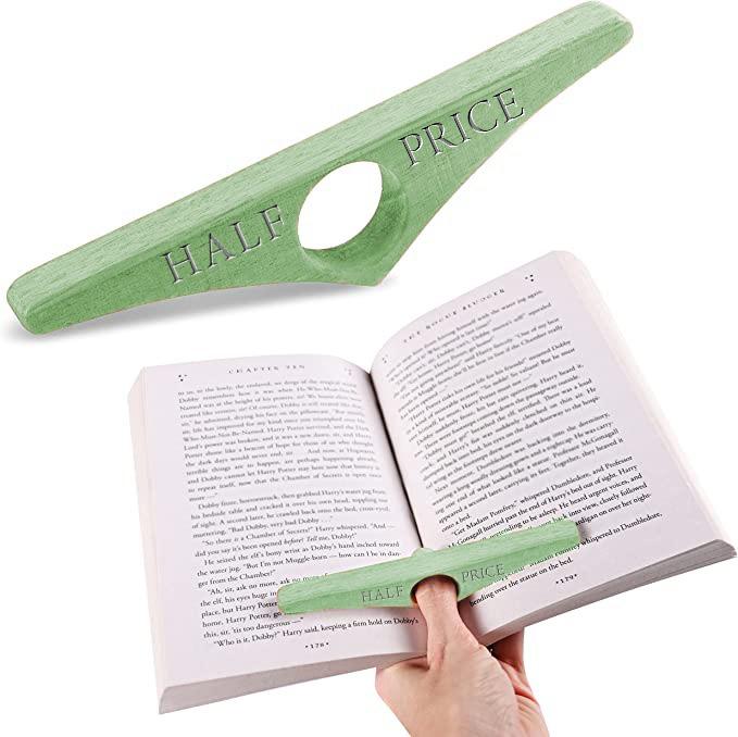
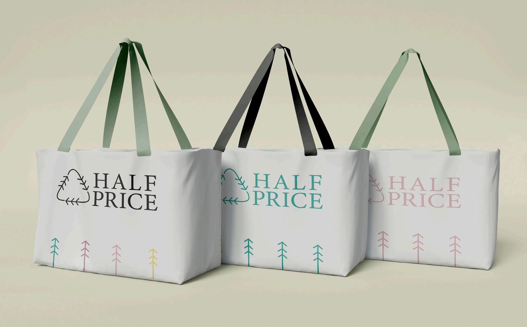
These ephemera items were created to be bought by or given to loyal customers for reaching different steps in the rewards program. The tote bag helps reduce plastic waste and is a fun way for customers to carry their favorite books. The windbreaker is a collab with Carhartt (another environmentally conscious brand) with the tagline “Keeping media out of the landfill since 1972.” The book ring will be given away as a free prize for the rewards program.
 HP X Carhartt Windbreaker
Engraved Book Ring
Ephemera
HP X Carhartt Windbreaker
Engraved Book Ring
Ephemera
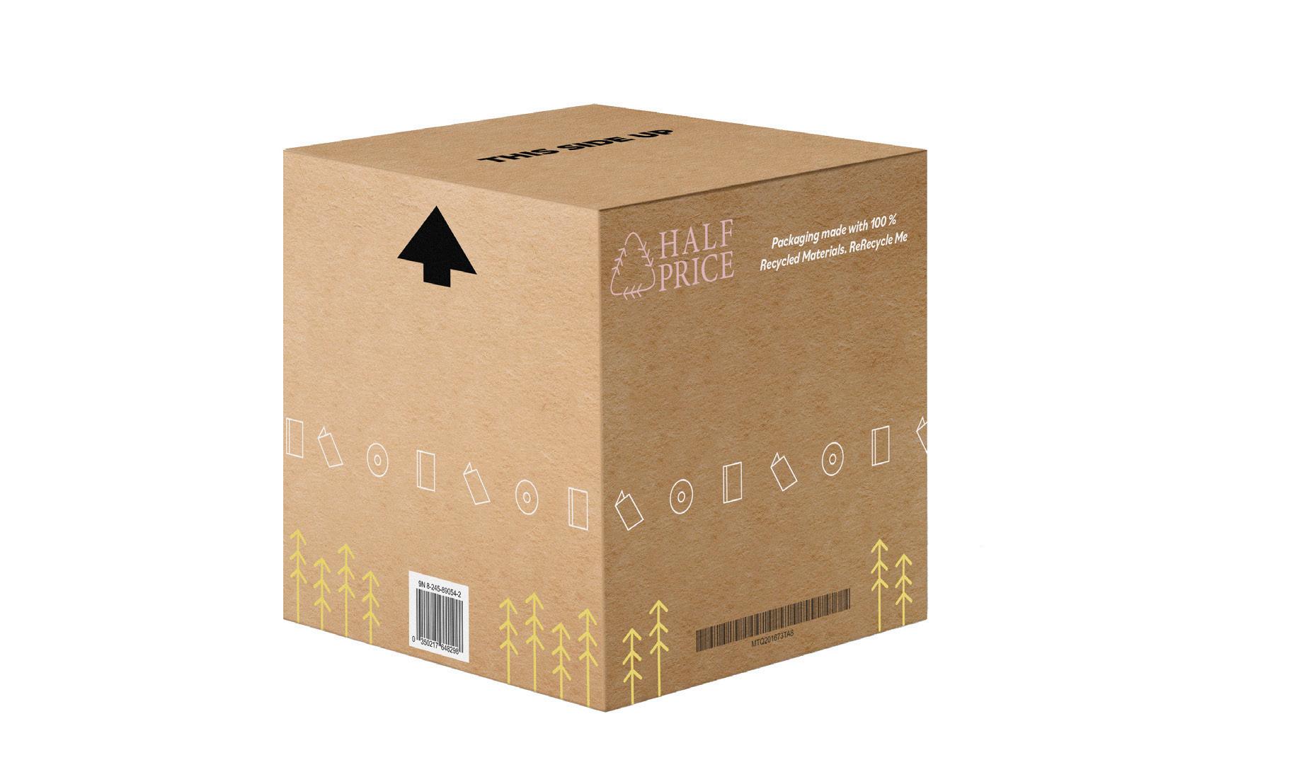
Packaging
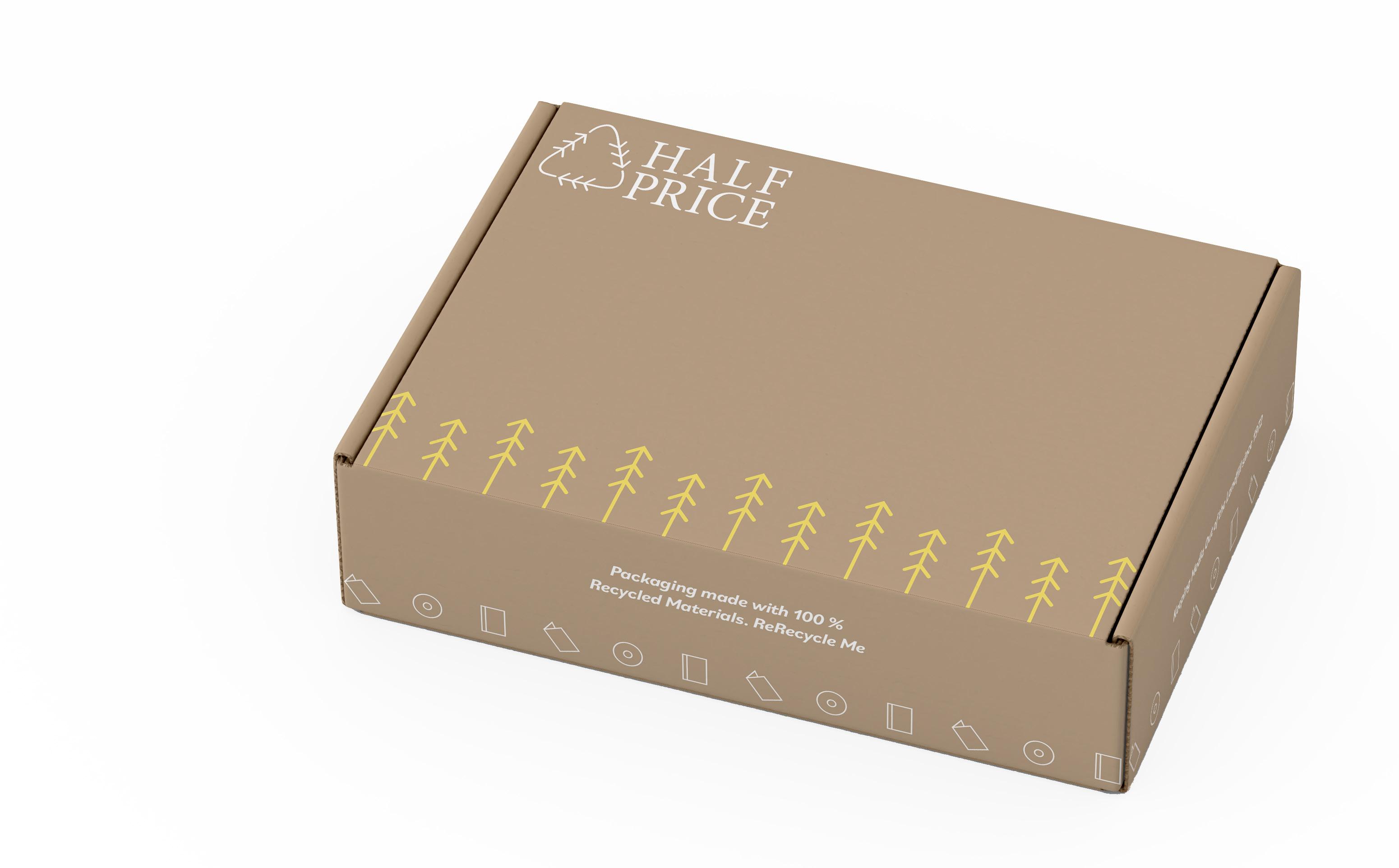
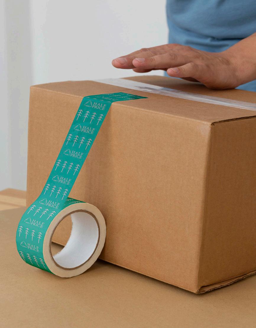
By utilizing environmentally conscious packaging and ink, the idea of the packaging is to further reference the good the customer is doing for the environment by choosing half price instead of a big book seller like B&N. The tagline “ReRecycle Me!” is meant to further represent the ecoconsious nature of the company.
Stubbs Studio | Half Price BooksRebrand
LargeShippingBox
Logo Pattern Packing Tape
Small Shipping Box
Social Media
This series was created to represent how people from all different walks of life can come to Half Price and leave with an item that will help inspire them to become the best versions of themselves and to find passion in recycling. Using different celebrities and having them talk about their experiences with media will also help inspire young adults to follow in the celebrities’ footsteps to be just like them. The tagline “We have something for everyone” is used throuhgout the series to instill this ideaology.
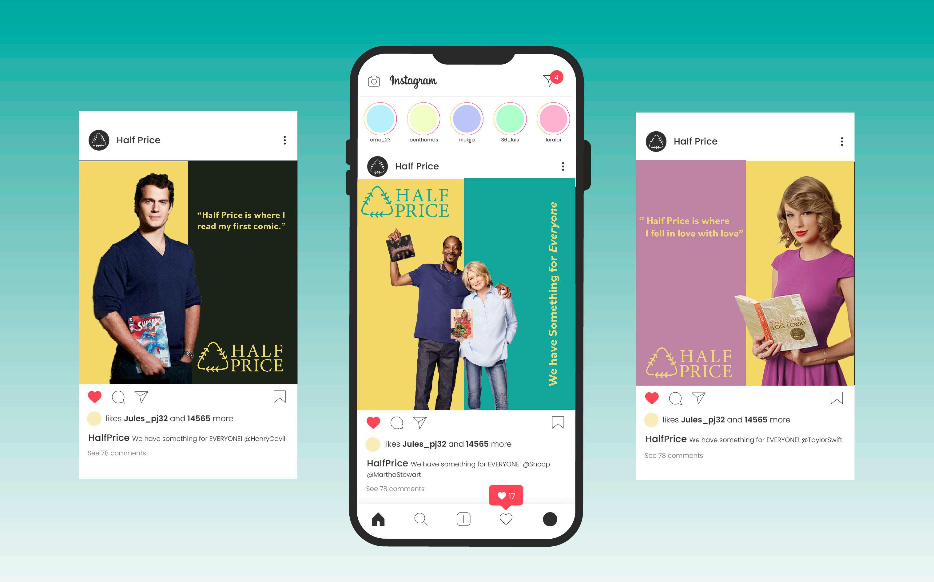 Celebrity Testimonial Instagram Series
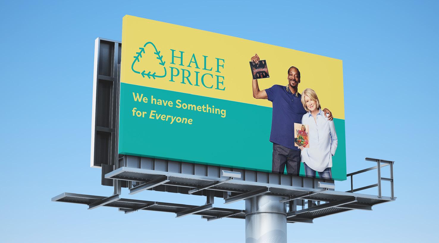
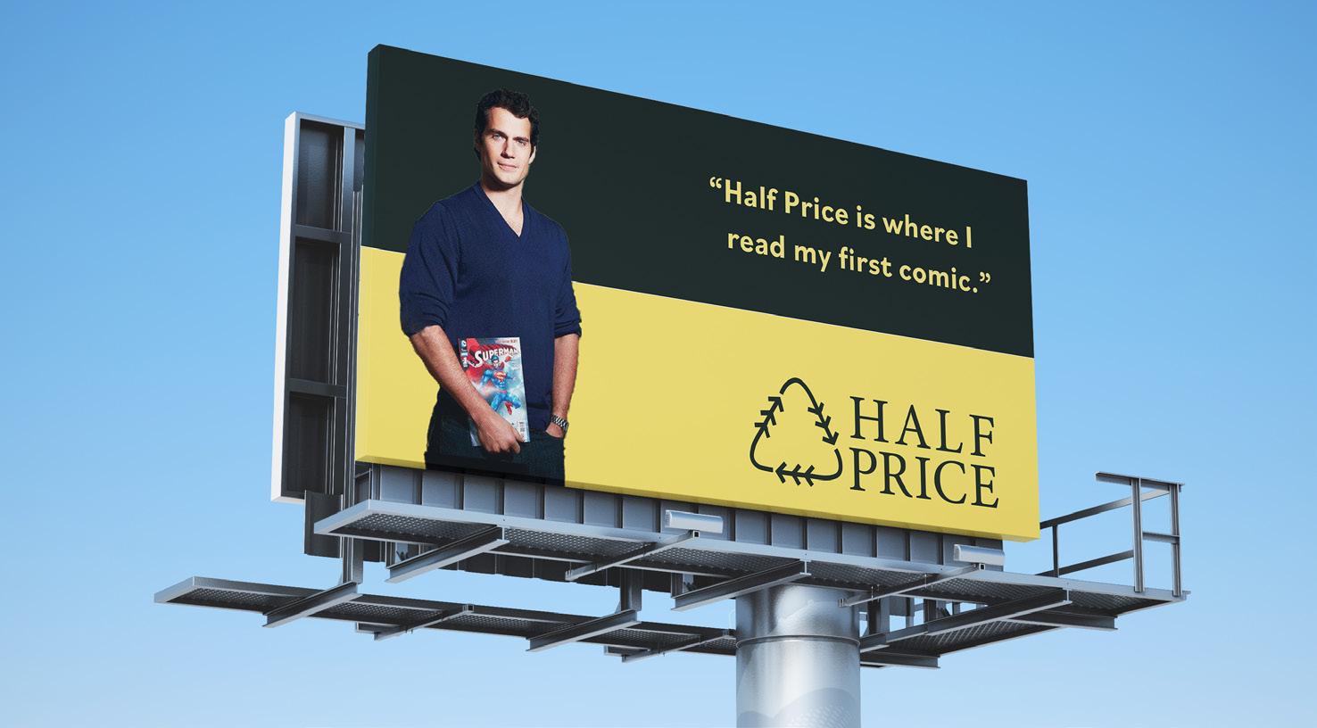
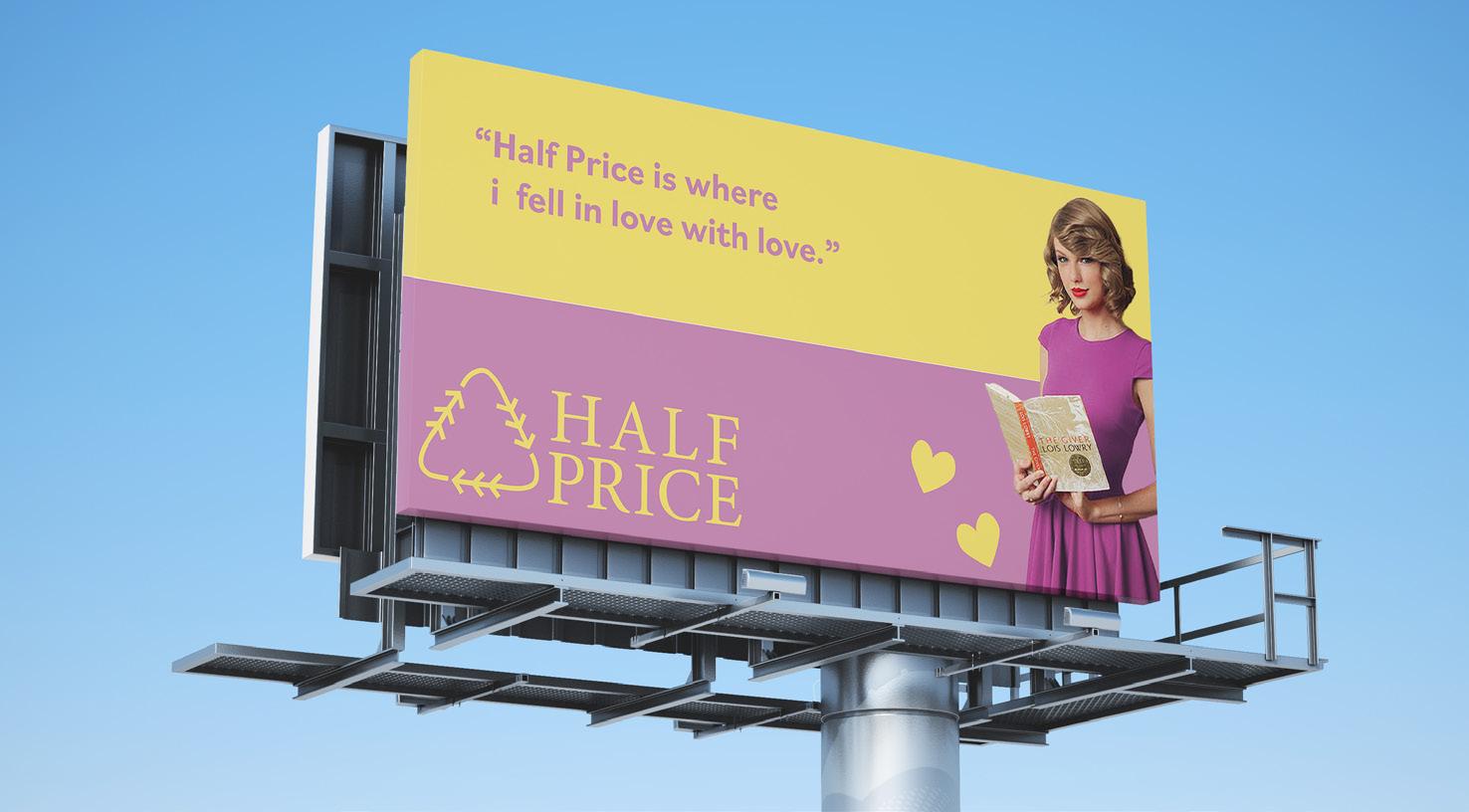
Billboard Series Campaign
The billboard series is an extension of the social media series which focuses on celebrites and their testimonials describing how half price positively impacted their lives. The use of a dual tone background also ties back into the name “Half Price” and helps split up the amount of white space on each composition.
Conclusion
This rebrand was an effort to shine a light on important aspects of Half Price as a brand and as a renewal culture and helps solidify who they are and what they represent to standing and new customers.
Stubbs Studio | Half Price BooksRebrand
Taylor Swift Testimonial
Henry Cavill Testimonial
Snoop Dogg & Martha Stewart Testimonial
Hot Topic x attack on titan
Catalogue Design
Overview
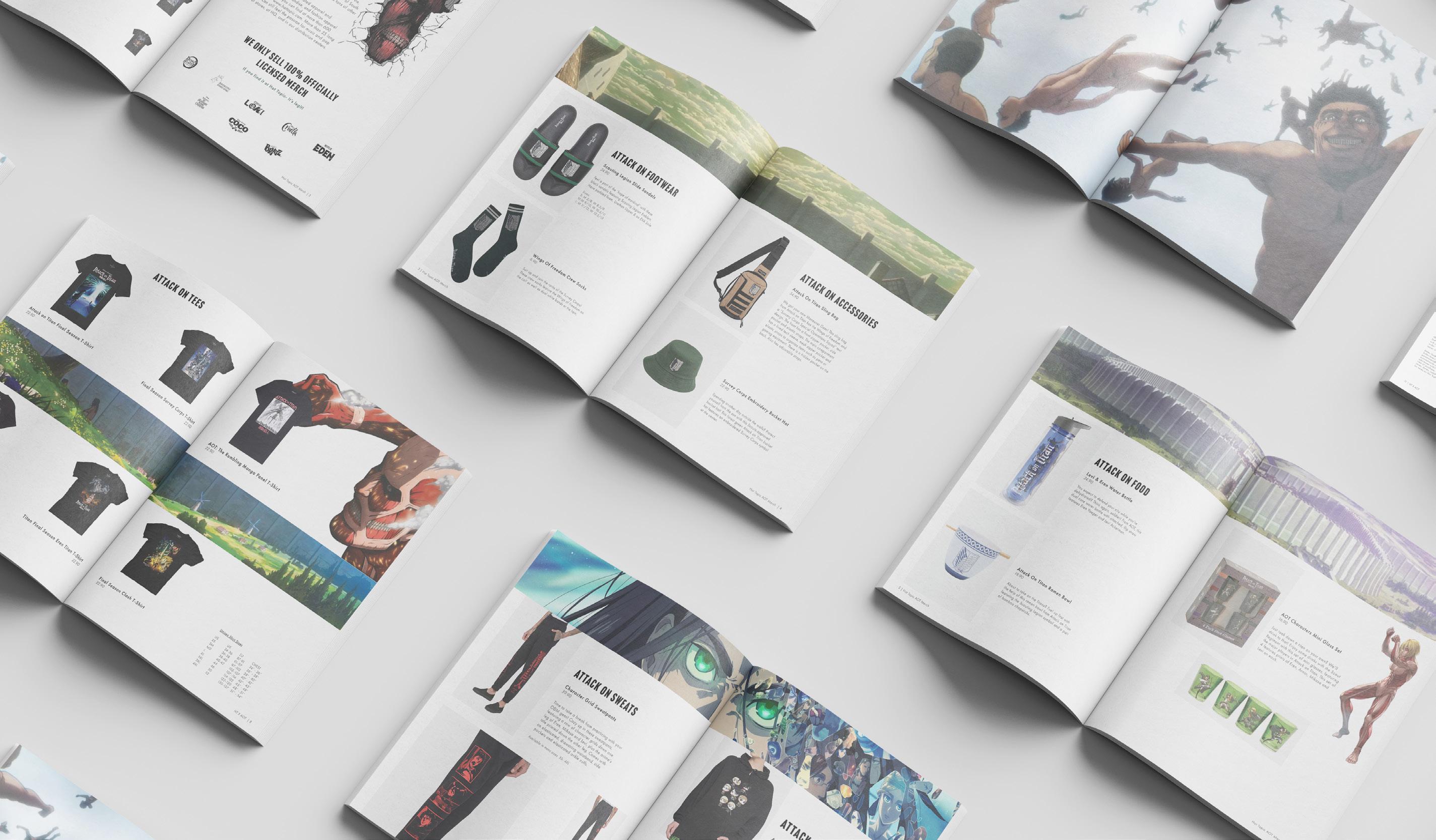
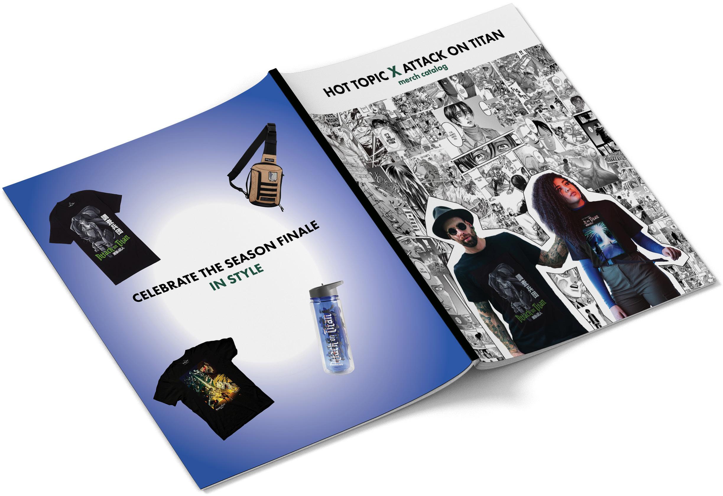
The idea for this catalogue was to create a promotional piece for the ephemera Hot Topic was to sell once the new Attack on Titan season premiered . This catalogue shows off items and pricing and often references the anime as well as the original manga. The focus of this catalogue was to promote the merchandise and entice Attack on Titan fans to purchase their merch there.
Skills Utilized
Print Copywriting Branding Advertising
Process
I edited different Attack on Titan merch items they were currently selling and collected the items and their information. I used this information to organize all of the items planned to include across the different spreads. I worked with manga clippings to represent the fans that read manga and show them that we do not only cater to the fans that watch the anime. Including iconic scene in the background was also an important part of the compositon that helped elevate this piece.
Solution
By using imagery from the Attack on Titan manga & anime I worked to elevate the current AOT merchandise items to promote them in this catalogue. Working with different formats of media and mashing them together helped me better understand collage art and Adobe Photoshop.
OutsideCovers
Stubbs Studio |Hot Topic X AOTCatalogue
Cannabis and its by-products can help people around the United States with its medicinal and therapeutic properties. “Cannaseur” is going to present the beneficial world of cannabis to otherwise “normal” motherly and workers demographic that want to be informed and entertained at the same time. Cannaseur is here to show that medicinal cannabis users are not just lazy people they are strong vibrant women as well.

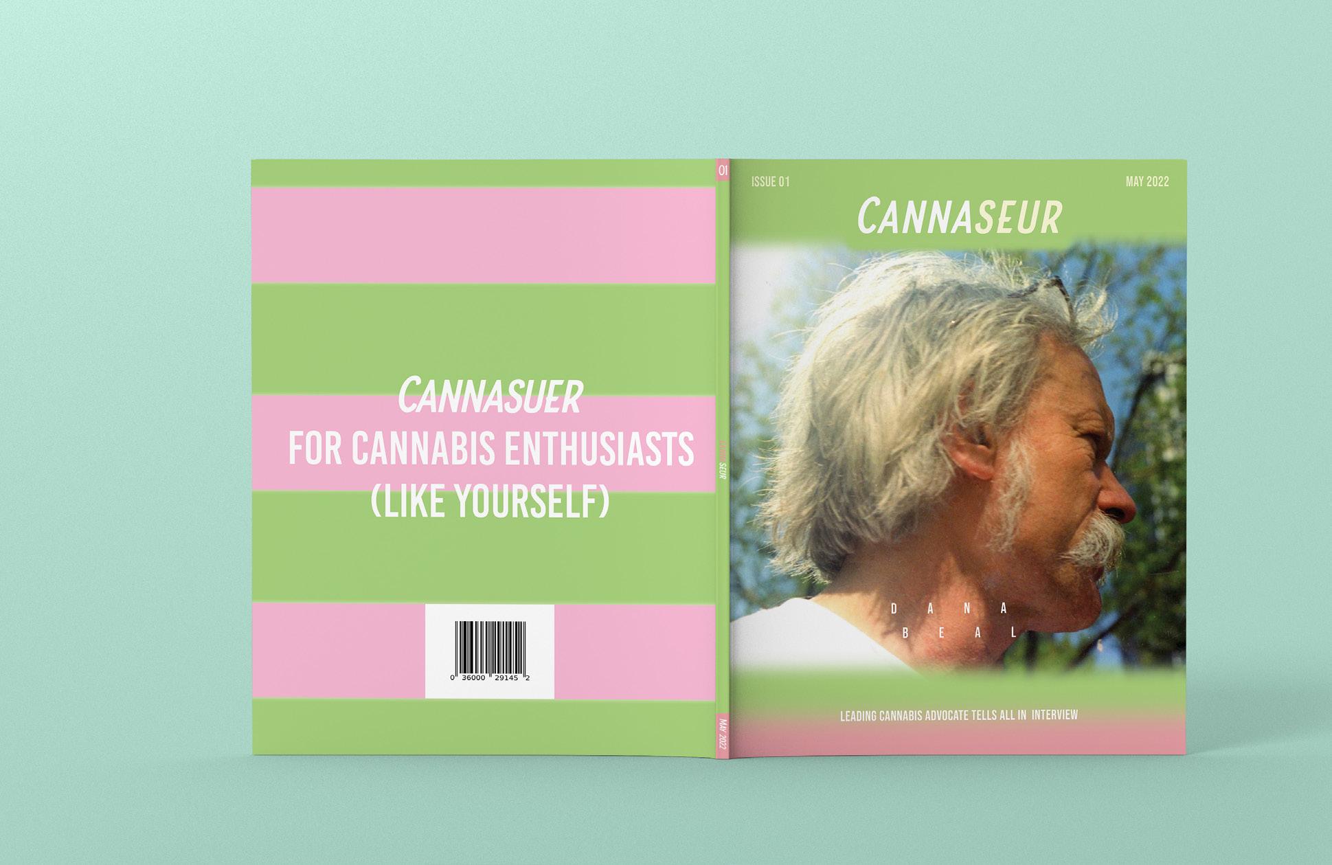
Print Copywriting Original Concept Magazine Outside Cover Overview Skills Utilized Original Magazine Concept Branding Long Format
Cannaseur Original Logo Design
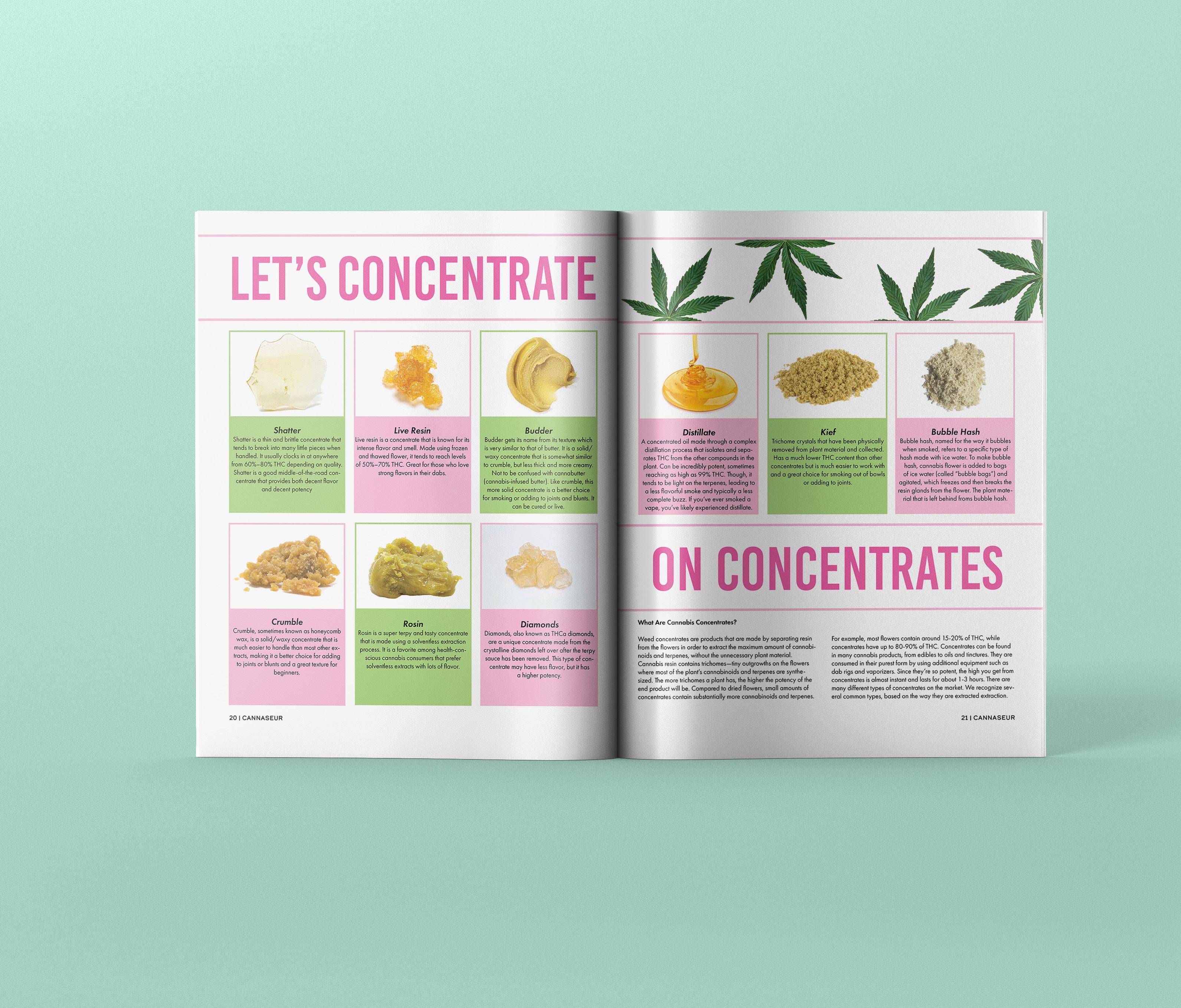
Cannaibis Concentrate Infographic Spread
Process
Since the focus for this magazine is teaching women about medical cannabis, I conducted quite a bit of research and also did a competitor analysis. Once finished I was able to further reinstate the concept and rationale for this magazine and was able to better undertand the culture of people I was attempting to connect when creating the brand logo and palette. I first focused on the inforgraphics then the feature spread with cannabis activist Dana Beal. I then piggy backed on those to make everything cohesive and informative as possible.
Stubbs Studio | CannaseurOriginal Magazine
This spread is the beginning of a multipage interview with cannabis activist Dana Beal. Throughout the interview Dana talks about wild and adventurous times as well as the corrupt government and their policies through the years. This piece is used to highlight a great activist and create buzz for the magazine for their “exclusive” content.
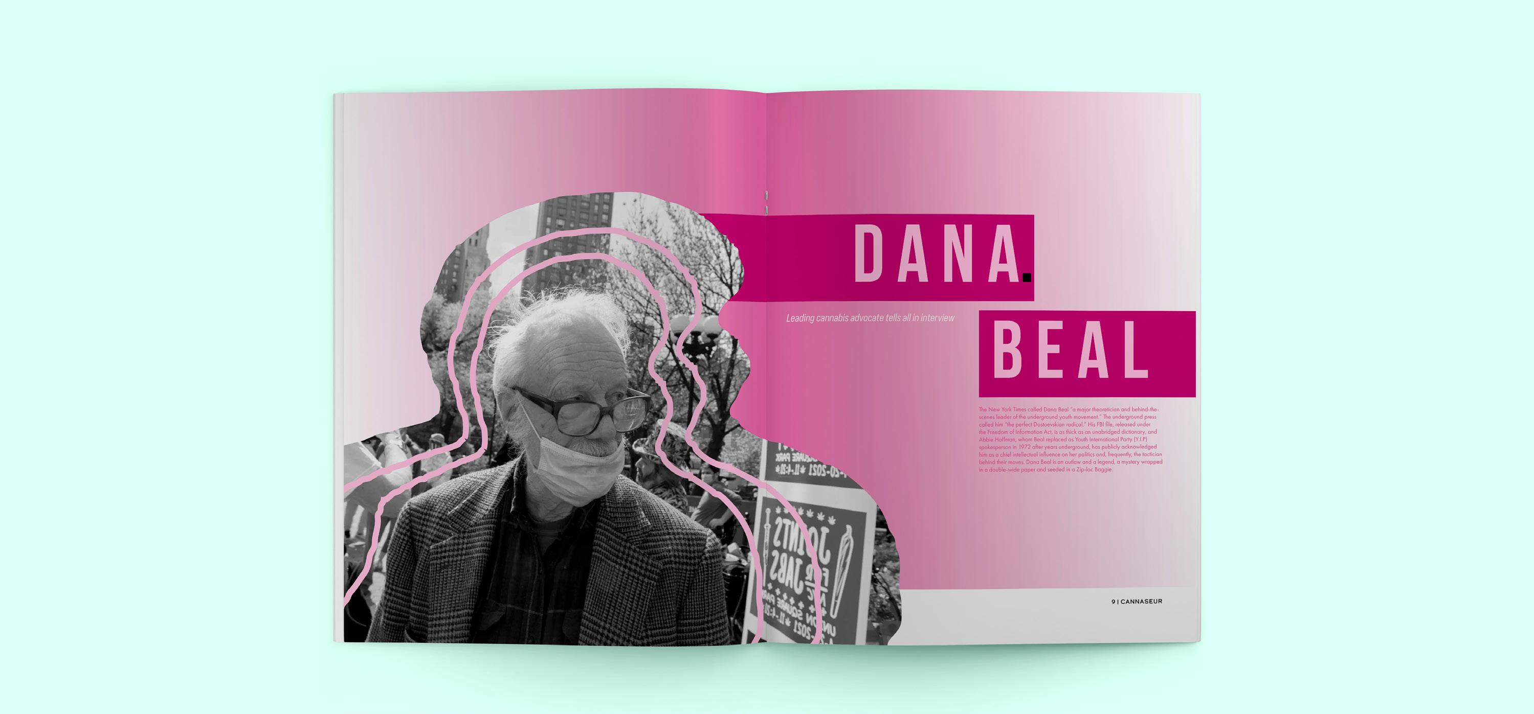


Feature Spread
Exclusive Interview
Solution
I created this magazine in the hopes to end the stigma and spread of misinformation about cannabis. A magazine is an informative yet entertaining way for people to warm up to the concept of healing naturally instead of with a lot of prescription drugs. Working with all of the research I collected helped me better understand the potential users and create a brand they could relate to.
Stubbs Studio | CannaseurOriginal Magazine
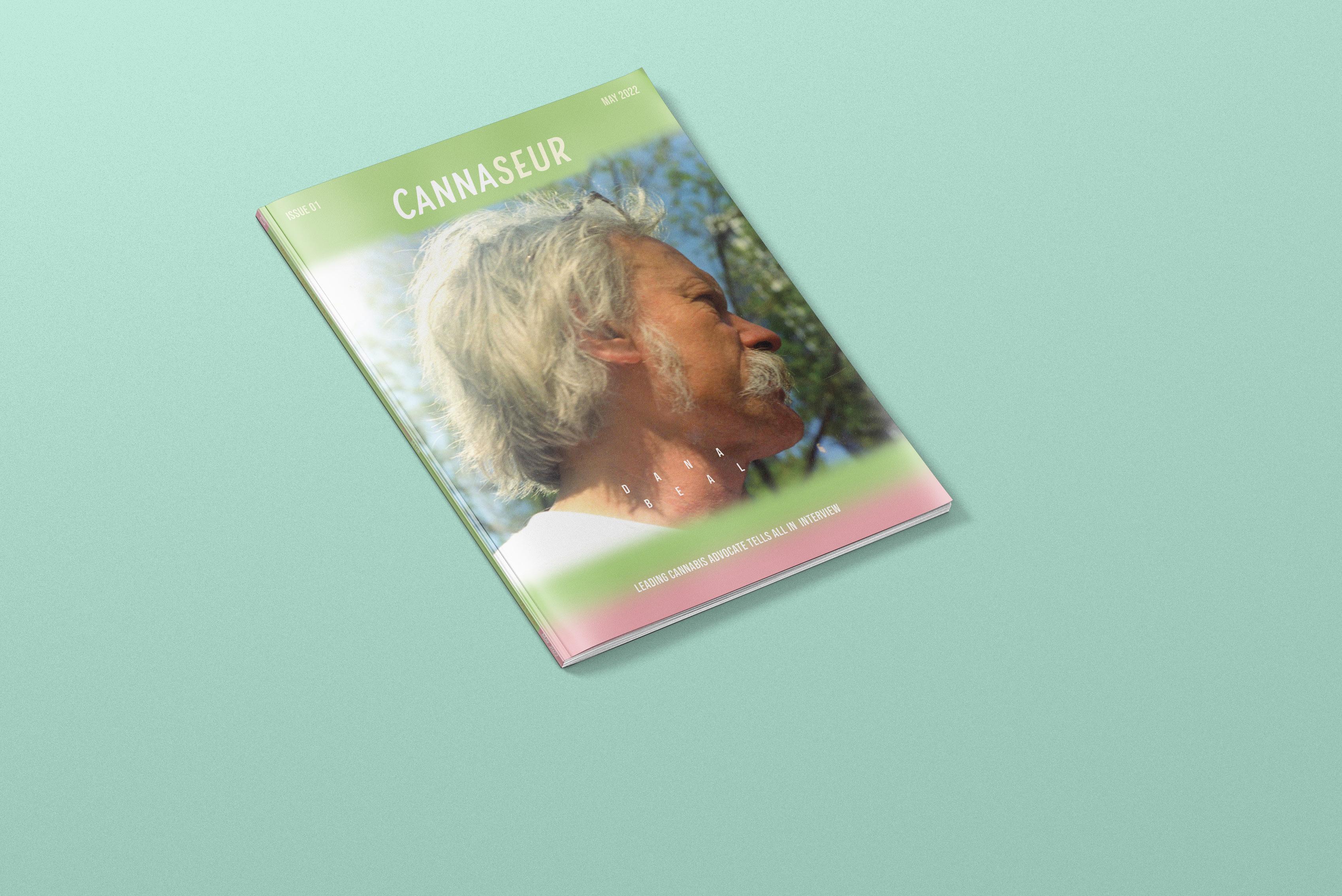
FrontCover
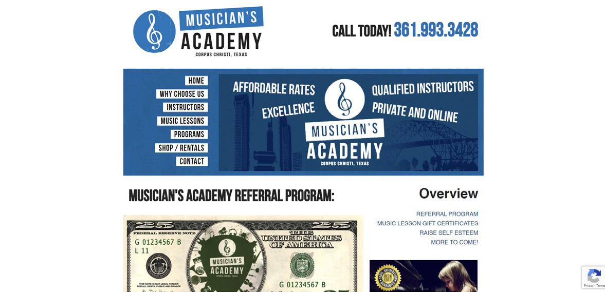
musician’s academy
Website Redesign
Overview
The main goal of the website rebrand was to get people to increase the number of customers for music lessons and to improve the user experience for all visitors of the website. The overall idea of the redesign was to keep everything simple yet eye-catching and easy to understand. Parents are constantly overwhelmed and creating a site that was informative, yet intriguing was incredibly important.
Skills Utilized
Branding Long Format UI/UX
After conducting research and a competitor analysis, i used the information I gained to begin deciding what elemnents did or did not work for this company and began laying out wireframes to get a feel for the location of everything. After wireframing I went on to distributge all of the content into where it needed to be then i prototyped the website in Adobe Xd.
Wireframes
These wireframes were created to give me an idea of where everything would eventually go and the amount of space I am allowed per section to determine what information should go where. This step helped me get a rough idea of the final picture of what the site would be like.

Wireframes

Stubbs Studio | Musician’s AcademyWebsite Rdesign
Process
Scan the QR to view full site
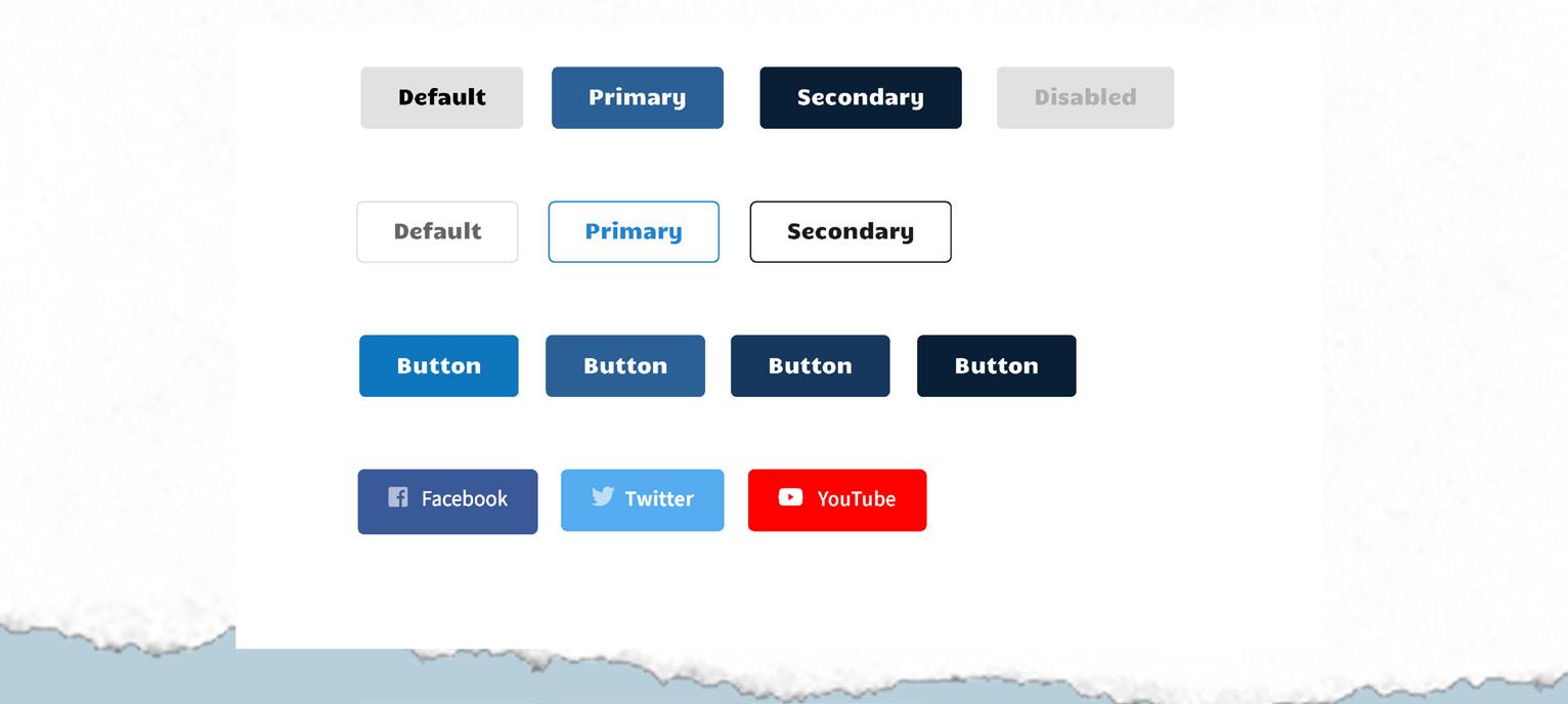
UI Components
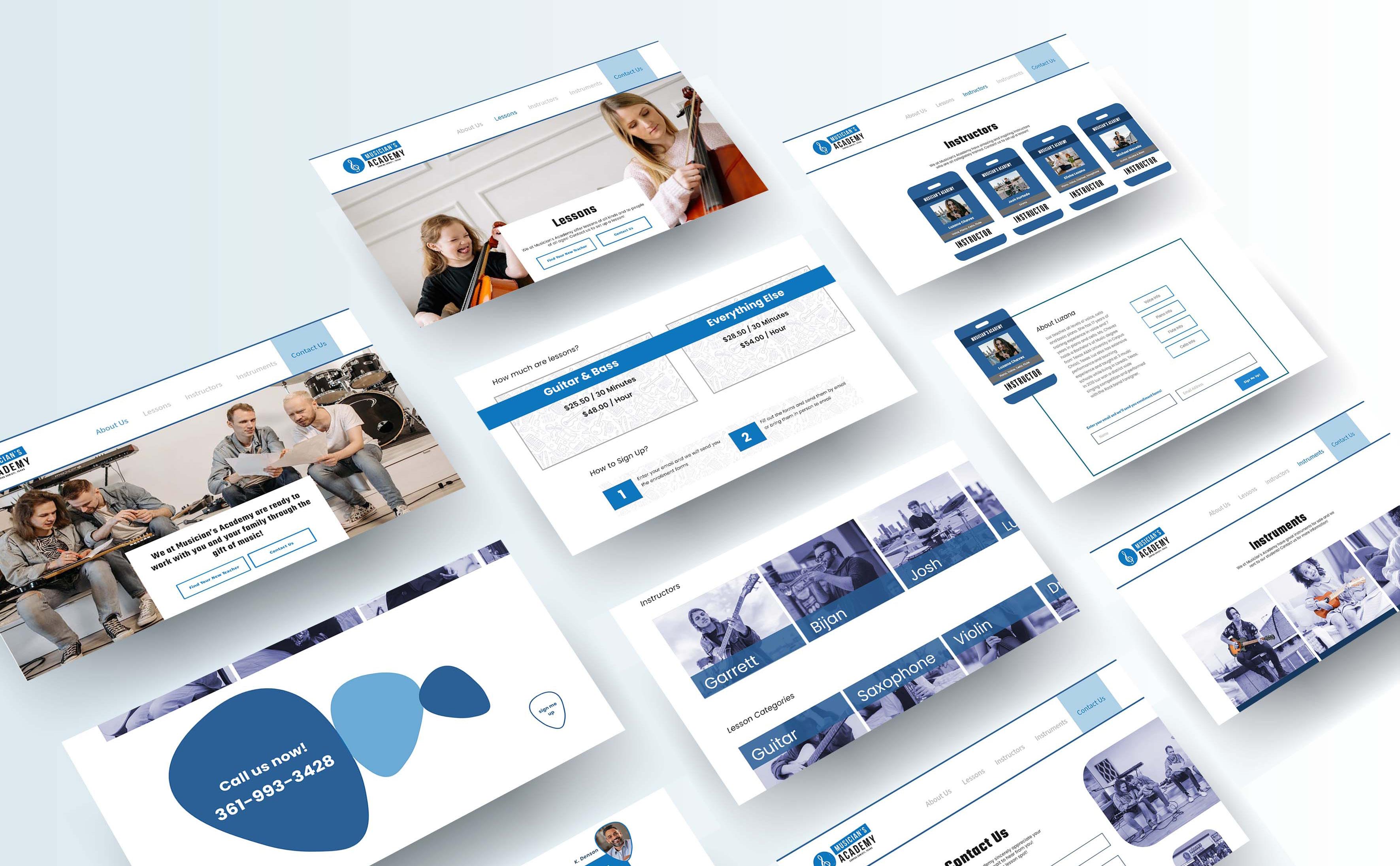
Redesigned Pages
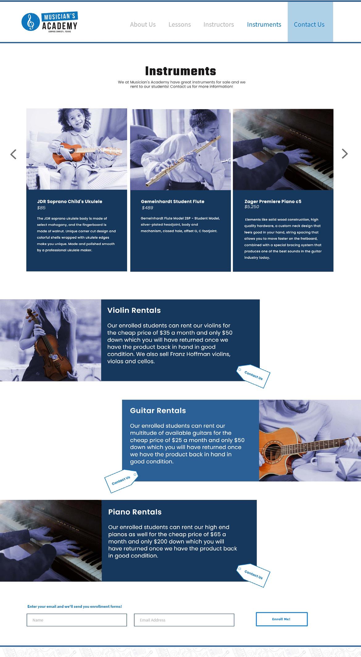
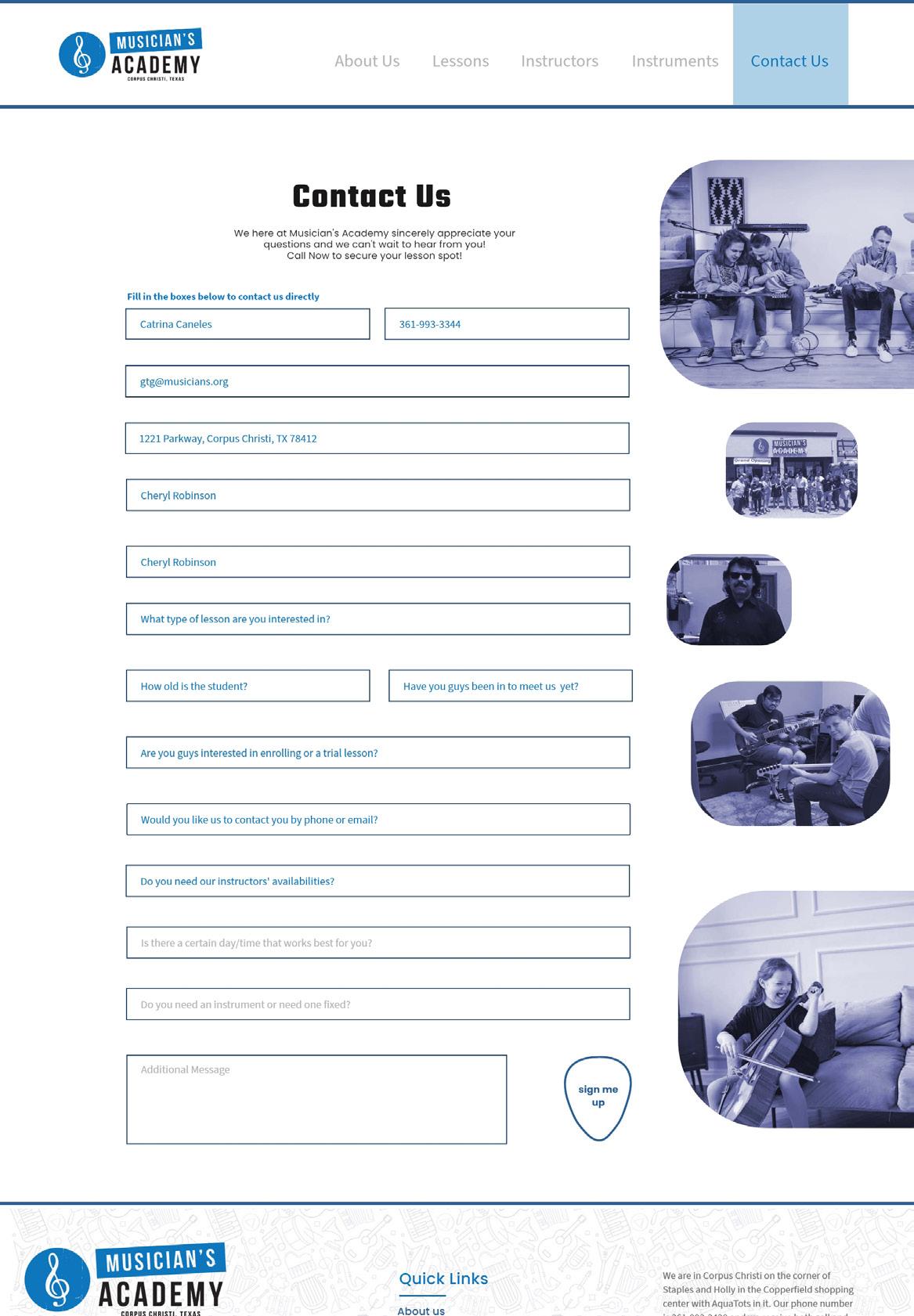
When redesigning the website I found that i needed to focus on information location and spacing. In working with these concepts and the idea to keep things light and airy I used a lot of white space with a monotone imagery for cohesion.
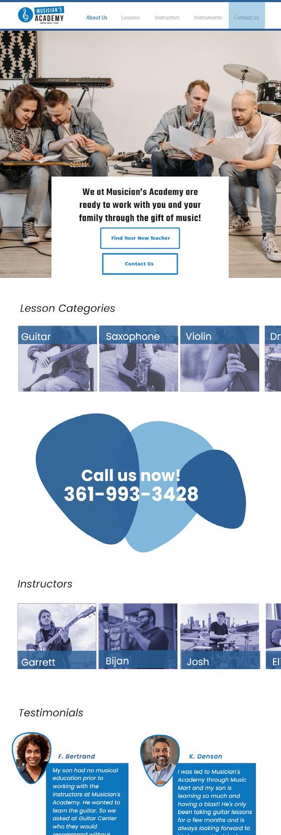
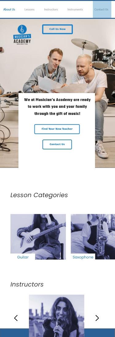
Website Lessons Info Page (Mobile) Home Screen (Mobile)
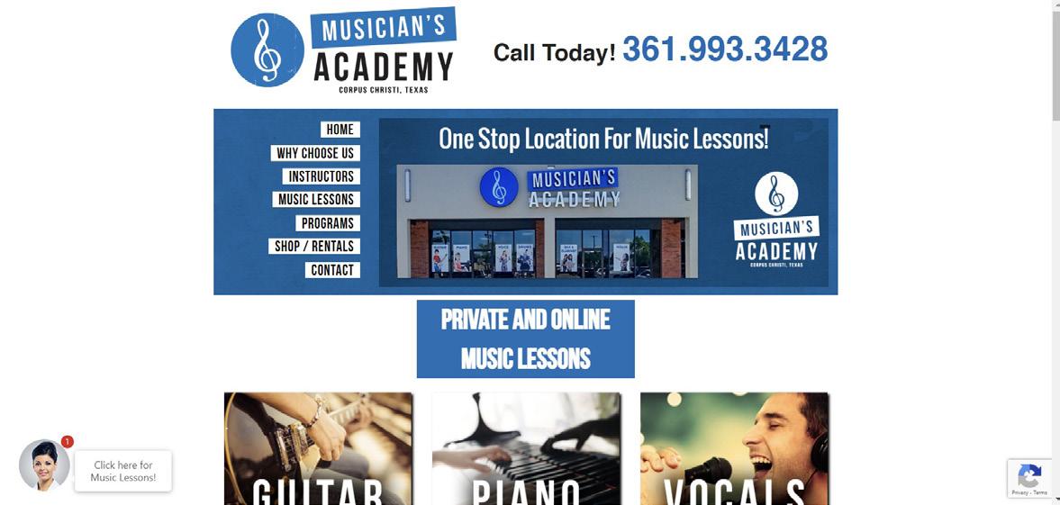
Original
Stubbs Studio | Musician’s AcademyWebsite Rdesign
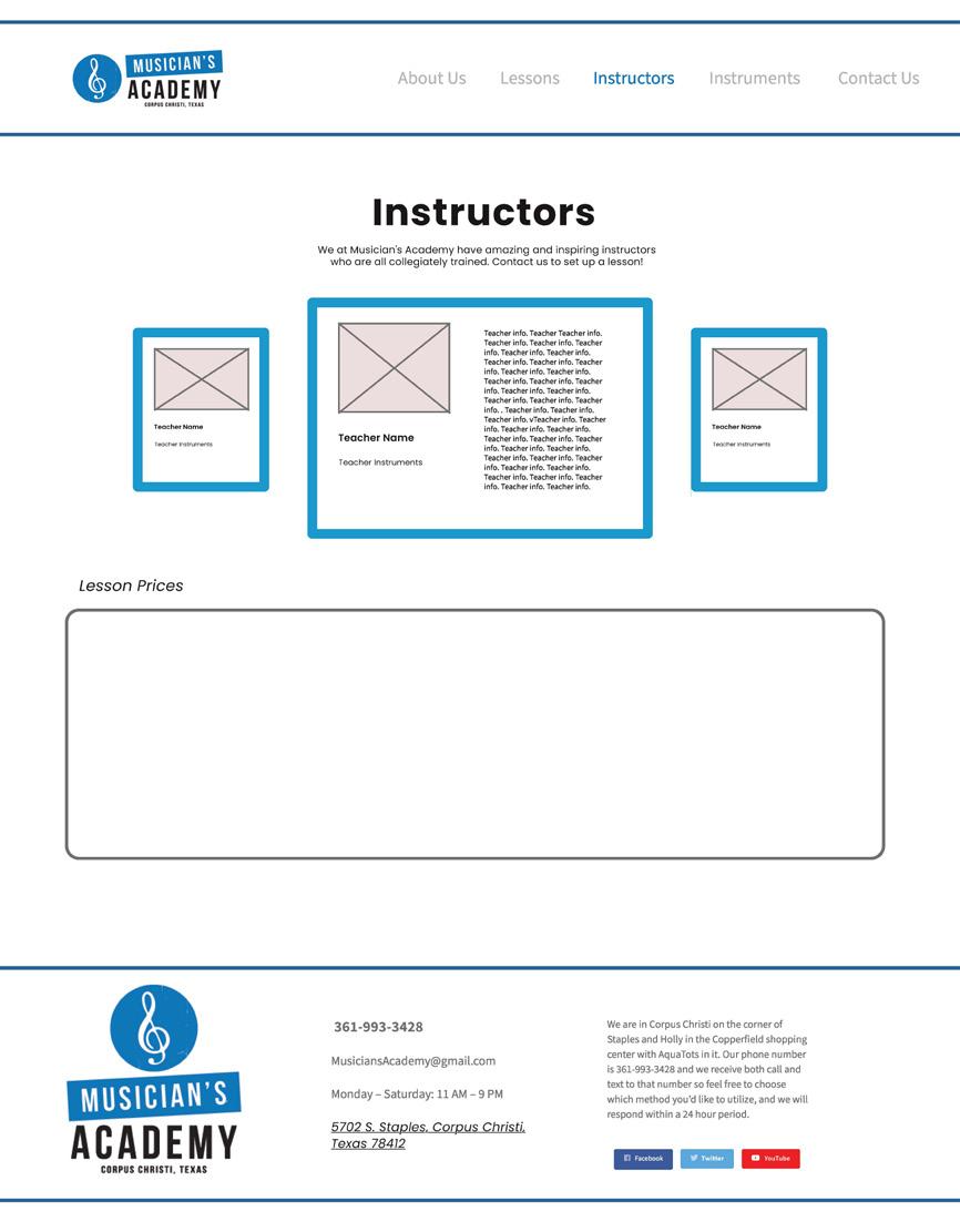
Instrument Rental Page (Desktop)
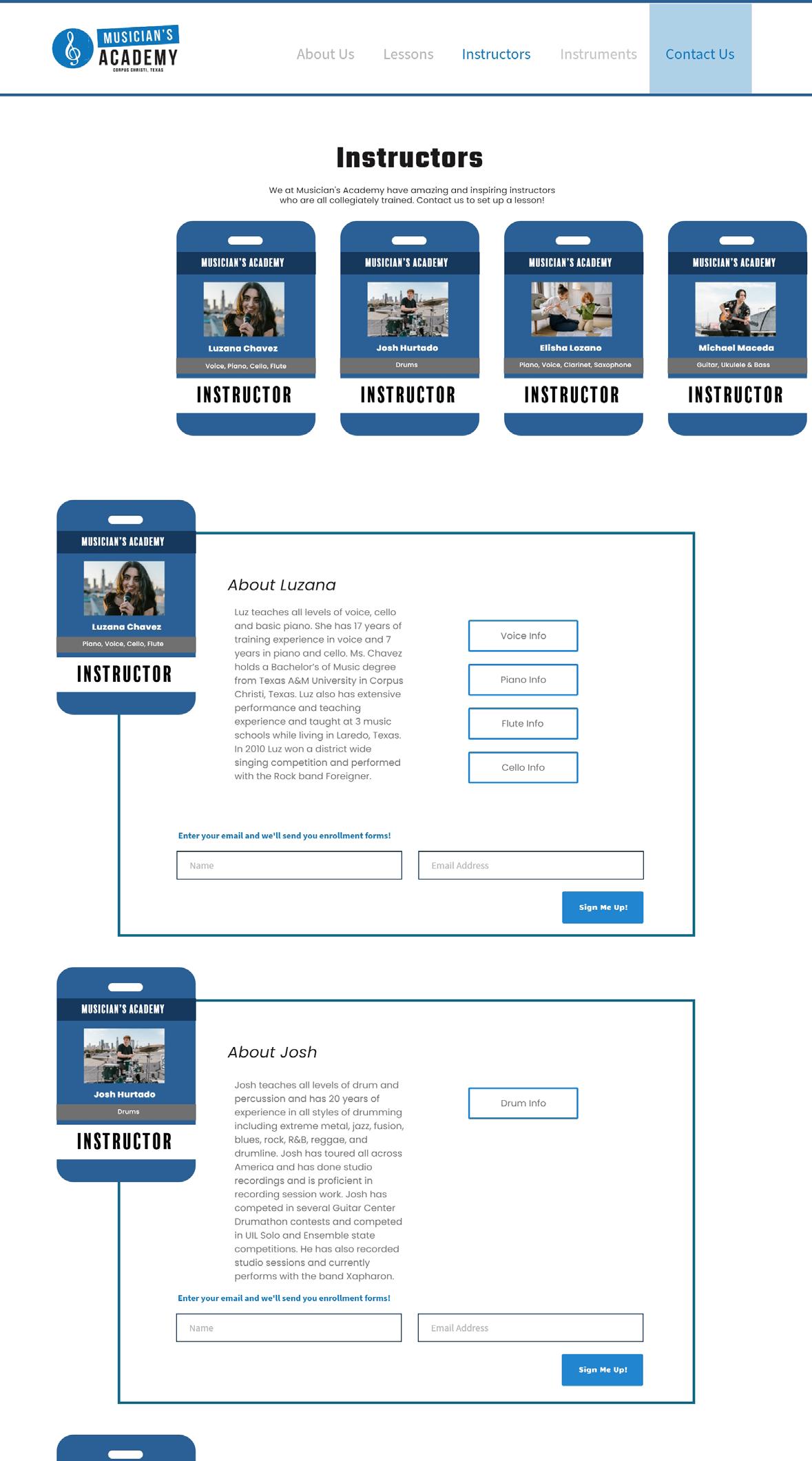
Instructor Information Page (Desktop)
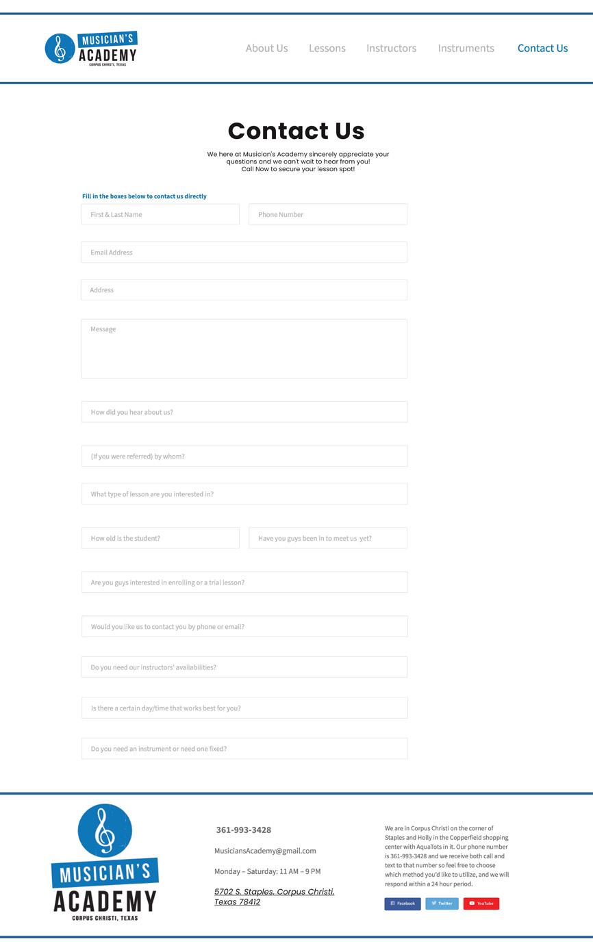
Contact Screen (Desktop)
Conclusion
When redesigning this website i wanted to focus on clearing up the page and presenting the important information where needed to declutter and entertain the eye. Using joyful images and lightweight design elements helps reinforce the friendly yet informative nature of the company.
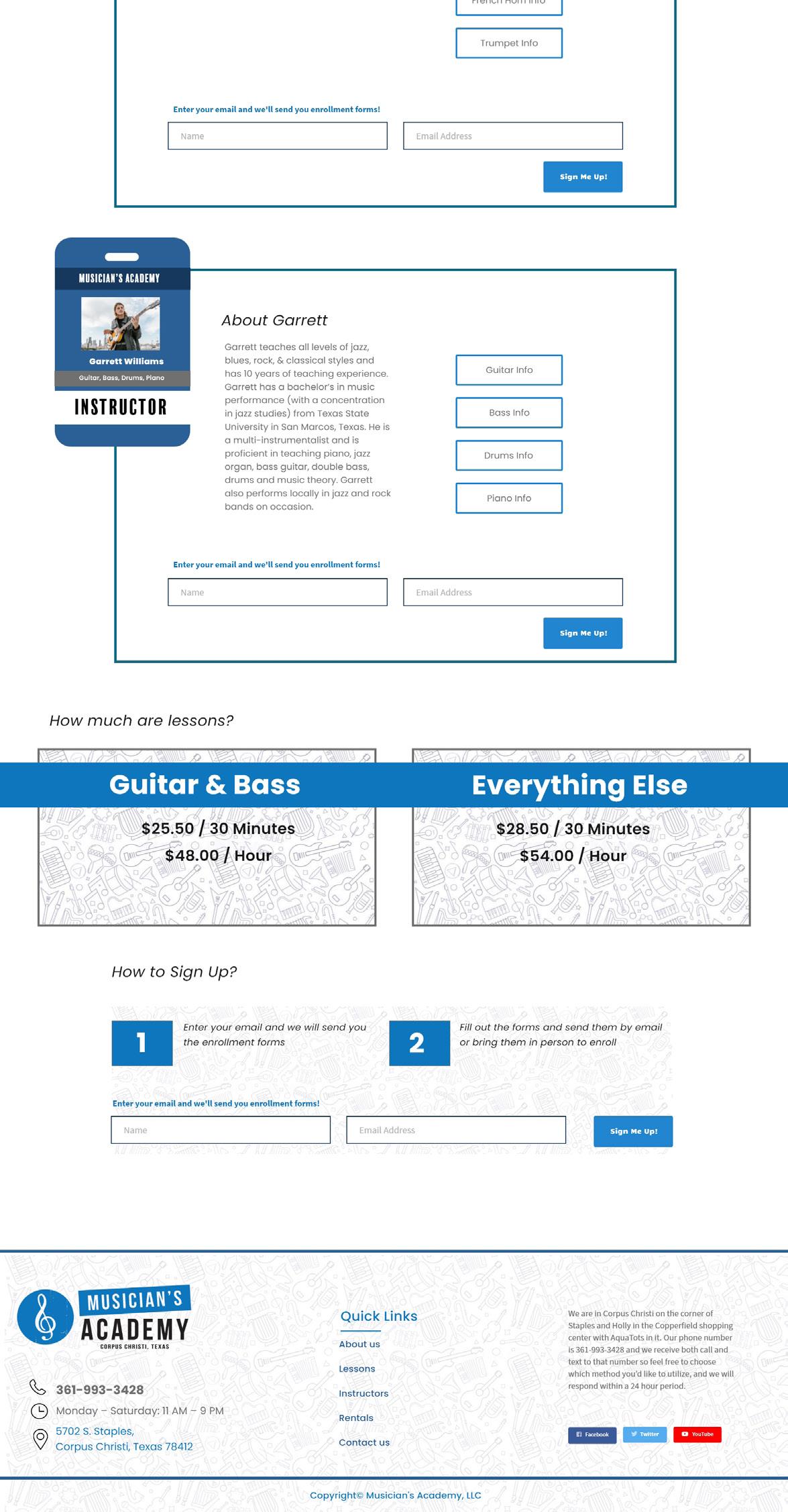
Instructor Information Page (Desktop)
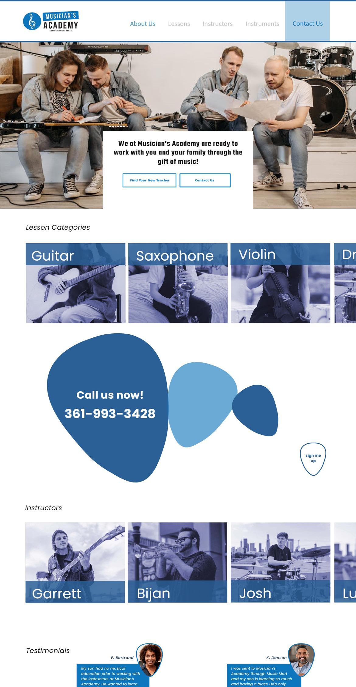
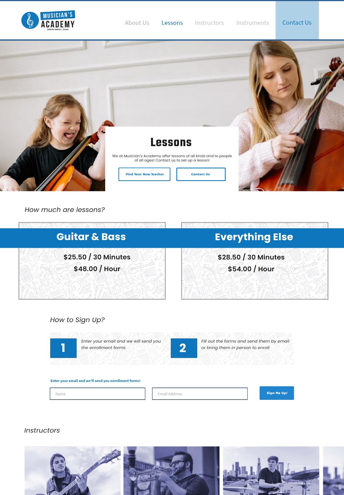
Stubbs Studio | Musician’s AcademyWebsite Rdesign Home Page (Desktop) Lesson Information Page (Desktop)
the creme shop x hello kitty
Advertisement Campaign
Overview
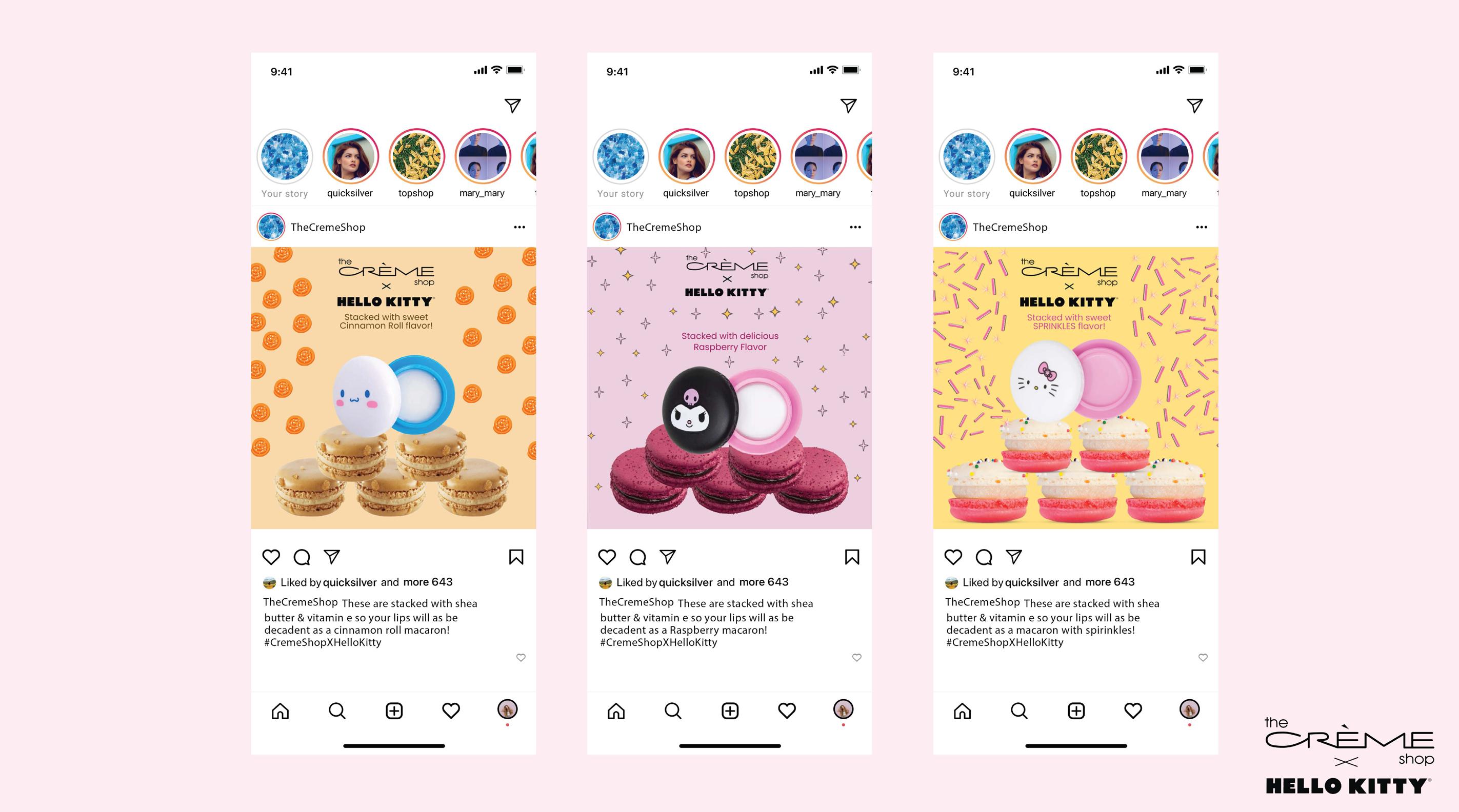
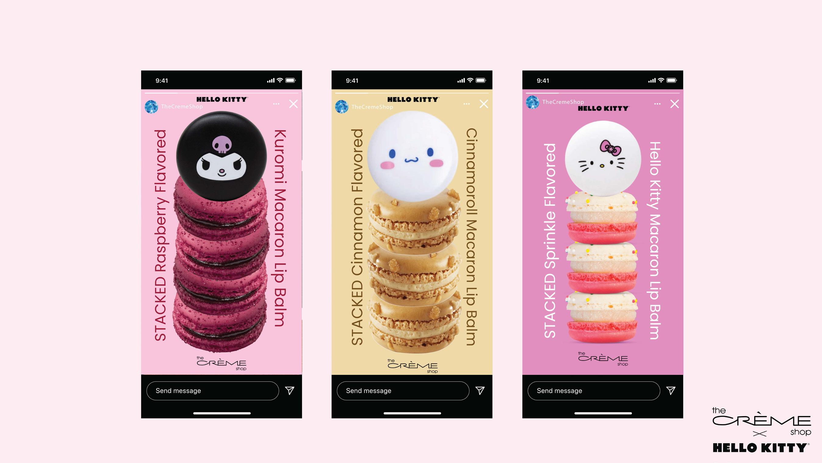
The purpose of this campaign is to promote the purchase of The Creme Shop x Hello Kitty’s Macaron Lip Balm line. I chose to represent 3 of their flavors that coinsided with some of Hello Kitty’s most well known characters for co-brand alignment.
Skills Utilized
Branding
Advertising
Copywriting
Organic Instagram Post Series
Solution Process
In conception of this campaign i researched their products and was able to better understand their consumers. Their consumers are looking for a witty and fun brand with a good amount of banter and a great tagline. The tagline for this campaign is “STACKED with flavor” to tie banck to the fun macaron packaging design and to represent the powerful flavor of their lip balms.
Once I came up with the tagline “STACKED with flavor” i was able to source imagery relevant and edit them in photoshop to then be brought into Adobe Creative Cloud Express where I worked a bit of my magic. The animations read through the text on the screen like an led billboard to further bring interest ro the brand and this super cute product.
Stubbs Studio | The Creme Shop X HKAd Campaign
Animated Instagram Story Series
