OF DESIGN
關於嶺東視傳
本系前身為商業設計科,成立於民國77年,於民國90年改名為視覺傳達設計系,為因 應文化創意產業與數位內容之需要,主要培育平面設計、廣告、繪畫、展示、多媒體等視 覺傳達設計人才,使之能理論與實務兼備、科技與藝術和一,達到促進社會整體發展所需 的知識技能,以提升國家經濟競爭能力。
為培育具有核心設計能力之領導人才,課程在設計上分為院訂必修課程、系訂必修課程、 以及專業選修課程;而專業課程則依「創意設計加值」以及「品牌整合設計」兩大領域進 行規劃,藉由專業課程的修習發展個人專長與特色,以呼應職場需求及時代脈動。以下收 錄本系近年畢業製作之獲獎作品。
Brief Introduction to Ling Tung University the Department of Visual Communication Design
The Department of Commercial Design, founded in 1998, has been changed name to Dept. of Visual Communication Design since 2001.The goal of the Dept. of Visual Communication Design is to cultivate a middle and higher class of visual communication designers with capabilities of advertising, packaging, display and layout in the graphic design area. The graduated students should develop into a comprehensive expertise and familiar with theory and practice combining technology and art. Successful students will be able to possess the knowledge and proficiency to contribute to integral societal development and to raise national economic competitive ability.
獎項說明
德國紅點設計獎 Reddot Award
德國IF設計獎 iF International Forum Design Award
美國ADOBE卓越設計大獎 Adobe Design Achievement Awards
金點設計獎 Golden Pin Design Award
巴黎DNA設計獎 DNA Paris Design Awards
金典新秀設計獎 Young Pin Design Award
A+文資創意季設計競賽 A+ Cultural Heritage Creative Festival Design Competition
臺灣國際學生創意設計大賽 TISD Competition
桃園設計獎 Taoyuan International Design Award
台灣金星設計獎 Taiwan Top Star
放視大賞 Vision Get Wild Award
2024 2024 2024 2024 2024 2024 2024
2024 2024 2024 2024 2024 2024 2023
張雅涵 Chang, Ya-Han
鄭子靖 Zheng, Zi-Jing
吳蘋芳 Wu, Ping-Fang

呂尚宸 Lu, Shang-Chen
簡佑翔 Chien, Yu-Hsiang
指導老師 Instructor 郭中元Kuo, Chung-Yuan
MT+FRIENDS+

Reddot Publishing & Print Media
Reddot Posters
傳達設計類/金點新秀設計獎
A+文資視覺傳達設計類/銅獎


放視大賞 文資視覺傳達設計類/銅獎
青春設計節 視覺傳達設計類/馬玉山最佳設計獎 K-Design 大獎


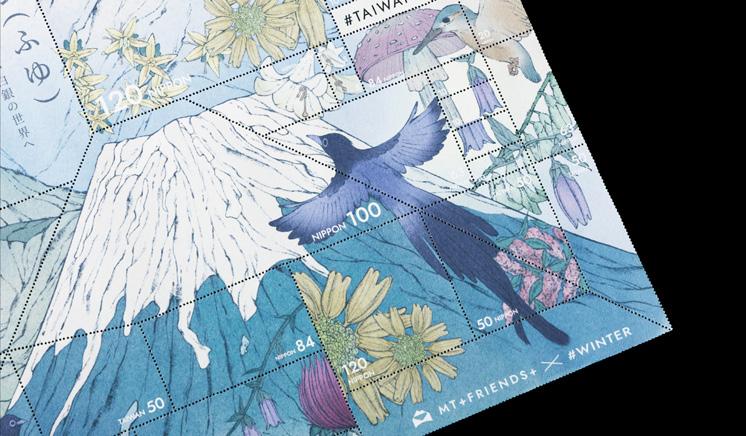


臺灣和日本因其多山的地形綿延出豐富的自然生態,從臺灣百山與日本百
名山之中,挑選出具有各自特色和影響力的24座山,作為郵票的主題。
構圖上以山峰呈現郵票的輪廓,展現山的獨特和生物多樣性,垂直相鄰, 仿佛在山川之間展開一場神秘的對話。在後期的加工採用傳統郵票的齒孔 分割,面值為燙銀,讓整體有不一樣的質感與視覺效果。
Taiwan and Japan, characterised by their mountainous terrain, habours diverse and thriving ecosystems. This project involves the selection of 24 distinct and influential peaks selected from the 100 Peaks of Taiwan and the 100 Famous Japanese Mountains to be the postage stamps' theme. The peaks are outlined as the silhouette of the stamps, showcasing the uniqueness and biodiversity of the mountains. Arranged vertically, there seem to be a mysterious dialogue between the mountains and rivers. In the later stage of processing, traditional perforations were applied on the stamps and their face value were embossed with silver, making these products' texture and visual effect unique.
張芷妍 Zhang,Zhi-Yan
蕭羽芸 Shiao,Yu-Yun

李慧伶 Lee,Huei-Ling
蔣鈺臻 Jian,Yu-Zhen
指導老師 Instructor 涂以仁 Tu,Yi-Jen
weights and measures


讓人能夠輕鬆地找到所需的零件,以打造方便拿取且數量整齊的零 件包裝結構。每個包裝上都有設計開孔,可以一眼就看出每種零件 的實際尺寸,附加每個零件大小比例的尺寸小卡,方便使用者去比 對手邊的零件,外盒都有明確的標示尺寸及數量,這樣的設計風格 使得尺寸易於辨識,壓印設計使觸覺上有更加獨特的手感。
Allowing users to easily find the required parts, the packaging is designed for convenient access and organized quantities of parts. Each package features designed openings for instantly viewing the actual dimensions of each part, accompanied by dimension cards showing the size proportions of each part, facilitating comparison with parts on hand. The outer box is clearly labeled with dimensions and quantities, making sizes easy to identify. This design style ensures ease of size recognition, with embossed designs providing a unique tactile feel.
丁佳吟 Ding, Jia-Yin
黃柏諺 Huang, Bo-Yan.
許祥慧 Xu, Xiang-Hui

白逸文 Bai, Yi-Wen
詹珈畇 Chan, Chia-Yun
林佩欣 Lin, Pei-Xin
指導老師 Instructor
REEFS STACKS
秦安慧 Ching, An-Hui
黃煒仁 Huang, Wei-Jen


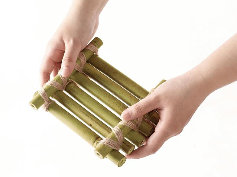
以人與自然的關係重塑珊瑚基座。前往台灣東北角探索九孔池與珊瑚復育的連 結,提出破壞x再生概念,結合復育知識與議題的書籍,用廢棄材料製作復育基 石,轉化成視覺特色包裝書。
Reshaping coral frag base through the relationship between humans and nature. We introduce the concept of regeneration after destruction, and combine it with the knowledge about ecological restoration in the book. We also use recycled materials to craft packaging for coral regeneration cornerstone,Transforming both into visual book packaging.
蔡承勳 Tsai, Cheng-Hsun
許瑋翔 Hsu, Wei-Hsiang

官振愷 Kuan, Jen-Kai
林竑均 Lin, Hong-Jun
MEDUSA ERA
指導老師 Instructor
郭中元 Kuo, Chung-Yuan


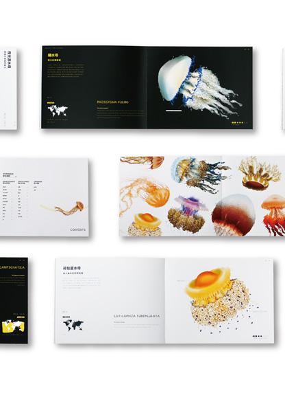
透過觀察水母的特徵,深入了解相關知識。認識到水母 對海洋生態的重要性,以及環境變遷所造成數量氾濫的 問題。盤點出世界上34種資料充足的水母種類,將水 母自身流體的特性作為插畫風格,搭配科普知識作為書 籍來認識各種水母的特徵。再透過創意的重組混合做為 視覺呈現,探討關於美杜莎時代對環境所造成的影響。
Through observing the features of jellyfish, gain indepth understanding of related knowledge. Recognize the importance of jellyfish to marine ecology, and the environmental change messages contained within themselves. List out 34 jellyfish species around the world with abundant data, use the water flow characteristics of jellyfish themselves as an illustrative style, combine with popular science knowledge as a book to understand the features of various jellyfish. Furthermore, through creative recombination and mixing as a visual presentation, discuss the impact of the Medusa era on the environment.


賴靖宇Lai,Ching-Yu
陳玟均Chen,Wen-Jun
唐靖雯Tang,Ching-Wen
白芳瑜Pai,Fang-Yu
林琪恩Lin, Chi-En
朱浥慈Chu, Yi-Tzu
EN ROUTE
指導老師 Instructor
秦安慧Ching,An-Hui 黃煒仁Huang,Wei-Jen

Reddot Publishing & Print Media
Reddot Illustrations


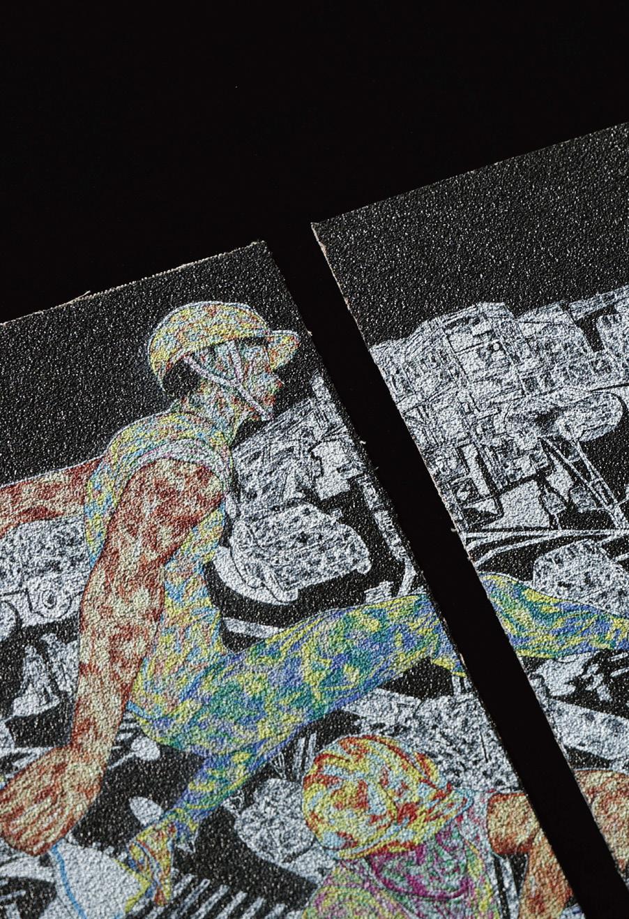
我們將在臺灣所觀察到的用路日常轉譯成圖像,以線條勾勒出在臺灣常見 卻脫序的用路行為,結合日曆的特性,讓大眾能在翻閱的同時去認識這些 屬於台灣特色的用路環境,選用砂紙作為核心模擬出柏油路的道路感,並 以最直接的方式呈現我們想傳達的主題特性,透過圖面視覺的衝擊結合粗 糙觸感的特色,讓觀者能夠藉由觸摸達到道路體驗
We translate the daily road observations in Taiwan into visual images, outlining the common yet unconventional road behaviors in Taiwan with lines. By incorporating the characteristics of a calendar, we allow the public to understand these unique road environments while flipping through the pages,we use sandpaper as the core to simulate the feel of asphalt roads, presenting the theme characteristics we want to convey in the most direct way. By combining the visual impact of the images with the rough texture, viewers can experience the sensation of the road through touch.

SNAKE PLUS+KING SNAKE

SNAKE OF MORPHS


在當代社會,隨著生活方式的多元化,人們對於寵物的選擇也日益豐富。透過研究,觀察到近年來 飼養爬蟲類寵物的人數持續增加。在對爬行動物飼養的研究中,發現普通大眾對蛇的瞭解並不普遍, 存在普遍的刻板印象。
目前,在臺灣,飼養著各種品種的寵物蛇,其中大部分具有溫和無毒的特點。
通過遺傳多樣性(品系)形成的多樣化外觀對喜歡飼養它們的人特別有吸引力。
因此——SNAKE PLUS+KING SNAKE OF MORPHS
透過設計藝術形式的品系圖鑑出版,民眾可以了解到生物的多樣 性,進一步提升對這些物種了解與保護的意識,旨在為爬行動物的發展開闢未來的前景。
In contemporary society, with the diversification of lifestyles, people have increasingly diverse choices when it comes to pets. Through research, it has been observed that the number of people keeping reptiles as pets has been steadily increasing in recent years.In studying the keeping of reptiles as pets, it has been found that the general public's understanding of snakes is not widespread, and there exist common stereotypes.Currently, in Taiwan, there are various breeds of pet snakes being kept, most of which are mild and non-venomous. The diverse appearances created through genetic diversity (morphs) are particularly attractive to those who enjoy keeping them.Therefore, SNAKE PLUS+KING SNAKE OF MORPHS aims to publish a design art form of a breed guidebook, allowing the public to understand the diversity of living organisms. This further enhances awareness and protection efforts for these species, with the aim of opening up future prospects for the development of reptiles.
陳妘 Chen,Yun
何羽雯 Ho,Yu-Wen
溫欣柔Wun,Sin-Rou

施如芳 Shi,Ru-Fang
陳欣慧 Chen,Xin-Hui
指導老師 Instructor 陳正桓 Chen,Chan-Heng
HEADWATER NEWSPAPER


「人人享有水、衛生及永續管理」水源報社是時間與世界觀架空在2030年的未來。設定在未來 用水的每一天,是可以無限的使用的世界裡,並非是單方面付出的,而我們要付出對等的代價, 然而付出的代價是什麼呢?沒有水的未來又會對我們造成多大的影響呢?利用架空的世界裡盡情 的想像未來用水會需要付出的所有可能性,從「食」開始,生活,會影響著現在、未來,使用報 刊作為與大眾對話的載體,在刊物內表現出現在與過去的「食」,如何影響著未來對於水的改變, 預演著未來用水的所有可能性。在這個未來的世界觀下,我們不只是受限水與我們的單方面使用 的關係,更是與我們如何與水並存以及建立可持續用水模式的未來。
"Water, Sanitation and Sustainable Management for All"Headwater Newspaper presents a future set in 2030, where time and worldview are reimagined. In a world where water is inexhaustibly used every day, the concept of payment is not one-sided payment; we must pay an equal price. But what exactly is this price? And how significantly will a future without water impact us? By delving into the alternate world, we can explore all the possible scenarios that may require payment for water in the future. Starting with ‘food’, our daily lives are intimately connected to how we utilize water, affecting both the present and the future. Through newspapers and publications, we engage in a dialogue with the public, showcasing the influence of ‘food’ in the past and present on future water management scenarios, while also envisioning all potential outcomes of future water usage. With this future-oriented worldview, we are not only limited by water and our unilateral use, but also by how we coexist with water and establish the future of sustainable water usage patterns.
成漢康Cheng, Han-Kang
許茹芸Hsu, Ju-Yun
陳怡如Chen, Yi-Ju

邱俊傑Chiu, Chun-Chieh 宋子毅Sung, Tzu-Yi
指導老師 Instructor 涂以仁 Tu, Yi-Jen
BALLS EXCHANGE


設計一場用平日賽後淘汰的「廢棄球」球賽,從入場門票到比賽 後頒發以廢棄球製成的獎盃,以紀念方式來解決廢棄球無法正確 回收的問題,並且整場球賽能夠藉由循環所獲得收益能夠作為促 進體育推廣及發展。
Design a discarded ball match with weekday eliminations. From admission tickets to post-match trophies made from discarded balls, this event aims to address the issue of improperly recycled balls. Additionally, the entire match will use the revenue generated from recycling to promote and develop sports.
何心雨 He, Xin-Yu
黃晶美Huang, Ching-Mei
羅庭佑Lo, Ting-You


陳筱君Chen, Xiao-Jun
薛誼辰Hsueh, Yi-Chen
陳雨柔Chen, Yu-Rou
指導老師 Instructor
藍偉憲Lan, Wei-Hsien
Drug Description


家中藥袋多會不易辨識藥品種類,有誤食的風險。藥盒裡的日曆 可配合藥包紀錄並提醒用藥情形。針對不同年齡層進行編排設計, 讓患者更方便閱讀藥品資訊以達到安心用藥的效果。
The accumulation of medicine bags at home makes it difficult to distinguish between medications, increasing the risk of errors. Using the medicine container’s calendar and sachets helps individuals track medication status, providing convenient access to medication information for peace of mind during use.
郭文詠 Kwok, Man-Wing


指導老師 Instructor
吳政璋 Wu, Cheng-Chang
陳正桓 Chen, Chan-Heng
how's it going today?


在台港生的鐵道環島攝影計畫。探索 1065公里島嶼風光,認識不同在地文 化;以慢快門呈現不可預期的驚喜, 捕捉眼前的感動,體驗平凡而美好的 日常。平凡的一天,也可以是有趣美 好的一天。
This was a round island rail journey. On this 1065-kilometer journey, a Hong Kong student captured unexpected motions with a slow shutter and interacted with various cultural ambiances. It was touching to experience the good daily lives of locals.
陳莆霖 Chen, Fu-Lin

指導老師 Instructor
秦安慧Ching, An-Hui
黃煒仁Huang, Wei-Jen
Integration of Solar Terms

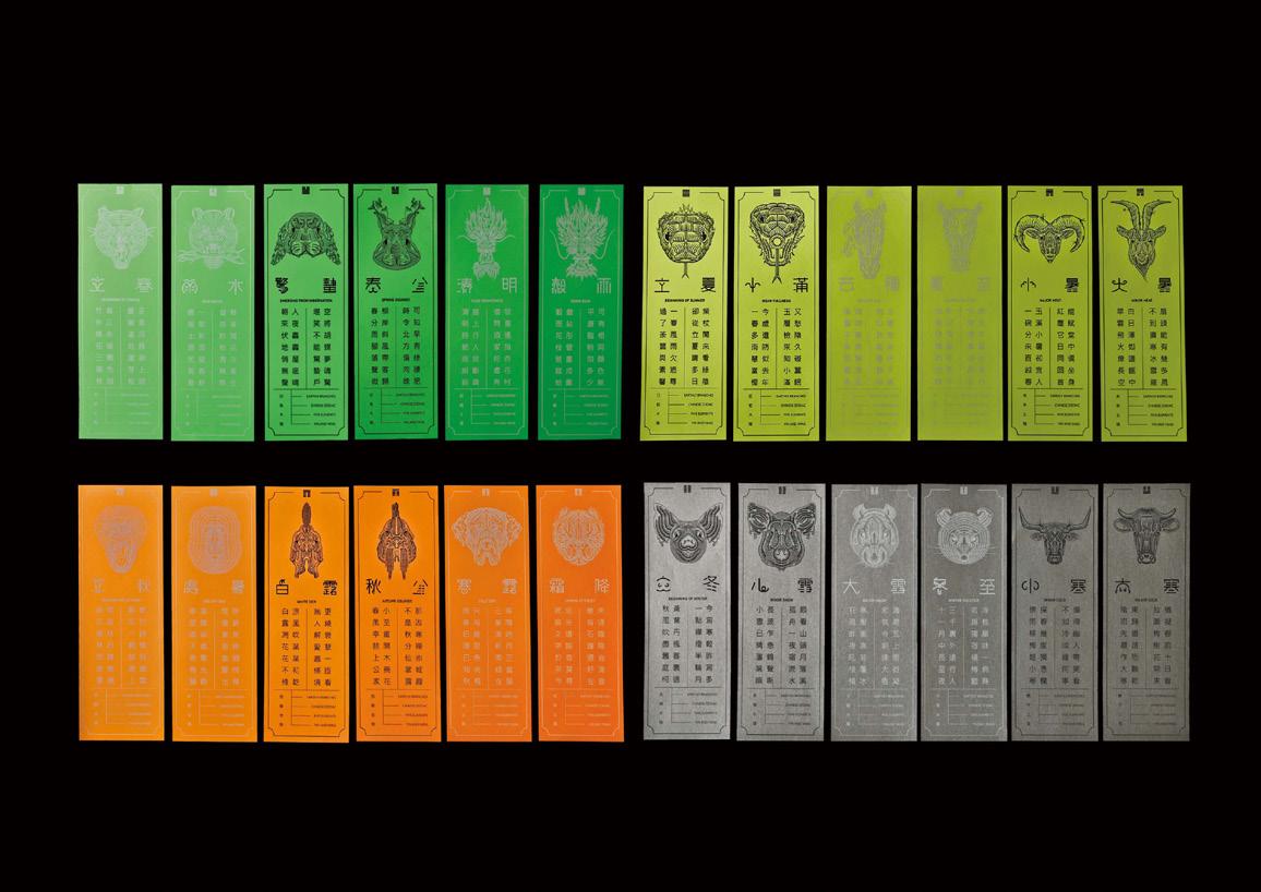


此系列作品將華人生活中與二十四節氣相關的抽象元素,以具象化且有規律
地插畫手法呈現,讓觀者藉由圖像了解節氣的相關元素,將生肖、卦象、五行、
陰陽元素融入插畫,跳脫傳統四季色彩,改以代表陰陽的黑與白,搭配與節 氣對應的中國古詩,讓華人智慧的文化永續流傳。
This project uses systematic illustrations to present the abstract elements of the twenty-four solar terms in Chinese life, including Earthly Branches, zodiac signs, Hexagrams, the five elements, and yin and yang. It employs unconventional color schemes for the seasons, using black and white for yin and yang, and features ancient Chinese poems. This ensures the sustainable transmission of Chinese cultural wisdom.


2023 2023 2023 2023 2023 2023 2023
2023 2023 2023 2023 2023 2023 2023
翁于晶 Weng, Yu-Jing
李如芸 Li, Ru-Yun
柯欣廷 Ke, Xin-Ting

顏色凡 Yen, She-Fan
謝山未至夏 Xie, Wei-Jing
FIREFLY
指導老師 Instructor
黃庭超 Hwang, Tyng-Chau
藍偉憲 Lan, Wei-Hsien

Best fo the best Brand Design & Identity
Publishing & Print Media
iF International Forum Design Award


針對螢火蟲的認識與了解不足,在踏查與訪問專家後,將台灣52種螢火蟲的樣貌與資訊 組織成為圖像,以發光軌跡為發想,線構成為載體,連結螢火蟲的樣貌與相關知識,使螢 火蟲與我們建立聯繫,讓賞螢不再只是賞螢。
In response to the lack of knowledge and understanding of fireflies, after conducting fieldwork and consulting with experts, the appearance and knowledge of 52 species of fireflies in Taiwan were integrated and visualized. The materials were reorganized into images, with the luminous trajectory used as a starting point for the extension of ideas, and lines used as carriers to connect the appearance of fireflies with related knowledge. This allows for a deeper connection with fireflies beyond simply viewing them, bringing fireflies and our daily lives closer together.


胡景琇 JING-XIU HU
李卓蓉 ZHUO-RONG LI
陳偊綸 YU-LUN CHEN

郭昕寧 HSIN-NING KUO
李岱瑾 DAI-JIN LI
指導老師 Instructor 張露心 LU-HSIN CHANG
PLASTIC IN OUR FOOD


本設計希望透過「塑膠化食物」的可視化創意, 凸顯塑膠微粒全面入侵食物鏈之迫切性。
藉由日常生活中經常食用的20種食物被塑膠滲透的意象,提醒和警示過度使用塑膠製品 的切身性,使大家能更自發性地透過減量、回收和再利用,大幅減少塑膠廢棄物產生, 善盡地球公民的責任。
This design aims to raise awareness about the urgent issue of microplastics in our food chain. Through creative visualization of "plasticized food," it depicts 20 commonly consumed daily foods being penetrated by plastic. This serves as a reminder of the immediate consequences of excessive plastic product usage and encourages everyone to actively reduce, recycle, and reuse to minimize plastic waste generation. By doing so, we fulfill our responsibilities as global citizens.
林世美 LIN, SHIH-MEI
范方容 FAN, FANG-JUNG

葉秀婷 YE, XIU-TING
劉于禎 LIU, YU-ZHEN
指導老師 Instructor 陳健文 Chen, Chien-Wen 72 HRS


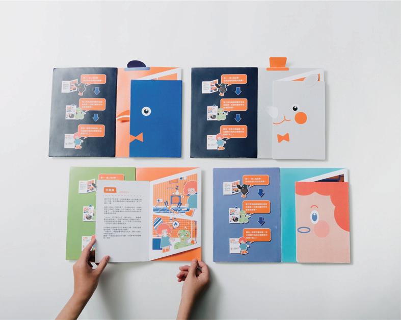


當火災發生時,若沒有逃生意識容易錯過逃生的時機,72HRS通過閱讀故事做遊戲 培養兒童的防災意識。針對8-12歲的兒童設計的教具,了解應對各種場合下發生的 火災,科普日常預防火災發生的相關知識,經調查後選擇客廳、廚房、房間、神明
廳等4個容易發生火災地區,將逃生與防災知識譜寫成故事,希望兒童藉由閱讀故 事學習正確應對火災的方法,並創造「七步逃生口訣」:報- 喊-跑-下-躲-窗-通; 第一時間報警,大喊告知周圍,往一樓跑或躲在通風的窗戶旁。
When a fire occurs, if there is no escape awareness, it is easy to miss the opportunity to escape. “72hrs” cultivates children's awareness of disaster prevention by reading stories and playing games. The teaching aids are designed for children from aged 8 to 12, to understand how to deal with fire in various occasions, and to popularize the relevant knowledge of daily fire prevention. After survey, four fire-prone areas, including the living room, kitchen, bedroom, and hall of gods, were selected, and the knowledge of escape and disaster prevention was written into stories. It is hoped that children will learn the correct way to deal with fire by reading the stories, and create a “seven-step escape formula”: report-call-run-down-hide-window-pass; call the police immediately, everyone shout to inform the surroundings, run to the first floor or hide by the ventilation window.
林易萱 Yi,Syuan Lin
王煒勝 Wei,Sheng Wang
卓訓邦 Xun,Bang Zhuo

陳振維 Jen,Wei Chen
鍾誌仁 Chih,Jen Chung
易子恒 Tzu,Heng Yi
指導老師 Instructor
EXAM BY MAZU
秦安慧 Ching, An-Hui
黃煒仁 Huang, Wei-Jen

Brand Design & Identity


EXAM BY MAZU品牌設計透過形狀、色彩、質感等媒介,為大 眾提供另一個審視傳統文化的視角。通過這場實驗拉近公眾與傳 統宗教信仰之間的距離,藉此加深對台灣獨特文化的了解,同時 提高人們對於環保可行性的認識。
Through the mediums of shape, color, and texture, the brand design of EXAM BY MAZU seeks to offer the public another lens through which to view traditional culture. Our designs aim to narrow the distance between the public and traditional religious beliefs and offer greater understanding of Taiwan's unique culture, while also improving awareness of the feasibility of environmental protection.
黃采渝 Huang,Cai-Yu
張語姍 Zhang,Yu-Shan

指導老師 Instructor
張露心 Chang,Lu-Hsin
涂以仁 Tu,Yi-Jen
DAMPNESS%CLINIC

Design


疫情時代人們更注重身體健康,本專題打造濕氣診療品牌,將人體5種濕
氣症狀分析後抽取關鍵元素,轉譯為視覺意象進行溝通,並深入探討以及 瞭解濕氣的症狀與處理方式。
In the era of epidemics, people pay more attention to their health. This project creates a brand of dampness diagnosis and treatment, which analyzes the five symptoms of dampness in the human body, extracts the key elements, translates them into visual images for communication, and explores and understands the symptoms of dampness and its treatment in depth.


徐若涵 Hsu,Jo-Han
陳伶萌 Chen,Ling-Meng
翁琇萱 Weng,Hsiu-Hsuan

呂家婷 Lu,Jia-Ting
李侑靜 Lee,Yu-Ching
林立綺 Lin,Li-Qi
指導老師 Instructor 黃庭超 Hwang,Tyng-Chau
STREET TREE


行道樹是自然、人、城市之間的聯繫,將在日常中隨手可觸及的行道樹,透過代表城市的水 泥為媒介,建構成屬於你和我與城市的一段故事。書刊中包含了臺中三種區域屬性的三種行 道樹,他們不僅僅只是為了美觀與政治而種植,更多的是自身的特性與作用,從不同角度發 現這些樹種,透過介紹他們為什麼適合這裡、樹種資料,以及探索地圖來吸引注意,進而引 起關注。
It is the connection between nature, human and city. The street trees that are easily accessible in daily life are constructed into a story that belongs to you and me and the city through the medium of cement that represents the city. Books are include three types of street trees in three regions of Taichung. They are not only planted for aesthetics and politics, but also for their own characteristics and functions. Discover these tree species from different angles and introduce why they are suitable for this place. , tree species information, and explore the map to attract attention, which in turn attracts attention.

林貝兒 Lin,Bei-Er
孫貽瑄 Sun, Yi-Hsuan

施佳宜 Shi ,Jia-Yi
呂芸寧 Lu,Yun-Ning
Herb'ook
指導老師 Instructor 藍偉憲 Lan, Wei Hsien

Illustrations Publishing & Print


以《本草綱目》為出發點,重新定義現代常用的百種藥材。用不 同的角度重新譯製,深入解析,將長久歷史事物以新風格呈現。
We hope to redefine the hundred commonly used medicinal herbs in modern times from the perspective of the representative book of traditional Chinese medicine, the "Compendium of Materia Medica." We will retranslate them from different angles, conduct in-depth analysis, and presented long-standing historical things in a new style.


潘欣榆 Pan,Hsin-Yu
江昀宣 Chiang, Yun-Hsuan

連珮妤Lian, Pei-Yu
指導老師 Instructor
郭中元 Kuo, Chung-Yuan
RELABOR PROJECT

勞動基準美學致力於改善勞工與雇主間的雙向關係,藉由美學設計的視覺再造,將原本不易理
解的法條書籍以圖像化的方式呈現,拉近雙方與法條間的距離並一同走向共好。
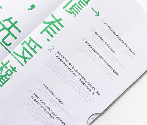
這是一本將台灣的勞動基準法視覺再設計的書籍,團隊將法條中的十二個大章節結合日常物件 屬性,並針對每一條法條再進行繪製與編排,書中使用橘綠兩色分別代表勞工與雇主,並以此 作為閱讀時色彩引導的基礎,再配合版型設定構成畫面,使整體保有規範卻不木訥;在書籍手 感上,使用裸背線裝的方式裝幀,四邊的圓角與鍘刀的設計,更符合讀者在閱讀時翻閱的使用 習慣,同時也更便利查找重點章節
“RELABOR PROJECT” is dedicated to improving the two-way relationship between workers and employers. By redesigning Taiwan's Labor Standards Act, shortening the distance between both parties and the laws, and moving towards a common good.
This is a book that visually redesigns Taiwan's Labor Standards Act. The team combines the twelve major chapters of the law with everyday object attributes, and then illustrates and arranges each article of the law. The book uses orange and green colors to represent workers and employers respectively, serving as a color guide for reading. The layout design complements the visual composition, ensuring that the overall presentation is informative yet not dull. In terms of the book's tactile feel, it is bound using exposed thread sewing, with rounded corners and a bookmark design, which aligns with readers' habits of flipping through pages while reading and facilitates locating key chapters.



謝恩慈 Hsieh, En-Tzu
劉子愉 Liu, Tzu-Yu
蔡湘富 Tsai, Shiang-Fu

尤芊驊 You, Qian-Hua
張瀞予 Chang, Ching-Yu
指導老師 Instructor
OCEAN HERTZ
郭中元 Kuo, Chung-Yuan
秦安慧 Ching, An-Hui


鯨魚是藍碳循環的重要角色,為傳達來自海洋的聲音,運用超 現實風格的插畫設計,創作與鯨豚、五大洋及全球議題有關的 系列畫報、圖鑑及書籍,作為與大眾溝通的媒介,反思當前全 球氣候異常和海洋生態面臨的威脅與影響,進而傳達鯨豚保育、 全球藍碳危機,在深入了解海洋保育的重要性後,能關注近年的 淨零碳排計劃。
Whales play a pivotal role in the blue carbon cycle by serving as oceanic messengers through surrealistic-style illustrations. They produce a collection of posters, field guides, and books that revolve around whales, dolphins, the five oceans, and global concerns. These creations serve as a means of engaging with the public, encouraging contemplation on the existing global climate anomalies and the perils faced by marine ecosystems. Additionally, their objective is to promote awareness regarding the conservation of whales and dolphins and the global blue carbon crisis. Following a comprehensive understanding of the significance of marine conservation, the focus is directed toward recent endeavors to achieve carbon neutrality.
曹鈞偉 Cao,Jun-Wei
朱興秀 Zhu,Xing-Xiu
張尹禎 Zhang,Yin-Zhen

張馨倪 Zhang,Xin-Ni
許汝婷 Hsu,Ju-Ting
鄭伯漢 Zheng,Bo-Han
BEST PICKLE
指導老師 Instructor
藍偉憲 Lan,Wei-Hsien
陳正桓 Chen,Cheng-Heng

「最佳配角」是本品牌的名稱,命名的理念以醃漬物是成就臺味美食的最佳 配角,其貼近日常卻容易被忽略。我們希望透過重新梳理屬於漬物的臺式美 學,並推廣臺式醃漬物,促使傳統和現代共存為本品牌最宗旨的目標。盤點 出15種,屬於臺灣四個族群,漢人、外省人、原住民、新住民的醃漬物,以 淺嚐式體驗作為設計目標,透過醃漬物視覺可視化、包裝容量再定義與異材 質實驗,三大方向進行設計。
"BEST PICKLE" is the name of the brand. The concept of naming is that pickles are the best supporting role in the achievement of Taiwanese delicacies, which are close to daily life but easy to be ignored. We hope that by reorganizing the Taiwanese aesthetics of pickles and promoting Taiwanese pickles, the most important goal of the brand is to promote the coexistence of tradition and modernity. We have counted 15 kinds of pickles belonging to four ethnic groups in Taiwan: Han Chinese, non Taiwanese, aborigines, and new residents. With the design goal of tasting experience, through visual visualization of pickles, redefinition of packaging capacity and experiments with different materials, three Design in the general direction.


李佳靜 Li, Jia-Jing
蔡亞妤 Tsai, Ya-Yu
黃元芊 Huang, Yuan-Chien

徐敏禎 Hsu, Min-Chen
胡凱竣 Hu, Kai-Jiun
紀博翔 Chi, Bo-Siang
指導老師 Instructor
郭中元 Kuo, Chung-Yuan
秦安慧 Ching, An-Hui
Flow of Dialogue

Design


畢業展覽主題「建立對話框」中,聚焦對話存在於世代裡的各種可能性,透過不同話題的流動,個 體群體間的交疊,建構整個世代的樣貌,從中接收訊息轉化為自我意識,在資訊爆炸的世代中找尋 自我定位。或許,在急著接收訊號前,先嘗試停下腳步,想像與自己開啟一場對話旅程,不被資訊 大浪沖走腳印,找回自己的步調。
In the exhibition theme "Flow of Dialogue" various possibilities of dialogs that exist in the generation are concentrated. The appearance of the entire era is built through the flight of different topics along with the overlapping of individuals and groups. By transforming the received information into self-consciousness, we can position ourselves in the age of big data.Perhaps we do not know what we want, or perhaps we should try to pause the step before receiving signals impatiently. Imagine you have started a journey of self-talk. And find your own pace, do not let the rough sea of information washes away your footprints.
劉婉翎 Liu, Wan-Ling
廖俐淇 Liao, Li-Ci
鄭微霓 Cheng, Wei-Ni

丁勤桓 Ding, Chin-Huan
OM-Institute
指導老師 Instructor
涂以仁 Tu, Yi-Jen


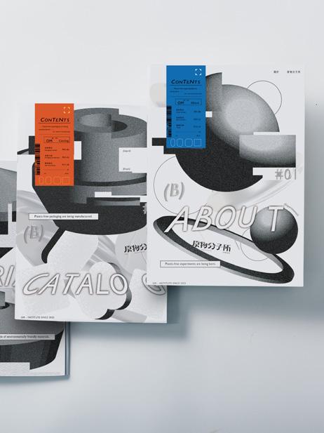
原物分子所為一間實驗性無塑超商,透過取代材質、環保材質再 利用、無塑材質分解形成對環境自然循環,取代超商原有大量塑 類包裝,以扁平回收完全分解達成無塑超商循環概念。
OM-Institute is an experimental plastic-free convenience store. Using material replacement, recycling environmental friendly stuff and decomposing no-plastical material to make natural circulation well.
OM-Institute creation is a substitute for original plastical packaging in store. The flat recycling mold and decomposing completely is the natural circle concept of OM-Institute.
NG_OMG

詹祥棋 Chan,Hsiang-Chi
呂玉慈 Lu,Yu-Ci
蘇育慈 Su,Yu-Tzu
NG_OMG
指導老師 Instructor
張露心 Chang,Lu-Hsin
陳凱翔 Chen,Kai-Hsiang

Brand Design & Identity
NG(NO GOOD)不代表不完美,即使 NG 但我們的人 生還是持續中…
我們以NG隱射各種過度強加的完美。將性別典型特 徵以氣球視覺化,代表各種尺寸都是各自獨立的存在, 沒有唯一標準與完美。生活中的NG 没有實際的對與 錯,更没有所謂絕對的標準;「不夠好」不是壞事, 成就不完美的個人價値,才是我們各個世代的獨特性。
就算錯了又何妨?用會心一笑的方式,讓大家理解不 完美又怎樣學會認同自我、展現自己的獨特性,不在 乎他人眼光才是我們該學習的事。
The word NG , which is frequently used in Asia country, is used to mean "someone or something is not OK." We use NG to imply various over-imposed perfections. The gender typical characteristics of breasts and penis are distinguished by balloons, which means that all sizes exist independently, and there is no single standard and perfection. This project aims to enhance and promote the social inclusion of all, regardless of any distinction.


2022 2022 2022 2022 2022 2022 2022
2022 2022 2022 2022 2022 2022 2022
陳羿伶 Yi-Ling Chen
何欣蓉 Xin-Rong He
陳虹潔 Hong-Jie Chen
陳品羚 Pin-Ling Chen
指導老師 Instructor
Laundry Clinic
秦安慧 An-Hui Ching
黃煒仁 Wei-Jen Huang


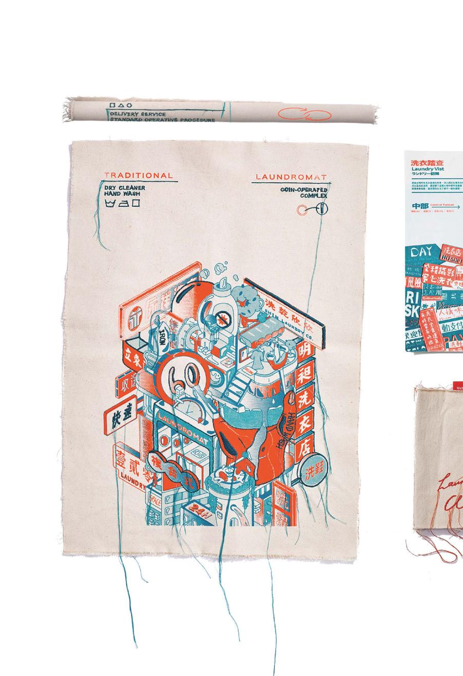
探索五大類洗衣模式,以觸摸實驗的設計手法並簡化日 常生活的洗衣知識與步驟,希望民眾珍視衣物的健康, 讓洗衣之於惜衣融入日常,成為永續時尚的基礎。
We explore the five major methods of doing laundry. This design highlights first-hand experience and the simplification of laundry knowledge and procedures. We hope that the public can treasure their clothing, expressing this sentiment through proper laundry methods that serve as a foundation for sustainable fashion.
馬唯原 Ma,Weu-Yuan
向湘淩 Xiang,Xiang-Ling
陳盈盈 Chen,Ying-Ying

林佳儀 Lin,Jia-Yi
何曉苓 He,Siao-Ling
指導老師 Instructor
郭中元 Chung-Yuan Kuo
秦安慧 An-Hui Ching
ROCK RESEARCH


「與石共生」承載著臺灣土地的文化。以拓印、攝影、3D研究「石」的可能性, 實驗設計翻轉石頭既定印象,從產地科普縱谷地貌與石業職人,讓大眾重新認 識花蓮石頭多樣的美。
Symbiosis with Stone tells the story of the culture of Taiwan's geology. Stone rubbings,photography, and 3D imagery are used to research the possibilities of stone, with experimental designs challenging the public's conventional impressions of stone. Through investigations into the Rift Valley from the perspective of popular science and talks with stone artisans, we offer the public a new understanding of the multi-faceted beauty of Hualien stone.


何秀文 Ho, Hsiu-Wen
白貽萱 Bai, Yi-Xuan
謝奕琪 Luo, Yu-Lan

羅毓嵐 Hsieh, Yi-Chi
朱紫綾 Chu, Tzu-Ling
指導老師 Instructor
PILOT PROJECT
郭中元 Kuo, Chung-Yuan
秦安慧 Ching, An-Hui

Corporate Design & Identity


在新世代設計架構中顛覆對生態圈的想像。泳池比喻成校園,潮間帶做為社會, 每個人為當中的生物,畢業浪潮使我們跳脫舒適圈進入未知環境,生態鏈也表現 出在競爭中碰撞變化而生存。畢業浪潮使我們跳脫舒適圈進入未知環境,於是透 過淨灘行動採集海廢,轉化為實驗性的裝置藝術與變異生物,反映生態與人類社 會間影響。採取貼近台灣四面環海的環境,作為策展策略與觀者溝通,並藉由新 世代將視覺語言進化、跨域、實驗性的延伸,從設計角度引導大眾對生態的認知。
A new generation of design architecture looking to subvert our ecosystem of imagination. A swimming pool is likened to a campus, the intertidal zone of a society, with every person an organism within. This graduation is an opportunity to jump out of comfort zones and enter environments unknown; a time to show the continuation of the ecological chain amid the collisions and changes of competition.This graduation is a chance to jump out of comfort zones and enter environments unknown. Garbage collected in beach clean-up activities is refashioned into experimental installation art and mutated creatures to reflect our influence on ecology and vice versa. The marine environment that surrounds Taiwan serves as both a curatorial strategy and a medium of communication. Through this new generation's evolution of visual language and its extension of inter-disciplinary and experimental work, the public's understanding of ecology is deepened from a design perspective.


黃子杰 Zi-Jie Huang
王奕筑 Yi-Zhu Wang
許明聖 Ming-Sheng Hsu

何佳謙 Jia-Qian He
鄭宇淳 Yu-Cheng Zheng
指導老師 Instructor
藍偉憲 Wei-Hsien Lan
黃煒仁 Wei-Jen Huang
黃庭超 Tyng-Chau Hwang
Feeling Reflection

Posters Publishing & Print
Illustrations


觀落陰是古人探索未知世界及心靈的儀式,如今沒落,我們用符咒、特殊印刷、烤松 香的表現手法,以視覺、嗅覺、觸覺將觀落陰元辰宮的十二關卡,重新賦予新定義, 用豁達角度去看世界不同的樣貌。
Guan Luoyin is an ancient shamanistic ritual used to explore unknown worlds and the mind. We use traditional methods for making Taoist charms, prints, and rosin, as well as the senses of touch, smell, and sight to bring new meaning to the so-called 12 Gates of Yuan Cheng Gong. Doing so, we learn to approach the world’s different aspects with an open mind.
黃子杰 Zi-Jie Huang
王奕筑 Yi-Zhu Wang
許明聖 Ming-Sheng Hsu

何佳謙 Jia-Qian He
鄭宇淳 Yu-Cheng Zheng
SIWEIOLOGY
指導老師 Instructor
宋思明 Sih-Ming Shen
符逸群 Yi-Cyun Fu

Brand Design & Identity



溪尾國小人數不足,發展特色課程以自然為師,渡溪故事之 水課程,鴨稻共生之稻課程,走訪社區之地課程,打破圍牆 結合生態與美學,給予新生祝福「迎新禮」打造溪尾學。
Siwei Elementary School lacks sufficient teachers, thus the development of special courses where nature assumes the role of teacher. The nearby creek teaches about water, rice-duck farming teaches about rice, and community field trips point to local or geographical points of interest. The outdoor courses combine both ecology and aesthetics, offering new students a unique introduction to the school and its environs.
張凱博 Kai-bo Zhang
張家豪 Jia-hao Zhang
陳昀 Yun Chen

鄭丁瑄 Ding-xuan Zheng
黃麒宇 Chi-yu Huang
呂娜 Na Lyu
指導老師 Instructor 嚴月秀 Yuen-hsiu Yen
LIOUGUEI OLD STREET

Brand Design & Identity


六六映像,傳遞六龜想像。
六龜,座落於高雄偏遠山區。在地龜石受風災影響,僅剩一座龜 王岩守護六龜。曾經的林業重鎮、鼎盛的戲院、原住民交易的商 號與日人休憩的旅社已不再紛鬧,六龜光景短短數載,漸漸走進 沒落記憶。我們透過映像設計傳遞在地想像,重現六龜昔日印象。
Liouguei old street,Communicating the Liouguei Imaginings.
Liouguei deep in the mountains of Kaohsiung, Liouguei District is known for its six turtle-shaped outcroppings. Following several typhoons, however, only one “turtle” remains as a guardian of the area.
Liouguei was once an important forestry town, its movie theatre filled with patrons. Today the theatre is nearly empty, while the area’s six protector turtles fade from public memory. Image design is thus used to transmit features of the local imagination and reproduce impressions of the past.
陳珮琦 Chen, Pei-Chi
楊雅淳 Yang, Ya-Chun
溫佳柔 Wen, Jia-Rou

許絜沂 Hsu, Jie-Yi
李承諺 Li, Cheng-Yan
陳楷潔 Chen, Kai-Chieh
SONG KO LA
指導老師 Instructor
楊鼎獻 Yang, Ding-Xian

Brand Design & Identity


透過客家五花積木和印章搭主題地圖及教學書,利用抽 象拼湊的方式,顛覆傳統客語教學方式,畫面感加上聲 音的沉浸式教學讓小朋友從中激發創造力 ,快樂學習並 傳承客家文化。
We leave behind the conventional way of teaching Hakka language to instead use building blocks and seals inspired by the “five flowers of the Hakka”, along with a themed map and textbooks to focus on language acquisition through the assembly of abstract shapes. The immersive nature of the pictures and sounds stimulate children’s creativity and capture their attention as they happily learn about Hakka culture.
吳知罃Wu, Zhi-Ying
楊詠晴Yang, Yong-Qing
溫翎婷Wen, Ling-Ting

江佩娟Jiang, Pei-Juan
朱容慧Jhu, Rong-Huey
陳瓊櫻Chen, Qiong-Ying
指導老師 Instructor 嚴月秀 Yen, Yuen-Hsiu
Snails living in UHI

Brand Design & Identity


熱島效應是城市特有的現象,影響高溫、空汙、降雨與生物圈。將蝸牛轉化為環境變化指標, 預示生物不斷演進,因環境改變其樣貌。自然深受人類影響,希望城市能與環境共存。
A heat island is a phenomenon found in urban centers that effects temperature, air pollution, precipitation, and ecology. Using snails as a marker of environmental change, we see a continued evolution of organisms in the altering of their appearance due to environmental changes. Nature is deeply influenced by humanity, and we hope that urban spaces can come to coexist with natural environments.
湯欣旻 Tang,Xin-Min
陳冠樺 Chen,Guan-Hua
陳品蓁 Chen,Pin-Jen

李妍慧 Lee,Yan-Hui
薛嘉琳 Hsueh,Chia-Lin
葉奕廷 Yeh,Yi-Ting
SoiLover
指導老師 Instructor
宋思明 Song,Szu-Ming
符逸群 Fu,Yi-Chun
張宗舜 Chang,Tsung-Shun
Brand Design & Identity


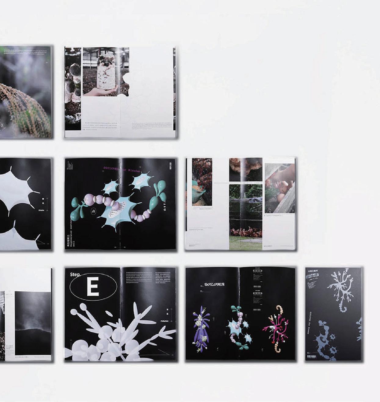
新社香菇佔全台七成,廢棄太空菇包問題嚴重。建立品 牌並與當地居民合作整合三種處理方式,以菇類菌種的 分裂型態做視覺元素並科普處理程序,啟發廢土轉為循 環土壤的新認知。
Mushrooms grown in Xinshe account for 70% of those cultivated in Taiwan. The number of discarded plastic bags used in their cultivation is a serious problem, however. We’ve created a brand to work with locals in integrating the mushrooms’ three processing methods. Through a visual reading of the mushrooms’ growth stages annotated with common scientific concepts, we hope to inspire a new recognition of environmentally friendly soil.


蘇子晴 Su,zu-qing
萬興蕙 Wan,xing-hui
黃琦涵 Huang,qi-han

黃毓文 Huang,yu-wen
李紓緹 Li,shu-ti
朱宇昂 Zhu,yu-ang
TOU DO LAB
指導老師 Instructor
郭中元 Kuo, Chung-Yuan

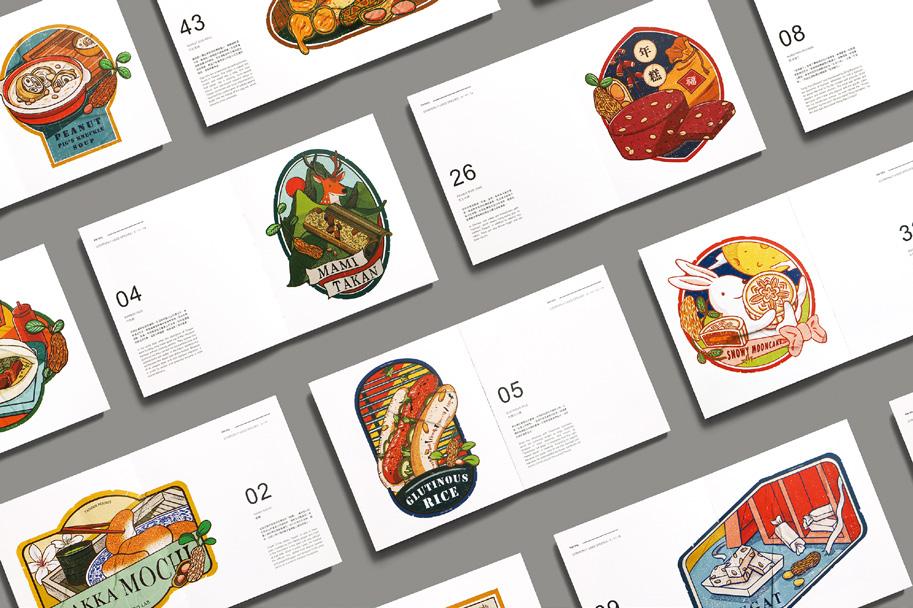


隨著花生農高齡化,產業逐漸沒落,未來將面臨仰賴進口花生的局面,但台灣許多
小吃都運用到本土花生,對於台灣飲食文化來說它是不可或缺的一部分,以此為出 發點,成立頭島花生會社來專研台灣花生,傳遞本土花生對台灣的重要,並實驗花 生殼循環應用的可能性。
As peanut farmers in Taiwan are aging, the peanut industry is gradually declining. In the future, Taiwan will face a situation where it relies on imported peanuts. However, many Taiwanese snacks use locally grown peanuts, which are an indispensable part of Taiwan's culinary culture. With this in mind, the Toudao Peanut Cooperative was established to specialize in researching Taiwanese peanuts and to emphasize the importance of local peanuts to Taiwan. Additionally, the cooperative aims to explore the possibilities of recycling peanut shells.


吳欣庭 Wu,xin-ting
陳子琇 Chen,zi-xiu

指導老師 Instructor
Herb- Future
宋思明 Song,Szu-Ming
符逸群 Fu,Yi-Chun
黃煒仁 Huang, Wei-Jen


傳承古人智慧保健飲品,盤點青草文化脈絡,將傳統健
康智慧結合現代程式語言設計,以互動手法來探索青草 知識,翻轉傳統打造趣味樣式,成立青草品牌重新與年 輕人對話。
Preserving Ancient Wisdom in Healthful Herbal Beverages, Unveiling the Tapestry of Herbal Culture, Fusing Traditional Health Insights with Modern Programming Language Design to Explore Herbal Knowledge through Interactive Means, and Revitalizing Tradition to Craft Engaging Styles, Establishing an Herbal Brand for a Fresh Dialogue with the Youth.
2021 2021 2021 2021 2021 2021 2021
2021 2021 2021 2021 2021 2021 2021
梁潔宜 Ling, Jie-Yi
林奕廷 Lin, I-Ting
任芒甄 Jen, Li-Chen


游孟庭 You,Meng-Ting
盧萱穎 Lu,Syuna-Ying
指導老師 Instructor 楊鼎献 Yang, Ding-Sian
Knowing Our Land And


「平淡最真、自然最美」圍繞在我們日常周遭的自然景色,看似平淡無奇, 卻是最純粹的美好。好比土壤,帶給萬物生機,孕育各種植株,是大地之 母賞賜給我們的禮物。提倡台灣大地文化,帶領大家從認識自己的家鄉開 始,親自走訪北、中、南、東部,採集全台8種土壤以研磨、濾篩、打 粉等程序,成為可繪製的媒材。用最原始的材料來添加美感,呈現獨一無 二的藝術,貼近大自然的創作。透過此作品鼓勵大眾,能在閒暇時親身體 會大自然所帶給人類的美妙之處,進而更加珍惜這些所謂日常,卻不平凡 的大地面貌。
"The more natural is, the more beautiful it will be”. It is the nature of scenery which around our surroundings every day, it seems bored, but it is the purest gift. Just Like the soil, we can see it all the time, and think it's useless, but it brings vitality to all the living things, breeds various plants, is the blessing of the earth.
To advocate the Earth Culture of Taiwan, we will start with leading you to recognize your hometown and bring you to visit eight regions in the north, middle, South, and East in person. Collecting 8 kinds of soil in Taiwan to grind, filter, powder, and other procedures become a media that can be drawn. With the most original materials to enhance beauty, present a unique art, and close to the creation of nature. Encouraging the masses via this masterpiece, be able to personally experience the beauty of nature in their free time, and not take it for granted even if it looks ordinary.
夏友慈 Shia, You-Cig
楊蕙綺 Yang, Wei-Ce

曾筱婷 Zeng,Xiao-Ting
洪明萱 Huang, Ming-Hsuan
Naturally
指導老師 Instructor
秦安慧 Ching, An-Hui
黃煒仁 Huang, Wei-Jen

Illustrations
Packaging Design


化學農藥殘留往往引發誤食、誤傷的事件,長期施用也會讓田間的生態失去平衡, 導致民眾對農藥有負面印象。生物費洛蒙是農藥問題的解方之一,它的優點是可以 減少蟲害發生也能維護生態平衡。我們探訪有機市集、農藥行及專門研究費洛蒙的 研究室 - 農業毒物試驗所,與農民及專家對話,希望觀者能因作品而對台灣土地有更 深的了解。
我們設計了12 款針對蛾類害蟲的費洛蒙捕蟲器包裝,紙器結構與圖樣,發想於蛾類 翅膀的花紋,並且使用環保紙張與油墨降低田間的污染,希望以設計的力量讓默默 為台灣土地盡力的辛苦結晶被看見。
Pesticide residue frequently causes event for eating by mistake and accidental injury.Longterm use of pesticide causes not only ecology in the field out of balance but negative public impression.Biological pheromones is one of the solution to pesticide residuce ,its advantages are pest control and maintaining ecological balance.We have had a conversation with experts and farmers by visiting farmer's markets,pesticide shops research office specializing in pheromones called Agricultural Chemicals and Toxic Substances Research Institute. We hope that visitors can gain an insight into our mainland by the work.We 'be designed twelve kinds of packing,packing structure and patterns of pheromones insect-traps for the moth pests, and its design concept is from the moths wings patterns.
Moreover, we reduce farmland pollution by recycled paper and soy ink, hoping that we can step closer to putting our original intention of land friendly into practice by ameliorating the pesticide polluction from the perspective of packaging design.
徐盈米 Xu,Ying-Mi
周葦亭 Chou, Wei-Ting
黃乙晴 Huang, Yi-Qing

莊佑聆 Chuang, Yu-Ling
陳芷寧 Chen, Chih-Nin
王妙華 Wang, Mio-Hua
指導老師 Instructor
蔡昌吉 Tsai, Chang-Chi
楊少鈞 Yang, Shao-Chun
PITAYA ART MUSEUM

Brand Design & Identity

在台灣,位於臺中西北部,地處於大甲和后里之間,大多數的人對於外埔的印象較為薄弱,每個 地方都有獨屬於自己的土地個性,於大地中所產生的人文故事都是其個性的來源,人們印象中大 甲有鎮瀾宮、后里有馬場,反觀外埔會有什麼呢?
眾多新鮮作物中以火龍果最為突出,60日所成就的一顆顆飽滿成熟的果實,我們以此來增加外地 對此的形象記憶,提出與外埔形象連結的赤美術館,將火龍果藝術化,以攝影和結構訴說火龍果 的生長過程與赤色大地上的人文故事。將赤美術館展品以及攝影作品收錄於年鑑中,並設計火龍 果結構門票,透過手作體驗瞭解火龍果。因應疫情與資訊化時代製作網站供人線上參觀,並透過 與火龍果的美感交流來看見外埔。
Waipu is a rural district in northwest of Taichung City, Taiwan. It’s an obscure place and may leave less impression on the tourists’ mind. However, every place has its own specialty. The stories from the generations there brought out the unique stories of the land. When speak of Dajia and Houli, people think of Zhenlan temple and horse ranch. How about Waipu?
From all the crops that are produced at Waipu, Pitaya stands out from it. It takes 60 days for Pitaya flower to reach harvest. We decide to make Pitaya as the symbol of Waipu to make the deeper impression in the mind of everyone. We create The Pitaya Art Museum. In the museum, we use photography and the shape of Pitaya to teach visitors the cultivation of it and combine it with the stories of Waipu. People can find the exhibits and photography collections in the yearbook. We also use the different shapes of Pitaya at each growth stage to create 3D pop-up tickets. Visitors can also join the workshop to get to know more about Pitaya. In response to the epidemic and the era of Internet, we make a website for people to visit the Pitaya Art Museum virtually. After the visit, they will love Waipu through the aesthetic of Pitaya.


江昱鴻Chiang, Yu-Hun
劉浩緯Liu,Hao-Wei
傅珮欣Fu, Pei-Xin

謝宜芳Xie, Yi-Fang
辛紀元Hsin, Chi-Yuan
陳栢安Chen, Bo-An
指導老師 Instructor
宋思明 Song,Szu-Ming
符逸群 Fu,Yi-Chun
張宗舜 Chang,Tsung-Shun
Tianzhong *Library

Brand Design & Identity


以居民口述記憶與故事,透過「圖書館」分類、編制索書號、轉譯 並編輯成冊,舉辦活動提供「讀者」借閱書籍認識田中,使人人都 能成為館內藏書的作者,共同建立田中*圖書館。
The library sorts, compiles request numbers, translates, and edits books from residents' oral memories and stories, and organizes events for readers to borrow books and learn about Tianzhong, so that everyone can become the author of the library's books and build the Tianzhong* Library together.


UTUX

陳明欣 Chen, Ming-Xin
曾禹瑄 Zeng, Yu-Syuan
鄭欣蓓 Jheng, Sin-Bei
指導老師 Instructor
宋思明 Sung, Szu-Ming
符逸群 Fu, Yi-Chun
涂以仁 Tu, Yi-Ren
UTUX, KITCHEN

Brand
Design & Identity


“原物”是推廣台灣原住民農作植物的品牌,以羅氏鹽膚木、壺底油、川中米及樹豆去 取代澱粉、蛋白質與調味,並利用解決大量進口的問題去創造部落經濟支撐的方法。保 留原有的菱形紋轉化出40種圖騰語彙,以真空包裝的方式取代既往的部落形象,傳承 文化保存的價值,冀望原民物能夠在生態、生計與生活上達到共生共好。
"Utux Kitchen" is a brand that promotes the agricultural plants of Taiwan's aboriginal people. It replaces starch, protein, and flavoring with Roxburgh Sumac, black bean soy sauce, Kawanaka rice, and pigeon peas, creating tribal economic support by solving the problem of massive imports.40 totem vocabularies have been converted through retaining the original diamond pattern, and the value of cultural preservation is inherited by replacing the previous tribal impression with vacuum packaging. It is hoped that the aboriginal people can achieve symbiosis in ecology, livelihood, and lifestyle.
陳絡婷Chen, Luo-Ting
林佳瑩Lin, Jia-Ying
王馨培Wang, Xin-Pei

胡可英Hu, Ke-Ying
詹于萱Zhan, Yu-Xuan
吳庭瑜Wu, Ting-Yu
指導老師 Instructor
Beans Promote
藍偉憲Lan, Wei-Hsien

Packaging Design
Publishing & Print Media


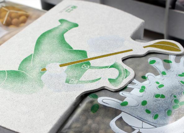


台灣糧食九成仰賴進口,導致台灣本土豆類種植面積日益減少,想讓國人願意主動 了解台灣豆益處並用行動支持台灣豆,我們走訪台灣南部的豆田,暸解其種植過程 後,創造出豆研所這個品牌概念,透過包裝及視覺設計做為推廣媒介,以豆子飽滿 圓潤的形態繪製豆農,並結合地方特色,將UV Inkjet Printing的技術應用在具有防 水、耐揉、撕不破的泰維克紙上,設計出具有地方特色可重複使用的包裝容器,同 時將互動媒體結合在包裝上,藉由圖像與互動資訊做傳達,在挑選前暸解產品的源 頭,進而改善市場舊式包裝並塑造鮮明的小農形象。
Taiwan imports 90 percent of its grain, causing a decline in areas under legume cultivation. We visited bean fields in southern Taiwan to learn the growing process and created Soy Milk Room, a brand concept, hoping that Taiwanese people understand and support the benefits of Taiwan beans. Using packaging and visual design, we drew farmers with round beans and applied UV inkjet printing on waterproof, kneading-resistant, and tearproof Tyvek papers to design reusable containers with local features. We also integrated interactive media, conveying that knowing the products’ origin before selection improves the old packaging and visualizes smallholder farmers.
葉嬝竺Ye, Man-Zhu
吳珮榕Wu, Pei-Rong
林亨澤Lin, Heng-Ze

蔡學富Cai, Xue-Fu
指導老師 Instructor
郭中元Kuo, Chung-Yuan
DOU YAN Gallery

Brand Design & Identity


鬥豔藝廊是一場美學設計實驗,也是由一群喜愛 鬥魚的人共同創造的品牌,源於長期養殖鬥魚的 經驗,承載著知識與對鬥魚之美的追求,開啟了 實驗之路。
我們觀察鬥魚型態特徵,進而展開研 究與設計,過程涵蓋生態的養殖觀察及仿生,用 專刊、影像紀錄實驗過程,解構鬥魚,衍伸出色 研系統,並以仿生流線型設計發想妝感及妝品, 視覺透過書刊與主視覺海報傳遞鬥魚之美,並介 紹鬥豔品牌故事,製作動態時尚影片,以布料編 織構成色票,用不同方式投射鬥魚的曼妙,使觀 者自行解讀進而反思,激發內心對於美的追求, 並帶給大眾一場視覺與心靈上的饗宴。
DOU YAN GALLERY is an experiment in aesthetic design and a brand created by a group of betta lovers. It originates from the long-term experience of breeding bettas, carries the knowledge and pursuit of bettas' beauty, and opens an experimental journey. We observe the bettas' morphological characteristics and then carry out research and design, including ecological breeding observation and bionics. We record the experimental process with monographs and images, deconstruct the bettas, generate color research systems, and design makeup looks and cosmetics with bionic streamline. Through books, periodicals, and primary vision posters, we convey the beauty of bettas, introduce the brand's story, produce dynamic fashion films, and make swatch cards with woven fabric, projecting the grace of bettas for viewers to interpret and reflect on their own, stimulating their inner pursuit of beauty, and providing the public with a visual and spiritual feast.

SEE YO


林怡萱Lin, Yi-Xuan
張雅淳Zhang, Ya-Chun
張瑋倢Chang, Wei-Chieh
謝昀庭Hsieh, Yun-Ting
陳曉崟Chen, Xiao-Yun
指導老師 Instructor
楊鼎猷Yang, Ding-Sian


SEE YO及LOGO含意是因為台南麻豆的名稱來自於西拉雅語,有眼睛、 樞紐的意思,也呼應著希望不同品種的柚子及讓這個果園的品牌能被更多 人看見。我們以油胞為主要構圖紋理,創建四種品種的油胞排列組合,以 氣泡紙藝術呈現油胞特性。專題主軸為柚園創新再造品牌,打造出小家庭 及年輕族群的少量送禮包裝,材質選取有防撞效果的氣泡布。我們在台南 麻豆找了一個柚園,因為他們沒有基本的品牌識別,與他家相比辨識度明
顯不足,我們想透過設計提升果園品牌知名度。增加網路行銷方式推廣柚 子,讓更多消費者進而了解柚子的品種差異、營養及功效。
SEE YO is inspired by Madou, a township famous for its pomelos in Tainan. “Madou” originally comes from Silaya languages and stands for the meaning of eyes and hub. Therefore, via the project, we want the orchard to be rebranded with new life and various pomelos to be seen.We took four different arrangement of oil cells as crucial references to create four various combination and used bubble paper art to present the idea. Re-branding and innovating the pomelo orchard is the mission of the project.It create a decent and delicate packaging for young generations and nuclear families.The concept of new packaging is made of anti-collision.We cooperated with a pomelo orchard in Madou, Tainan.Because they have no significant brand recognition. Via the design, we want to improve the brand awareness.We set a website for digital marketing not only for promotion but also for educating the public to know the nutrition of pomelo and how it can be used in daily life.
Brand Design & Identity
楊凱婷Yang, Kai-Ting
戴言錚Dai, Yan-Zheng尤
玨晰Yu, Chueh-Hsi

許凱翔Xu, Kai-Xiang
陳亭妍Chen, Ting-Yen
陳桂琳Chen, Guei-Lin
指導老師 Instructor
黃庭超Huang, Tyng-Chau
涂以仁Tu, Yi-Ren
Winds of September

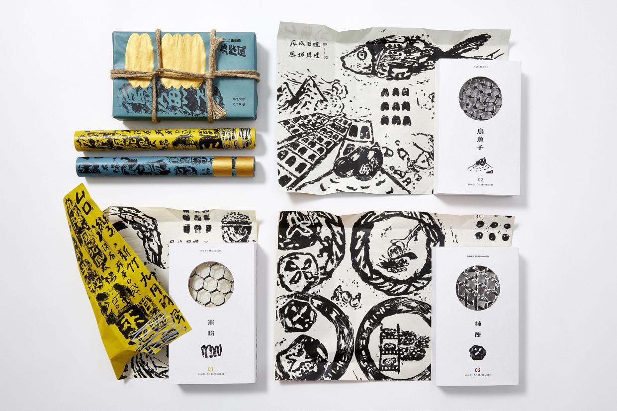
九降風為新竹的東北季風,由於地理位置吹來的 風乾燥且強勁,這陣風造就在地米粉、柿餅、烏 魚子的發展,依靠自然製成的產物擁有機器無法 取代的香氣及口感,運用曬網元素和手感拓印來 詮釋產物與風的故事,使人更清楚兩者之間密不 可分的關係,並融入當地環境、製作過程的圖樣, 讓九降風和產物用包裝來傳達。
The Winds of September is the northeast monsoon in Hsinchu, Taiwan. The dry and fierce wind made the rice vermicelli , dried persimmons, and mullet roe. Because of the naturally handmade process , they have the aromas and tastes that can’t be replaced by the machines. Hence, we incorporate the local environment and the patterns of the productive process in the packaging.The packaging with the elements of net and manual rubbing to interpret the story of these delicious food and the wind of September, make people learn the inseparable relation between these two.


陳奕彤 Chen, Yi-tong
王欣悅 Wang, Xin-yue
郭子皓 Guo, Zi-hao

林思妤 Lin, Si-yu
劉有威 Liu, You-wei
孫欣怡 Sun, Xin-yi
指導老師 Instructor
#White INDEX
涂以仁Tu, Yi-Ren
宋思明 Sung, Szu-Ming

Brand Design & Identity


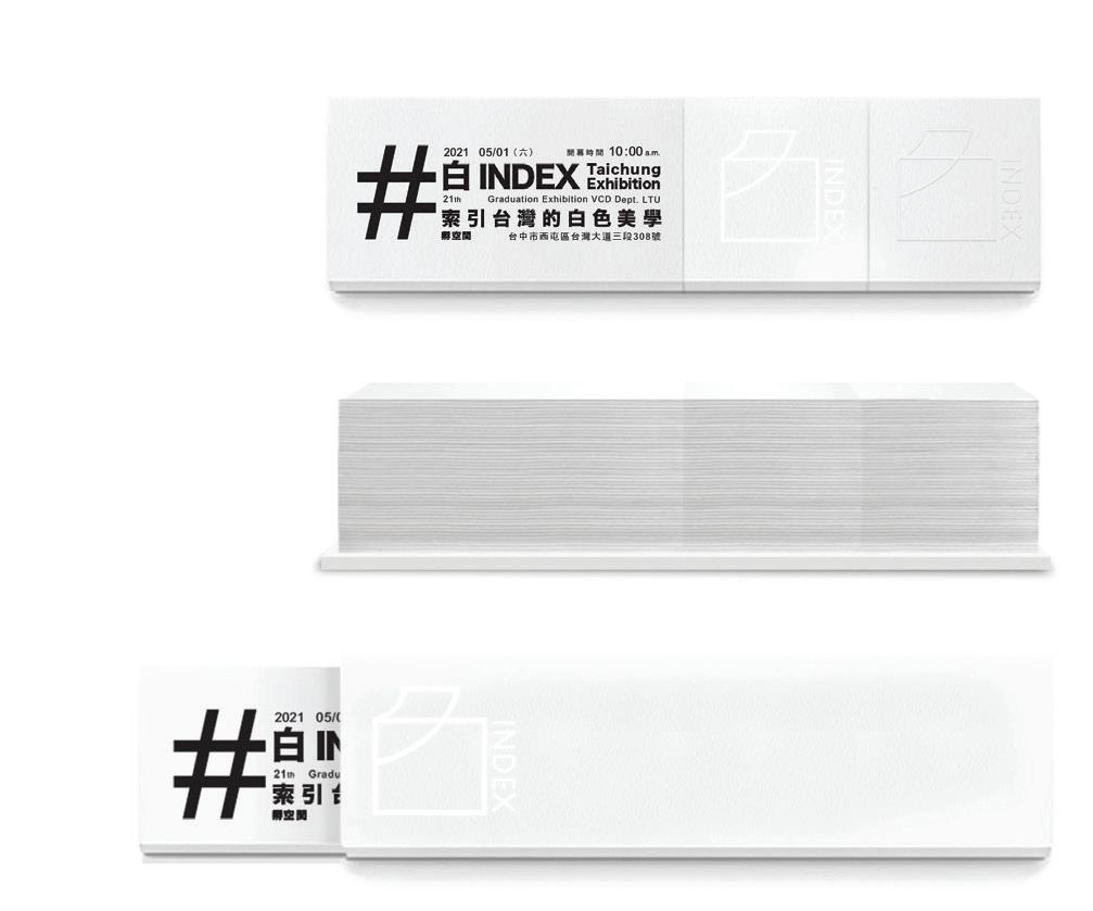

「白」的本質,透過媒介傳遞視與觸覺的感受,呈現白所展現
的生命意識與文化軌跡,並訴說著與台灣個產業以「白」為本 的連結,農業、食物、文學、電影、藝術、流行文化、民俗活動、 文化論述、建築與都市空間、社會現象、新聞媒體等,都是以 象徵結構具象化問題意識的文化文本。
索引台灣白色美學,連結紙張與設計間的想像對白。
The essence of "White" conveys visual and tactile feelings through the media, presents the life consciousness and cultural trajectory, and tells the "white"-based connection with industries on Taiwan, such as agriculture, food, literature, movies, art, popular culture, folk activities, cultural discourse, architecture and urban space, social phenomena, news media, etc., are all cultural texts that concretize problem consciousness with symbolic structures.
Index the white aesthetics of Taiwan, creating the imaginary dialogue between paper and design.
曾定澤 Zeng, Ding-ze
莊怡芳 Zhuang, Yi-fang
廖彥輔 Liao, Yan-fu

胡楷恩 Hu, Kai-en
陳柏叡 Chen, Bo-rui
指導老師 Instructor
張露心 Chang, Lu-Hsin
陳凱翔 Chen, Kai-Hsiang
you are who you are

Design & Identity
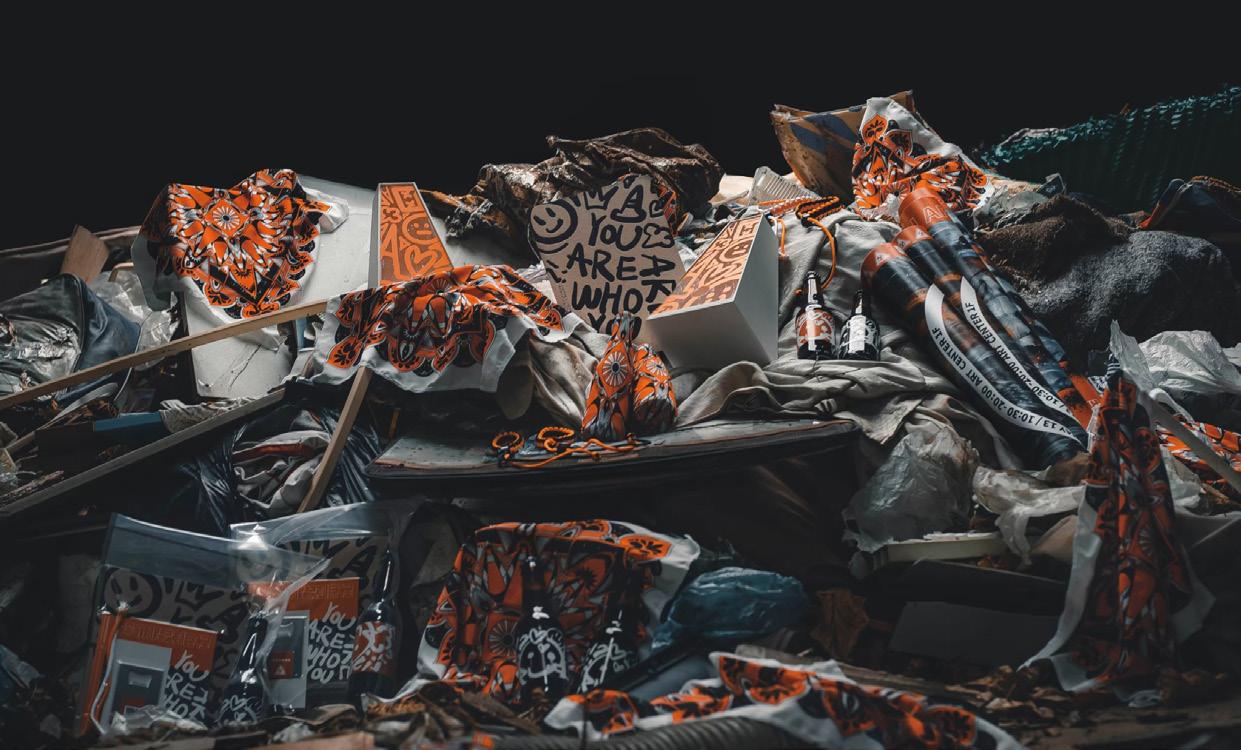
當劇變環境碰上混沌青春,這 樣成長的狀況下,我們會是甚 麼模樣?「我是誰?」是每人 都曾向內心提出過的疑問,是 成長中必須正視和處理的問 題,也是尋找自我的起點;嘗 試回顧過往經驗,叛逆青春固 然是一個人的蛻變期,九十後 正是這個獨特環境下的「產 物」,在時代洪流中勇於挑戰 權利與自我成長的一群人。
What will we look like when the dramatic environment encounters chaotic youth and grows like this? “Who am I?” Everyone has raised questions in their heart, the problem that must be addressed and dealt with in growth, and the starting point of finding oneself. Try to recall past experience that rebellious youth is certainly a person's metamorphosis period, and the post-90s is the "product" in this unique environment. In the torrent of the times, a group of people bravely challenged their rights and self-growth.


陳夢Chen, Ting
林怡瑄Lin, I-Hsuan
廖唯霖Liao, Wei-Lin

楊恩瑞Yang, Ee-Jui
李宜謙Li, Yi-Qian
吳沛軒Wu, Pei-Hsuan
指導老師 Instructor
藍偉憲Lan, Wei-Hsien
黃煒仁Huang, Wei-Jen
Slowly Formosa


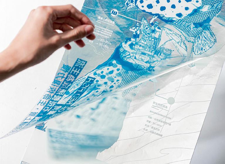
海報呈現魚種真實樣貌,以銀箔襯托魚鱗光澤、透明片加海洋 通透感,插畫構圖重現魚種餐桌回到海洋的過程,並至各地市 場向消費者述說鱼種背後故事,將永續海洋的知識循環帶入消 費端,建立消費者與魚之間溝通的橋梁。
The poster design presents the true appearance of the fish species. The design uses silver foil to set off the luster of the fish scales and the transparency of the ocean through the clear acetate sheets. The composition reproduces the process of returning the dining table to the ocean and tell the story behind the fish species. The purpose is to influence consumer perception and change the current situation of marine resources.
楊昕玫Yang, Hsin-Mei
周宸瑋Zhou, Chen-Wei
林維安Lin, Wei-An

林育萱Lin, Yu-Shiuan
劉冠伶Liu, Guan-Ling
蘇珈文Su, Chia-Wen
指導老師 Instructor
藍偉憲Lan, Wei-Hsien
楊少鈞Yang, Shao-Chun
The Pieces of Life


「螺鈿」為即將失傳的貝殼鑲嵌工藝。透過現代印刷將螺鈿與異材質做連結, 重新 繪製吉祥圖樣, 以禮金袋、工序體驗賀卡保留工藝祝福與贈予的傳統,使螺鈿以創 新方式帶入生活。
Raden which is a traditional craft technique of shell inlay. However the technology is going to lose. We use modern printing technology to connect raden with different materials. And reinterpreting the auspicious patterns, using plastic shell pieces inlaid in gift bags and greeting cards, retaining the tradition of blessings and gifts, so that Raden can be a new Way into life.
