TFO LIO
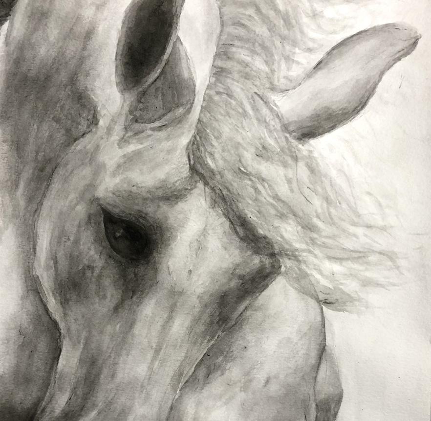
KORANDO SELECTED WORKS2022
POR
KYLEE
Hello! I am a deeply passionate student in architecture, currently in my junior year at the University of Illinois at Urbana-Champaign. I have loved exploring more of architecture, particularly in this last semester of study. Although I think I have learned a lot in the classroom setting, I am excited to explore the profession in the field, for real projects and real people. I know I have a lot to learn, and am willing to put as much effort into this next chapter as I can. Thank you for reviewing my portfolio.

618-559-4969


2
Architecture Student at the University of Illinois Urbana-Champaign
Kylee Korando
kkorando18@gmail.com RESUME
RESUME EDUCATION
Architectural Intern Lunsford Architects, Inc.
Intern Champaign County Realty
Assistant Stage Manager Southern Illinois Music Festival
June 2022 - August 2022
3 Months
August 2020 - Sept. 2021
13 Months
June 2017, 18, 19, 21
4 months
University of Illinois Urbana-Champaign Bachelors in Architectural Studies
Carbondale Community High School
May 2024
AWARDS
Earl Prize Nominee
SOFTWARE SKILLS
AUTOCAD REVIT
May 2020
Fall 2022
RHINO ADOBE INDESIGN
ADOBE ILLUSTRATOR ADOBE PHOTOSHOP
Portfolio 3

4 Temple of Knowledge Fall 2022 Intersect Fall 2022 Flow Spring 2022 01 02 03 TABLE OF CONTENTS
Selected Artwork 2020-2023 06 Portfolio 5 Tiny House Winter 2022 Stew Spring 2023 04 05
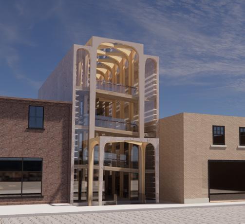
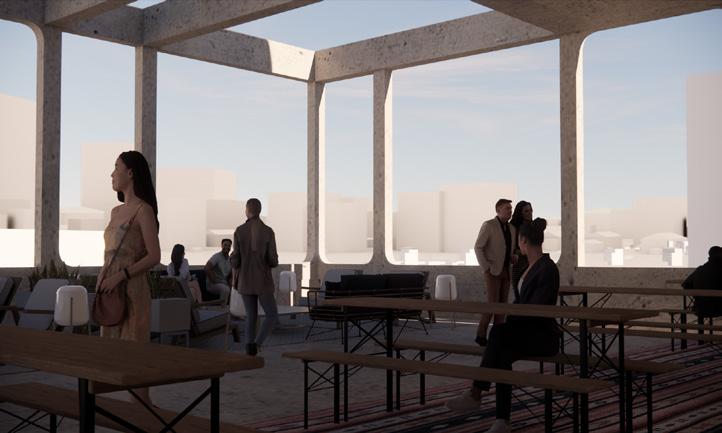
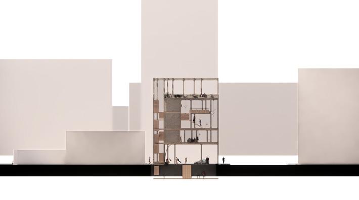
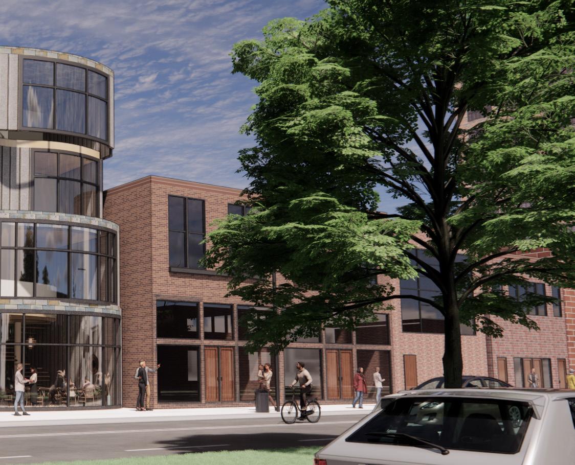
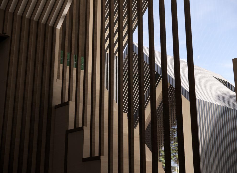
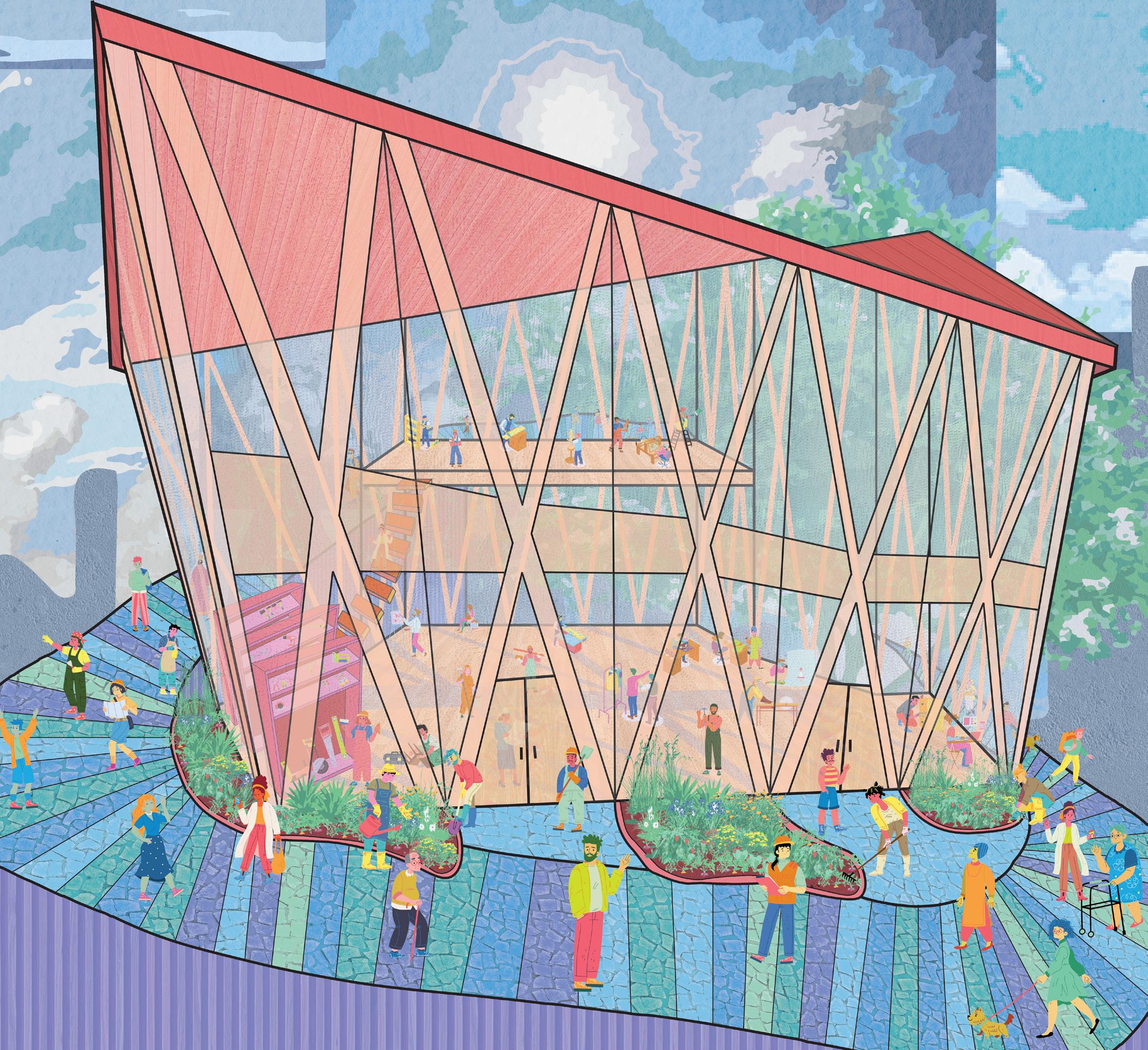
TEMPLE OF KNOWLEDGE BOOKSTORE IN DOWNTOWN CHAMPAIGN, IL 01 /
With the goal of creating a fresh take on the traditional bookstore, The Temple of Knowledge aims higher, reframing the historical and cultural framework of religious temples to focus on knowledge, rather than a given deity. An abstract take on flying buttresses from Gothic architecture store lines of bookshelves and house the ramp system that allows customers to navigate up and around the central atrium space, while also continuing to browse various media sources. The ramp system was also important for the design process, as it incorporated a sense of circumambulation, a common practice in worships of all faiths. However, instead of encircling a religious holy person, place, or object, this design places the focus on the holiness of consuming knowledge. The main concept came from a thought of a reimagined ribbed vault system, which actually is present throughout, although with particular focus in the largest atrium space. As the building continues west, the height steps downward, with a sense of reverence for the original city’s train station. As the ceiling heights become shorter, the spaces become more private, and thoughtful. It was my hope to create a transformative experience, beginning with the awe from the large-scale atrium, aiming high, before moving to smaller group spaces, and ending with a private reflection or reading room, a take on a traditional prayer space. Consumers travel through this space, and with the new knowledge from the books-or other media forms-within, come out with a new perspective.
6

Portfolio 7
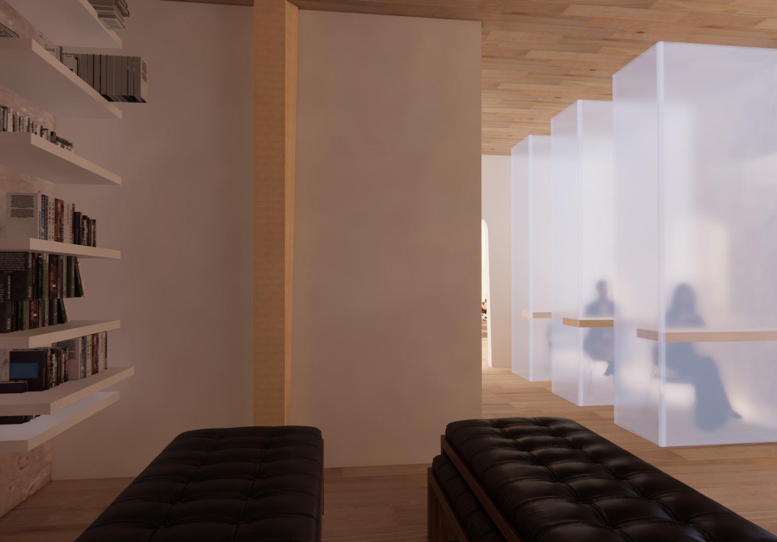
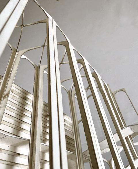
The exterior street view displays the grand entrance and atrium space. The modernized rib vault system can be seen here, as well as the ramp system, lined with bookshelves on the buildings sides.
DIAGRAMS
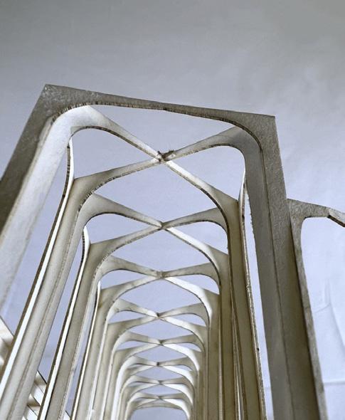
Ribbed vault structures continue overlapping in four structural forms.
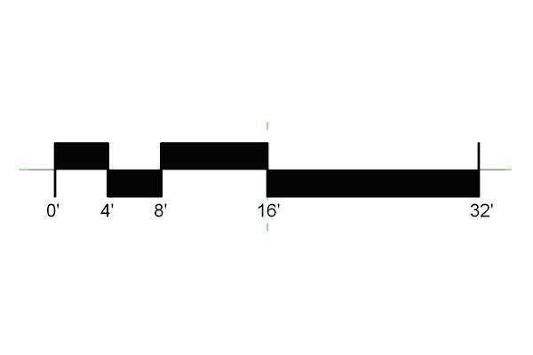
The exterior is comprised of golden ratio forms: 0’, 11’, 22’, 33’, and 55’.
Additionally, it continues with the fibonacci sequence: 0, 1, 1, 2, 3, 5.
Lighting evenly spreads throughout the year, coming from each level.
SECTIONS AND ELEVATIONS
8
1 0 1 2 3 5 5 5 5 15.5’-0” 25’-0” 1 2 3 5 0 1 0 1 2 3 5 5 5 5 15.5’-0” 25’-0” 1 2 3 5 0 Summer Solstice Winter Solstice Angle Incidence: 26.46 Natural Lighting Diagram
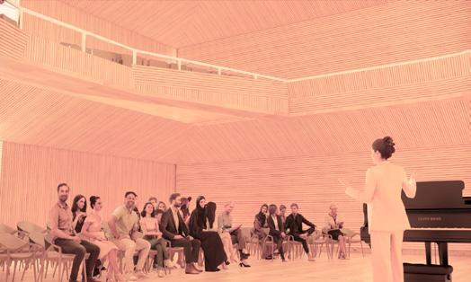
ENTRANCE
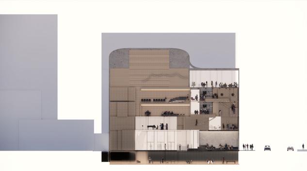
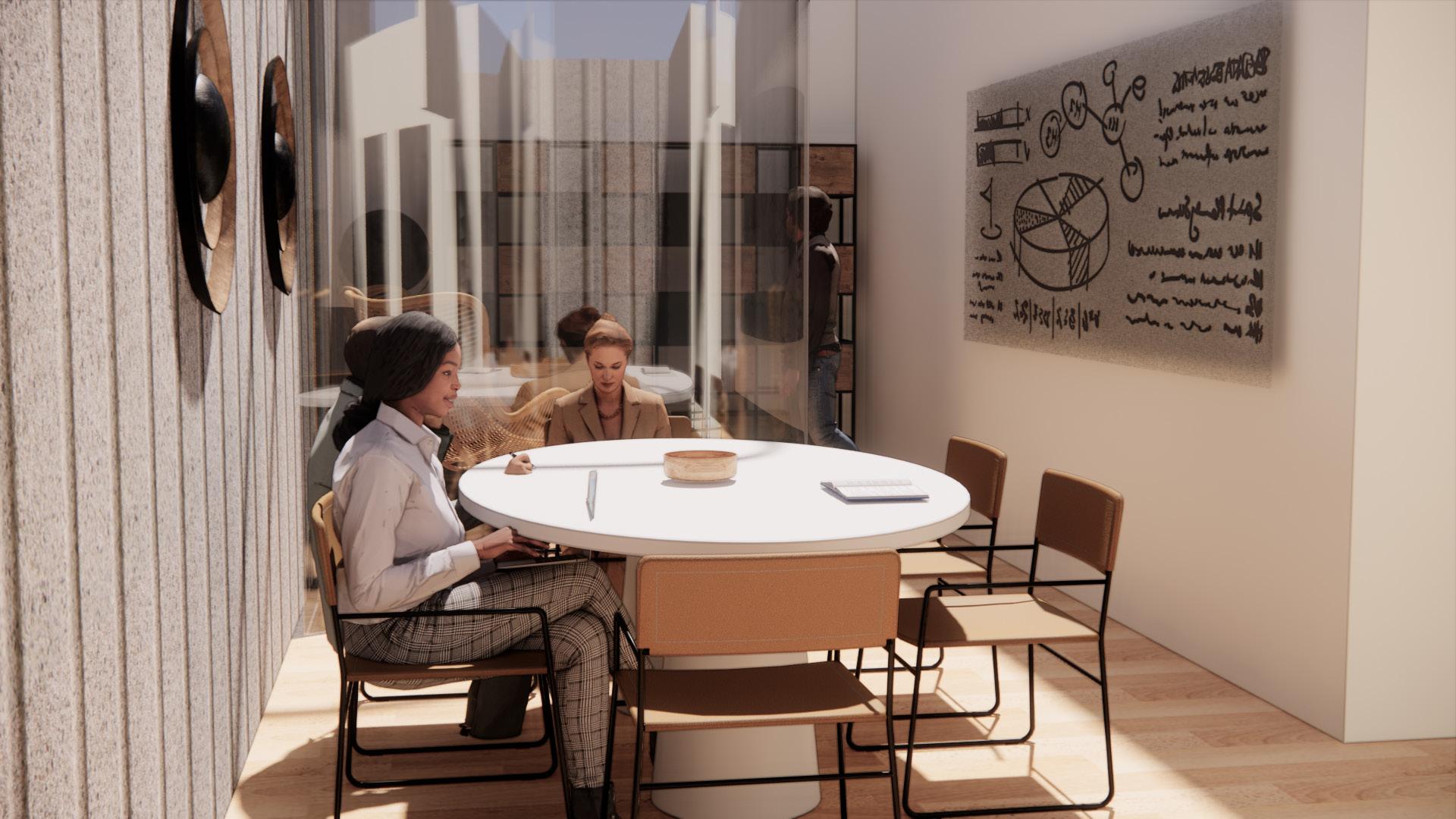
Upon entrance, the users of the space are greeted in an enormous, 55’ tall atrium space. On the main floor of the space, there is a space for purchase, as well as display tables for various reading material. Looking up, they would be able to see the adapted ribbed vault system, as well as three platform spaces above, where users can interact with the space and the merchandise, at various levels in the atrium.
To the left, users will find a ramp that moves upward, encircling the space, and lined with more display shelves. To the right, they can descend (to account for the 6’ decrease in elevation from the east and west side) into the more private spaces. This choice represents a part of their journey, a continuation of the ascention and descention of their movements.
The movement throught the ramps can be seen clearly in the longitudinal system. Along the ramps are walls of shelves, for flexible usage and storage of media. There are three “floating” floors in the main atrium, each serving a different purpose for users of the space.
LONGITUDINAL SECTION
9
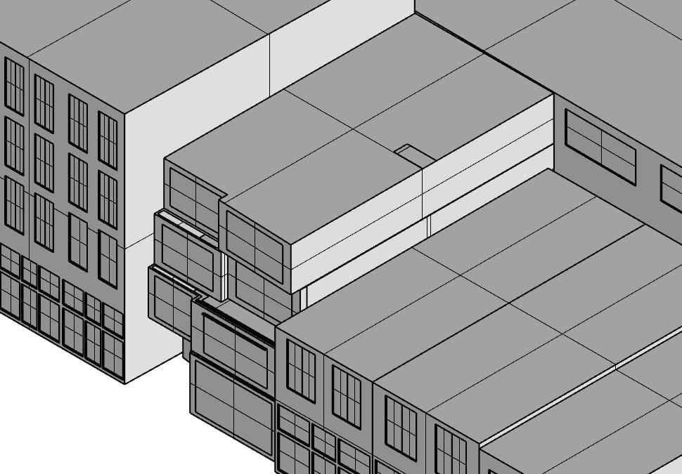
CEILING STRUCTURE
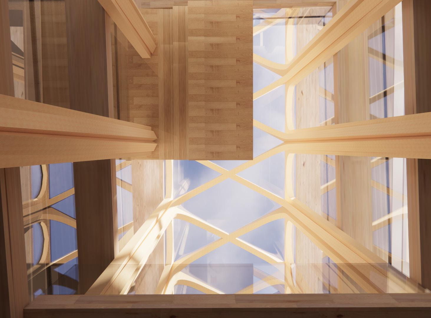
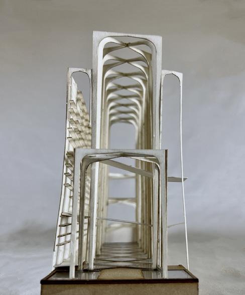
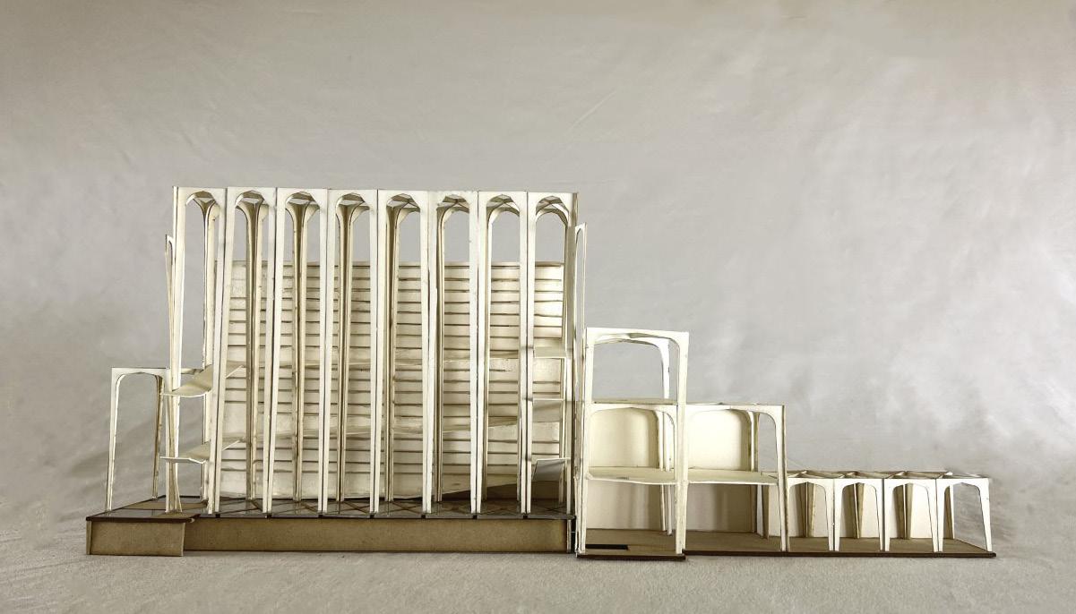
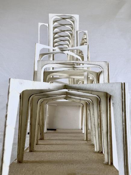
The ribbed vault system creates an organized, divisive strucutral system that is continued, in different forms, throughout the entire structure. Although the width and height of these structures varies, they interlock with each other to provide structural support in interesting and usable ways. Intersections provide opportunities for divisions of space, walls, and therefore do not interrupt space. Instead, it creates them.
The main atrium space is divided in five parts, in a 1:3:1 ratio. The smaller (flying buttresse-esque) forms flank the larger and slightly taller arched forms in the center. The intersection of the center supports with the side supports forms a point of structural support for the ramps moving up the side of the building.
10
FLOOR PLANS
FLOATING PLATFORMS
THIRD FLOOR
SECOND FLOOR
FIRST FLOOR
LOWER LEVEL
Portfolio 11
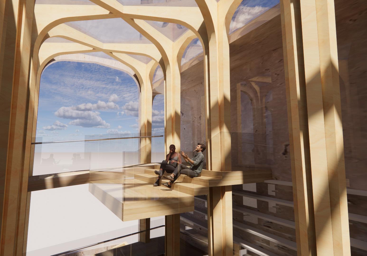
VIEWS
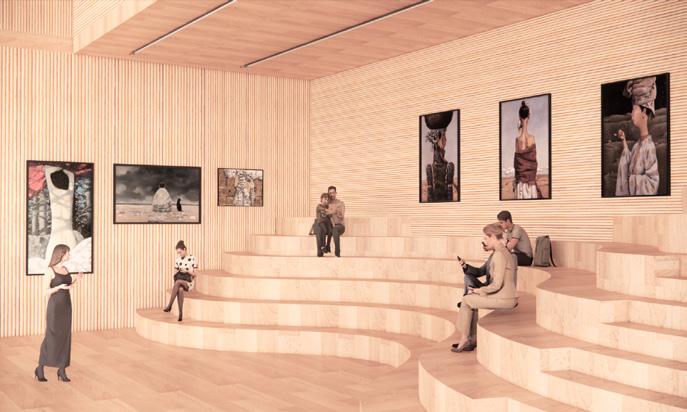
Because of the height that the main atrium provides, there are a lot of views that this space can provide for users. As one ascends, they can see people working up from below, and also are able to see the framing structure above.
Here, the cashier desk is able to be seen, as well as one of the lower levels of the ramp. It ascends quite slowly, which made it difficult to design around to make usable space. However, placing this desk here made it usable as a storage space for employees.
One of the floating platforms can be seen here, this being the tallest one. The end of this platform represents the highest point of the ramps. This space could be used as a gathering area for users, or also for special visitors/speakers, as assigned by the bookstore owners.

12
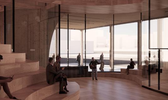
As one of the more private areas, this back space allows for individual study or work areas, as well as a serene space, as shown. Behind this wall are group work booths, where groups can gather together in smaller groups, with friends.
The “Temple Room” was one of the first concepts in the design process for this project. Intended to resemble a chapel space, on a smaller scale, this space is meant for reflection and reading, before the eventual exit through these doors.

Portfolio 13
PHYSICAL MODEL
Iterations of physical models were helpful to the design process, particularly with regards to the elevation decline from the east to the west and with placement of the varying forms of the ribbed vault structural system. It made it easier to visualize how the different ‘pieces’ fit together, and inspired a more chesive thought process as to how to incorporate the transitions between these different architectural steps.
14
Portfolio 15
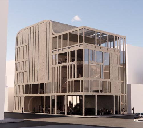
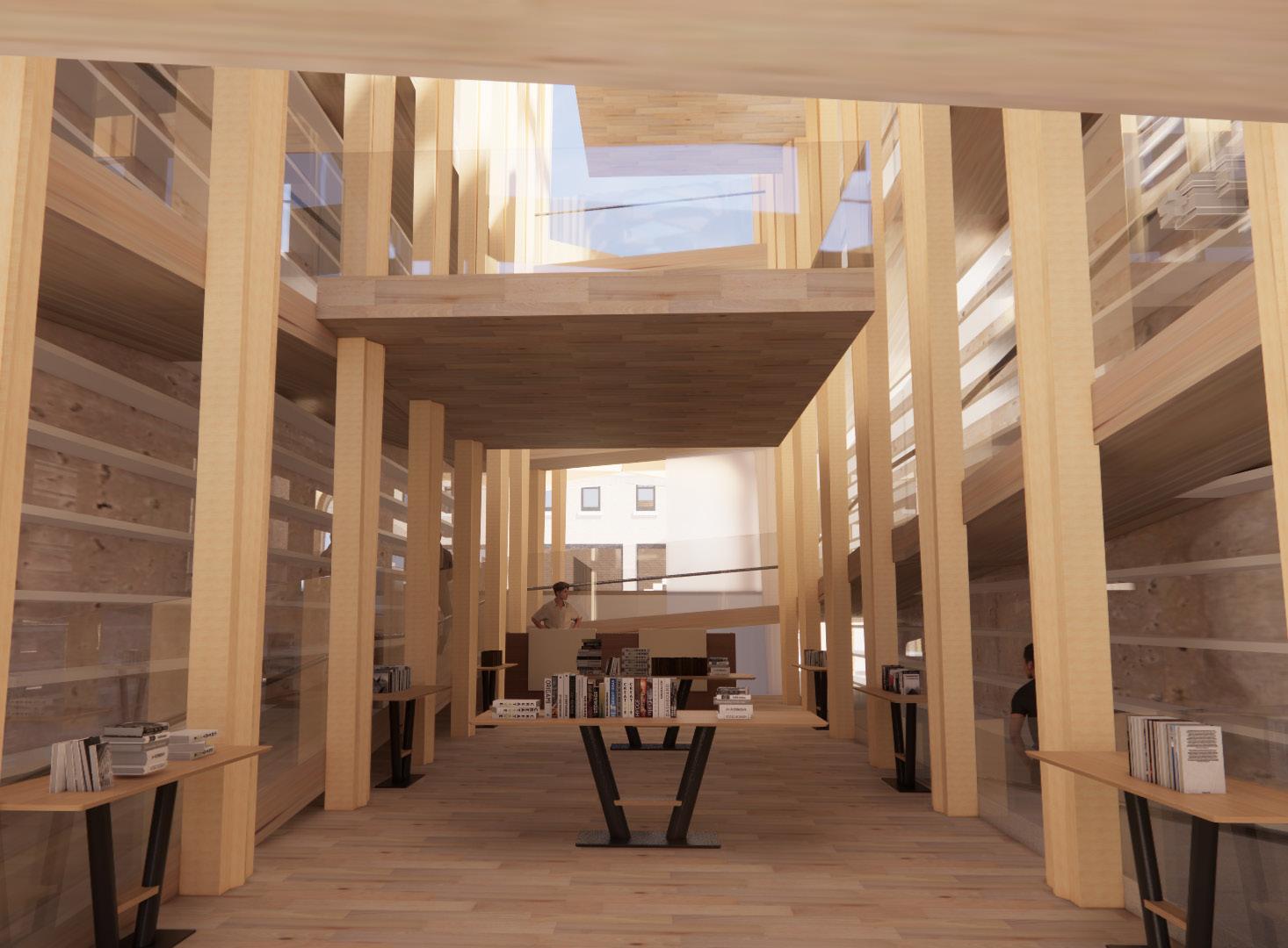
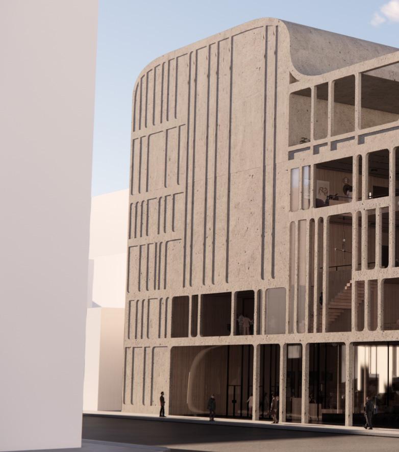
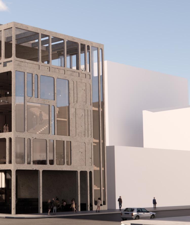
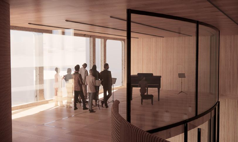
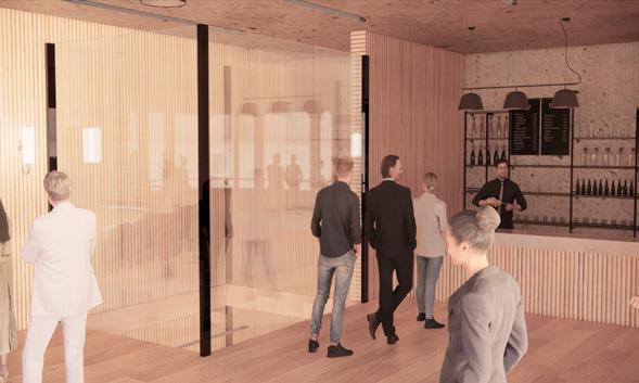
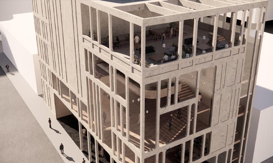
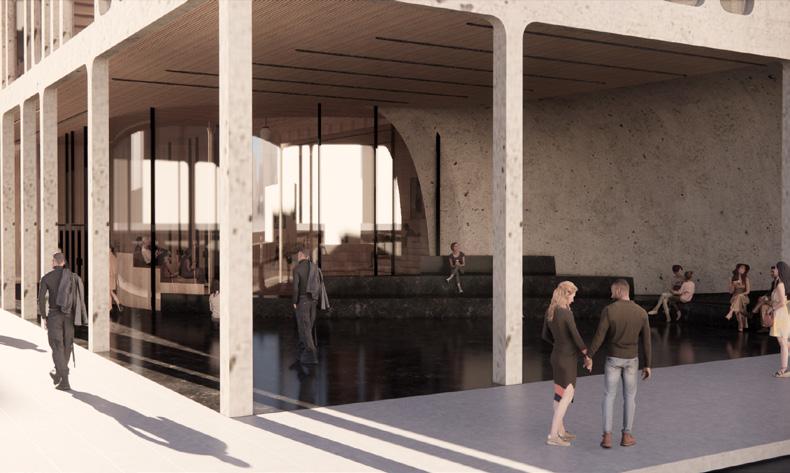
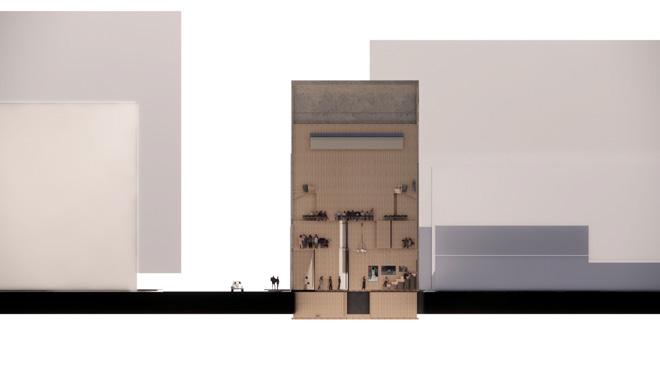
INTERSECT
CONCERT HALL IN CHICAGO, IL
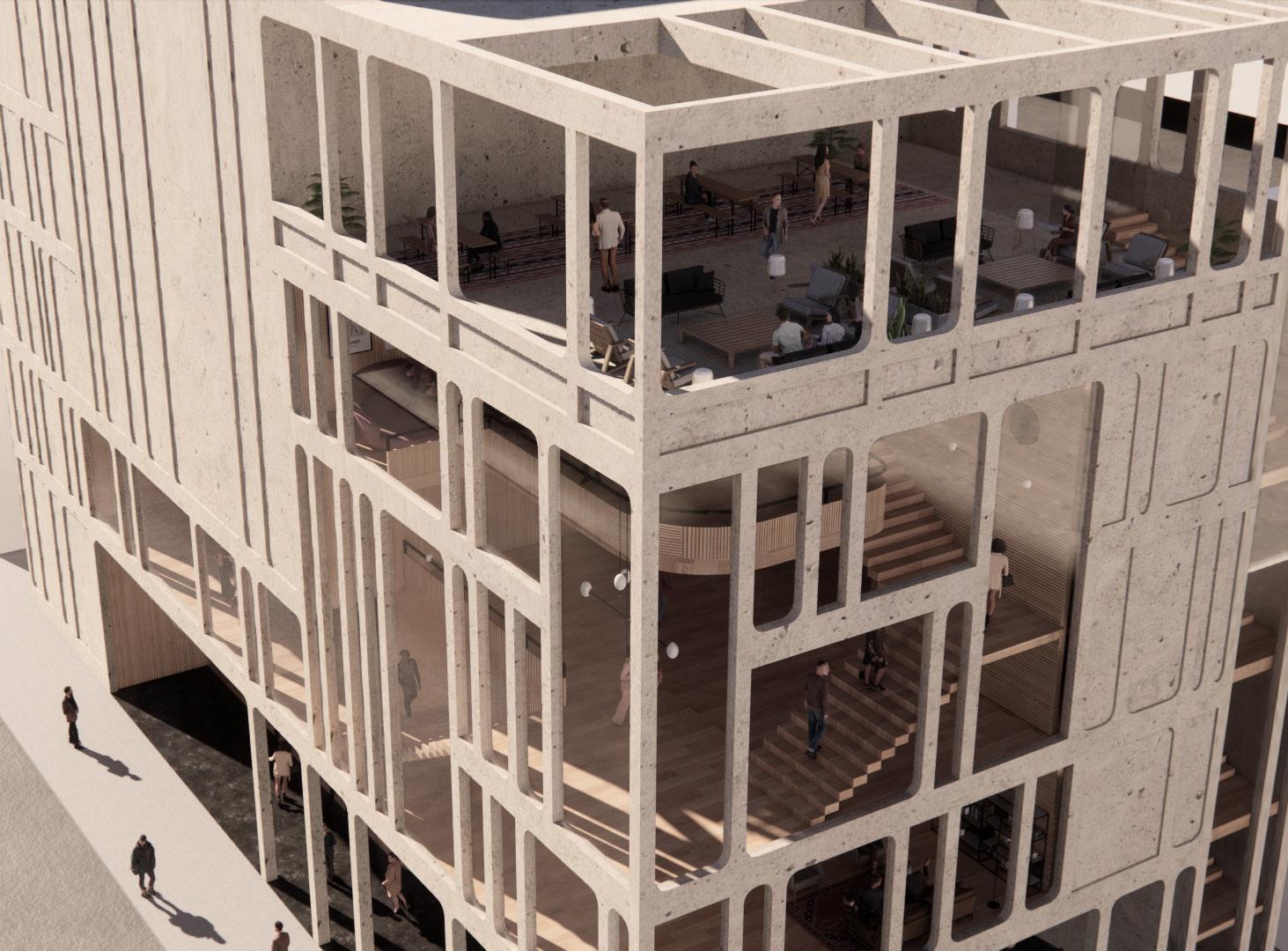
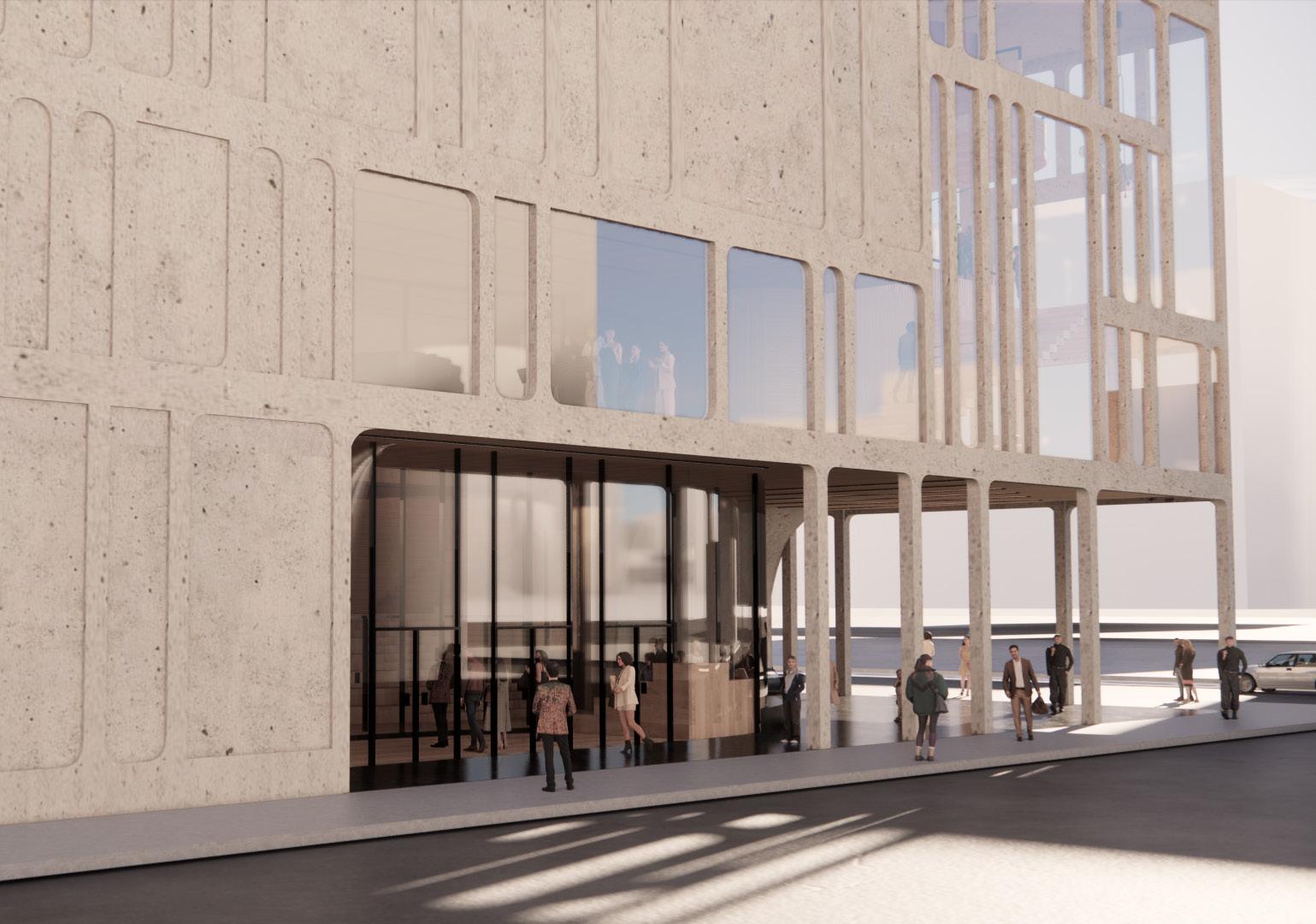
For this project, I wanted to focus a lot of effort on ensuring the public had a place in this space. To ensure this intersection of the public and the fine arts occurred, the design includes an exterior public plaza, as well as a fully publically accessible first and second floor lobby. Elements of this intersection can be found throughout the building’s design, from the facade the interior structural plans.
16
02 /
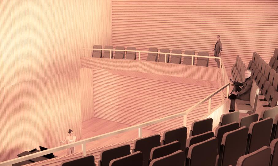
To emphasize the public nature of this space, above the lobby is a “public procession” of sorts, as viewers can watch the users of the space ascend to the concert hall. The column spacing and materiality also reflects the public or private nature of the space. Public spaces have glass (or in the case of the plaza, no sheathing) and larger column spacing, while the private spaces are sheathed in concrete and have smaller column spacing.
Portfolio 17
THE SITE
W VAN BUREN ST
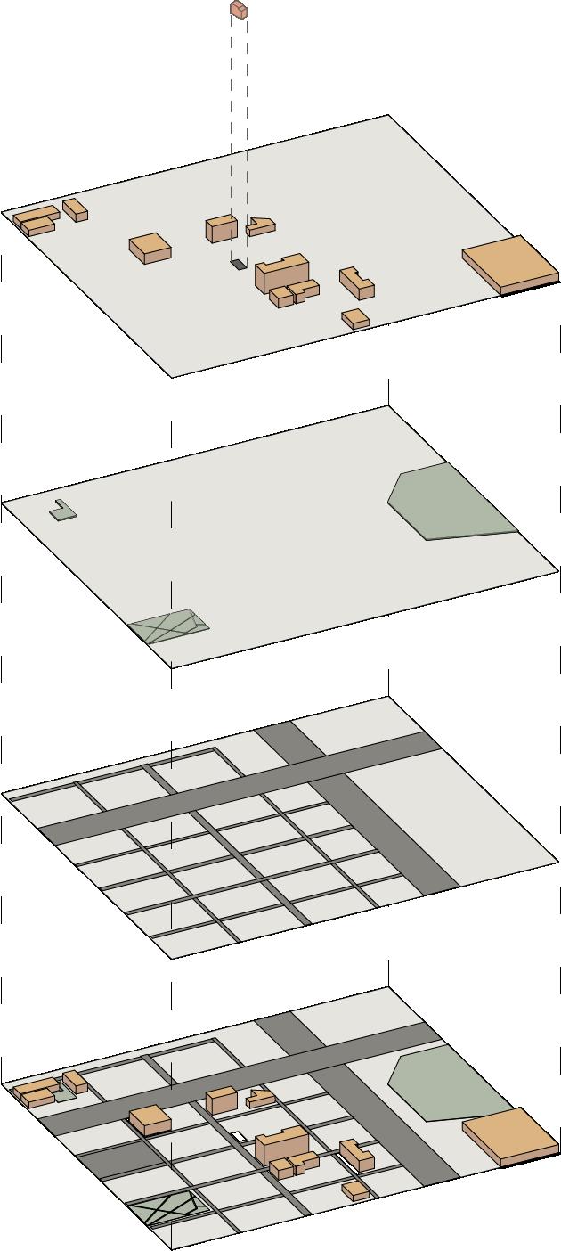
Because of the public nature of the space, the urban context and surrounding site played an incredibly important role in the concepts and design of this concert hall. The site for this project was located in the West Loop, near Greektown, at the corner of West Jackson Boulevard and South Green Street, currently infrequently used parking lot. To the west, there was a lot of residential development, particularly in young couples, around the ages of 25-35. To the east is Greektown, with many cultural art pieces and dining places. Thus, this site was positioned in a transition zone, easily walkable between the residential spaces and the nearby restaurant hub on Halsted. Additionally, there was a great lack of public spaces in the area, which was part of the inspiration to make this a recognizable cultural and public center for the community.
18
W JACKSON BLVD
S
GREEN ST S HALSTED ST
This exploded axon drawings demonstrates the distribution of public spaces in the urban context of this site. The green spaces are quite spread out, with no green spacein the center of this space (ie. the site). With this sense of environmental connection, there was an even greater need for public intervention. The buildings in yellow are those that allow for public use. Although there are some, there is a need for more, particularly in such a highly dense area. Additionally, many of these public spaces, though public, are for certain demographics (churches, schools, etc.). There was a clear need for a new community space, public for all.
Portfolio 19
USE DIAGRAM
With such an extensive building, that houses so many different uses, it was important to ensure that these spaces would be efficiently used and shared. This diagram documents this use, over the span of a day.
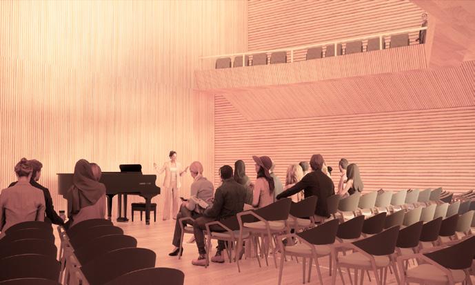
CONCERT HALL
BACK OF HOUSE PLAZA
UPPER LOBBIES
20
1ST FLOOR LOBBY
0 6 3 4 5 2 1
TIME OF DAY THE COURSE
COURSE OF A DAY

Portfolio 21 6 12 24 18 9 15 21 22 23 20 19 16 17 14 13 10 11 8 7
CEILING STRUCTURE
The visible public procession of people added an important sense of connection to the public and to the urban context. Urban corners are always a place of importance, and emphasizing this with this spread of glass gave it the presence it deserved, giving back to the corner, since the building was now using that space. The ability to see in and the ability to see out connected the users of the space and the public. It also illustrates the inevitable change from completely publict to semi public to private as one looks up this corner of the building.
22
FLOOR PLANS
Portfolio 23
1 - LOBBY 2 - AIRLOCK 3 - BATHROOM 4 - LOADING DOCK 5 - SECURITY 6 - STAFF ROOM 7 - JANITOR'S CLOSET 8 - ELEVATOR 9 - EGRESS STAIRS 4 2 4 8 3 5 3 3 10 2 2 7 8 5 9 1 1 9 9 2 2 8 9 9 6 7 6 6 7 7 1 5 13 13 12 3 5 4 2 1 1ST FLOOR PLAN 1 - MECHANICAL/HVAC SPACE 2 - ELEVATOR 3 - EGRESS STAIRS 6 7 4 3 8 5 4 5 3 6 5 11 2 2 4 5 1 6 8 1 1 9 9 2 2 2 2 2 7 8 8 9 9 6 7 6 6 5 2 12 13 12 LOWER 2 FLOOR PLAN 4 6 2 7 4 8 8 3 5 6 5 11 3 10 2 7 9 8 5 9 4 1 1 9 1 2 2 2 2 2 2 8 8 9 9 6 7 7 6 7 1 2 3 2 12 13 5 5 1 - STAFF ROOM 2 - DRESSING ROOM 3 - BATHROOM 4 - ASSIST. DIRECTOR'S 5 - CLERK 6 - MEETING ROOM 7 - GREEN ROOM 8 - VISITOR'S OFFICE 9 - STORAGE 10 - TRASH ROOM 11 - JANITOR'S CLOSET 12 - ELEVATOR 13 - EGRESS STAIRS LOWER 1 FLOOR PLAN 4 6 2 5 3 4 6 5 5 4 1 1 2 2 2 7 9 6 7 7 1 2 5 3 4 2 TERRACE FLOOR PLAN 1 - OUTDOOR TERRACE 2 - ACOUSTIC PANELS 3 - STORAGE 4 - EGRESS STAIRS 5 - ELEVATOR 1 - LOBBY 2 - BALCONY 3 - CONCESSIONS 4 - BATHROOMS 5 - STORAGE 6 - ELEVATOR 7 - EGRESS STAIRS 4TH FLOOR PLAN 7 4 4 5 4 1 9 2 2 7 7 7 7 5 2 3 4 2 1 1 - LOBBY 2 - STAGE 3 - BACK OF HOUSE 4 - CONCESSIONS 5 - BATHROOM 6 - ELEVATOR 7 - EGRESS STAIRS 3RD FLOOR PLAN 4 6 2 7 4 8 8 3 5 6 5 11 3 5 4 1 1 9 1 2 2 2 2 2 2 8 8 9 9 6 7 7 6 7 1 2 3 2 5 5 1 - LOBBY 2 - PRACTICE ROOM 3 - TICKET BOOTH 4 - DIRECTOR'S OFFICE 5 - CLERK 6 - BATHROOM 7 - JANITOR'S CLOSET 8 - ELEVATOR 9 - EGRESS STAIRS 2ND FLOOR PLAN 4 6 7 4 8 5 3 5 3 8 5 4 1 1 9 9 1 2 2 2 2 2 2 8 9 9 6 7 6 7 2 2 3 5 5 4 1
PUBLIC V. PRIVATE
24 CONCERT HALL PUBLIC PROCESSION COMPLETELY PUBLIC LOBBY OUTDOOR PUBLIC SPACE BACK OF HOUSE COMPLETELY PUBLIC LESS PUBLIC PROCESSION TICKETED PUBLIC PRIVATE + SERVICE
MORE PUBLIC = LARGER COLUMN SPACING MORE PRIVATE = SMALLER COLUMN SPACING
PARTI DIAGRAM PUBLIC V. PRIVATE
DIAGRAMS
PROPORTIONS
ACOUSTICS
Portfolio 25 8’ 8’ 8’ 5’ 5’ 13’ 5’ 5’ 2’ 3’ 13’ 3’ 5’ 5’ 3’ 3’ 3’
ALIGN WITH GOLDEN RATIO PROPORITONS THROUGHOUT THE ELEVATIONS IN SEQUENCES OF 1', 2', 3', 5', 8', 13', 21'
PROPORTIONS COLUMNS
EXTERIOR
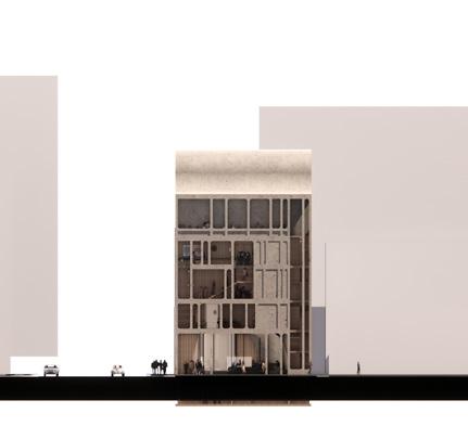
SECTIONS AND ELEVATIONS

26
Portfolio 27
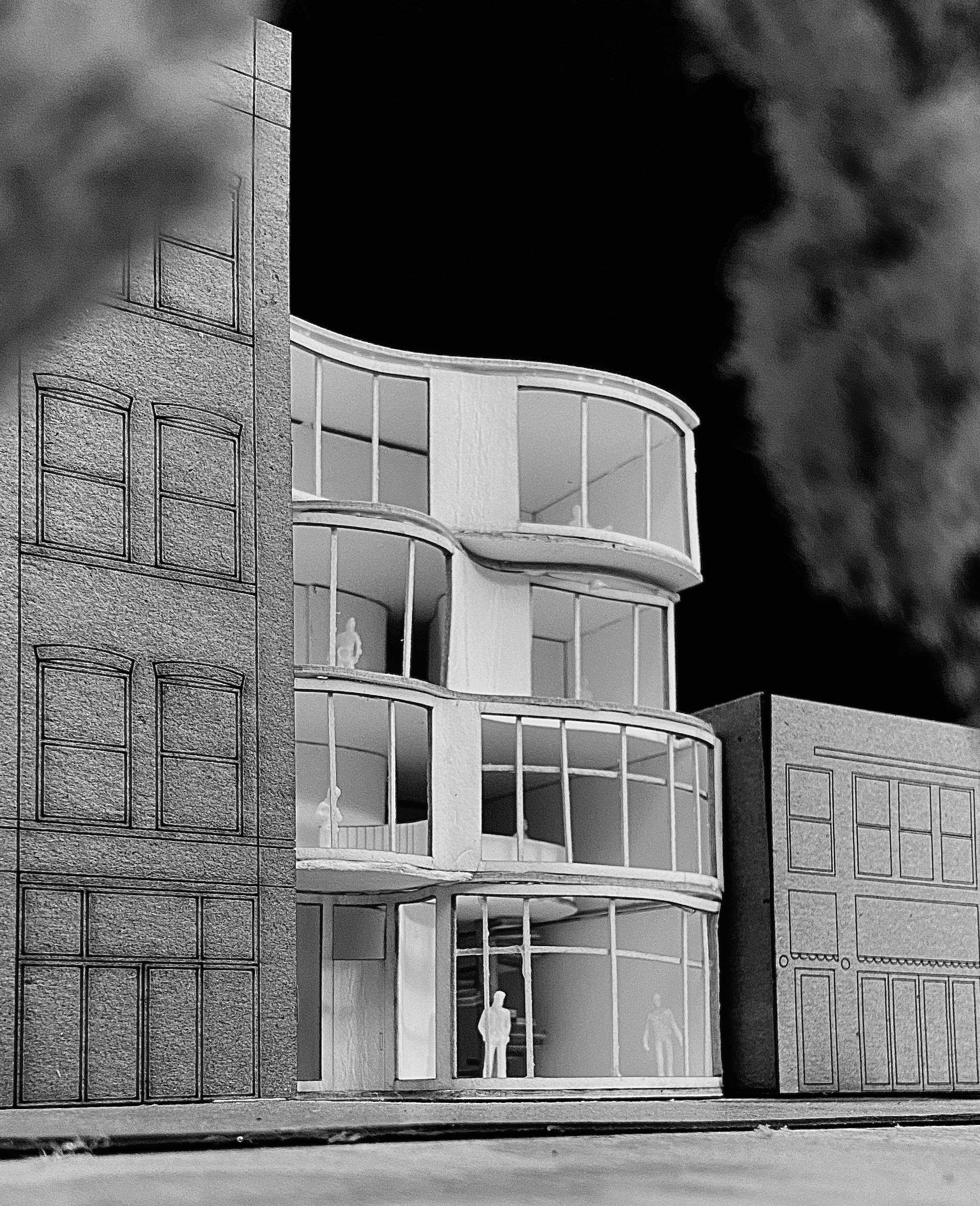
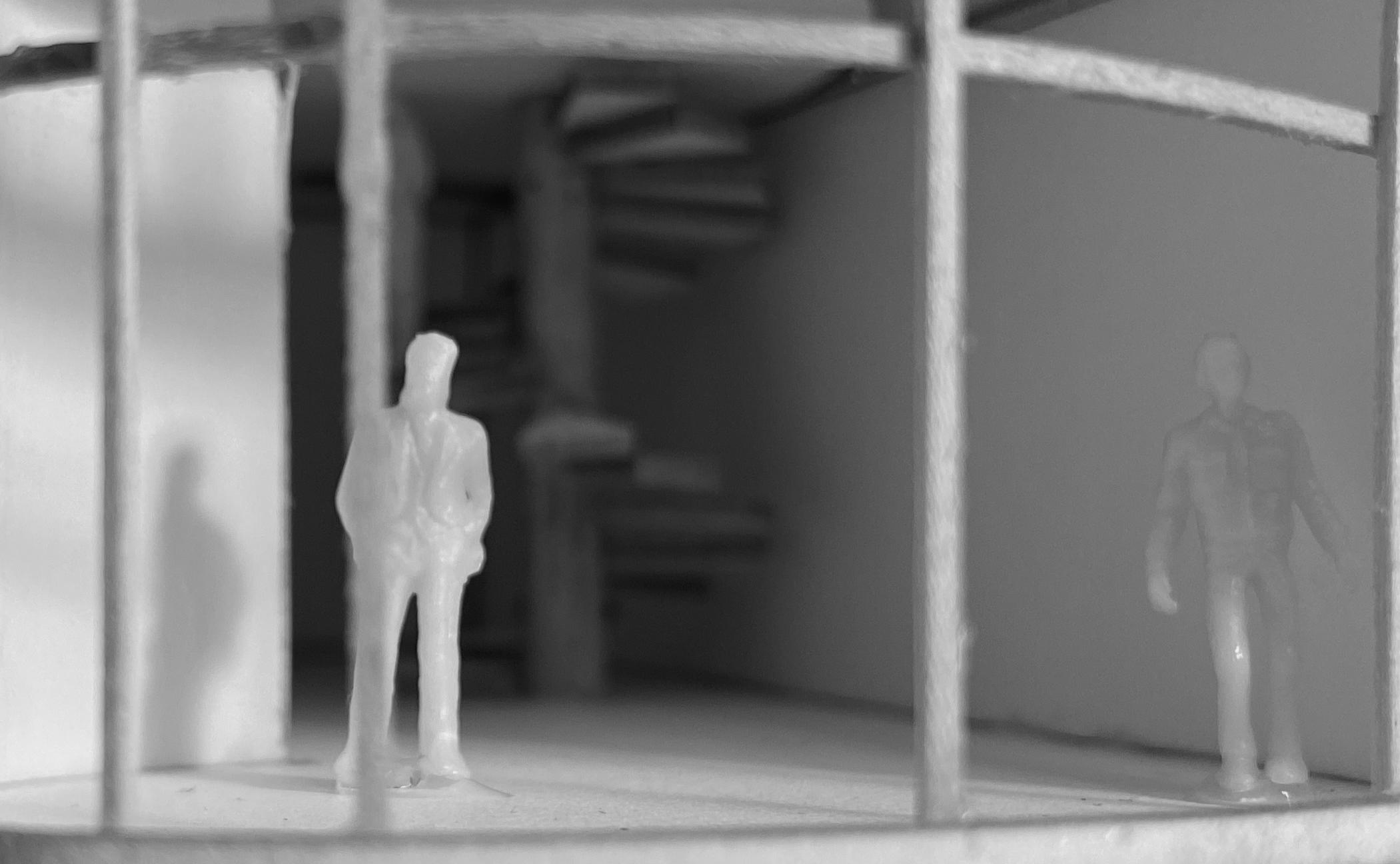
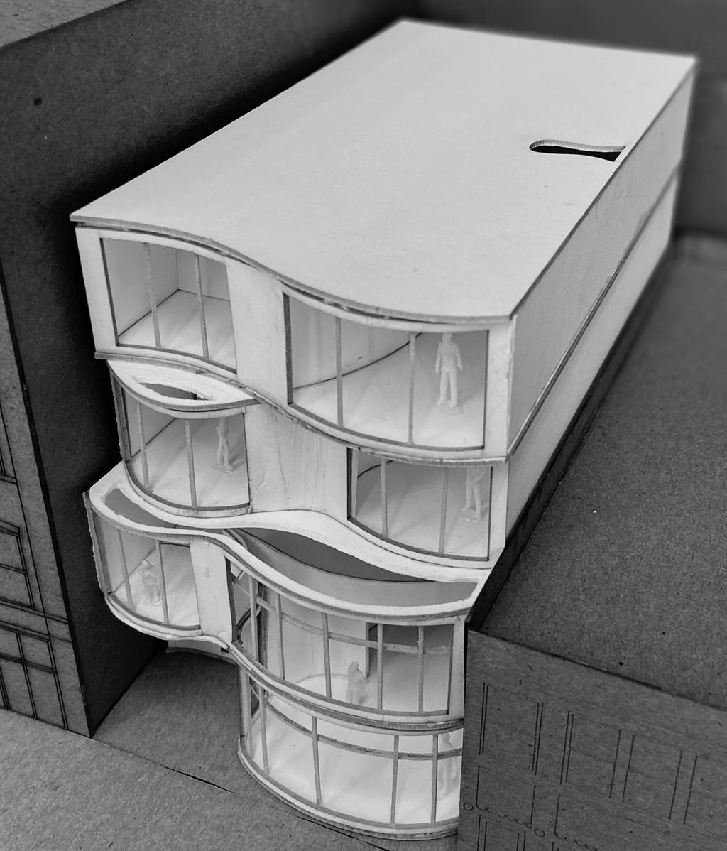
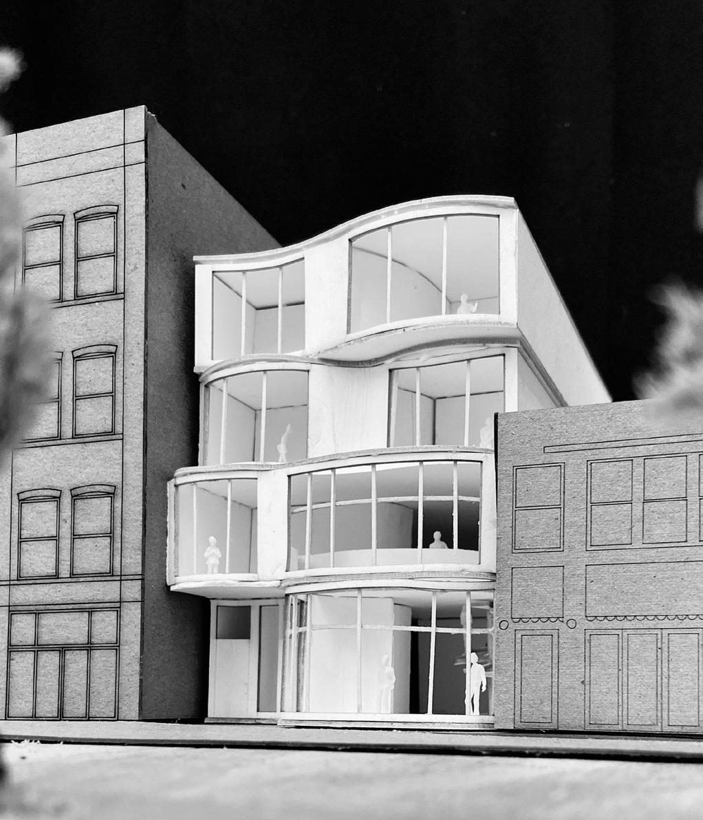
FLOW RESTAURANT AND OFFICE IN CHICAGO, IL 03 /

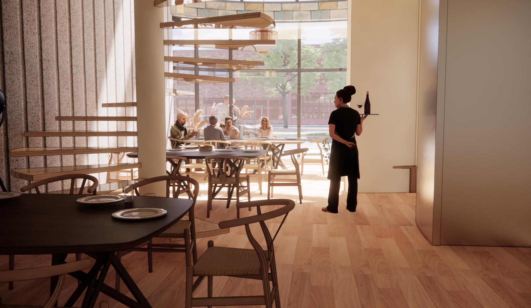
The prompt for this project was to create a combination building, with the lower two floors being for a restaurant, and the upper floors for a flexible office. The inspiration came from the flow of rivers; the curved facadesfor the four individual floors are derived from the curves of the Chicago River.
28
Portfolio 29
Daylighting Design and Analysis

ARCH 274
Lighting was a major dilemna with this project, as the only source of light from the sides of the building could be from the front facade. Using the lighting tester add-on for Rhino, Ladybug, lighting levels could be found throughout the building. This was used to improve lighting throughout the building, and a light well was added in the center, so as to allow a bit more light to enter the building. The staggering of the floor facades on the front elevation was also helpful, as more skylights could be added there to increased access to light.
30
1ST FLOOR 2ND FLOOR 3RD FLOOR 4TH FLOOR 1ST FLOOR 2ND FLOOR 3RD FLOOR 4TH FLOOR MIN MAX AVG
DAYLIGHTING
FLOOR PLANS
FOURTH FLOOR - OFFICE
THIRD FLOOR - OFFICE
SECOND FLOOR - RESTAURANT
Portfolio 31
FIRST FLOOR - RESTAURANT
EXPLODED AXON STRUCTURE DIAGRAM
SCALE: 1/16” = 1’ - 0”
STEEL STRUCTURAL SYSTEM
STRUCTURAL AXON
STEEL STRUCTURAL SYSTEM
ROOF DECKING
3” Steel Decking, 6” Total Depth
ELEVATOR SHAFTS
W18-50 STEEL BEAMS
W18-50 STEEL GIRDERS
W12 STEEL COLUMNS
DECKING
3” Steel Decking, 6” Total Depth
STAIRS & ELEVATOR SHAFTS
W18-50 STEEL BEAMS
W18-50 STEEL GIRDERS
W12 STEEL COLUMNS
DECKING
3” Steel Decking, 6” Total Depth
STAIRS & ELEVATOR SHAFTS
W18-50 STEEL BEAMS
W18-50 STEEL GIRDERS
W12 STEEL COLUMNS
DECKING
3” Steel Decking, 6” Total Depth
STAIRS & ELEVATOR SHAFTS
W18-50 STEEL BEAMS
W18-50 STEEL GIRDERS
W12 STEEL COLUMNS
FOUNDATION AND GROUND FLOOR
32
STRUCTURE GRID STRUCTURAL PLAN
Portfolio 33
A B C D 1 2 3 4 5 24’-0” 20’-0” 14’-0” 8’-0”7’-0”5’-0”10’-0”
SECTIONS AND ELEVATIONS


34
INTERIOR VIEWS
Portfolio 35
MODEL
Portfolio 36
Ique cus as aditatur, odiam facepud ioriandantum eost imoluptas minim invercidere debit, quia cus, sam aceperi berent quaes dolo is dolupta taquod et re evelecabo. Itate eum dolorio rerspic to optate idernam doloriat la voluptatia dendi rem ex exersped quaeper cilisqu
Portfolio 37
04 /
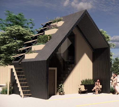
ACCLIMATE
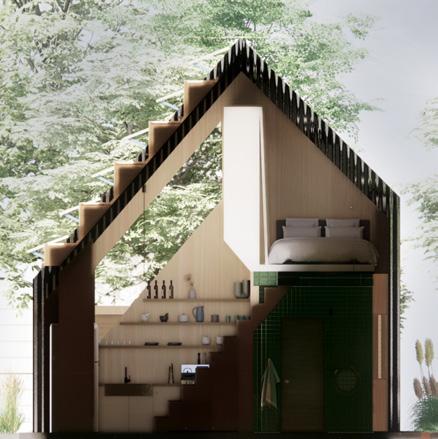
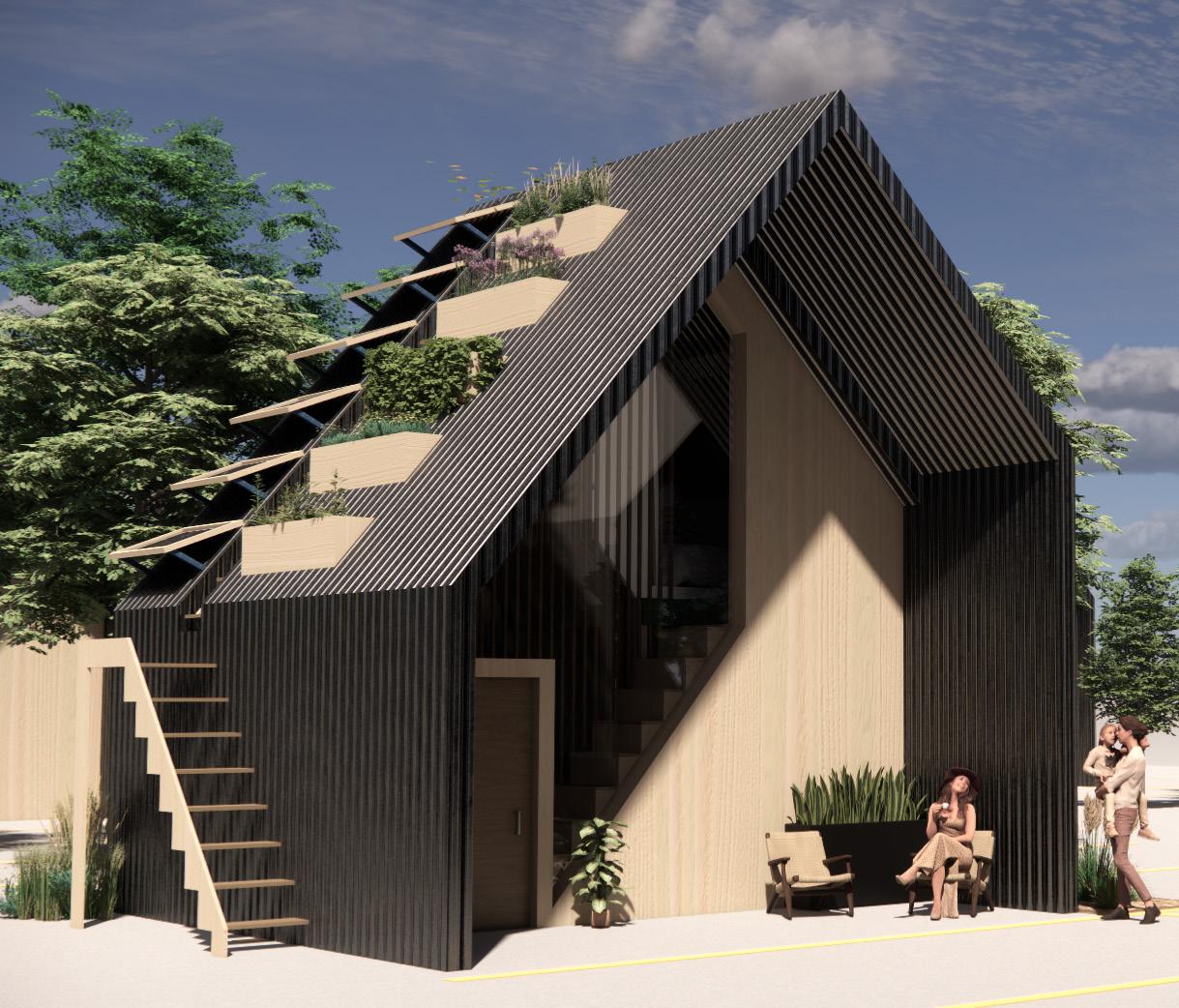
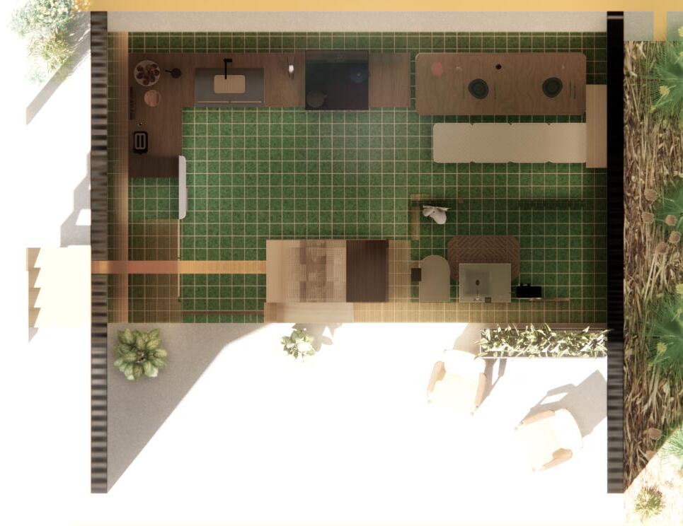
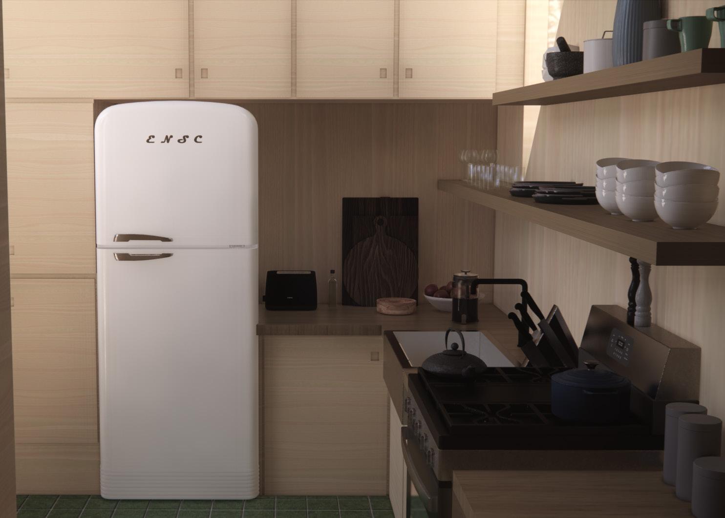
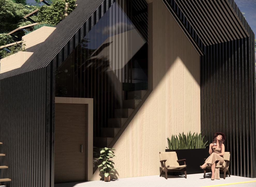
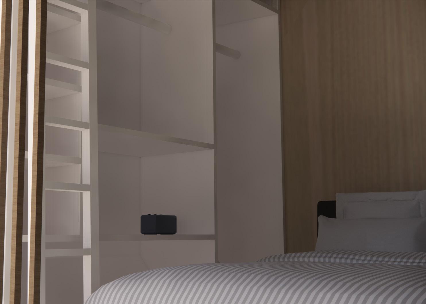
TINY HOUSE DESIGN COMPETITION
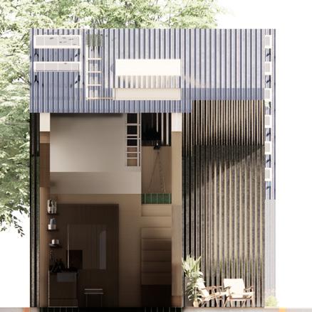
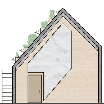
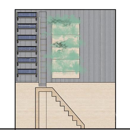
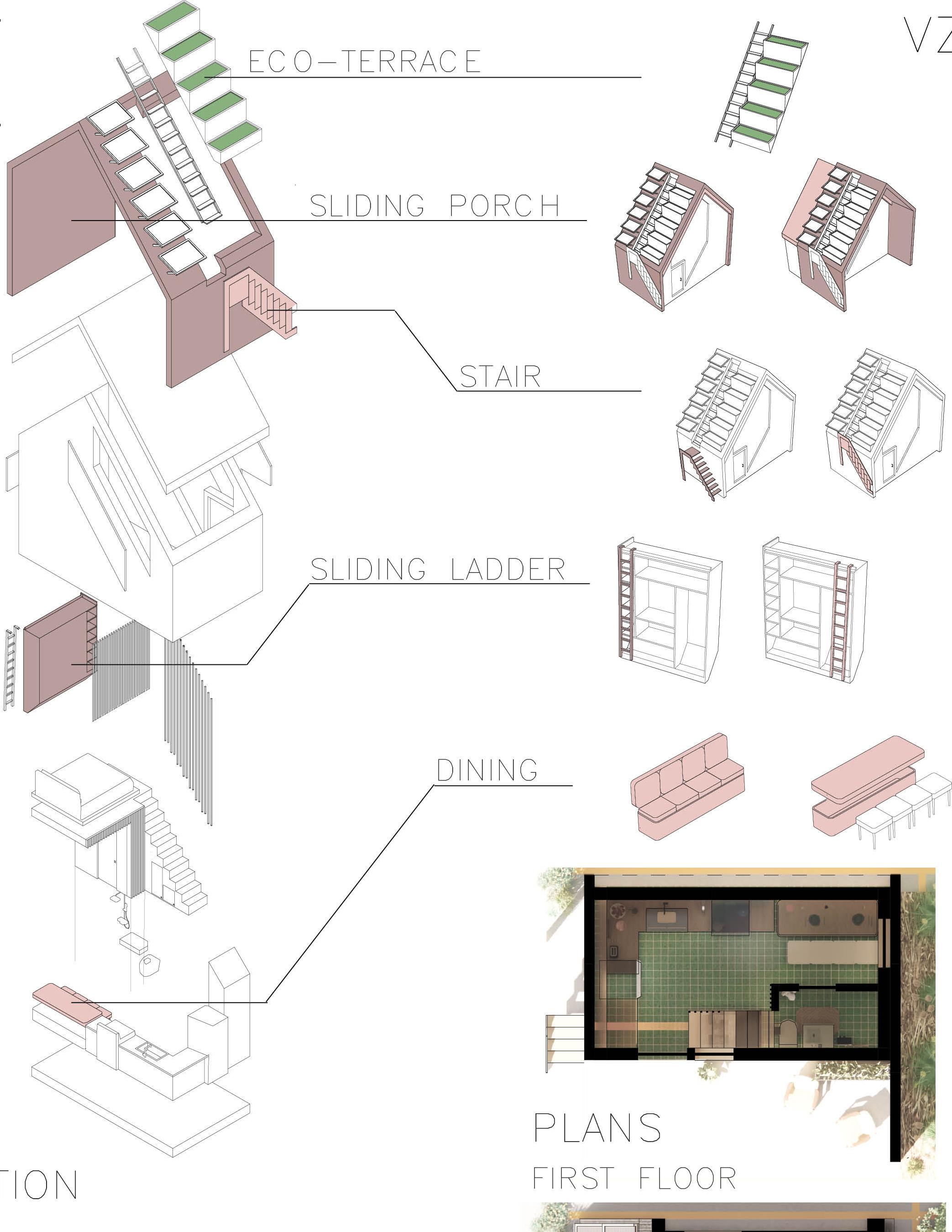
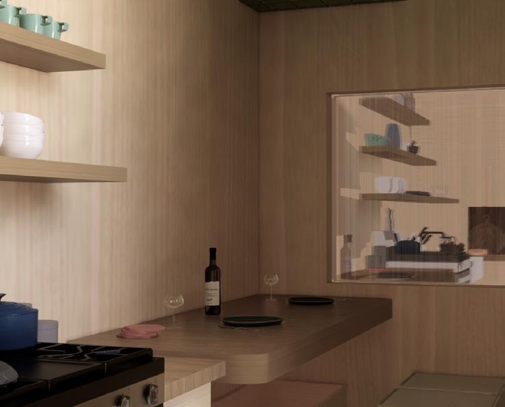
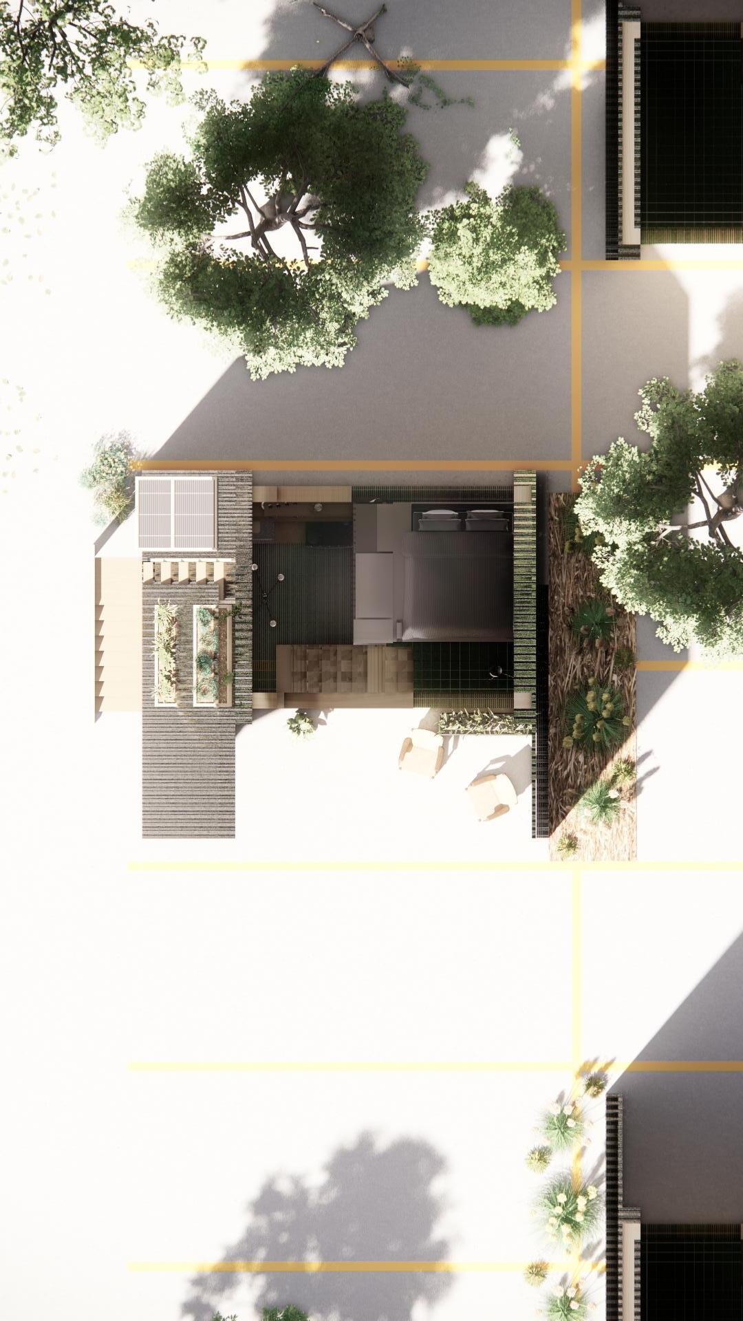
The main concept for this project began with the idea of creating a tiny house that would fit within standard parking space dimensions. Moving towards a more sustainable future, we wanted to create an eco-friendly house, which could be placed in abandoned parking lots as an affordable housing option. To achieve this, we began with the idea of it being self-sustained, with a roof comprised of solar panelling and a green roof. A foldable ladder was added for access to the roof.
**As a note, this was a group project. I completed this competition with a fellow student, Audrey Cicmanec. We discussed concepts and ideas throughout, but I worked mainly on building the 3-D model, rendering, floor plans, and elevations while she illustrated the flexiible design by detailing in diagrams.

SECTIONS AND ELEVATIONS
38
Portfolio 39

40
SOFA POSITION DINING POSITION
PLANS AND RENDERS
41
STEW


MEAL FOR 100 STRANGERS
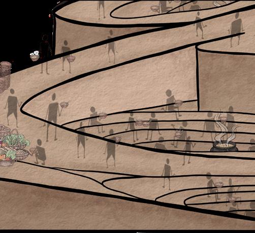
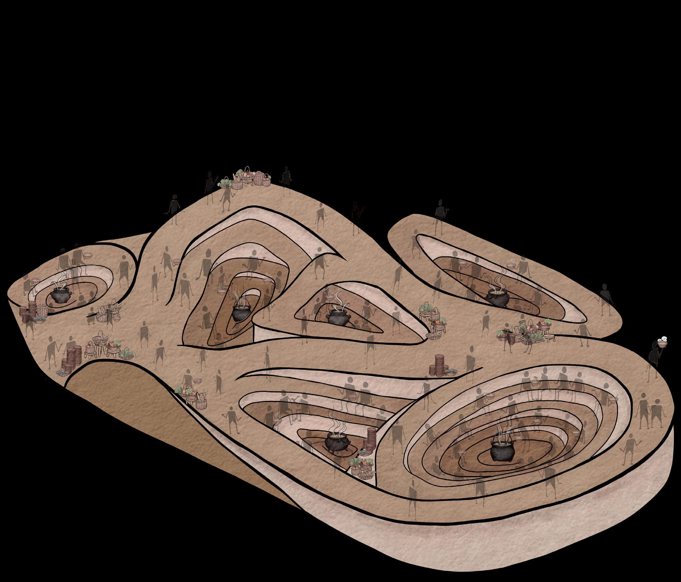
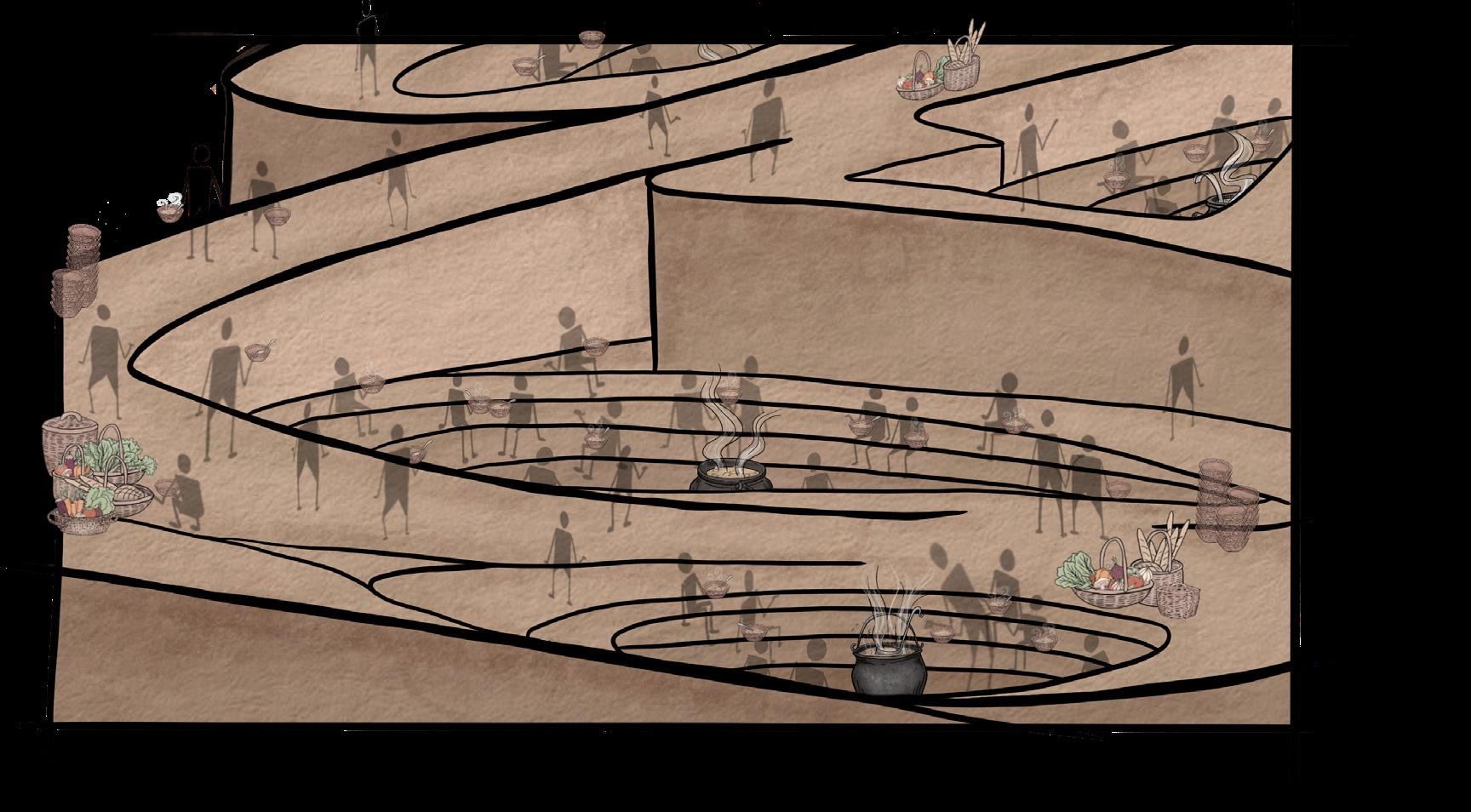
The prompt of this project was to design a “meal space” for the preparation and consumption of a communal meal for 100 people, who had no previous link to one another. Attempting to take advantage of the creativity allowed from this prompt, I decided to lean into my initial idea: soup. Soup is a warm, comforting food, with variations found in cultures in every part of the world. By having different soup bases in an abstracted “conversation pit,” people could venture around the meal space, gathering additional ingredients for their own soups, sharing personal and cultural experiences along the way. This project is focused on reducing people to their most basic forms, and because of this, I leaned into the idea of prehistoric humans. The architecture base is made of compacted earth, people gathered around a fire, various shades of browns and earth, and people inspired by cave paintings.


Adding and designing unique details were important for this project. I wanted every bit of the drawing to fit the aesthetic of the overal design. The people, as the focus of this project, were the most important. They add character, and when connecting, overlap in color as well. I also designed small details, including the “cauldrons” of soup”, the food, and the bowls with steam to enhance the depth of the project.
42
05 /
Portfolio 43
SELECTED WORKS
ART AND WORKS IN PROGRESS
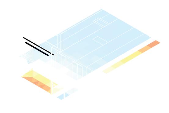
PERSPECTIVE FOR TOOL LIBRARY IN ALBANY PARK Spring 2023
Used as a design tool, this was a preliminary step in designing this tool library. It combines ideas of community, shared space, and livelihood to create a “perspective mood board” for the project.
44
06 /
Ique cus as aditatur, odiam facepud ioriandantum eost imoluptas minim invercidere debit, quia cus, sam aceperi berent quaes dolo is dolupta taquod et re evelecabo. Itate eum dolorio rerspic to optate idernam doloriat la voluptatia dendi rem ex exersped
Portfolio 45
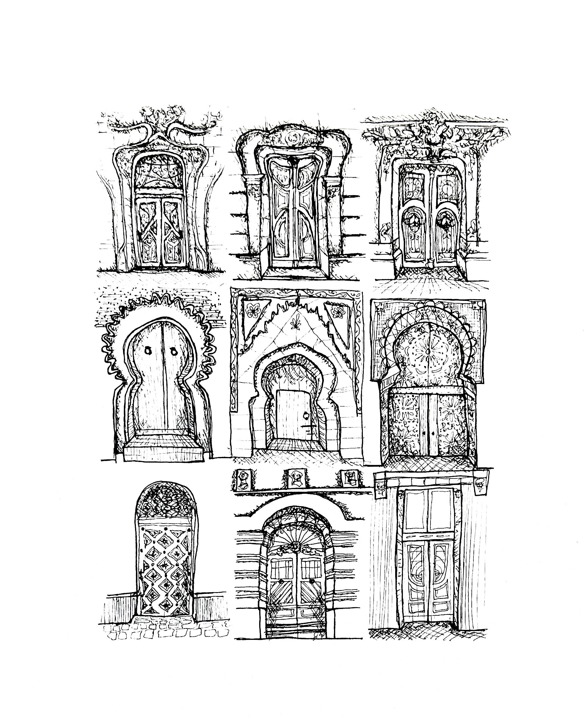
DOOR STUDY
46
ART


Portfolio 47
48
SELECTED WORKS2022
KYLEE KORANDO
