JENNIFER ORTIZ

LAA 6936 COLOR THEORY +

APPLICATION FOR THE BUILT ENVIRONMENT


PROFESSOR BRIANNA CROWDER
SPRING 2023
TABLE OF CONTENTS M0 M1 M2 M3 M4 M5 M6 M7 M8 M9 M10 COLOR + YOU ............................................. 3 COLOR + CULTURE ..................................... 8 COLOR + THEORY ...................................... 13 15 ................................ COLOR + DESIGNERS 21 .............................. COLOR + PERCEPTION 23 ........................... COLOR + ENVIRONMENT COLOR + HEALTH ...................................... 30 COLOR + BALANCE ................................... 32 COLOR + EMPHASIS ................................. 34 42 .............................. COLOR + WORKSPACE 49 ..................................... COLOR + VARIETY 55 ............................................. REFERENCES
COLOR + YOU M0


Hi,
I’m Jennifer Ortiz, you can all call me Jen. I’m a 20 year old Architecture student who just finished D4. I was born in Miami, Florida into a Cuban family. I have two wonderful parents, and one brother 13 years older than me!

I’ll be a graduate student next term. I’d like to eventually go for my 2nd masters in Interior Architecture, and get licenses in real estate and general contracting.


This is my 8 year old fur baby. He is a morkie-a mix between Maltese and Yorkie. He is the calmest and most wholesome boy in the world.

These are some very special people in my life.


For fun I like to go to to concerts.

My favorites, and most recent, were Juan Luis Guerra and Michael Buble. It’s been a dream of mine to see them both since I was young!
I also love to travel. I’ve traveled to: Punta Cana, Cancun, Atlanta, Nashville, Bahamas, Cuba, etc.


Soon I’d like to visit London, Brazil, and Japan!

I also like to play with my style. I like to do creative nail art, and regularly dye my hair different colors to play with my look.


My favorite colors are different shades of brown, and specifically burnt orange. I especially enjoy incorporating these colors into my clothing.

COLOR + CULTURE M1
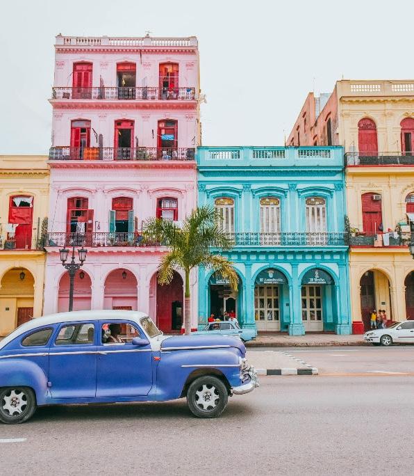
CUBA


Red: National color symbolizing freedom. Closely linked to the passion and bloodshed of the recent Patria y Vida protests. The color of guava paste, a popular Cuban dessert.
Yellow/ orange: Symbolizes positivity and happiness. Associated with the characters of many Cubans. Many traditional foods such as tostones and “arroz amarillo” (yellow rice). Sunny climate. One of many vibrant colors found on houses.

Blue: National color symbolizing justice and unity. Associated with the island’s beautiful beaches and tropical views.
White: National color symbolizing purity and goodness. Related to Santeria, a prominent religion on the island. Also the typical color of “guayaberas”, Cuban men’s shirts. Color of dominoes, a typical Cuban game.


COLOR ANALYSIS
Brown: Associated with many Cuban foods such as frijoles and cafecito. Crop growing fields as well.
Green: Represents economy and agriculture. Crops grown and sold on the “campos” (fields) by “guajiros” (Cuban term for farmers).


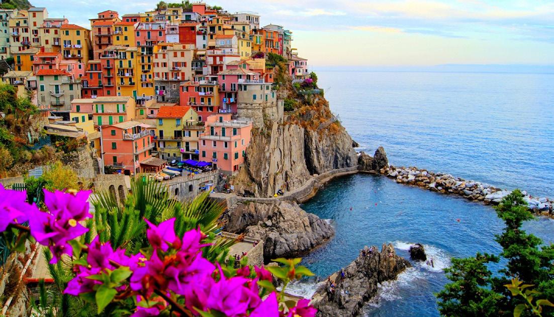
ITALY
Green: National color symbolizes hope and the Italian landscape. It also relates to social equity and freedom. A lighter shade of green is found in the waters running through Venice, Italy.
Grey: Representative of classical Italy. Used widely in famous paintings, classical architecture, and marble sculptures. Some Italians use this color to describe their political state.
Orange: For the Italians, symbolizes physical and spiritual health, and has been linked to love and romance in Italian literature. Seen in lush landscapes, common orange trees, and painted on houses.

Blue: Symbolizes pride and joy for the Italians. Color of the Italian soccer team, as a tribute to the Italian monarchy (Royal House of savoy).
COLOR ANALYSIS
Red: National color used to represent both charity and the blood/sacrifice of the Italian people. Found in the sauces of many typical dishes such as pizza and pastas.
White: National color used to represent faith, purity, innocence, as well as the snowy alps.
COLOR + THEORY M2
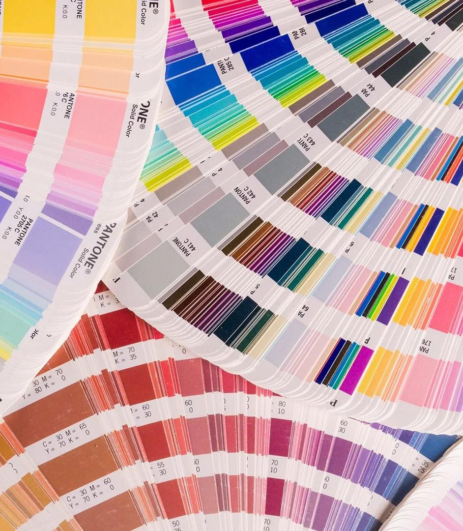
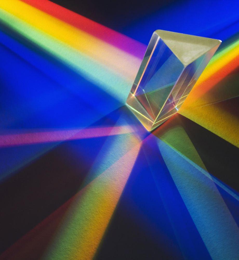
Color Theory
Color Theory is used to study and understand the relationships between color and light. It is essential to design in order to understand how colors react to different materials, lighting, etc.

Color Wheel

Before we dive into the effects of the surrounding environment on colors, we are first introduced to the color wheel, developed originally by Sir Isaac Newton. From the color wheel, we can derive color groups based on their positioning from one another. Primary colors consist of yellow, red, and blue. Complementary colors are orange, green, and purple. An example of analagous colors are orange, red-orange, and yellow-orange. We also explored split complementary, triadic, and tretradic colors. Albert Munsell expanded on these basic understandings of color relations by creating the dimensions of hue, value, and chroma. Hue is pure color. Value is the lightness/darkness of a color. Chroma is the level of purity of a color with nothing added.
Color In The Environment
Even with Newton’s and Munsell’s deeper understanding of colors, it is difficult to incorporate it into a design because colors are everchanging depending on materiality, lighting, the viewer, etc. Colors are darker on rougher materials and lighter on smoother surfaces, different for individuals of different ages, genders, personalities, brighter in direct lighting and darker in indirect lighting, etc. It is extremely important to note these characteristics of the space before choosing a color for it.
M3 COLOR + DESIGNERS
LE CORBUSIER
Le Corbusier was a Swiss-French Architect who at 13 years old, started his art/ architectural studies at École des Arts Décoratifs at La Chaux-de-Fond. His teacher, Charles L’Eplattenier, got him started as an architect by allowing him to work on some of his local projects and taking him on a educational trips. Through these trips, Le Corbusier learned about: collective vs. individual spaces, classical proportion, geometric forms, handling of light and landscape. All important elements in his concepts for future designs.
From 18 to 77 years old, Le Corbusier’s works made him a pioneer of modern architecture; particularly: Villa Savoye outside Paris, Notre Dame du Haut in Ronchamp, France, and the Unité d’Habitation in Marseille. Through these projects, he introduced his iconic “5 points of architecture”, Pilotis (pillars), roof garden, open floor plan, long windows, and open facades. He also became known for his urban planning, paintings, sculptures, engravings, furniture design (especially built-in furniture), etc.

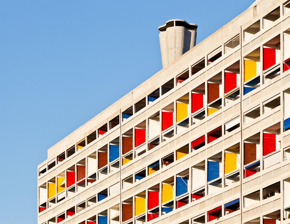
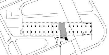
UNITE D’HABITATION
WHERE: Marsaille, France
WHEN: Construction completed in 1952
CONCEPT: Was meant to be a “vertical garden city” for inhabitants to live, shop, etc. It focused on the balance between communal and individual living (collective vs. individual spaces).
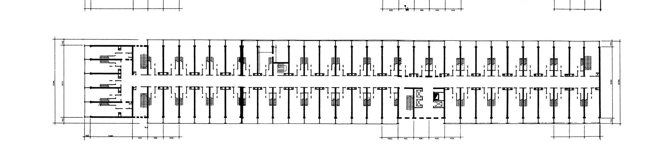
DETAILS: The dimensions of the building are: 24 meters wide, 56 meters tall, 135 meters long. It consists of 18 floors, 337 apartments (23 different layouts), a shopping plaza, and a roof garden-- all mounted on pilotis.
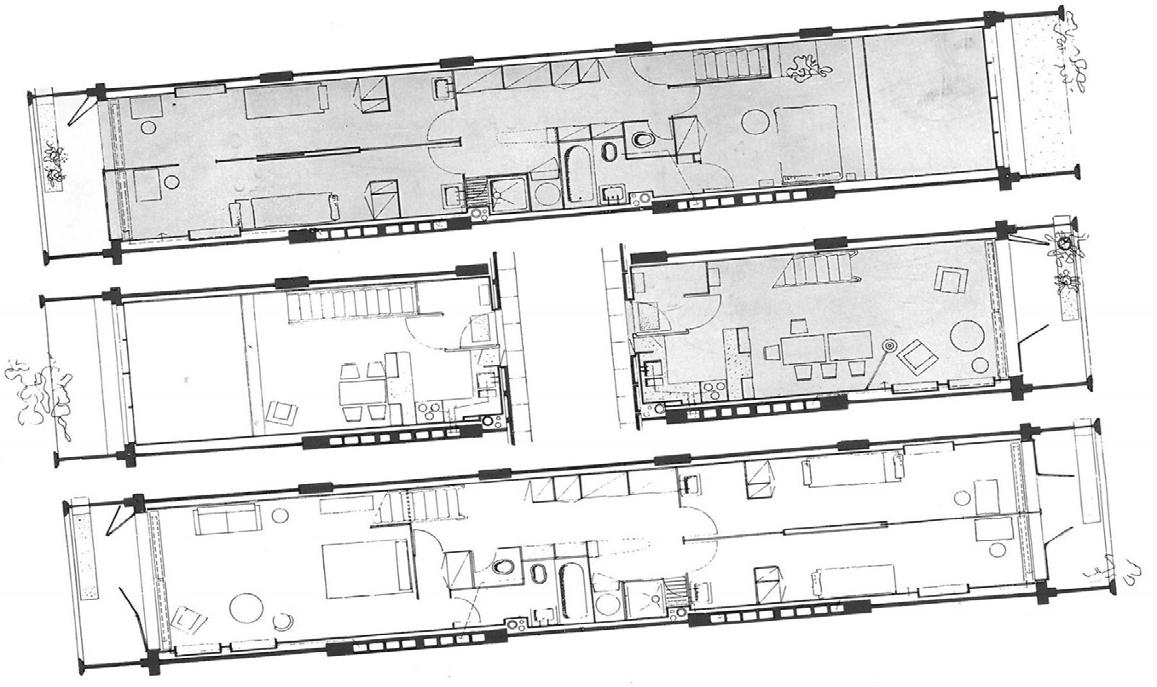
WHY: The Unite D’Habitation was built in response to a desperate need for housing in France after World War II.
EXTERIOR


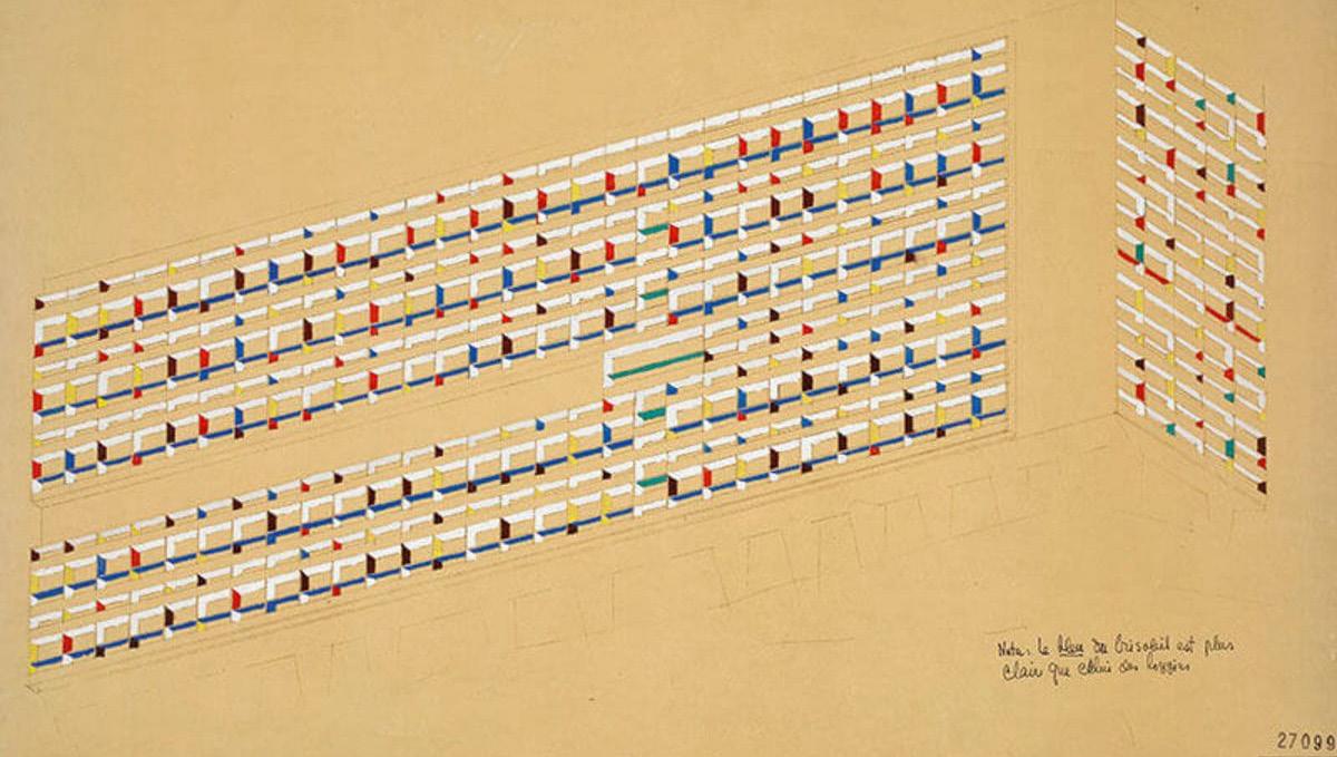
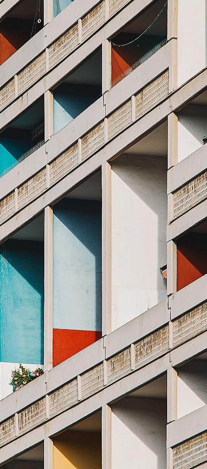
Le Corbusier used vivid shades of red, blue, yellow, green, etc. to make the building seem less dull during the already gloomy post-war era. The color on the Brise Soleil, framing each apartment balcony, was also meant to highlight the individual cells within the massive structure (exponsed concrete)-further communicating his concept: exploring communal spaces vs. individual spaces.


In the interior, Le Corbusier continued to highlight individual spaces with color. For example, the doors of the apartments (above, center) were all painted various colors to differentiate the apartments. Kitchens (above right) were mostly characterized by the color green. On a smaller scale, shelves in separate rooms (pictured right) were painted different colors.


INTERIOR
CONCLUSION
Le Corbusier used plenty of color throughout his projects, eventually even writing a book on his ideal color palettes. Specifically in his Unite d’Habitation project in Marsaille, France, Le Corbusier used a mixture of vivid red, blue, green, yellow, and orange to contrast the dark political climate of the time as well as the dullness of the exposed concrete structure.
Conceptually, the colors were meant to highlight the communal vs. individual spaces of the structres. The unpainted, exposed concrete represented the massive, shared structure. Meanwhile, the painted portions of the brise soileil, which framed the balconies of the interior units, emphasized the smaller cells of the structure.
In the interior, Le Corbusier continued to compartmentalize spaces using color. The doors of each apartment were painted different colors to differentiate between them. Inside the units, kitchens, specific shelving, built-in furnitures, certain walls, etc. were painted differently to further divide the spaces visually.

M4
COLOR + PERCEPTION
Color is Subjective
We learned in Chapter 2 that each individual sees colors differently based on their age, gender, personality, and a myriad of other factors. In Chapter 3, we learn that similarly the emotional response of individuals to color are subjective. With different life experiences and memories comes different association of color with specific emotions. This is an important factor to consider when designing a space for a client.
Color Association and Preference

Color association and preference can stem from within cultures, branding, age group tendencies, gender groups, etc. For example, most Western countries tend to utilize blue, while Japan prefers the color red. Luxury brands lean towards using darker, richer colors, especially purples. The Cheerios brand has become closely related to the color yellow. Studies have been able to generalize specific emotions related to colors: red with love, passion, excitement; pink with sweetness and femininity; blue with calmness and strength; green with growth and renewal; yellow with happiness; purple with bravery; orange with warmth and festivity, etc.
Color changes Spaces
Color association not only effects how an individual may feel about a color, but also how they experience a space. Walls, columns, roofs, that stick out in a specific color could pull or push an individual from a certain direction. Color can also be used as a form of organization of a building-- for example, by associating each floor with a different color, it makes it easier for visitors to navigate the space if lost. Color can even make a space feel larger or smaller-- darker colors tend to tighten spaces while lighter colors widen the space.
M5 COLOR + ENVIRONMENT
INTRODUCTION/ SUMMARY: DRIVE
The film “Drive” focuses on a Hollywood stuntman, who doubles as a getaway driver for criminals. Though his character is icy and distant, he starts to gain romantic feelings for the wife, Irene, of one of said criminals, Standard.
Upon Standard’s release from jail, the driver assists him in a robbery in attempts to help him (and his unknowing wife and kid, Benicio) be free from debt to criminal bosses.
When the robbery doesn’t go as planned, the driver must now protect Irene and Benicio from Standard’s vengeful enemies.
FILM INFORMATION:
DIRECTOR: NICHOLAS WINDING REFN
YEAR: 2011
CAST:
DRIVER- RYAN GOSLIN

IRENE- CAREY MULLIGAN
BENICIO- KADEN LEOS
STANDARD- OSCAR ISAAC
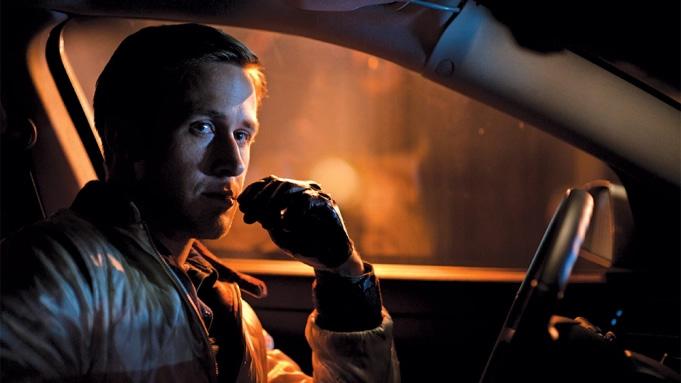
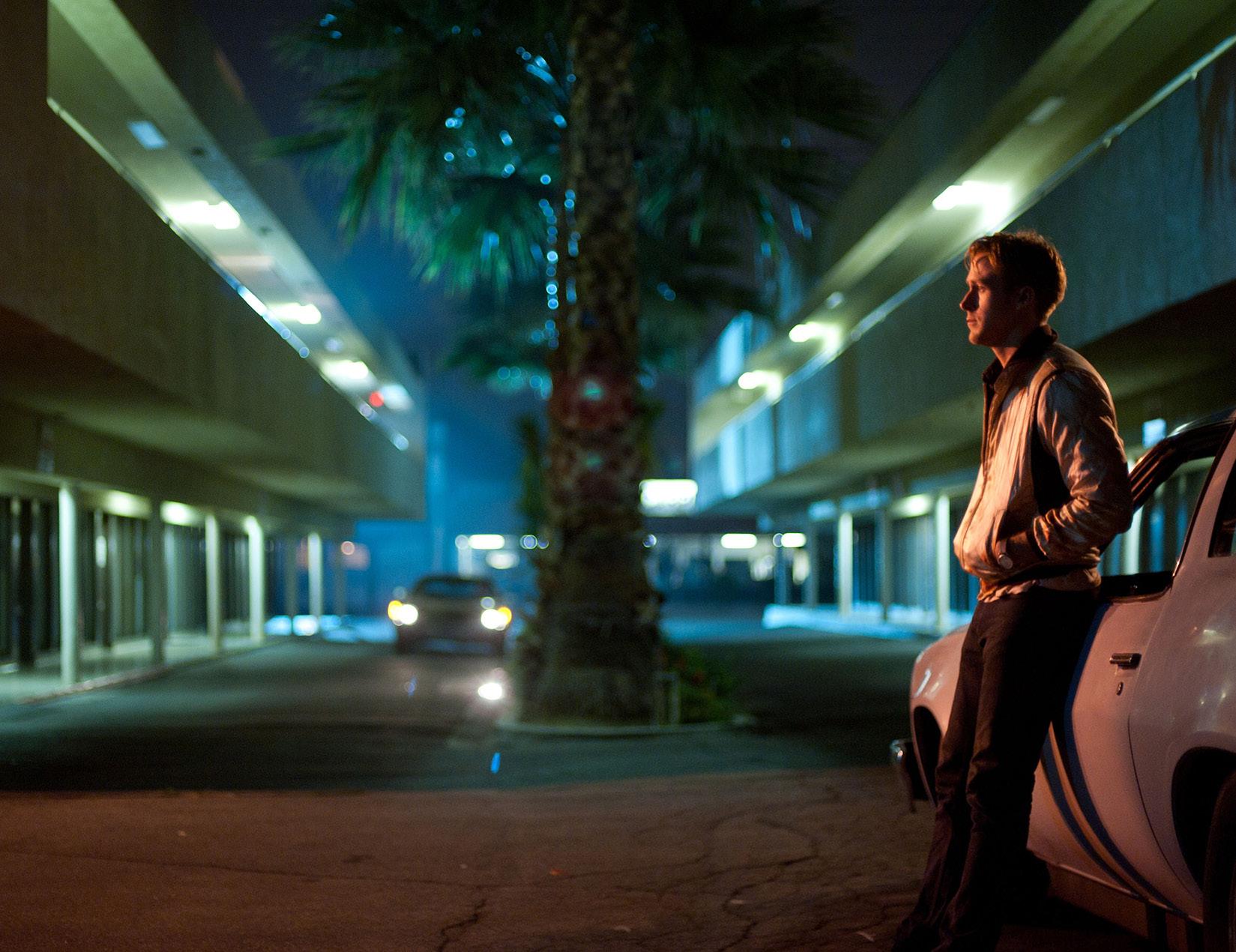
BLUES
There’s a blue tone throughout the entirety of the film “Drive”. Which gives the crimedrama a moody feeling, such as was intended by director Nicolas Winding Refn.

Refn, a colorblind director, likes to use high contrast in his films. Therefore, he couples the overwhelming blue in the film with orange, pink, and red highlights.
Associated with calm emotions, the blue in this film overtakes the screen completely in the quiter scenes such as: dinner (pictured above), reflective moments, work (pictured below), etc.
The color blue in this film could also be representative of the unnamed main character’s icy personality.

ORANGE/ BROWN
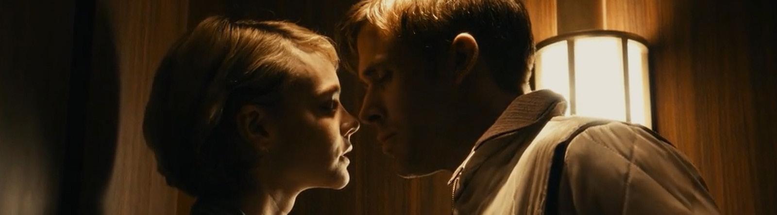
Warmer colors such as orange and brown are present throughout the intimate and happier scenes, such as: kissing (pictured above), driving with Irene and the child (pictured below), etc.
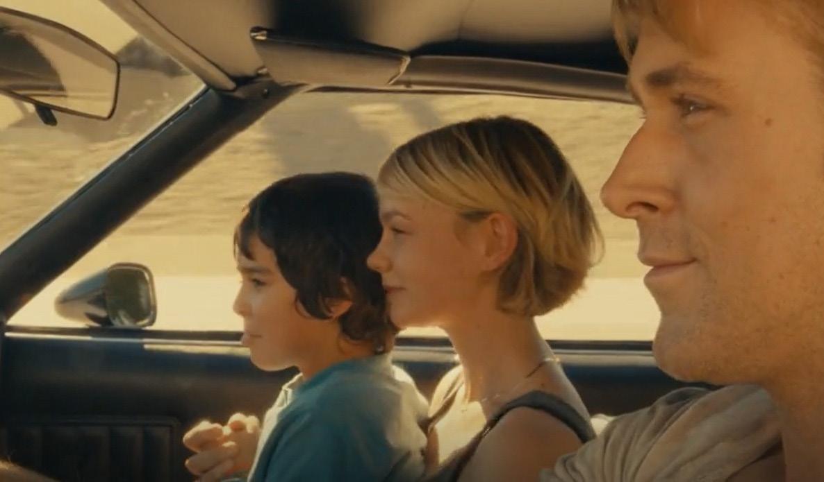
This creates a stark contrast with the blue/black tense scenes of the rest of the movie.
More subtle hints of orange and brown are present throughout the movie, again to create the contrast preferred by Refn.
REDS
The brightest color that appears in the movie is red. It appears in very specific scenes to visually alert the viewer of danger or intensity.
The red checkered wall pictured above is found in Nino’s Pizzeria. Nino is the main adversary in the movie, and the red associates feelings of danger and aggression with his character.

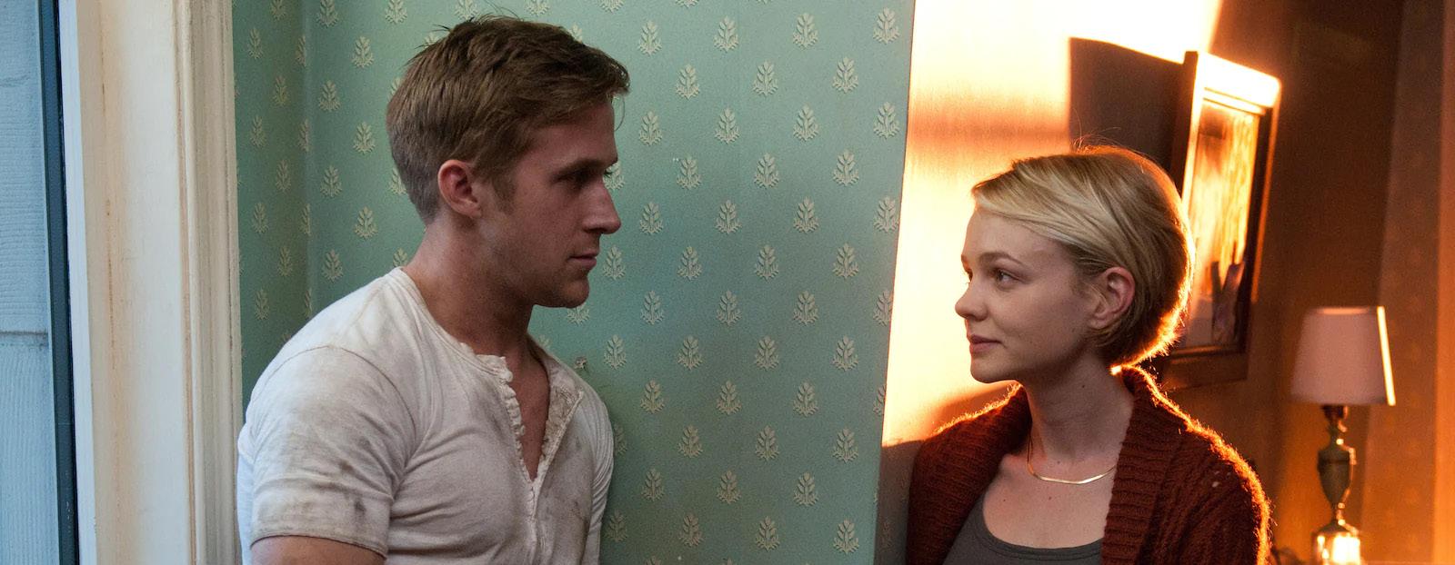
In the scene pictured below, the driver is trying to uncover Standard’s (husband) lies to Irene (wife). Irene subtly flirts towards the end of the conversation. The red in this scene perfectly reflects the tension in the plot-- both of the lies and drama, as well as the budding romance between the driver and Irene.

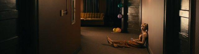
PINKS
Pink tones appear mainly in scenes focused on Irene, one of the few, and the main, female character of the movie.

In the scene below, the driver and Irene’s child are waiting for her to finish getting ready so that they can go for a drive.
The scene pictured above, centers on Irene as she takes a break from a party thrown to celebrate her husband’s release from jail.
The walls in Irene’s home are also painted pink.
This color highlights Irene’s femininity and gentleness, contrasting with the darker, blue tones throughout the movie which could be associated with Gosling’s icy character. It portrays Irene as someone who would need the protection that the driver provides.
In the film’s poster, a light pink shines on blue overtones. This could symbolize the driver and Irene’s dynamic and complicated romance, a pivotal part of the plot.
CONCLUSION
The film “Drive” has high contrasting colors, opposite of each other on the color wheel: blues vs oranges/reds/pinks. This is done intentionally for several reasons: it is typical of the director Refn’s style, it contrasts characters of the film such as the driver and Irene, and it highlights specific emotions that should be evoked during specific scenes.
Each color is mainly associated with certain characters or emotions:
- blue= the driver, icy, moody, quiteness
- orange= happiness, intimacy, warmth
- reds= Nino, danger, aggression, intensity, love
- pinks= Irene, femininity, gentleness.
M6
COLOR + HEALTH
Color
+ Physical Health
In Chapter 3, we covered how age, gender, personality, etc. can effect an individual’s perception of color. Chapter 4, dives deeper into correlations between colors and physical human reactions: red raises blood pressure, pink soothes an upset stomach, blue slows down heartbeats, orange increases oxygen supply to the brain, yellow speeds human metabolism, etc.

When designing a space, especially if tailored to a client, it is essential to understand the client’s physical conditions and needs. For example, aging individuals experience yellowing of the lense between their pupil and iris. This causes cataracts, which reduces their ability to distinguish colors. When designing for an aging eye, it is best to incorporate plenty of light sources and high contrast colors in order to increase sensitivity to levels of contrast. Another example is individuals with color blindness. Deuteranopia makes red and greens appear yellow; protanopia makes reds, greens, and some blues indistinguishable; and tritanopia makes blues and greens, and yellow and violet hard to identify. When designing for individuals with color blindness, it is best to incorporate high contrast, saturation, and even supporting labels which can help identify colors from each other.
Color + Mental Health
Color can also be used as a tool to assist people with mental disorders such as attention deficit disorder (ADHD), autism spectrum disorder (ASD), anxiety, and depression. Limited variety of color and pattern, accent colors to focus, and use of value to create intimate spaces is beneficial to decrease overstimulus for individuals with ADHD. For people with ASD, warm, unsaturated colors with gradual contrast, and options to control light settings produce a positive response. In hospitals, treating people with anxiety and depression, use of subtle colors and patterns, matte finishes, and natural lighting and materials, is encouraged to produce a soothing and comforting environment.
M7
COLOR + BALANCE


Balance + Symmetry
Balance refers to the use and positioning of different hues (pure color) to appear equal in visual weight. It can be acheived through the use of symmetry-- arranging colors, shapes, and other various elements on either side of an implied axis to reach the same shape and form on either side. Balance and symmetry are essential to making a design feel cohesive. Otherwise, unwanted elements may be adding to the design to reach balance. Before beginning to apply colors to a design, they should be organized by weight.
Different Kinds of Balance
There are three different kinds of balance: asymmetric, symmetric, and radial. Symmetric balance, previously defined, is also refered to as formal balance. Asymmetric balance, also refered to as informal balance, is when elements on either side of an implied axis seem equal in visual weight but may differ in size and form. Radial is, “the equal rotation of design elements around a central axis”, more commonly used for organization rather than design purposes.

Ways to Acheive Balance
There are mainly four ways that color combinations are used to acheive balance: value contrast or light versus dark colors, hue balance or using high-contrast complementary colors against each other, intensity contrast or using a combination of bright and dull colors, and lastly different sizes of color area. “The larger the amount of color used, the darker it appears; the smaller the amount of color used, the darker it appears.”

M8 COLOR + EMPHASIS
INTRODUCTION: CAMPER
WHO: Camper store, designed and handfabricated by architect collective “Oficina Penades”, including: Jorge Penadés, Javier Martín, Antonio Borlado, Vincent Orts, Darío Giménez
WHERE: Binissalem, a small village in the center of Mallorca, Spain
WHAT: Camper is a footwear company first founded in 1975 by Lorenzo Fluxa
WHEN: This store was designed and opened in 2020

TARGET AUDIENCE: It is a global brand, but their main consumers are 22-28 year olds with a taste for fashion and eco-friendly clothing
VISUAL IDENTITY: The “Camper Together” initiative advocates for unique retail experience. Each Camper store is one of a kind, and designed by different architects and creative leaders around the world. They are a clean brand, meaning all materials used for both their stores and their products are sustainably sourced or recycled.
CONTRAST OF HUE
A contrast in hue, is a contrast of different colors against each other.
Throughout the store, there is a play on the contrasting primary colors, as can be seen in the image to the left.

The metal, industrial shelving is painted a light, aqua blue.
Right next to it, the same metal is painted red, but now placed vertically and with a marble countertop to act as a register.
In other areas of the store, the same metal is painted yellow and positioned in an ‘X’ with a wooden topper to act as seating.
The changes in color begin to compartmentalize each area, and make the small store feel bigger by creating vastly different spaces.
CONTRAST OF VALUE
The check-out counter exemplifies a contrast of value-- lighter/ darker shades of the same color.
The vertical, perforated rods underneath the counter are painted an intense and darker cherry red, matching the above light fixture of the same material and color.
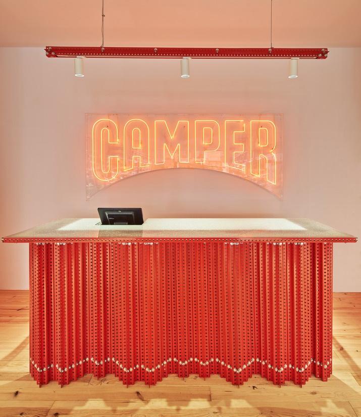
Behind it, a contrasting wall painted a pastel red-orange. The neon lights of the business logo also shine a lighter red-orange.
Red, the brightest color in the store, is contrasted at the register to emphasize it as the place to go for help or to pay.
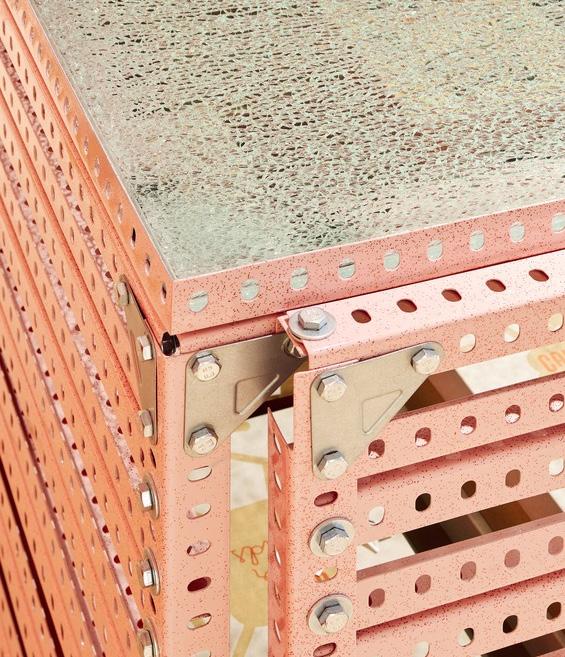
CONTRAST OF A DESIGN FEATURE
In the image to the right, there are several examples of contrasts in design features-changes in position, size, function, etc.
There is a change of material in the shelving. Against the wall, the shelving is made of perforated metal and wooden shelves. Meanwhile, the central shelving, is made of metal rods and a marble countertop.
The perforated metal industrial rods are also used in many different ways for different purposes/functions. As pictured, they are used in both the shelving and the light fixtures.
In other areas of the store, they are used diagonally for seating and vertically as a desk.

CONTRAST OF TEXTURE
A contrast in texture can include changes from rough to smooth, soft to hard, etc.
There are three main materials, with vastly different textures, used throughout the store.
The central shelving of the store demonstrate the most dramatic example of contrast in material texture: rough, marble countertops held by smooth, perforated powder-coated industrial metal.
The wall perforated metal of the wall shelvings and seating contrast tagainst glossy wood shelves/ toppers.
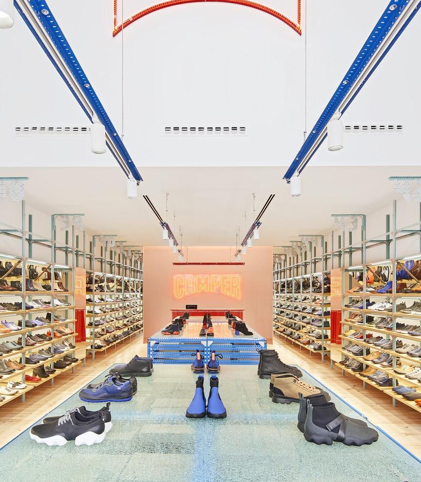
FOCAL POINT
A neon light fixture of the store’s logo acts as the focal point of the store.
Entering the store, an individual would have the view pictured to the left.
All shelving on the wall and center of the store, as well as above light fixtures, direct the eye to the end of the store.
The check-out counter, as well as said store logo light fixture is found there. However, walking in the register is blocked by shelving, and so the neon store logo sign becomes the focal point.
CONCLUSION
The “Camper Together” initiative of giving each store its own identity, is seen at an even smaller scale within this store. The store feels compartmentalized by its use of color, and in this way it makes every view of the store a unique experience: the bright red and glowing checkout, the rough blue marble central shelving, and the sleek wooden wall shelvings.
As learned throughout the previous chapters, colors have a physical and emotional effect on individuals. The use of blue and red in their respective areas of the store feel very intentional. Blue is often associated with calmness, which is what the store would want their consumers to feel while shopping. The more comfortable they are, the longer they would stay to browse. Red is often associated with excitement and passion. The use of this color specificaly at the checkout, would make the consumers feel even more excited about their purchase as they’re leaving the store.

M9 COLOR + WORKSPACE
INTRODUCTION:
INTRODUCTION: MACQUARIE GROUP
WHO: Macquarie Group
WHEN: Built in 1928, transformed into a Macquarie Group office in 2014
WHERE: 50 Martin Place, Sydney, Australia
WHAT: It is a global financial services group dedicated to the following: asset management, banking, trading, wealth management, special advising, investment, etc.
TEAM SIZE: More than 17,000 employees in 33 countries around the world
TARGET AUDIENCE: They are a global company who mainly cater to individuals who want to become more financially savvy, want to protect their assets, or need other financial assistance.
IMPORTANCE OF LOCATION: The building is only a couple of miles away from Sydney Harbor, whose shipping containers inspired the design of the interior working pods of the building.

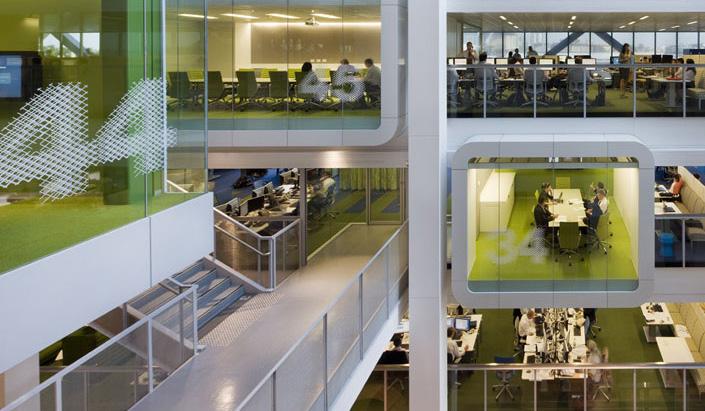
LINE
Throughout the building, straight horizontal and vertical lines are used to create simple shapes and spaces. The building itself is more of a vertical structure as it has central columns along which cubicle meeting pods and floors lie.
These orthogonal shapes and lines are repeated even in the interior seating arrangements and other decorative features.
However, in certain areas, such as the one featured to the left, angled lines are used to create indoor canopies or define smaller spaces within these larger cubicles.

PATTERN
Color and shape is used throughout the building to create patterns in the space.

Each floor is themed with a different color which covers the walls, carpet patterns, furniture, etc. This creates a pattern on each floor, while helping distinguish one from the other.
The cubicle shape of the meeting rooms, inspired by the nearby Sydney Harbour shipping containers, is also repeated on each floor. This helps the differently themed floors feel more cohesive.
TEXTURE
The major texture of the building is sleek steel, which is what makes up the structural vertical columns, cubicles, etc.
However, in some spaces, this same material is repeated to create a ridged texture such as the one pictured to the left.


Wood is also used in certain areas in the building. To the right, we can see it being repeated to recreate the ridged texture. In other areas, larger smoother planks are used to create an indoor web canopy.
Carpet texture is also common in the building, as it is featured on almost every floor in different colors to match each floor’s color theme.
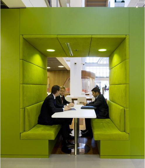
SHAPE
The cubicle shape is one that is repeated throughout the entirety of this building.
It is featured in each meeting pod on every floor.
It is also seen in smaller scales such as interior seating booths like the one pictured to the right.
CONCLUSION
The Macquarie Group incorporates a flexible Activity Based Working (ABW) platform for their employees, which means their workers tend to do more group work, meetings, and socializing throughout their workdays.
The design of their building echoes the importance of a connected work community. At the larger scale, the long vertical columns (line) which run through the building create large open space which connect all of the floors visually. Each floor is also color coded (pattern) for specific work groups, making each floor feel uniquely tailored for a certain function or feeling, and again visually connecting every space within the floor.
At a smaller scale, the cubicle meeting pods (shape/form) create intimate spaces which allow for deeper, productive work discussions.

M10 COLOR + VARIETY
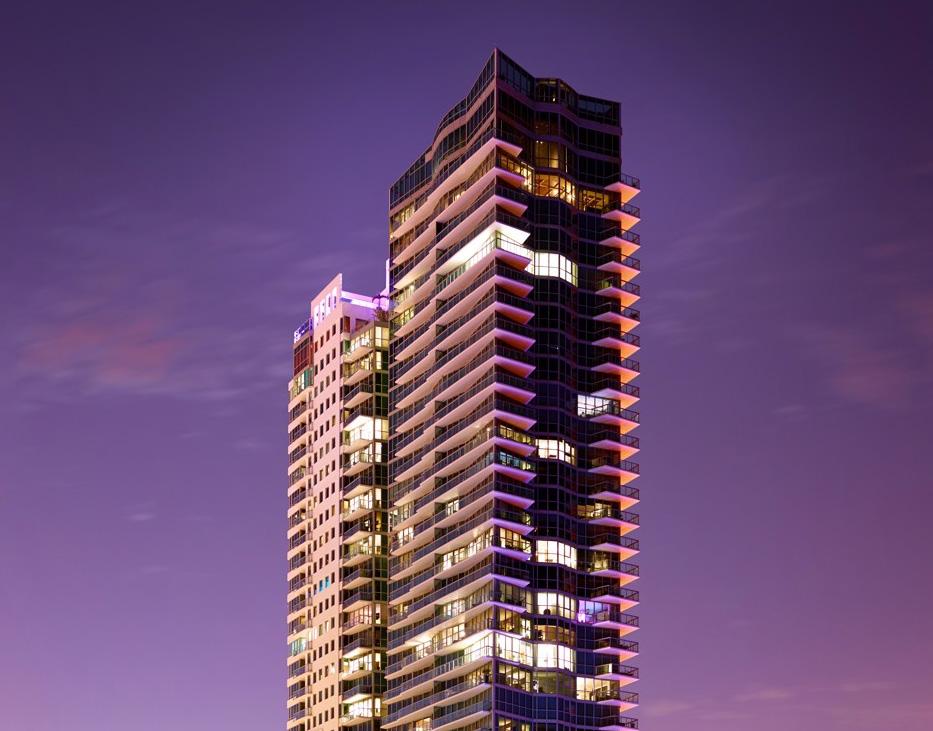
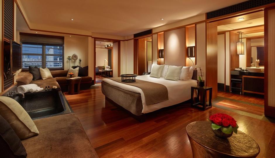
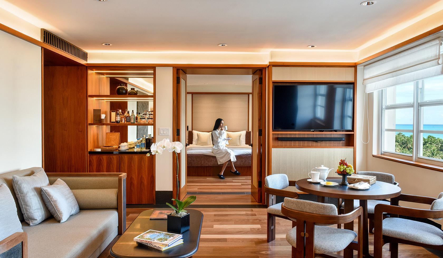
INTRODUCTION: THE SETAI MIAMI
The Setai Miami, originally named the Dempsey-Vanderbilt hotel, is a luxury Asian-inspired hotel opened in 1937.
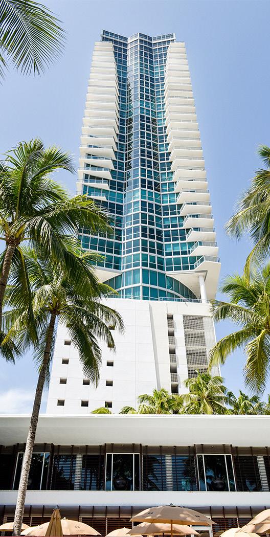
The design of the hotel was inspired by a, ”blend of Chinese and Southeast Asian aesthetic motifs”. It includes Asian-inspired materials, colors, and features which give it a serene and cozy, yet modern and moody air.
Dark, smooth wood-laden spaces, large water features, and decorative pops of red/orange are just some of the design qualities that make the design of this hotel successfully sophisticated and luxurious.
GUEST ROOMS
SHAPE: Shelving, doors, storage, lighting, etc. are all organized into rectangular grids along the walls.
FORM: Although most of the room’s fixtures are organized into these rectangular grids, the furniture has rounded edges for a more modern look.
PATTERN: The rectangular grids on the walls is echoed by the flooring pattern created by the wooden planks.
TEXTURE: Wood is a common material used throughout the hotel. It has a smooth finish for a sophisticated look.
COLOR: The rooms use a lot of brown wood furniture and cushioning which gives the room a warmer, cozier feeling.
DINING AREAS
SHAPE: The rectangular grids in the rooms are continued in the shared dining rooms by the columns lining either side, the floor pattern, etc.
FORM: Again, we can see contrast between the sharp rectangular features of the room versus the rounded furnituere.
PATTERN: The repeated black columns on either side of the room make it seem more vertical and therefore taller. The pattern of the floor tile continues the rectangular grid followed throughout the hotel.

TEXTURE: A new texture is introduced in this space, (besides the commonly used wood) which is the sleek floor tile.
COLOR: The hotel uses brown and orange to continue the cozy feeling of the guest rooms. However, black and red details are used to elevate the room to a more sophisticated, moody, public space.

COURTYARD
SHAPE: Rectangular planters and seating areas cut into the large pool in the center of the courtyard.

FORM: The furniture conforms to the rectangular spaces created within the large central pool.
PATTERN: Tall columns and palm trees repeat on either side and frame the space to make it appear vertical and taller.
TEXTURE: Wood and water textures are mainly employed in this area. The large pools of water are an example of the Asian-inspired design used by the hotel.
COLOR: Darker, moodier shades of brown are featured in this space. The darker colors further the calm, serene air of the space.

CONCLUSION
The repeated use of warm colors like brown and orange, materials such as wood, and large water features, creates a zen feeling typical of Japanese gardens and other forms of Asian architecture.
The subtle incorporation of red, and less subtle use of black, in the furniture and some planting, elevates the hotel to a more sophisticated look. The combination of the dark force of black and power of red, is often associated with luxury and exclusivity.
The rectangular grids found along the walls of the guest rooms, dining area floors, courtyard roof and planters, and interior columns, give the hotel a sharp, clean look. It’s perfectly balance by the organic details in the furniture.

REFERENCES
An Italian lesson on Colours. Italy Magazine. (n.d.). Retrieved January 22, 2023, from https://www.italymagazine.com/featured-story/italian-lesson-colours#:~:text=A%20 very%20last%20note%2C%20many,to%20bring%20about%20substantial%20changes.
Golden Fruit: A cultural history of oranges in italy - researchgate. (n.d.). Retrieved January 23, 2023, from https://www.researchgate.net/publication/325112964_Golden_ Fruit_A_Cultural_History_of_Oranges_in_Italy
Italy flag. Flags.com. (n.d.). Retrieved January 22, 2023, from https://www.flags.com/ italy-flag/#:~:text=Green%20symbolizes%20social%20equality%2C%20freedom,the%20 white%20snow%2Dcapped%20Alps.
Libguides: Cuba: A research guide: Welcome. Welcome - Cuba: a Research Guide - LibGuides at University of Massachusetts Lowell. (n.d.). Retrieved January 22, 2023, from https://libguides.uml.edu/cuba#:~:text=Cuba’s%20Flag&text=The%20two%20 white%20stripes%20describe,star%20represents%20independence%20and%20freedom.
M1
Meaning of colors. ITALIAN CULTURE - Made in Italy -. (2013, February 17). Retrieved January 22, 2023, from https://italiots.wordpress.com/2012/10/13/meaning-of-colors/
Encyclopædia Britannica, inc. (n.d.). The First Period of le corbusier. Encyclopædia Britannica. Retrieved February 5, 2023, from https://www.britannica.com/biography/Le-Corbusier/The-first-period
Fondation Le Corbusier. (n.d.). Retrieved February 5, 2023, from http://www.fondationlecorbusier.fr/corbuweb/morpheus.aspx?sysId=13&IrisObjectId=5234&sysLanguage=en-en&itemPos=45&itemCount=79&sysParentName=home&sysParentId=64
Olson, C. (2017, May 30). You can own a salvaged piece of Le Corbusier’s design legacy. Architectural Digest. Retrieved February 5, 2023, from https://www.architecturaldigest. com/story/artcurial-le-corbusier-unite-dhabitation-sconces
The colours of the collective. (n.d.). Retrieved February 5, 2023, from https://www.lescouleurs.ch/en/journal/posts/the-colours-of-the-collective
Unite d’habitation of Marseille - Data, Photos & Plans. WikiArquitectura. (2020, September 24). Retrieved February 5, 2023, from https://en.wikiarquitectura.com/building/ unite-dhabitation-of-marseille/
M3
M5 M8
Dazed. (2015, June 12). Ever wondered why drive was so colourful? Dazed. Retrieved February 19, 2023, from https://www.dazeddigital.com/artsandculture/article/25061/1/ ever-wondered-why-drive-was-so-colourful
Drive (2011). Home Cinema Choice. (2018, August 30). Retrieved February 19, 2023, from https://www.homecinemachoice.com/content/drive-2011
Emerson, J. (n.d.). Drive: Yellow light, red light, Blue Light, pink light: Scanners: Roger Ebert. Scanners | Roger Ebert. Retrieved February 19, 2023, from https://www.rogerebert.com/scanners/drive-yellow-light-red-light-blue-light-pink-light
R/movies - orange/blue colour schemes in “Drive” (2011). reddit. (n.d.). Retrieved February 19, 2023, from https://www.reddit.com/r/movies/comments/132xq6/orangeblue_ colour_schemes_in_drive_2011/
Silva, V. (2020, March 17). Camper Store / oficina penadés. ArchDaily. Retrieved March 12, 2023, from https://www.archdaily.com/935504/camper-store-oficina-penades?ad_ medium=widget&ad_name=category-store-article-show
Macquarie Group Revolutionary Workplace Design: Idesignarch: Interior Design, Architecture & Interior Decorating Emagazine. iDesignArch. (2022, January 4). Retrieved March 19, 2023, from https://www.idesignarch.com/macquarie-group-revolutionary-workplace-design/
Macquarie Group, one Shelley Street. Clive Wilkinson Architects. (1970, January 1). Retrieved March 19, 2023, from https://clivewilkinson.com/portfolio_page/macquariegroup-one-shelley-street/
One Shelley street | architect magazine. (n.d.). Retrieved March 20, 2023, from https:// www.architectmagazine.com/project-gallery/one-shelley-street
M9
The Setai, Miami Beach – Asian glamour in the Art Deco District. South China Morning Post. (2019, November 18). Retrieved April 16, 2023, from https://www.scmp.com/magazines/post-magazine/travel/article/3037480/setai-miami-beach-asian-glamour-heartfloridas-art
Our hotel. The Setai Miami Beach. (n.d.). Retrieved April 16, 2023, from https://www.thesetaihotel.com/our-hotel
M10
