1 minute read
FOCAL POINT CONCLUSION

from Ortiz_FINAL

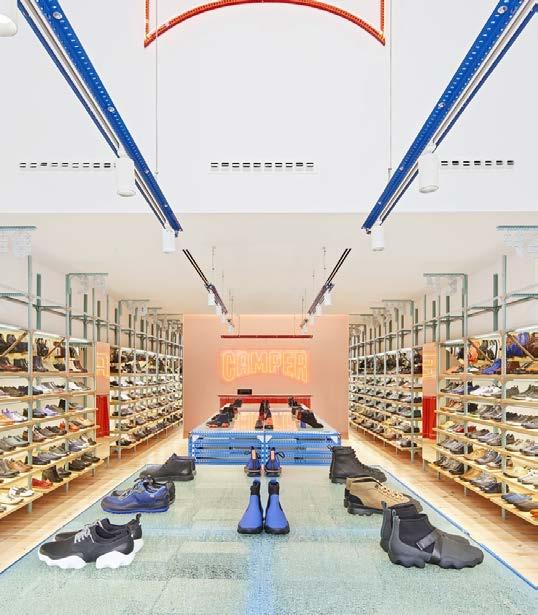
A neon light fixture of the store’s logo acts as the focal point of the store. Entering the store, an individual would have the view pictured to the left. All shelving on the wall and center of the store, as well as above light fixtures, direct the eye to the end of the store.
The check-out counter, as well as said store logo light fixture is found there. However, walking in the register is blocked by shelving, and so the neon store logo sign becomes the focal point.
Advertisement
The “Camper Together” initiative of giving each store its own identity, is seen at an even smaller scale within this store. The store feels compartmentalized by its use of color, and in this way it makes every view of the store a unique experience: the bright red and glowing checkout, the rough blue marble central shelving, and the sleek wooden wall shelvings.
As learned throughout the previous chapters, colors have a physical and emotional effect on individuals. The use of blue and red in their respective areas of the store feel very intentional. Blue is often associated with calmness, which is what the store would want their consumers to feel while shopping. The more comfortable they are, the longer they would stay to browse. Red is often associated with excitement and passion. The use of this color specificaly at the checkout, would make the consumers feel even more excited about their purchase as they’re leaving the store.


