1 minute read
PINKS
from Ortiz_FINAL
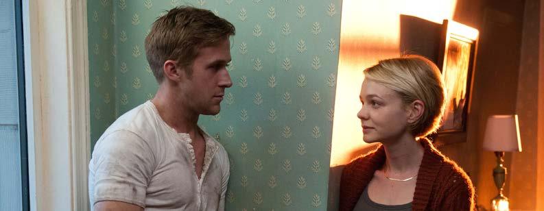
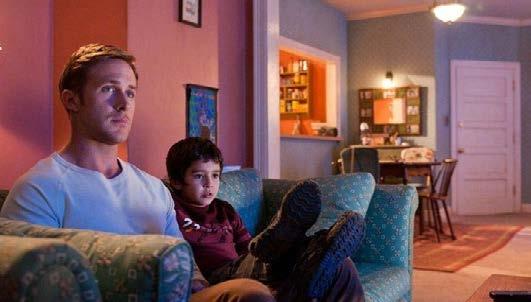
Pink tones appear mainly in scenes focused on Irene, one of the few, and the main, female character of the movie.

Advertisement
In the scene above, the driver and Irene’s child are waiting for her to finish getting ready so that they can go for a drive.
The scene pictured below, centers on Irene as she takes a break from a party thrown to celebrate her husband’s release from jail.
The walls in Irene’s home are also painted pink.
This color highlights Irene’s femininity and gentleness, contrasting with the darker, blue tones throughout the movie which could be associated with Gosling’s icy character. It portrays Irene as someone who would need the protection that the driver provides.
In the film’s poster, a light pink shines on blue overtones. This could symbolize the driver and Irene’s dynamic and complicated romance, a pivotal part of the plot.
Conclusion
The film “Drive” has high contrasting colors, opposite of each other on the color wheel: blues vs oranges/reds/pinks. This is done intentionally for several reasons: it is typical of the director Refn’s style, it contrasts characters of the film such as the driver and Irene, and it highlights specific emotions that should be evoked during specific scenes.
Each color is mainly associated with certain characters or emotions:
- blue= the driver, icy, moody, quiteness
- orange= happiness, intimacy, warmth
- reds= Nino, danger, aggression, intensity, love
- pinks= Irene, femininity, gentleness.


