I’m studying graphic design at the University of Fine Arts. Other than that, I cook, I hike and climb, and love Sci-fi in both book and film.
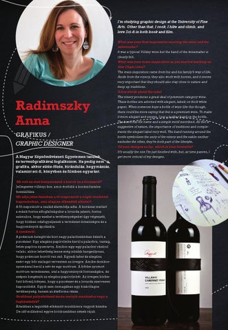
Radimszky Anna GRAFIKUS / GRAPHIC DESIGNER A Magyar Képzőművészeti Egyetemen tanulok, és tervezőgrafikával foglalkozom. Ha pedig nem grafika, akkor sütés-főzés, kirándulás, hegymászás, valamint sci-fi, könyvben és filmben egyaránt. Mi volt az első benyomásod a borról és a borászról? Jellegzetes villányi bor, amin érződik a borász fiatalos hozzáállása. Mi adja jelen fázisban a fő inspirációt a cégér címkével kapcsolatban, ami alapján elkezdtél alkotni? A fő inspirációt a család életmódja adta. A borászat mellett a másik fontos elfoglaltságukat a lovarda jelenti, fontos számukra, hogy ezeket a tevékenységeket úgy végezzék, hogy közben odafigyeljenek a természet-közeliségre és a hagyományok ápolására. A címkéről: A prémium kategóriás bort nagy palackszámban készíti a pincészet. Egy elegáns papírcímke kerül a palackra, vastag, fehér papírra nyomtatva. Amikor egy-egy palackot vásárol valaki, akkor lehetőség lenne még inkább hangsúlyozni, hogy prémium borról van szó. Egyedi lehet és elegáns, ezért egy bőr szalagot terveztem az üvegre. Amibe dombornyomással kerül a név és egy motívum. A bőrbe nyomott motívum természetes, utal a hagyományok fontosságára, és szépen kiegészíti az elegáns papírcímkét. Az üvegen körbefutó bőrszíj kifejezi, hogy a pincészet és a lovarda szervesen kapcsolódik. Egyik sem önmagában egy kizárólagos tevékenység, hanem az életforma része. Grafikusi pályafutásod során melyik munkádra vagy a legbüszkébb? Általában a legutóbb elkészült munkáimra vagyok büszke. De idő múlásával egyre kritikusabban nézek rájuk.
What was your rst impression meeting the wine and the winemaker? It was a typical Villány wine but the hand of the winemaker is clearly felt. What was your main inspiration as you started working on this Cégér label? The main inspiration came from his and his family’s way of life. Aside from the vinery, they also work with horses, and it seems very important that they should also stay close to nature and keep up traditions. A few words about the label The vinery produces a great deal of premium category wine. These bottles are adorned with elegant, labels on thick white paper. When someone buys a bottle of wine like this though, there could be more saying that this is a premium wine. To make it more elegant and unique, I put a leather band on the bottle. The band has the name and a simple motif inscribed. All this is suggestive of nature, the importance of traditions and complements the elegant label very well. The band running around the bottle symbolises the unity of the vinery and the sable: neither excludes the other, they’re both part of the lifestyle. Of your designs so far, which is your favourite? It’s usually the one I’m just finished with, but, as time passes, I get more critical of my designs.