creative
Empyrean Airlines
Airline Branding
Design Objective
Research the airline industry and develop a branded airline company. The branded airline must be original and reflect the spirit of the business. With a name that is not currently on the market for the airline industry, design a logo for the brand that will include the name of the airline company, well-chosen typefaces, a tagline, and a mark.
Design Brief
Empyrean Airlines is an international, luxury airline with a mission to ensure the safety and comfortability of every customer during their travels around the world. The target audience of the airline are those who value comfort and safety during their travels. This audience can include a wide variety of customers due to the airline being international. The airline’s branding was designed to be bright and welcoming to the target audience along with representing the sun rising or setting when traveling. The name that was chosen for the brand which roughly translates to “high heavens” is so that the company will be recognized as a luxury airline. The tagline, “New Adventures. Across Nations”, was chosen to imply that the airline is an international airline. The airline brand’s mark, is a symbol that showcases wings in flight. The typefaces used were chosen to complement the airline’s name and add a cohesive finish to the brand of the airline company.

Aviano Copper Variable - Heavy

John Meadows
John Meadows is a 28-year-old businessman who flies within and out of states for business. He is rarely home due to his work and prefers to stay at his location until the next business travel. Because of his outgoing attitude, he easily makes friends and connections. He hates being late and enjoys an easy travel to not further his stress as much as possible with work and traveling. During his free time he enjoys to relax and read.
Ashley Ka mble
Mother

airlines
airlines
cross nations. new adventures.
Aviano Copper Variable - Light ABCDEFGHIJKLMNOPQRSTUVWXYZ 1234567890

Ashley Kamble is a 30-year-old, married mother with two children ages 5 and 10. Her and her family travels at least once a year for a family vacation during the summer during the kids break from school. She a very loving to her family and is a cheerful person to all. When traveling, she worries greatly about their safety and is always well-prepared for her children’s needs. If her children are content then her and her husband, Carl, can be at ease and relax a little too.
airlines
cross nations. new adventures.

Mi rabeth
Belum Photographer
Mirabeth Belum is a 22 year-old aspiring and freelance photgrapher. She is friendly and outgoing which brings people to her and is very excited about the things she loves. Her crave to learn and explore is what led her to photographing and traveling. Becaue of this crave, she was well-prepared. She focused on saving money to travel and studied languages and cultures to freely travel the world with little to no complications.


ABCDEFGHIJKLMNOPQRSTUVWXYZ
1234567890
Secondary C 2.35 M - 75 Y 100 K 0 M 0 35 M -60 Primary 2.35 M 62 76 0.39 M 20 100 0.34 C 2.49 M - 22 Y 85 K
nations.
adventures.
airlines cross
new
nations.
adventures. Secondary 2.35 75 - 10035 M -60 Primary - 2.35 62 - 76 0.39 M 20 100 0.34 2.49 22 - 85
cross
new
RGB: 238, 131, 33 CMYK: 3, 59, 100, 0 HEX: ee8321 RGB: 244, 167, 73 CMYK: 2, 39, 82, 0 HEX: f4a749 RGB: 109, 110, 112 CMYK: 58, 49, 47, 15 HEX: 6d6e70 RGB: 188, 189, 192 CMYK: 26, 21, 19, 0 HEX: bcbdc0 RGB: 249, 192, 67 CMYK: 2, 26, 85, 0 HEX: f9c043
Salesperson
creative
Tidy Up!
App Design
Design Objective
Develop a unique app that is currently not available for download and create a prototype of it for user-testing. Consider the target audience and what the app will do. Design the brand identity for the app which will include the logomark, logotype, color palette, a unique set of icons, and the layout of the in-app screens and functions. In addition, design and create a booklet to be viewed.
Design Brief
Tidy up! is an app designed to help make cleaning fun. The target audience is anyone and everyone who has a hard time cleaning and needs a fun and motivating way to tidy their area. The logo of the app is designed to be a combination of a checklist and house with a broom splitting them apart. This design is to give the users a visual of what the app is about. Along with the main logo, an app icon logo was also designed which takes on a similar concept as the main logo with the checklist being a bubble and the broom being the light reflection in the bubble to imply cleaning. The typeface used in the main logo is to give off the feeling of being hand-rendered while the typeface used in the app is for better readability. The color palette of the app is mainly a monochromatic one with different variations of blue being used along with highlights of yellow to connect it back to the main logo. The layout of the app is quite simple and easy to navigate with little movement away from the home screen within the app. The icons are also easy to understand and were designed after the bubbly look of the app icon.
ABCDEFGHIJKLMNOPQRSTUVWXYZ
abcdefghijklmnopqrstuvwxyz
1234567890


ABCDEFGHIJKLMNOPQRSTUVWXYZ
abcdefghijklmnopqrstuvwxyz
1234567890


RGB: 225, 244, 253 HEX: e1f4fd RGB: 171, 225, 250 HEX: abe1fa RGB: 255, 245, 109 HEX: fff56d RGB: 0, 149, 218 HEX: 0095da RGB: 0, 192, 237 HEX: 00c0ed RGB: 142, 216, 248 HEX: 8ed8f8
Duffy Script - Regular
Helvetica Neue - Regular
creative App Booklet Scan to view App Prototye Scan to view

 Sarah Whitewood
Sarah Whitewood is a married 38-year-old women who is a stay-at-home mother with two children. She wishes to teach responsibility and life skills to her children and have them be more willing to help clean the house and do the chores that she asks of them. She has been finding ways to have a fun and engaging cleaning routine for her family which will encourage a connection between family members and a clean house.

David Ekart is a busy 34-year-old financial analysts who desires a clean, tidy, and comfortable, stress-reducing space. He is very guest-friendly and is a man of efficiency, productivity, and a sense of balance in his life. David, being a very busy man, has been looking for a fun and unique way to clean and maintain a comfortable living space when he comes home from a tiring day outside.

Jennifer Carter is a 28-year-old women who is a marketing coordinator. She is constantly working and moving about, never one to be in the same spot. With many due dates and deadlines, her calendar is always packed full. She wants something that is specifically for her to focus on cleaning and maintaining her living space to be clean and tidy.


 David Ekart
Jennifer Carter
ABCDEFGHIJKLMNOPQRSTUVWXYZ
abcdefghijklmnopqrstuvwxyz
Written in Flowers
Design Objective
Design and develop a subscription box. Curate what the content of the box will be and the unique benefits it will offer. The logo must be designed with a logotype, mark, and a tagline along with a well-chosen color palette and a supporting pattern. Further expand the brand by creating a digital case study for the subscription box.
Design Brief
Written in Flowers is a monthly flower themed subscription box targeted specifically at women. The logo was designed to capture a sophisticated and hand-rendered appearance with the chosen typeface and color palette. The mark, a feathered pen, is designed to look like a flower stem. It is a combination of the theme of the subscription box and the contents that will be in the box. The tagline, “A New Bloom”, adds on to that theme of a new flower each month. The supporting pattern that was designed is taken from the logo mark and used for borders. To delve deeper into the branding, a digital case study was also developed to further expand brand recognition and identity.
A New Bloom in F lower s
ABCDEFGHIJKLMNOPQRSTUVWXYZ
abcdefghijklmnopqrstuvwxyz
1234567890


Epicursive Script Regular
1234567890 Bree - Light
Subscription
Box
creative


Digital Marketing Case Study Booklet Scan to view
Quick Aid
Vending Machine
Design Objective
Research and develop a brand for a vending machine and the products that will be offered. The name of the brand must be unique, and the products offered must appeal to the target audience. Design the brand to include both a logomark and logotype along with a color palette. To further expand the branding, design the packaged products that will be offered and the wrap that the vending machine will be wrapped in.
Design Brief
QuickAid is a vending machine that targets those who need “a quick fix on the go”, the tagline to the brand. The logo design was overall quite simple with a color palette of three colors and a typeface chosen to match the desired theme of the vending machine. The wrap is designed to look and feel like fast movement much like the name of the vending machine. The mark was made to be integrated into the logotype by manipulating the “Q” and “i”. In doing so, the name is connected while also giving an idea of what the vending machine offers. Being a vending machine, the products offered are easily packable and able to be carried for travel.

A quick fix on the go! A quick fix on the go!


Freude - Regular ABCDEFGHIJKLMNOPQRSTUVWXYZ abcdefghijklmnopqrstuvwxyz 1234567890
creative
Florence Kelpies
Sports Branding
Design Objective
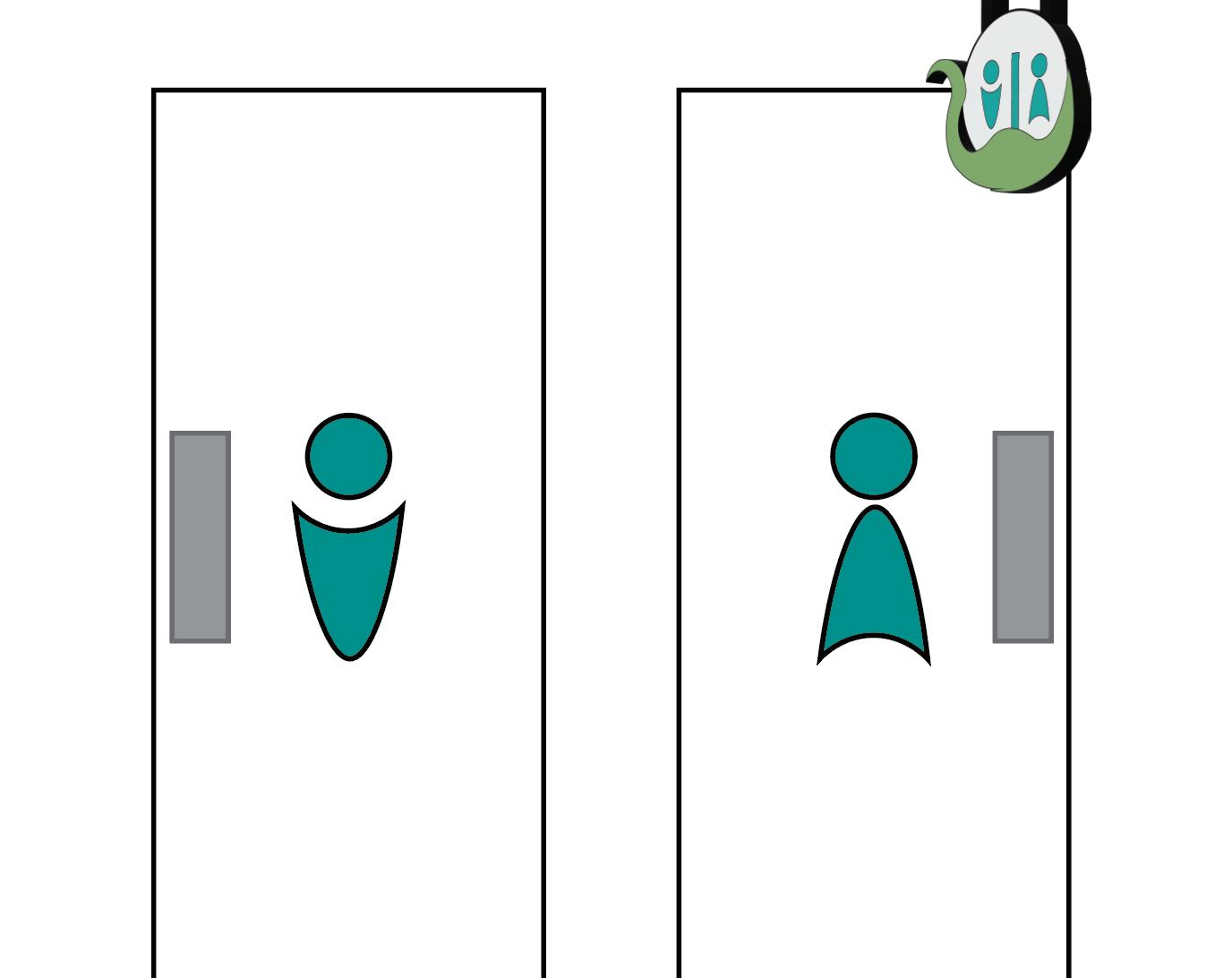
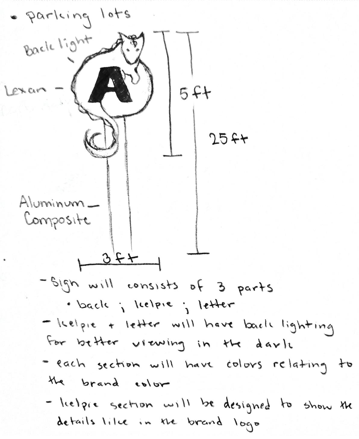
Develop a professional sports team in a city that has yet to have a professional team in the sports industry of either the MLB, NBA, NFL, NHL, or MLS. Create and design the team’s brand identity which includes the team’s name, the logo, logomark, logotype, and their color palette. In addition to the creation of the sport team’s brand identity, research signage and expand the brand by designing wayfinding and environmental graphics.
Design Brief
The Florence Kelpies’ design comes from Florence, Alabama which resides near the coast and has a horse sanctuary. The kelpie, a mythical creature, perfectly represents both the sanctuary and Alabama’s coast. The logo’s design, both primary and secondary, implies movement. The kelpie’s positioning and the unfinished circles in both logos take on the gestalt theory of closure and represents a hockey puck. The typeface that is used is relatively simple, but still matches well with the design of the logo. For the color palette, an earthy tone consisting of greens and blues was used along with complimentary white and black for contrast. To expand the brand, wayfinding signs and an environmental graphic was designed to create brand recognition, familiarity, and connection with the fan base of the team.
Florence


Bree ABCDEFGHIJKLMNOPQRSTUVWXYZ abcdefghijklmnopqrstuvwxyz 1234567890
creative


Sports Booklet Scan to view
Origami - In The Modern World
Design Objective
Choose a subject that relates to design and research how it has affected the world. With the chosen subject, design a six-page layout magazine spread that contains information about how the world has changed because of the introduction of the subject. The magazine spread should be designed to include text information, images, and pull quotes.
Design Brief
Upon choosing origami and researching its origins, the theme and appearance of the magazine spread were designed to have an aged look. The magazine spread is designed quite simply with the text being the focus and covers most of the space on the pages. The spread contains information about origami and the different ways that origami has been used worldwide. It also has information about how origami has affected specific subjects in a positive manner. Images of different origami pieces were used throughout the spread to showcase the types of origami folds and the many shapes that can be created with paper folding.


Digital Magazine Spread Scan to view
Print and Digital Media Magazine Spreads
creative
creative
Deep Sea Creatures
Infographic Poster
Design Objective
Create an infographic with the given subject. Design a layout for the poster and research information about the subject. Create two sets of icons, primary and secondary ones that relate to each other, to be used in the poster.
Design Brief
The poster is designed to look like the colors of the ocean that appear darker the deeper the water gets. The scuba divers and small white circles create eye movement that guides the eye down the page and clear the negative space. The text “Into the Deep!” also takes away negative space and gives a brief overview of what the poster is about. The primary icons were randomly chosen from the main subject but designed to look like how the sea creatures look. The secondary icons relate to the primary icons by being what the sea creatures are named after and are all quite simple as to not take away from the primary subjects. As for the text bubbles, they provide short information about the creatures such as their living depth, what they eat, and how they got their names.
INTO THE DEEP!
Sea Angel
Sea angels live in the ocean ranging from the surface to 2,000 ft (600 m). Their diet consists of only Sea butterflies, who are cousins to Sea angels. Sea angels get their name from their translucent body and wing-like fin that helps them swim, similar to that of snow angels.
The Oarfish typically lives in depths of 656 ft (200 m) but the deepest they have been found is 3,280 ft (1,000 m). Their diet includes plankton, crustaceans, and squids. The reason for their name is because of their pectorial fins that resembles oars.
Vampire Squids live in ocean depths of 2,000ft to 3,000 ft (300 3000 m). They eat marine snow, detritus that consists of bits of dead planktonic creatures and fecal pellets. The name came from its dark color and the skin that connects the arms which resembles a cape.
The Glass Octopus lives in the ocean 3,000 ft (900 m) deep below the surface. The mainly eat mollusks and crustaceans but their diet also includes various types of fishes and snails. Its name is from its nearly transparant body.

because blows up its mouth, creating massive net to scoop its prey.
Vampire Squid
Glass Octopus
Oarfish
Pleaz Clean
Packaging Series
Design Objective
With the given subject, design a logo for a 3-piece packaging series that properly relates to the subject. Include variation changes to the logo for the different packaging pieces. Choose 3 pieces of items to include in the packaging series and create mockups of them with the designed logo and any additional information added on to the mockups. Display the mockups in a pleasing way and properly showcase the products.
Design Brief
PleazClean is a 3-piece packaging series for cleaning. The logo for PleazClean is designed to evoke swift and fast cleaning with the swooshing motion of the logo mark. The blue and white colors are used to represent the feeling of cleanliness, and the bubbles were added to clear the negative space between the two endpoints of the swoosh. The name of the series was chosen for its simplicity and to connect the two words together. For the variations to the logo for the different type of cleaning product, the only change to the logo is the color of the swooshing motion.

Impact - Regular
ABCDEFGHIJKLMNOPQRSTUVWXYZ
abcdefghijklmnopqrstuvwxyz
1234567890


C ean
Social Media GIF Scan to view
creative
Jellyfish Windchime
Technical Illustration
Design Objective
Choose a subject to combine with a completely different subject. The design must be fully hand-rendered and done in black ink only.
Design Brief
The design of the illustration combines a jellyfish and a windchime together. To create the effective shading of the image with only black ink, repetitive strokes were added on top of each other to create a darker shade in certain areas of the illustration. To preserve the shape of the jellyfish and windchime, the strokes were made in a way that followed the direction of the initial drawing. To add to the illustrated piece, a digitized version was designed and animated to move.


creative Animation Scan to view
Polished
Nail Cosmetics Branding
Design Objective
Design a logo and brand identity for a nail cosmetic business. The business can offer a singular product or it can offer a variety of products. With the branded assets, design packaging mockups that effectively showcase the products that the business offers. In addition, create a variety of nail designs for visual displays.
Design Brief
The logo of the nail cosmetic brand is designed to be simple because it will be used in the packaging of products. A variation of the logo was also made for different usage in displays and placement. The color chosen for the logo is neutral and only used in the logo’s icon while the font is black to be easily viewable on the product packaging. The packaging of the products continues the simple design and uses the color of the polish it holds as the main color with only black as the secondary color. The nail art showcase what can be created with the products and designs for fake nails.


 Sarah Whitewood


 David Ekart
Jennifer Carter


