FLOW
Guide Wise | App Prototype
Design Objective
Design and prototype a functional app that satisfies a need. The app must include a small monetization as well. Curate a brand that can be applied to the app design and build off of that. Curate a good color scheme, logo and a logo mark to apply. After designing the prototype send it through user testing make make proper adjustments.
Design Statement
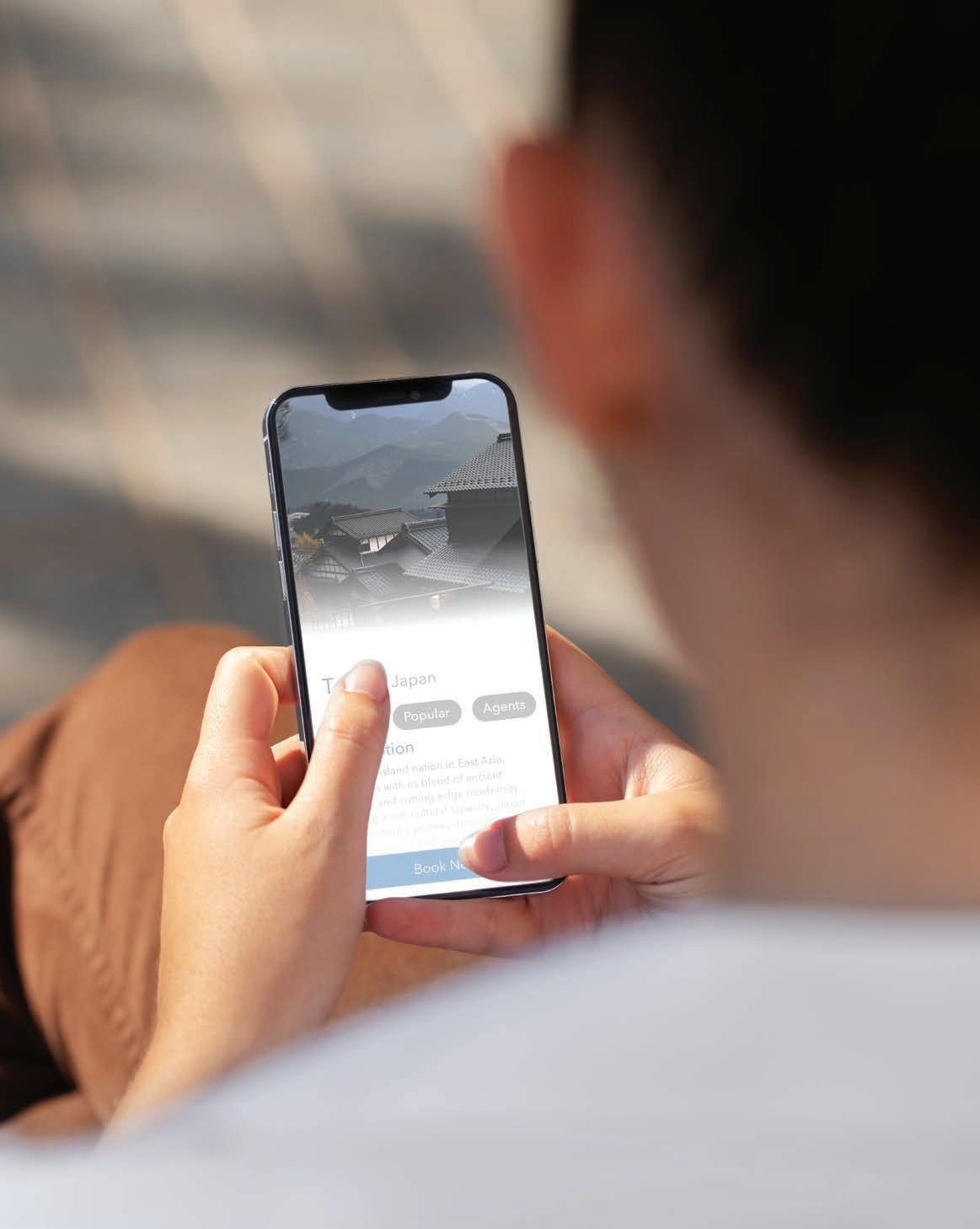
Guide Wise is an app that allows you to connect to a personalised “guide”. Your guide will create your itinerary for your travels and if you upgrade your app plan you can stay with your guide. The app itself has a simple design really focusing on the ease of booking. With a light and soothing to the eyes color scheme the app id designed to not hurt the eyes as its expected to look at it for a while while booking. The logo for the app is a easy sans serif font with a mark. The mark is a circle broken in half by waves. Its represents the half of the world you have explored vs. the half that you haven’t.


Guide Wise Style Guide
wise
Create Memories, Not Itineraries
Create
Not Itineraries
ABCDEFGHIJKLMNOPQRSTUVWXYZ
Create Memories, Not Itineraries Avenir
ABCDEFGHIJKLMNOPQRSTUVWXYZ


Sarah is a 28-year-old marketing professional who thrives on adventure and exploration. Her vacations are all about pushing her limits, whether it’s hiking up a challenging trail, bungee jumping off a cliff, or diving into the depths of the ocean. She values unique experiences and seeks out destinations that offer adrenaline-pumping activities. Sarah often travels solo or with a small group of friends who share her passion for adventure.
David, 35, is a dedicated father of two energetic kids, aged 6 and 9. He values quality family time and wants to create lasting memories through travel experiences. David seeks destinations that offer a balance between fun activities for the kids and relaxing moments for the adults. He often travels with his wife, kids, and sometimes extended family members.
Ahmed, 24, is a recent college graduate with a passion for im-mersing himself in different cultures. He loves exploring historic sites, trying local cuisine, and connecting with people from diverse backgrounds. Ahmed often travels alone, valuing the freedom to follow his own schedule and interests.
Prototype Booklet


FLOW
The
Hum | Subscription Box
Design Objective
Develop a unique subscription box that encompasses a fun design plan. Create a physical mockup and take product shoots. Study digital marketing and create a digital marketing case study based off of your findings. Create a web landing page for your subscription box.
Design Brief
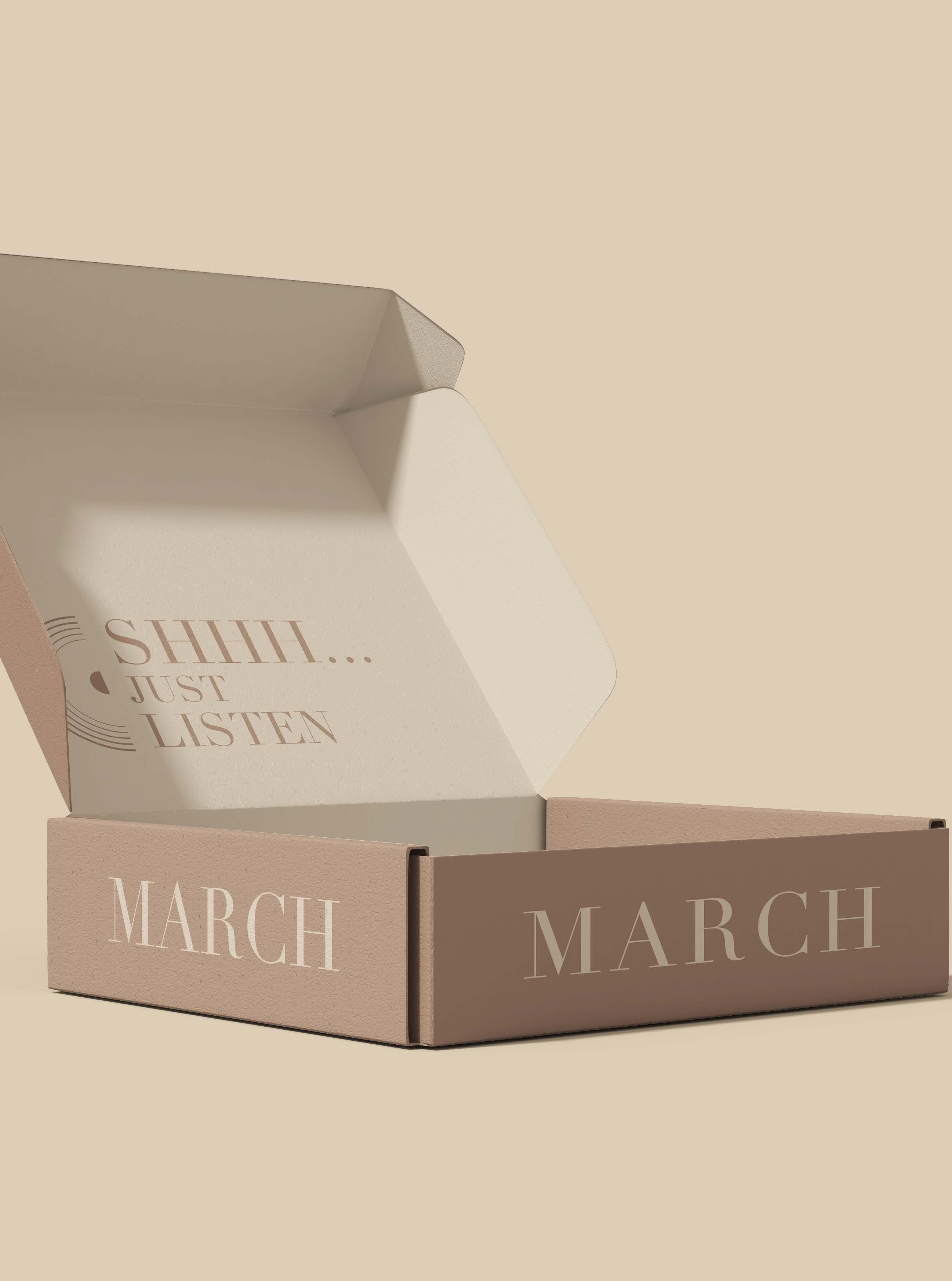
The Hum is a vinyl subscription box that showcases different artists and even curates different artists for you. The logo is a serif font that gives it an elegant feel. The mark is a few lines in a half circle above it. This represents the vinyl’s moving on the player. The color scheme was kept a nice muted tone that can be changed depending on holidays, season, ect.


THE
THE HUM


FLOW
GD USA | Magazine Spread
Design Objective
Develop a magazine spread that belongs in Graphic Design USA. Put your spreads into mockups and design a cover.
Design Brief
The magazine spread is very simplistic focusing the attention on the colors of the in game. It introduces you to the idea of the spreads then slowly moves into comparing maps and character design to show the vast differences in Call of Duty and Valorant. It shows how two different color designs really impact game play and how players see the games.


FLOW
Urbane Denim Co.
Illustration
Design Objective
Develop a distinctive denim brand based off of an illustration. Digitize the illustration with color and turn it into a logo for further social media branding. Create a Instagram post and magazine ad for the brand.
Design Brief
Urbane Denim Co. is a modern, up and coming brand. With a highlight on appealing to the newer generation, the logo is a colored illustration focused on stippling to create shades and lines. The dots used in stippling are colored with tints and shades to show shadows or highlights throughout the logo. The typography around the logo is a serif font to match the rustic vibe of the brand. The Instagram is a rustic theme with a color scheme of muted blues, green and mahoganies. While it places an emphasis on the jeans themselves, it also includes some fun extras to give some balance to the posts. Our magazine ad has a hierarchy of the background being a faded out western scene with a main focus on the jeans from behind. This is to show how strong the jeans are- or to even give a sense of strength.

Logo


FLOW
Design Objective
Create an aesthetic branding for a vending machine. It should include colors that are visually appealing. Develop mockups of the vending machine with packaging design and mockups. Design a webpage to put into a mockup to showcase the machine as well.
Design Brief
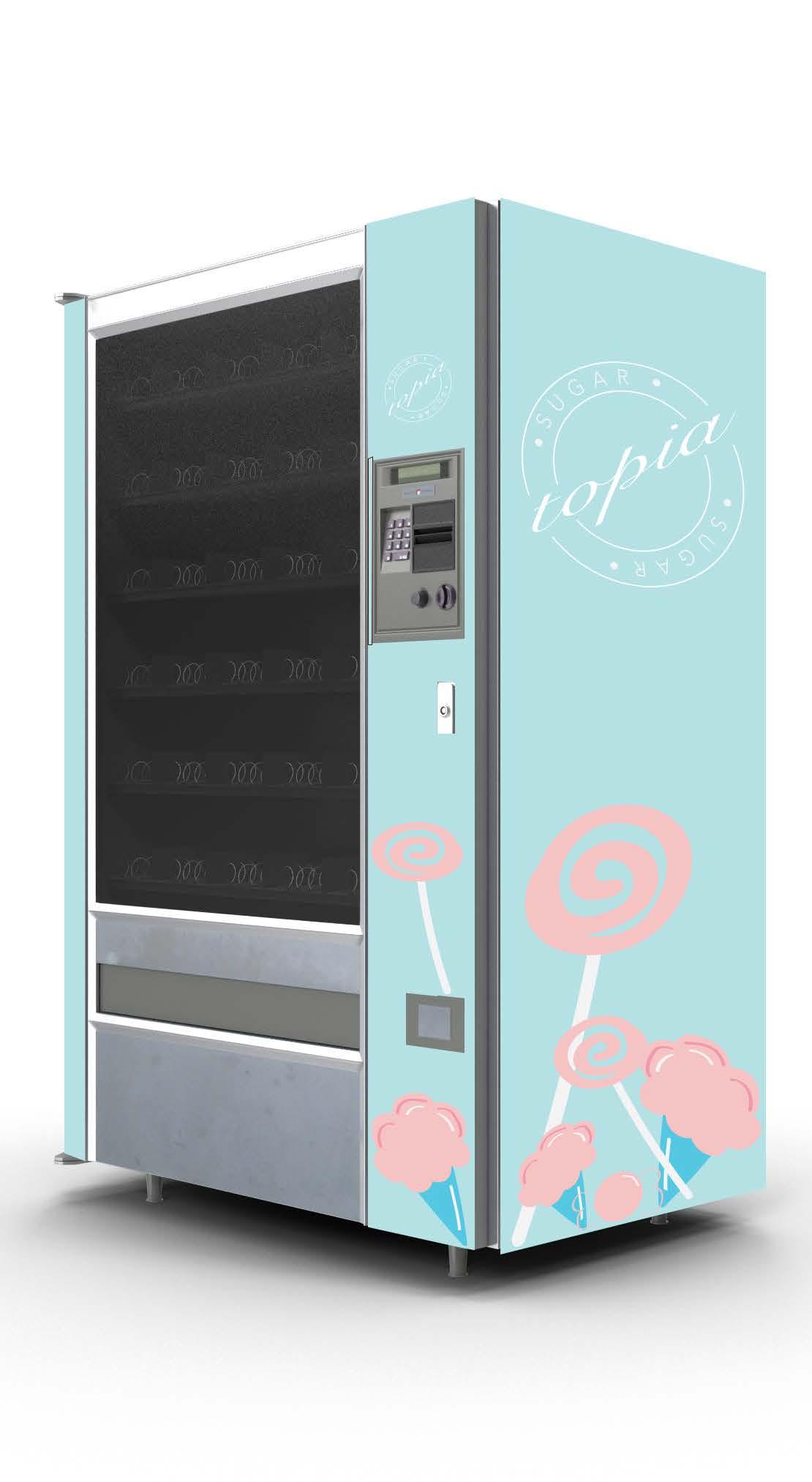
Sugartopia is a candy vending machine that was designed to attract more customers through its aesthetically pleasing appearance. Instead of a boring black vending machine, it has more fun colors such as light pink and light blue patterns. The logo includes a scripted cursive font with a sans-serif font. The logo is done in a circle to give off the vibe of being a hard candy for a generic shape so consumers can tell what the vending machine is for.


FLOW
Cinema De Lune | Drive-In
Design Objective
Develop a drive in movie theatre that is visually appealing. Create an event poster for the theatre and put it into mockups. Create a promo video for the theatre.
Design Brief
My movie theatre is a more fun, romantic, or even hippie theme to it, showing romantic comities the poster has a romantic feel to it. It is a typographic poster focusing heavily on colors, shapes, and the fonts used. The branding is very colorful and has a hippie feel to it.
Big Caslon Medium
A B C D E F G H I J K L M N O P Q R S T U V W X Y Z
a b c d e f g h i j k l m n o p q r s t u v w x y z
Hype Video


FLOW
Infographic Poster | Jett
Design Objective
Design an icon set and infographic poster.
Design Brief
The icons for my poster are a singular color to keep it simple against a busy background. There is a description about the abilities under the icons. They are inspired by a video game agents abilities in game. The background being an illustration of the character so you can learn about the specific character in game.


FLOW
Schone Luft | Airline Branding Design Objective
Design a cohesive and visually captivating airline brand that includes two mockups, a logo, and a cohesive color scheme. Additionally create another in plane mockup that will be displayed whether that is a uniform, a TV screen, or even some of the graphics in the plane.
Design Brief
Schone Luft is a German airline that promotes safety, punctuality, and German culture. With the direct translation it means Beautiful Airs, this is that you can see the beauty of the world from the air. The tagline -See the Beauty- reflects that. The logo incorporates this tagline under the primary part of the logo- the airlines name Schone Luft. The E in Schone is the mark of the logo with three lines that is the colors of the German flag, helping signify Germany’s culture and highlight what Germany had to go through to get to where she is now. Each color in the flag has a meaning behind it that shows the rich history. The typography in the logo is a sans-serif font, Avenir Next in regular to keep the attention to the mark of the logo. The mockups of the planes are kept simple to really highlight the colors on the German flag. In the middle of the plane, the color scheme is kept simple to bring emphasis to the logo. Then the tail of the plane is a German flag which balances out with the nose of the plane, which has just the pure color red.


SCHÖN
LUFT
SEE THE BEAUTY
SCHÖN
LUFT
 Tara Li 21 content creator
Tara is a very busy woman, she wants to travel in luxury but for as cheap as she can get it. She needs to travel to take photos and film videos to keep as genuine as possible with her fans.
 Tina Andrews 32 business woman
Tina is a orgaized woman who likes to fly in luxury. It doesnt matter to her the price she just wants to make sure she is safe and treated well. She needs to travel for her business and relies on her planes being ontime and never canceled.
 Mitch Elis 45 electrician
Mitch is a father of two and works as an electrician. He wants as good as he can get it for as cheap as he can get it. He is a vacation flyer and just wants to make sure his wife and children are as comfortable as possible.


Senses
Packaging FLOW
Design Objective
Craft a packaging brand that is visually aesthetic and alluring for your product. Use Adobe Dimension to develop mockups and 3D images of your product. Create a GIF to use in an Instagram Mockup.
Design Brief
Senses is exactly what the name is- a perfume for the senses. Highlighting the intense scent the design is kept simple, with the main color scheme kept neutral, black, white, and grey; it highlights the scent. The main logo on the bottle is kept simple, with the typography highlighting senses; it utilizes a serif font. The design on the bottle is a elegant one, the top and bottom part of the logo has some swirls around it then mirrored to emphasis that Senses is the main point. The GIF is a clash of all the different notes to create the bottle of perfume. This is to help highlight the different scents within senses to get a better understanding of the perfume itself.
EAU
1.0 FL OZ (30mL)
EAU
4.2 FL OZ (125 mL)


Blosso Floral Co.
BSnell Redhand
A B C D E F G H I J K L M N O P Q R S T U V W X Y Z
a b c d e f g h i j k l m n o p q r s t u v w x y z
Ambroise Std
A B C D E F G H I J K L M N O P Q R S T U V W X Y Z
a b c d e f g h i j k l m n o p q r s t u v w x y z


Kromatic Photography
FLOW


