Blubird. Airlines
Airline Branding | Mockup Usage | Collateral Design
Project Objective:
The objective of this project is to conceptualize, design, and develop a comprehensive branding strategy for a new airline. This involves creating a unique brand identity that resonates with target audiences, setting the airline apart in a competitive market. The branding elements include a logo, mockups, and collateral materials, each reflecting the airline’s values, vision, and commitment to exceptional service.
Design Brief:
Blubird Airline, a mid-range regional carrier, commits to enhancing the travelers experience, making it a seamless part of the vacation. Our logo, the bluebird, symbolizes good fortune following hardship, reflecting the rewarding experience we offer our hard-working customers. Our branding deeply integrates shades of blue, from the rich hues of the bird to the tranquil blues of the sky, embedding peace and joy into our identity. The logotype features a custom script font that complements the primary logo, harmoniously paired with a simple sans-serif typeface for cohesive branding. Blubird Airline was created to make the flying experience just as relaxing as the vacation.
Source Code Variable Light
Aa Bb Cc Dd Ee Ff Gg Hh Ii Jj Kk Ll Mm
Nn Oo Pp Qq Rr Ss Tt Uu Vv Ww Xx Yy Zz


 Johnson


Wyoming, Herdsmen
Sports Team Branding | Wayfinding + Environmental Graphics | Collateral Design
Project Objective:
Create a fake professional sports team unique to the area. Include stylized branding, wayfinding, environmental graphics, and other collateral pieces. Effectively utilize color and design principles to create a team in the National Football League to draw in a specific target audience.
Design Brief:
The Wyoming Herdsmen, a professional league football team, boasts branding that embodies vigor and readiness, depicted through the downward-facing angle of the bull, signaling its readiness to charge. The logo incorporates a circular rope that is strategically positioned in the background and then reemerges, intricately knotted, at the forefront, creating additional movement. The typography is infused with a texture that imparts a rugged, Western ambiance. Utilizing a palette of bold brown and yellow, the team’s branding captures attention and encapsulates the indomitable spirit of the Wild West on the football field.

Jerseyclub Grunge - Bold
ABCDEFGHIJKLMNOPQRSTUVWXYZ abcdefghijklmnopqrstuvwxyz
Georgia - Regular
ABCDEFGHIJKLMNOPQRSTUVWXYZ abcdefghijklmnopqrstuvwxyz
Hat Brown Bull Brown Black Lasso Yellow BRAND BOOKLET


Epic Wingspan
Technical Drawing | Digitized Drawing |
Animation | Layout Design
Project Objective:
Craft a hand-drawn illustration that seamlessly merges an inanimate object with a living creature, achieving a level of realism that makes the composite image convincingly life-like. Following this, evolve the illustration into a captivating book cover design, ensuring it embodies the essence and allure of the narrative within.
Design Brief:
Epic Wingspan is a hand-crafted illustration that, ingeniously blends the essence of a book with the spirit of a bird into a unified, lively creation. Furthermore, the design was digitized transforming it into a captivating children’s book cover design for the fictional “The Wise Wings of Walter Warbler” by Arabella Inkwell.


 See Walter Flap His Wings
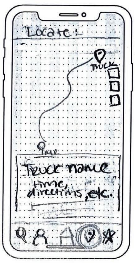
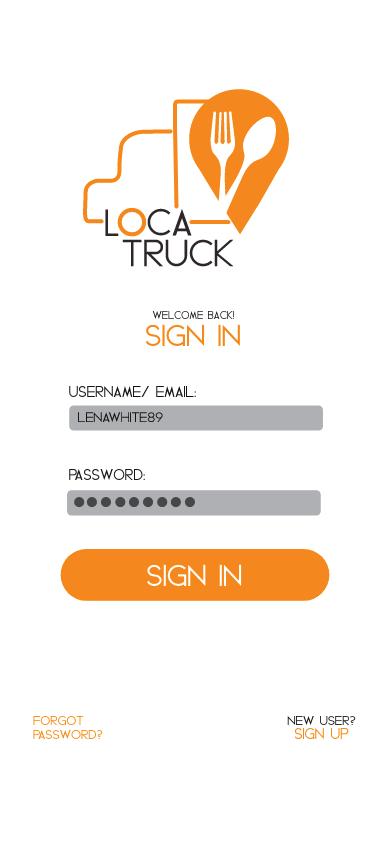
LocaTruck
Application Design | Branding | User Interface + User Experience Design
Project Objective:
Create an application that is new to the market. Make the navigation of the app easy-to-use but also engaging for the intended target audience. Include screen flow, prototypes, wireframes, and user testing to develop the target audience and gain a better understanding of personal design choices.
Design Brief:
LocaTruck redefines the food truck experience with an intuitive app designed to effortlessly search, save, and navigate to individual users beloved food trucks, all from one convenient location. This user-friendly platform encourages food enthusiasts to personalize their culinary journey by keeping notes on their favorite and least favorite trucks, along with tracking their locations. LocaTruck’s mission is to streamline the customer’s food truck adventure, making it both easy and enjoyable. Our company’s branding, characterized by a vibrant and attention-grabbing orange, encapsulates the essence of the app through creative elements such as the distinctive half-truck design incorporated into the “O” of LocaTruck, ensuring brand cohesion. Our logo’s centerpiece, a location marker adorned with a fork and spoon, perfectly symbolizes my brand’s core focus on connecting food lovers with mobile gastronomy.


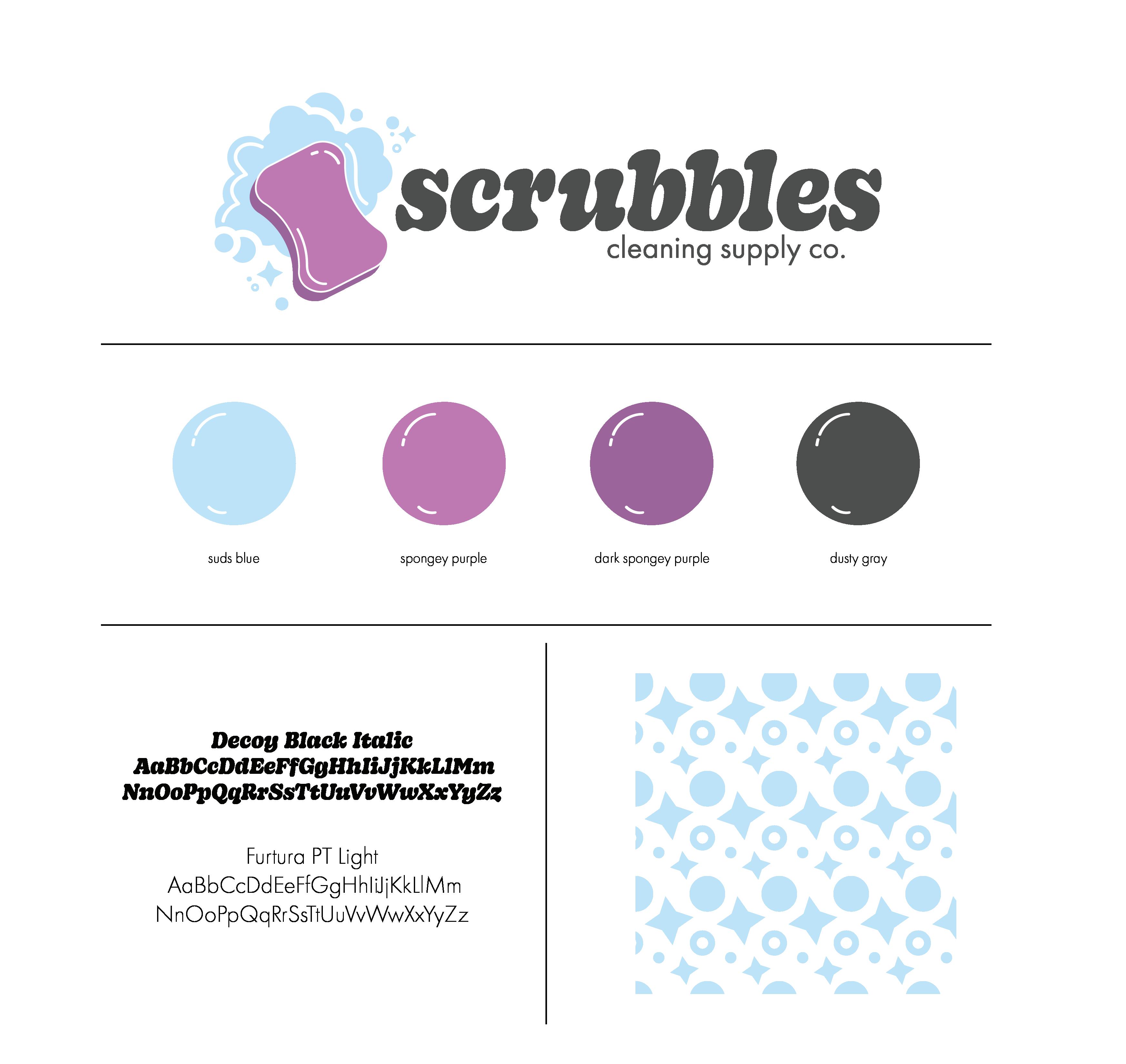
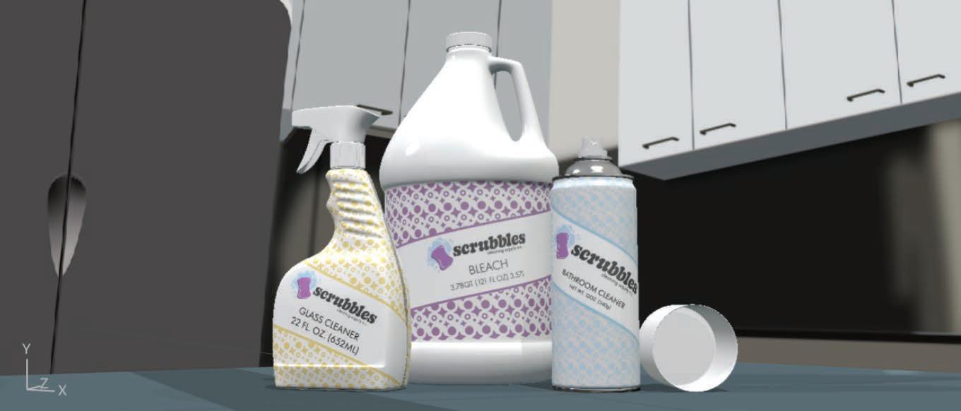
Scrubbles
Digital Marketing Case Study: Logo Design | Packaging | Mockup Usage | Social Media Marketing | Email Campaign
Project Objective:
Craft a captivating cleaning supplies brand complete with an innovative packaging design for three products in the line. Following the brand creation, strategically broaden its presence and market reach through engaging social media posts, dynamic email campaigns, and a professionally designed website.
Design Brief:
Scrubbles transforms everyday cleaning into a joyful journey for parents and their children. At the heart of our brand is the commitment to nurturing responsibility and fun in kids, all while ensuring their safety. Scrubbles carefully formulated products are gentle on both skin and lungs, making them perfect for family use. Our brand comes to life through a vibrant blend of deep purple and bright blue hues, accentuated by our playful, bubbly logo. This combination injects a delightful, child-friendly vibrancy into our identity. Scrubbles signature packaging features an eye-catching gray triangular pattern, designed to stand out while gracefully complementing our logo, striking the perfect balance between engaging and understated. Consistency is key to the Scrubbles experience. Every post, email, and the meticulously designed interface of our website echo our brand’s essence, ensuring a seamless and engaging journey for our customers. With Scrubbles, cleaning is not just a chore—it is an adventure in bonding and learning for parents and children alike.


MYFIVE
Subscription Box Branding | Packaging Design | Collateral Design | Imagery
Project Objective:
Develop an exclusive subscription box that showcases compelling design elements. Establish a distinctive brand identity, oversee box production to create the ultimate customer unboxing experience, and extend this concept through an impactful social media marketing campaign.
Design Brief:
MyFive offers an innovative monthly subscription box designed specifically for adults, uniquely tailored to stimulate all five senses. Each month, subscribers delight in receiving a box filled with five carefully curated items, personalized to their preferences through an initial survey. Our brand’s vibrant color palette is strategically chosen to capture attention and spark excitement among our customers. The logo, a creative rendition of the number 5 transformed into the silhouette of a hand, symbolizes the integration of the five senses, embodying the core essence of our brand. The distinctive pattern we use incorporates icons representing each sense, all while maintaining the bold, eye-catching colors that define us.


The Weekly Ketchup
Podcast Branding | Logo Design | Multimedia Creation | Backdrop Design
Project Objective:
Craft and establish a unique podcast identity, encompassing the creation of a distinctive logo, the development of exclusive merchandise, the production of at least one engaging multimedia post, and the design of a visually captivating backdrop for use in broadcasts.
Design Brief:
“The Weekly Ketchup” is an independent podcast that brings a fresh serving of gossip and laughter directly to listeners’ ears on a weekly basis. Our hosts create an atmosphere so engaging and lively, listeners will feel as if they are right there with them, sharing in the fun and camaraderie. Our branding flawlessly mirrors the playful spirit of our name, featuring an animated tomato donning headphones and a microphone, all set and eager to dive into lively conversations. A palette of subdued reds and greens, were selected to invoke a nostalgic, retro vibe that complements our tomato-themed mascot perfectly.
“The Weekly Ketchup” is the go-to podcast for introverts craving a burst of laughter and the latest gossip without needing to step outside the comfort of their home.


Targeted Advertising Online Article
Print + Digital Media Publication | Copywriting | Digital Layout + Design
Project Objective:
Create an appealing magazine cover for a Print Magazine that incorporates what your specific article highlights. Using typography and visual hierarchy, create the layout for the given article. In the layout, include a sidebar with additional information about your related topic. All imagery chosen should be cohesive and enhance the article for readers.
Design Brief:
This magazine spread aims to explain the science underpinning targeted online advertising. The article delves into the essence of targeted advertising, shares the mechanisms by which websites harness this technique, explores its advantages, and features an accompanying video for visual learners. The integration of imagery—featuring computers and technological vdevices—alongside a palette of blues and greens, harmonizes the article’s theme with the spread, enhancing reader engagement. This project exemplifies the application of photo composition, photo manipulation, and sophisticated layout design.


 Interactive Magazine
Stork Stop Vending Machine Branding | Logo Design | Mockup Usage | Digital Screen Design
Project Objective: Design and establish the brand identity for an innovative vending machine focused on baby products. This project involves not only crafting a captivating visual and thematic brand identity but also applying the branding across a range of products and the machines. Eye-catching wraps for the machines not only attract attention, but also resonate with the needs and aesthetics of modern parents. This concept was brought to life by creating a harmonious blend of functionality, design, and branding that stands out in the market.
Design Brief: Stork Stop revolutionizes on-the-go parenting with our innovative baby products vending machines. Designed with modern families in mind, our machines feature intuitive touch screens that offer a sleek, glass-free facade. This thoughtful design encourages a more interactive experience, guiding customers through a digital journey to discover everything about our products, from sizes to nutritional details, with just a tap. Our branding comes alive with a vibrant palette of pinks, blues, and oranges, intentionally chosen to capture the attention of parents seeking quick solutions. At the heart of our identity is our charming logo, depicting a stork gracefully carrying a bundle, a whimsical nod to the timeless tale of storks delivering babies. Stork Stop stands as a beacon of convenience and reliability for parents caught in the hustle of life, offering a helping hand when they need it most. Whether it’s a last-minute necessity or an immediate need, our vending machines are strategically placed to ensure that parents have access to essential baby products anytime, anywhere.


 StorkStop Vending Machine Prototype!
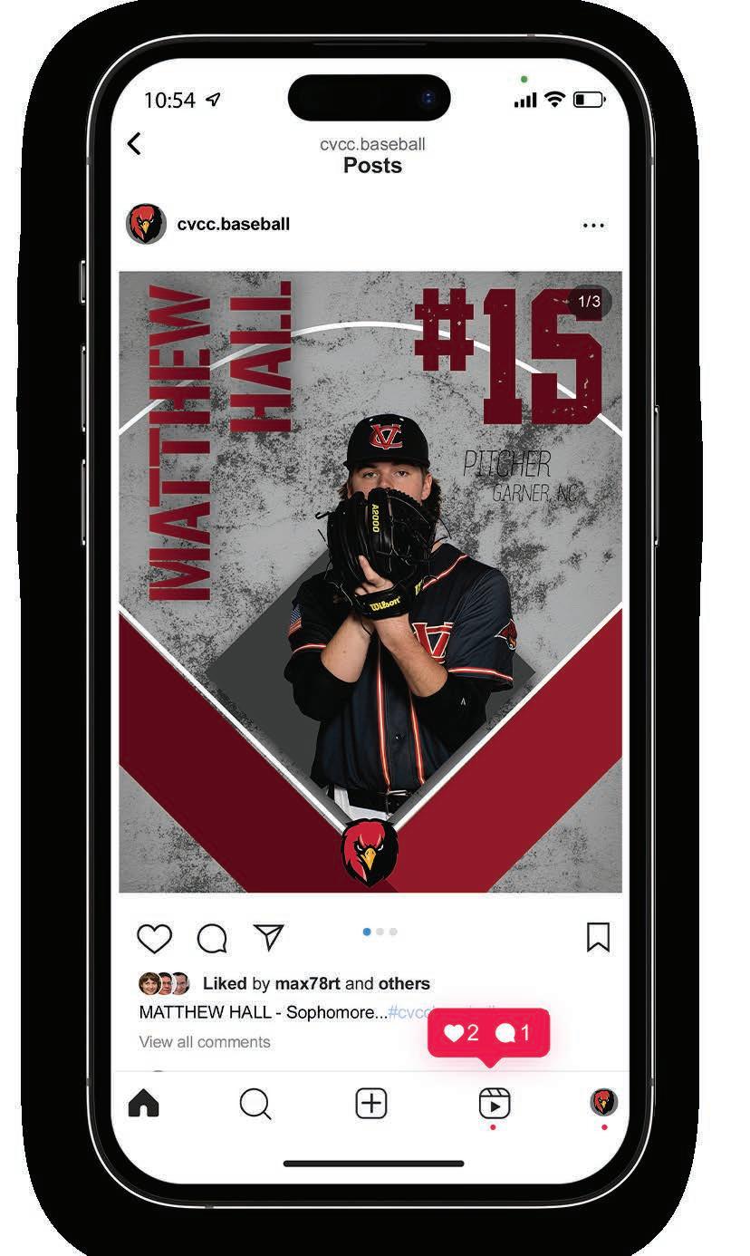
Red Hawk Baseball Graphics
Animation | Layout Design |
Mockup Usage | Social Media Presence
Project Objective
Craft a dynamic series of social media motion graphics that captivate and engage audiences, celebrating the spirit and prowess of the CVCC Baseball Team. Collaborating in teams, we aim to master the art of motion graphic design using After Effects, coupled with video editing prowess in Premiere Pro. This project is an exciting journey towards excellence in visual storytelling, brand promotion, and the creation of compelling social media content.
Design Brief
Leveraging the distinct branding of Catawba Valley Community College, I crafted engaging introduction graphics for 13 players on the CVCC Baseball Team. The design process involved a meticulous arrangement of elements to create a visual hierarchy that highlights the players’ photographs, followed by their names, numbers, positions, and hometowns. Post design, each element was intricately animated using video editing software, resulting in dynamic and striking motion graphics. These animations are not just visual treats but encapsulate the vigorous and fierce essence of the CVCC Red Hawks, designed to leave a lasting impression on the audience.