

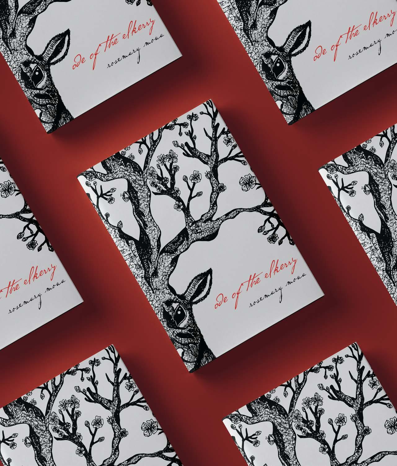
On an 11” x 14” mixed media paper, draw a technical illustration by combining two distinctly different organisms/objects. The work must be hand-rendered using pen and ink as the only medium. The illustration must utilize only the shade of black in the design and exhibit advanced illustration techniques. Expand the illustration by digitizing and creating a book cover series.
The object/organism chosen for this subject is an elk and a cherry blossom tree. Elks are known to have big antlers; therefore, using a cherry blossom tree in place of the antlers was a perfect placement. Various types of techniques were used to illustrate the subject. Cross-hatching is used to show depth in the shadows of the elk’s chin and jawlines. Circling and scribbling were used on the cherry blossom barks to create the texture of the tree. This not only gives the illustration depth but also gives the drawing realism.


Create a new design for the next Summerscapes. The project requirements were to design a new branding and logo to promote the event that would be displayed throughout various merchandise such as t-shirts, postcards, and a digital booklet. The logo and branding should relate to the target market and keep a fun and youthful aesthetic.

Summerscapes uses a sun as its central figure with different themes for branding each year. To continue with Summerscapes’ branding, a character for the sun was created and a jungle/safari theme was used. A postcard and t-shirt mockup are included to provide visuals on how the graphics will be printed out. The background of the graphics incorporate different shades of green for the trees and plants. The sun stands out against the green background and becomes the focus of the layout. The target audience of Summerscapes is a youthful demographic. “Seek Adventure In” is the tagline used to represent the theme of Summerscapes.

Color Palette
Typography


Design a pin design representing North Carolina for the state competition at SkillsUSA. The design must include elements from North Carolina and give reasons as to why each element was chosen. The name North Carolina must be included among the elements. The pin must be in color whether it is a two-tone color or a full-color palette.
The design of the pin for North Carolina is colored in a two-tone color palette. The color palette is designed with a brass metal tone with a hint of gold. The elements chosen to represent North Carolina are Pepsi, Krispy Kreme Doughnuts, Babe Ruth, Roanoke Island, and thirteen stars. The theme for this pin is ‘North Carolina’s Firsts.’ The pin has a circular shape with stitches inside the shape, representing a baseball that coincides with Babe Ruth as well as a gold coin representing the first gold rush in North Carolina. The idea behind the color palette of the pin is to let it be like a vintage collector’s item. The main element of the pin is Babe Ruth because there are many baseball fans who are fans of Babe Ruth and are looking to collect items that are related to Babe Ruth. The companies, Pepsi and Krispy Kreme Doughnuts were first founded in North Carolina, and Roanoke Island was the first settlement of settlers in North Carolina. The thirteen stars represent North Carolina for being one of the first states to become a colony in the United States, which is the 13th colony.


Design Objective:

Design an app interface that solves a problem with a logo and matching iconography. Define and utilize personas and conduct user testing through storyboards, wireframes, and prototypes for optimal and overall user experience.
Design Brief:
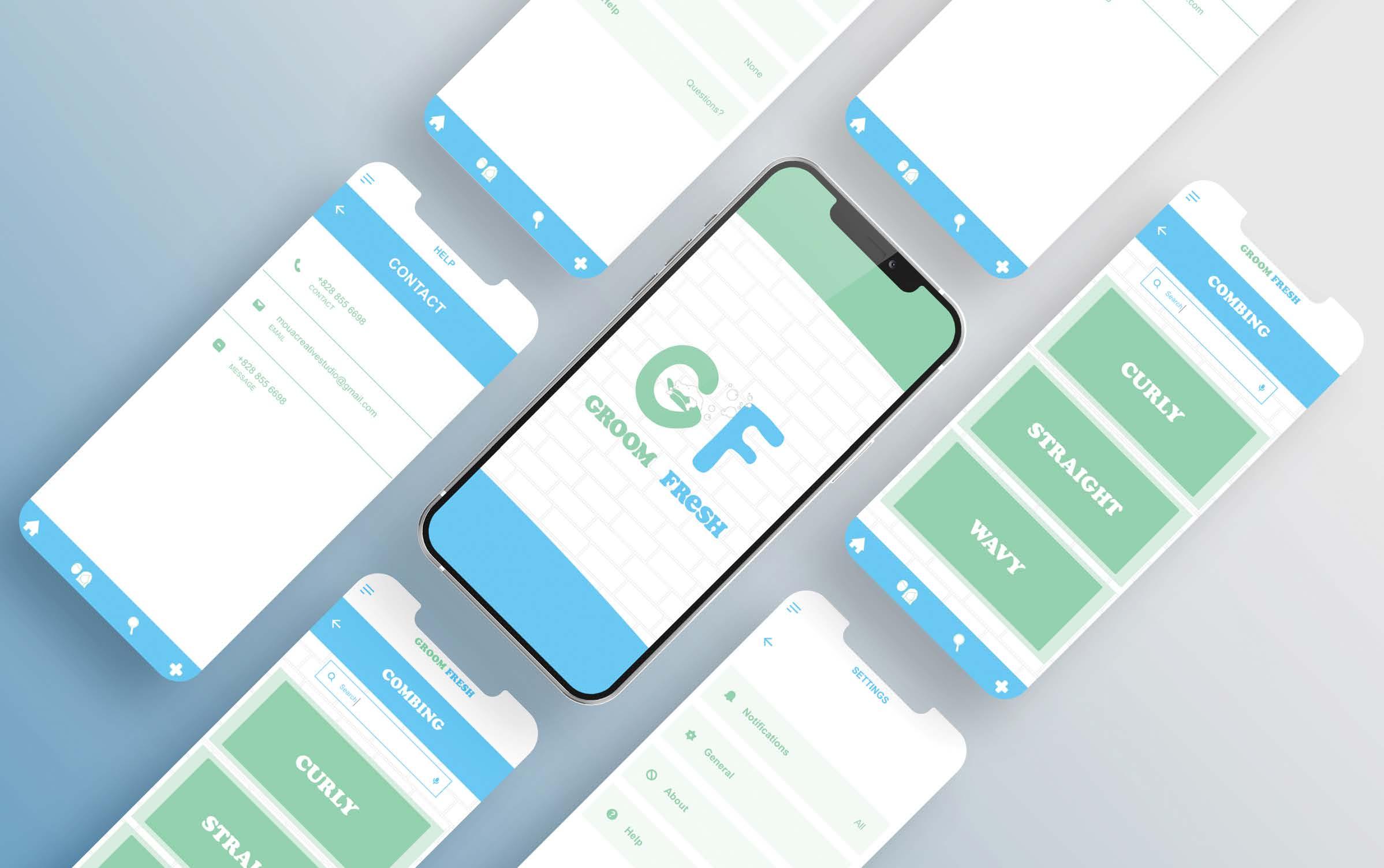
Groom Fresh is an app meant to help provide tips on grooming, hygiene, and any type of personal care. Groom Fresh is a Freemium-based app. The app offers free written tutorials and reviews, and video tutorials are offered through premium. The premium package also offers chat forums within the grooming and hygiene community and professionals. Groom Fresh’s logo is a simple design made up of the first letter of the app’s name. Between the two letters, a hand with foam can be seen representing both grooming and hygiene. Green and blue are often associated with grooming and hygiene; therefore, the colors are green and blue. The user-friendly interface is simple, clean, and easy to navigate.
Tanya is a social worker at a middle school. She has been working as a social worker for over 20 years. She is employed at a Tier 1 school for low-income students. She also works as a counselor at a private clinic. She wants to find other ways to discreetly help her students so that they won’t have to feel embarrassed or shy to ask for help on how to take care of their personal care. Looking for a personal care app would not only help her students, but she can also suggest the app to her colleague, and they could spread the word about the app, therefore, students can download the app without having to feel uncomfortable asking for help.


 Color Palette

Illustrate an 11” x 14” work of art that morphs an object with the letter that it starts with. This illustration will be hand-rendered using only Prisma colored pencils. The work should use at least 80% of the page including the background. Digitize the illustration and create and expand the work into an animation.

The object chosen for the subject is a peacock. The peacock is an intriguing animal with its vibrant colors and the uniqueness of its feathers. Peacocks are also symbolic of beauty, vision, success, and other special qualities. To showcase the objective of the assignment, the neck is morphed into the shape of the letter P. The illustration and colors of the peacock replicate the version of the bird people often see, the blue peacock.


Design a brand for a pharmaceutical drug called Cortipril, used in aiding depression and anxiety. Create and design trade show booth mockups, packaging, and collateral pieces for the drug.

The drug Cortipril is used to treat depression and anxiety. The logo for Cortipril was based on the symbol for depression, a semi-colon. The color palette chosen is yellow and lime green, giving off a bright and light feeling to the packaging, also correlating with the purpose of the drug. The catchphrase, “Live happy, Be happy,” nods back to the purpose of the drug in treating depression and anxiety. The inspiration for the trade show booth design to attract customers is an art theme where customers can come and paint and express their moods and emotions. The backdrop used for the booths is the famous painting Starry Night by the famous painter Van Gogh. Most of the booths’ colors are blue, which provides a calm yet relaxing atmosphere.
Typography
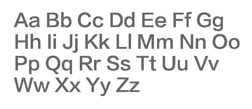
Aa Bb Cc Dd Ee Ff Gg Hh Ii Jj Kk Ll
Mm Nn Oo Pp Qq Rr Ss Tt Uu Vv
Ww Xx Yy Zz
Aa Bb Cc Dd Ee Ff Gg Hh Ii Jj Kk
Ll Mm Nn Oo Pp Qq Rr Ss Tt Uu Vv
Ww Xx Yy Zz
Primary Logo

Secondary Logo


 10 x 10 Booth

 10 x 20 Booth
Design a set of Oracle cards and their packaging. All graphics must include elements of the title of the deck, pattern, color palette, and the graphics on the cards.

The design for this deck of cards is based on a minimal design. The inspiration for the oracle deck is based on the Chinese zodiac. Line art is used to draw the animals as it offers a minimalist design and does not distract the viewer’s attention. A single word of the animal’s name is used on each card to stay consistent with the minimalistic design. The color palette is a range of warm colors from red to orange to yellow. These colors are often associated with the Chinese zodiac, especially during the Lunar Year.




Design Objective:

Conceptualize and design branding and collateral pieces for a city planning guide. A branding guide is developed to showcase the branding assets, layout and content, and an illustrative map of the chosen city.
Design Brief:
Tourism is one of the fastest-growing industries in the world. The city Rome, Italy is chosen as the subject of the city planning guide due to its popularity. Rome, Italy is full of history and attractions for tourists of all ages. The logo is a simple creation designed after a historic monument, the Pantheon. Warm colors were chosen for the color palette due to the cobblestones, ancient history, and buildings of Rome. The footprint pattern is incorporated to signify that the best way to travel in Rome is by foot. Images and interactive components are incorporated to give more visuals for the guide. The illustrative map is designed simply to show Rome’s main attractions and affordable restaurants.


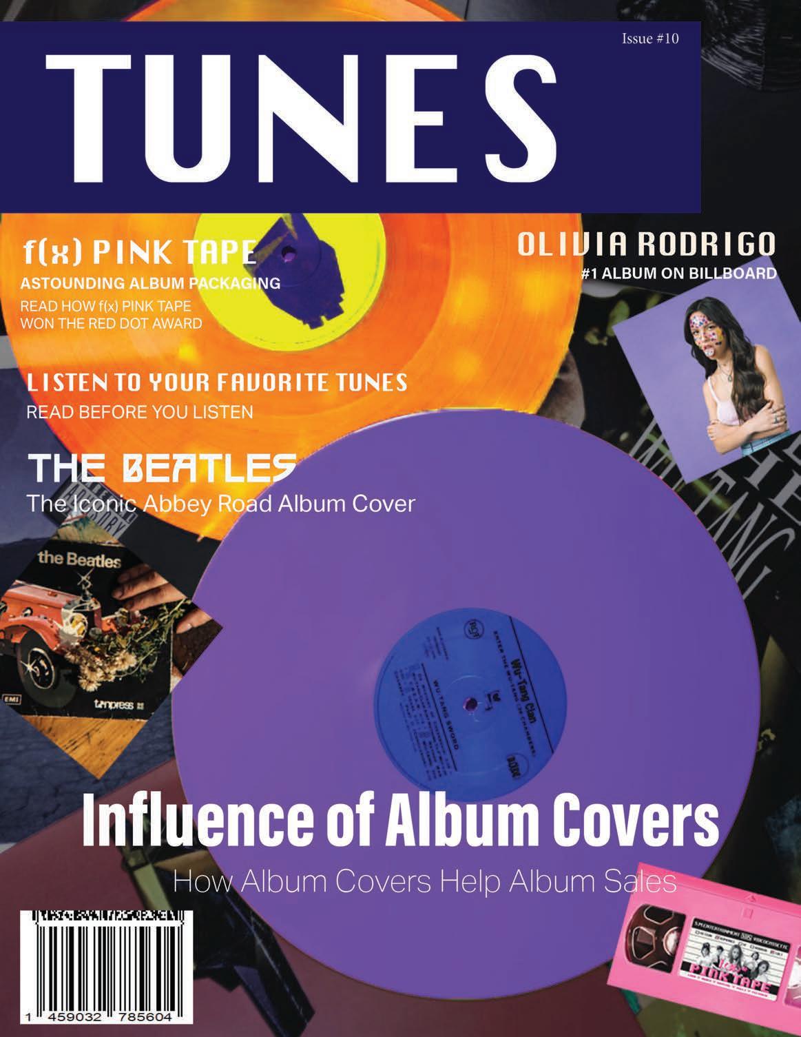
Design a six-page magazine layout for print and digital editions based on a chosen topic within the subject matter. Research, conceptualize, and execute the layout of the six-page spread. The magazine layout may incorporate visual illustrations, images, pull quotes, etc. within the layout.
The interior layout was created using images and interactive components that relate to the subject of the magazine. The aesthetic of the magazine is inspired by a retro theme using a two-tone color palette, purple and orange. The magazine is designed with a simple and minimalistic layout in mind. The spread talks about how the design of album covers help promote the music and draw an audience towards the artist.
Typography

Aa Bb Cc Dd Ee Ff Gg Hh Ii Jj Kk
Ll Mm Nn Oo Pp Qq Rr Ss Tt Uu
Vv Ww Xx Yy Zz
Minion Pro
Aa Bb Cc Dd Ee Ff Gg Hh Ii Jj Kk Ll Mm
Nn Oo Pp Qq Rr Ss Tt Uu Vv Ww Xx Yy Zz
Color Palette


Conceptualize and design branding and collateral pieces for a mobile retail business. A branding guide is developed to showcase the mobile business plan and branding assets and illustrate the overall mood of the brand.

Soko Dog is a mobile food business that sells Korean-styled corn dogs. The logo is the focal point and comprises two elements: the icon and the wordmark. The logo colors are made up of warm colors, red, yellow, and orange. These colors are often associated with food. The logo gives the business a fun and simple tone, creating and giving off a fun yet light atmosphere. The pattern is made up of geometric shapes representing the crumbs of the corn dogs. Collateral pieces such as mockups were created to go with the branding that can be used to further market the brand and business.


 Custom-made Font
Primary Logo
Typography
Color Palette
Pattern


Create and design new branding for Catawba Science Center’s Foothills Col-LAB-oratory. Branding must include elements such as brand name, logo, environmental graphic(s), color palette, animation, and collaterals. The target audience is aimed towards children. The graphics must be visible, legible, and stay consistent with the Science Center’s vision.
Catawba Science Center is looking to rebrand its maker space, Foothills Collaboratory. The logo is inspired by the themes chosen to represent the space (Motion, Balance, Magnets, and Build) and STEM. The color palette was chosen due to the maker space’s colors and was incorporated into the logo. Within the logo, there are four major icons that were chosen to represent the themes. Each icon is chosen due to its recognizable features among the target audience. STEM is represented by a beaker and inside the beaker are the foothills representing the maker space’s name “Foothills” with the gear placed behind the foothills representing the sun and the theme “build.” The new branding will inspire and challenge children while highlighting STEM careers in the Foothills area.


Primary Logo


Typography
marvin
Aa Bb Cc Dd Ee Ff Gg Hh Ii
Jj Kk Ll Mm Nn Oo Pp Qq
Rr Ss Tt Uu Vv Ww Xx Yy Zz
Omnium

Aa Bb Cc Dd Ee Ff Gg Hh Ii Jj Kk Ll
Secondary Logo
Mm Nn Oo Pp Qq Rr Ss Tt Uu Vv
Ww Xx Yy Zz
Icons
Build Balance Magnet Motion

Tertiary Logo


Color Palette


