SAN DIEGO CALAVERAS
San Diego has a rich Spanish history. One widely celebrated holiday in the city is the Day of the Dead. The team’s name, “Calaveras,” means “Skulls” in Spanish. The logotype is custom-designed to represent a Mexican-themed typeface with intricate features. The team’s primary logo represents a Day of the Dead sugar skull, a unique and significant element of the widely celebrated holiday. The logo includes the ornate decorations typically seen on sugar skulls. The color palette takes inspiration from elements seen on the Day of the Dead and their meanings. The San Diego Calaveras NBA team captures the hearts of individuals who seek to celebrate the city’s rich cultural heritage while enjoying the excitement of professional basketball.


ARENA WAYFINDING


AURORA AIRWAYS
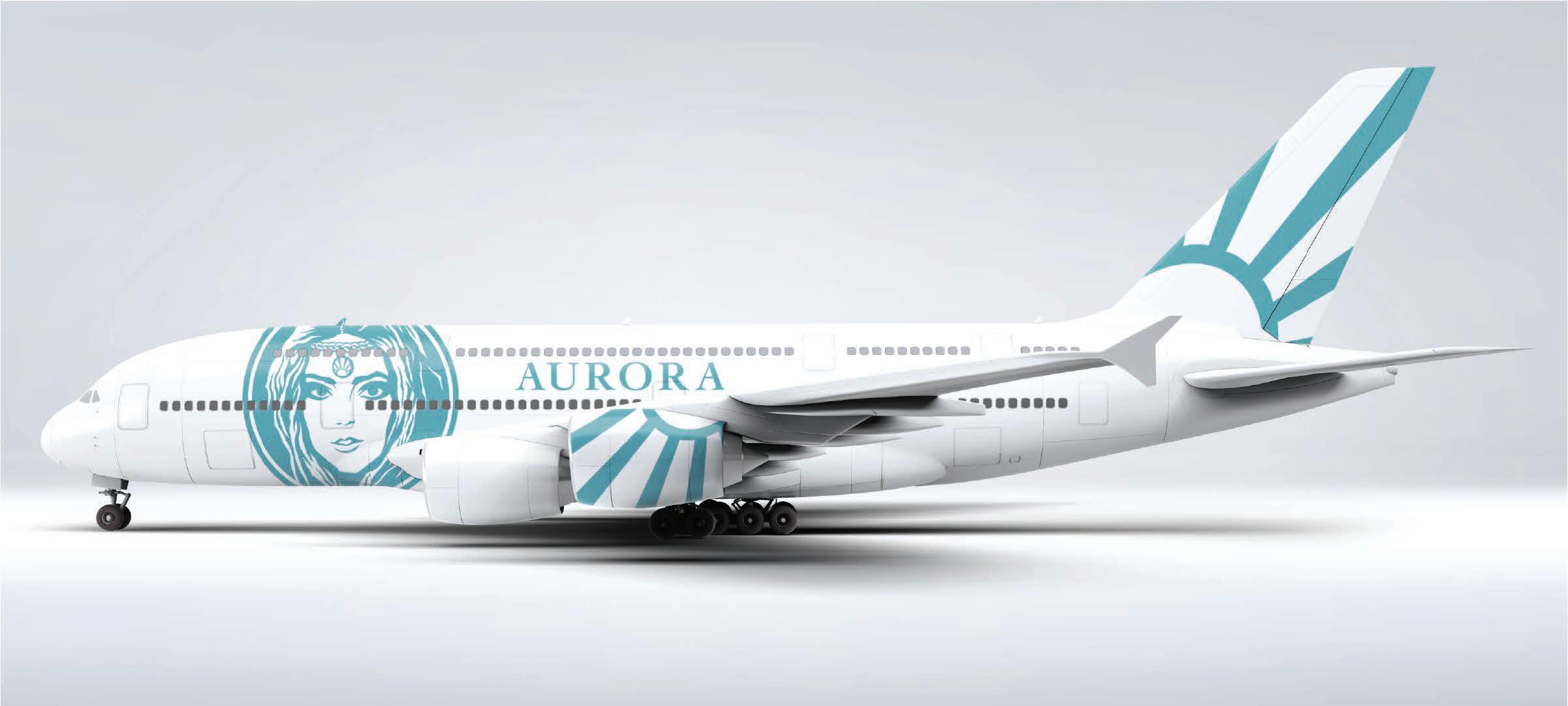
Aurora Airways is a luxury airline. The name “Aurora” is a Latin word that translates to “dawn” or “sunrise.” In Greek and Roman mythology, Aurora is the goddess of dawn. The ancient Greeks and Romans believed Aurora raced across the sky like an airplane to alert them to the breaking of a new day. The logomark illustrates the face of Aurora and includes a headdress that has a sunrise medallion to signify a new dawn. The medallion is circular, depicting a sun with light rays shining. The medallion is the airline’s secondary logo. The logotype has characteristics of ancient Roman typography, which again calls back to the brand’s history and identity.
PRIMARY LOGOS


SECONDARY LOGOS


RIDEMASTER APP
RideMaster is a great all-in-one app designed for motorcycle riders. The app includes a wide variety of features for anything related to motorcycling. The RideMaster branding utilizes a 2-color palette: Biker Black and RideMaster White. Biker Black is bold and confident, representing the strength and power of motorcycles, while RideMaster White is a crisp and clean white, symbolizing the purity of the open road. The RideMaster logotype is custom-designed and created from scratch to evoke the essence of a fast-moving motorcycle. It features sharp lines, dynamic angles, and a slanted posture to convey speed, agility, and excitement. The home screen app icon features the “R” from “RideMaster” enclosed in a rounded square.


APP STORYBOARD
VOODOO DRIVE-IN CINEMA
Historically, New Orleans is one of the most haunted locations in the United States, known for vampire myths and voodoo. Voodoo Drive-In Cinema is a drive-in movie theater that represents the haunted history of the city by showing horror films and classic scary movies at nighttime.
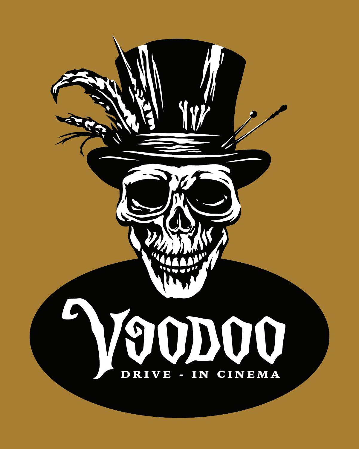
Voodoo Drive-In Cinema presents spooky and sinister visuals to represent the genre of films the drive-in cinema shows at night, as well as the haunted history of New Orleans. The primary logo displays a large voodoo skull with a custom logotype below. The logotype takes inspiration from classic horror film logotypes. The secondary logomark resembles a voodoo heart, brandishing some of the same eerie characteristics of the logotype.
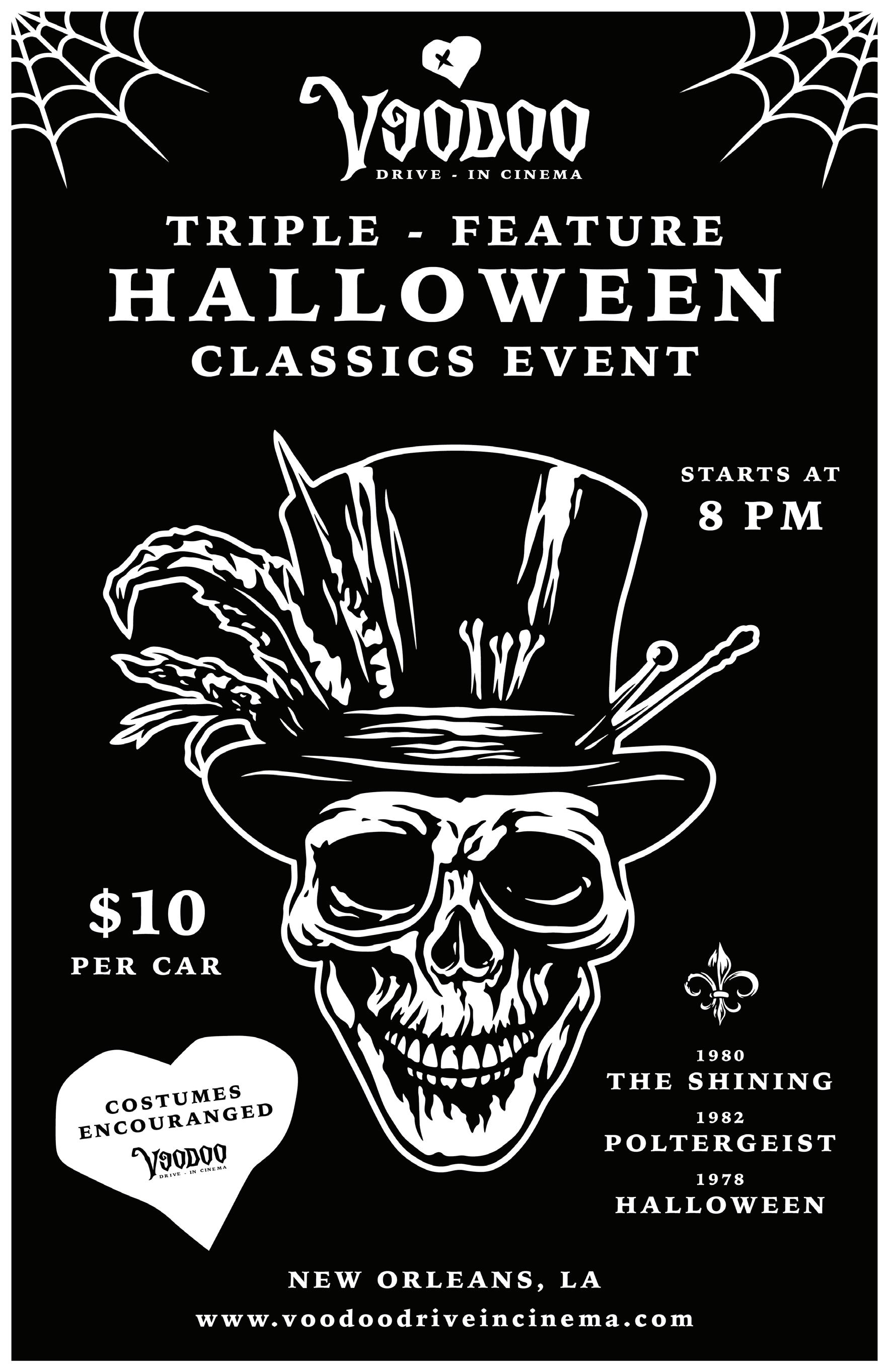
Voodoo Drive-In Cinema’s color palette presents black, white, and gold, colors that proudly represent the city of New Orleans. NOLA is known for having many of those colors, such as architecture, sports teams, and the fleur-de-lis, which is a popular symbol of Louisiana, tying into the rich history of New Orleans. This project also includes the curation of a poster promotion for a triple-feature Halloween movie event at the drive-in, as well as a website for the drive-in theater.

PRIMARY AND SECONDARY LOGOS


PONO TROPICAL PUB
Pono Tropical Pub is a tropical bar located in Honolulu, Hawaii. The bar provides tropical drinks and food for anyone, from tourists to locals. The word “pono” means living in balance within ourselves, those around us, and the world that sustains us. Pono is a significant and powerful word in Hawaiian culture, as it can be applied to many different areas of life and the community around us. Those who visit Pono Tropical Pub may be trying to find that state of balance. The identity of the pub displays vibrant and tropical visuals in a bright pink and a golden yellow. The pink and yellow create a nice gradient that the brand uses for logo variations and other brand items. The two main graphics in Pono Tropical Pub’s branding are some of the most significant and recognizable elements in Hawaiian culture: a tiki statue and a plumeria flower. This project includes a menu design for the pub, using elements and colors from Pono Tropical Pub’s branding, as well as a short promotional video for the pub.
PRIMARY LOGOS


SECONDARY LOGOS


JOYCE’S SODA CO.
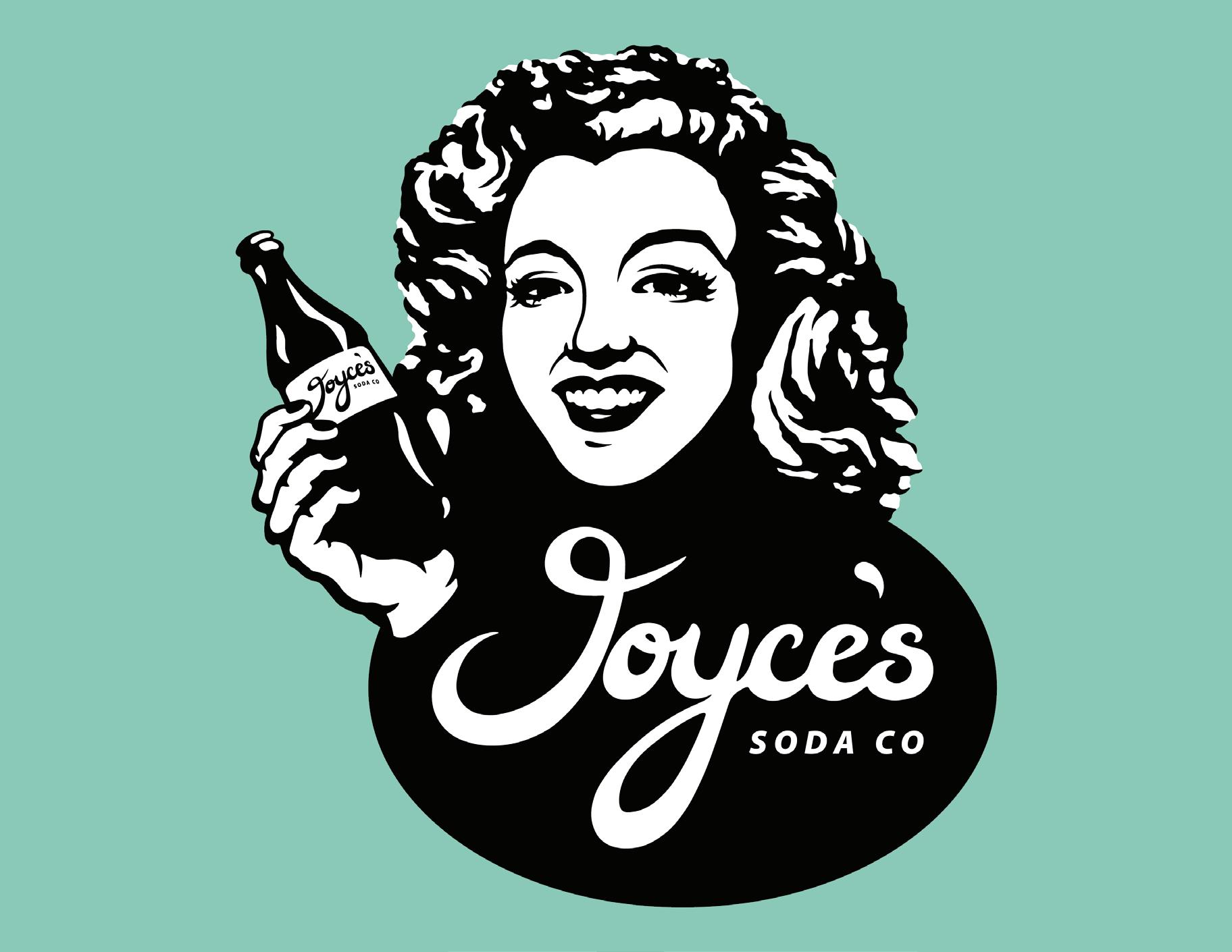
Joyces Soda Co. is a soda company established in 1954, providing classic glass soda bottles in vintage vending machines. The company has a 1950s aesthetic to represent the era it was established in, as well as represent the great longevity and history of the company. The primary logo presents the company’s founder, Joyce, holding their classic soda bottles while a custom logotype fits below. The secondary logo is of an old soda bottle cap. The nostalgic vending machines display Joyce’s Soda Co. graphics, along with the brand colors. The color palette features the popular classic, mint, symbolizing the 1950s era of fashion, cars, and other vintage things the color was seen on during that time. The colors black and white are also in the palette to, again, represent the classic elements of the 1950s, like television, photographs, and newspapers.


NORTH CAROLINA SKILLSUSA 2023
This project consisted of creating a t-shirt design to represent North Carolina for SkillsUSA. The theme of the t-shirt design is a hippie-themed summer, including vibrant colors and vintage elements. North Carolina is known for its wide variety of beaches, stretching for over 300 miles. To represent this, there is a beach element with surfboards in the sand and an ocean wave in the background. A hippie bus is included in the design, with a surfboard rack and the state flower, dogwood, as a repeated pattern on the bus. The dogwood flower blooms in the summer as a white flower.
And of course, in the background, the silhouette of North Carolina is present with a colorful, swirling ray pattern inside. The design features eye-catching colors like pink, yellow, and blue to represent the retro style of the hippie era of the 1960s and 1970s. These vibrant colors are ones you would see on things like hippie art and clothing. They also fit the beachy aesthetic, as the pink would represent a surfboard, yellow would represent the sun, and blue would represent the ocean waves. The typography adds to the theme of this design, as the vintage serif typeface represents the time period of the design’s style, while the groovy typeface represents the fun and carefree personality of hippies. People would wear this t-shirt design due to its exciting colors and patterns and the many elements that represent North Carolina.


RIVERBEND CREAMERY
The objective of this project was to create a series of t-shirts and sticker designs for Riverbend Creamery. There are seven unique concepts, each capturing the brand’s aesthetic with their designs and colors. The first design is named “Queen of Quality.” The design illustrates a jersey cow dressed in a royal crown, representing the superior quality jersey cows are known for. The color of the design is a royal crimson, further representing the first-class reputation of jersey cows. The second design displays a large ice cream cone, including the brand name and location below it. The color of the design is an appealing light blue. The third design is a cow ear tag. The tag includes the brand logo, the location, and the creamery’s established date. The phrase “Fresh From the Farm” is placed below the tag, along with the brand name. The green color represents freshness and nature, which ties into the “Fresh From the Farm” phrase. The fourth design illustrates a milk bottle. The bottle includes the Riverbend logo on the front. Riverbend’s slogan, “From Our Grass to Your Glass,” is displayed above the bottle, along with the creamery name. The design is colored in a warm, burnt orange. The fifth design depicts the silhouette of a jersey cow with the Riverbend Creamery logo inside of it. The phrase “Local & Family Owned” is above the cow, along with the location. The color of the design is a warm gold. The sixth t-shirt design is named “Official Taste Tester,” a shirt targeted towards kids. The design illustrates a big ice cream cone with the phrase “Official Taste Tester” surrounding it. Burgundy is used for the design to create a unique colored t-shirt. The final t-shirt design for Riverbend is the “Support Local” shirt. The cow wears an ear tag that includes Riverbend’s logo. The “Support Local” phrase arches above the brand name and the cow. A unique navy color is used for the t-shirt design. The sticker designs are based on the Riverbend t-shirt design series, using the main elements from the designs to create the stickers. Each sticker includes Riverbend Creamery’s logo in some way, which provides brand recognition for the stickers.


NATIVE WARRIOR NUTRITION
Native Warrior is a subscription box company that provides subscribers with quality gym and fitness supplements in their boxes every month. They represent the many great Native American warriors of the past and the Native American nations today with a brand that shows strength and wisdom. Their target audience is made up of strong, healthy, and active individuals, much like Native American warriors. The primary logomark depicts a Native American warrior on horseback holding an arrowhead spear. Below the logomark, a vintage script typeface is utilized for the brand name, paired with a bold typeface below to symbolize strength. The secondary logo takes one of the elements from the main logo, the spear, to pair with the brand logotype. The brand patterns represent the Native patterns used on things such as clothing and other fabric worn by Native Americans. The colors used in the branding consist of a burgundy, known as Battle Burgundy, and white, officially named Warrior White.


WILD PRAIRIE
The objective of this project was to create a digital marketing case study for Wild Prairie. The case study includes an email marketing campaign, a desktop and mobile website, and social media content curation. Wild Prairie Pet Care is a company that provides food and treats for pets. The purpose of this business is to provide high-quality pet food made with natural and ethically sourced ingredients. The primary logo features the brand name “Wild Prairie” with a custom logotype made from scratch. The brand identity consists of three main colors: red, yellow, and white. Additionally, the brand uses red and yellow to create a gradient. One of the main aspects of the company’s values is providing humane and sustainable ingredients for pet owners. On the packaging of the product line, information such as “ethically raised and sourced” and “grass-fed” is included on each product. The main and most consistent element on each bag is the brand logo, which is the largest and most emphasized feature.


NURTURING VITALITY, SUSTAINING VALUES.

ABOUT WILD PRAIRIE
At Wild Prairie Pet Care, our mission is to nurture the vitality and well-being pets providing exceptional, natural, and ethically sourced pet food and treats. We are committed to offering premium products that align with the values health-conscious pet owners and ethically minded consumers. Our pet food reflects the love and commitment our customers have for their furry companions. We believe that nourished pet happy pet, and our high-quality ingredients ensure that pets receive the nutrition they deserve.
We understand the deep concern ethically-minded consumers have for the health animals and the environment. That's why we take pride in sourcing our ingredients from responsible and sustainable sources. By choosing Wild Prairie, these consumers can trust that their support contributes positive impact on both the lives of animals and the planet.
Our commitment extends beyond just providing nourishment. We aspire create community pet owners who share our values and beliefs. Through education and engagement, we aim to empower pet owners to make informed decisions about their pets' nutrition and well-being. By fostering this community, we envision future where every pet thrives and flourishes in environment care and compassion.
NEWSLETTER


Our newsletter subscription is fantastic opportunity for pet owners who want to stay informed, save money, and access valuable resources related to pet care and nutrition. By joining the email list, subscribers not only receive percentage off their next or first purchase, but they also gain access to wealth of useful content.
Wild Prairie Pet Care's email newsletter subscription not only helps subscribers save on their pet care expenses but also keeps them well-informed and engaged with community of like-minded individuals who share their values and concerns about the health of their pets and planet.
JOIN NOW
THE REVIEWS
Pet Nutrition Expert, Dr. Sofia Romano
"Wild Prairie Pet Care setting high standard in the pet food industry. Their commitment natural ingredients and ethical sourcing exceptional. wholeheartedly endorse their approach to pet nutrition."
Animal Welfare Advocate, Amelia Thompson:
"Wild Prairie Pet Care's dedication responsible sourcing not only ensures the health pets but also contributes more compassionate world for animals. Their products are true reflection of their values and commitment to positive change."
Veterinarian, Dr. Wilhelm Fischer
"Wild Prairie Pet Care's emphasis on high-quality, ethically sourced ingredients benefits pets in more ways than one. encourage pet owners to consider their products for healthier, happier pet."
SEE MORE

FREQUENTLY ASKED QUESTIONS
WHAT SETS WILD PRAIRIE PET CARE APART FROM OTHER PET FOOD BRANDS?
At Wild Prairie Pet Care, our commitment to providing exceptional, natural, and ethically sourced pet food and treats truly distinguishes us. We take pride in crafting products that align with the values of health-conscious pet owners and ethically minded consumers.
WHAT DO YOU MEAN BY "ETHICALLY SOURCED" INGREDIENTS?
"Ethically sourced" means that we carefully select ingredients from suppliers who prioritize animal welfare, environmental sustainability, and responsible practices. We aim to make choices that benefit both pets and the planet.
HOW DO YOUR HIGH-QUALITY INGREDIENTS
BENEFIT MY PET’S HEALTH AND WELL-BEING?
Our high-quality ingredients ensure that your pet receives the nutrition they deserve. We believe that well-nourished pet happy pet, and our products are designed to support their vitality, energy, and overall well-being.
WHAT EFFORTS DO YOU MAKE TO EDUCATE AND ENGAGE PET OWNERS?
Our commitment goes beyond providing nourishment. We aspire to create a community of pet owners who share our values and beliefs. Through educational resources, blog posts, and engagement on our platform, we aim to empower pet owners to make informed decisions about their pets' nutrition and well-being.
SEE MORE

WHERE TO BUY HOME ABOUT US REVIEWS FAQ NEWSLETTER Wild Prairie, are dedicated providing owners with range high-quality pet food and treats made from natural, wholesome ingredients. Ourmission be the trusted companion on every pet owner’s journey toward nurturing happy, healthy, and vibrant lives their beloved pets.
PET HEALTHY REAL FOOD HUMANE SUSTAINABLE SOURCING take pride sourcing our ingredients from responsible and sustainable sources. choosing Wild Prairie, customers can trust that their support contributes to positive impact both lives animals and the planet. Wild Prairie committed the well-being animals, we carefully select ingredients from trusted sources that prioritize health animals. When people choose our products, they’re not only providing their pets with healthy, nourishing meals, but they’re also supporting brand that shares their values and works towards brighter future for all living beings. SHOP NOW WHERE TO BUY HOME ABOUT US REVIEWS FAQ NEWSLETTER WHERE TO BUY HOME ABOUT US REVIEWS FAQ NEWSLETTER WHERE TO BUY HOME ABOUT US REVIEWS FAQ NEWSLETTER WHERE TO BUY HOME ABOUT US REVIEWS FAQ NEWSLETTER


