Codename “Decorina”
Category: App Design
Design Objective
Develop and design a user-friendly app interface that solves a problem. Conduct research to identify the target audience and develop personas to guide the design of the app. Create a user flow and wireframes to help design the user interaction and user interface. Design a logo with supporting icons and other graphic elements to contribute to the look and feel of the app. Create a prototype and conduct user testing to refine the app.
Design Brief
Decorina is a social media platform for interior design. The goal of Decorina is to make it easier for designers to reach their audience and for clients to find a designer. The app streamlines the workflow of a designer, promoting their work and offering their services by integrating aspects of different apps like Instagram, Pinterest, and Houzz. The branding uses a blue color that contrasts with white to communicate elegance. The logo uses a vase, which is the most recognizable home decoration and represents the variety of interior design styles the app curates. The name comes from the affectionate nickname “decorina” which is given to a designer by their client. These elements work together to create a visual brand that is consistent with the company goals.


Bio
Mark is a local business owner. He has been operating in the area for seven years and has sucessfully grown his business. He is family oriented man and believes in helping other local business owners like himself.

Mark
Wants
• Rebrand and revamp his HQ to a modern office
• Support local businesses
• An easy way to get in contact with an interior designer
Frustrations
Bio
Christina is a new interior designer and is looking for a way to get her name out there. She knows social media is a popular platform to increase brand awareness. She is still learning new ways to get more clients and grow her reputation.

35 Bus. Owner Denver, CO Married
• Doesn’t know where to go for interior design help
• Current office is contributing to a lack of productivity
Christina
Occupation Location Status
Wants
Grow her reputation
• Increase her social media engagement and presence
• Collaborate with other interior designers and learn from more experienced designers

24 Designer Tuscon, AZ Single
Frustrations
• Struggling to gain clients
• Lack of a platform for interior designers
Occupation Location Status Scan for App Booklet Scan for App Prototype


Codename “Oasis”
Category: Packaging/Web Design

Design Objective
Develop a brand for a skin care company, which includes a logo, packaging, website and a digital marketing case study. Design a logo and packaging that can be expanded into a product library featuring a website and a social media campaign, which is outlined in the case study.
Design Brief
Oasis’ mission is to simplify skincare and provide customers with a straightforward routine that is easy to follow. As a result, simplicity was key to the design. But just like an oasis, the branding needs to stand out from the crowd. The packaging design uses color to create visual distinction within the product line. Each color chosen represents a different product and also represents unique traits of that product. The cleanser uses a soothing blue which represents the cleansing characteristic of water. The toner is made with all-natural ingredients, this is represented by a forest green that communicates an all-natural feeling. The moisturizer is made with an orange extract which is represented by a warm orange, this color represents the natural warm tone of skin.


Bb Cc Dd Ee Ff Gg Hh Ii Jj Kk Ll Mm Nn Oo Pp Qq Rr Ss Tt Uu Vv Ww Xx Yy Zz
1234567890


Bb Cc Dd Ee Ff Gg Hh Ii Jj
Kk Ll Mm Nn Oo Pp Qq Rr Ss Tt Uu Vv Ww Xx Yy Zz 1234567890
Medium


Bb Cc Dd Ee Ff Gg Hh Ii Jj
Kk Ll Mm Nn Oo Pp Qq Rr Ss Tt Uu Vv Ww Xx Yy Zz 1234567890
Bb Cc Dd Ee Ff Gg Hh Ii Jj Kk Ll Mm Nn Oo Pp Qq Rr Ss Tt Uu Vv Ww Xx Yy Zz 1234567890
Modula OT Futura PT Black
Bold Demi


Scan for Casestudy


Scan for Website/Mobile Desktop Mobile
Codename “Phoenix FC”
Category: Sports Design

Design Objective
Develop a professional sports team for a small market city. Deliverables include a logo, style guide, environmental and wayfinding graphics, complete with jerseys and ticket stubs.
Design Brief
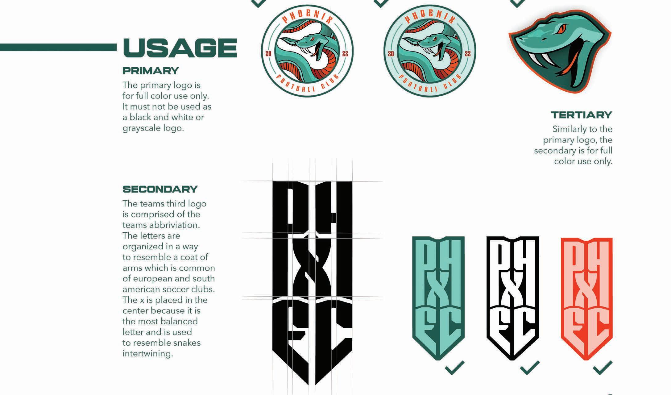
Phoenix FC (Football Club) is an MLS (Major League Soccer) expansion team for the city of Phoenix, Arizona. It is common for soccer club names to incorporate the city name followed or preceded by FC or United. The mascot for Phoenix FC is represented by a pit viper with the nickname Vipers. The choice behind the mascot comes from the large population of vipers found around Arizona. The logo is inspired by abstract soccer ball designs that use lines and shapes to communicate movement, similar to the fluid motion of a snake. The colors are inspired by the skies and landscapes surrounding Phoenix and are incorporated in the logo to create depth and tone. Together, these elements create a visually pleasing brand that appeals to sports fans, and in particular soccer fans.


Scan QR Code for Style Guide
Codename “Fan Focused”
Category: Magazine Layout
Design Objective
Write and design a six-page spread magazine article about a topic in graphic design. Efforts include making the article available in print and as a digital interactive document and develop a magazine cover.
Design Brief
The title of the article is Fan Focused and talks about how design acts as a bridge between teams and fans. Attending a sports event is an immersive experience. The article uses the nostalgia associated with sports to emphasize the topic and draw in the reader. For example, the video shown on the title page in the interactive document is a special moment that many fans of Barcelona FC and the team share together. The video is a good visual representation of the relationship between the fans and team. The article provides visual cues that draw attention to different topics within. Additionally, the images complement each other and together maintain visual consistency. Every visual cue is intentional and makes this article easier to read and understand as well as pleasing to look at.


Scan for Style Guide
Codename “Southern Leaf”
Category: Branding Design
Design Objective
Design a logo for a mobile retail business that includes collateral material, a brand identity packet and graphics for a mobile truck.
SOUTHERN LEAF
Design Brief
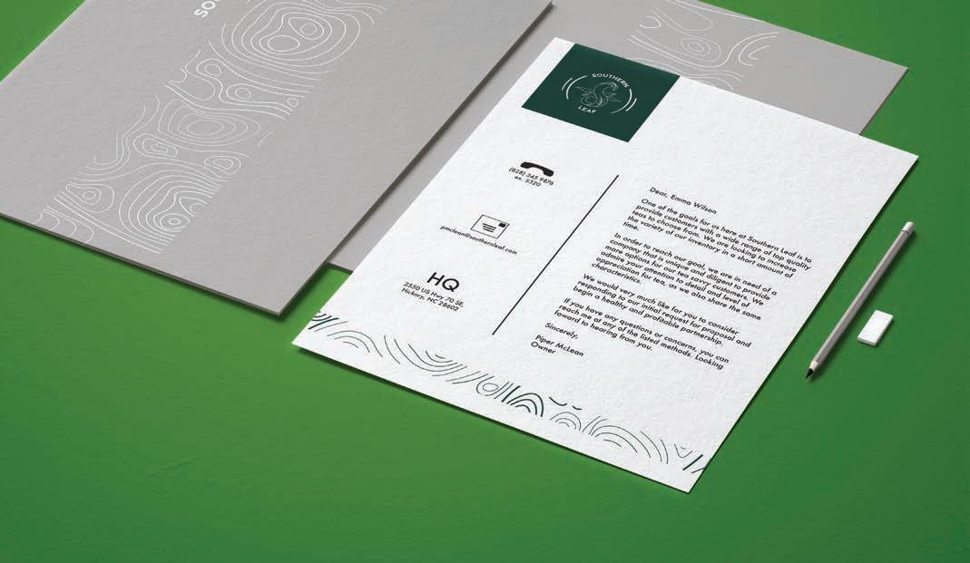
Southern Leaf is a mobile retail business focused on providing a selection of balanced and unique high-quality teas. The branding is designed to communicate refinement and luxury which appeals to the intended target audience of affluent customers. The logomark incorporates an illustrative style to combine the letter S and tea leaves. The logotype is a clean sans serif type that communicates sophistication. The green colors are taken from tea leaves and the grays from tea kettles, together they represent wealth and balance. The pattern is a topographic map which communicates direction and contributes to the clean, minimalistic branding.


Scan for Style Guide


Codename “Lexinide”
Category: Pharmaceutical Branding
Design Objective
Develop a logo, packaging, collateral material, and EXPO Display Booth for the pharmaceautical company Lexinide.
Design Brief
Lexinide is a pharamceautical company specializing in hypothyroidism medicine. Research was conducted to learn the design trends of the industry and determine the target audience. Hypothyroidism mainly affects women in the forty to sixty year old range. The colors represent this demographic since these colors mean love, peace and dignity. The logo is a play on the letter “x’ in the name “Lexinide. It combines the letter x and the caudaceus which is a symbol of medicine. Lexinide helps people with hypothyroidism balance their hormones and the logo communicates this by being very balanced. The pattern uses an element from the logo and repeats to maintain consistent branding throughout.


(levothyroxine) (levothyroxine) (levothyroxine)
Marketing Message: We help you balance your health so you can focus on balancing life.
The focus of the marketing message is to communicate empathy and let the target audeince know that the company is personally invested in them and understands their struggles. The company offers to shoulder the burden of dealing with hypothyroidism by helping regulate it with reliable medicine.
Bilo ABCDEFGHIJKLMONP QRUSTUVWXYZ abcdefghijklmnop qrstuvwxyz
Rose Lilac R:191 G: 32 B: 38 R: 181 G: 168 B: 210 C: 17 M: 100 Y: 100 K: 8 C: 28 M: 32 Y: 0 K: 0 #bf2026 #b5a8d2


Codename “Reboot”
Category: Poster Design
Design Objective
Conceptualize a poster series based around a social issue and design it photoshop using at least five images and typography.
Design Brief
The posters focus on the role technology plays in our lives. The more technology advances, the more our phones and computers are capable of. To communicate the idea of hope and excitement new technology brings, vibrant and colorful images were selected. These images also resemble the screens found on our devices. The posters contain human elements but faces are never shown. This was to further push the idea of social disconnect that many are experiencing. Each poster contains enough individuality to stand out while also working well as part of a series. These posters achieve the tone intended and the message is clear, successfully meeting the project objective.


Codename “Red Giraffe Productions”
Category: Branding Design
Design Objective
Develop a logo, brand identity package and website landing page for Red Giraffe Productions, a freelance photographer specializing in fashion and product photography and multimedia content.
Design Brief
The logo for Red Giraffe Productions is direct and represents the client’s kind nature and organic style of photography. This organic feel is expanded on by the difference in stroke weight which resembles the natural movement of a pencil. The circle that surrounds the giraffe resembles the camera lens and represents community and commitment which are qualities the client values. The shade of red used is an attention-demanding color that spurs people into action. The brand pattern is a simple giraffe pattern subtlety used on the business cards and letterhead.


Codename “Save the Rainforest”
Category: Screen Printing Design
Design Objective
Design a two-color t-shirt series and complete the screen-printing process from beginning to end.

Design Brief
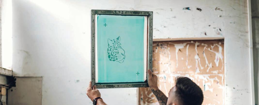
The concept for this project was to design a t-shirt series bringing awareness to animals going extinct due to deforestation. An organic feel was important to create a connection to the animals affected. The colors used are inspired by the lush green ecosystems inhabited by these endangered animals.


Codename “Miami”
Category: Branding and Layout Design
Design Objective
Design a twelve-page booklet for a city planning guide that appeals to the target demographic visiting the chosen city. Deliverables include logo, brand identity, magazine ad, and illustrative map.

Design Brief
Miami was chosen for its vibrant nightlife, rich food culture, and modern art. The vibrant colors used represent the nightlife of Miami as well as the youthful target audience. The imagery and color palette reflect the diverse culture and cuisine found in Miami. The logo and typography within the booklet are inspired by the famous art deco district on Miami Beach. The neon lights found in nightclubs are incorporated into the magazine ad. The colors, logo, imagery and typography work together to create a cohesive layout that appeals to the target audience.


Scan for Planning Guide


Scan for Style Guide
Codename “Save the Rainforest”
Category: Screen Printing Design
Design Objective
Develop an extreme sportswear clothing brand and poster series to increase brand awareness. Deliverables include a mission statement, logo, brand pattern, and poster ad.
Design Brief
The name Hazard depicts the risk and danger associated with extreme sports. The logo communicates this danger and risk with sharp angles and a Z that is designed to resemble a lightning bolt found on caution signs. The logo is also balanced with the custom letterforms mirroring each other on either side of the Z. This balance represents the physical and mental balance required to master extreme sports like snowboarding, skateboarding, biking and others. Yellow was chosen because it represents confidence, curiosity, and can even improve learning. The darker shade of yellow also communicates risk, referencing the caution signs once again. Blue is a great complimentary color as it communicates reliability and as the color of the sky it implies a connection to nature. The pattern resembles tire tracks and caution lines maintaining consistency with the logo and brand values.


Electric Yellow
This is the Hazards main color. It will be used on most products and promotional material.
This blue acts as the complimentary color and can be used as an alternative to the yellow.
Bolt Blue
RGB 252 182 21 CMYK 0 31 100 0 HEX #fcb615 RGB 58 178 230 CMYK 66 11 0 0 HEX #3ab2e6
ABCDEFGHI JKLMNOPQR STUVWXYZ abcdefgh ijklmnopqr stuvwxyz
0123456789 MODIFIED Z
CHAKRA PETCH | MEDIUM


Scan for Style Guide


