


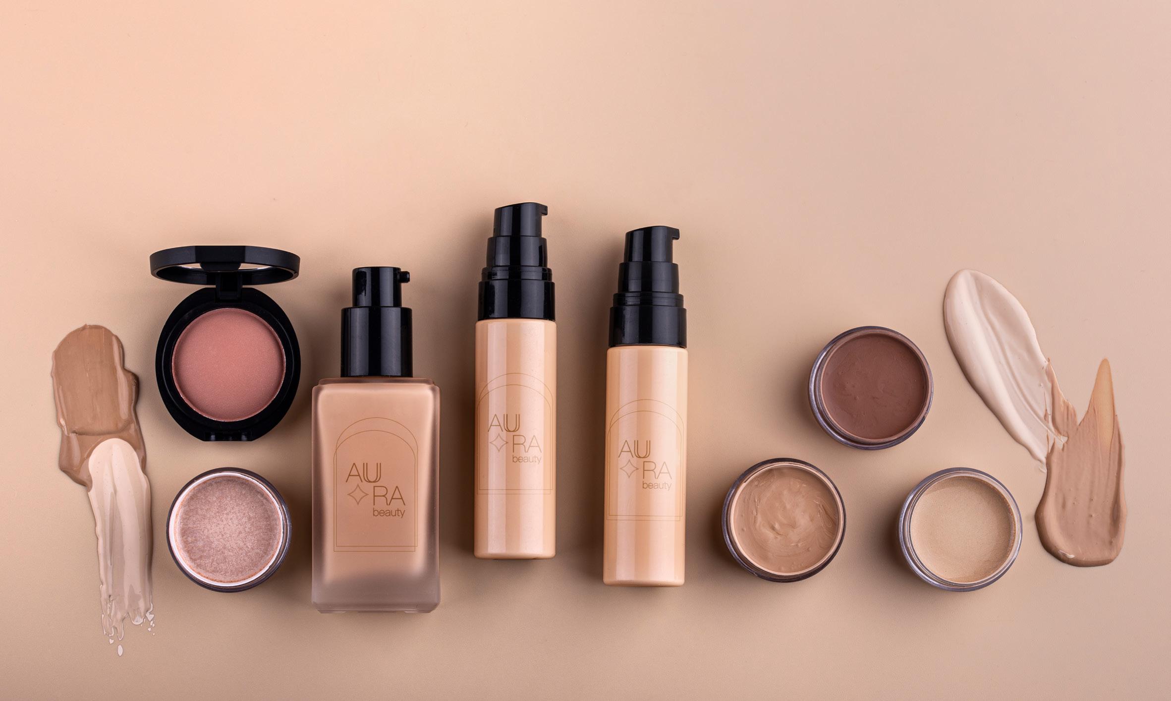
Aura Beauty
Design Objective:
Create packaging that showcases the brand’s identity and values and designing visually appealing packaging for a new line or products.

Design Brief:
Aura Beauty is a gender-neutral makeup brand that embodies sophistication and sustainability. With a minimalist approach, muted gender-neutral colors, and a distinctive diamond logo, Aura Beauty showcases the essence of clean beauty by harmoniously blending elegance and eco-consciousness. Every element, from the cruelty-free ethos to the use of all-natural ingredients, reflects a commitment to ethical beauty.


Elettra Air
Design Objective:
Design Brief: Create a strong brand identity and promotional materials that enhance the airline’s market presence, improve customer engagement, and ultimately drive ticket sales and customer loyalty.
Elettra Air embodies elegance and sophistication in the realm of airline branding. With a sleek and opulent design aesthetic featuring a harmonious blend of black and gold colors, Elettra transports viewers to a world of luxury travel. Through stunning visual concepts, meticulous attention to detail, and refined typography, “Elettra Air” exudes a sense of exclusivity and style.


Gym Chica
Design Objective:
Create a groundbreaking subscription box concept that serves a visual representation of the brand’s values and mission.
Design Brief:
Gym Chica is designed exclusively for women. It celebrates body inclusivity, female empowerment, and embraces a feminine color palette dominated by empowering shades of pink. Through striking visual elements, innovative packaging designs, and impactful branding, Gym Chica redefines the fitness industry by promoting self-confidence, diversity, and empowerment.


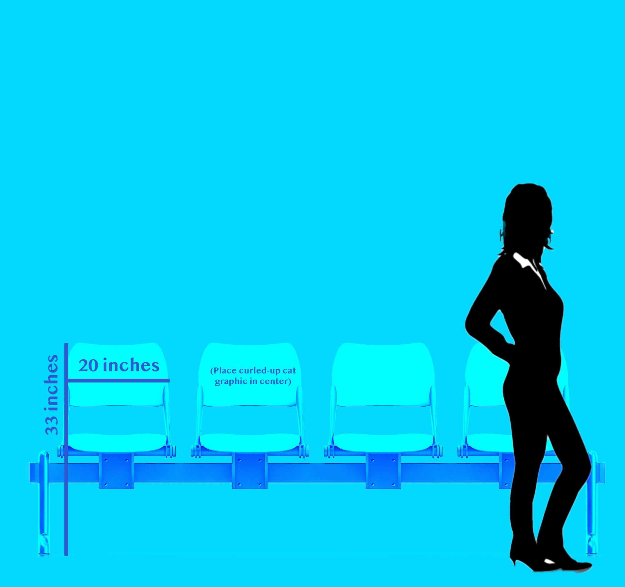
Salem Cats


Design Objective:
Develop a visually striking and memorable logo that captures the essence of a sports team’s brand personality. Create branding materials and merchandise that engage fans and supporters, reinforcing the sports team image as a competitive sports team while fostering a sense of community and belonging.
Design Brief:
Inspired by the mystique of Salem, Massachusetts, the logo features a sleek black cat to evoke a sense of mystery and power, while symbolizing the team’s agility and determination on the field. The logo incorporates elements of agility, strategy, and quick decision-making, drawing inspiration from the nimbleness and resourcefulness of a cat and blends elements of both Salem’s witchcraft lore and the athleticism of the sports world. The choice of a cat as their mascot is a nod to the superstitions surrounding black cats during that dark period in history. The scratch-like font used in the team’s branding adds a touch of mystique to their identity.


the importance of acknowledging and dismantling colonial influences in design, promoting diversity, and the celebration of indigenous and marginalized voices in the creative process. Furthermore, the magazine showcases the power of design to challenge traditional norms, promote inclusivity, and contribute to a more equitable creative industry.


FITTING IN HOW FASHION FINALLY MADE SPACE FOR ME DECOLONIZING DESIGN


Prank Patrol
Design Objective:
Create a visually striking and memorable design that enhances the visibility and attractiveness of the vending machine, capturing the attention of consumers and encouraging interaction and sales.
Design Brief:
The Prank Patrol
Vending Machine Project aims to create engaging and interactive vending machines that dispense kids’ gag toys in convenient locations such as malls, amusement parks, and family entertainment centers. Inspired by the playful spirit of Prank Patrol, the vending machines will provide young pranksters with a fun and exciting way to access a variety of gag toys and novelty items. The vending machines offesr a wide range of kids’ gag toys and novelty items, including prank gadgets, joke books, funny masks, and trick candies. Its logo is branded with the distinctive logo of a police car with sirens and a friendly face on the front. The use of red, white, and blue colors reminiscent of a police car further reinforces the brand’s identity and appeal to young pranksters.


VISIO
Design Objective:
Create visually captivating banners, postcards, and other materials that effectively promote the VISIO portfolio show and highlights the diverse talents and disciplines showcased at the event to attract attendees.
Design Brief:
This design aims to create visually captivating banners, postcards, and other materials to promote the portfolio show and attract attendees. Inspired by the theme of creativity and innovation, the design features an engaging banner depicting a wall of an art gallery. Within the gallery frames, photo manipulations showcase a unique interpretation of a cityscape, using colored pencils to represent graphic designers, SD cards as bridges symbolizing photography students, and keyboard keys replacing leap pads. The juxtaposition of traditional art elements with technological symbols creates visual interest and sparks curiosity, compelling viewers to learn more about the portfolio show. This creative approach serves to highlight the diverse talents and disciplines showcased at the portfolio show, enticing viewers to explore further.


Rouge Riot
Design Objective:
Create a visually compelling and conceptually rich poster series that effectively communicates a brand’s identity, values, and offerings. Seamlessly integrate branding elements into the posters to ensure brand recognition and consistency.

Design Brief:
Rouge Riot is a purse brand inspired by the concept of embracing the rebellious and fearless nature of red lipstick stains inside handbags. The series plays off the idea of “rouge” as a shade of red, symbolizing lipstick, and “riot” as a rebellion against the inevitable stains lipstick can leave behind. The design of the posters incorporates edgy and avant-garde aesthetics, utilizing bold typography, dynamic compositions, and striking imagery to capture attention.


Sola Support
Design Objective:
Design a custom app’s logo and matching iconography for all aspects of the app concept. The app should be an intuitive and user-friendly interface that prioritizes ease of navigation and accessibility for users with varying levels of technological proficiency.
Design Brief:
Sola Support is a revolutionary mobile application designed to cater to the multifaceted needs of mothers, offering comprehensive assistance in navigating the complexities of parenthood. With a focus on fostering a supportive community and providing tools for organization and self-care, Sola Support aims to empower mothers to manage their schedules, nurture their children, and prioritize their mental health with ease. The app’s interface features a calming color palette of muted gentle shades of yellow, creating a serene and welcoming atmosphere for users. The logo, depicting a woman’s face, symbolizes strength, resilience, and the interconnectedness of the community.


The Origin of Coffee
Design Objective:
Create a visually engaging and informative poster that effectively communicates the unique offerings and ambiance of the coffee shop to customers and passersby.
Design Brief:
The Coffee Shop Icon Poster project aims to create a visually striking and informative poster that showcases coffee’s true origins. By utilizing iconography and minimalist design principles, the poster effectively communicates essential information about Africa while enhancing the overall aesthetic of coffee.


HartSquare
Design Objective:
Create a cohesive and visually compelling series of social media posts that align with the foundation’s mission of preserving pioneers’ history. The campaign will highlight the unique charm and historical significance of the village while engaging and informing followers about upcoming events, educational programs, and preservation efforts.
Design Brief:
The social media posts maintains consistency with the theme and visual style established in previous HartSquare Foundation social media posts. This includes using similar color palettes, typography, and imagery to reinforce brand recognition and creates a cohesive and unified look across all platforms. The designs highlight the historical significance and cultural heritage of Hart Square Village through engaging visuals.


