

Project Scope
Design a mobile application prototype from initial concept to final digital wireframes, including the creation of a distinctive logo and comprehensive style guide. This project entails the development of a mobile application aimed at addressing a specific user need or solving a particular problem. The app will be designed to provide users with a seamless and intuitive experience, incorporating user-friendly interfaces and engaging visual elements.
Design Brief
Vida Venture is a revolutionary travel research application designed to empower users to explore destinations and plan their trips with ease and confidence. The app provides comprehensive tools and resources for users to conduct indepth research on potential travel destinations, enabling them to make informed decisions and create personalized itineraries tailored to their preferences and interests. Vida Venture aims to revolutionize the way people plan and experience travel by offering a seamless and intuitive platform that combines cutting-edge technology with user-centric design principles.

vida VENTURE vida VENTURE

Secondary Logo Primary Logo American
Aa
Ee
Kk Ll Mm Nn Oo
Xx Yy Zz
Typewriter
Bb Cc Dd
Ff Gg Hh Ii Jj
Pp Qq Rr Ss Tt Uu Vv Ww


Story Board


SCAN FOR APP BOOKLET SCAN FOR APP PROTOTYPE

Project Scope
Establish a subscription box company from branding to final product, including the creation of a distinctive logo, comprehensive style guide, and mockups that align with the brand’s identity and values. This final box caters to a specific niche or target audience; coffee lovers. The company will create and deliver themed boxes on a regular basis, providing subscribers with a curated selection of products tailored to their interests or needs.
Design Brief
Better Bean is a subscription box company specializing in delivering selections of organic coffee beans from various regions around the world. In addition to premium coffee beans, each box includes complementary items such as coffee syrup, stickers, a mug or iced coffee cup, tailored to the subscriber’s coffee preferences. The brand identity of Better Bean revolves around the concept of organic, sustainable, and high-quality coffee. The logo features a coffee bean adorned with a leaf, symbolizing the organic nature of the coffee beans sourced. The color palette chosen for the brand reflects earthy tones and natural hues, evoking a sense of warmth and authenticity. By adhering to the principles of organic farming, sustainability, and premium quality, Better Bean aims to differentiate itself in the competitive subscription box market.

Primary Logo
Secondary Logo
better bean better bean
a
a b c d e f g h i j k l m n o p q r s t u v w x y z
b Arima Koshi Regularused for logotype


 SCAN FOR DIGITAL MARKETING CASE STUDY
Project Scope
Create a magazine spread. The creation of “Storytelling in Graphic Design” magazine, a publication dedicated to exploring the dynamic interplay between narrative and visual communication within the realm of graphic design. The magazine aims to showcase exemplary examples of storytelling through captivating magazine spreads and an engaging cover design, offering readers insights into the techniques, inspirations, and innovations employed by graphic designers to convey compelling narratives.
Design Brief
The design scope encompasses the development of “Storytelling in Graphic Design” magazine, a publication dedicated to exploring the intricate fusion of narrative and visual communication within the realm of graphic design. This magazine aims to showcase exemplary instances of storytelling through meticulously crafted magazine spreads and a captivating cover design. The objective is to inspire, educate, and engage readers by presenting compelling narratives within the context of graphic design.


SCAN FOR INTERACTIVE MAGAZINE
Project Scope
Design a series of packages for a product line, develop a distinctive logo, and incorporate UV elements into the packaging design to enhance visual appeal and brand identity. The packaging design will play a crucial role in attracting customers’ attention and conveying the brand’s identity and value proposition. Additionally, the development of a unique logo will serve as a visual representation of the brand, while the incorporation of UV elements will add depth and dimension to the packaging, elevating the overall design and enhancing shelf presence.
Design Brief
The aim of this design project is to create a cohesive and visually compelling brand identity for the “Skin of the Earth” series of skincare products. This includes the development of a distinctive logo, packaging design, and packaging labels that embody the brand’s commitment to using organic ingredients and convey a sense of simplicity and natural beauty. From the distinctive logo to the packaging design and labels, every element will work harmoniously to convey the brand’s commitment to organic ingredients, natural beauty, and environmental sustainability. By capturing the essence of nature in its design, “Skin of the Earth” will resonate with consumers seeking wholesome and holistic skincare solutions.


Project Scope
Establish a new airline company, complete with a comprehensive brand identity and visual elements. This includes developing a detailed style guide that encapsulates the essence of the brand, along with creating a distinctive logo featuring airplane mockups aligned with the brand’s overarching theme and values.
Design Brief
Bleu Horizon Airline is a fresh addition to the aviation industry, aiming to redefine the travel experience for those who struggle with flight anxiety or are embarking on their maiden voyage. Our primary focus is to cultivate an environment of serenity and relaxation, fostering a sense of ease and confidence in our passengers throughout their journey, from the terminal to touchdown. Our fundamental mission at Bleu Horizon Airline is to alleviate the stresses associated with air travel, ensuring each passenger feels calm and reassured every step of the way. We understand the apprehensions that can accompany flying, especially for those encountering it for the first time or grappling with anxiety. Therefore, our branding endeavors to embody these principles of tranquility and comfort, serving as a beacon of solace amidst the hustle and bustle of air travel.


Primary Logo

Secondary Logo
Logo Type


size details color price 123456788999 THE HORIZON IS CALLING THE HORIZON IS CALLING H O R I Z O N B L E U AIRLINES Thank You for flying with us! B L E U H O R I Z O N
Project Scope
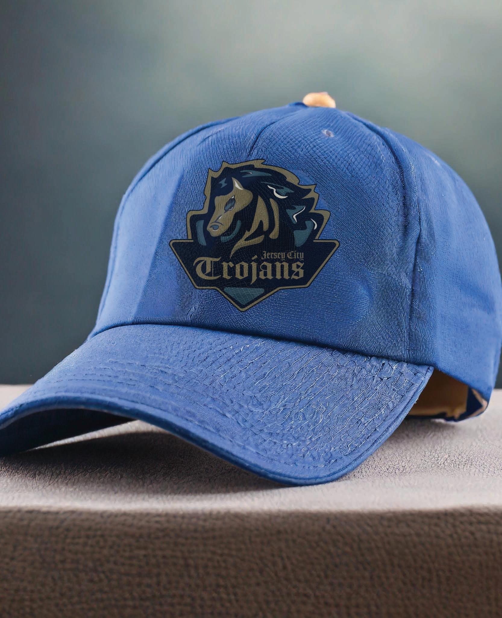
Establish a comprehensive branding and visual identity framework for a sports team, encompassing various elements such as logo creation, environmental and wayfinding signage, as well as the design of team jerseys and helmets. This initiative will involve the development of blueprints and mockups to guide the implementation of these visual elements, ensuring consistency and effectiveness in representing the team’s identity across various touchpoints.
Design Brief
The design scope involves the creation of a cohesive brand identity for the sports team, beginning with the development of a distinctive logo and team name that encapsulates the essence and values of the organization. Following this, the design process will extend to the creation of environmental and wayfinding signage, strategically placed within the sports venue to enhance fan experience and facilitate navigation. Additionally, the project will include the design of team jerseys and helmets, incorporating the newly established brand elements to foster team unity and recognition. Mockups will be produced for each design element to visualize their application and ensure alignment with the overarching brand identity.
Through meticulous attention to detail and creative innovation, the design scope aims to establish a compelling visual presence that resonates with fans and stakeholders alike.

Primary Logo Away Game Helmet

Secondary Logo
Trojans


SCAN FOR SPORTS BOOKLET
Jersey City


“We


25 ft
came to destroy!” 6ft 6ft 9ft 6ft
didn come to play, we


Project Scope
Develop a comprehensive vending machine solution, encompassing the creation of a brand logo, design of vending machine screens, and application of the visual identity onto the physical vending machine. This initiative aims to deliver an engaging and intuitive vending experience for users while effectively communicating the brand’s identity and values through cohesive visual elements.
Design Brief
The design scope involves the conceptualization and creation of a distinctive brand logo that embodies the essence of the vending machine’s offerings and aligns with the target audience’s preferences. Following the logo development, the design process extends to the creation of user-friendly vending machine screens, featuring intuitive navigation and visually appealing graphics to enhance the user experience. Moreover, the project includes the application of the newly crafted visual identity onto the physical vending machine, ensuring seamless integration of branding elements such as colors, logos, and imagery. Through meticulous attention to detail and strategic design choices, the design scope aims to elevate the vending machine’s aesthetic appeal while reinforcing brand recognition and trust among consumers.
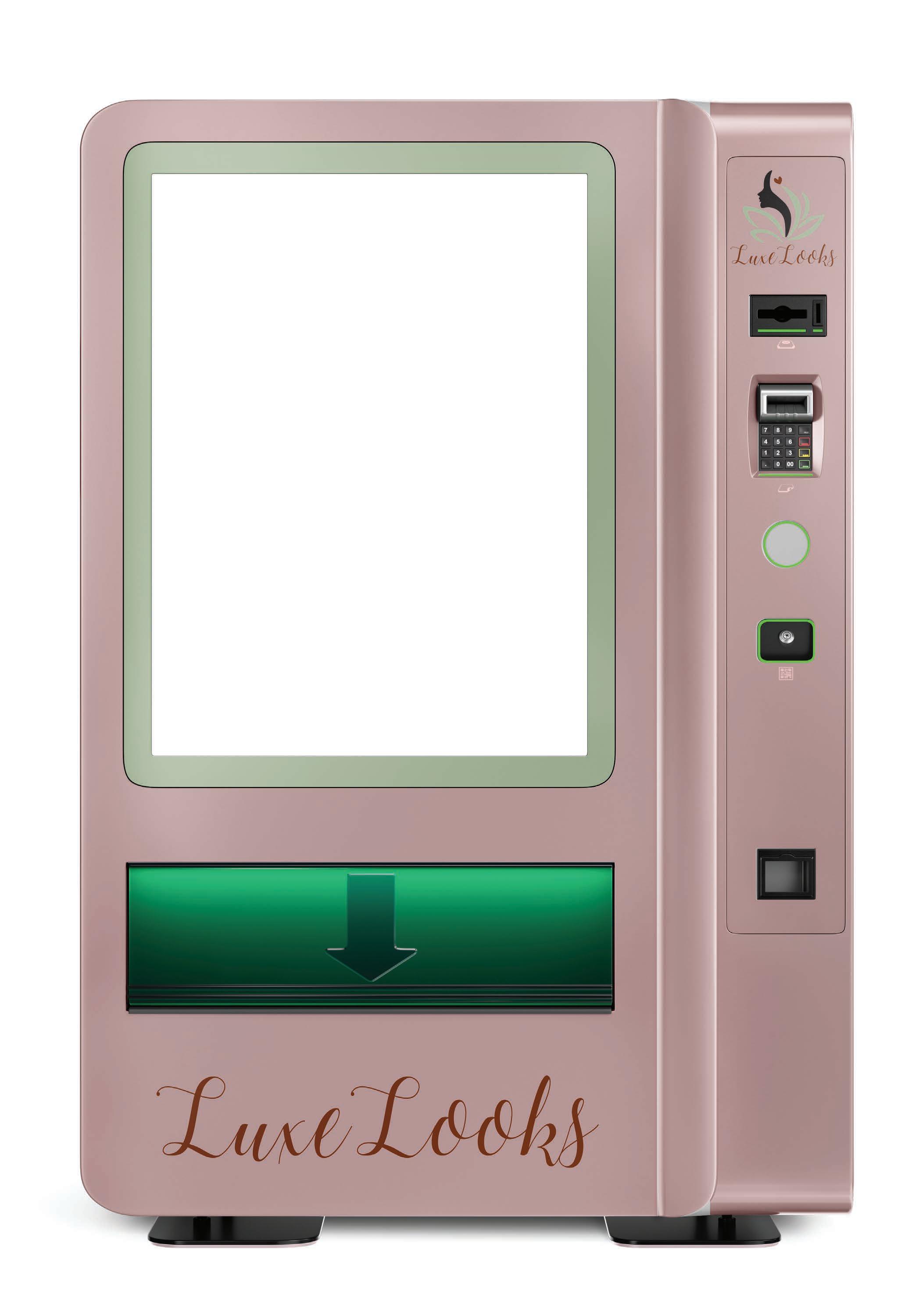


FOR VENDING MACHINE
SCAN
SCREENS
Project Scope
Establish a drive-in movie theater experience, aimed at providing a unique and memorable entertainment opportunity for the community. This initiative involves the creation of branding elements, including a distinctive logo, as well as the development of an event movie poster to promote the drive-in movie theater experience. The project aims to curate an immersive cinematic experience that celebrates nostalgia while catering to contemporary audience preferences for outdoor entertainment.
Design Brief
The design scope encompasses the conceptualization and development of a cohesive visual identity for the drive-in movie theater, beginning with the creation of a captivating brand logo that encapsulates the essence of the experience. Additionally, the design process extends to the creation of an eye-catching event movie poster, strategically crafted to generate excitement and attract attendees to the drive-in screenings. The poster will feature compelling imagery, engaging typography, and relevant event details to effectively communicate the movie lineup and schedule. By leveraging creative design strategies and thoughtful execution, the design scope aims to establish a memorable and visually impactful drive-in movie theater experience that resonates with audiences of all ages.


SCAN FOR PROMO VIDEO
Project Scope
The project focuses on the creation of technical drawings, initially in pen and ink format, followed by the subsequent animation and coloring of these drawings. This initiative aims to showcase technical concepts and designs through detailed illustrations while leveraging animation and color to enhance understanding and engagement. The project seeks to deliver a comprehensive visual representation of complex technical subjects, catering to diverse audiences ranging from professionals to enthusiasts.
Design Brief
The design scope encompasses the meticulous creation of technical drawings using pen and ink, employing precision and accuracy to depict intricate details of mechanical components, architectural structures, or other technical subjects. Following the completion of the pen and ink drawings, the design process extends to the animation phase, where key elements of the drawings are brought to life through dynamic motion sequences. This may involve demonstrating the functionality of mechanical systems, illustrating assembly processes, or visualizing structural dynamics. Subsequently, the design scope involves the application of color to the animated drawings, enhancing visual clarity and aesthetic appeal while effectively conveying important information.


SCAN FOR ANIMATION
Project Scope
Develop a line of stationary comprising a bullet journal, sticky note set, planner, and to-do list. This initiative aims to cater to individuals seeking functional yet stylish tools for organization and productivity. By offering a cohesive range of stationary products, the project aims to address various needs within the target market while aligning with the brand’s values and aesthetic preferences.
Design Brief
The design scope involves creating consistent branding and design elements across all stationary items, starting with the bullet journal. This includes developing layouts for goal setting, task management, and creativity. The sticky note set will complement the bullet journal’s theme, offering versatile tools for quick notes. The planner will feature weekly and monthly layouts with goal trackers and habit trackers, prioritizing functionality and aesthetics. Lastly, the to-do list will streamline task management with prioritization tools. Overall, the aim is to deliver a visually captivating stationary collection that enhances productivity and organization.


828.461.7417 kalynmelendez@gmail.com @studiomelendez
