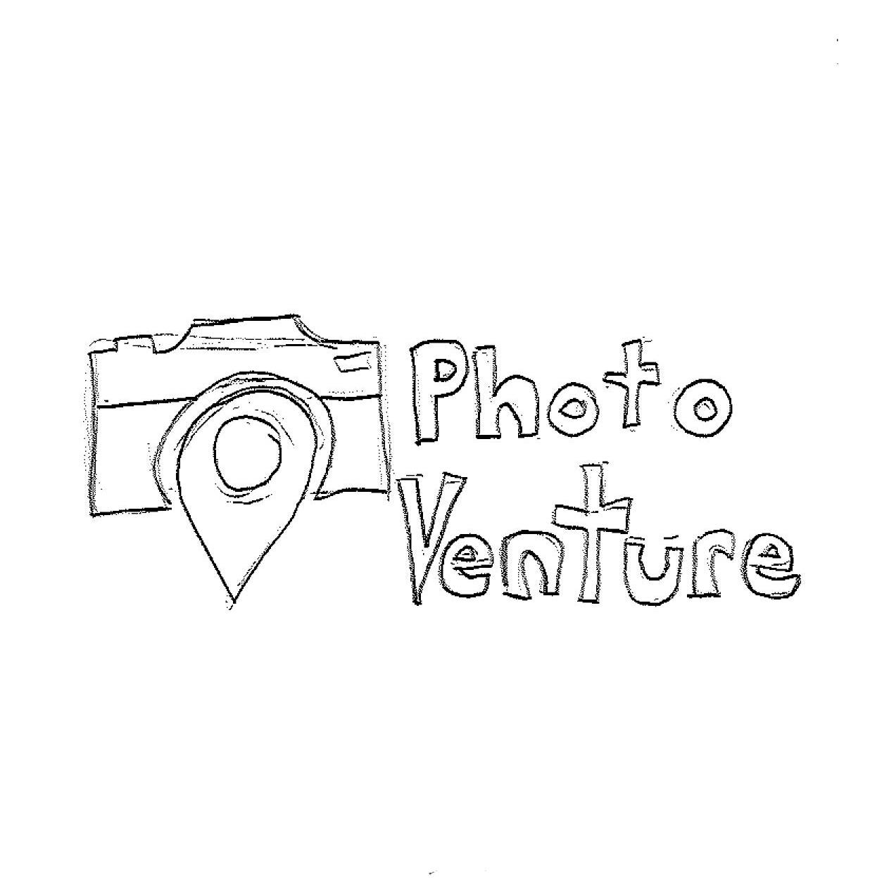
Photo Venture
Design Objective
Design and prototype a functional app that satisfies a need. The app must include monetization as well. Establish a brand that will be applied to the style of the app. Create a collection of icons that will be used as buttons for navigation. Create the mobile screens and animate them for interactivity. The final product should be a functional prototype with a cohesive design for users to experiment with.
Design Statement
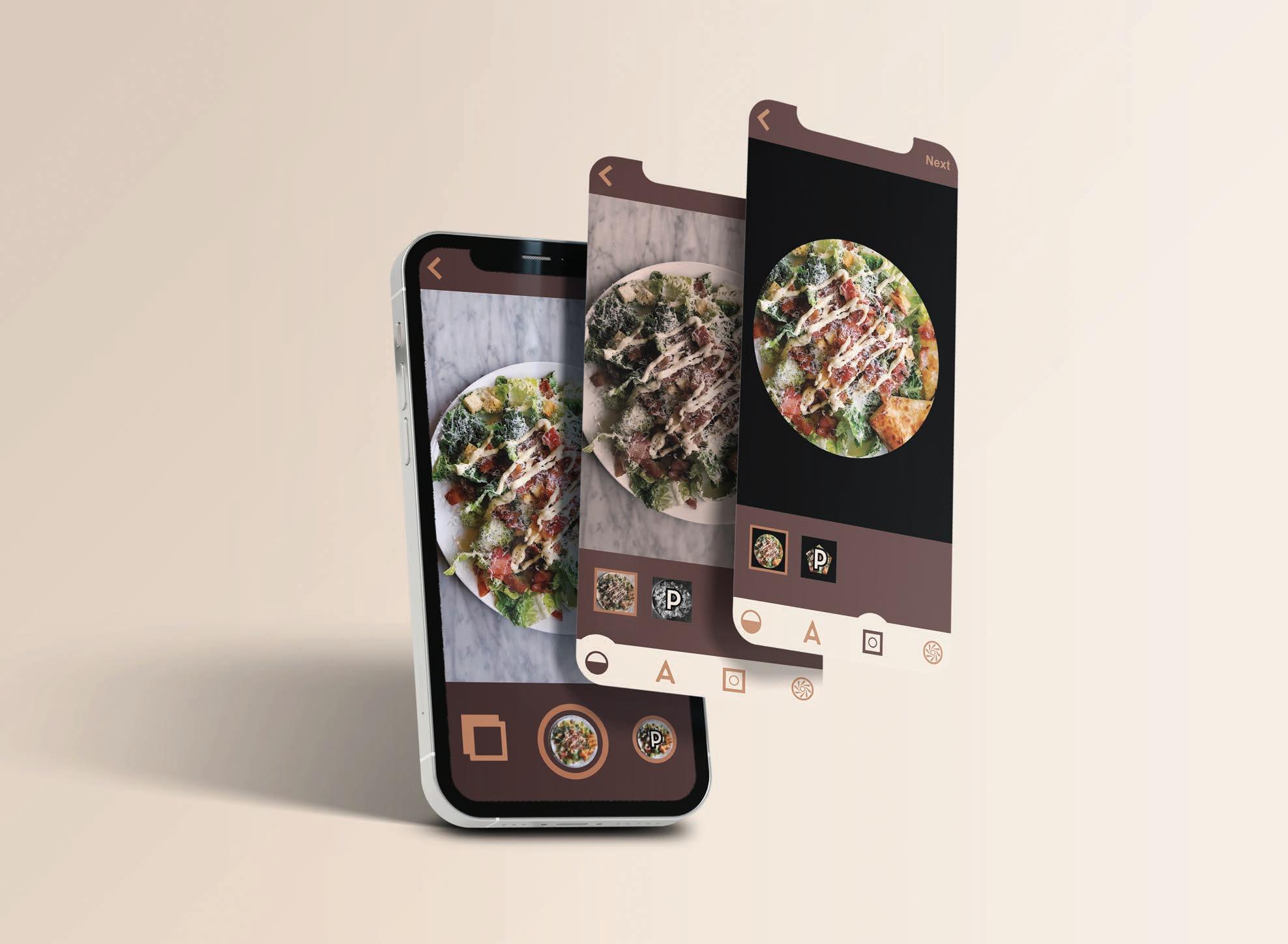
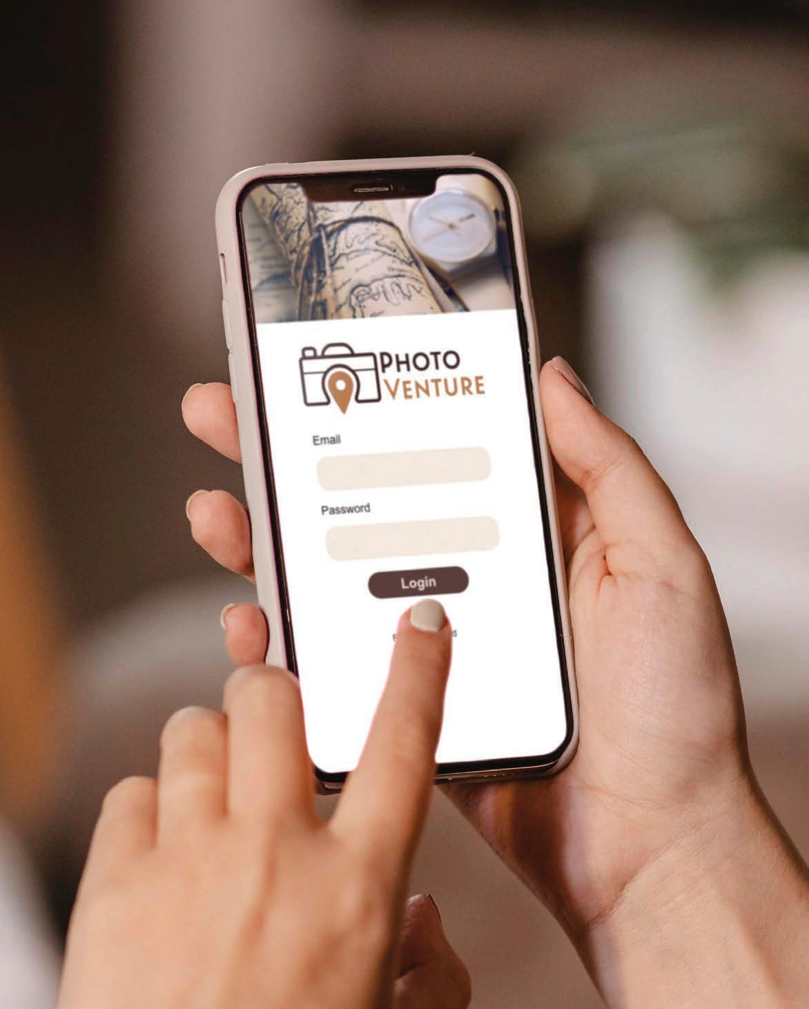
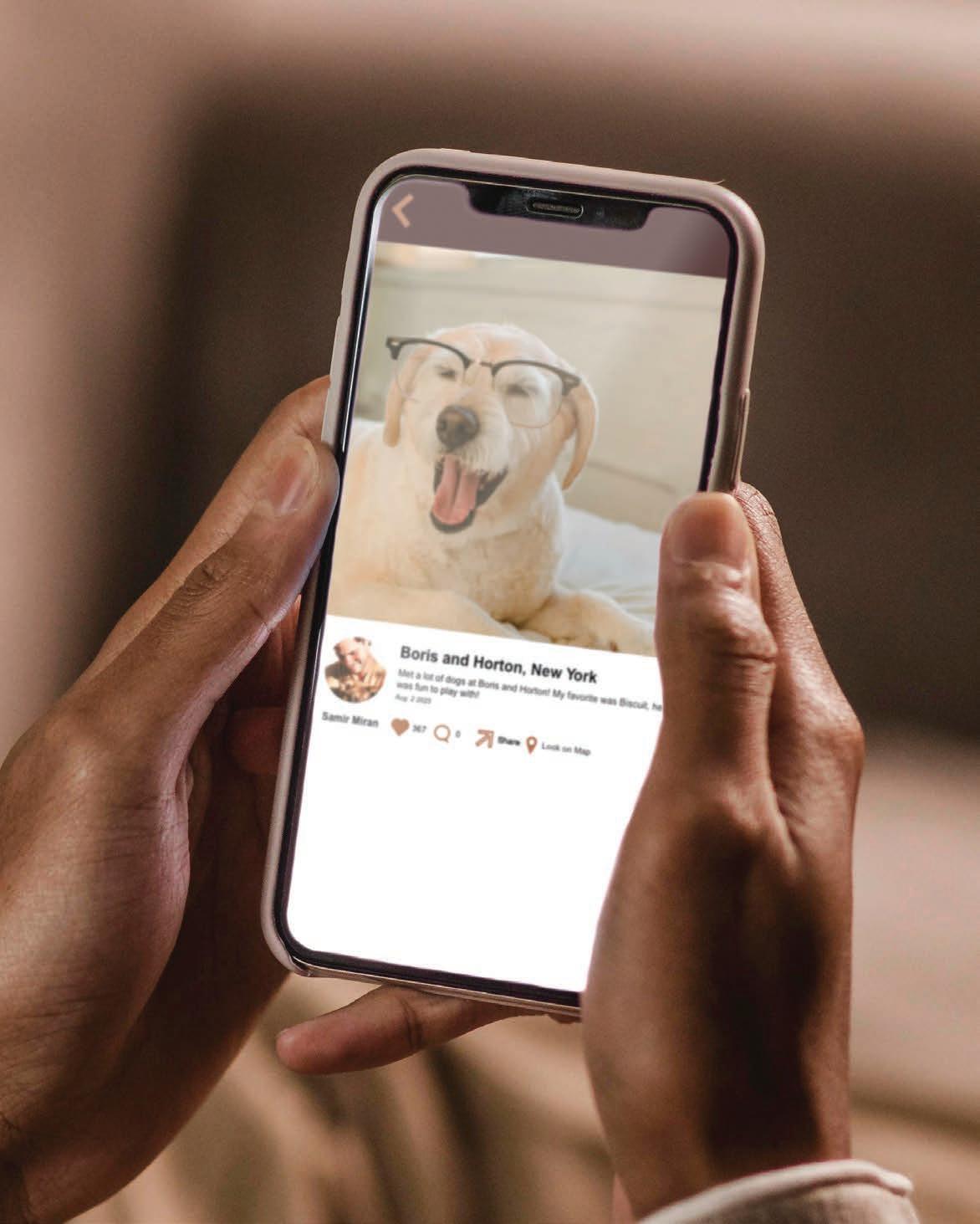
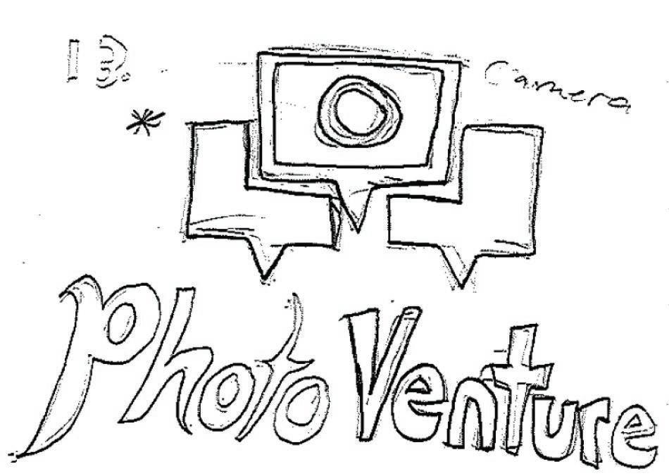
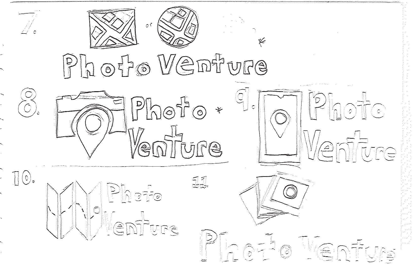
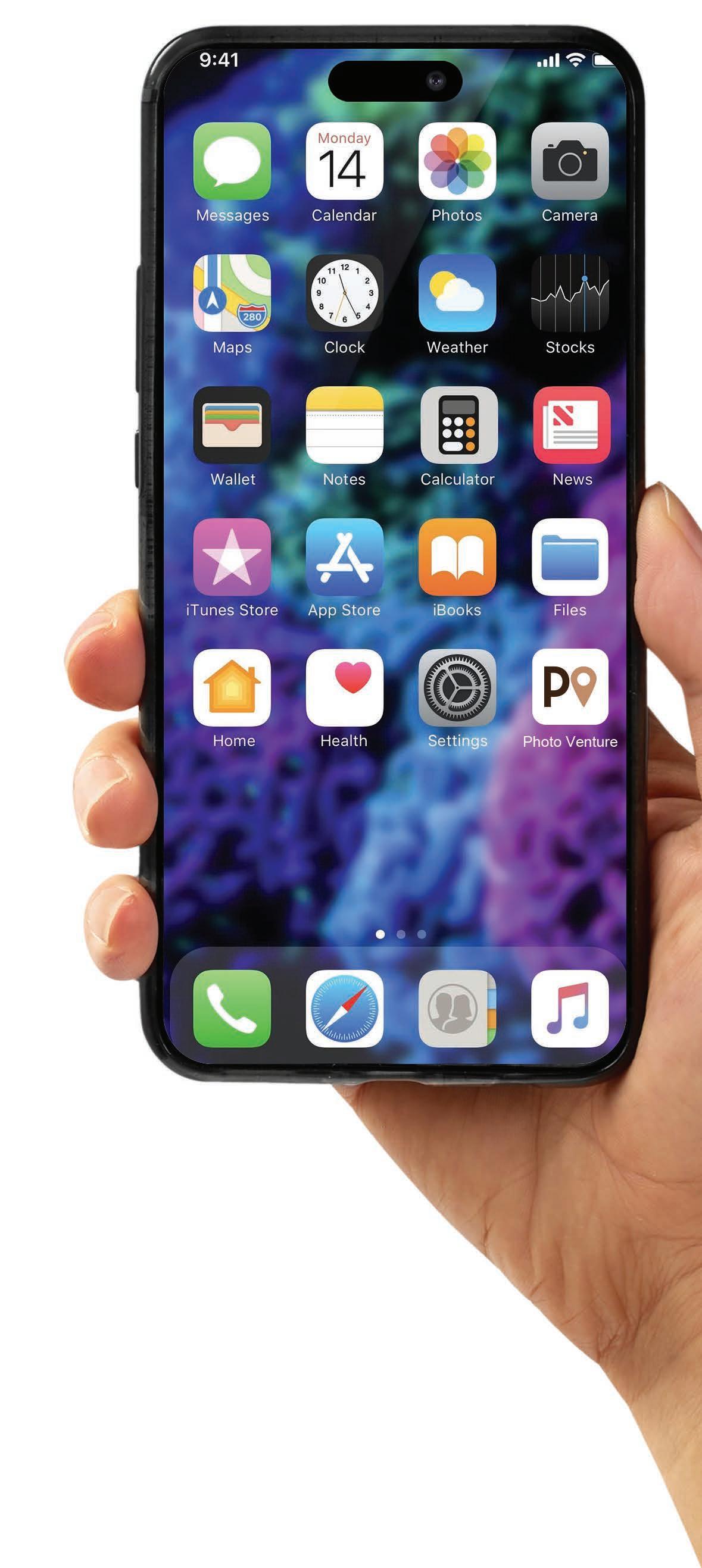
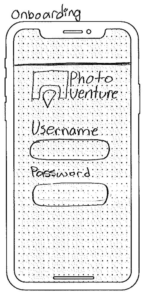
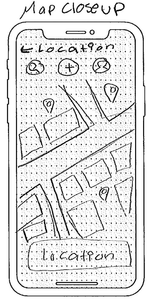
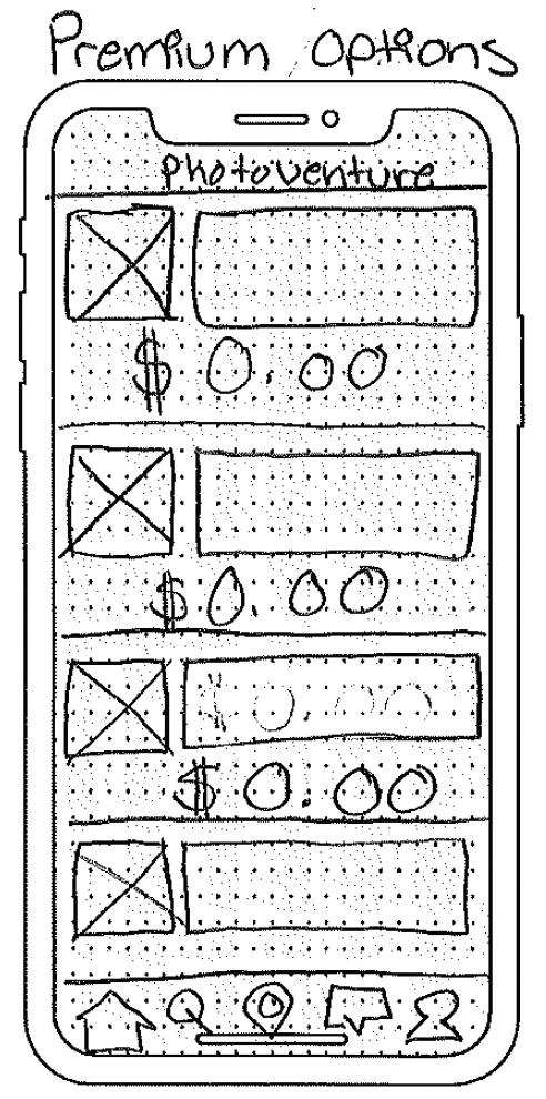
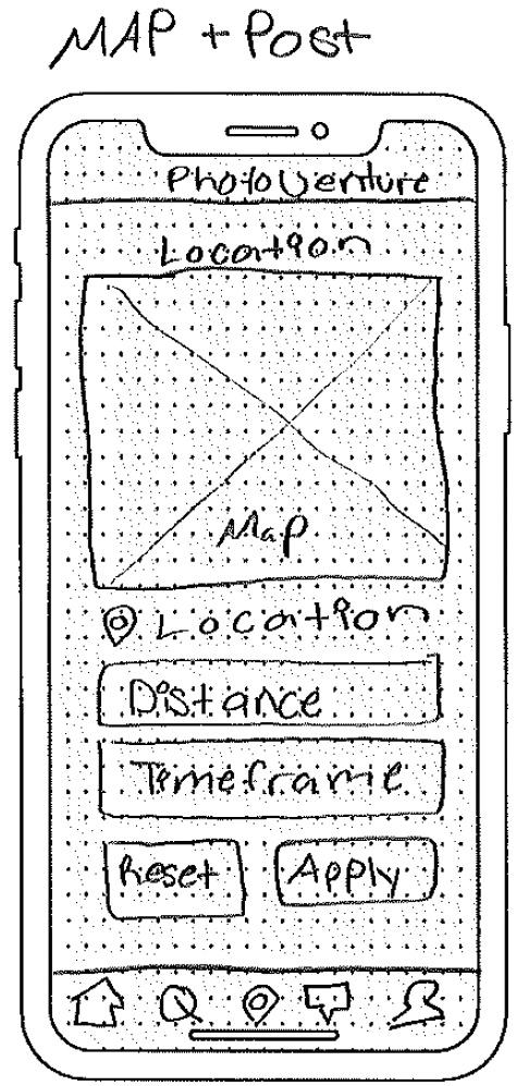
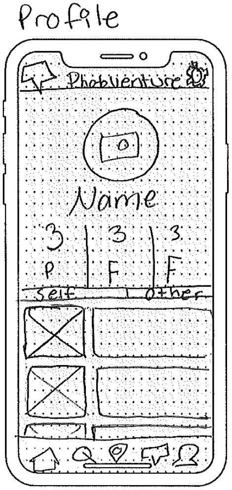
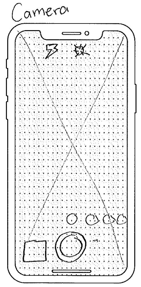
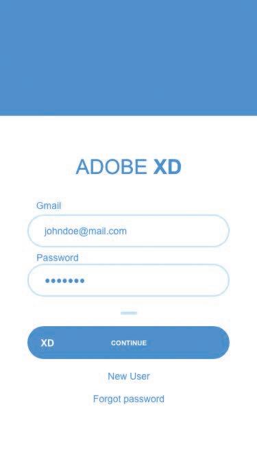
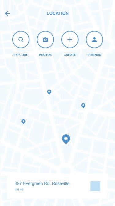
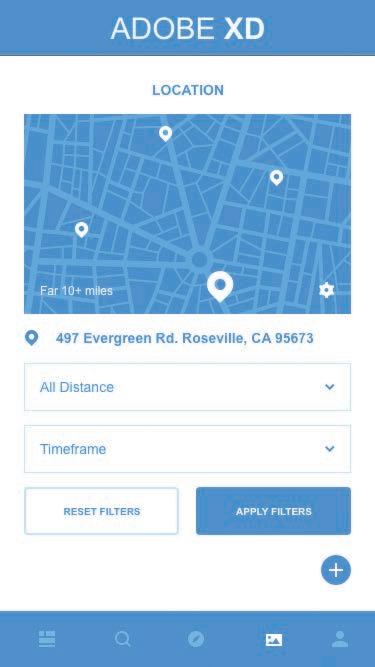
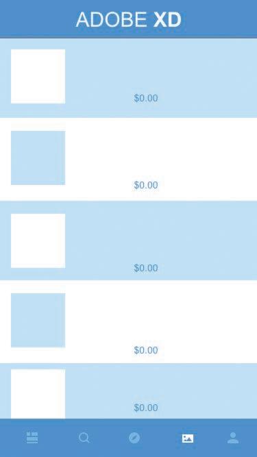
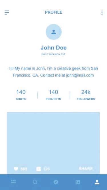
Photo Venture is a social media app that incorporates a digital map. The app will use premium features such as photo editing effects as monetization. Photo Venture has two crucial elements: photography and the digital map. To convey these two elements, a camera and map pin are illustrated in the logo. Neutral-earthly colors are the primary palette for the brand. After designing the brand, the style was applied to the collection of icons, mimicking its strokes and fills style. The mobile screens are inspired by Instagram and Google Maps. These screens are designed based on the brand and with the user in mind. Adobe XD was used to develop a working prototype for users to experiment with.
Personas
Storyboard + Ideation
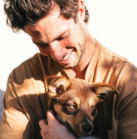
Samir Miran is a 28-year-old professional working at a pet shelter. He lives in a bustling urban environment and has a keen interest in photography. Samir enjoys spending weekends exploring parks, wildlife sanctuaries, and petfriendly cafes. He occasionally takes pictures to share glimpses of his experiences with family and friends.
Megan Grant, aged 26, is a passionate food blogger based in a bustling city. Armed with a degree in culinary arts, Megan has a keen interest in exploring diverse cuisines and capturing her culinary adventures. Her blog has garnered a loyal following, and Megan is recognized for her insightful restaurant reviews and vibrant food photography.
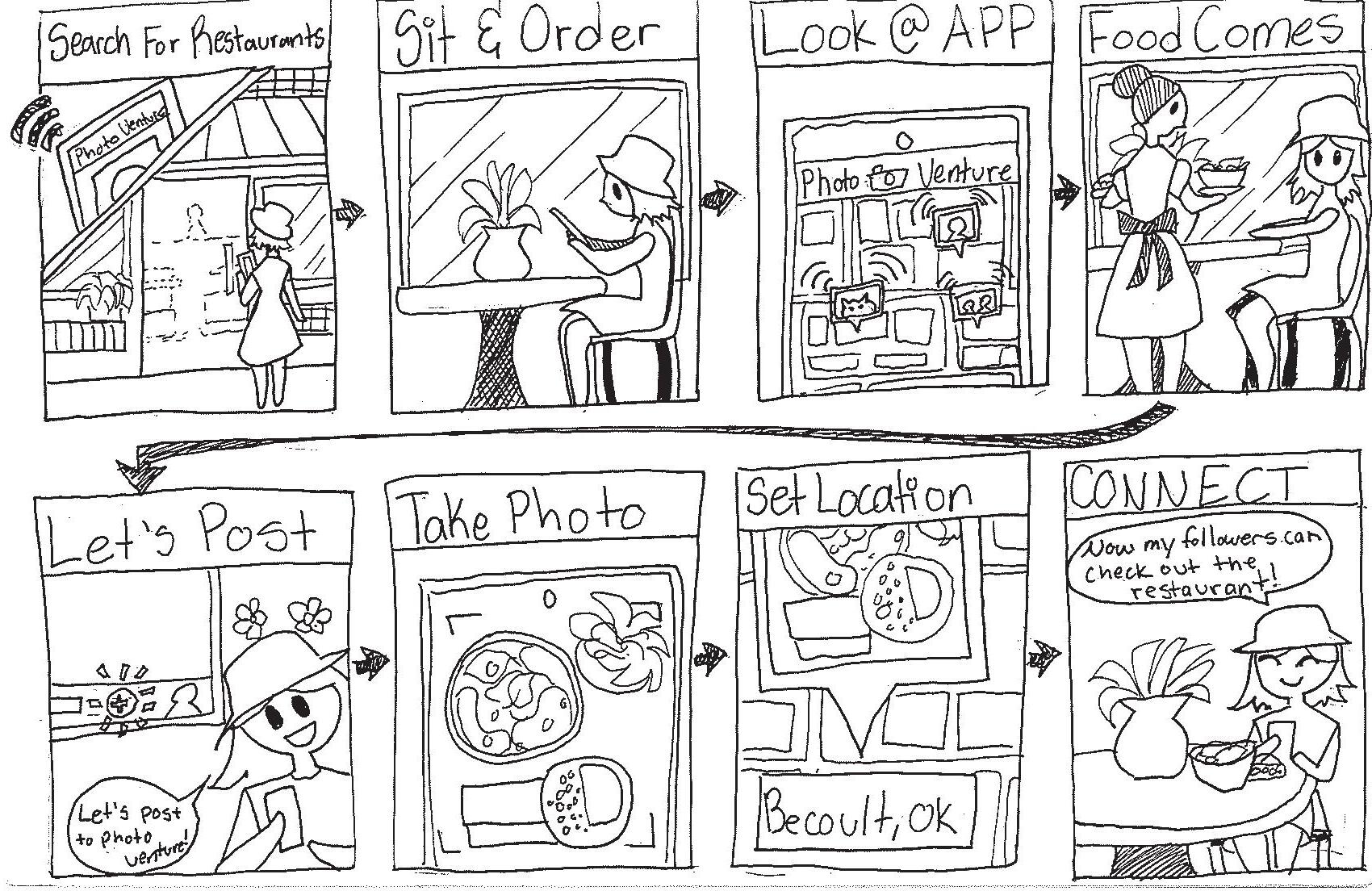
Brian Miles is a 22-year-old traveler and nature enthusiast who finds solace in exploring lakes, forests, and various attractions across the states. His passion for adventure extends to fishing trips with friends, and outdoor exploration. Brian captures his journeys through photography and enjoys sharing these scenic moments with his social circle.
 Extrovert Sensing Thinking Feeling Percieve Judging Intuition Introvert
Samir Miran
Extrovert Sensing
Thinking Feeling Percieve Judging Intuition Introvert
Megan Grant
Extrovert Sensing
Thinking Feeling Percieve Judging Intuition Introvert
Brian Miles
Extrovert Sensing Thinking Feeling Percieve Judging Intuition Introvert
Samir Miran
Extrovert Sensing
Thinking Feeling Percieve Judging Intuition Introvert
Megan Grant
Extrovert Sensing
Thinking Feeling Percieve Judging Intuition Introvert
Brian Miles

Screenflow
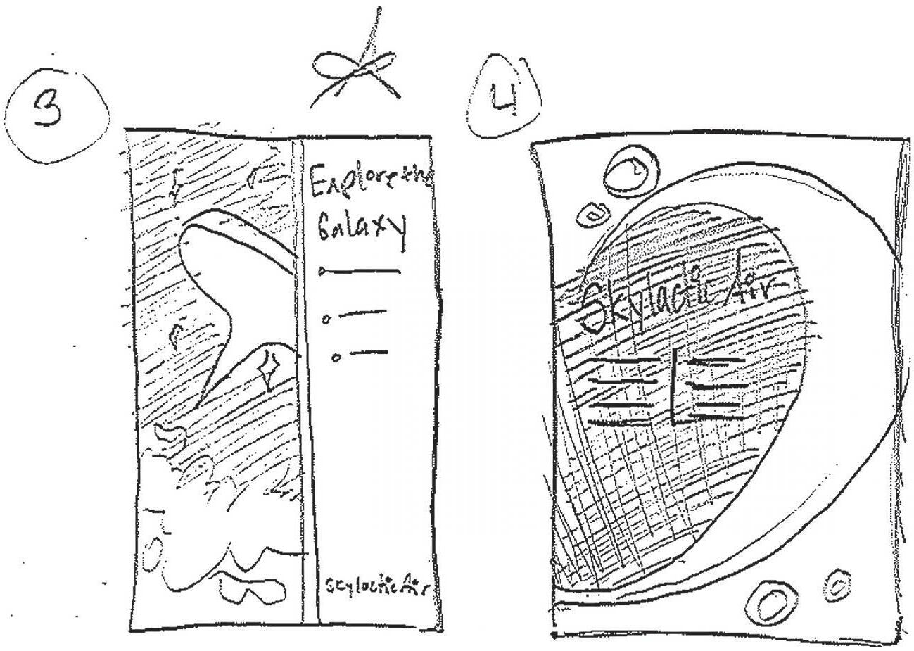
Sketches
Oskar A B C D E F G H I J K L M N O P Q R S T U V W X Y Z 1 2 3 4 5 6 7 8 9 0 Mryriad Pro A B C D E F G H I J K L M N O P Q R S T U V W X Y Z a b c d e f g h i j k l m n o p q r s t u v w x y z 1 2 3 4 5 6 7 8 9 0 Branding Booklet CMYK: 44, 67, 58, 60 RGB: 79, 50, 49 CMYK: 0, 33, 52, 36 RGB: 194, 143, 101 CMYK: 4, 7 , 12, 0 RGB: 241, 231, 218 Opening Returning User New User Make Account Login Home Page/Map Feed View Pin Feed View comments View Follow Camera Photo Editor Post Settings Preview Post Comment Like View User Profile Follow Share Set location, category Post Notifications Profile Personal Feed Edit Profile Settings Sign Out Click Pins on Map Key Main Icons Sub Categories (Click to return) (Back Button)

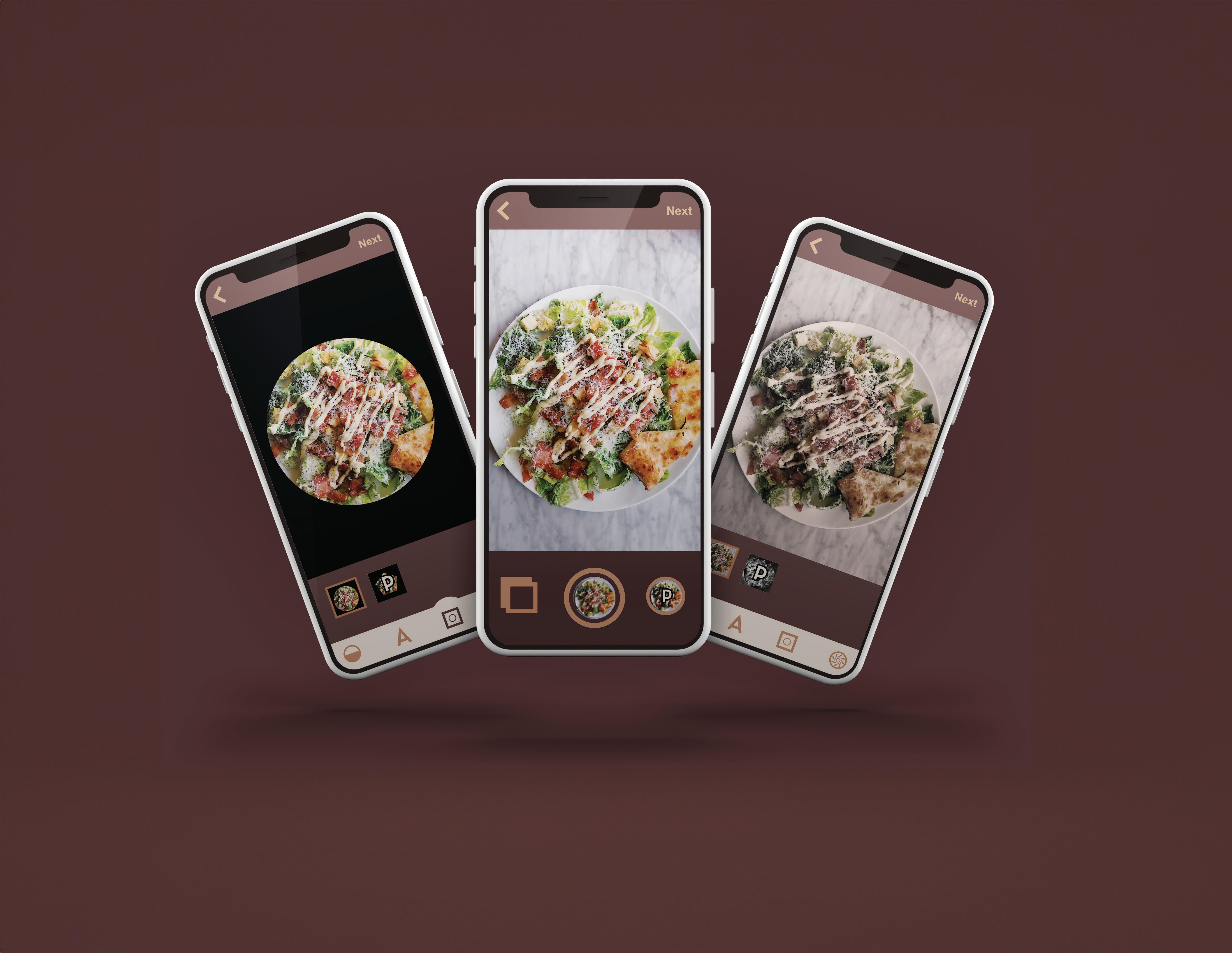
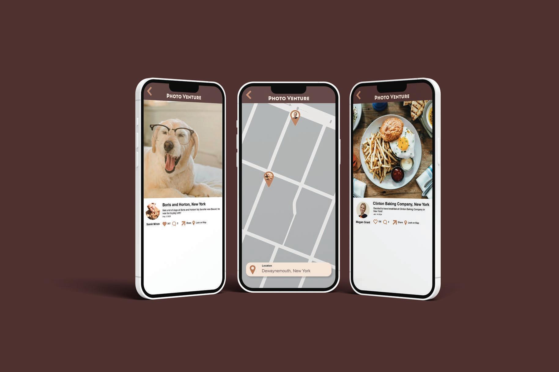
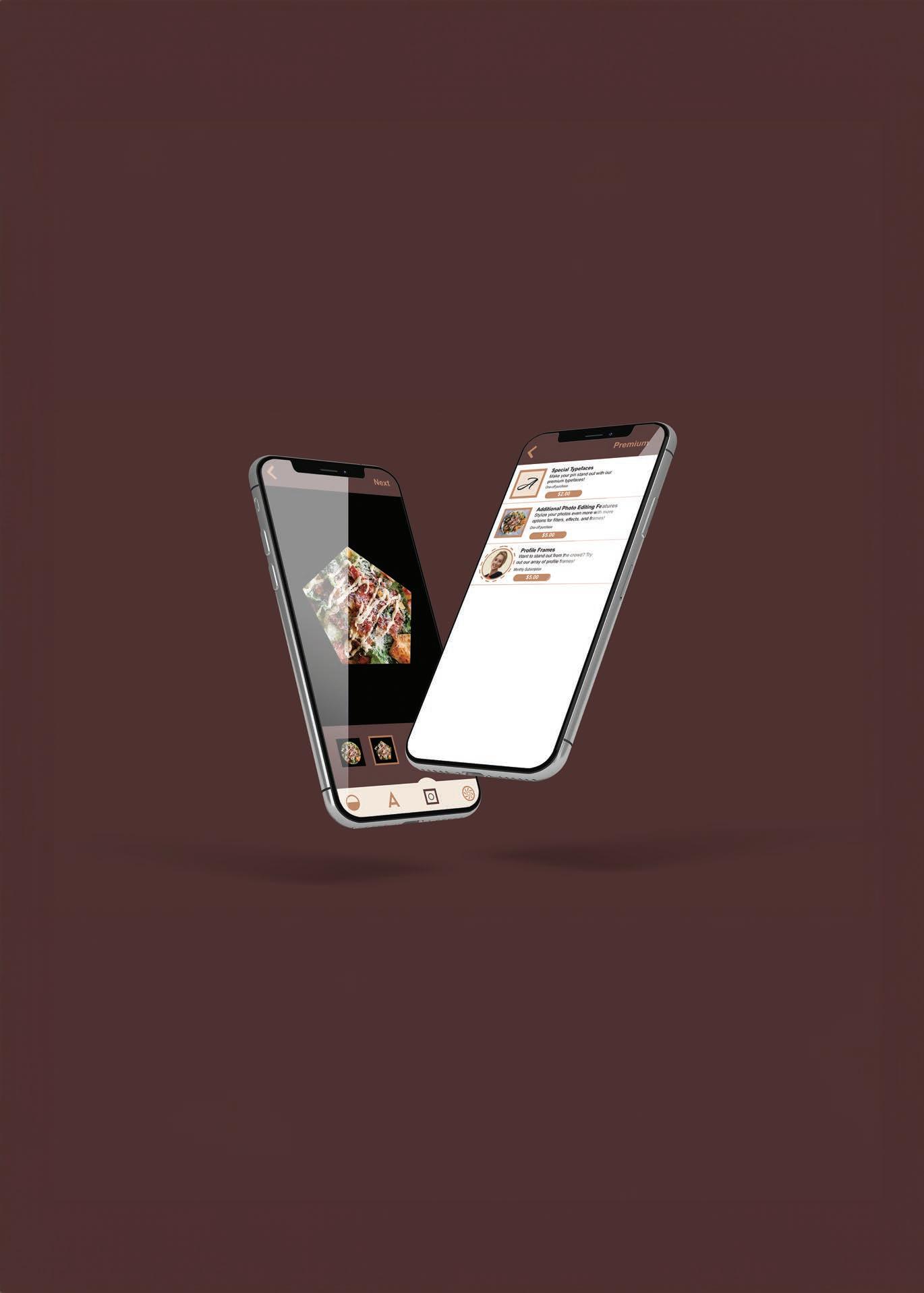
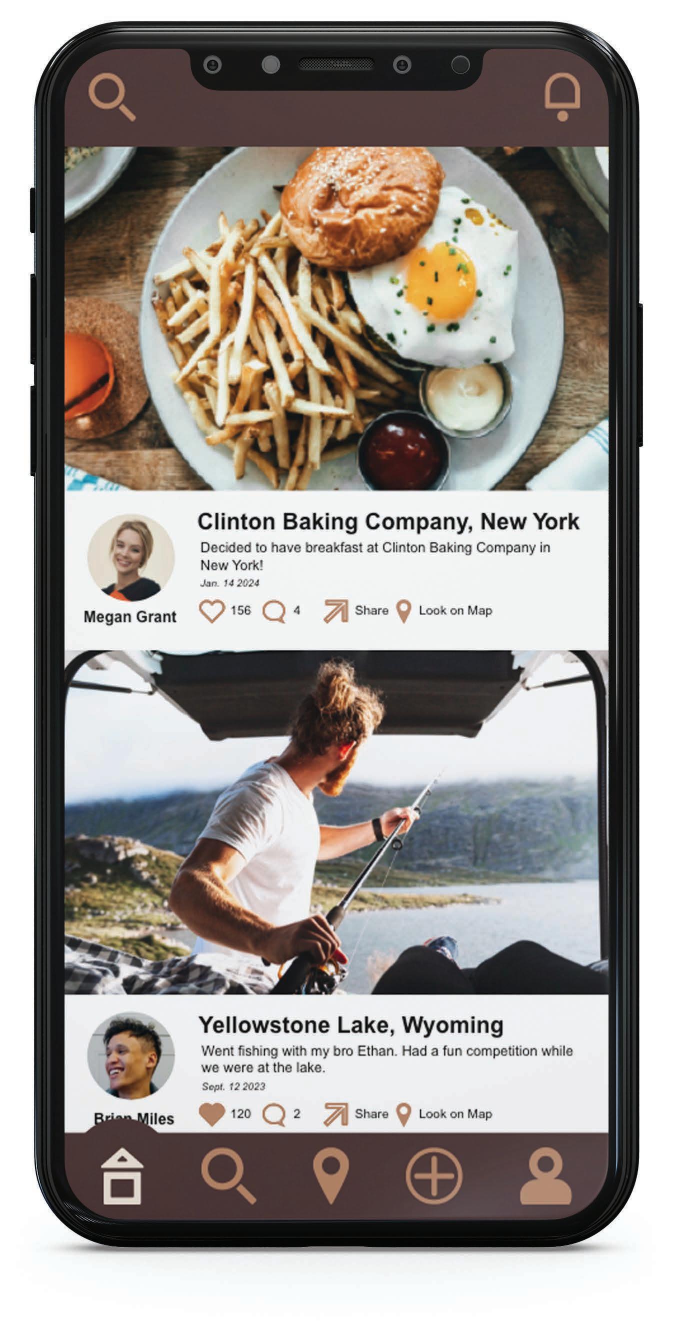
Email Password New user Forgot password Megan.grant@gmail.com ****************** Login A Special ypefaces Make your pin stand out with our premium typefaces! Additional Photo Editing Features Stylize your photos even more with more options for filters, fec and frames! Profile Frames W sta out from the crowd? ry out our array profile frames! $2.00 $5.00 $5.00 One-o purchas One-o purchas Monthly Subscription Premium Posts Following Followers Share Look Map Jack’ Wife Freda, New ork Had nice chicken salad at Jack Wife Freda. They always have the best salads! Definitely recommend For salad lovers! Clinton Baking Company New ork Decided have breakfast Clinton Baking Company New ork! 156 Share Look Map Megan Grant Photo V ntur P Next Yellowstone Lake, Wyoming Location Photo V ntur Add Photo Jack’ Wife Freda, New ork 10/18/2023 Location Date Caption (200 words) Had nice chicken salad Jack’ Wife Freda. They always have the best salads! Definitely recommend salad lovers! Post Yummy Salad! ummy
Digital
Map Recording Photo Recording App Prototype
Wireframes
Comps
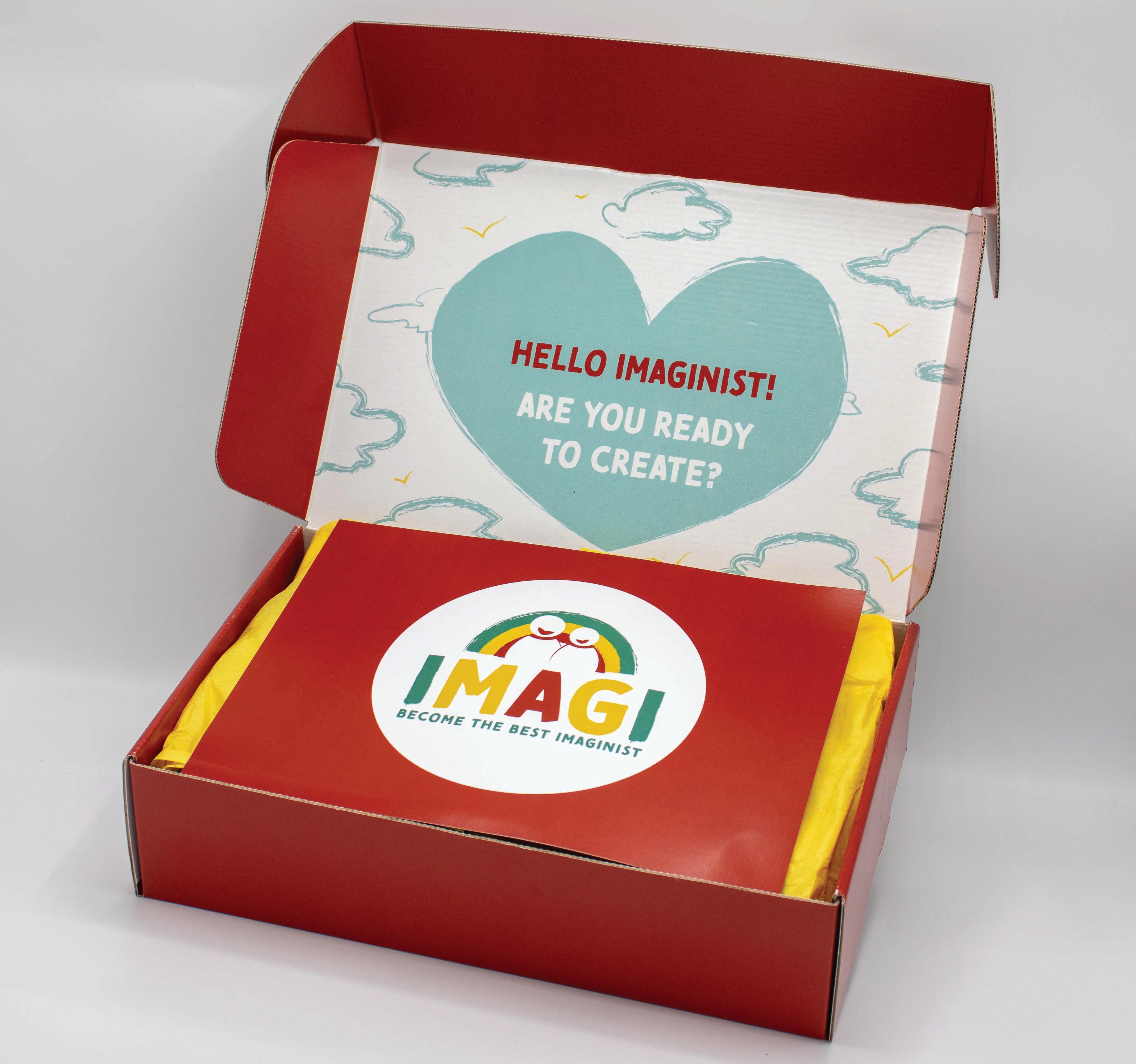
IMAGI
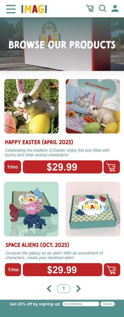
Subscription Box
Design Objective
Perform extensive research and select a niche to develop a subscription box. After determining the target audience, develop the brand and curate a selection of items for the subscription box.
Design Statement
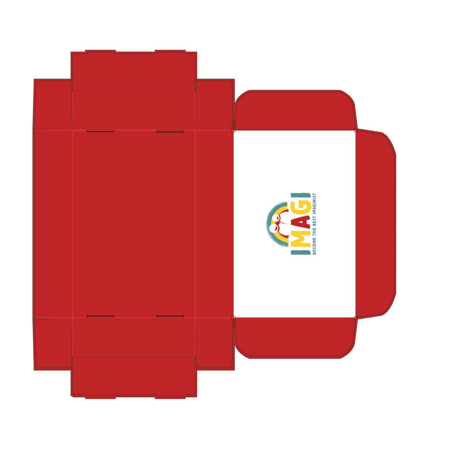
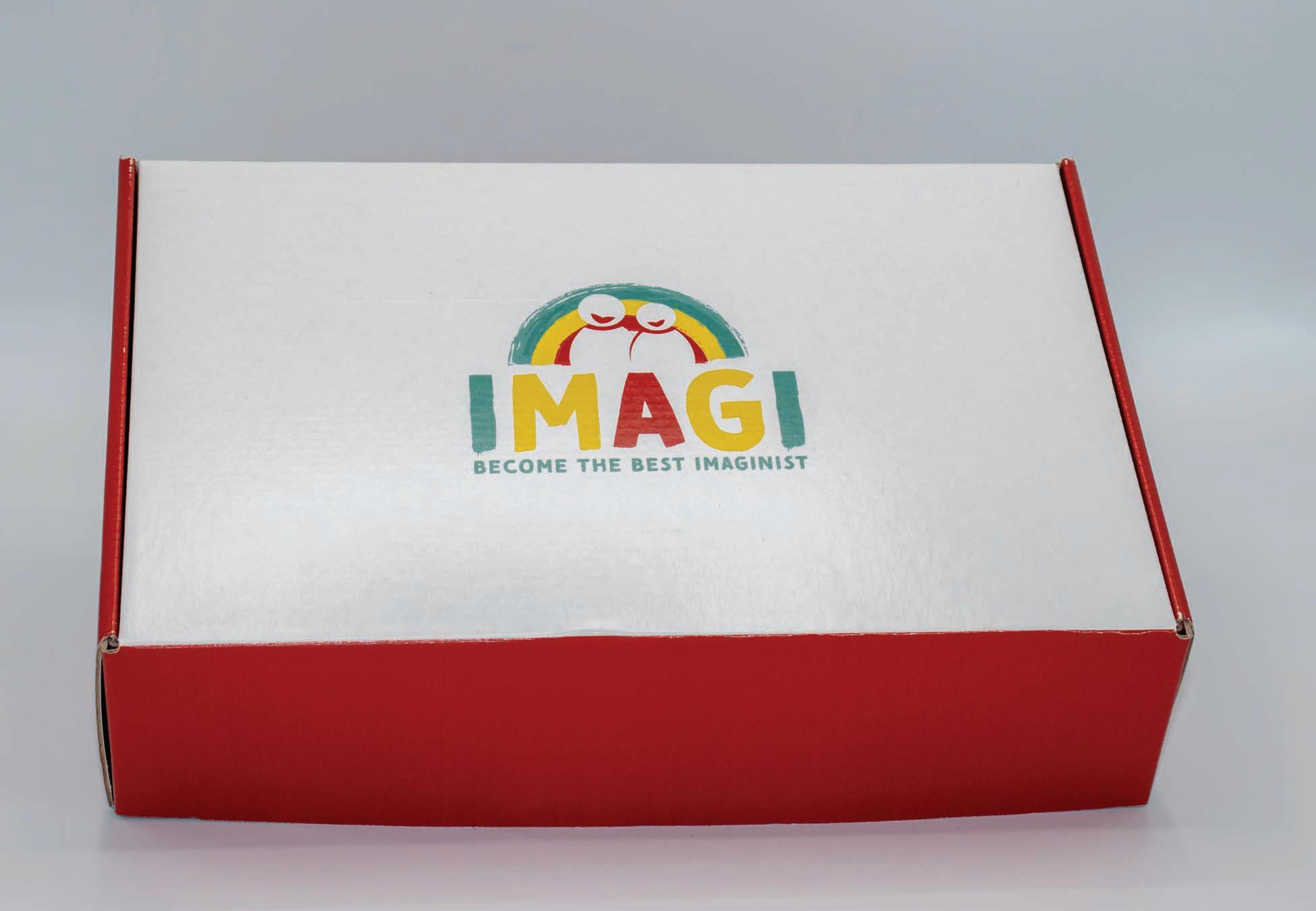
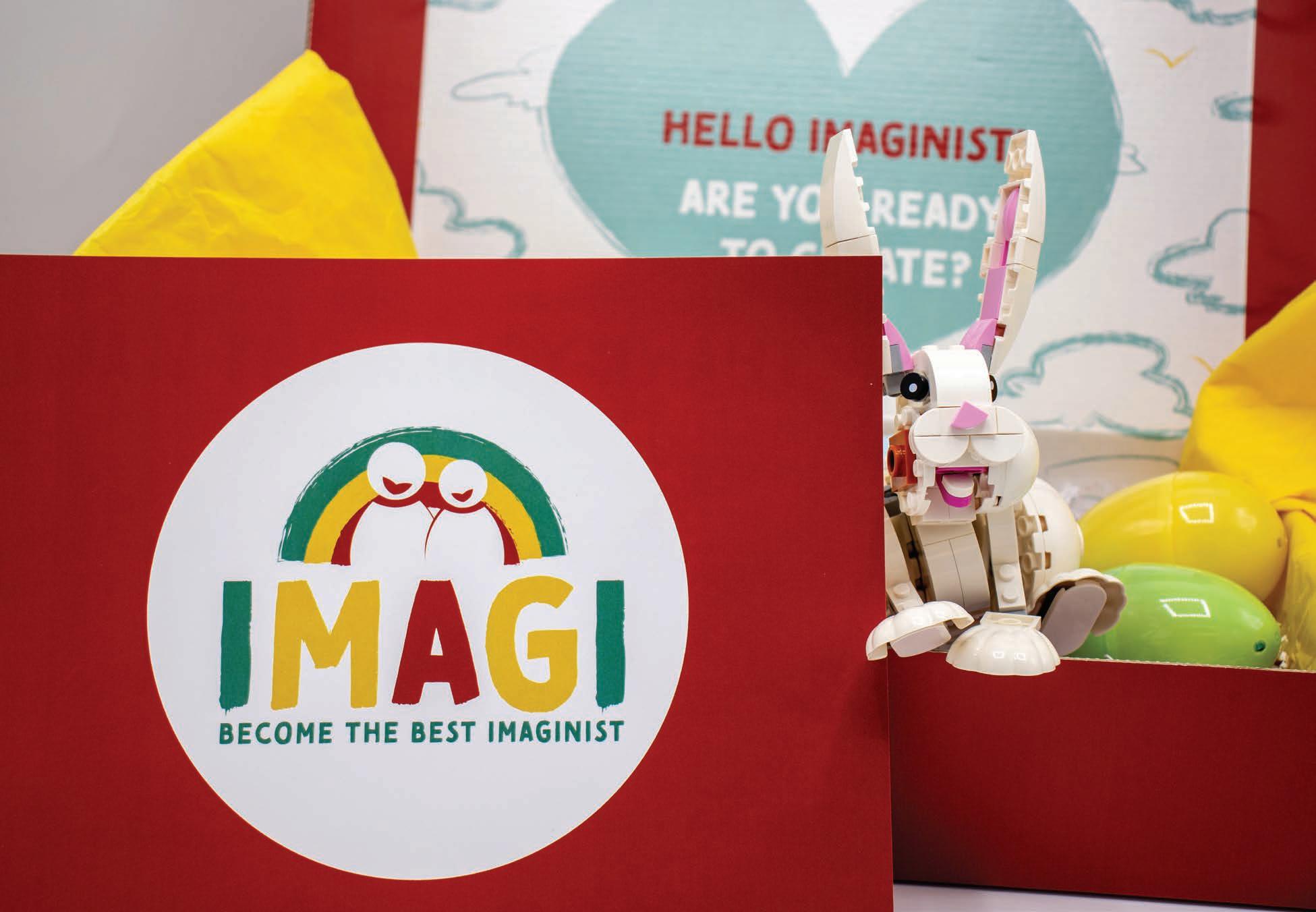
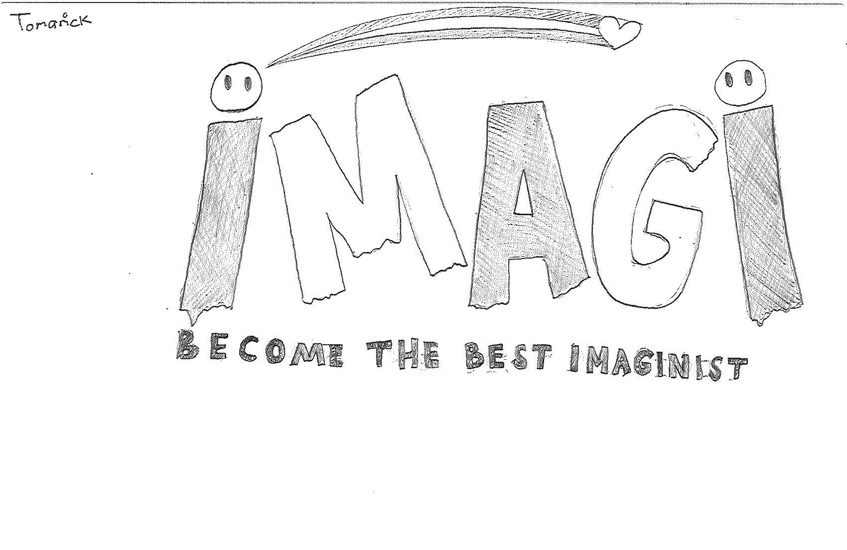
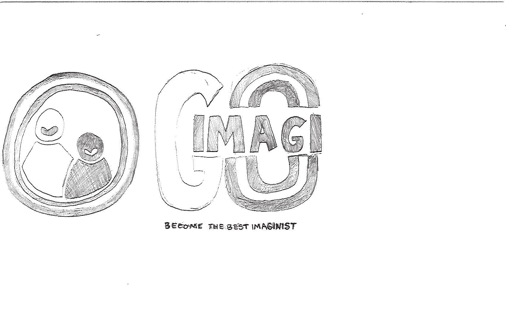
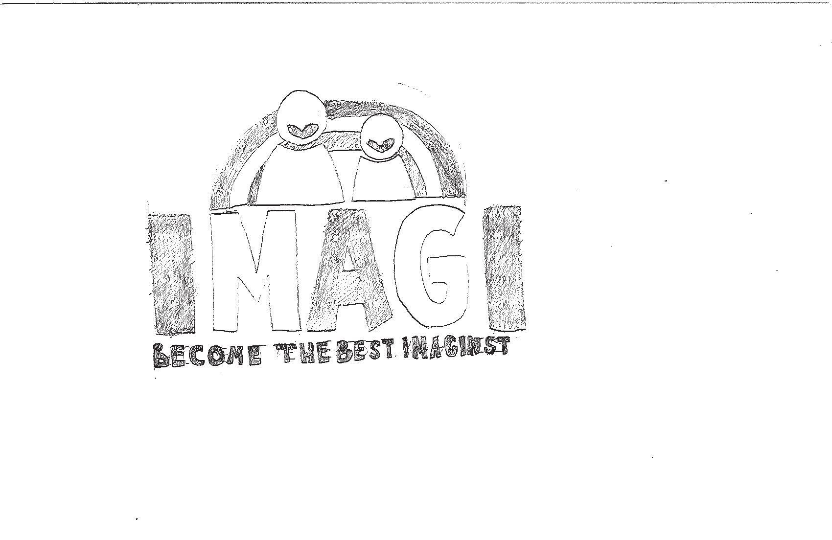
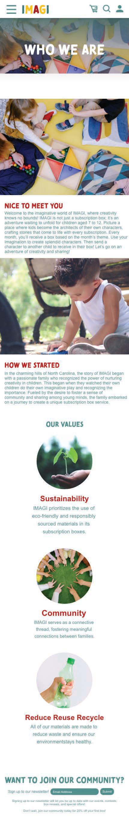
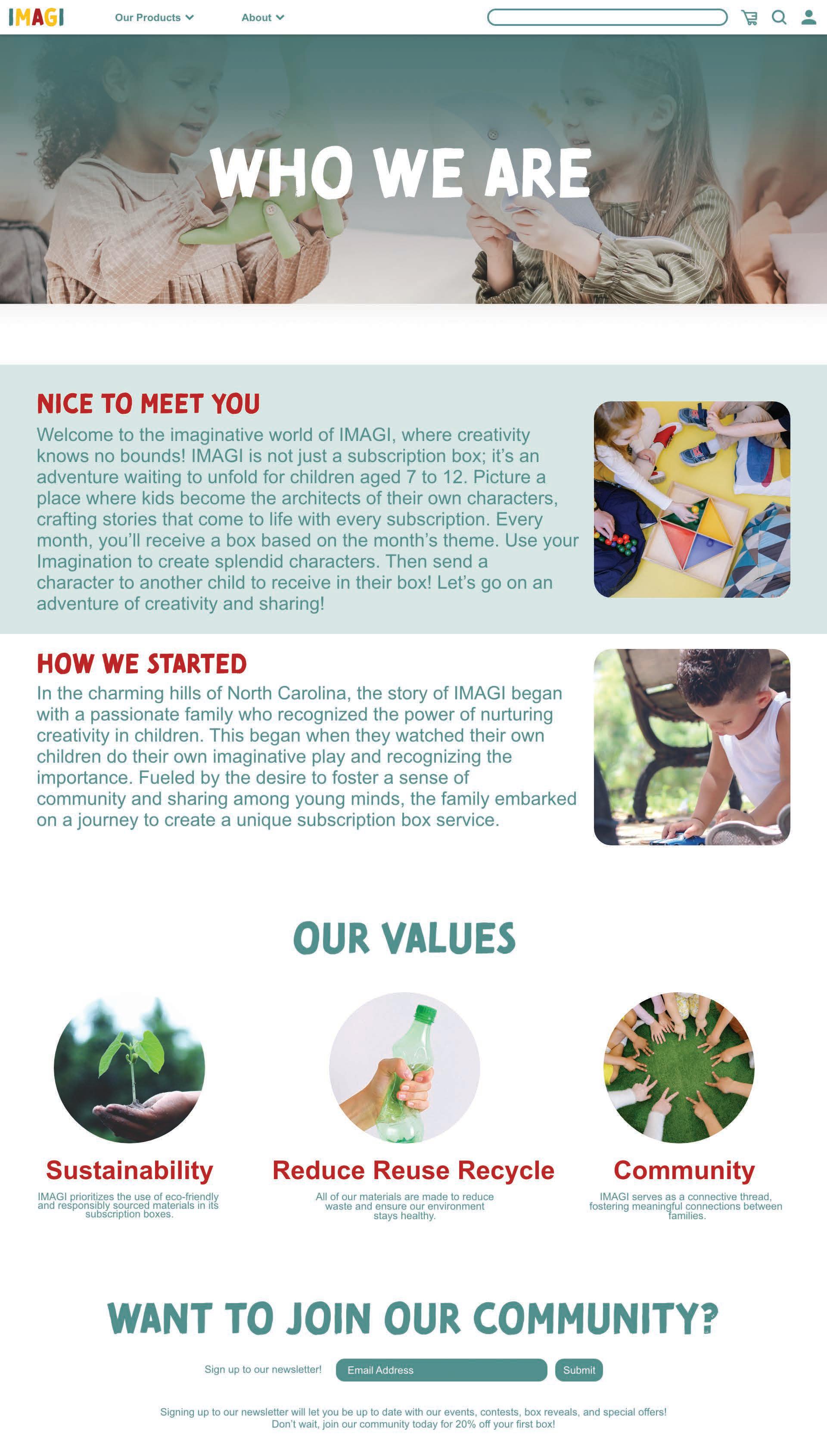
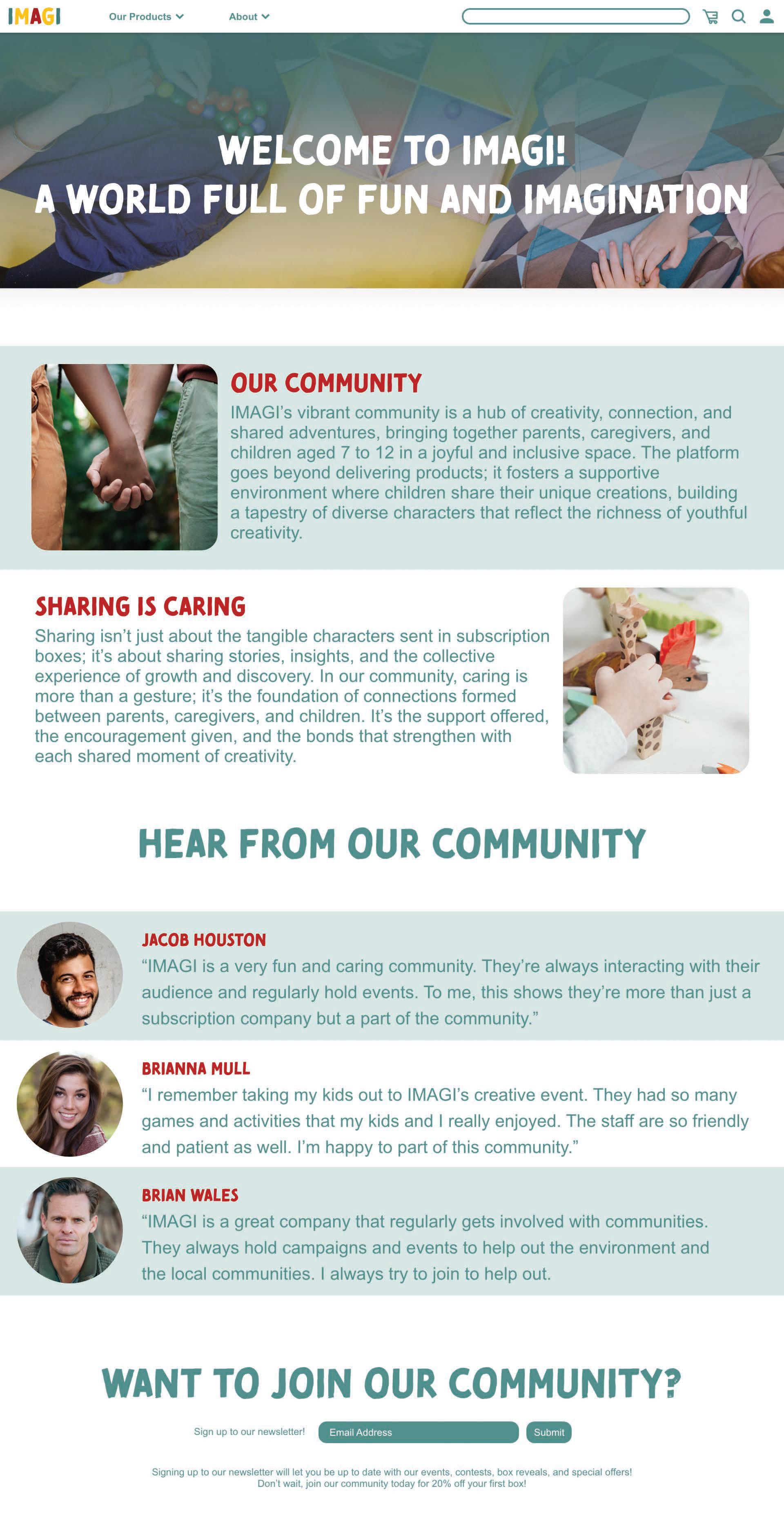
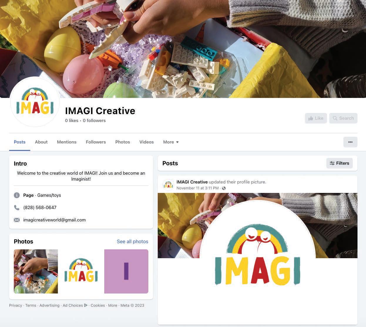
IMAGI is a monthly subscription box targeting children age seven to twelve. IMAGI is a fun, creative, and cheerful brand to appeal the target audience. This box consists of toy parts where children can create their own characters based on the month’s theme. The brand implements primary colors due to its appeal to young children.
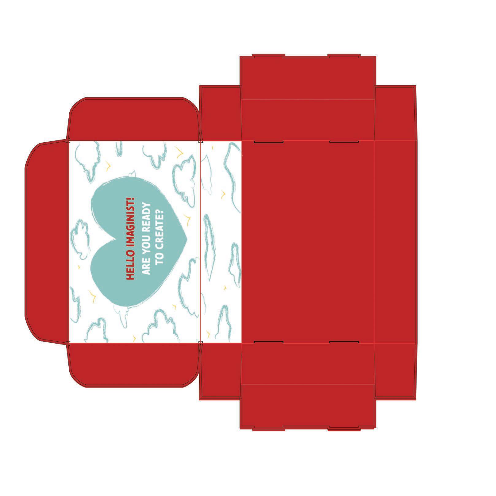
Developed through Adobe Illustrator, the logomark consists of a rainbow and two figures with smiling hearts. The figures represent children and parents to visualize family bonds and connections. The rainbow represents creativity and happiness. The logotype is stylized with the primary colors, copying the color pattern of the mark. The Easter-themed box features a bunny.
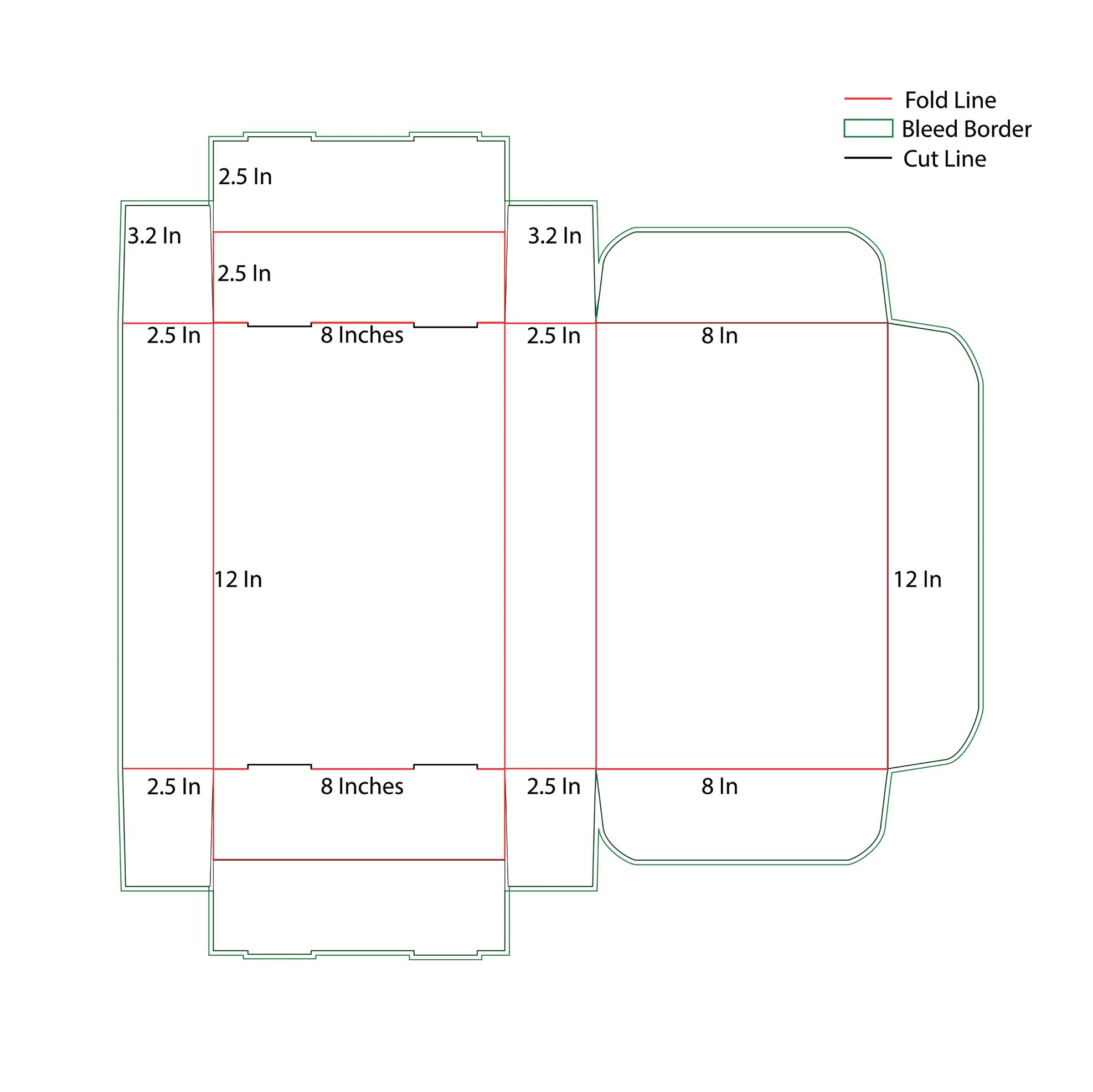
Dielines
Box Ideation
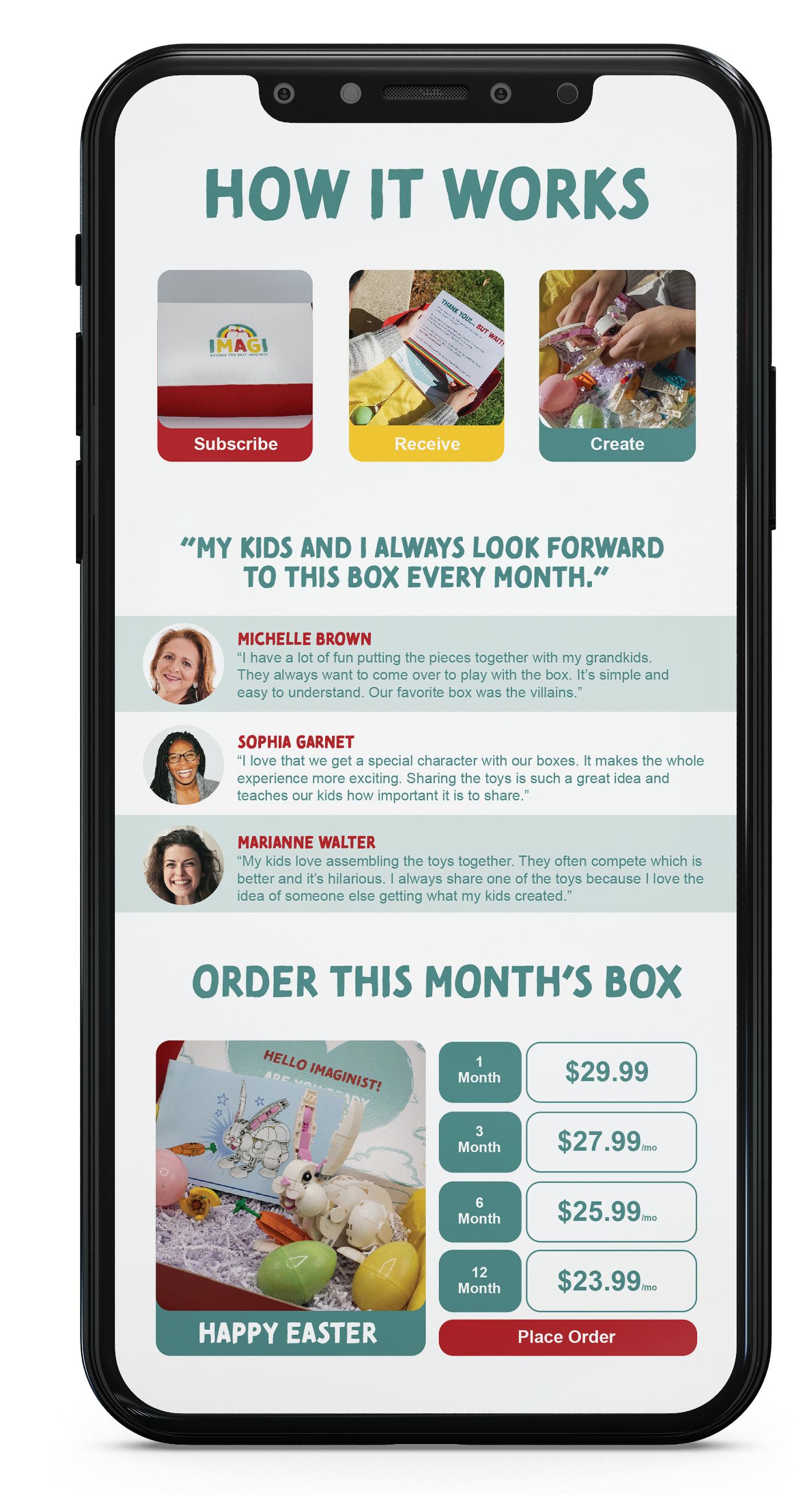
Tomarik Brush a b c d e f g h i j k l m n o p q r s t u v w x y z 1 2 3 4 5 6 7 8 9 0 Tomarik Poster A B C D E F G H I J K L M N O P Q R S T U V W Z Y X a b c d e f g h i j k m n o p q r s t u v w x y z 1 2 3 4 5 6 7 8 9 0 Hello Imaginists! Our Miss on Here at IMAGI, we live in a world of Imaginists. Our mission is to bring creativity and imagination to children through fun and safely curated boxes. W dedicate ourselves to building high-quality products that nurture creativity all the while building a brighter future for children worldwide. Subscribe Receive Create How it works “My k ds and I always look forward Mobile Prototype
Branding
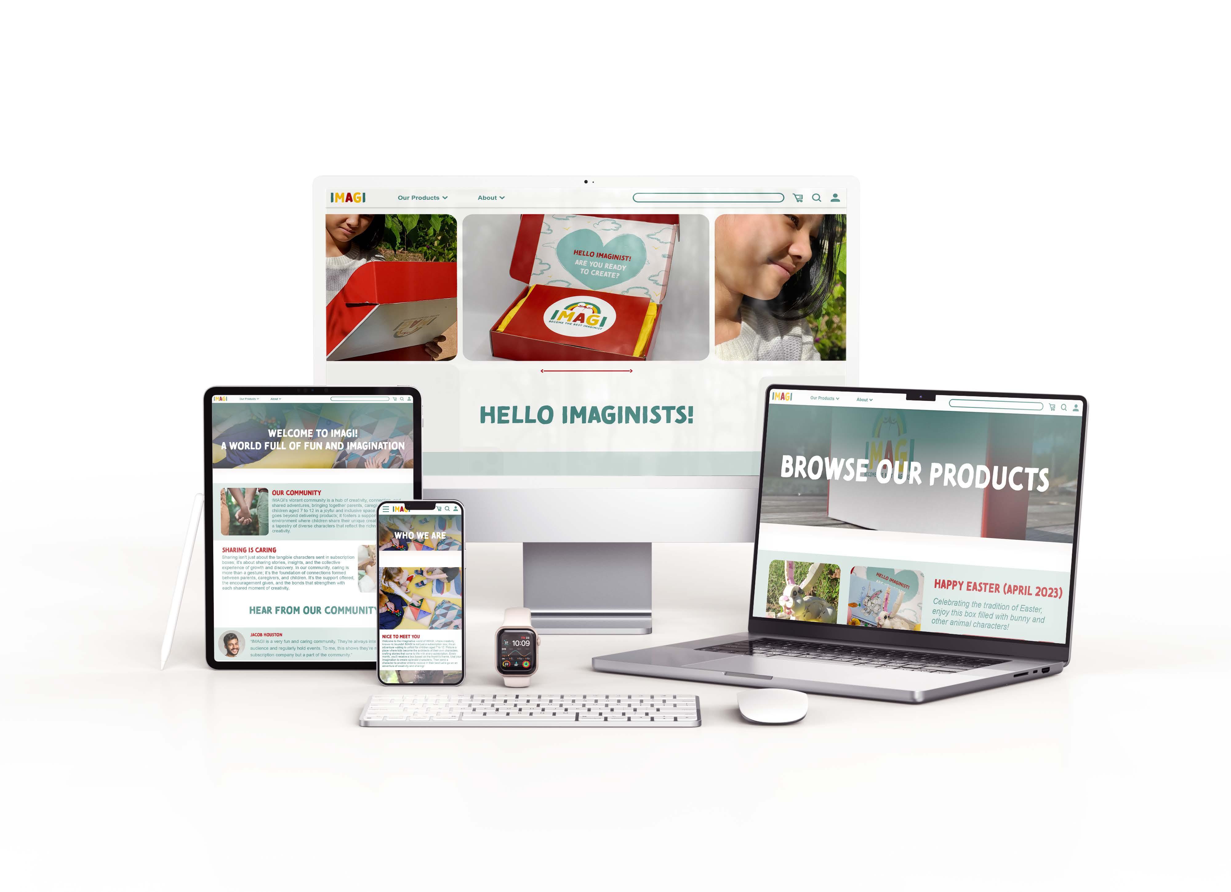
Website Prototype Case Study Website Prototype Mobile Prototype Mockups + QR
Biomimicry in Design
Design Objective
Conceptualize and design a publication layout of 3-spreads. The publication copy should revolve around design. Perform extensive research into the subject. Write a document that is sufficient for a 3-spread layout. When designing the pages use typography, visual hierarchy, and visual engagement with the end-user in mind. The final design should be cohesive and clear of written mistakes.
Design Statement
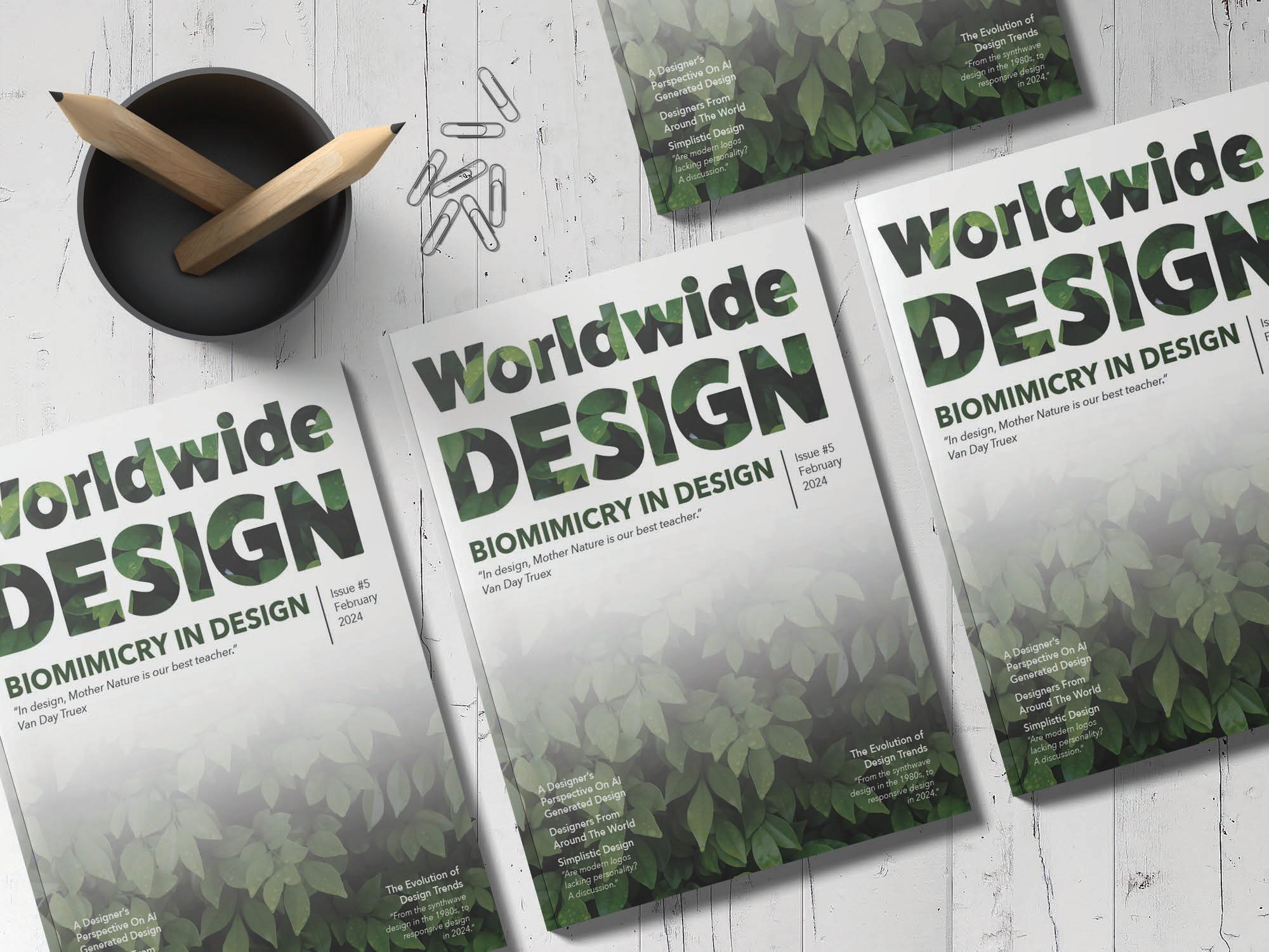
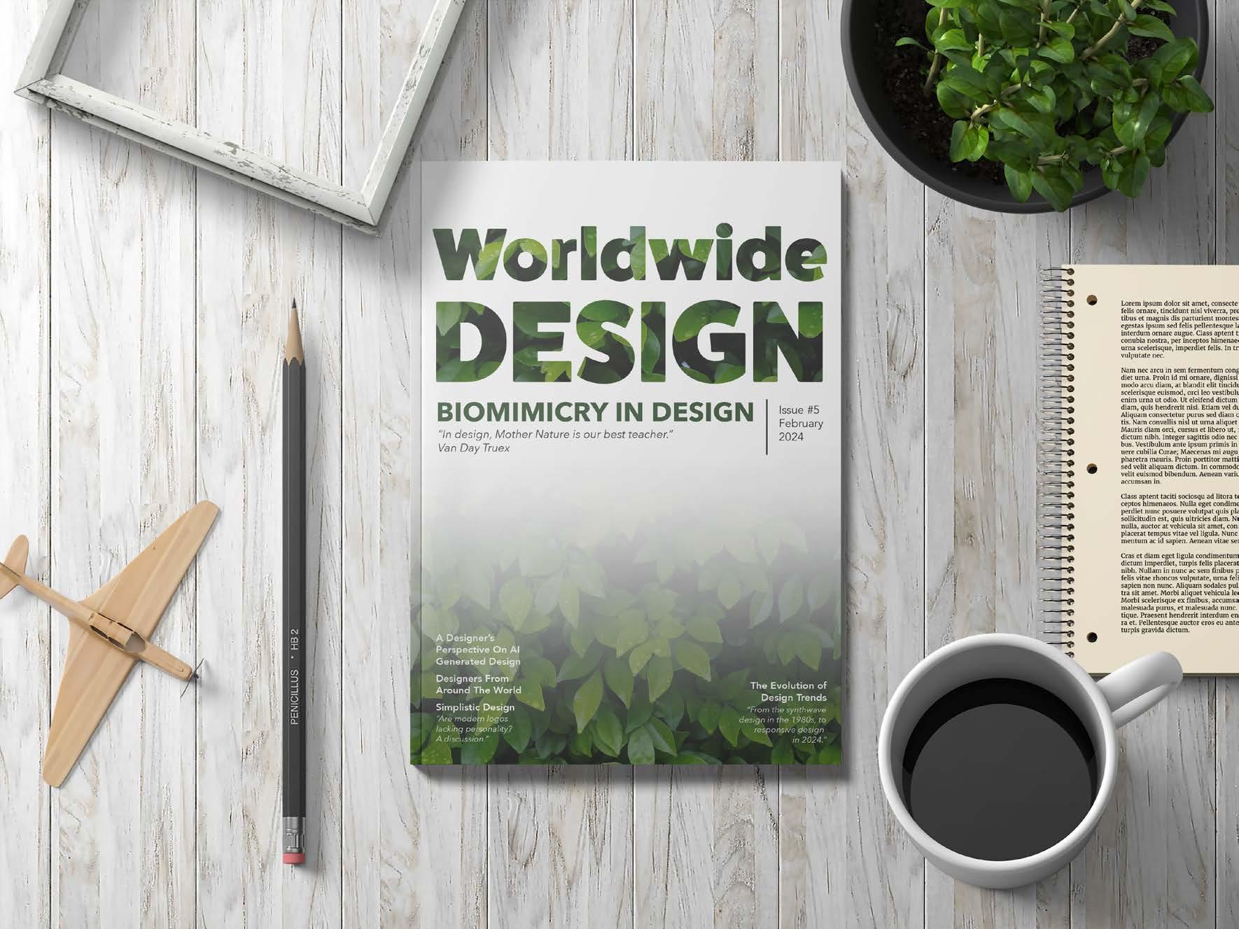
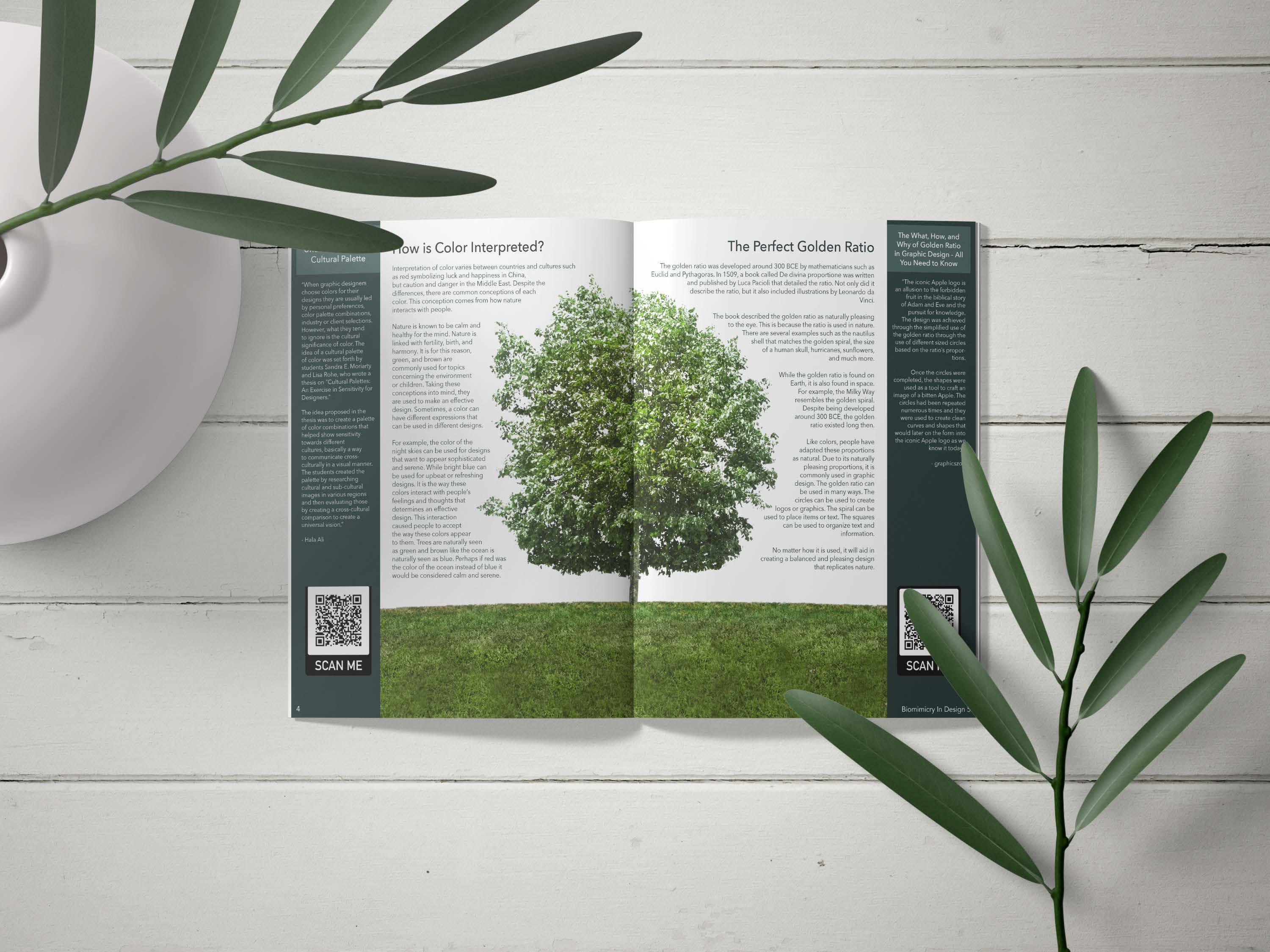
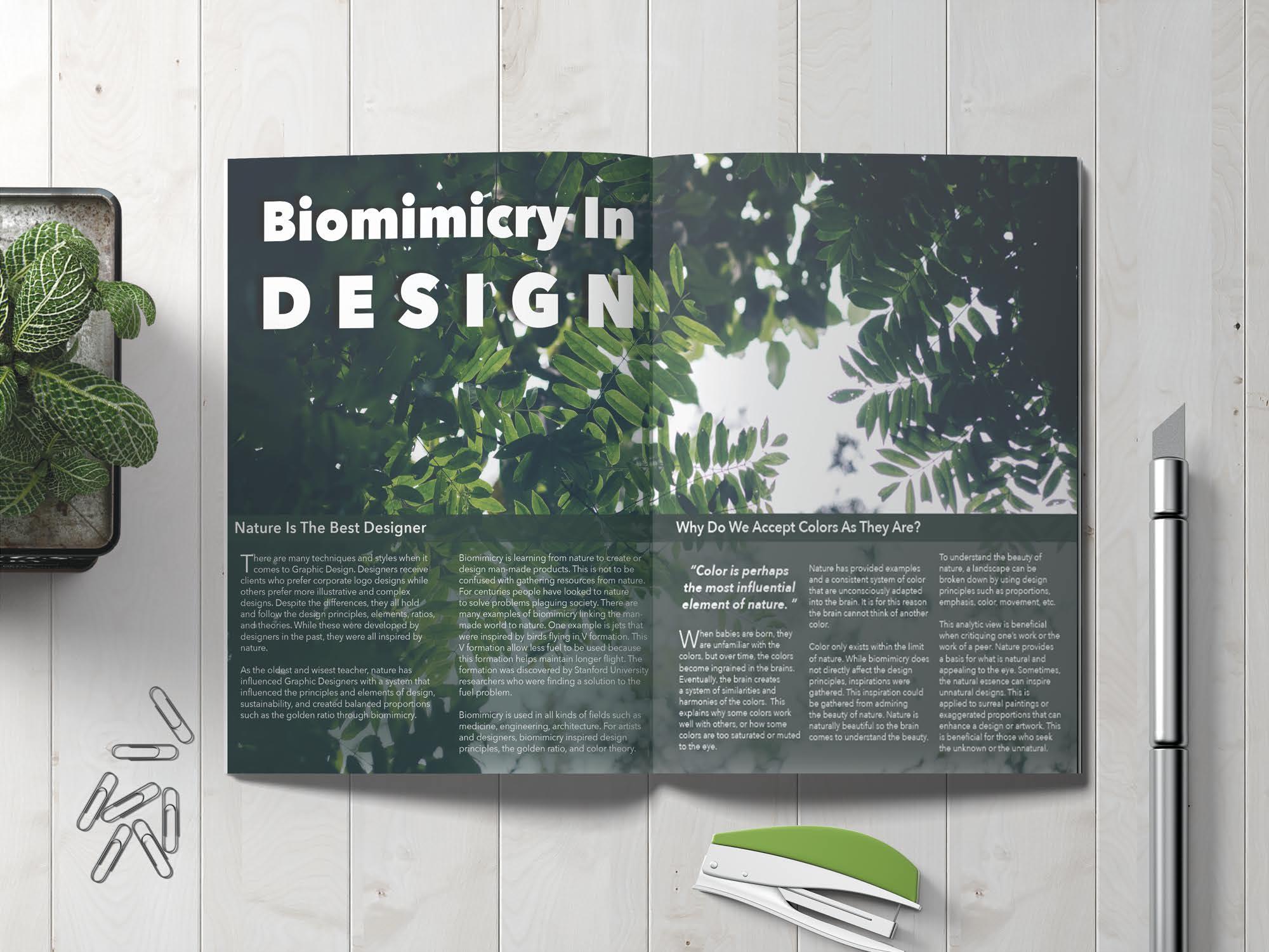
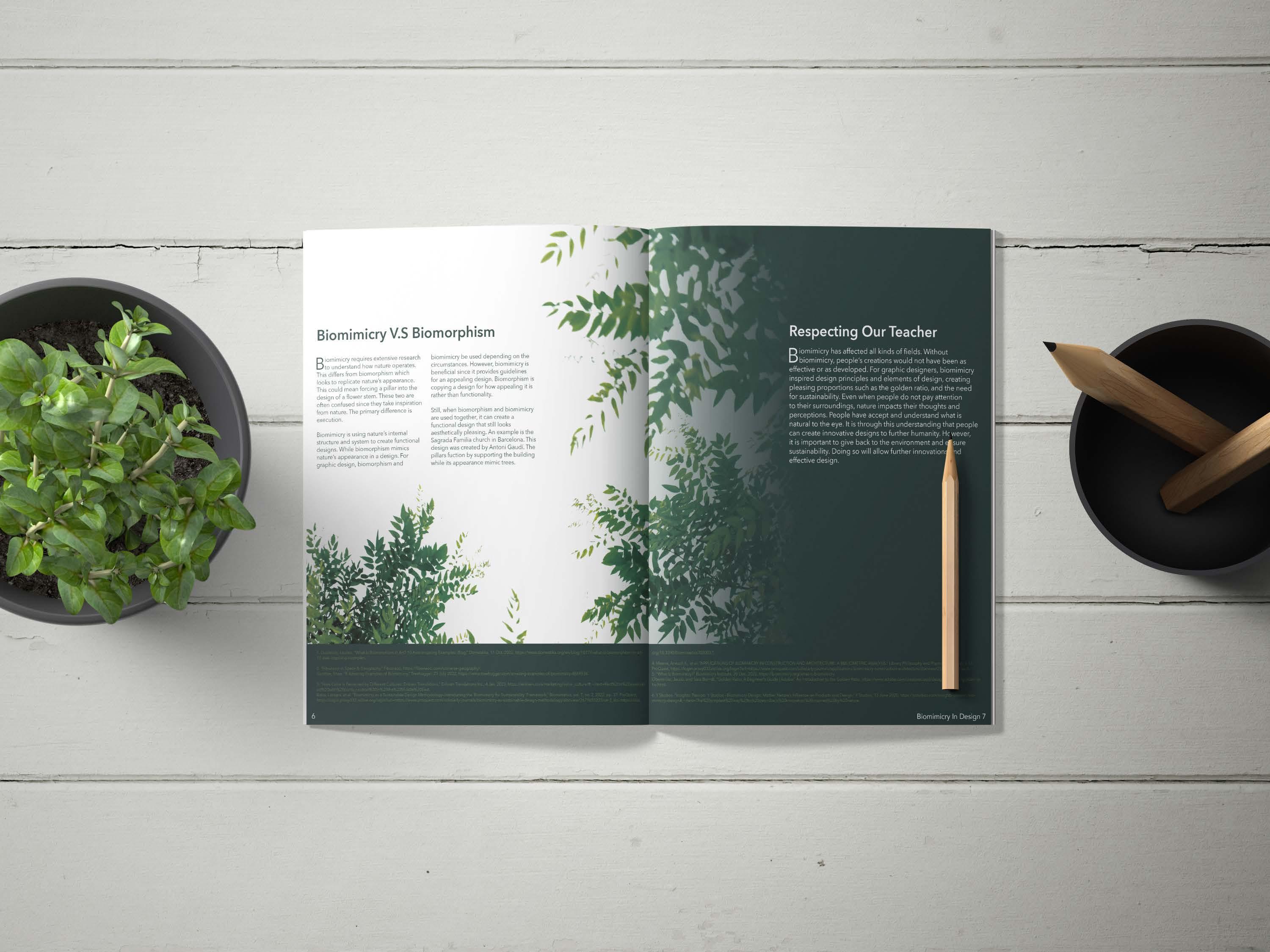
Biomimicry in Design focuses on how nature influences design and design principles. Stock photos of trees and leaves are the main visuals. Rectangular shapes are used to separate the body text from the background for improved readability. A pull quote is used to introduce a new topic and create visual interest. The second spread has a text wrap applied to the tree. The spread is organized with balance and symmetry in mind. The third spread is organized with the same balance and symmetry. The third spread mirrors the first spread with the opening of the leaves. The headers and body of texts contrast one another to create interest. Finally, citations are placed at the bottom of the page with a subtle green hue to avoid competing with the body copy.
Mockups
Article Interactive
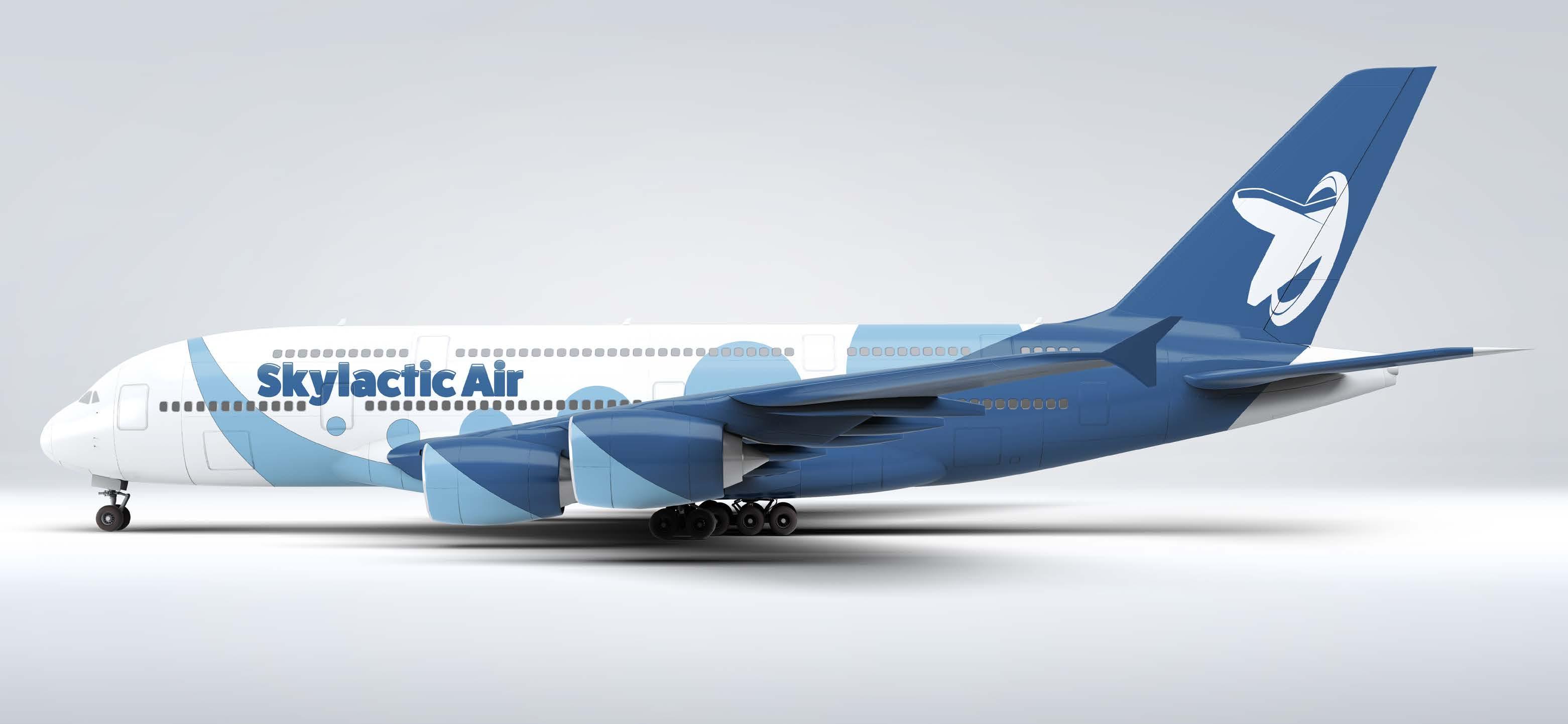
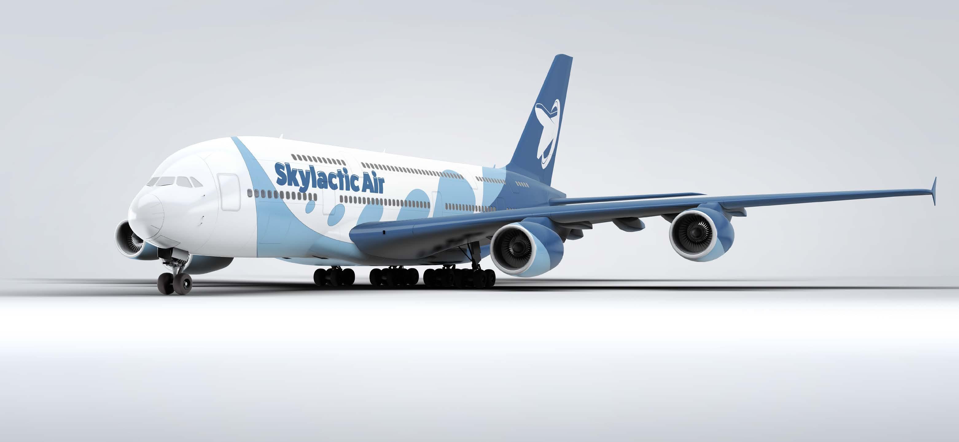
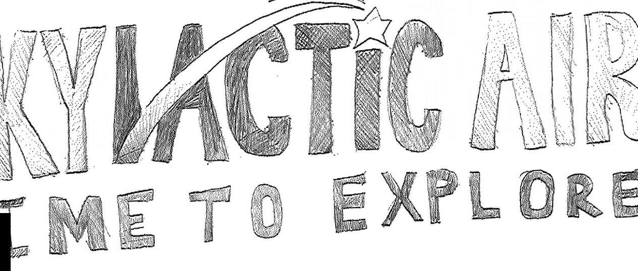
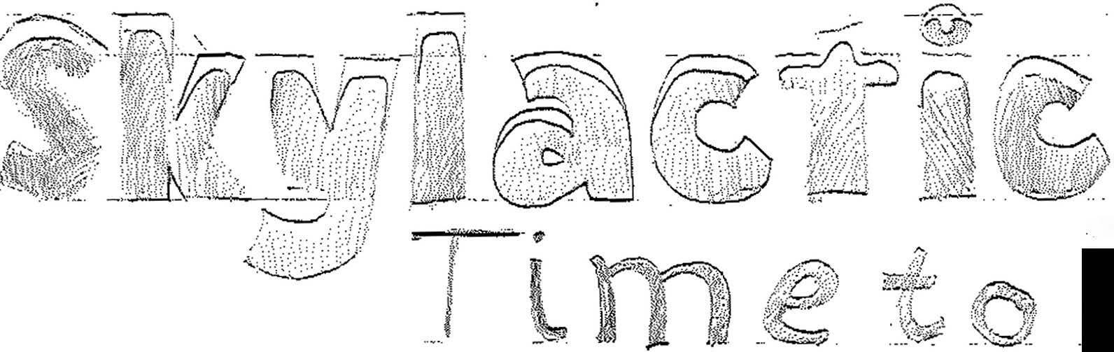
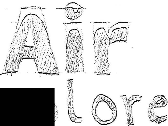
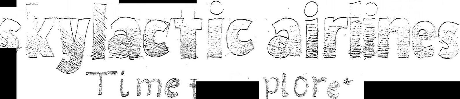
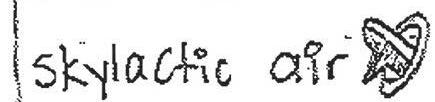
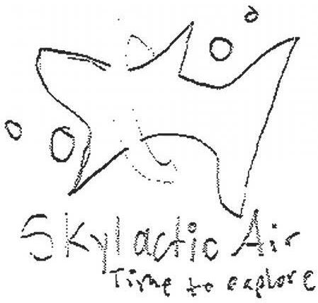
Skylactic Air
Design Objective
Design an airline that is unique and non-existent in the current market. Decide whether the airline is major, regional, or national. Design a brand that fits current trends and clearly exemplifies an airline. After branding, design an airplane in accordance to the brand. The plane must have the logo. Design and produce collateral pieces to go with the brand. The final product should have branding, airplane skin, and collateral pieces.
Design Statement
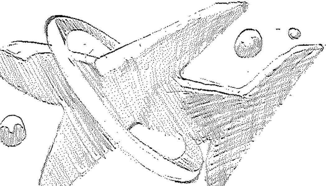
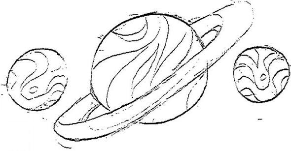
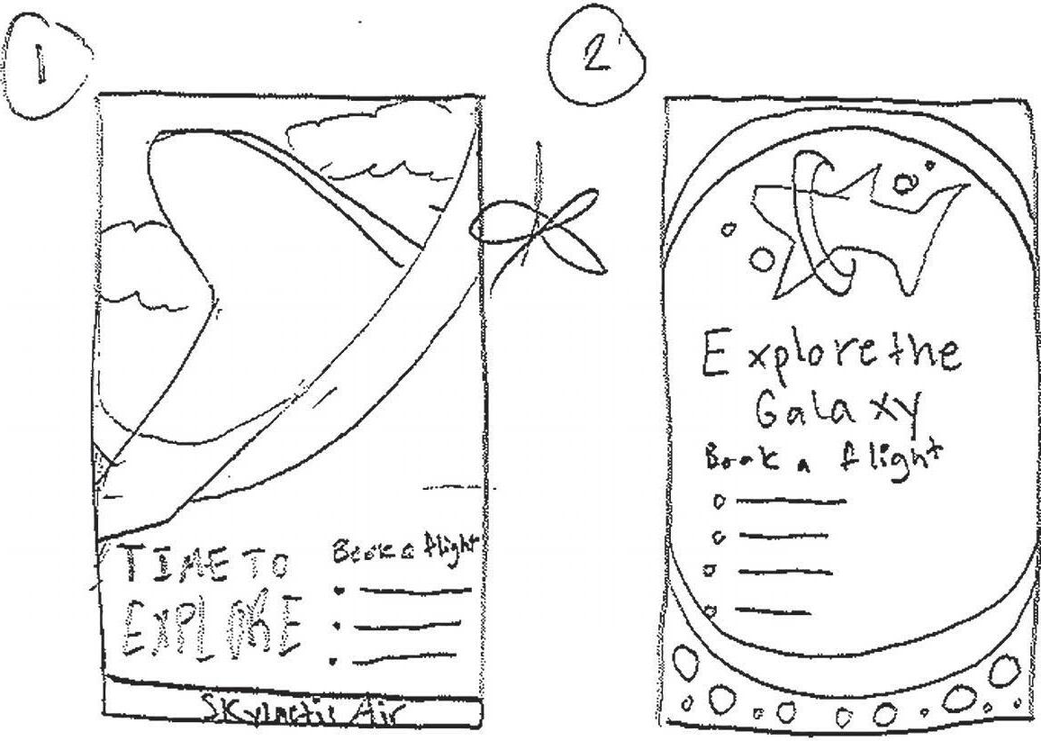
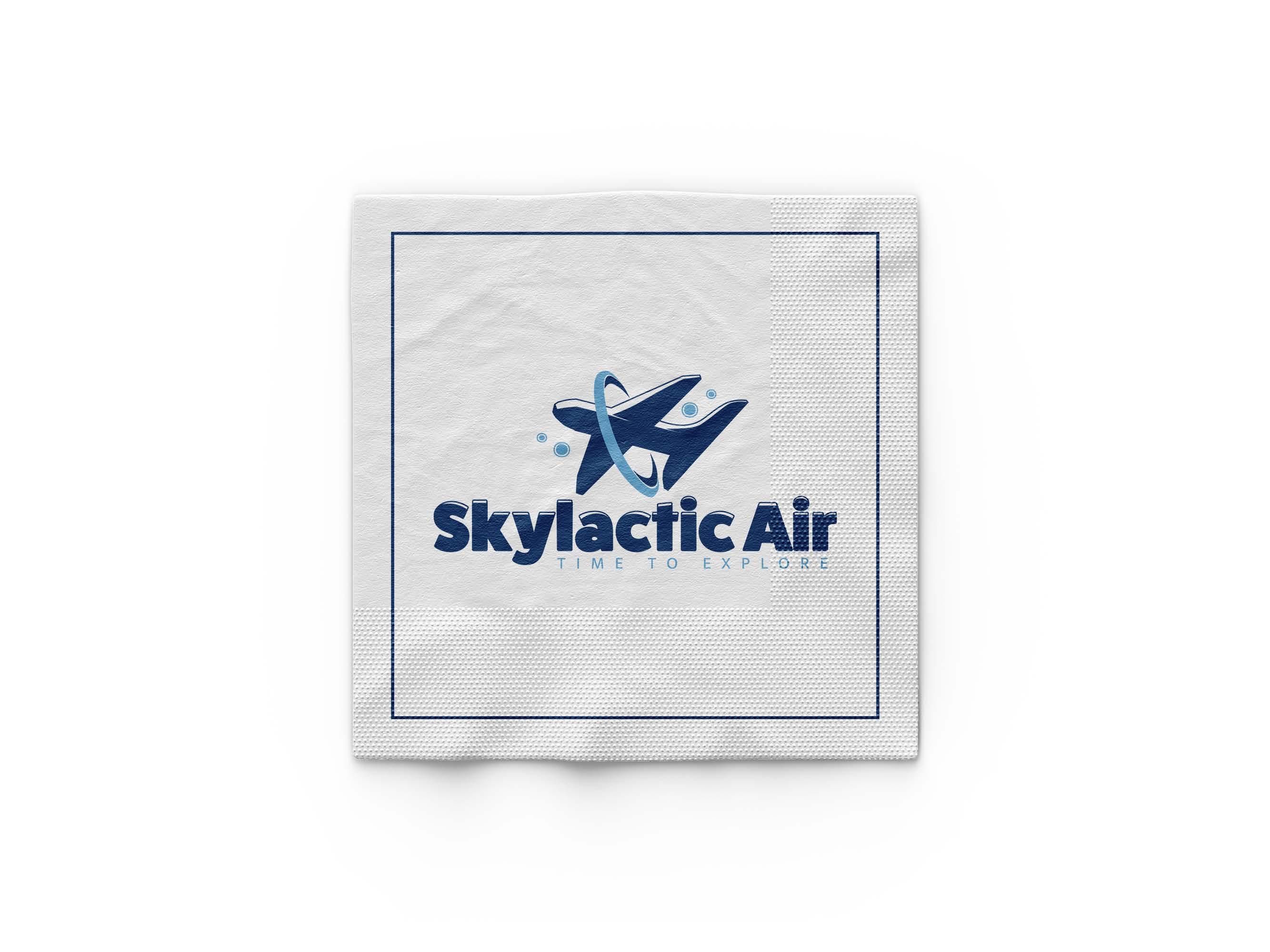
Skylactic Air is a regional airline for low-income families or individuals. The galaxy is the main focal point of the brand. It serves as an attractive aspect for the children as well as the brand’s motto. The logomark is an airplane with the planet ring surrounding it. Added elements include the planets next to the plane. The logomark incorporates both the airline industry and galaxy elements. The logotype is a thick san-serif font with a small x-height. The logotype mimics the logomark. The entire logo is meant to be friendly and welcoming to families. The secondary logo features the plane coming out of the ring. After designing the brand, the secondary logo would be applied to the airplane. The airplane design incorporates planets to tie back into the galaxy aspect. The logotype and secondary mark is applied to return to the branding. Three collateral pieces are made to complete the brand. These collateral pieces are a road poster, billboard, and napkin.

Personas
Carol
Biography
Carol is a mother of two children who are Haley and Adrian. As with all mothers, she takes extra care and attention to her children. She ensures they’re always happy. She lives in North Carolina in the sub-urban areas with her husband. For the holidays, she visits her parents in Virginia. She loves meeting new people but feels more comfortable with friends and family.
Biography
Elliott is a young out-of-state college student in the University of Utah. He is majoring in Accounting and shares an apartment with his girlfriend Sabrina. He works a low-wage job to earn cash for bills. Elliott travels on numerous occasions so it is important he considers options that fit his budget.

Biography
Ryan is a 9-year-old adventurer. He likes his environment to be relatively peaceful. Ryan also benefits from entertainment options to keep him engaged during the flight, such as movies, games, or activities. He loves the holidays since that is the time he visits his grandparents in Kansas.
Angel
Ryan Smith
Elliott Johnson
·:cc•--�� H ;1 � ,;; \, y IJJ \ X w 0 FatFrank Heavy A B C D E F G H I J K L M N O P Q R S T U V W X Y Z Cy Text A B C D E F G H I J K L M N O P Q R S T U V W X Y Z
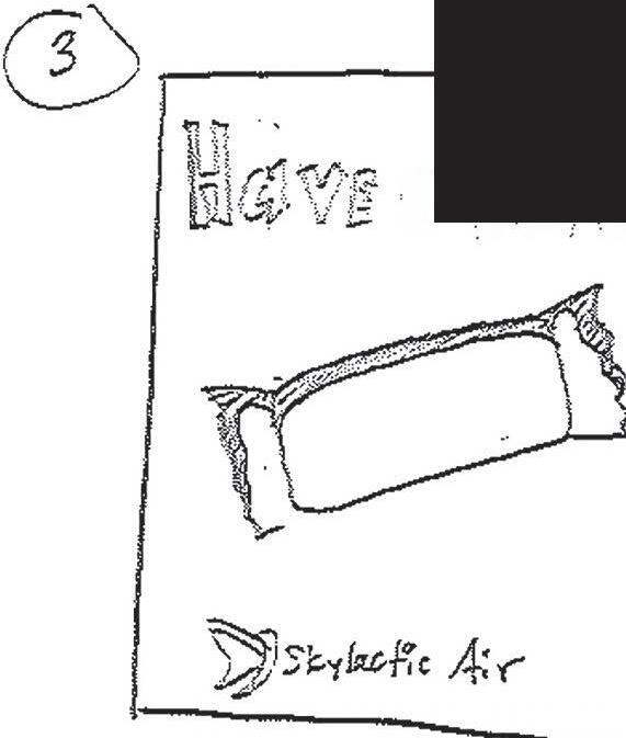
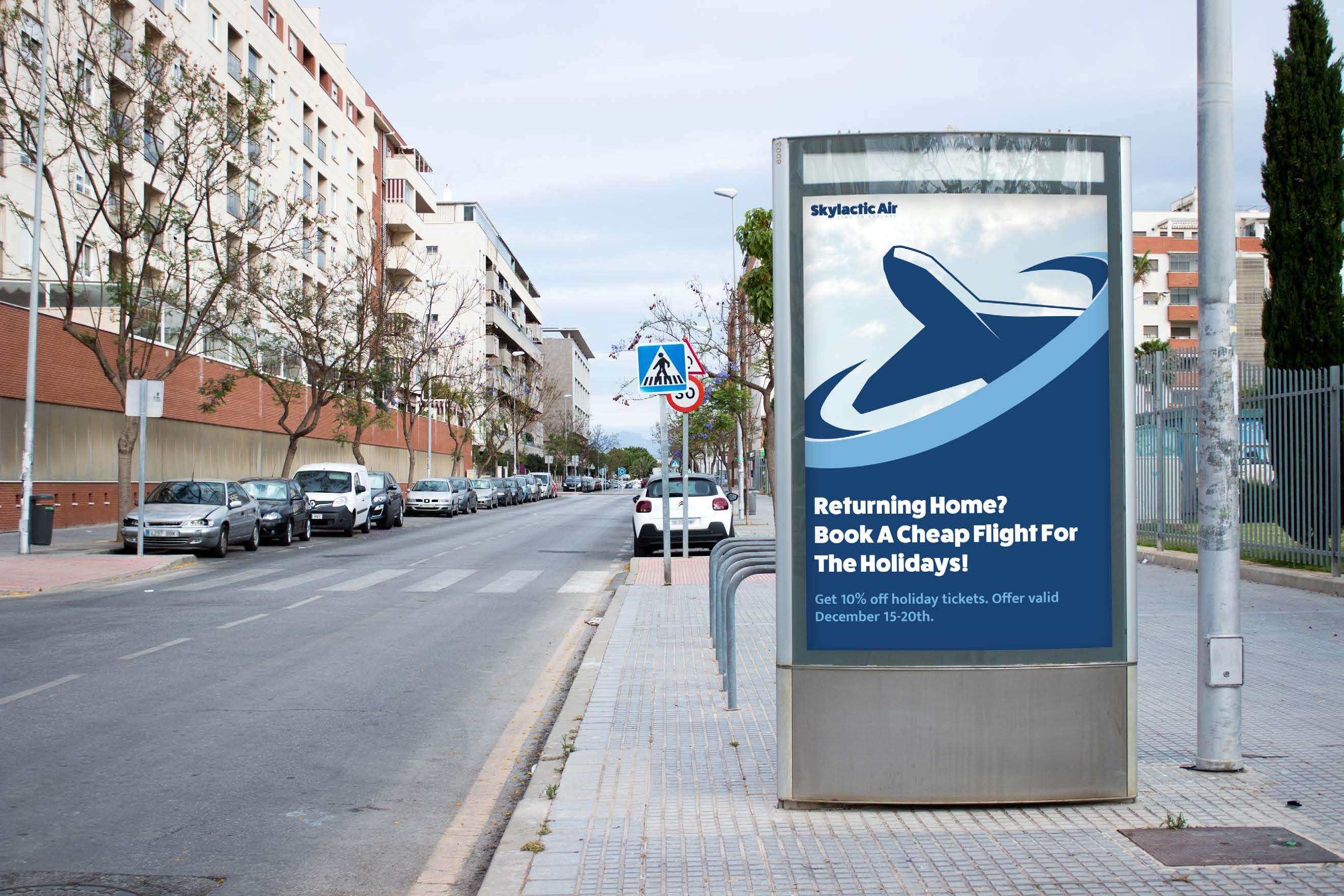
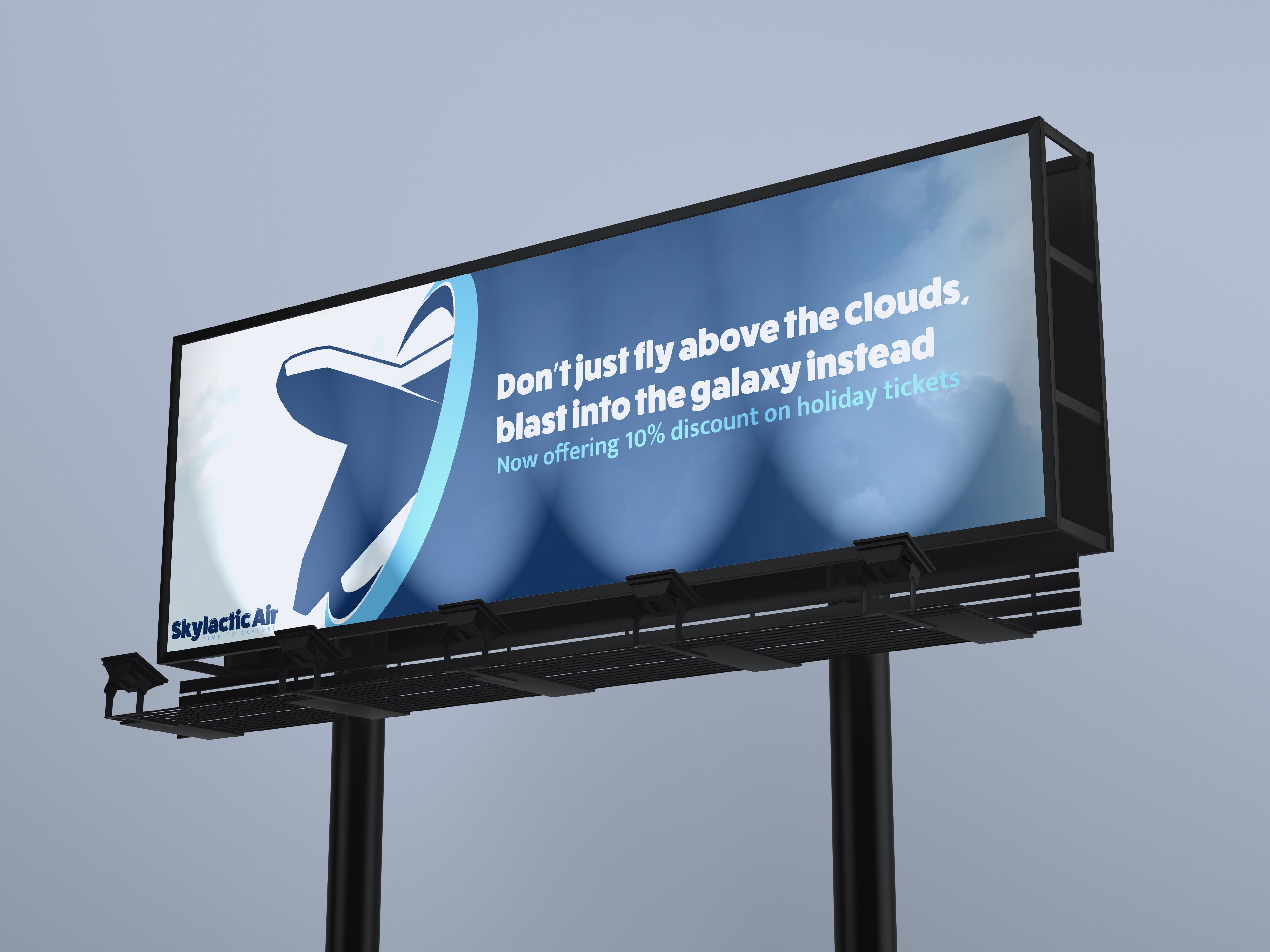
Collateral qi - - CJ 1(2 _, (_� '-j \'.) S> , (L u, T .) tT ::, �(? (l) :r :!�) qi - - CJ 1(2 _, (_� '-j \'.) S> , (L u, T .) tT ::, �(? (l) 1 -" "f I I l i 8
Ideation
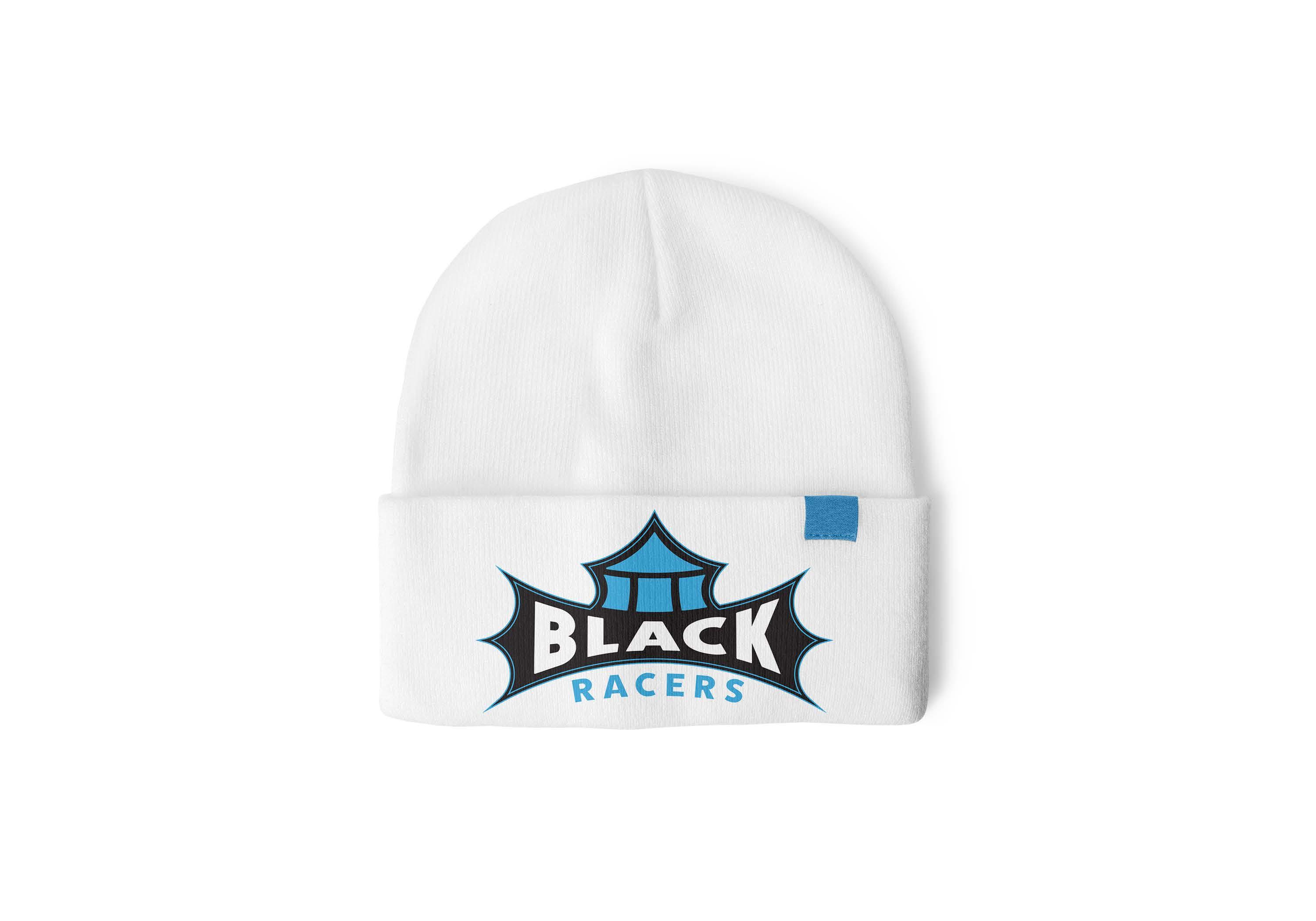
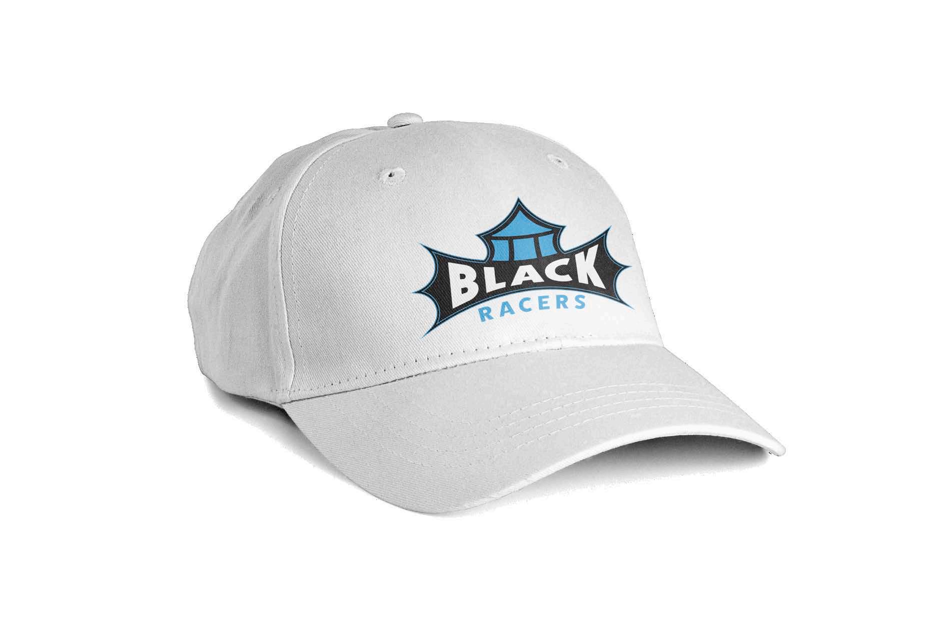
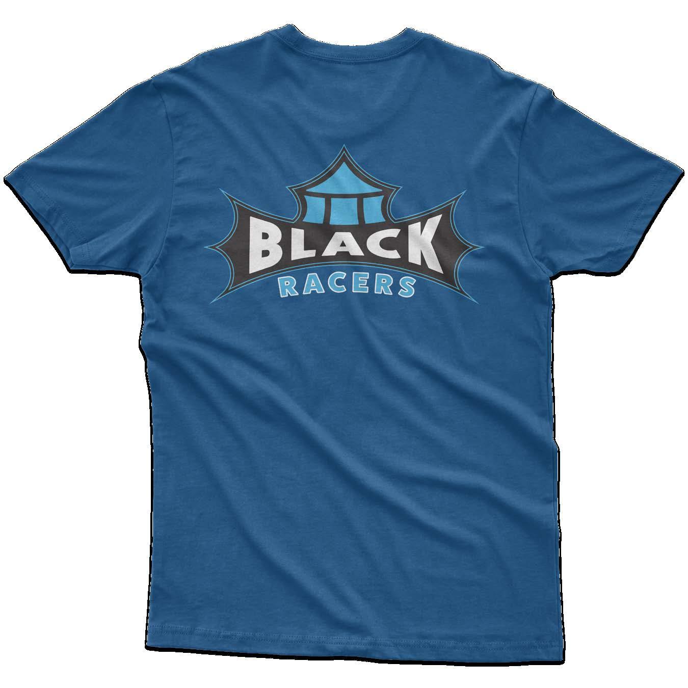
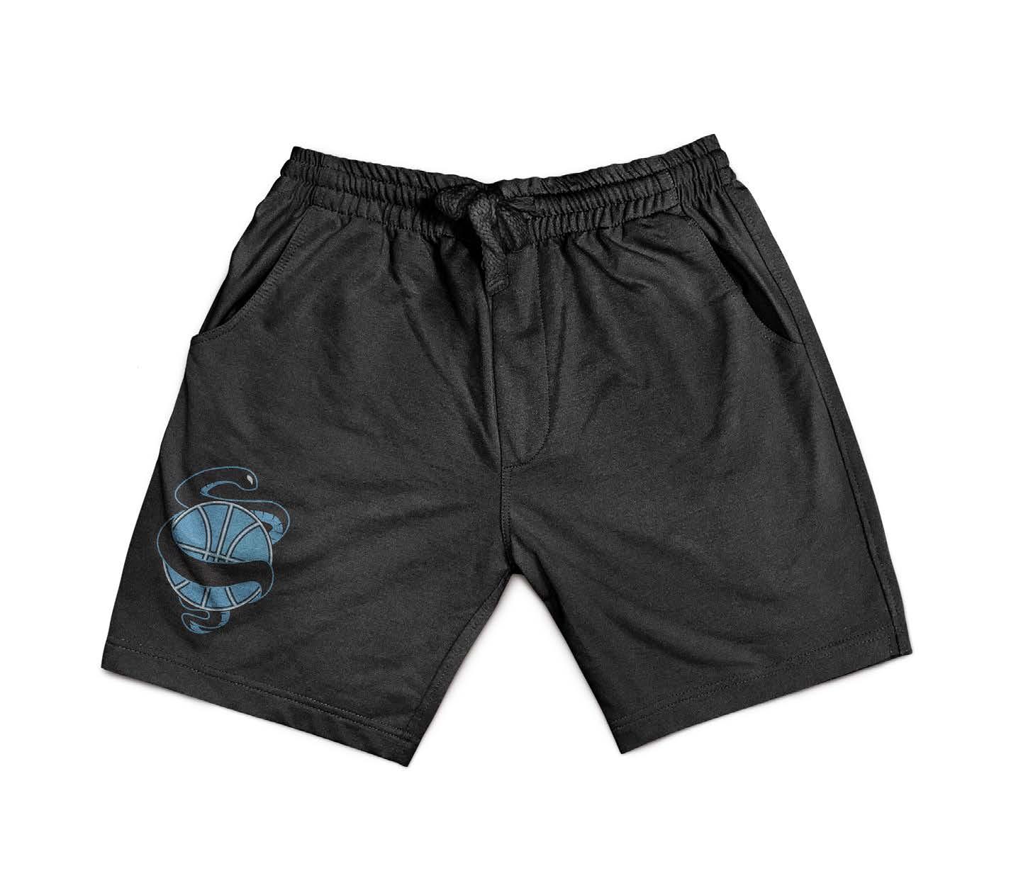
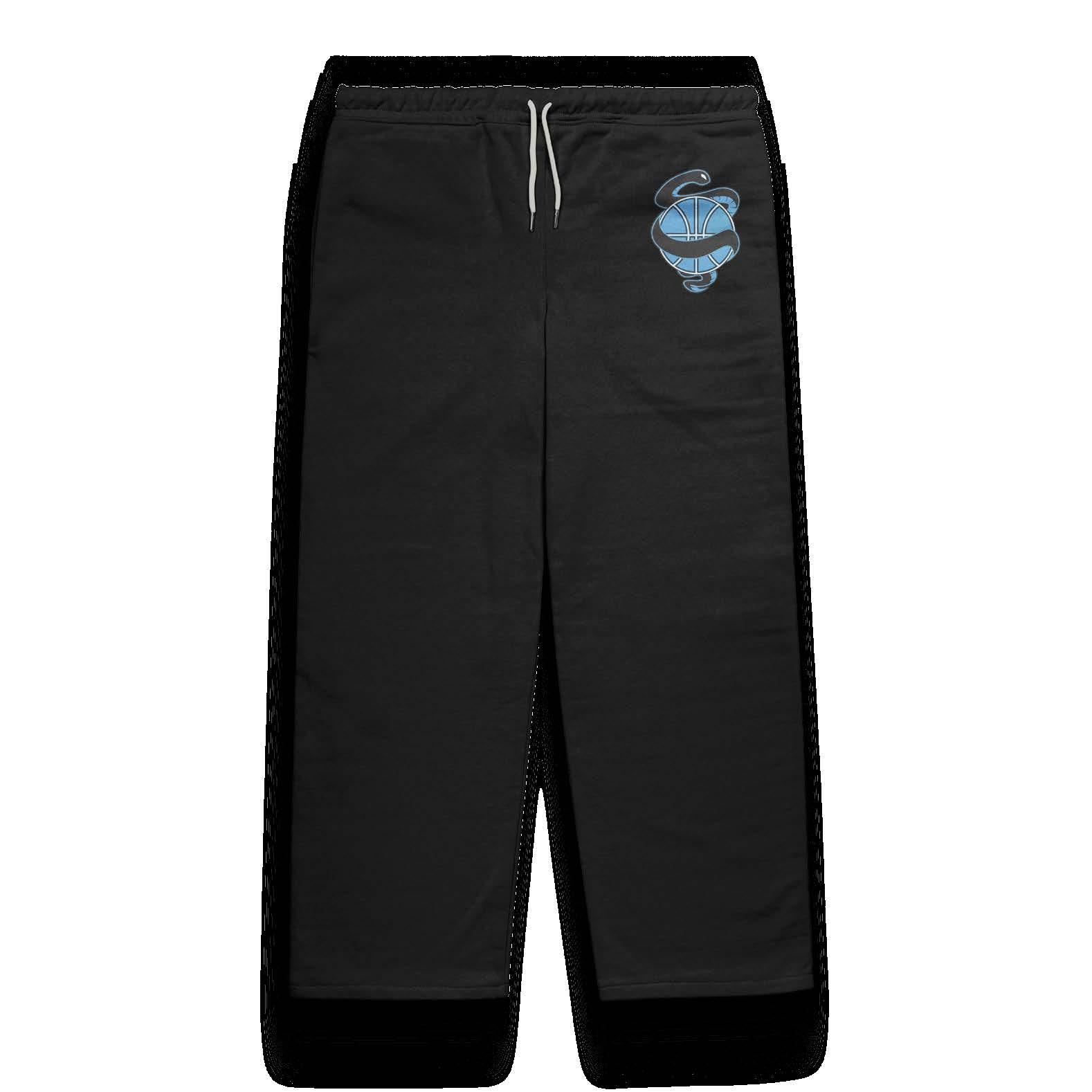
Black Racers
Design Objective
Research and choose a major city to design an original NBL sports team. The objectives include the type of sport, branding, way-finding, and environmental graphics. Branding should represent the city’s culture, history, and values. Wayfinding and environmental graphics should be consistent with branding and successfully fulfill its intended purpose. The chosen city is Columbus, Ohio with an original NFL sports team in basketball. Compile the brand and research into a booklet.
Design Statement
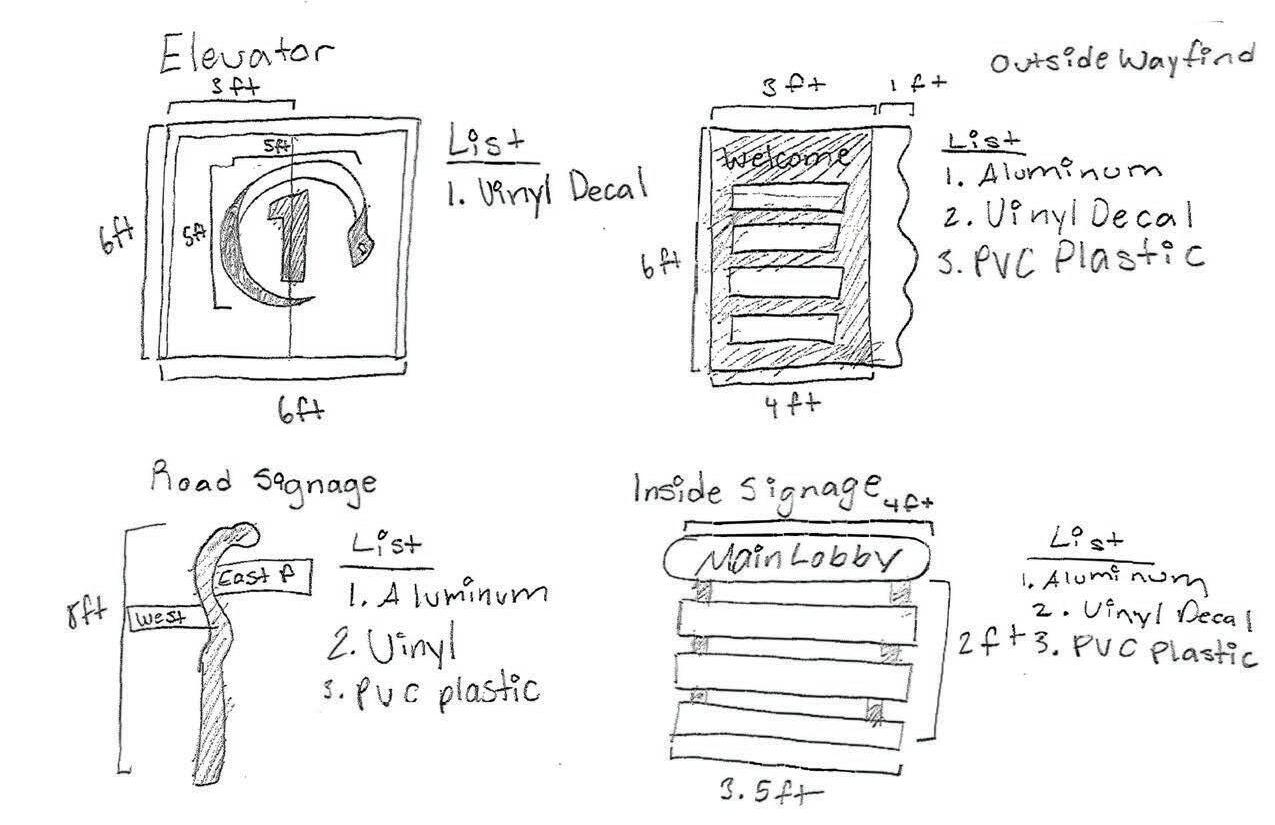
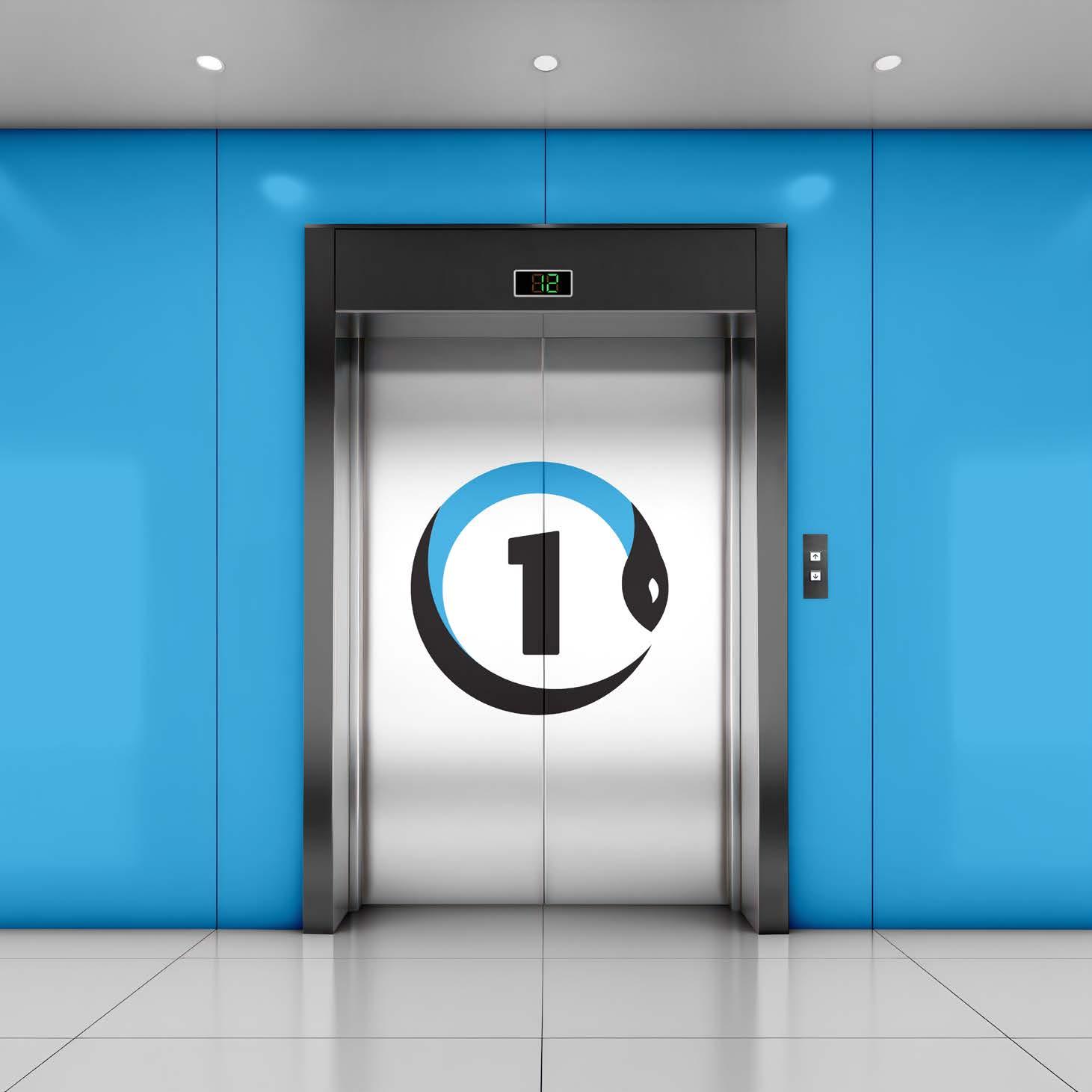
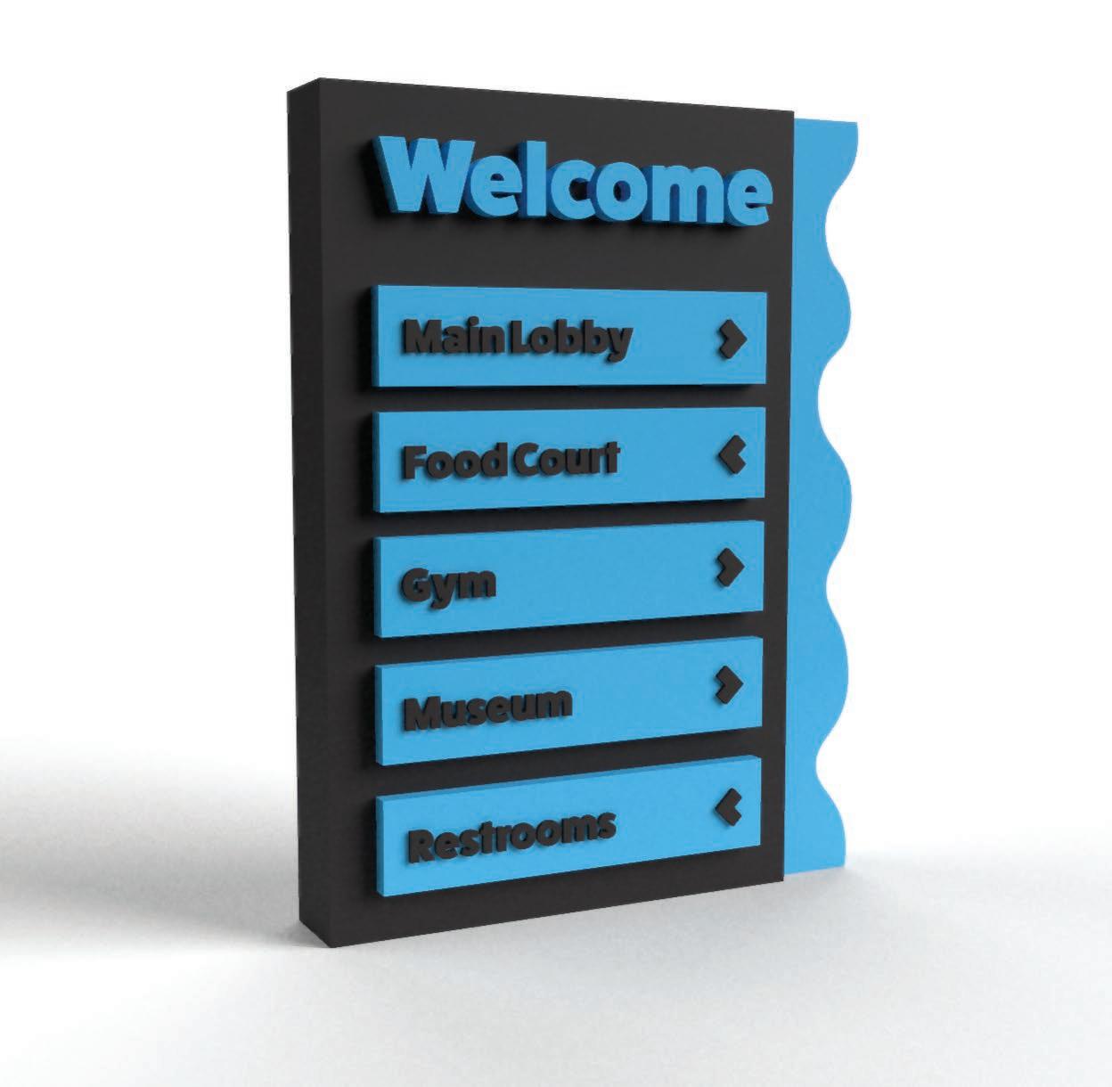
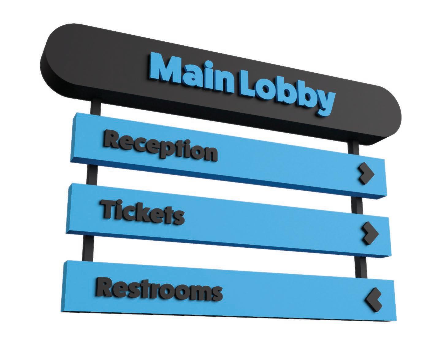
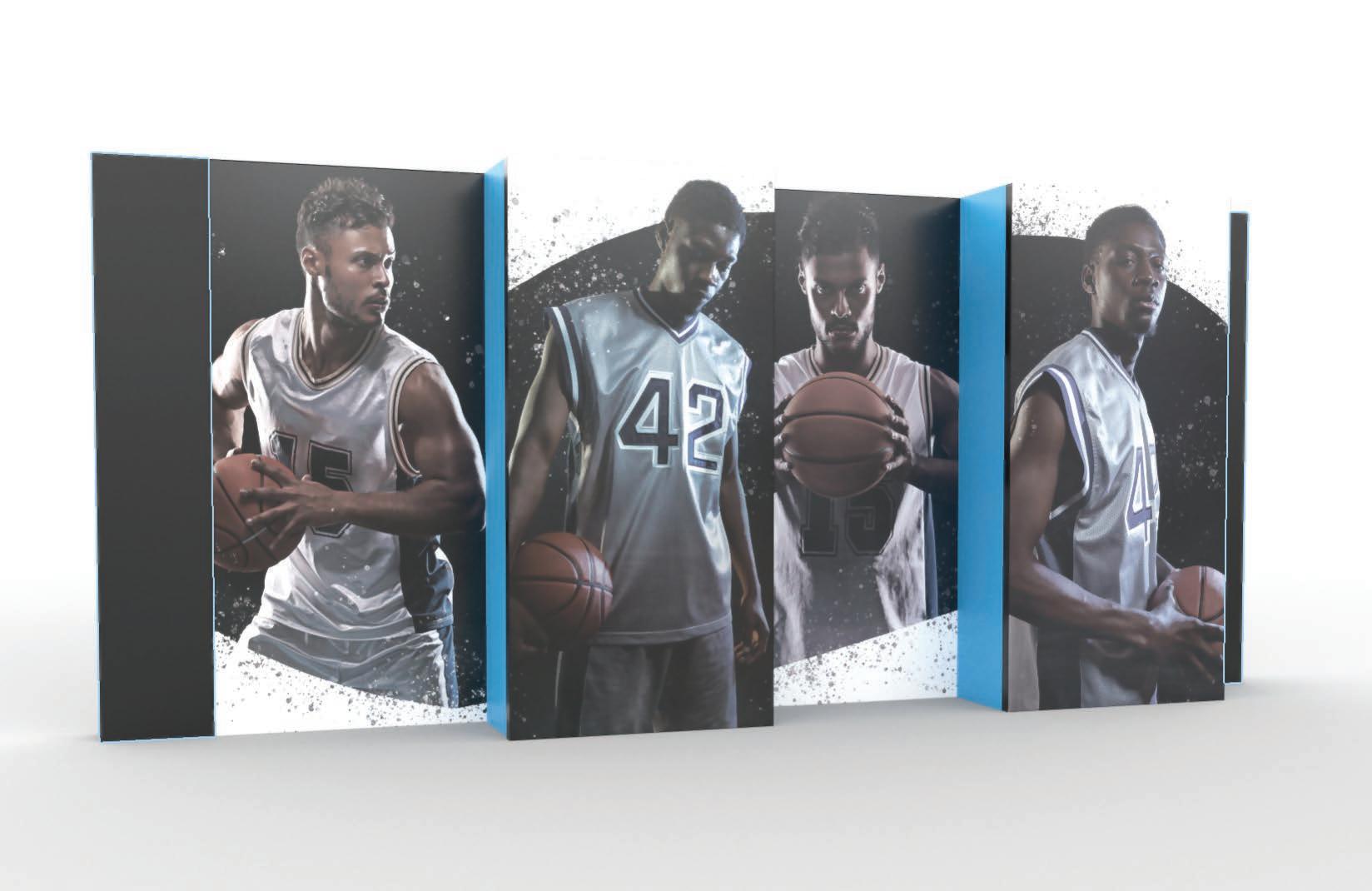
The black racer snake is the state reptile of the state of Ohio. The black racer represents the state and serves as a competitive visual for the Ohio basketball team. Inspired by the reptile, the team is named Black Racer. The reptile also represent Columbus’ culture. For example, the snake can represent the state’s resilience and adaptability, qualities that resonate with the growth and development of Columbus as a city that has overcome challenges and embraced change. The primary colors are blue, black, and white with blue representing confidence, stability, and loyalty. The logomark consists of a black snake wrapped around a basketball, symbolizing how the Black Racers entrap their enemies and secure victories. The wayfinding and environmental graphics are stylized according to the black racer and color scheme.
Ideation Blueprint

Mockup
A B C D E F G H I J K L M N O P Q R S T U V W X Y Z Futura PT A B C D E F G H I J K L M N O P Q R S T U V W X Y Z Resilient Blue Respectful White Unified Black 1 3 feet 6 feet 6 feet 5 feet 5 feet Welcome Main Lobby > Main Lobby > Food Court < Restrooms < Gym > Museum > 6 feet 3 feet 4 feet 8 inch thick 1 inch thick 2 feet 1 feet
FatFrank
Ideation Blueprint
Mockup


Merch Booklet
< > >
Main Lobby Tickets Reception Restrooms
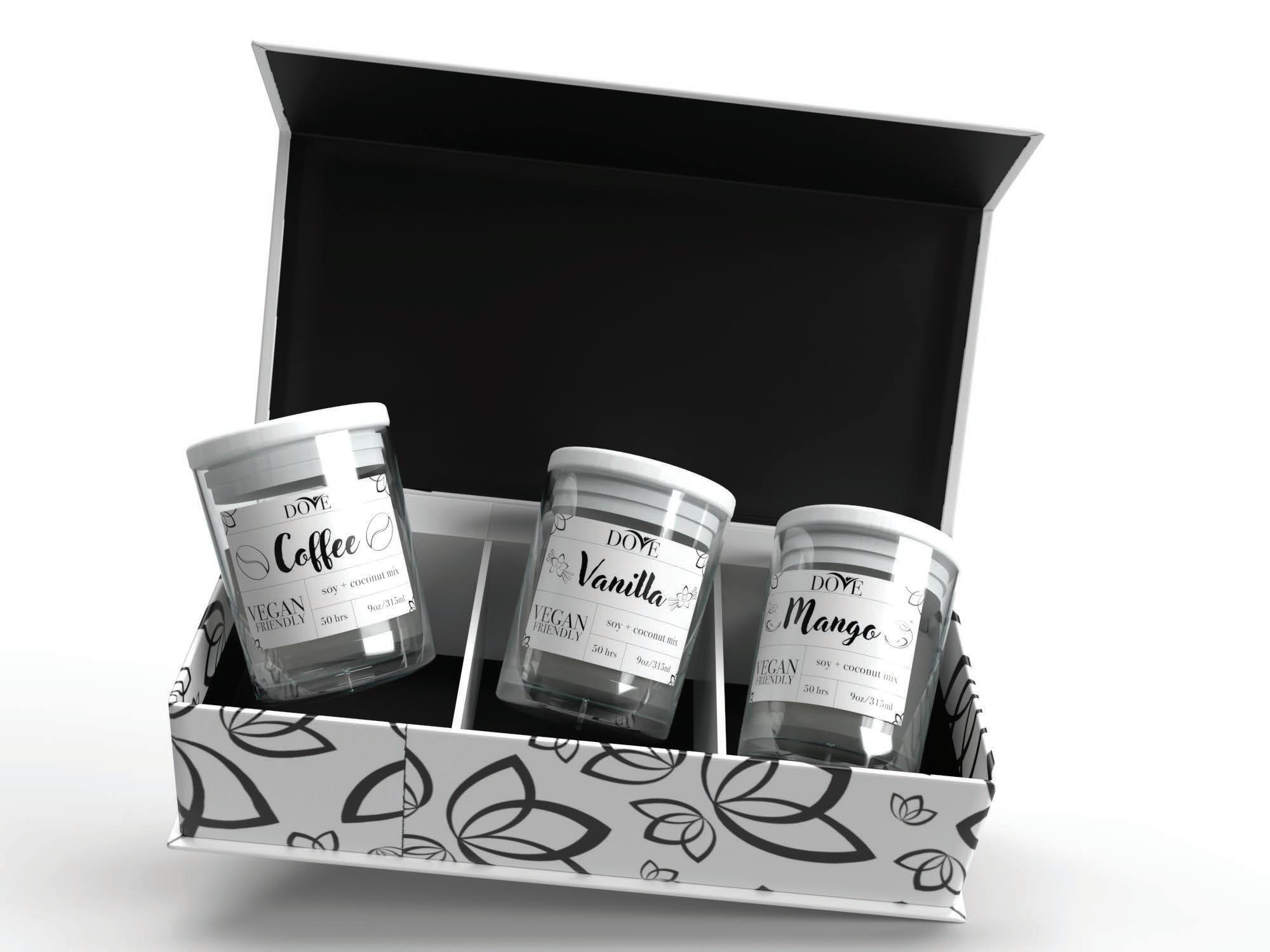
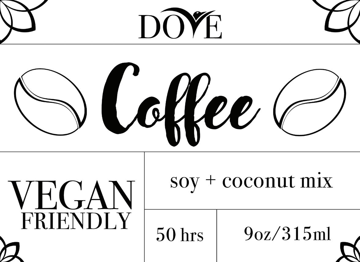
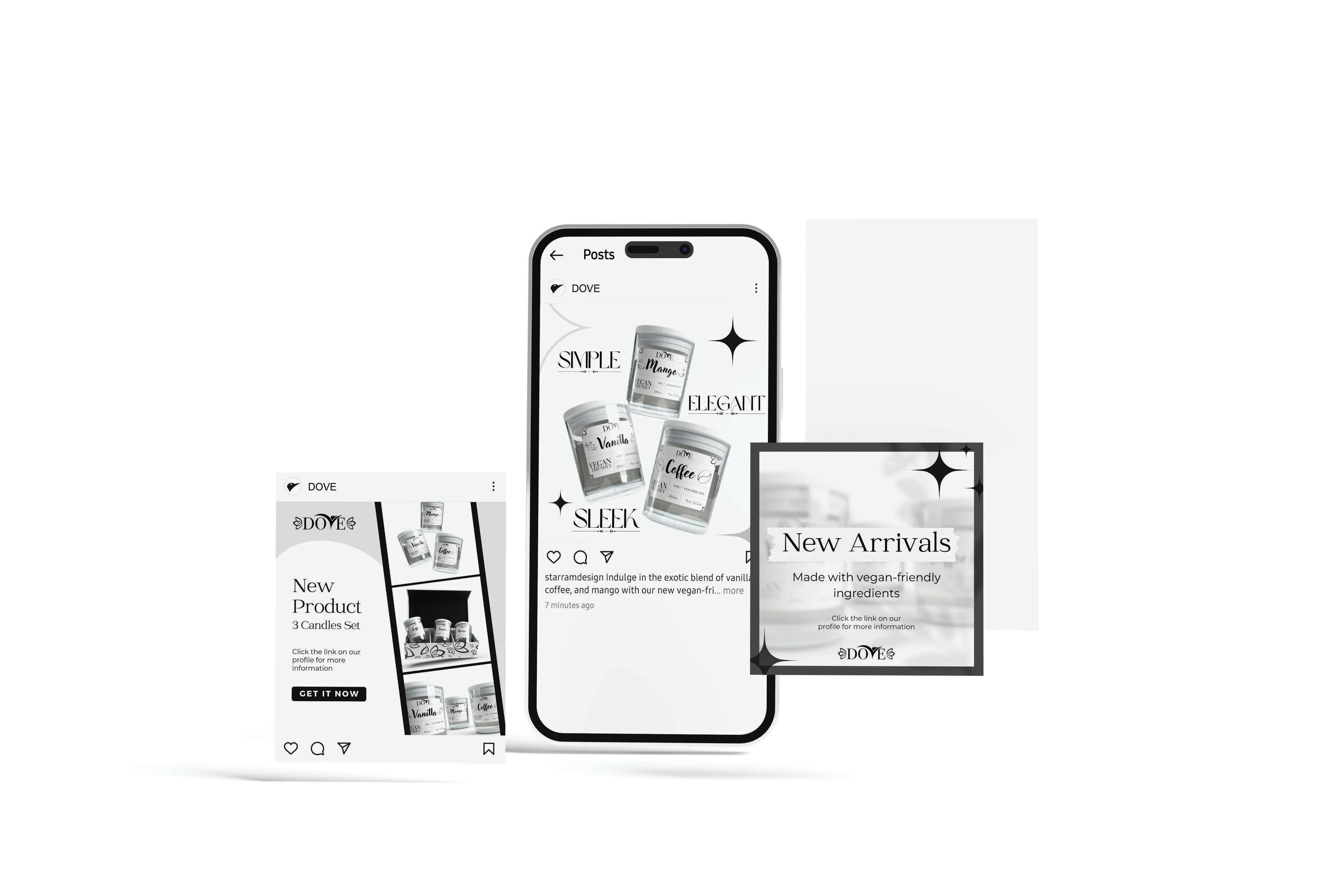
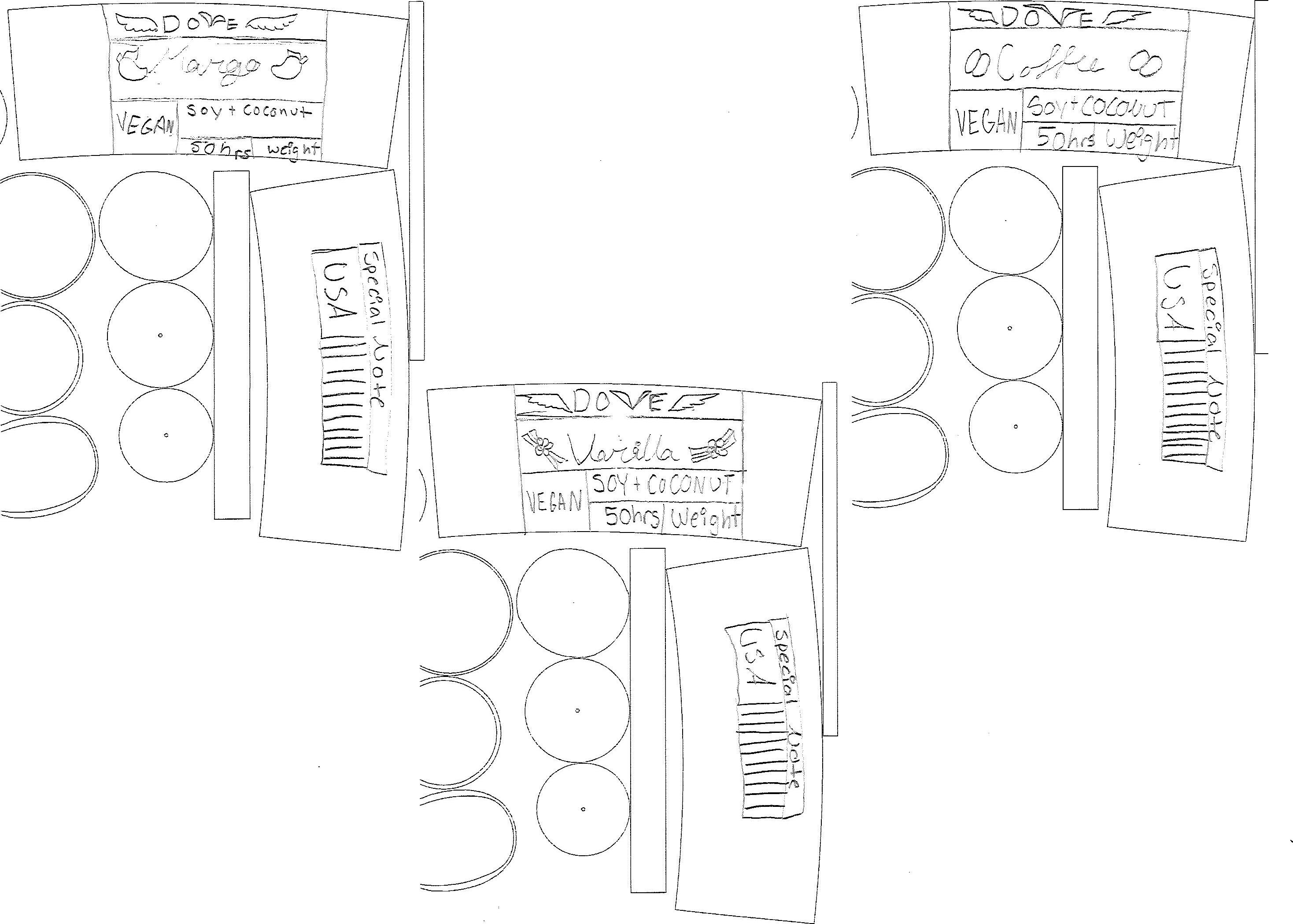
DOVE Branding
Design Objective
Develop a packaging series consisting of three related products. The design for the packaging and products must be consistent and provide the necessary information on the labels according to industry standards.
Design Statement
Dove is a candle packaging series consisting of three scented candles. The design is simple and sleek for an elegant look. The illustrations are strictly linework with varying thicknesses to replicate the style of the overall brand. Calligraphic and serif typefaces are used to exude elegance and beauty. The front label is organized into sections for easy distribution. The back label has a message, location of production, and a barcode. Flowers are added at the corners for visual interest. Each candle is named and has a designated icon for its scents. This will make it easy to distinguish each candle while keeping a consistent theme.
Vanilla

VEGAN FRIENDLY soy + coconut mix 50 hrs 9oz/315ml VEGAN FRIENDLY soy + coconut mix 50 hrs 9oz/315ml
AGAPE AGAPE
Adoring Red
CMYK: 100, 100, 100, 100
RGB: 0, 0, 0
Lighthearted Orange
CMYK: 100, 100, 100, 100
RGB: 0, 0, 0
(Heading)
GIF
FatFrank A B C D E F G H J K L M N O P Q R S T U V W X Y Z a b c d e f g h j k l m n o p q r s t u v w x y z 0 1 2 3 4 5 6 7 8 9
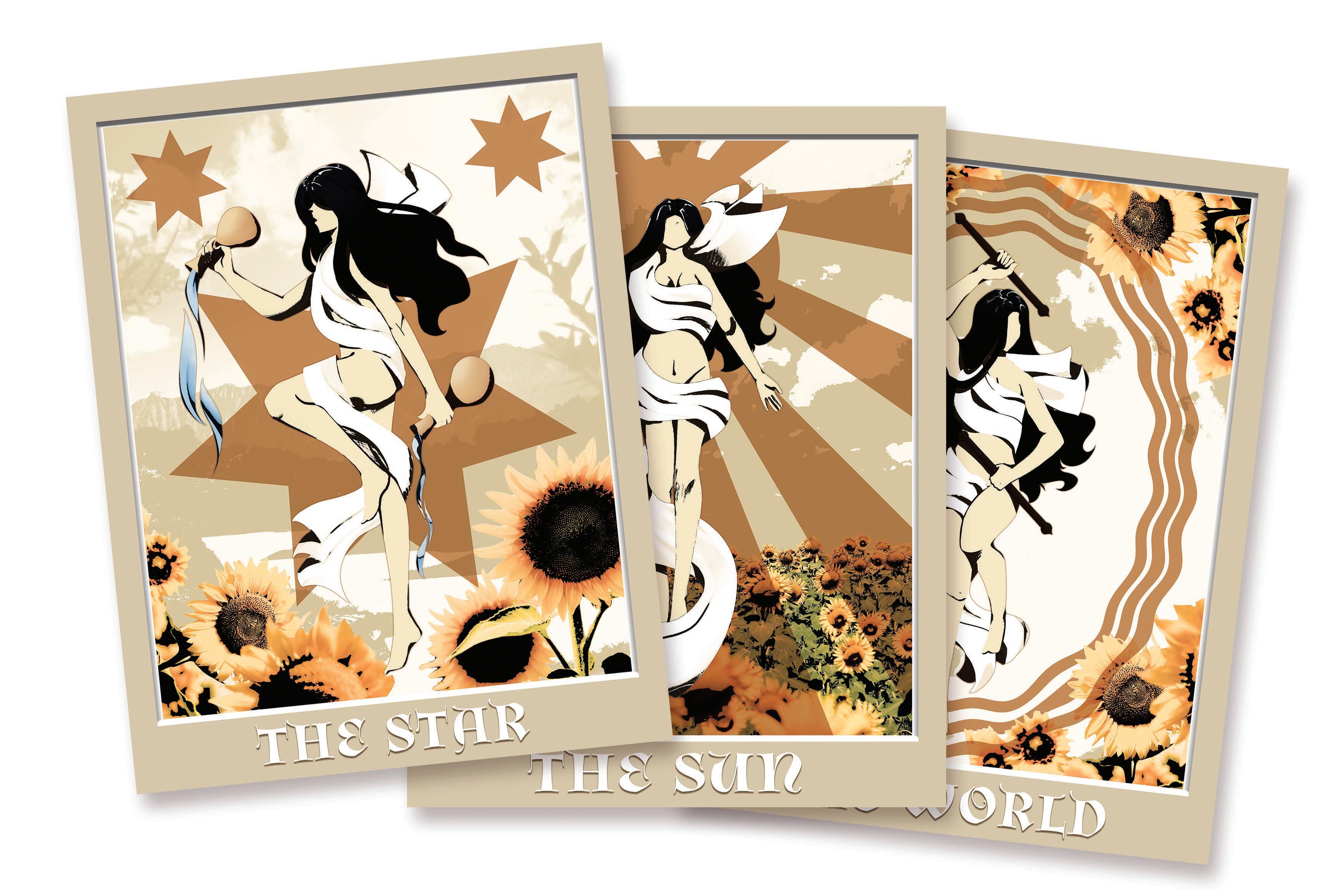
Tarot Series
Design Objective
Design a three-poster series with set theme. The posters should be organized and designed based on principles of design. The layout of the posters should be consistent while having distinctions from one another. Using Photoshop, incorporate photo manipulation into the poster series.
Design Statement
Tarot cards inspire the three-poster series. The chosen tarot cards are the world, the star, and the sun. These tarot cards represent my journey as an artist and my experiences. The tarot cards are colored gold, silver, and black. This gives the design a regal and sophisticated look. Additionally, the coloring of gold and silver gives a metallic illusion and unique shininess. Each poster incorporates my individual personas in different pose and setting, allowing distinction between each of them. For consistency, the posters are framed and organized with the same layout. My persona is illustrated in Procreate to convey my artistic skills while the background is photo-manipulated. By having the background photo manipulated, it places emphasis on my persona while adding a surreal look to the design. Incorporating two different mediums shows my inner turmoil between artistic illustrations and graphic design; however, the way the mediums complement one another and work harmoniously conveys my acceptance for both.
Sketches
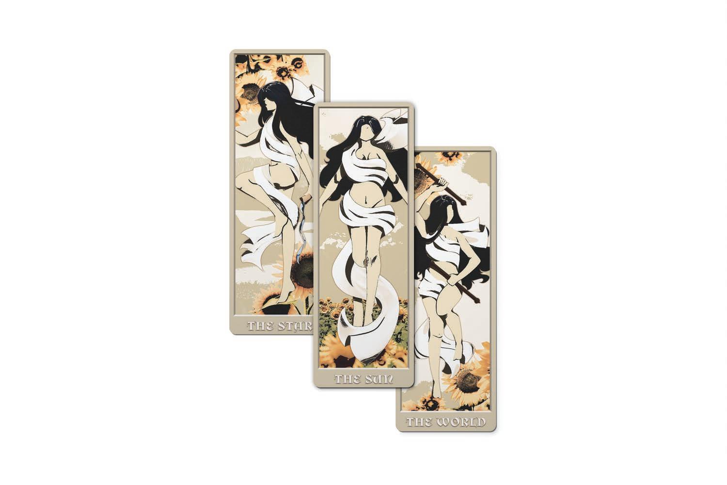
Bookmarks
Yokai Infographic
Design Objective
Design a series of five primary and supporting icons. After developing the icons, organize them into an infographic poster with the necessary information. Design with hierarchy, typography, and design principles.
Design Statement
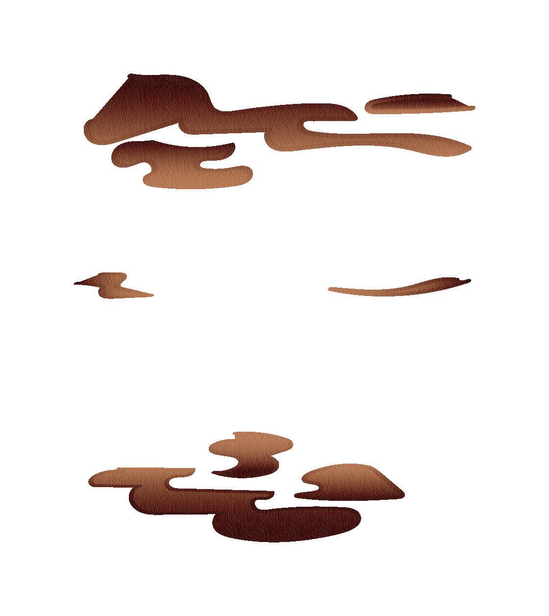
Yokai: Urban Legends is an infographic about odd occurrences and monsters in Japan. This infographic includes Bake-Danuki, Kitsune, Daitengu, Kappa, and Tsukumogami. The primary icons are the main physical features of these legends. The supporting icons are objects and powers that each legend is commonly associated with.
In the infographic, the icons are organized by hierarchy and balance. The icons are placed on each side of the infographic to ensure equal weight and distribution. The mountain serves as the main visual element and plays into the Yokai’s story. A monochromatic color scheme is utilized to give a ghostly and cool feel. Adding visual interest, ghostly mists and wispy clouds are illustrated. The infographic’s design mimics the brochure, ensuring consistency and cohesiveness.
Brochure
Infographic
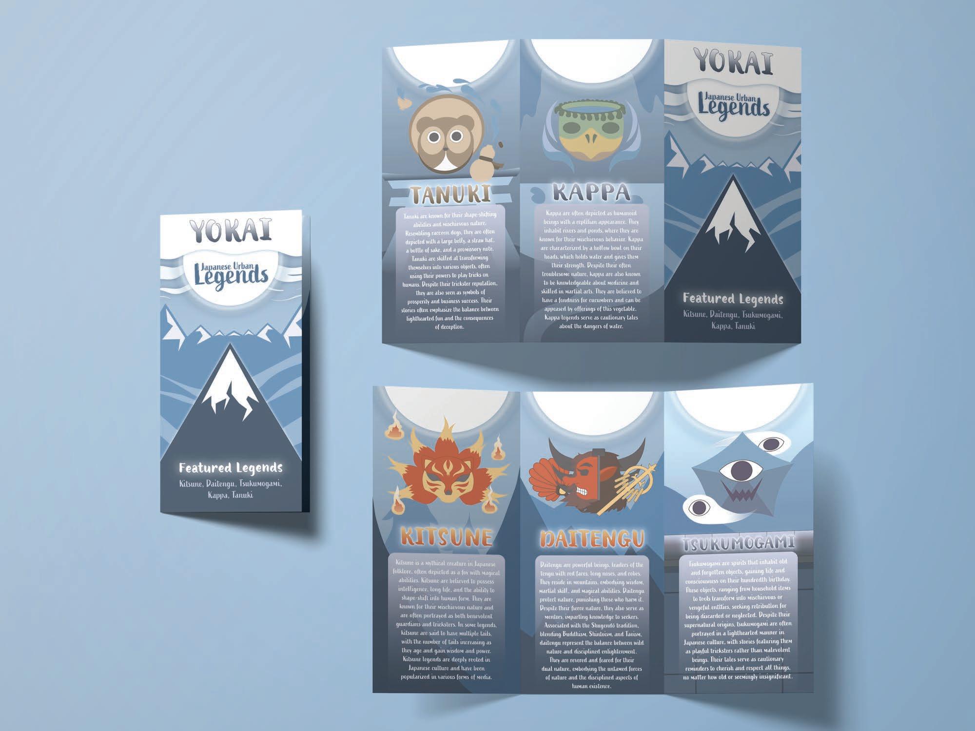

KITSUNE


Shape shi ing foxes. They are mischievous creatures who grow tail every one-hundred years.


KAPPA
Amphibian and rep le creature. Po e a bowl on their head which represent its life force.

TSUKUMOGAMI
Vengeful spirts po ing inanimate objects. S ks revenge for those who neglected them.

DAITENGU
An evolved form of Tengus. Crow-like creatures of the mountains who prac ce medita on in solitude.

BAKE-DANUKI
Shape shi ing ra n dogs. They are mischievous creatures who loves playing pranks.
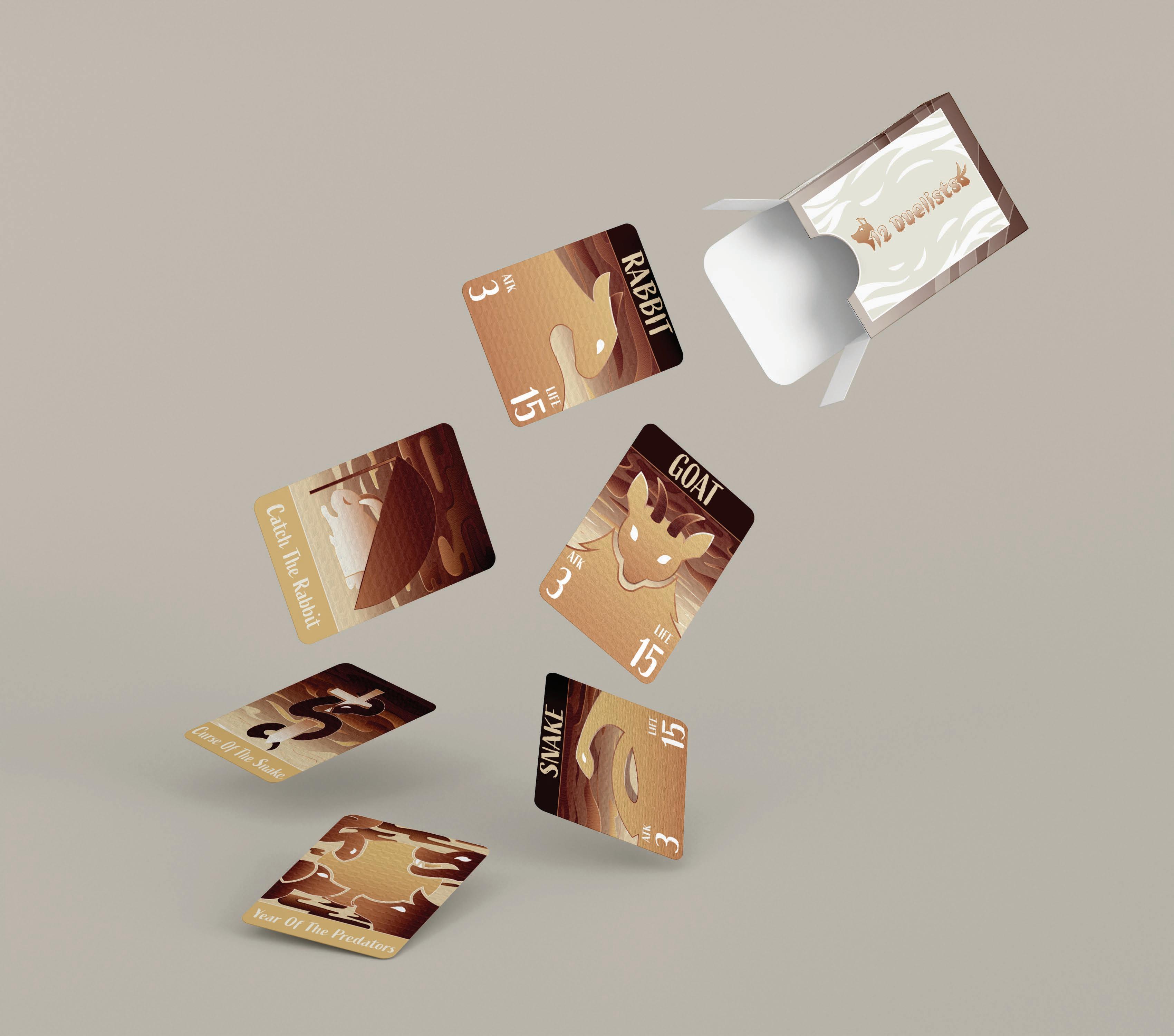
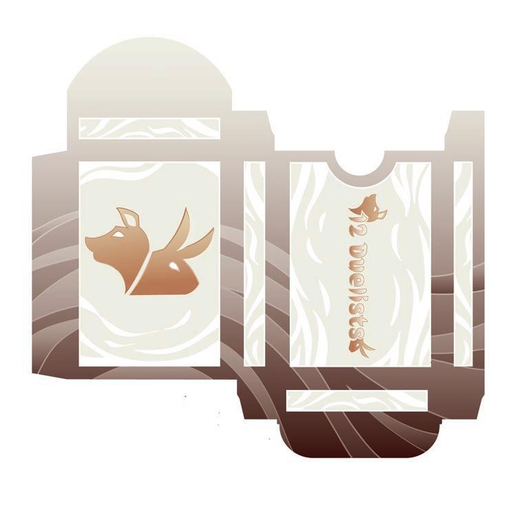
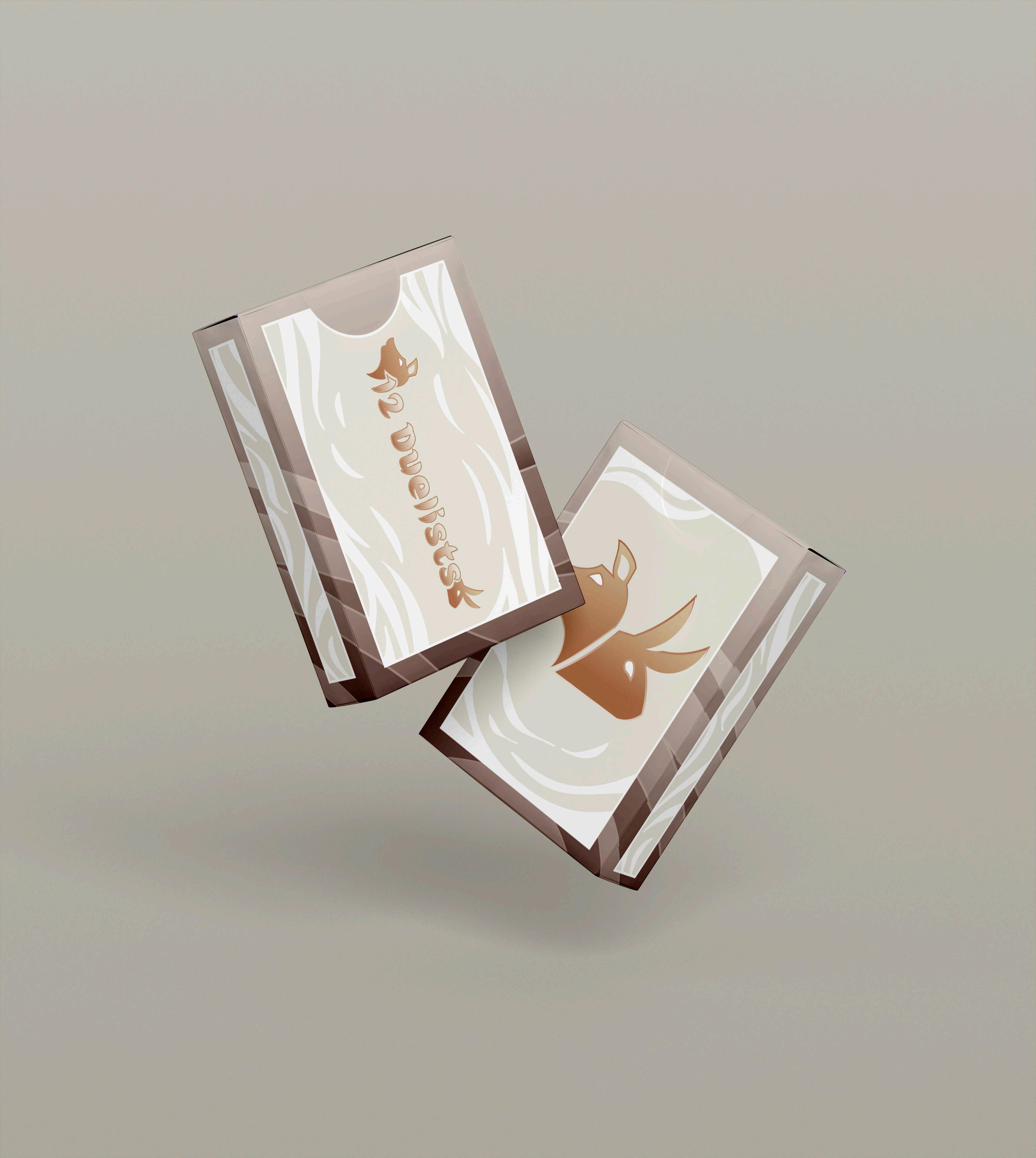
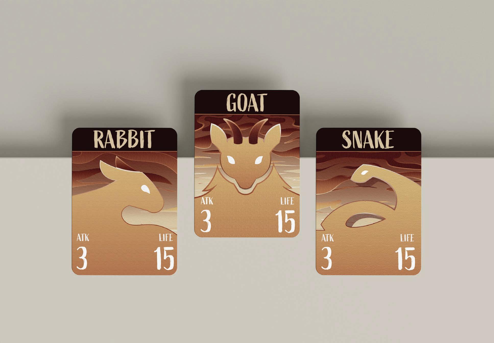
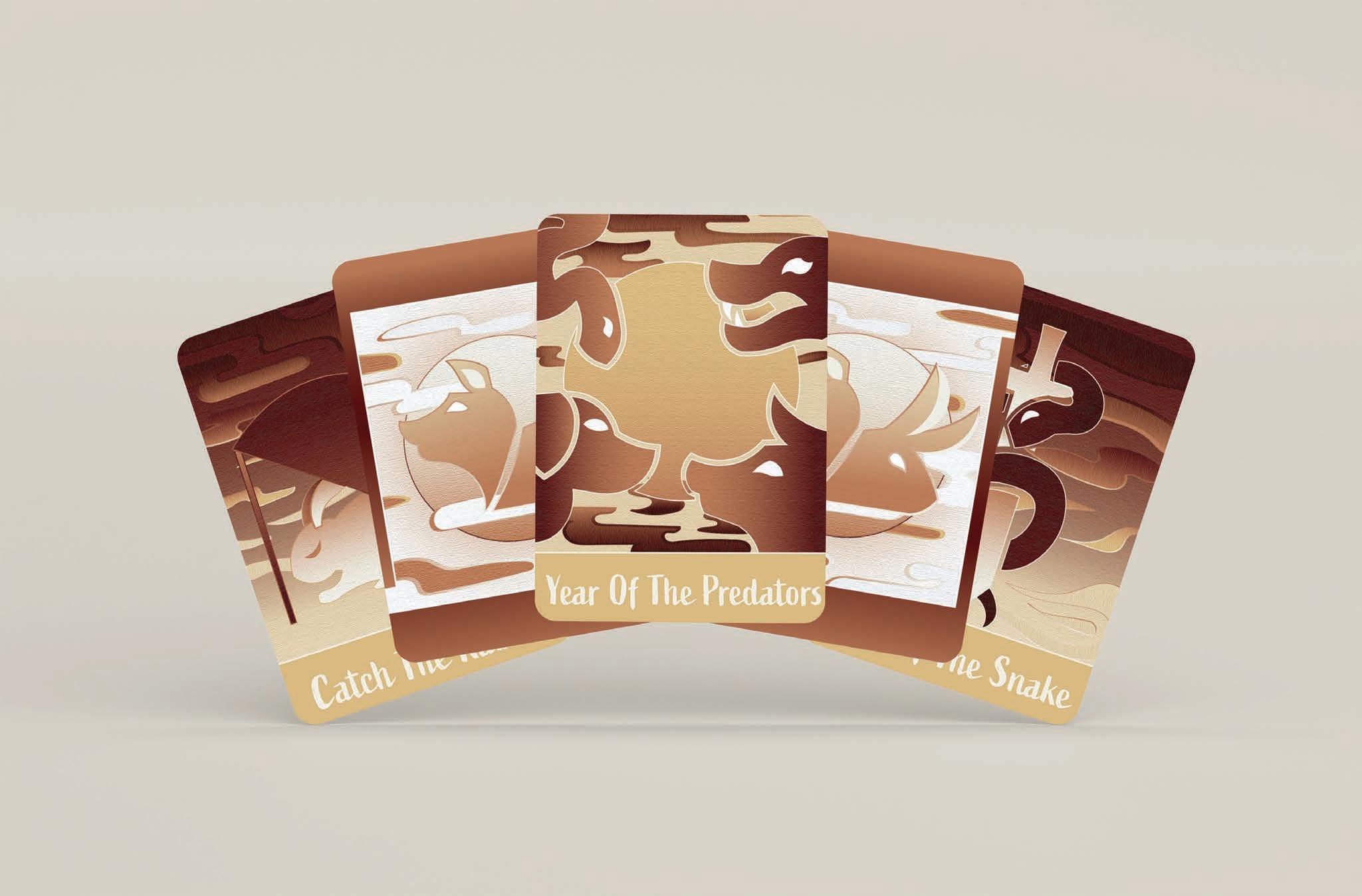
12 Duelists
Design Objective
Design a card game with six cards and box design. Establish a theme and genre for the card game through adequate research. Develop a style guide consisting of logomark, logotype, color palette, and typography. The design of each card should be consistent either through color or card layout. Design additional branding elements such as instructions and stickers.
Design Statement
The theme is Chinese zodiacs and the genre combat. The six cards are split into two categories: characters and supports. Three cards will feature characters that can be played to combat another player. The other three are support cards that will strengthen the character cards.
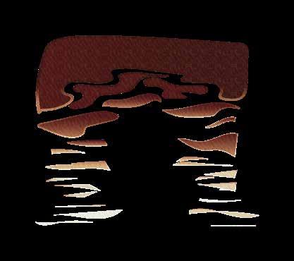
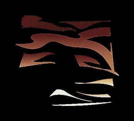
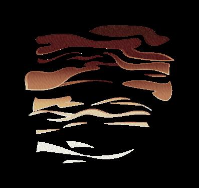
The name of the card game is 12 Duelists, linking to the twelve Chinese zodiacs. The logomark is the bust of a wolf and a rabbit that ties into predator vs. prey. The typography is a calligraphic script typeface to mimic the brush strokes of Chinese paintings. The two categories have alternating layouts for distinction. The cards and box are designed with warm hues to mimic the heat and passion for battle. All cards are texturized for visual interest and the illusion of touch. The branding is stylized by the branding. Illustrative elements such as the goat and cloudy moon from the cards are made into stickers.
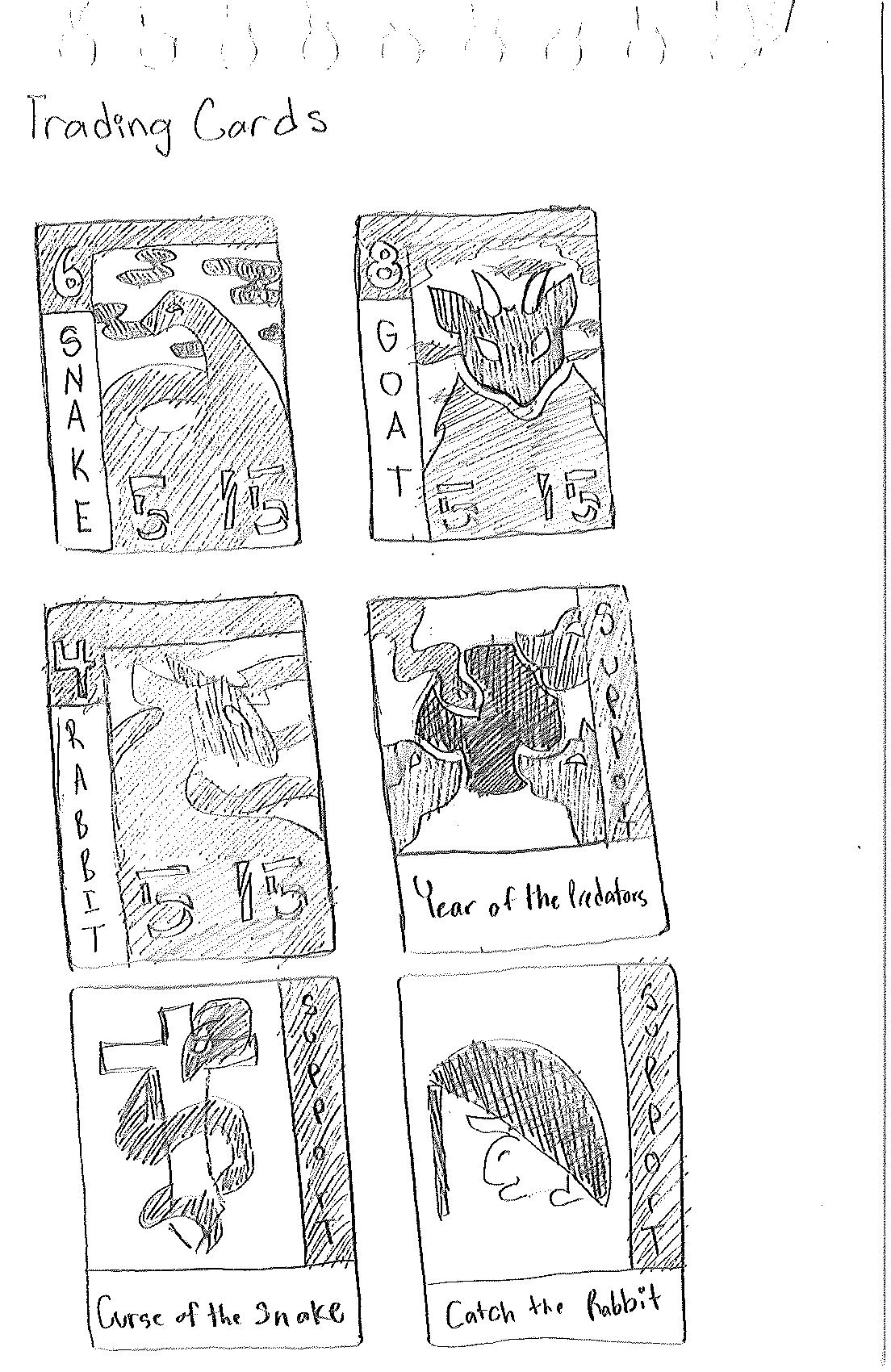
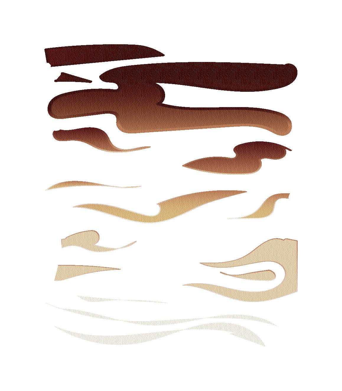
Sketches
Branding
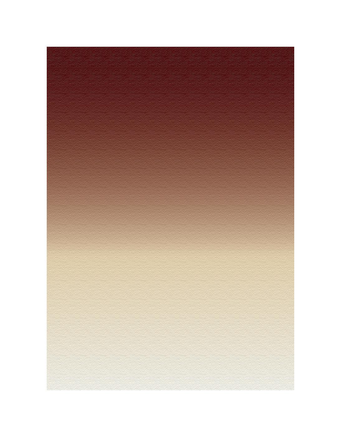
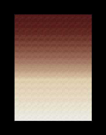
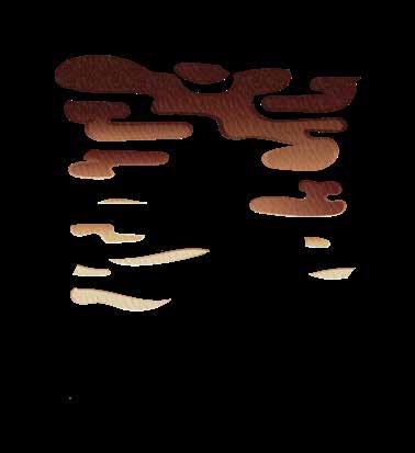
Perseverance CMYK: 17, 25, 55, 0 RGB: 217, 186, 130 Resilient CMYK: 25, 57, 71, 7 RGB: 184, 120, 86 Conquer CMYK: 47, 84, 78, 72 RGB: 61, 19, 15 Spiritual CMYK: 7, 6, 10, 0 RGB: 236, 233, 224 Active A B C D E F G H I J K L M N O P Q R S T U V W X Y Z a b c d e f g h i j k l m n o p q r s t u v w x y z 0 1 2 3 4 5 6 7 8 9

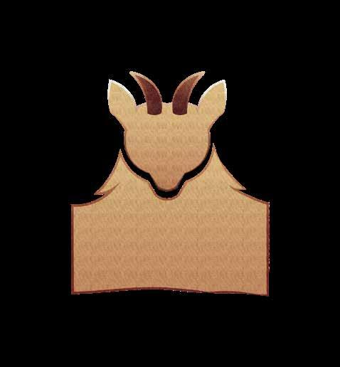
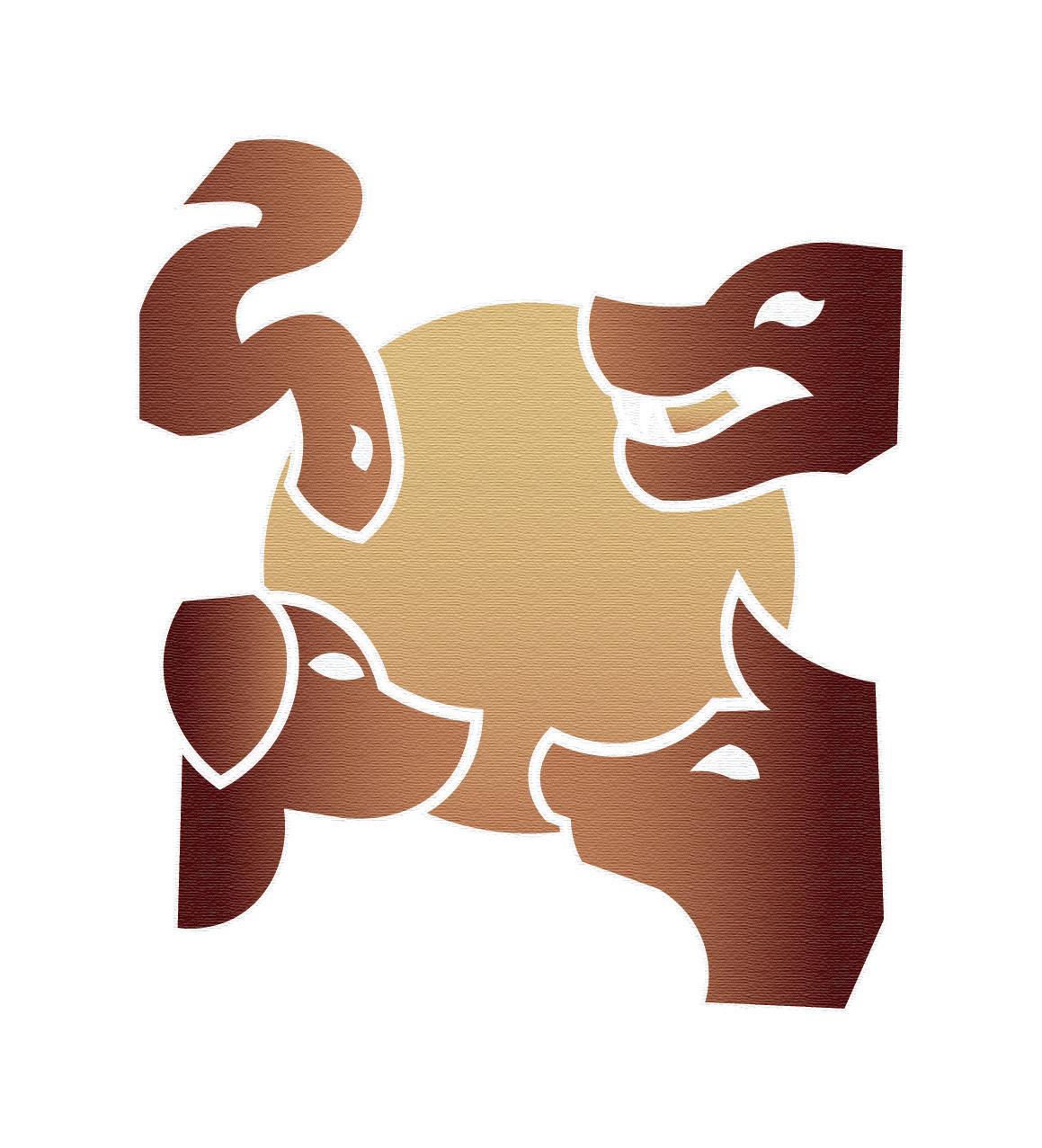
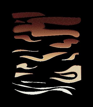

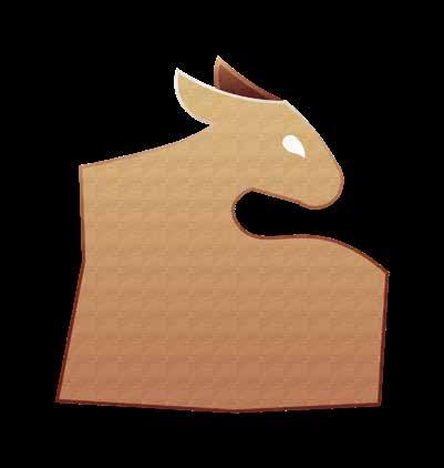

GOAT


Digital Comps
Year Of The Predators
Mockups
704.472.4834 starramdesign@gmail.com starramdesign.xyz
