BOARDS & SWORDS
DESIGN OBJECTIVE: Conceptualize, design, and prototype an app to solve a problem. Boards & Swords is an app that allows users to buy, chat, and play board games with other board game enthusiasts , all in one app.

DESIGN BRIEF: The app was developed for board gamers to buy board games at reasonable prices The logo reflected the idea of the “swords” part of the name with a shield, two swords crossing each other and a dragon behind the shield. The shield also had a checkerboard design to reinforce the “board” aspect of the name. Users of the app were able to sign-in as a guest or through an account created in the app or through social media such as Facebook. After signing in, users could browse from a variety of board games and chat with other users of the app, create group chats, and review products. Users could also customize their own profile and pay for a premium subscription for special features such as discounts and disabling ads.


Click on the link or the QR Code for the Interactive App: https://xd.adobe.com/view/e453a338-f4c9-43f9-a697-45dcc52c5d1c-b100/


CATAWBA FARMS
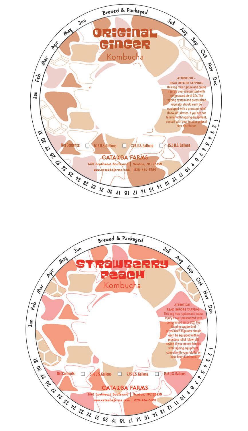
DESIGN OBJECTIVE: Create a series of banners, stickers, coasters, keg collars, labels, bottle labels, and a carrying system for Catawba Farms lineup of kombucha flavors. Flavors include Original and Strawberry Peach.


DESIGN BRIEF: The project’s design was to create a bubbly, modern, and flowing feel to the branding and design of the kombucha labels. Included in the flowing shapes are ingredients used to make kombucha, such as honeycombs representing honey and tea leaves representing the kombucha itself. The Strawberry Peach kombucha label design included strawberry and peach icons. The typeface chosen for the design was Blackcurrant, which emphasized the flowing and playful nature of the design. The design on the labels and keg collars incorporated a consistent branded theme to distinguish each flavor. Lastly, the design of the carrying system was structured to withstand the weight of each glass kombucha bottle. A minimalistic pattern of organic shapes was incorporated into the graphics on the packaging.


REDHAWK ESPORTS


DESIGN OBJECTIVE: Redesign the CVCC Redhawk Esports jersey design with potential merchandise in addition to a 3-D mockup for the layout of the arena where all the Esports players compete.


DESIGN BRIEF: The designs for the jerseys and merchandise helped reflect the serious and competitive aspect of Esports which used several bold lines with harsh angles to represent the competitive nature of online gaming. The merchandise included tumblers, keychains, stickers, pins, and socks. The social media campaign included a hashtag event recognizing team members as #GameChangers. Lastly, the 3D Mockup of the arena included additions such as a trophy display, an arcade cabinet, a series of four ceiling-mounted televisions in the middle of the room showing off top players, red light strips on the wall that shape the Redhawk Esports logo for cool decoration, a vending machine by the windows for a quick refreshment or snack to eat, and a giant calendar with the #GameChangers title on the wall next to the coach of the Esports teams’ desk.


SKILLSUSA
DESIGN OBJECTIVE: Create a series of collateral pieces and a poster design to promote SkillsUSA.


DESIGN BRIEF: The overall design was made to look very colorful, expressive, and exploding with creativity. The typeface chosen was Bold Italic Kallisto to further reflect on the bold personality. Collateral pieces included stickers, lanyards, pens, mousepads, desk pads, buttons, and a bottle. The desk pads and pens featured an alternate design with a bold red background color and white logo text to break away from the graffiti styled design that was used for the other pieces.


MAPLE DRIVE-IN
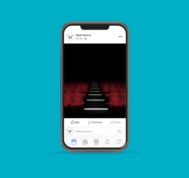
DESIGN OBJECTIVE: Create a drive-in movie theater logo, poster for an event, social media mockups, and a style guide.

DESIGN BRIEF: The project was about creating a unique drive-in movie theater brand and creating mockups for the movie theater about how the social media and marketing would look like. The drive-in would take place in Toronto, Canada and the logo would have moose horns to represent the Canadian theming in addition to a style guide to show how the logo was created. The first piece was a Halloween event poster called “Drive-In... If You Dare.”, followed by series of mockups for social media posts and an email.


CATAWBA COUNTY PARKS

DESIGN OBJECTIVE: Conceptualize and create posters for all four of the Catawba County Parks, including Bakers Mountain, St. Stephens, Riverbend, and Mountain Creek Park. Develop options for potential collateral pieces.

DESIGN BRIEF: The style of the posters is designed to be based off National Park posters for parks such as the Grand Canyon and Zion. Each poster is designed to reflect each of the park’s most notable qualities. Riverbend featured a paddleboard front and center to show off the popularity of paddleboarding at the park. St. Stephens features a golden retriever since the park is designed for pets in mind. Bakers Mountain featured a Red-Tailed Hawk since it is one of the many birds seen within the park. Lastly, Mountain Creek Park featured a bike tire to represent the popularity of mountain trail biking at the park. T-shirts were also designed to promote the park as well.


INFOGRAPHIC POSTER

DESIGN OBJECTIVE: Conceptualize and create an infographic poster about a subject and include five primary icons and five secondary icons along with a brief description of the primary icons.
DESIGN BRIEF: The subject of the infographic poster was influential artists. The five primary icons are Salvador Dali, Frida Kahlo, Leonardo DaVinci, Vincent Van Gogh, and Andy Warhol. The secondary icons are artist tools that best represent artists. They include a paintbrush, a tube of paint, a pencil, an ink brush with a glass of ink, and a palette. In the poster, each artist would have a brief description about them. The design of the poster is styled to look like it would fit into an art museum to fit with the overall “art” theming of the infographic.


NC STRAWBERRY FESTIVAL


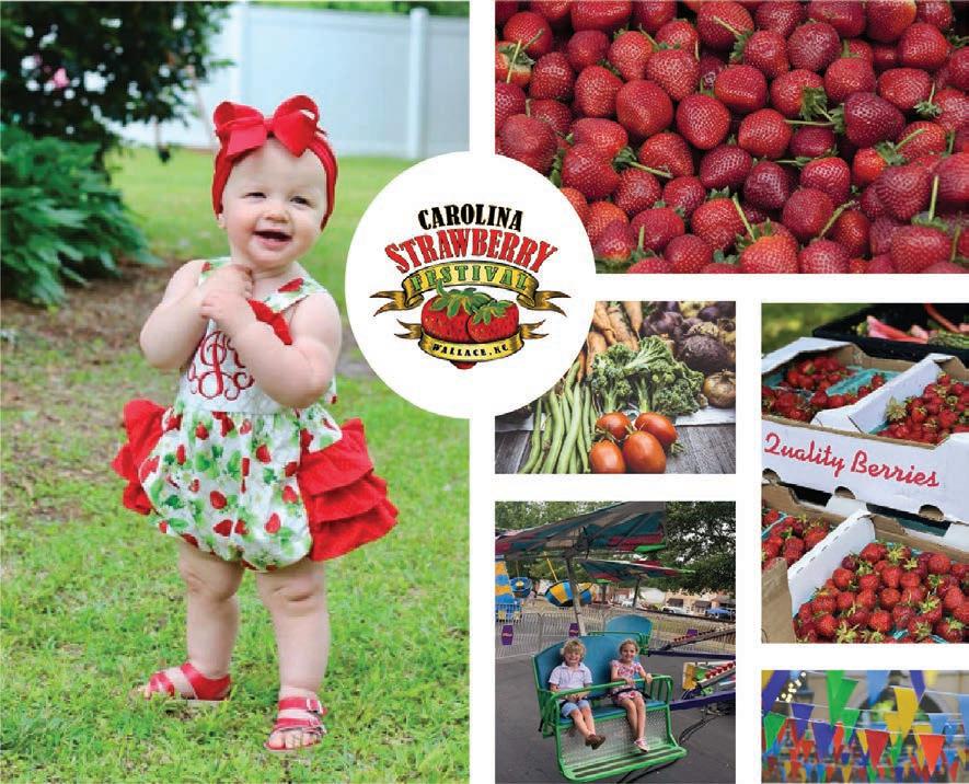
DESIGN OBJECTIVE: Choose a festival and redesign the logo and prototype a new website. In addition, include a style guide, a mood board, and a t-shirt as collateral.
DESIGN BRIEF: The chosen festival was the Wallace, NC Strawberry Festival. The logo was redesigned to be much more minimalistic and simpler. Other vegetables such as corn, pea pods, and carrots were implemented into the logo to represent the agricultural aspect of the festival. The website was redesigned to be slightly easier to navigate, have less clutter, and to not have excessive amounts of tabs. The mood board represents the overall feel and theming of the festival, and the t-shirt was designed to look simple but still represents the festival. Click on the link or on the QR Code

9f83-d73634831507-9254/?fullscreen
for the Interactive Website: https://xd.adobe.com/view/c7075cb0-730f-4169-


VISION ART SHOW
DESIGN OBJECTIVE: Conceptualize and create a banner, poster, and postcard to display at the CVCC Vision Student Art Show.

DESIGN BRIEF: The design of the banner, poster, and postcard utilized a black background with lots of red and blues to incorporate a 3D anaglyph feature into them. The post card incorporated a tear-off pair of 3-D glasses for users to look at the banner and poster to make the blue and red parts pop out. The design utilized a lot of geometric shapes to amplify the three-dimensional aspect of the layout.


COMIC STRIP & CHARACTERS
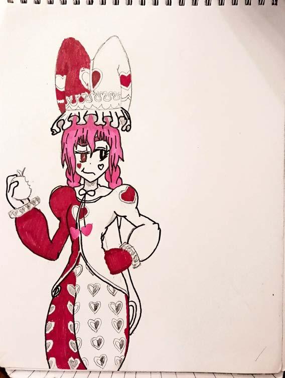
DESIGN OBJECTIVE: Conceptualize and create two characters, digitize them, and design a comic strip that includes them.

DESIGN BRIEF: The setting of the comic is about a princess who runs away from her kingdom because she’s tired of being contained inside and away from the world. The title is called The Runaway Princess: New Faces, New Places. The main character is a princess named Maryn and the second character is Maryn’s childhood friend retainer, Lachesis, a street entertainer who uses fire magic and wears a poofy jester outfit. The comic strip happens after the two fend off a group of local bandits and talk about how they got to where they were.


jackson.cossich@gmail.com 828-461-7291


