Gideon Hart Portfolio By: gjhart15@outlook.com 704.441.1076 @HartDesignSolutions
Catawba County Park’s Poster Series

Objective:
Create a four-poster series to promote each of the four Catawba County Parks. The posters must demonstrate the natural beauty within the parks. They must also intrigue viewers to come visit the parks.


Design Brief:
With the intent of portraying the natural world in a very aesthetically pleasing light, looked back at popular landscape painters of the past. The style that stuck out to me most was impressionism. This painterly style was recreated digitally with flat vector brush strokes. Positioning these strokes close together made the strokes optically blend together to the human eye. This optical blending helps create the depth, and shading, despite there not being any true blending of the colors going on. Working within the context of an impressionistic style also meant I leaned hard into lighting and how it reveals different colors, forms, and imagery within the landscapes. The color usage followed the rule of warm light and cool dark to create striking contrast and visual intrigue. Lastly each poster features flora and fauna naturally present in each respective environment.
Posters & Isolated Animal Files


Time-lapses & Collateral
Bakers Mountain

Scan The QR Code
To View Bakers Mountain
Painting Timelapse
Mountain Creek Park
Scan The QR Code
To View Mountain Creek
Park Painting Timelapse

YouTube Thumbnails


Stronger Together Phone App

Objective:
Create an app that provides support systems for non-straight, and/or non-cis, individuals who aren’t able to publicly come out yet.
Design Brief:
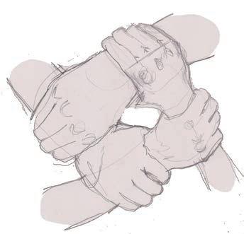
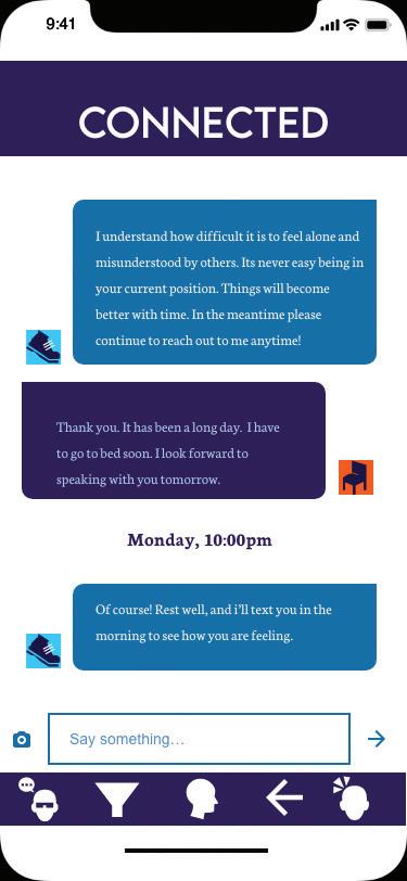
The focus here was for a clean, comfortable design without too many frills. Iconography is simplistic between menus, and there aren’t too many menus to navigate to get to your destination. The app’s color palette utilizes blues and some purple to create an analogous color scheme. The usage of the cool colors all in the same range of color creates calming visuals for the user. There are options for profile picture customization through a variety of premade icons that can be mixed and matched with colors so that users can distinguish themselves while also maintaining anonymity. Anonymity is an important part of the graphical design elements of the app from the iconography to the logo; all are not loudly LBGTQA+ for the sake of user safety.




User Testing


Scan To See Process Booklet




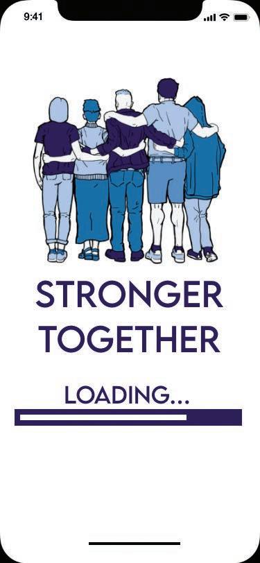

Screens Scan To See App Prototype
App
Micro Print Subscription Box
Objective:
Make a subscription box intended for those looking to collect, and commission artists. Each box includes small prints as examples of a working artist in the field today along with the artists contact information. Then make a microsite the box.
Design Brief:
The logo of the box utilizes several different fonts in different sizes to demonstrate proportion and emphasize the “micro” nature of these prints. Colors are highly saturated to grab the attention of the viewer. The box’s construction is very simplistic in nature and is adorned with patterns of hanging picture frames on the exterior of the box. In conjunction with the box itself, there is also a microsite that plays into the bold nature of the branding with blocks of color, interesting elemental placement, and also incorporates photography.
Color Logo
CMYK C=15 M=95 Y=85 K=5 RGB R:199, G:48, B:53 Hex #ce0c24 CMYK C=25 M=10 Y=96 K=0 RGB R:201, G:201, B:53 Hex #bfe60a
Logo type 1
Futura
PT Light
LOGO TYPE 3
& TAGLINE
BEBAS REGULAR
Logo type 2 & Headings

Futura PT Demi
Body Copy
Garamond
Logo
Palette
B/w
Color
Font Selections CMYK C=65 M=90 Y=30 K=30 RGB R:101, G:51, B:102 Hex #47148f
Premier Pro
Web Design


Packaging & Dielines


Sustainable Design Magazine Spread
Objective:
Create a clean modern layout for a magazine spread. The article’s information is about ecologically safe advertising practices. The choice of photos, and graphical elements must add to the themes of sustainability.


Design Brief:

Scan

My first thoughts for creating a magazine spread that was reflective of ecologically friendly advertising practices was to incorporate several shades of green into the layout’s graphical elements. I picked photos displaying a balance of nature and technology throughout the spread to help convey that one can work alongside the other. I chose two serif fonts for the spread. The first font, Didot, was reserved for headings due to its elegant structure. The second font, Warnock, chosen for its easy readability. The design incorporates arrow iconography to display progress and guide the eye through the spread. The QR Code To Read The Epub
Flat Spreads


Even casual gamers would likely express interest in an Esports space

CVCC eSports Rebrand & Arena Space
Objective:
Provide the CVCC eSports team redesigns of their team uniforms and arena space.


Design Brief:

This was a multifaceted project with a lot of moving parts, but the core focus was to create something exciting and visually engaging for the students. The space for the arena features plenty of stations for console and PC gaming. Open space that invites spectators to become players in the arena. There is a trophy case to proudly display CVCC’s eSport victories. There is also a streaming space for the eSports team to stream their online matches on platforms such as Twitch. Lastly, a pattern comprised of iconic console controllers were used to tie the room together.
Friendly rivalries can form while players test each other Sense of pride of long term participation
Find others with similar interests
Community
Recognition from those inside and outside Esports
Opportunity to learn new games to play in competitive scene
Players build rapport and eventually friendships
Large Skill and time invest goes into playing a game competitively
Competitive
Esports
Rewarding and memorable experiences players will always have
Rapid growth of Esports means lots of upcoming growth in the player base, School teams, and Professional teams
Thrill of victory
Video Games Exciting Elements
Hype around the release of new games
Getting a more through experience out of a game
Fewer physical barriers to entry compared to traditional sports.
Rediscovering older titles in a competitive format
Overcoming challenges
Breaking records
Engaging with fans. Both casual gamers, and those who follow Esports
Match result upsets, long term rivalries, the change of players over time.
Secondary Logo Construction


Yo Mama’s
Food Truck
Objective:
Create a logo design, branding, and marketing for a food truck specializing in southern cooking.
Design Brief:


I developed a fun design for the logo featuring oven mitts and using the complementary colors orange and blue. I also developed iconography to be used in branding featuring iconic southern foods. Next, I made a mock up van wrap showing what the YO Mama Food Truck would look like. When developing a marketing plan for Yo Mama, I looked into what other food trucks were doing, who my target audience is; then, conducted a SWOT analysis with that information. I also developed email campaigns, social media campaigns, and an animation to cover for various means of marketing.

Social Media & Video


Scan The QR Code To View Yo Mama Ad


Email & Web Site


Scan The QR Code To Read The Booklet


Pursuit Digital Painting Series
Objective:
Create a series of digital paintings with the intention of using them as book covers. These paintings must be thematically linked and have a consistent design between paintings. Lastly a video ad must be created to market said book series to the general public.

Design Brief:

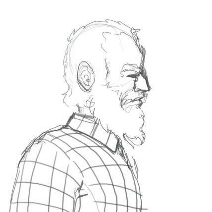
I wanted to create a 90’s era mystery series with elements of the supernatural. To achieve this look, I utilized an analogous color palette for each book cover. I also incorporated two distinctive styles for the front and back of the books. The front featured a graphic novel style illustration with thick lines and flat shading. The back featured a more painterly style with a focus on portraiture. I then unified these two looks with a textured background made with a digital paint brush. The video ad was shot in an appropriately rustic location complete with limited lighting to mimic the mood of the books.

Roughs






The QR Code To View Video
Video Ad Scan
Screen Separation: Magenta

Two-Color Screen Print Poster


Objective:
Create a two-color design that can be functionally screen printed, and is pleasing to look at. Break down the process for viewing in portfolio. Lastly build an animation using the two-color design.

Design Brief:
For my screen design I depicted a silhouetted woman standing in front of the sun amongst a flock of seagulls. I branded the poster as a music concert to give more of a direct thematic direction to the piece. To show process I separated my layers and changed the colors to the standard process colors Cyan and Magenta. When going into the animation I took advantage of the Tween Shape Tool in Adobe Animate to transform the lady in the illustration into more seagulls.
Screen Separation: Yellow
Animation Stills
Scan The QR Code
To View Animation


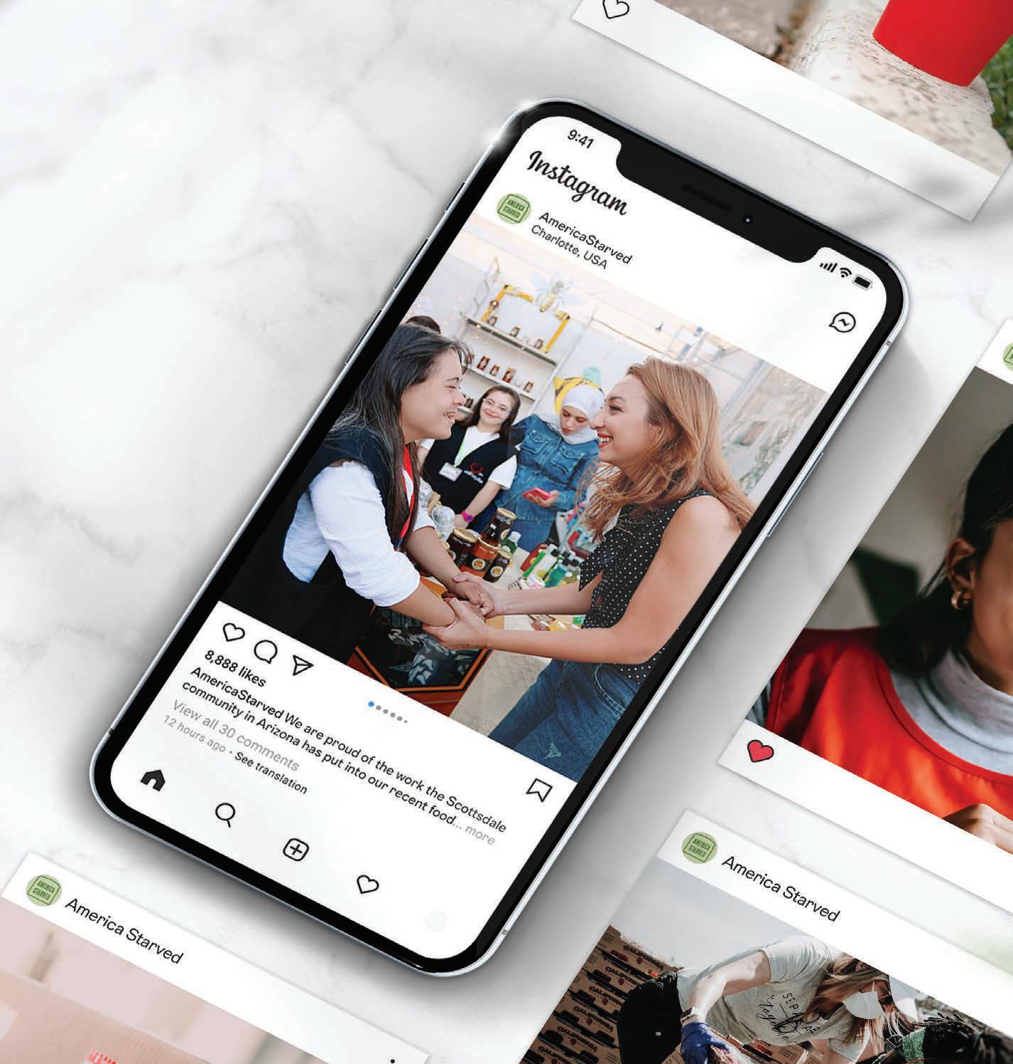
America Starved Social Campaign
Objective:
Create a meaningful, and well researched, infographic that details who is going hungry in America today. Build a brand behind this social awareness project that would work to inform and fight against hunger in America.

Design Brief:
The infograph for the project needed to have imagery alongside the researched information. I developed several graphically reduced icons that weave into the layout of the poster without drawing too much attention away from the body copy. The color choices for this project leaned into desaturated greens and a dark red. These color choices help to create a more serious atmosphere.

Full
Color
Black & White White
Style Guide


Color Choices
Type Choices
Steel Fish Logo |

Headings |Bio Sans Xbold
ABCDEFGHIJKLMN OPQRSTUVWXYZ abcdefghijklmn opqrstuvwxyz
The quick brown fox jumps over the lazy dog.
Body Copy |Bio Sans Regular
ABCDEFGHIJKLMN OPQRSTUVWXYZ abcdefghijklmn opqrstuvwxyz
Icon Set
The quick brown fox jumps over the lazy dog.

C=25 M=10 Y=40 K=0 R,195 G,206 B,166 #C3CEA6 C=50 M=0 Y=85 K=80 R,35 G,70 B,20 #234614 C=45 M=90 Y=80 K=30 R,118 G,46 B,49 #762E31 C=0 M=0 Y=85 K=35 R,182 G,170 B,0 #B6AA00 C=50 M=0 Y=85 K=50 R,75 G,118 B,50 #4B7632
Food price inflation is the most steadily growing inflation in the US. Meanwhile the perceived cost of living is the same as it was in the 1970’s.
Today, many people living in poverty can live beyond their means through the use of credit cards. Families that are struggling to have enough food will have such luxuries as cars, televisions, and houses. All this attributes to how poverty has changed drastically from how many people still perceive it to be.

20 Percent of food insecure children live in house holds that still earn too much to qualify for Federal nutritional programs like SNAP despite these children sometimes risk going with out food.
84 Percent of households report buying the cheapest foods available regardless of the health of the products.
61 Percent of poverty level housesholds rely on food stamps for food.


61%
30%
About 30 percent of food in the US was wasted in 2009. All together it was a 48.3 Billion dollar loss.
The bottom 10 percent of wage earners made the same amount of money in 2011 that they did in 1994. =
The USDA estimated that 13 percent (or 15.8 million) of US households are food insecure. Meaning, that they had difficulty at some time of the year providing enough food for the whole family due to a lack of resources. 1994 2011
Hunger in the suburbs has more then doubled since 2007, and is expected to out pace hunger in the city.
Instagram & Email



Instructional Art Video

Objective:
Create a personally branded YouTube channel with educational content. Also include a video exemplifying the type of content being posted there.
Design Brief:

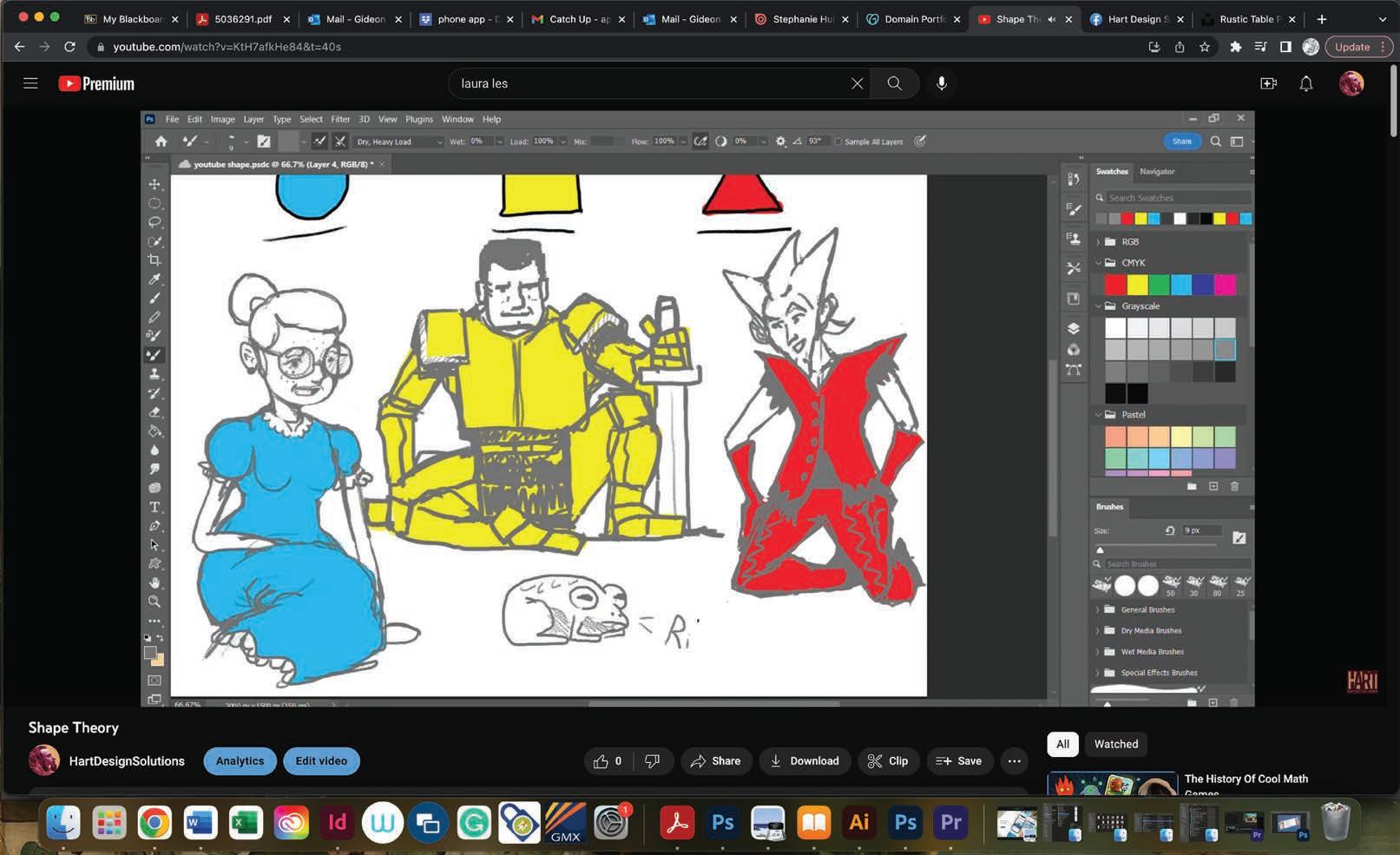
The personal branding for this channel included my logo, as well as a digitally edited photo of myself that I used for the banner and profile picture. The video itself demonstrated some fundamental concepts to aid in character concept art. The video features recorded illustration edited succinctly for easy viewing. I opted to record myself speaking rather than relying on text to communicate my thoughts. Lastly, I incorporated some humor to help give some added personality to what I was saying.
 Scan The QR Code To View Video
Video Stills


gjhart15@outlook.com 704.441.1076 @HartDesignSolutions


 Scan The QR Code To View Video


