Creative
Her Chapter
APP DESIGN
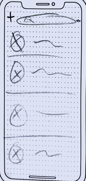
Create an app for a service that does not exist already. Design the app’s branding with a logo and matching iconography for all aspects of the app. Start by creating thumbnails, transitioning to wireframes, and then color comps that will be produced into a functioning prototype of the app. The prototype will be used to conduct a survey for user testing. Then, compile all findings and research into a branded booklet.
Design Brief
Her Chapter is an app geared towards sorority members who use it in order to stay connected and post updates. The Her Chapter logo replicatess the top of a Greek column with hearts incorporated, which appeals to the feminine audience, the color palette includes different tints of purples and oranges. With the target audience in mind, Each icon was created with a simple and easily recognizable symbol so that users know where to click. Her Chapter has the option to subscribe to premium access which costs ten dollars a month creating monetization for the app. Her Chapter is a unique social app because it allows sorority members to have everything they need at their fingertips.


Portland Yetis
SPORTS WAYFINDING & ENVIROMENTAL GRAPHICS
Design Scope
Design a sports team in a city that doesn’t have any competing professional league teams. Create a primary, secondary, and tertiary logo with a complete branding guide. After the brand is established, create five wayfinding and one environmental graphic for the stadium. The substrates for each should be researched and detailed blueprints created. Once the blueprints are created, use Adobe Photoshop and Dimension to create 3D models.
Design Brief
The city of Portland Maine has no professional Hockey team, so the Portland Yetis were created. Three logos and a wordmark will be used throughout the branding. There are also three patterns that can be used on any collateral. When it comes to the wayfinding elements, the three substrates that will be used for the wayfinding are vinyl cling, expanded PVC, and paint. The environmental graphic wall will be ten feet by twenty feet. This entire wall will have acrylic that is raised on top of it. Then the graphics will be a vinyl cling on top of the acrylic. For the foot imprint, the acrylic will be cut out to the size. A collateral piece was created of a potential hockey puck and jersey that the team will use.
View Proposal


Prison Issue Posters


SOCIAL ISSUE POSTER SERIES
Design Scope
Design an 11x17 social issue campaign in Photoshop and InDesign, consisting of three distinctive yet related posters. The design must include each of the following components used creatively: effective communication of social issue, a minimum five images per poster (cannot be repeated), typography, texture, memorable tagline (headline, description, etc.), and description or contact info for assistance. Use no copyrighted material. Use high-resolution stock photos from the internet, scanned line art, original artwork, and/or original photos.
Design Brief

The topic and research used for the social issue posters were the issues in the American prison system. The most common problems are the overcrowding of prisons, the treatment of the prisoners, and the conditions they are put into. When thinking of thumbnails, repetition was incorporated in order to give the posters a cohesive feel. This was done by including the handcuffs as the focal point in each poster, using the same background, and as well as using three different photos of handcuffs to give some variety. Inside the handcuffs was a composited scene that represented each issue. Each scene is over-exaggerated to persuade the viewers to take action. This poster series uses imagery to invoke pathos in the viewer and bring awareness to the issues surrounding our prisons.


Graphic Design USA Magazine

Design Scope
Design a six-page magazine spread for the spring 2023 print and digital editions of Graphic Design USA magazine. All images used should enhance the article, be unified, and add to the overall design. Using the Interactive features in Adobe InDesign, prepare the six-page article for digital publication. Students will be responsible for creating all the copywriting for the magazine and curating a related secondary article or informational graphic to use a sidebar within the magazine layout. The article’s structure must be creative and strategic. A cover for the magazine was also created in Adobe Photoshop.
Design Brief
The topic of the magazine layout was on the extensions of graphic design in set design. When creating copywriting for the magazine a large amount of research and writing was needed. The layout is simple; this is shown in the way that a two-column layout is used and the only other shape used is the red rectangle at the top. The color palette is a dark red that represents the curtain that is in theaters. This creates cohesiveness in the entire layout. When the layout was done, interactive pieces were added, which were animations, transitions, sounds, and buttons. All of these were used to give the magazine some interest and user experience when looking through it. The sounds added were applause and a computer clicking. Overall, this created an interactive and pleasing magazine to read and look at.


Illustration
Design Scope
Create a collage out of items in magazines. Then create a larger-scale version using different mediums such as charcoal and ink pen. Once that version is done, create a digital version that is colored.

Design Brief
When creating the collage, it was a cohesive layout with the placement as well as the pictures chosen. The next part of the project was creating the collage on a larger scale, so a 24”x36” drawing paper was used. The phone, column, and tissue paper elements were made using charcoal. While the phone booth and tree were made with ink pens. The different techniques used for those were stippling, cross-hatching, and hatching. The next part of the project was creating a colored digital version of the illustration. This was done in Adobe Illustrator and Procreate. Some elements were removed and moved around in the digital version to create a better layout.


Cortipril PHARMACEUTICAL BRAND
Design Scope
Create a pharmaceutical brand with a logo, tagline, packaging, and trade booth. Create a PSD mock-up, an Adobe Dimension mock-up, and a physical 1/10th scacle model of the pharmaceutical trade booth. This project is intended to reinforce your design skills and test your ability to turn a concept into a functional print and digital job. An animated logo will be added to the videos on the TVs that are in the trade booths.

Design Brief
Cortipril is a drug used for anxiety and depression. The idea behind the firefly logo was that the medicine is an anxiety and depression medicine, so when taking it there will be “the light in the dark.” The logo is graphically reduced with the color palette being navy and yellow. There are flat versions, 3D versions, and a 1/10th model of the booth. The booth has handout jars that represent what people catch fireflies in and a fake fireplace that they can stand around to play into the summer night vibe. Then using Adobe Animate, an animation was created that would be used in the trade booth.


 View Animated Logo
Trivi-Oke MOBILE RETAIL BUISNESS

Design Scope
Conceptualize and design branded collateral pieces for the mobile retail business, creating a business model, SWOT analysis, and targeted marketing position. The branded assets of design are based on the strategic approach to designing for the overall look and feel of the business. A branding guide is developed to showcase the mobile business plan, and branding assets, and to illustrate the general mood of the brand. A microsite was added for the mobile buisness where a customer could plan and book events with Trivioke.
Design Brief
Trivi-Oke is a mobile business that provides both karaoke and trivia in one. Instead of going to two different companies and paying more, our customers get the best in both worlds. They have a choice of karaoke and trivia or can choose both with different packages. The color palette gives off the vibes of a party and the lights that they would have on the bus. The logo is a mixture of a question mark and a record which combines both things the business offers. The collateral piece included was an answer sheet for the trivia. The identity packet includes the logo, patterns, and wordmark branding. There are also mockups of the bus that Trivi-Oke would use when riding around with the party bus.


SummerScapes
PIRATE DESIGN
Design Scope
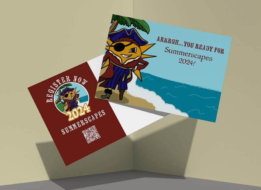
SummerScapes is a program through CVCC where participants learn about computer technology, E-sports, arts, cooking, journaling, and more. The project objective is to create a logo for the 2024 Summerscapes branding that will be used on postcards, t-shirts, and booklet covers. The only requirement was that the logo included a sun as the mascot.
Design Brief
The first part of the project was to think of different themes that have not been used in existing years. The theme that was chosen to create a digital logo for was a pirate sun. The logo was created with the sun being on a deserted island with trees, sand and ocean around him. Once the logo is created it will be put onto a t-shirt in a circle which has the tagline of “Arrrgh...you ready for 2024 Summerscapes?” around it. The same lockup with beused on the postcard and booklet covers. Included on the postcard with be a QR code with the website.


CMYK: 13:42:100:0
RGB: 221,154,1
CMYK: 100:100:24:19

RGB: 28,23,10 8
CMYK: 33:93:96:46
RGB: 110,29,21
CMYK: 8:7:36:0
RGB: 236,225,175
abcdefghijklmnopqrstuvwxyz
ABCDEFGHIJKLMNOPQRSTUVWXYZ
BC Parlament Regular wausau
abcdefghijklmnopqrstuvwxyz


Tranquil
PACKAGING SERIES & CASE STUDY
Design Scope
Design a packaging series, consisting of three related products. The design of the packaging series will prioritize consistency between the products, labels, intentional thoughts, and approach to the layouts as appropriate for the product category. We also created a complete Digital Marketing Case Study.
Design Brief
In this project, 3 different bath products were created for a set. The set will include a bag of Epsom salt, a pump bottle of shower gel, and a twist container of body cream. Each product contains instructions, ingredients, contact information, caution/warnings, how the product helps, and a barcode. The color palette of the products was pastel blue and purple. The colors evoke the emotion of calm and cleanliness. The business in general is a bath product company that focuses on creating a relaxing time for the target audience. The company’s target audience is women between the ages of 30 and 50 who live busy lives and want to unwind at the end of the day. In the Digital Marketing Case Study, the social media platforms that they use regularly will ill focus on Instagram, Tik Tok, and Facebook. The social media posts are themed based on Tranquil’s mission.


 View Digital Marketing Case Study
 View Prototype for Mobile Website


