

TROUPER
Design Objective
Develop an app idea that solves a problem and does not currently exist on any app stores. Design the app’s branding identity including a logomark, logotype, unique icon set, and an in-app screen layout. Create a prototype of the app into a functional concept display, and then use this prototype to conduct a survey through user testing.

Design Brief
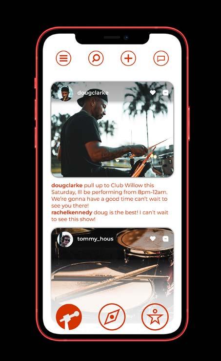
Trouper is an app that helps entertainers find places to perform, helps businesses attract customers, and helps a local community find entertainment. The platform connects businesses and entertainers into a shared social media space where they can post and communicate with each other. The name “Trouper” derives from the U.K. and is defined as “a successful entertainer who has had a lot of experience.” The name is a double entendre in that it represents performers, and also represents loyal fans called “Troopers,” which means reliable person. The big “T” logomark uses negative space to create a microphone to show the purpose of the app and to create a logo that is bold and enthusiastic to embody the passionate identity of the brand. The logotype complements the logomark by using a clean modern font altered to match the same angles seen in the logomark. The icon set is unique to this project and relates to the branding by incorporating the sharp points consistent throughout the branding.


MONTSERRAT LIGHT
MONTSERRAT BLACK TYPEFACE
TOMMY HOUSTON

Tommy Houston is a part-time waiter at a local restaurant in Richmond, VA. Tommy has a deep passion for playing music, especially with his friends because they’re the ones who got him interested in playing the drums. Tommy is a very outgoing person and can always spark a conversation with anyone. Since Tommy is very outgoing he does most of his band’s managing. Primarily, he runs their social media, finds places to play, etc. Tommy does most of this hard work because he believes he and his band can become very successful in the music industry. His family is very supportive of him as well, but they wish he were able to generate more profit from playing music than he currently is.
CARLOS MARTINEZ
BAR OWNER
Carlos Matinez is a small business owner in Jacksonville, FL. He was raised in Miami, FL, by his father who owned a gravel and landscaping business. Carlos also went to college in Miami, where he met his wife at the age of 21. After getting married to his wife, they moved to Jacksonville, FL, to live close to her family. Carlos worked a communication job for 12 years but eventually quit his job with the dream of following in his father’s footsteps and opening his own restaurant. He opened his bar/restaurant at the age of 32 and has been doing just enough to keep the business running but wants more for the business. He started a bar because he enjoys making positive connections having fun with other people in the community.

RACHEL KENNEDY

STUDENT


Rachel is a full-time student at Boston University studying to be a registered nurse. Rachel is typically very stressed out with completing schoolwork and preparing for her exams. To relieve some stress, she likes to go out with her friends to concerts or events and see local performers. Rachel is someone who is shy at first, but once she is with her friends or her boyfriend, she is very energetic. She loves to plan things out for her friend group, and once she graduates she wants to travel with her friends.

TRY THE TROUPER PROTOTYPE!


CAPTAIN SLUSH
Design Objective
Establish the name and business idea behind a mobile retail business. Create the logo and brand identity to develop into a branded style guide for your business concept. With the branded assets including the color palette, typography, patterns, etc., create a variety of visual collateral pieces that could be seen in the mobile retail business.


Design Brief
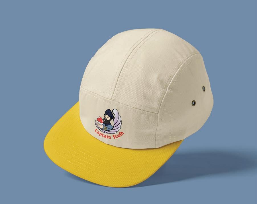
Captain Slush is a mobile pontoon boat that exclusively sells slushies/ snow cones directly from their boat on bodies of water including lakes, rivers, and on ocean coasts. The target audience of Captain Slush is families with children of all ages who live on any body of water. The business is presented with playful themes used throughout the branding pieces to this target audience. The logo itself displays the playful theme through the use of a naval captain enjoying a slushie in a very illustrative format. Assets such as the rope and wave patterns are seen throughout the collateral pieces to familiarize the customers with the Captain Slush theme. The collateral pieces include many common items that could be seen at similar venues. The typography used in the brand was picked because it fits the theme of a naval captain’s handwriting while also being fun for its audience. Lastly, the colors mostly seen throughout the brand are fun, bright colors used to represent the many different product flavors sold at Captain Slush.


Scan to see the animated GIF


FOOTHILLS COLLABORATORY
Design Objective
Design a logo that can be used in an inventive laboratory space for kids of all ages. Using this logo, create branding guidelines that can be used for additional collateral pieces. Design 8.5” x 11” flyer designs for the different topics used in this space including Motion, Balance, Build, and Magnetism. Lastly, create matching 20” x 20” signs for each of the four topics.
Design Brief

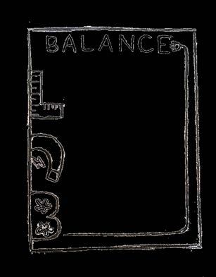
The primary logo created for the Foothills ColLABoratory is a multi-colored logo that incorporates many themes unique to this space. The logo works both in a multi-color version or a single-color version. In the first half of the logo, the word Foothills is designed to look like the foothills local to the Catawba Science Center by using a hand-lettered type that is unique to this project. The second half of the logo, the word ColLABoratory is laid out to create emphasis on the LAB aspect of the logo important to the theme of the space. Both halves of the logo work together seamlessly through the asymmetrical balance of the separate colors. The logo is effective in relating to its target audience in that it targets kids through a playful way without being too childish. The 8.5” x 11” flyers were designed to keep the branding consistent by having emphasis on the “LAB” on each flyer topic. All branded collateral pieces keep a consistent theme in that they include the off-white color seen in the branding guidelines accompanied by the foothills landscape spanning across the bottoms of each piece to show the local personality of the Catawba Science Center.


 Check out this logo animation!


PORT CITY NOSTALGIA
Design Objective
Develop research on an existing city to create a city planning guide and brand guidelines. The city planning guide will need a digital interactive version and a print version. Construct the written and visual content of the guide that is accurate to the history and culture of the chosen city. Design a name and logo to be used on any branded material. Lastly, create an illustrative map that highlights key destinations or attractions that can be seen in this city.
Design Brief

In the construction of the logo, familiar pieces of Wilmington, North Carolina’s attractions such as the Downtown Riverwalk were used so that it could be easily recognized as a logo that embodies the historical aspects of Wilmington. Wilmington is a historic coastal city, the name “Port City Nostalgia” was created to implement the historical nature of the city while also portraying the coastal personality seen in the port city. A dark green color was chosen to represent the gardens famous to Wilmington with a contrasting yellow color to represent the light given off from the riverwalk lamps. The typefaces used consistently throughout the planning guide are serif fonts to keep an aged tone which is fitting for the city’s historical attractions. The city planning guide uses the lamp post seen on the riverwalk on every page to keep each page related to the brand. Several small details are included in the planning guide to continue the historical theme like surrounding each page with a border and having every photo frame have inside beveled corners; both design elements resemble antique picture frames. All the subtle details used in the branded materials were used to represent the historical city of Wilmington while also engaging the viewer.

Oxtail OT Bold
Adelle Condensed Bold
New Spirit Regular Condensed
Adelle Condensed Regular
Semplicita Pro Bold


SHIELDED ROSES
Design Objective
Create a logo and the branded guidelines for a new streetwear clothing brand called Shielded Roses. Using inspiration from the branding and clothing style, I developed a two-color T-shirt design. Produce the two-color T-shirt design using the screen-printing method.
Design Brief
The Shielded Roses clothing brand represents urban elegance, so the logo had to keep an elegant figure while still appealing towards street wear fashion trends. The logomark is both thorough and clever, by incorporating a multitude of features representing the name of the brand. The left side of the logomark displays the letter “S”, for shielded, in the shape of both a rose petal and a shield. The right side of the logomark displays the letter “R”, for roses, uniquely formed into a rose petal and stem. The “S” and “R” are shaped together to create a single rose. The logotype is a hand lettered typeface created originally for this project. The characters of the logotype roam freely in an unorthodox method, establishing the visuals of organic growth seen in the movement of plants to represent not only the brand but the urban street wear fashion.


ALLESTIN
Design Objective
Conduct research on the pharmaceutical industry to find similar design trends, package requirement laws, and target audience. Using this research, develop the logomark, logotype, style guide and any other branding assets. Design a pharmaceutical tradeshow booth, using these assets, to be applied to a 1:10 size tangible model. Create a packaging design that follows the brand guidelines and packaging requirements regarding pharmaceutical packaging laws.
Design Brief
Allestin is an FDA approved weight loss drug provided to consumers via prescription. The typeface in the logotype is called DM serif and features slim to thick strokes. The logo mark displays a leaf-like shape gradually getting smaller using the golden ratio method, creating a natural attraction to the logo. Both the slim to thick type and the shrinking leaf pattern logomark are used to convey the weight-loss message. Using leaves in the logo was chosen to communicate the marketing message by representing new beginnings symbolized by blooming foliage.

To expand the project further, packaging was designed and displayed as mockups using 3D software. The packaging utilizes the logomark similar to the trade booth design to create brand familiarity across the main pieces of the project. The trade booth combines fitness imagery with the logo in the center of the booth to portray healthy living to the viewer whenever they think of the logo emphasizing the importance of the brand.


